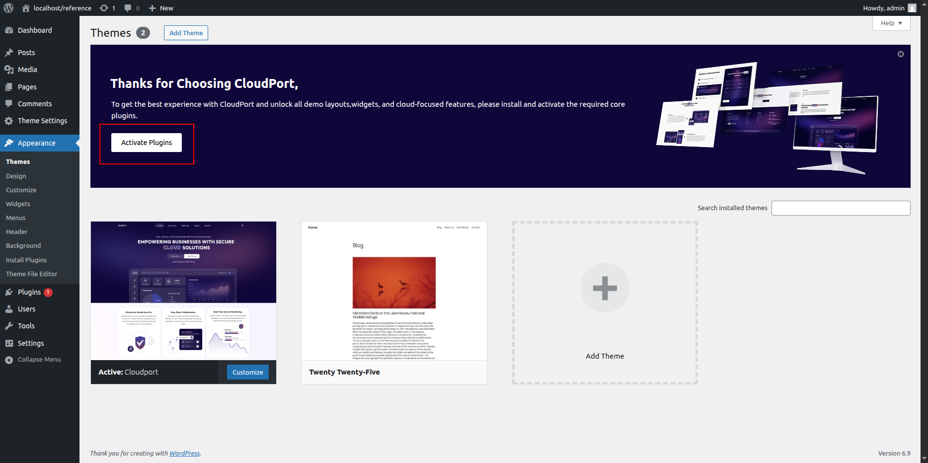
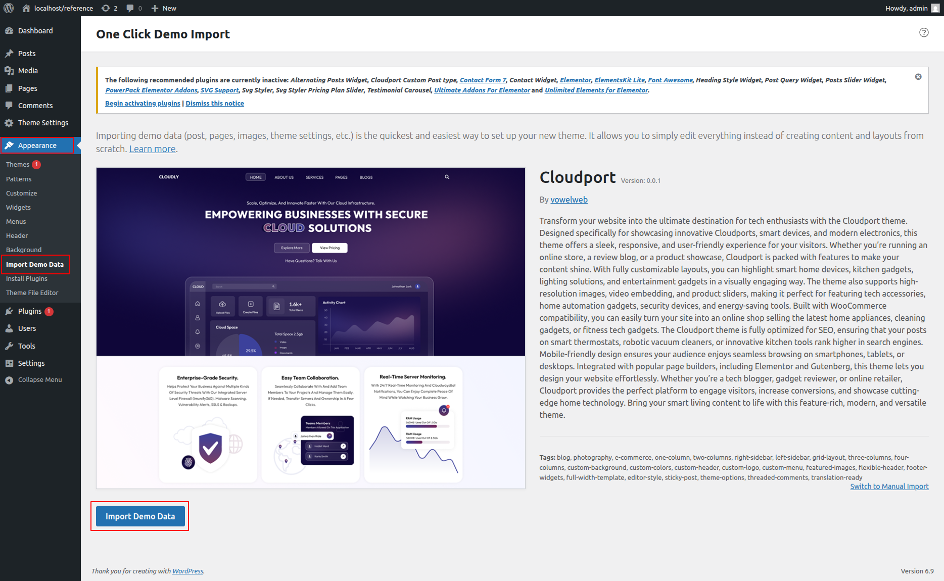
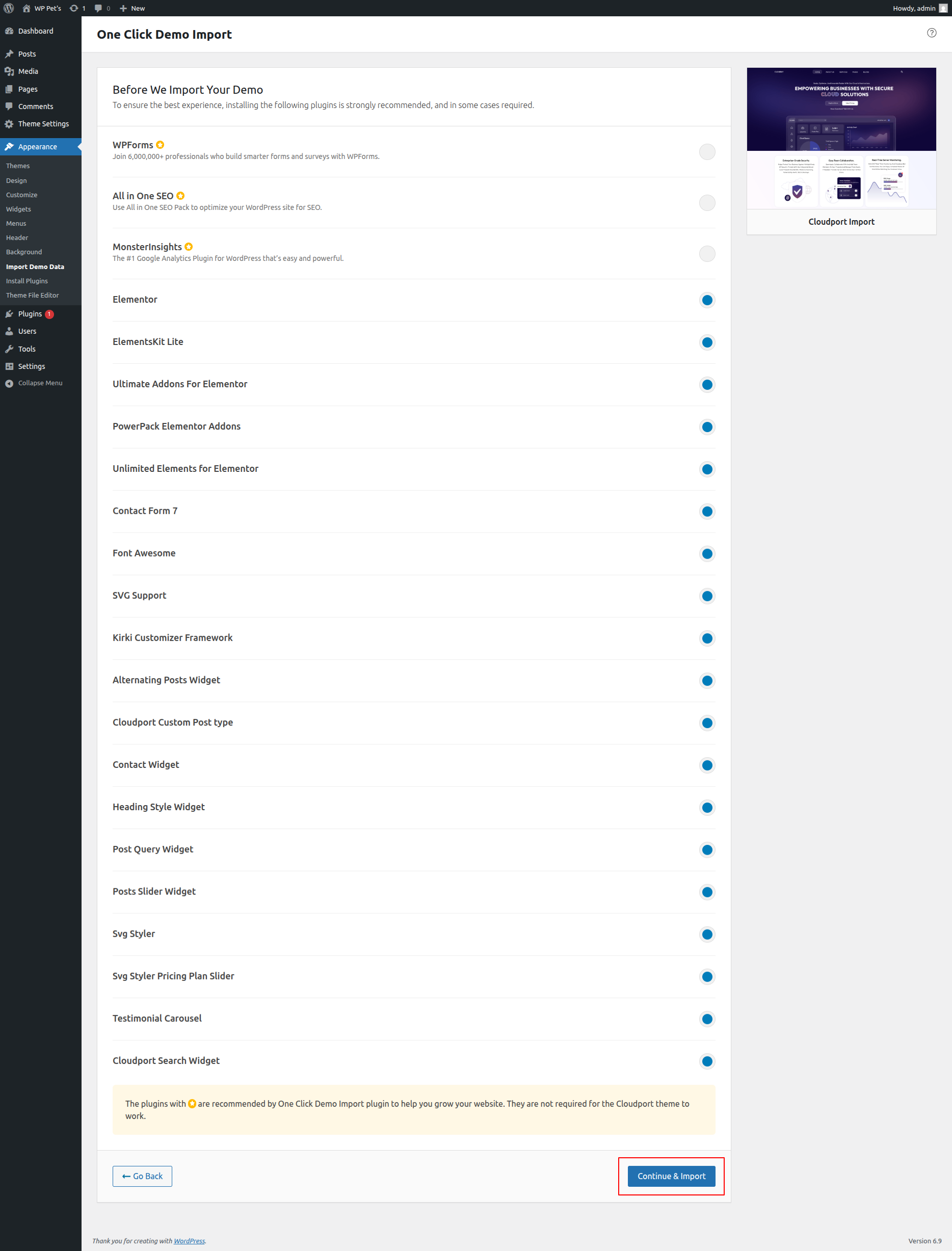
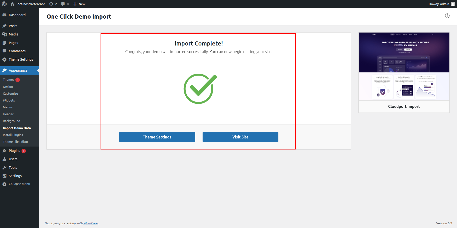
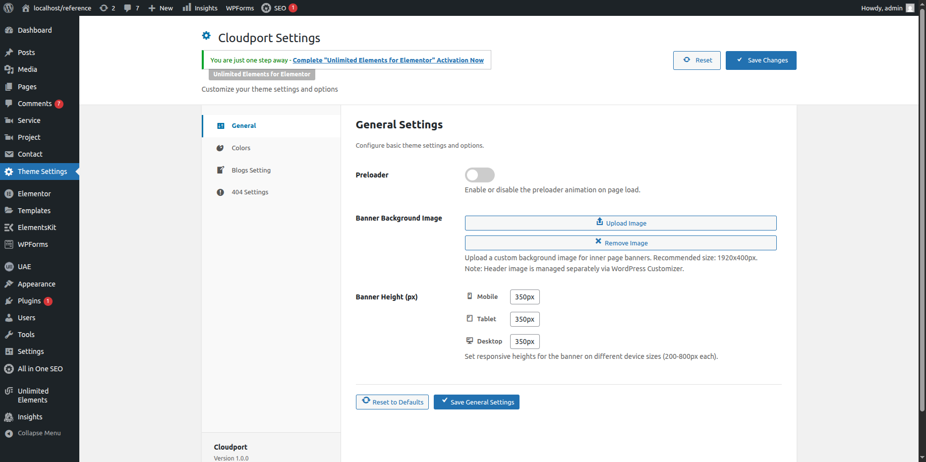
Theme Configuration
Now that you’ve successfully installed the theme, it’s time to explore how to configure and manage it effectively.
This guide will walk you through the key features and customization options available, helping you make the most of your new website.
Key Areas to Explore
Header Setup – Learn how to configure your site’s header layout, logo, and navigation options.
Menu Creation – Create and organize menus for easy navigation across your pages.
Footer Settings – Customize your footer area with widgets, links, and social icons.
Homepage Sections – Manage and design various homepage sections to highlight your content effectively.
Page Management – Create and edit pages to structure your site’s content.
Additional Features – Discover other useful theme features to enhance the functionality and user experience of your website.
General
Global Colors and Fonts Settings
In this section, you can set your website’s global colors and fonts using Elementor. This helps you maintain a consistent design across all pages.
- Step 1: Open Elementor Editor
- Go to your WordPress Dashboard.
- Navigate to Pages → All Pages.
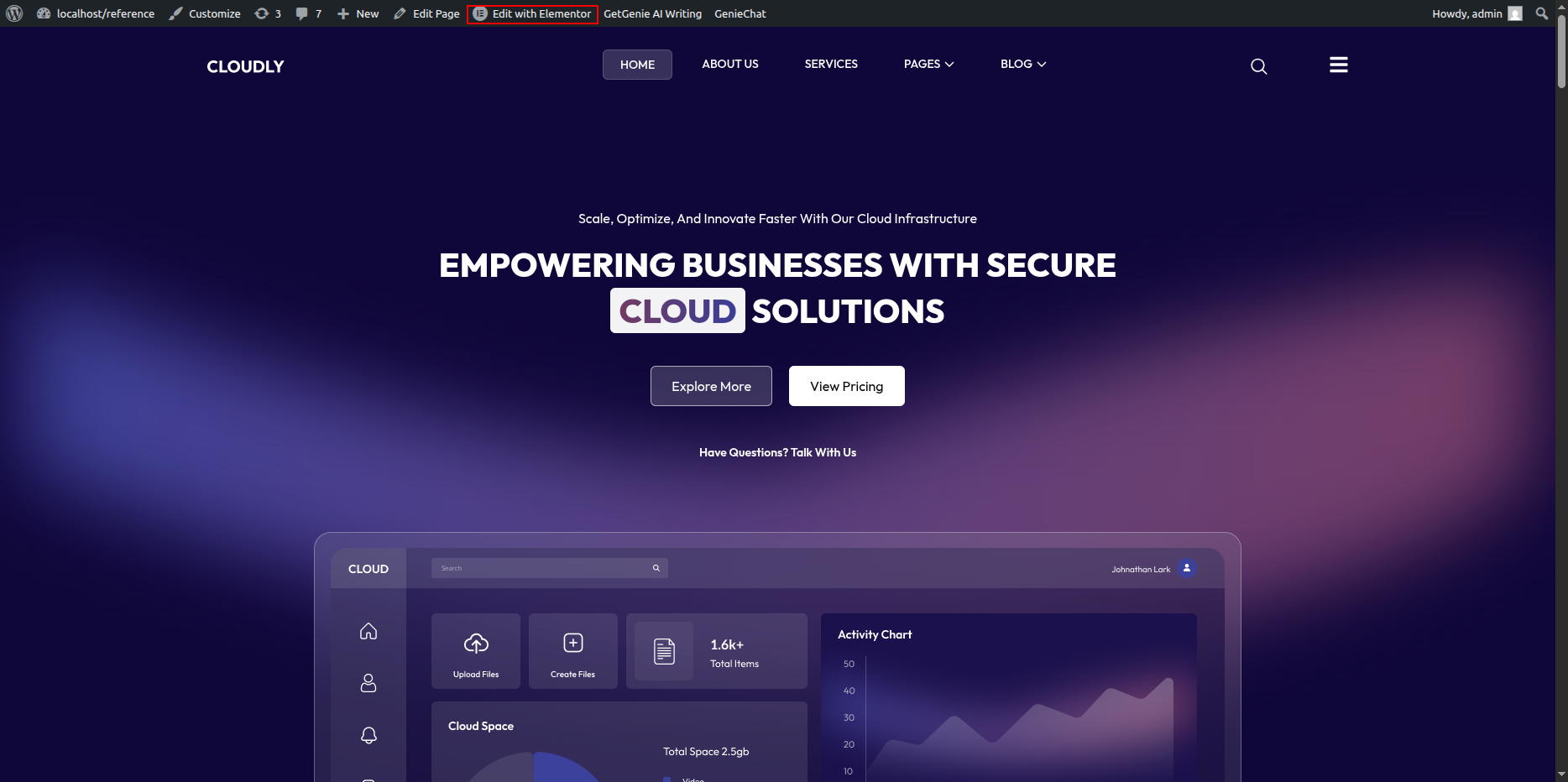
- Hover over the page you want to edit and click on Edit with Elementor.
- Step 2: Access Site Settings
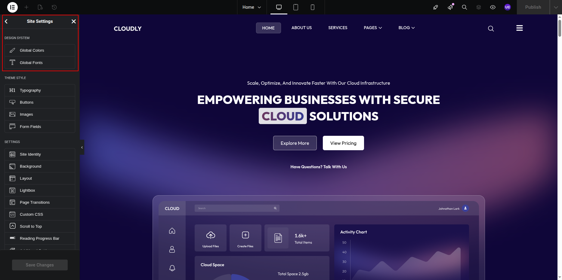
- Once the Elementor editor opens, click on the ☰ (hamburger menu) at the top-left corner of the panel.
- Select Site Settings from the dropdown menu.
- Step 3: Set Global Colors
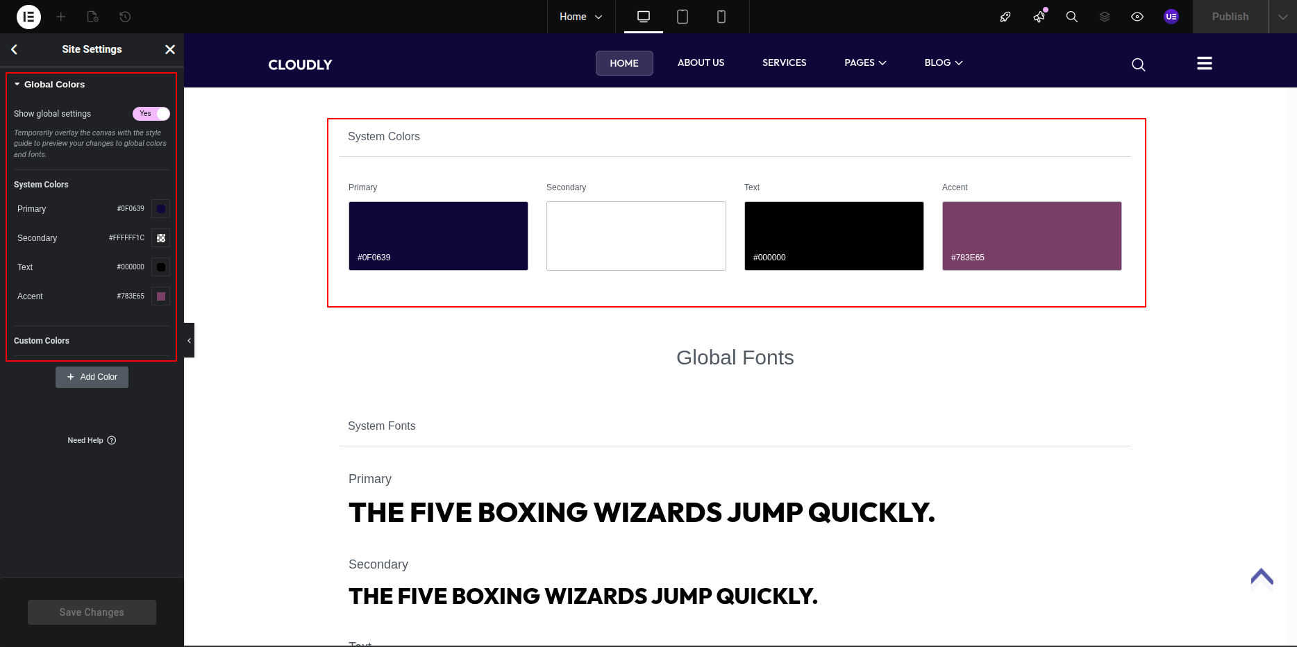
- Click on Global Colors under Site Settings.
- You will see default color options like Primary, Secondary, Text, and Accent.
- Click on a color box to change it or select Add Color to create a new custom color.
- After choosing your preferred colors, click on the Update button to save changes.
Tip: Use global colors in widgets to maintain consistent color styling throughout your website.
- Step 4: Set Global Fonts
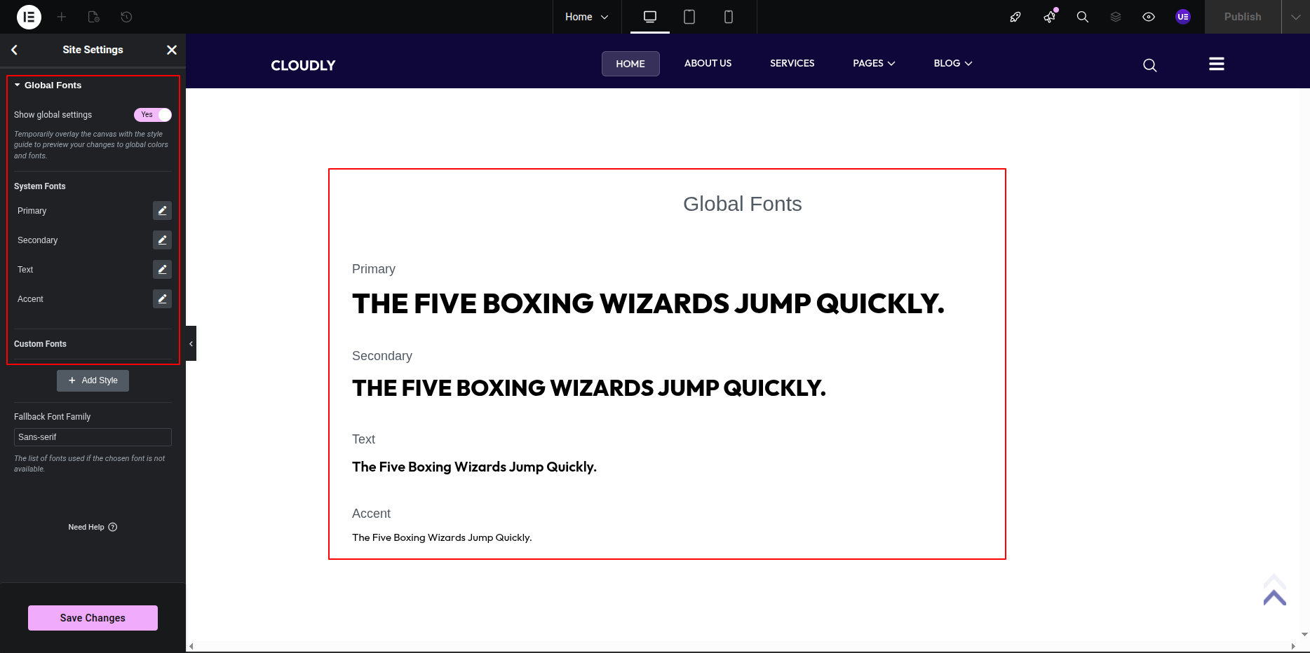
- Go back to the Site Settings panel and click on Global Fonts.
- You will see options such as Primary, Secondary, Text, and Accent.
- Click on each font type to select your desired Font Family, Weight, Size, and Style.
- You can also add a new custom font style by clicking on + Add Style.
- Click Update to save your typography settings.
Tip: Apply global fonts to headings, paragraphs, and buttons for consistent typography.
- Step 5: Apply Global Styles to Widgets
- While editing a widget, go to the Style tab.
- Under Typography or Color, click on the 🌐 Globe icon to select a global color or font.
- Step 6: Save and Exit
- Once you finish setting up your global styles, click on the Update button to save all changes.
- Click the Back Arrow or X icon at the top left to return to the Elementor editor screen.
Result: Your website will now automatically follow the global color and font styles, ensuring design consistency across all pages.
ElementsKit includes a powerful Header Builder that enables you to easily customize the top section of your website using a simple drag-and-drop interface. This feature allows you to design unique and responsive headers without any coding—giving you full control over elements like the logo, navigation menu, contact details, and more.
If you want to edit your header content, follow these steps:
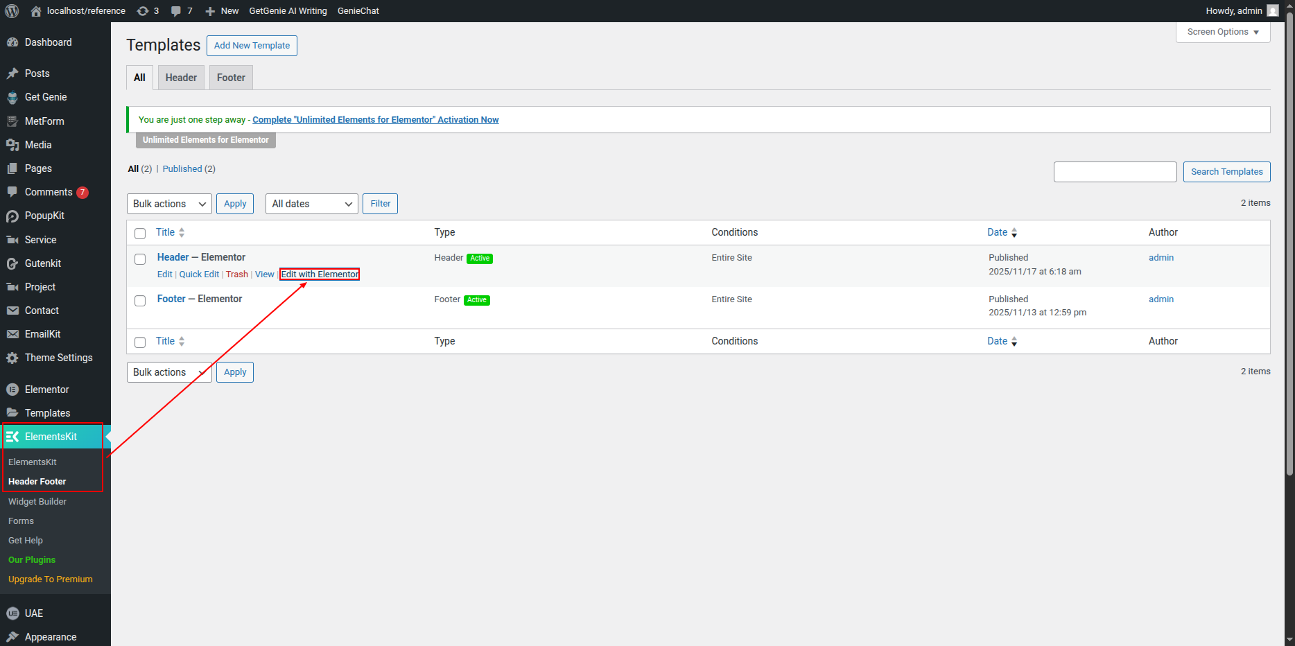
1. Go to your WordPress Dashboard.
2. Navigate to ElementsKit → Header Footer.
3. Locate the header template you want to edit.
4. Click on Edit with Elementor to open it in the Elementor editor.
5. Make your desired changes and update the header to save them.
Adding the Logo
To add your company logo:
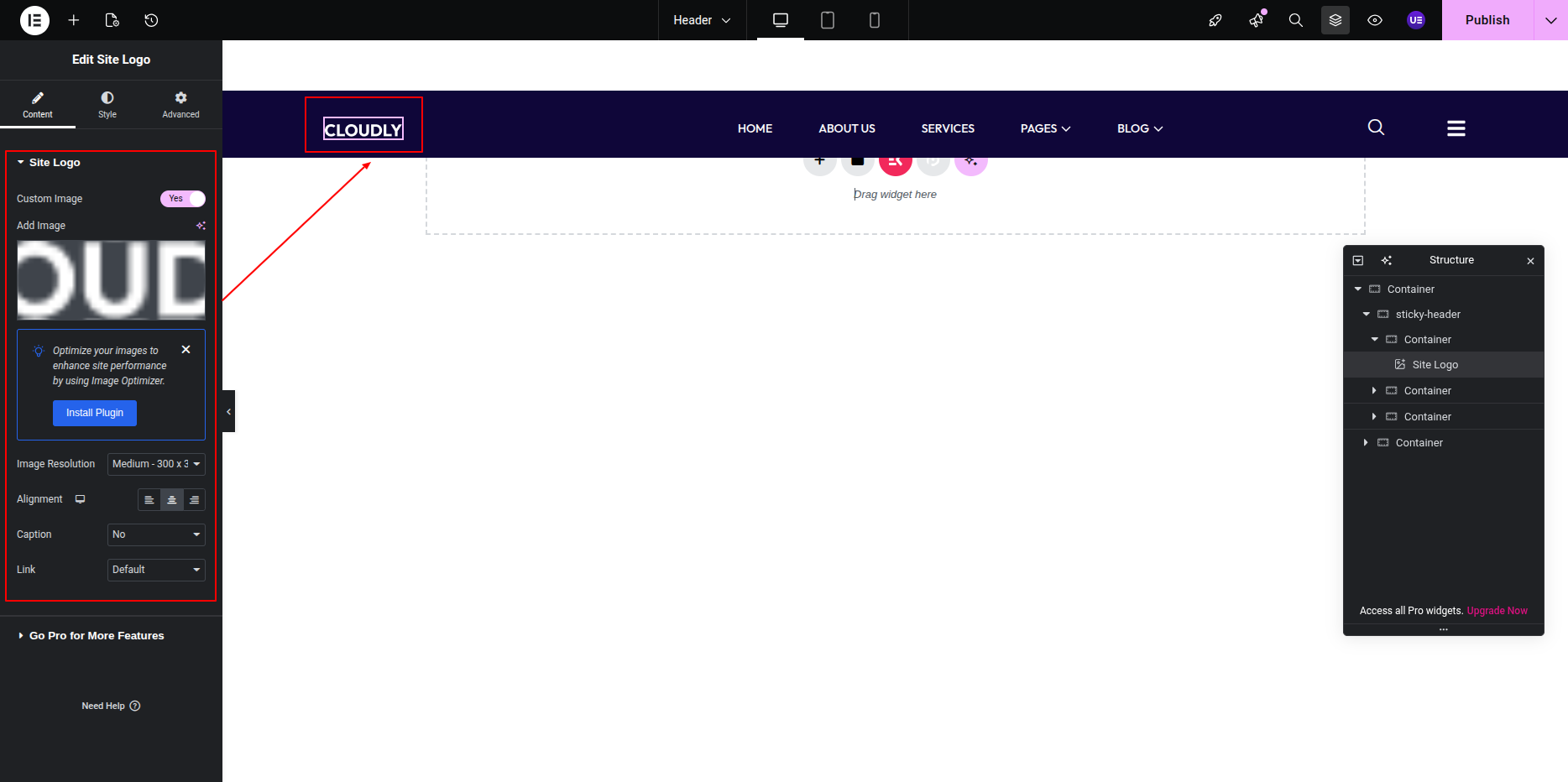
1. Open your header in Edit with Elementor mode.
2. Drag and drop the Logo element from the ElementsKit widget panel into your header area.
3. Upload your company logo image or select one from the media library.
4. Adjust the logo size settings as needed to fit your design.
5. Save your changes once done.
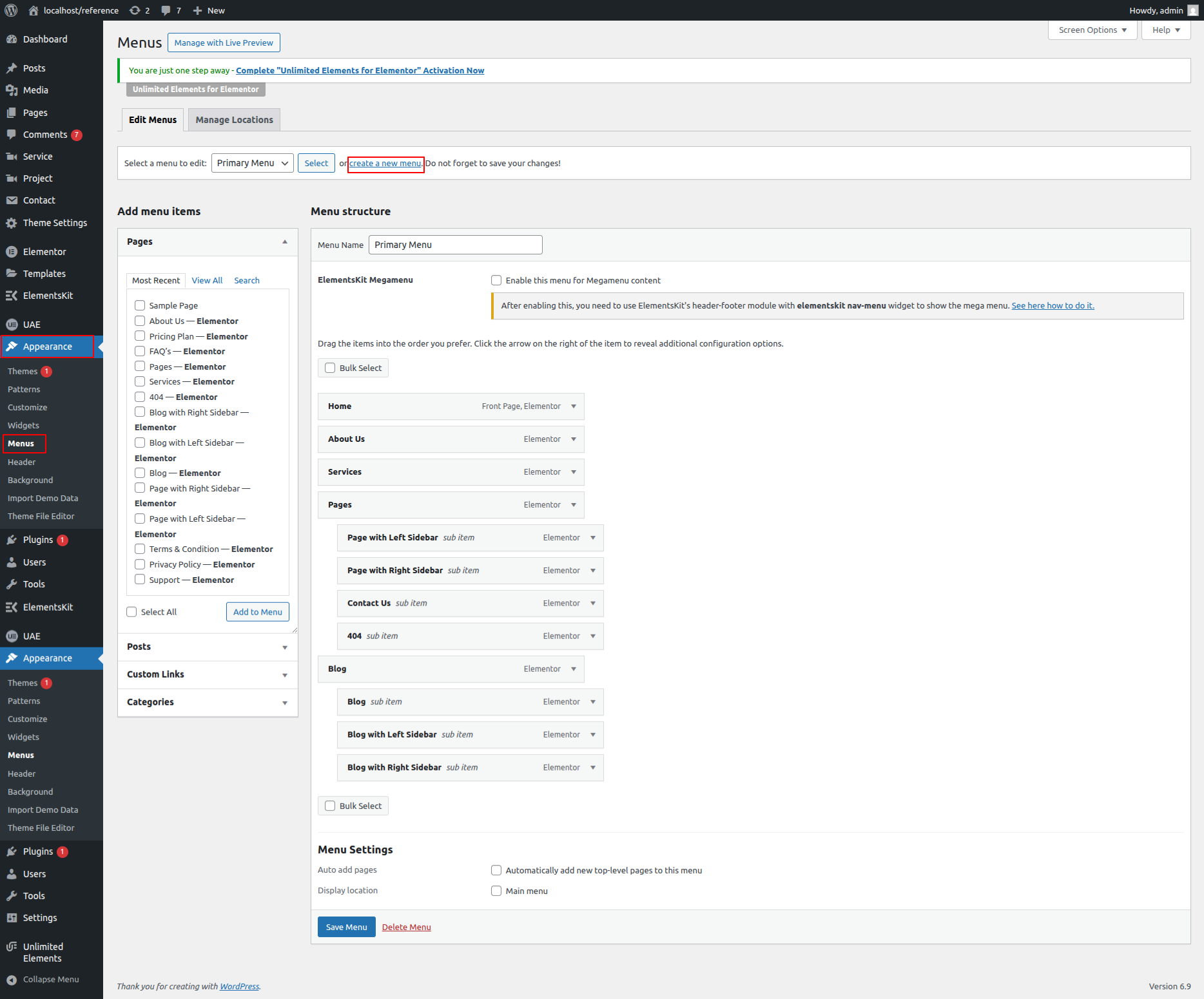
Menu Creation
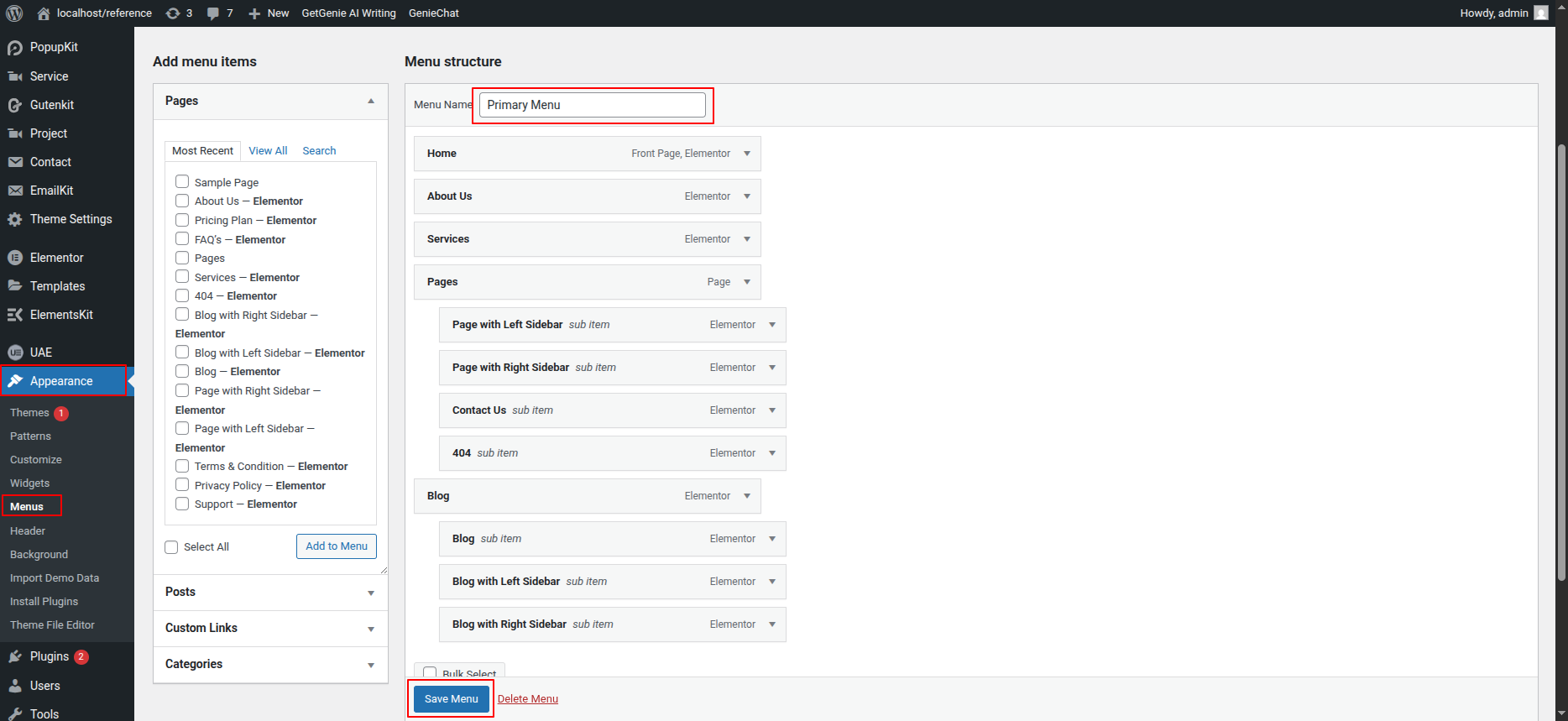
You can easily create and manage your website’s navigation menu through the WordPress Dashboard by following the steps below:
- Go to Appearance → Menus.
- Click on Create a New Menu.
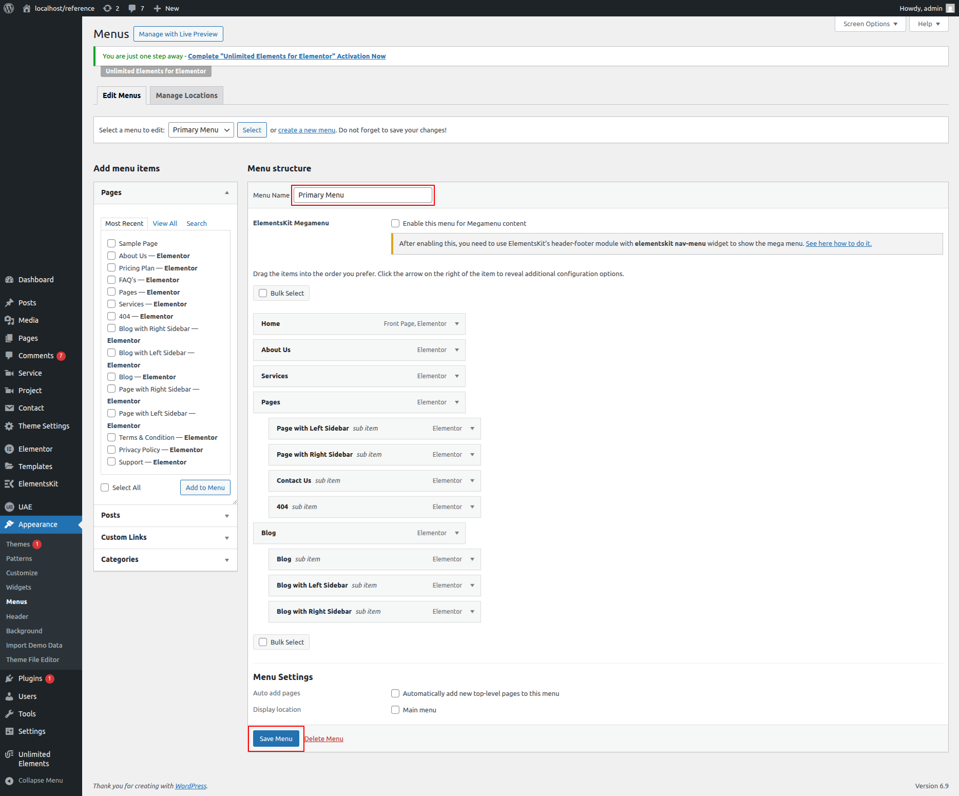
- Enter a name for your menu (e.g., Primary Menu).
- Add pages, posts, categories, or custom links to the menu using the options on the left side.
- Arrange the menu items by dragging and dropping them into your preferred order.
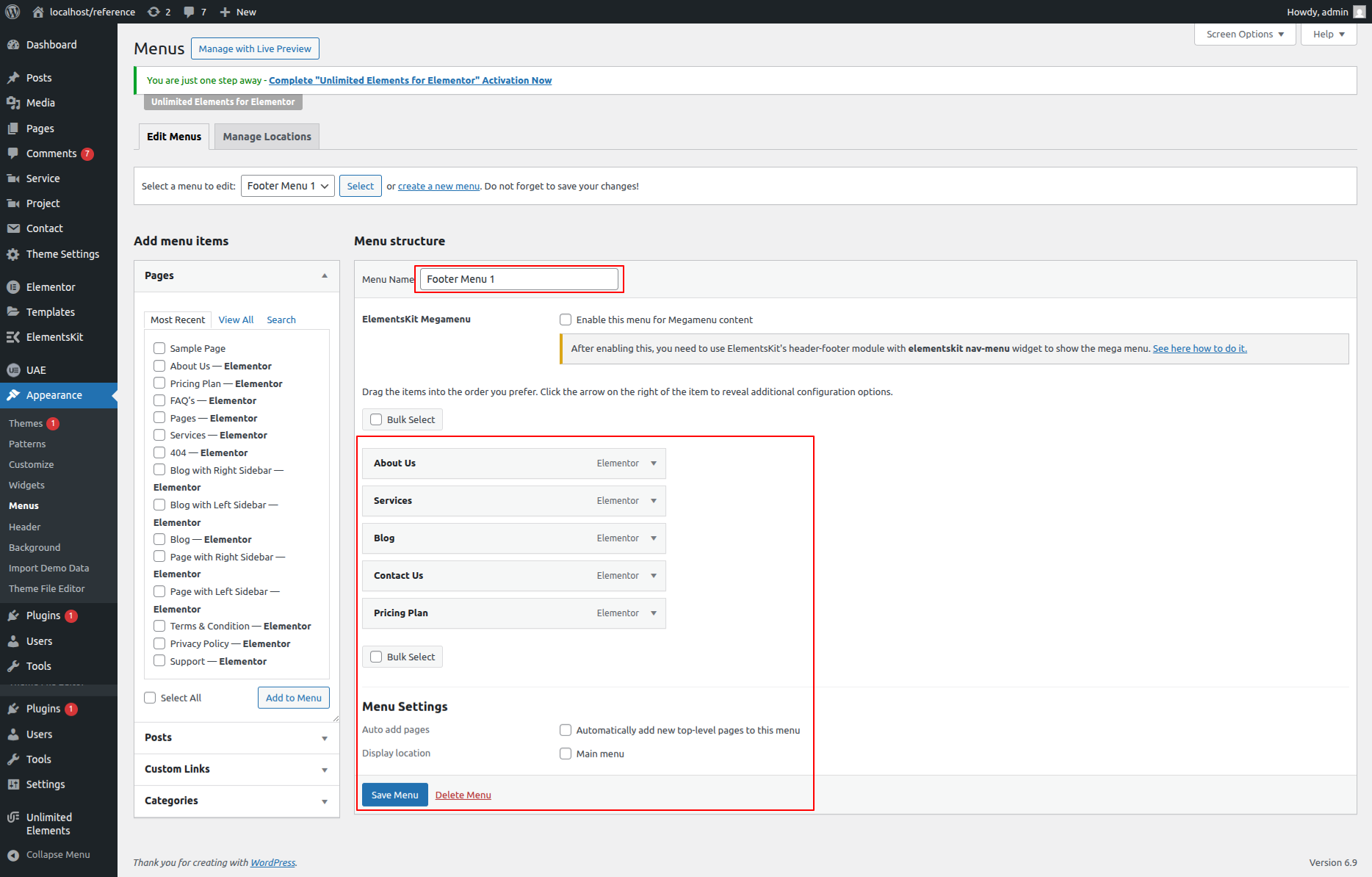
- Choose the appropriate Display Location (such as Header Menu or Footer Menu).
- Click Save Menu to apply your changes.
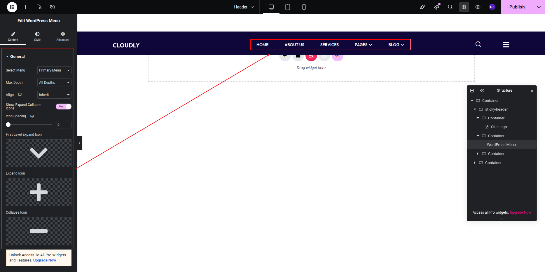
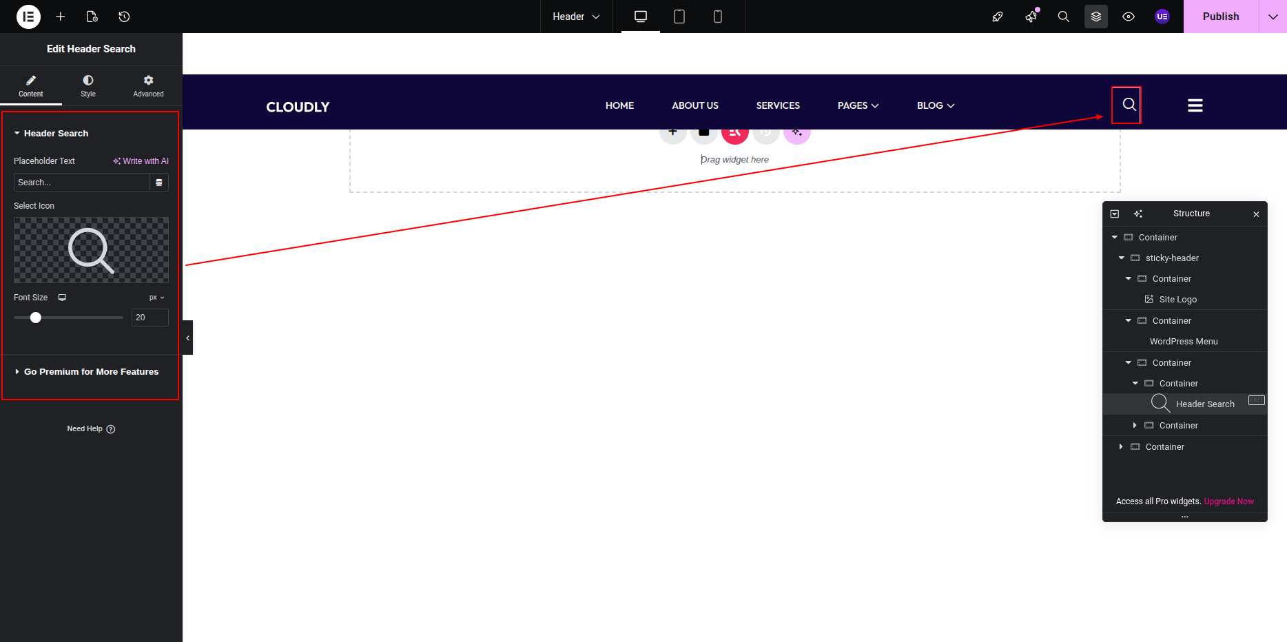
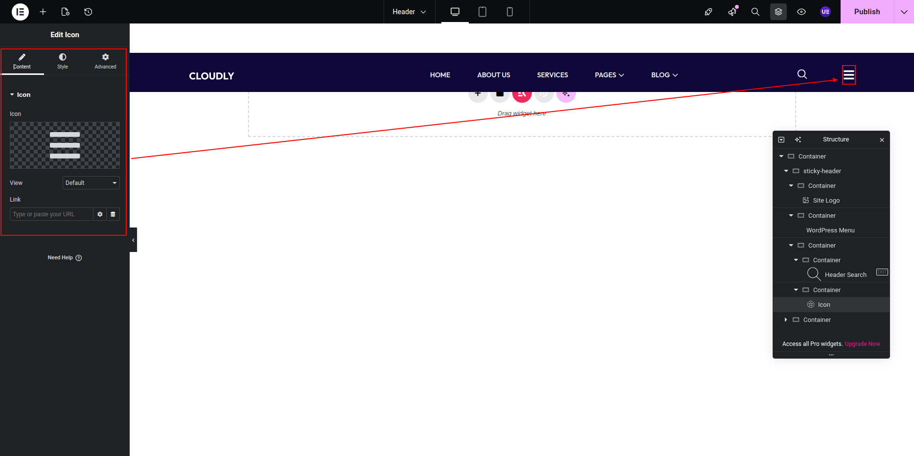
- To customize the menu’s design, open your header in Edit with Elementor mode and adjust it as needed.
Tip: You can create multiple menus for different areas of your website, such as the footer or mobile navigation.
This is the final view of your section:

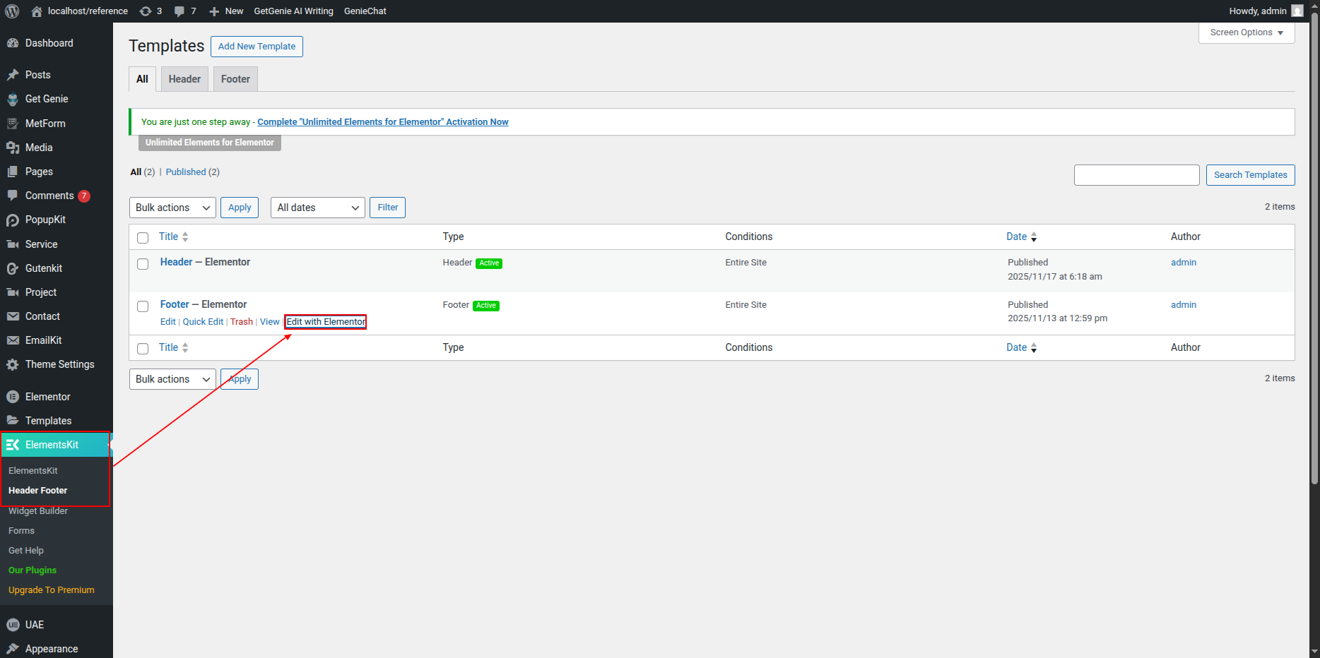
You can easily customize your website’s footer using the ElementsKit Footer Builder. Follow the steps below to edit your footer content:
- Go to your WordPress Dashboard.
- Navigate to ElementsKit → Header Footer.
- Locate the footer template you want to edit.
- Click on Edit with Elementor to open it in the Elementor editor.
- Make your desired changes and click Update to save them.
Tip: You can add widgets, social icons, copyright text, or any custom section to your footer using Elementor’s drag-and-drop tools.
Newsletter Section
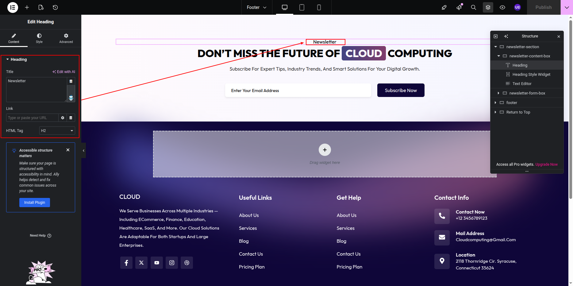
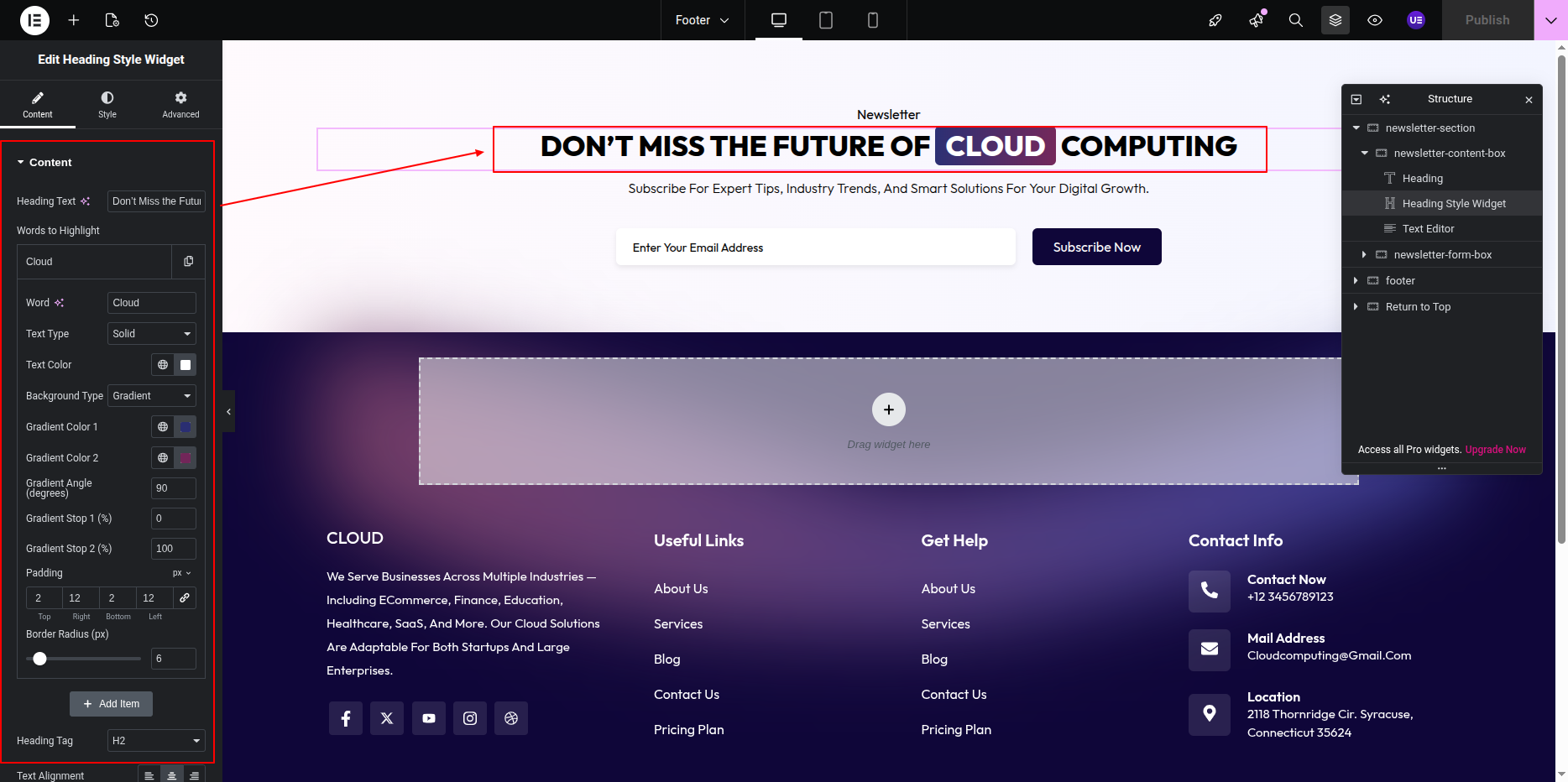
- Editing the Section Heading and Text:
- Open the page with Edit with Elementor.
- Click on the Heading Widget to modify the section heading.
- Click on the Text Editor Widget to edit any description text for the newsletter section.
- Adding the Newsletter Form with CF7:
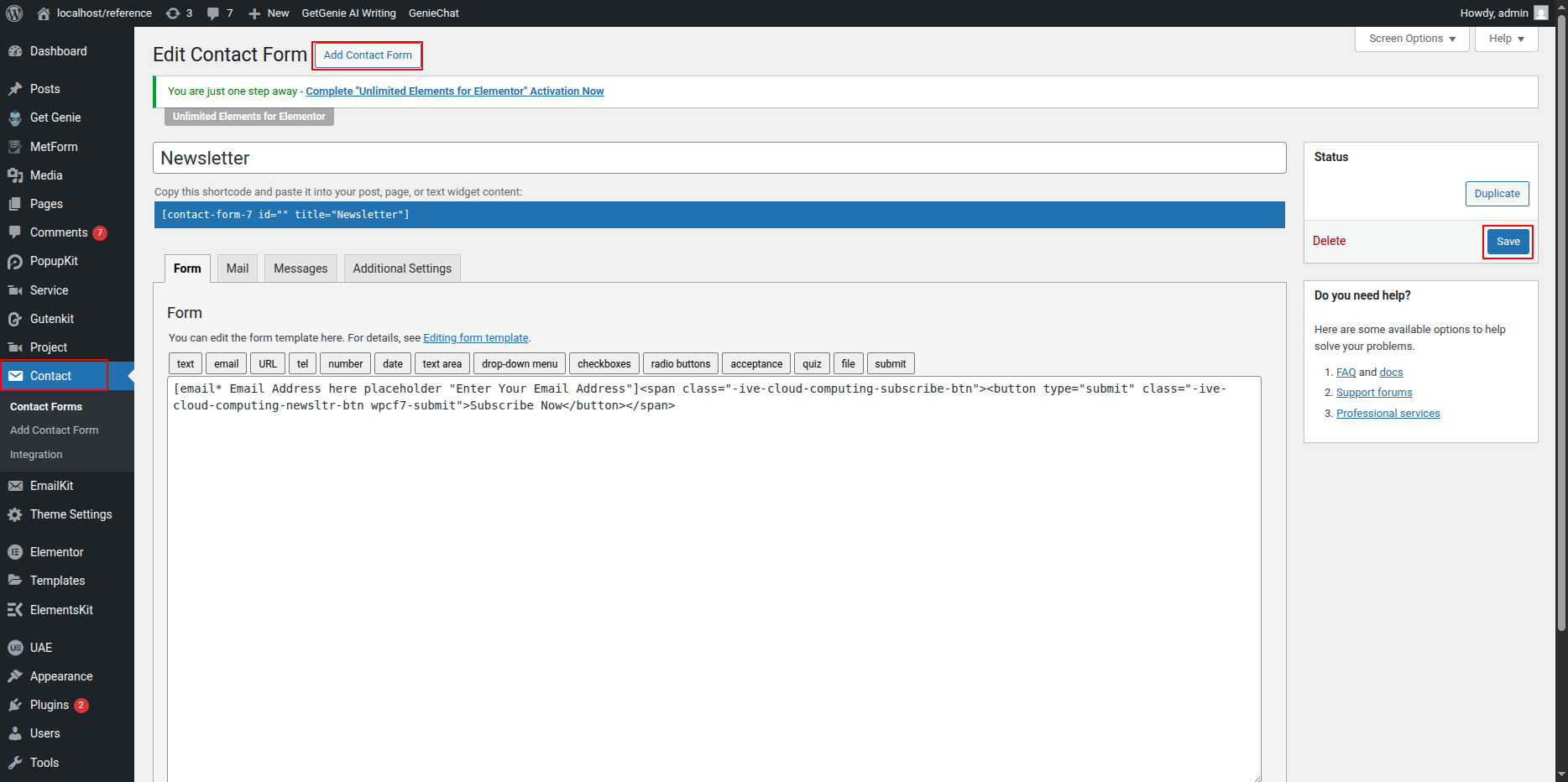
- Make sure you have the Contact Form 7 plugin installed and activated.
- Go to your WordPress Dashboard → Contact → Add New to create a new newsletter form.
- Configure the form fields, such as Name and Email, and save the form.
- Copy the shortcode of the form you created.
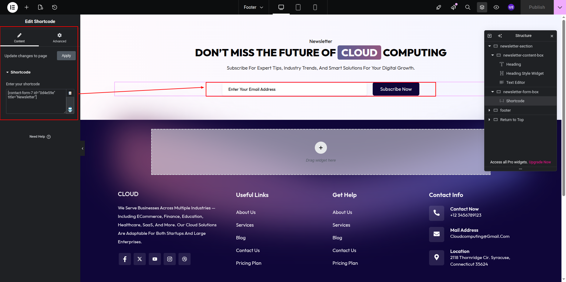
- Back in Elementor, drag and drop the Shortcode Widget into the newsletter section.
- Paste the copied CF7 form shortcode into the widget.
- Customize the styling of the form, including button color, input fields, and spacing, using Elementor style options.
- Click Update to save your changes.
This is the final view of your section:

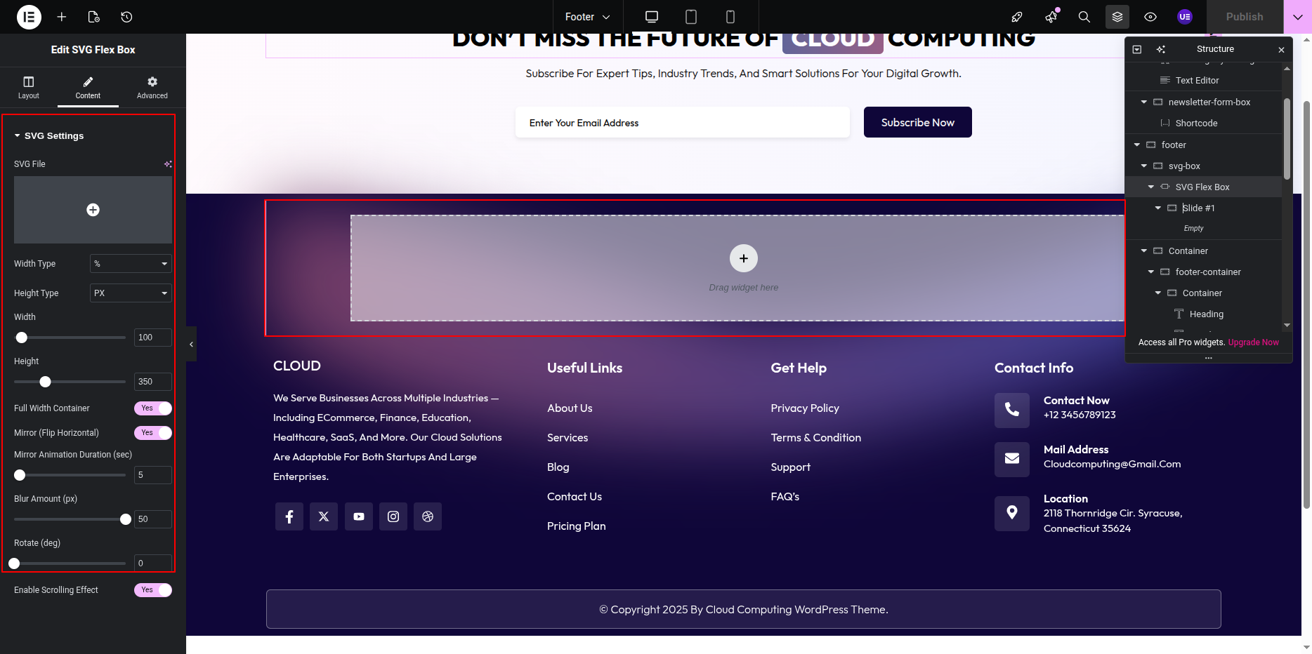
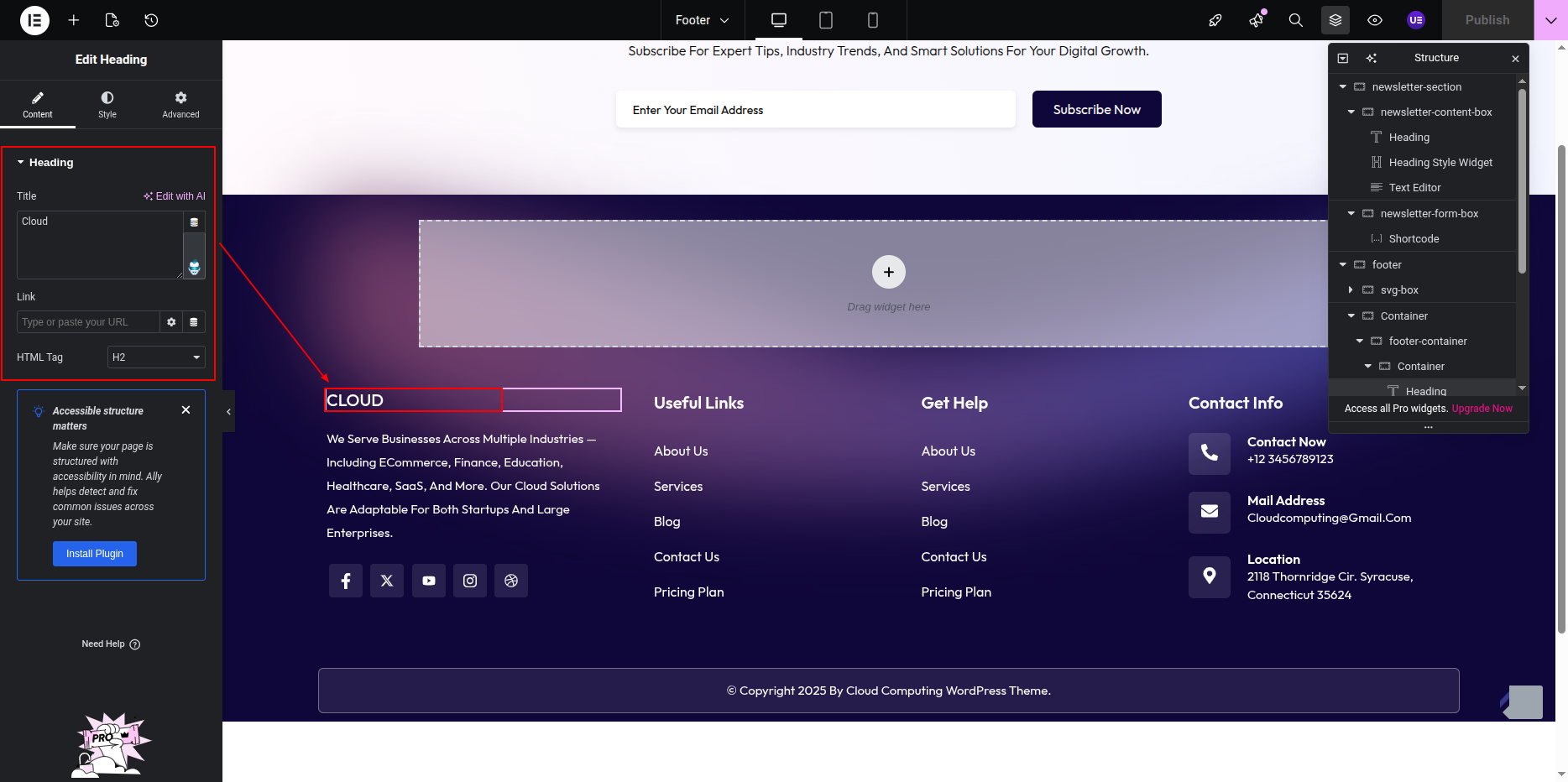
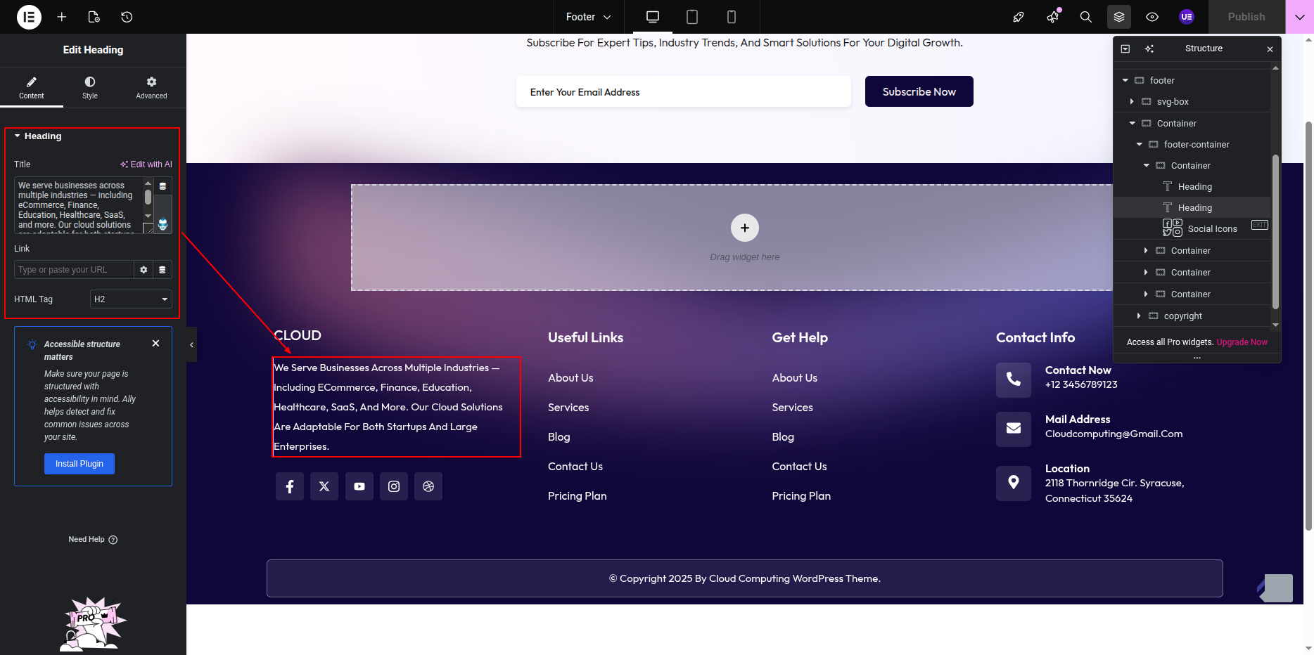
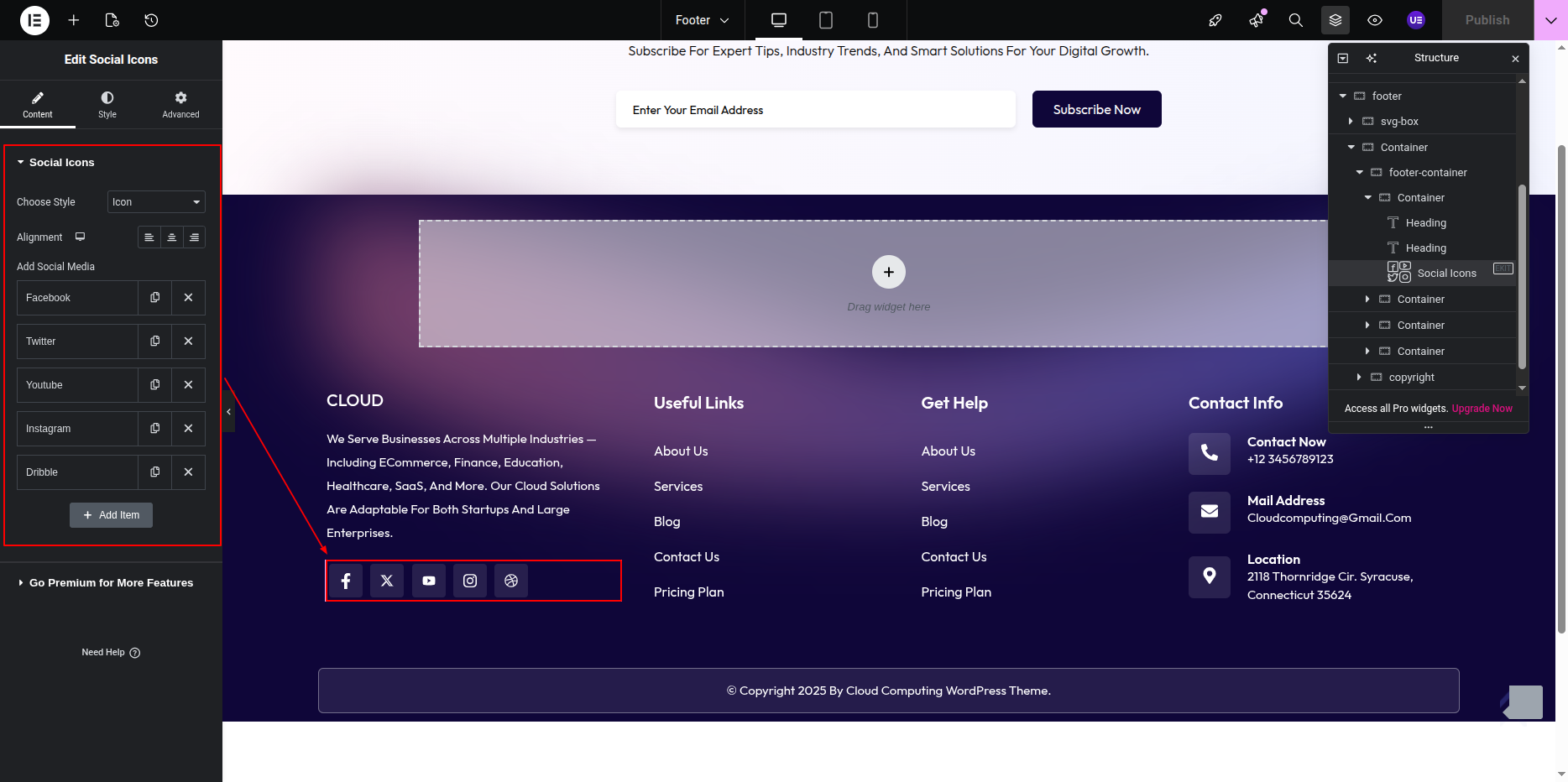
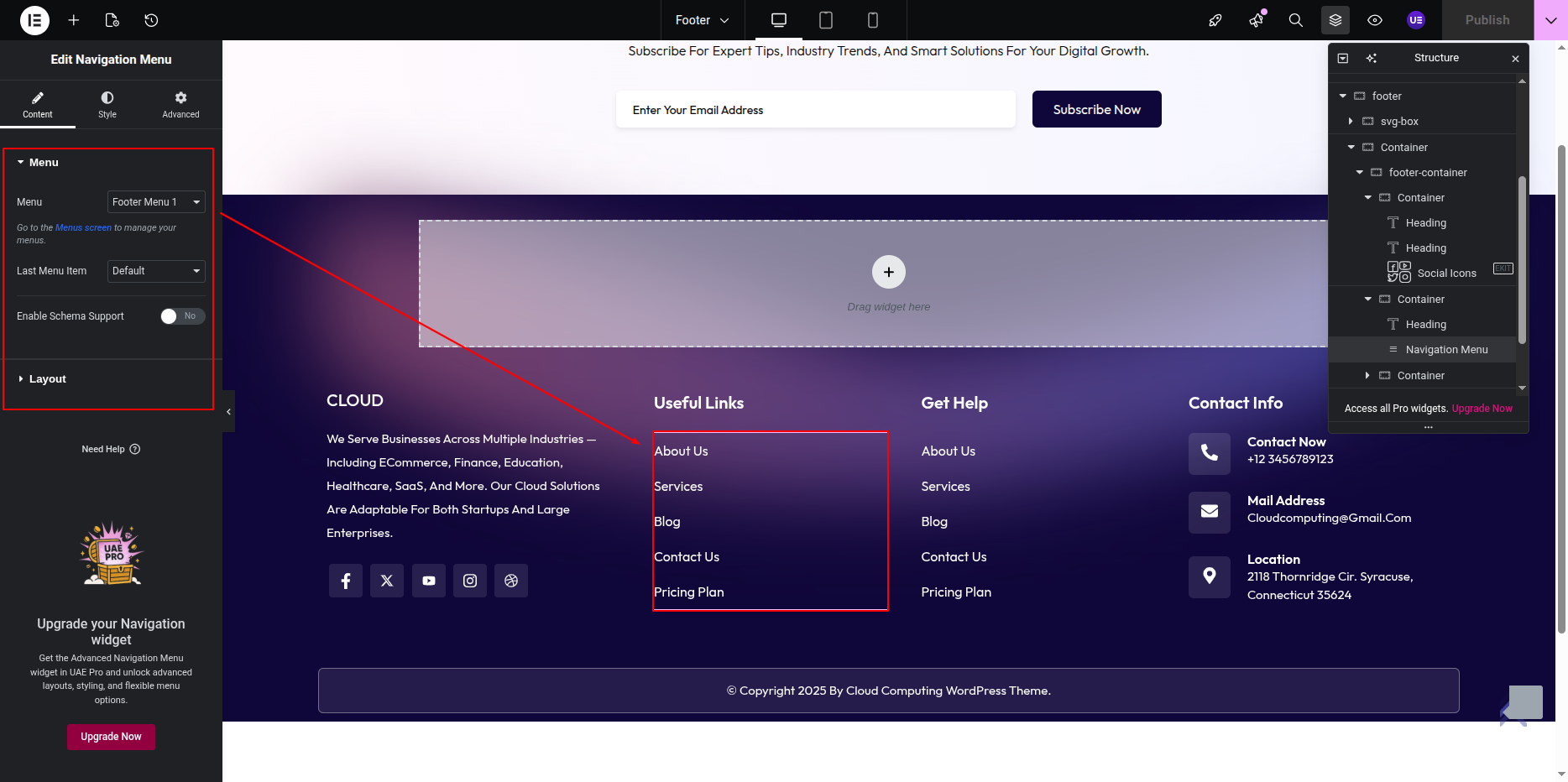
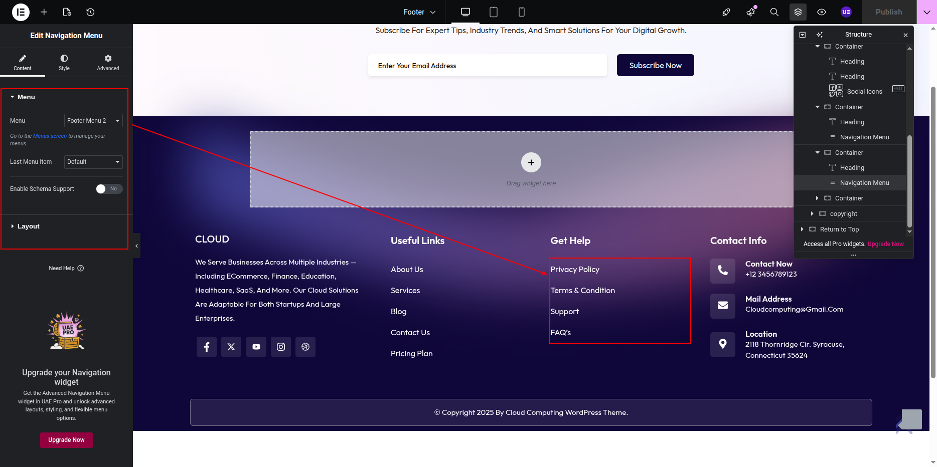
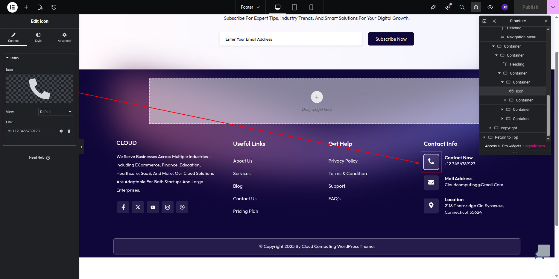
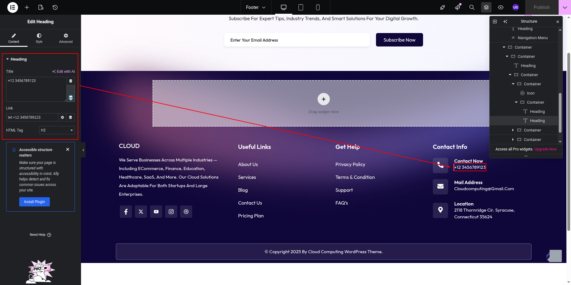
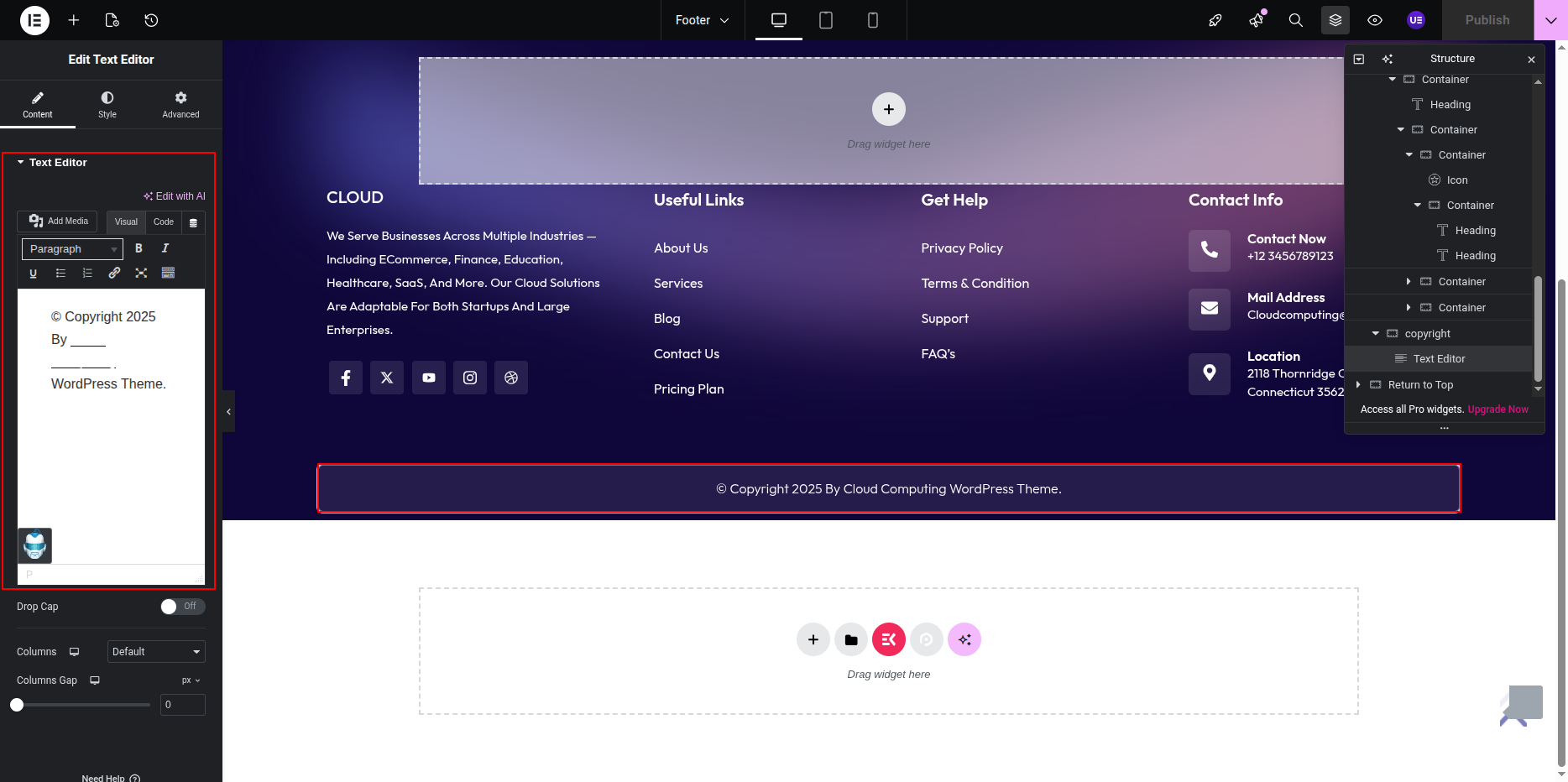
You can edit the remaining footer content, such as text and links, directly from this section.
Widgets and copyright area.
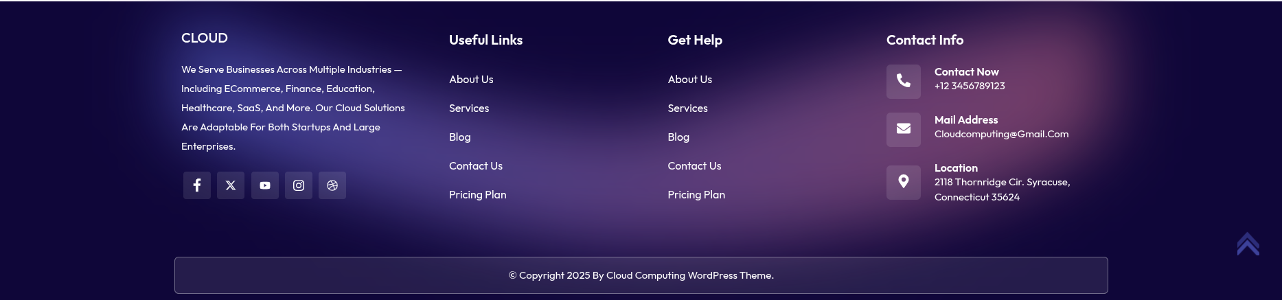
This is the final view of your section:
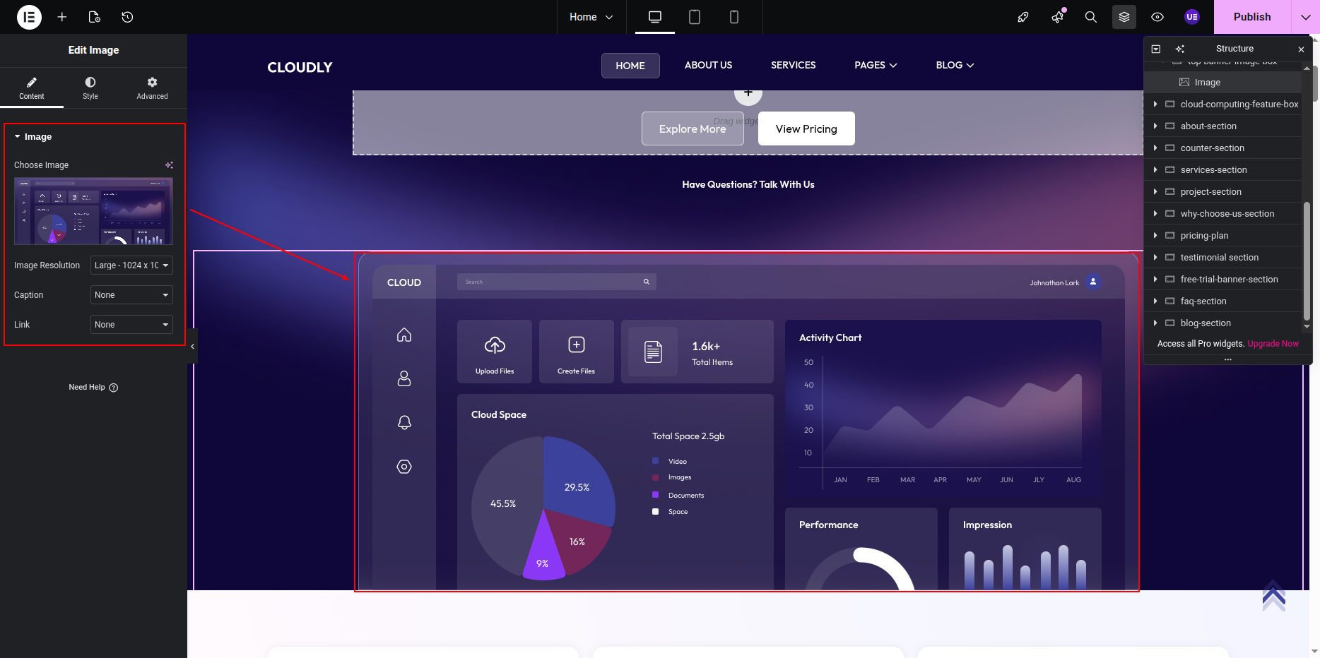
Banner Section
Banner Section
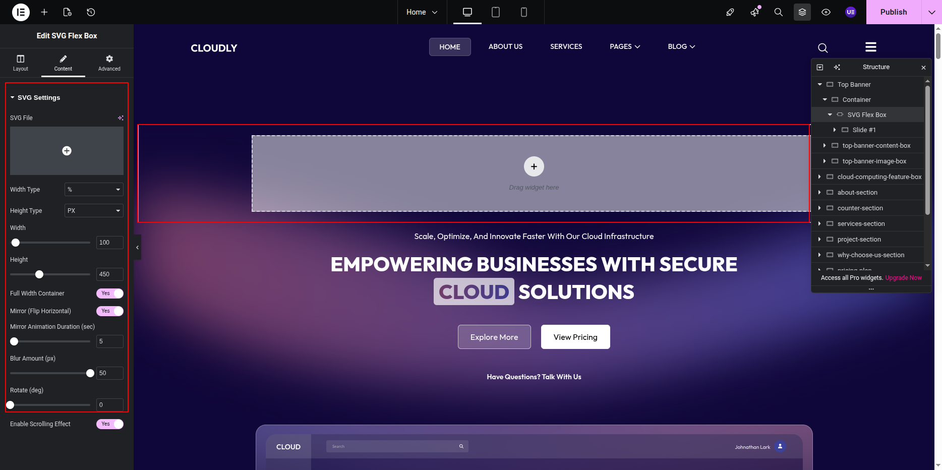
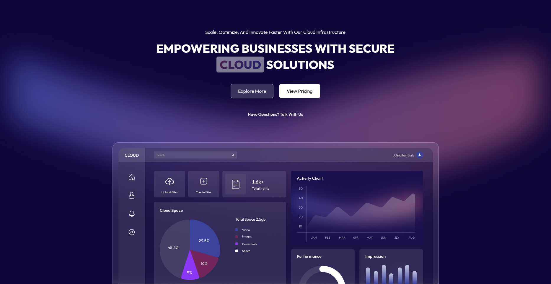
The Banner Section is a key visual area of your homepage, designed to display your main heading, tagline, and call-to-action button.
To edit this section:
- Go to the page where the banner is displayed (usually the Home page).
- Click on the Edit with Elementor button.
- The page will open in the Elementor Widget Editor.
- Select the Banner Section and customize the text, background image, button, and other elements as needed.
- Once your edits are complete, click Update to save the changes.
Tip: Keep your banner content visually appealing and concise to make a strong first impression on visitors.
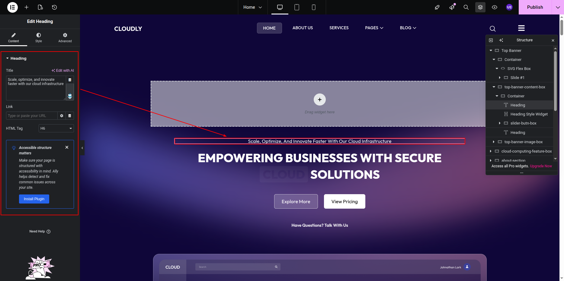
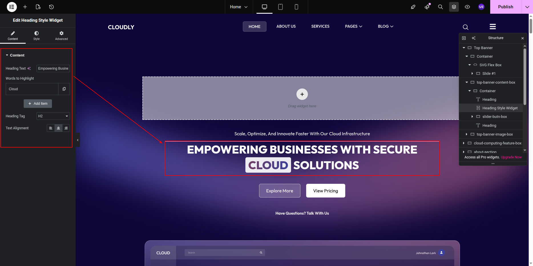
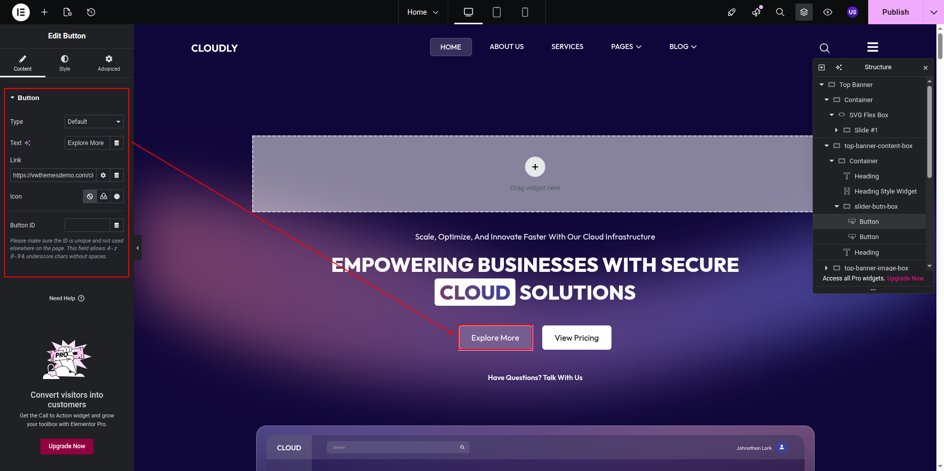
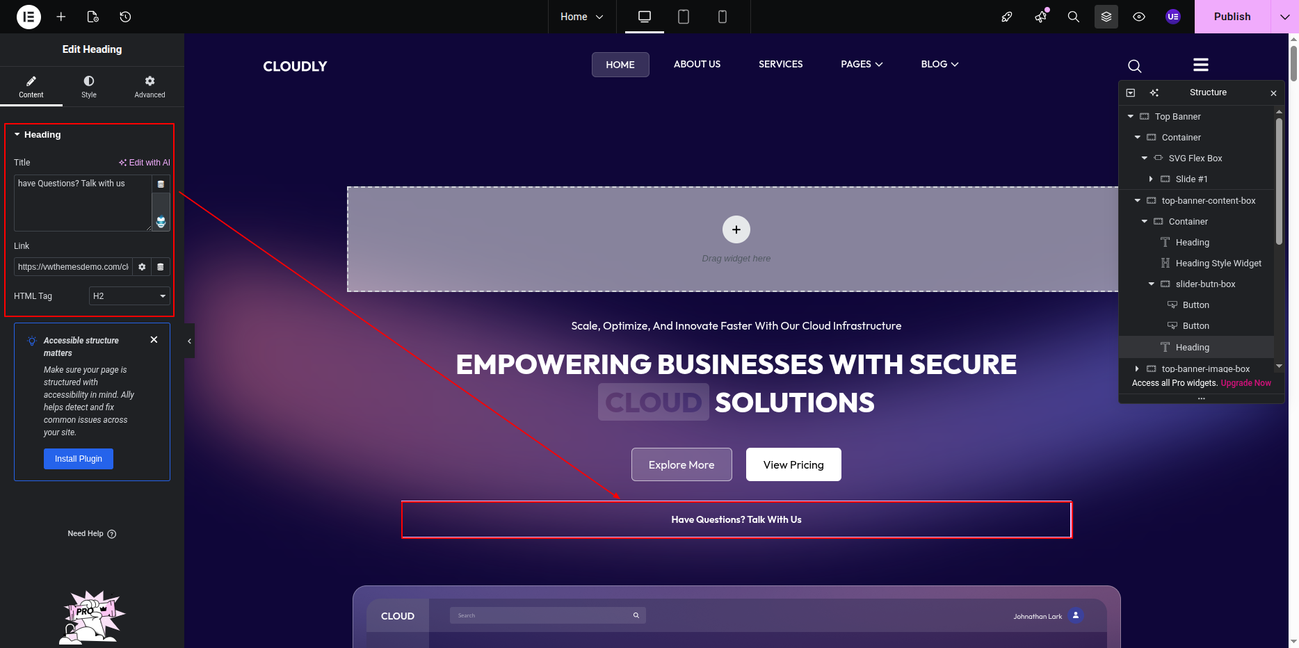
This is the final view of your section:
Features Section
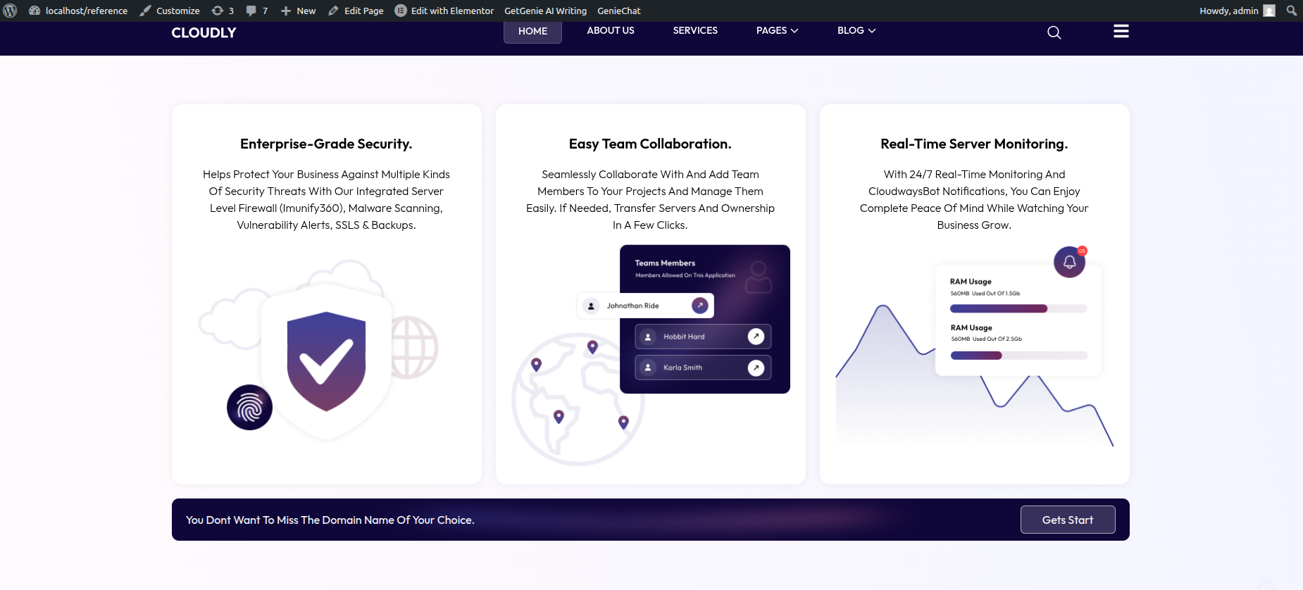
The Features Section is used to showcase the main highlights of your website using a visually appealing linear gradient background and three feature cards. Each feature card includes an image, a title, and a short description.
To edit this section, follow the steps below:
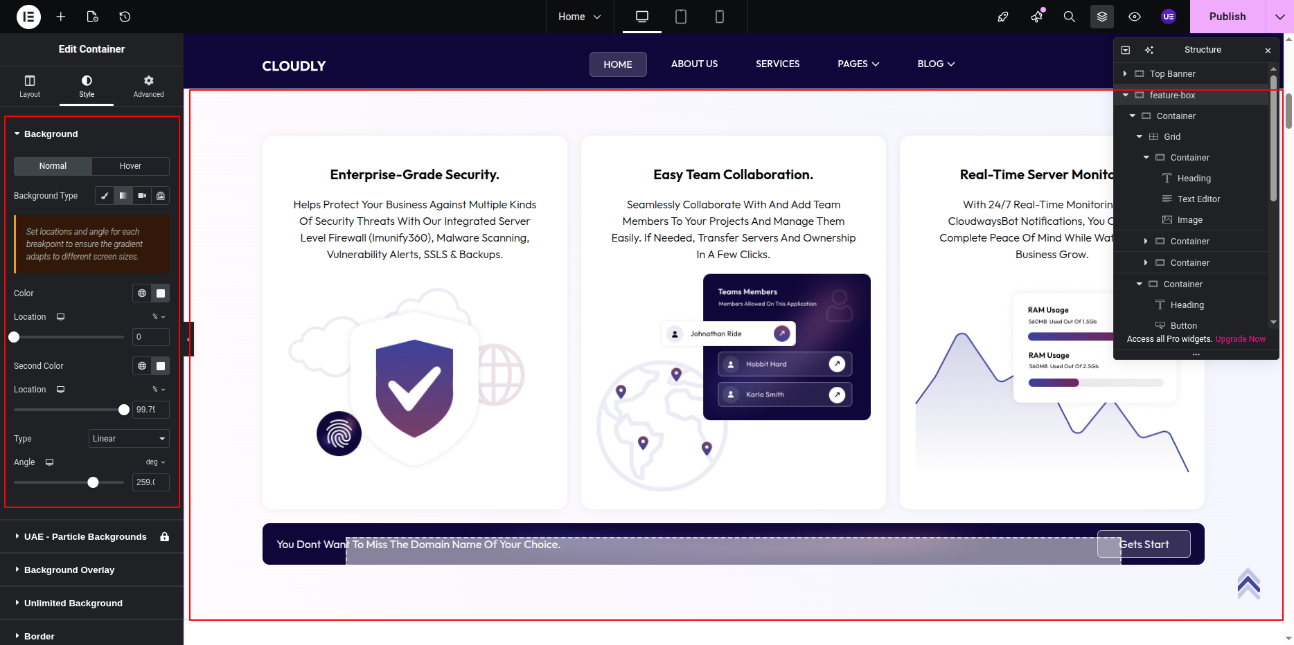
Editing the Gradient Background
- Select the main Section widget.
- Go to the Style tab.
- Open the Background option.
- Choose Gradient as the background type.
- Adjust the following settings as needed:
- Color 1 – First gradient color
- Color 2 – Second gradient color
- Gradient Type – Linear
- Angle – Adjust to control gradient direction
Editing Feature Cards Layout
- Inside the main section, select the Inner Section widget.
- Ensure the layout is set to 3 Columns.
- Each column represents one Feature Card.
Editing Feature Card Content
Each feature card is built using the following Elementor widgets:
To edit a feature card:
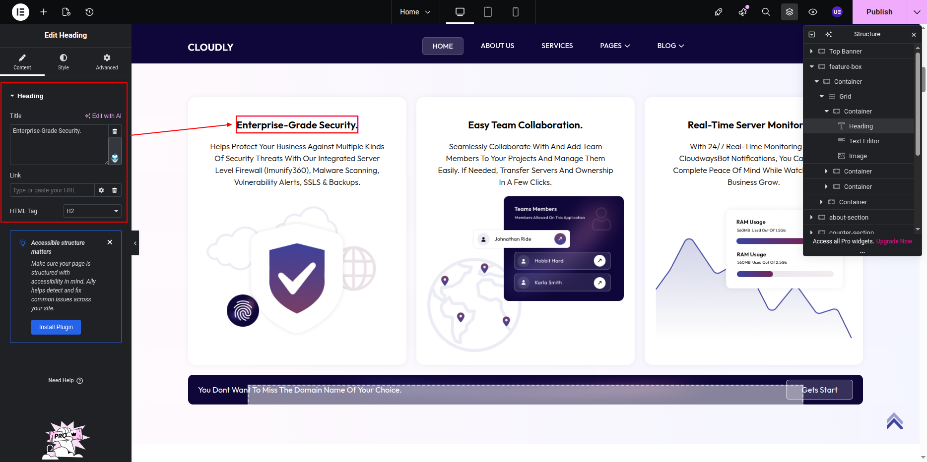
- Click on the Image Widget to replace or edit the feature image.
- Click on the Heading Widget to update the feature title text.
- Click on the Text Editor Widget to update the feature description.
Tip: Keep feature titles short and descriptions concise. Always maintain sufficient contrast between text and the gradient background for better readability.
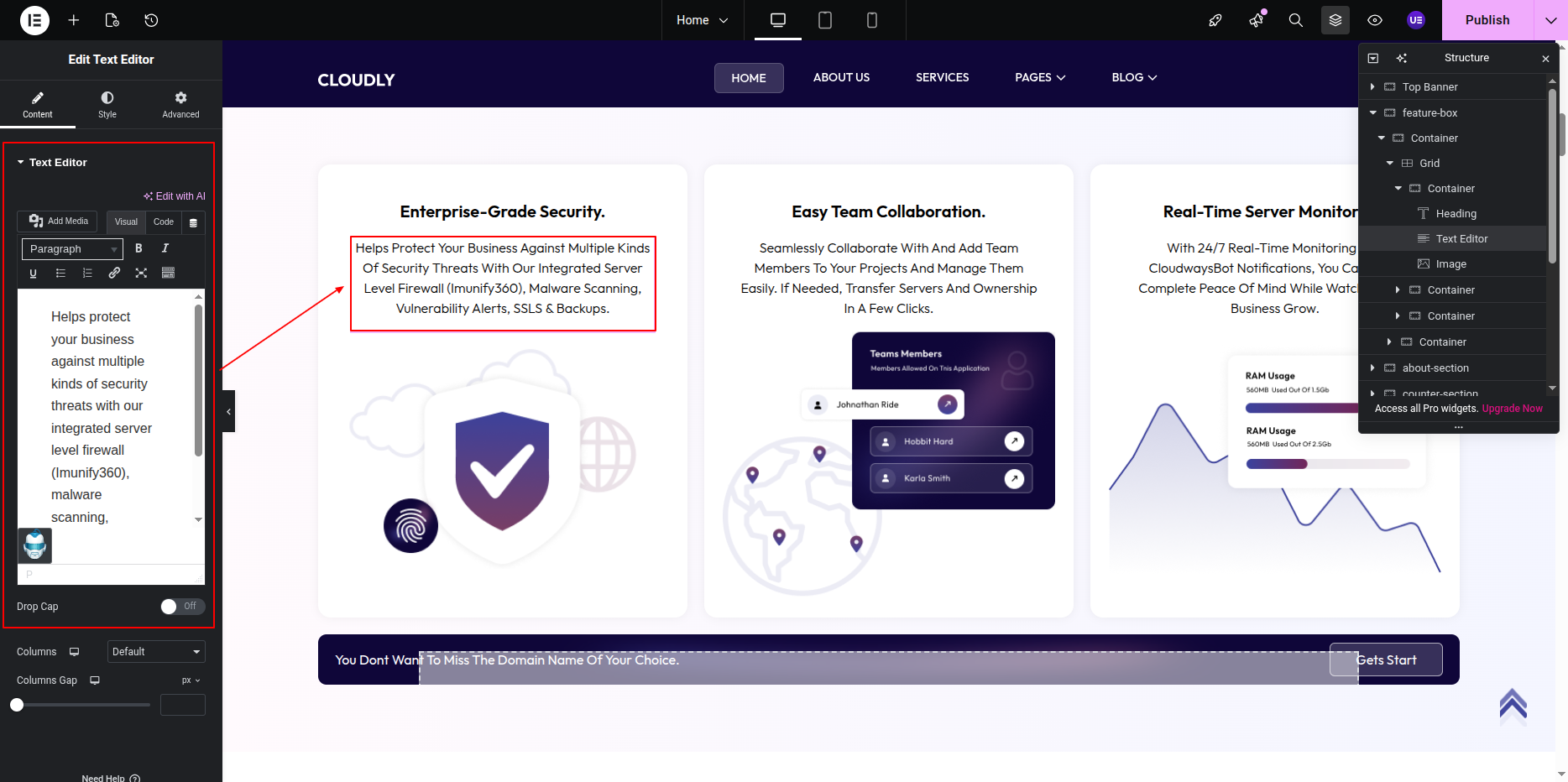
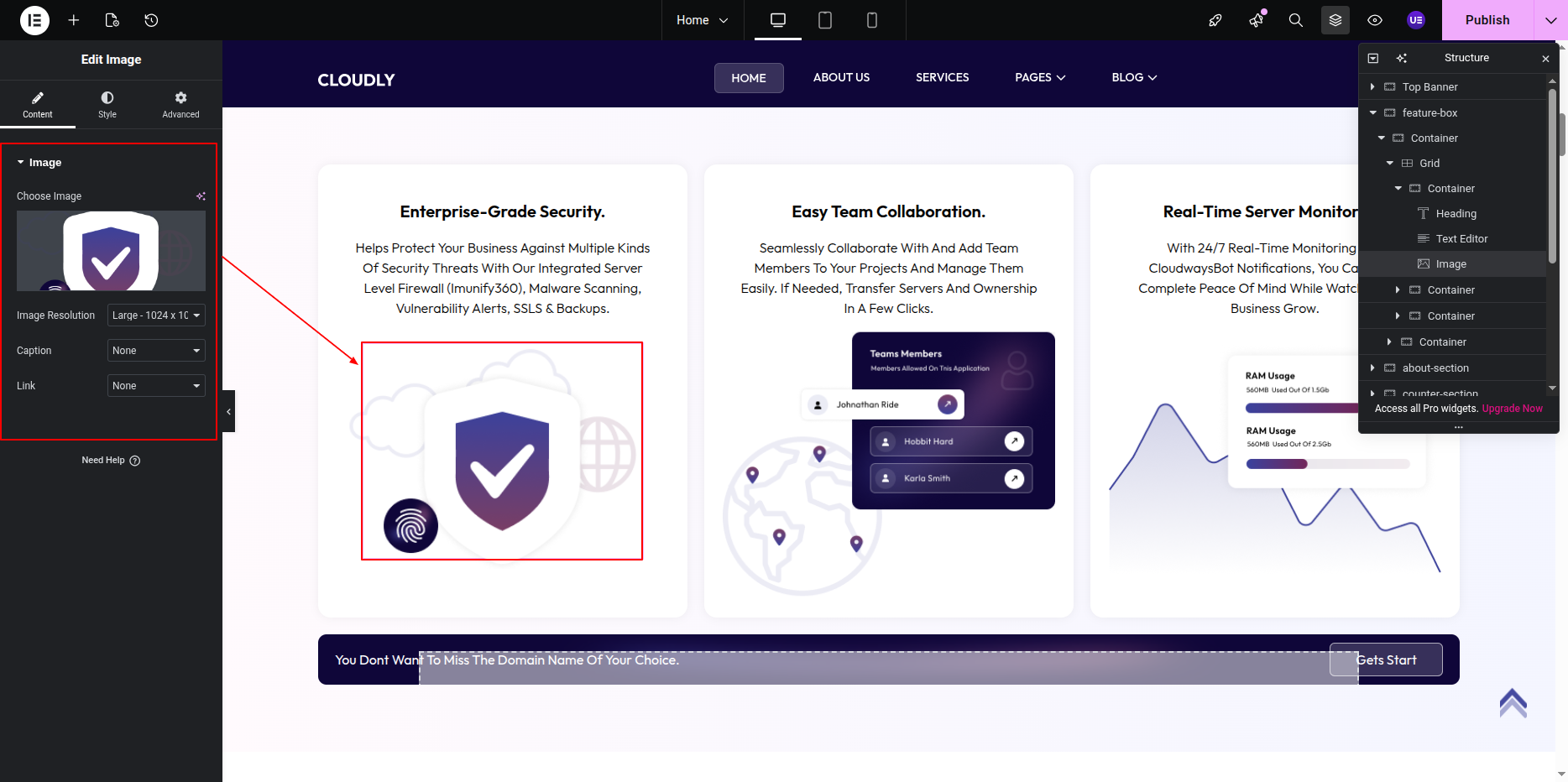
- Click on the Image Widget inside a feature card.
- Upload or select an SVG file from the Media Library.
- Set the Alignment to Center.
- Adjust the Width under the Style tab if needed.
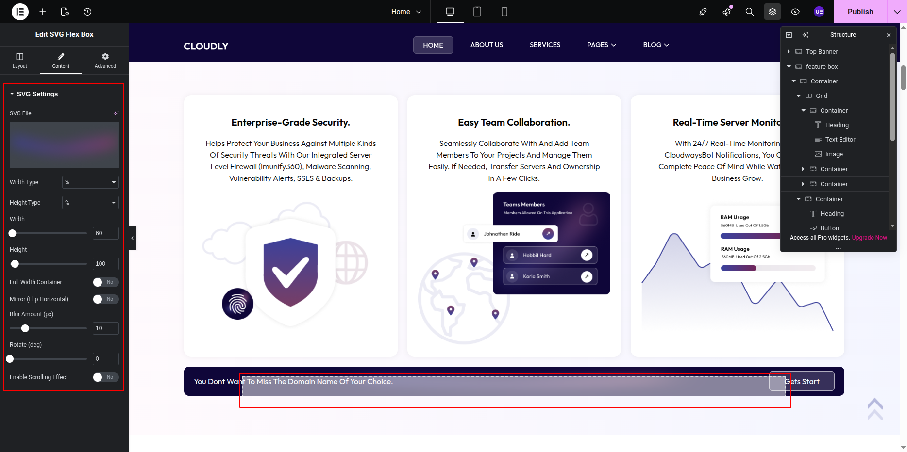
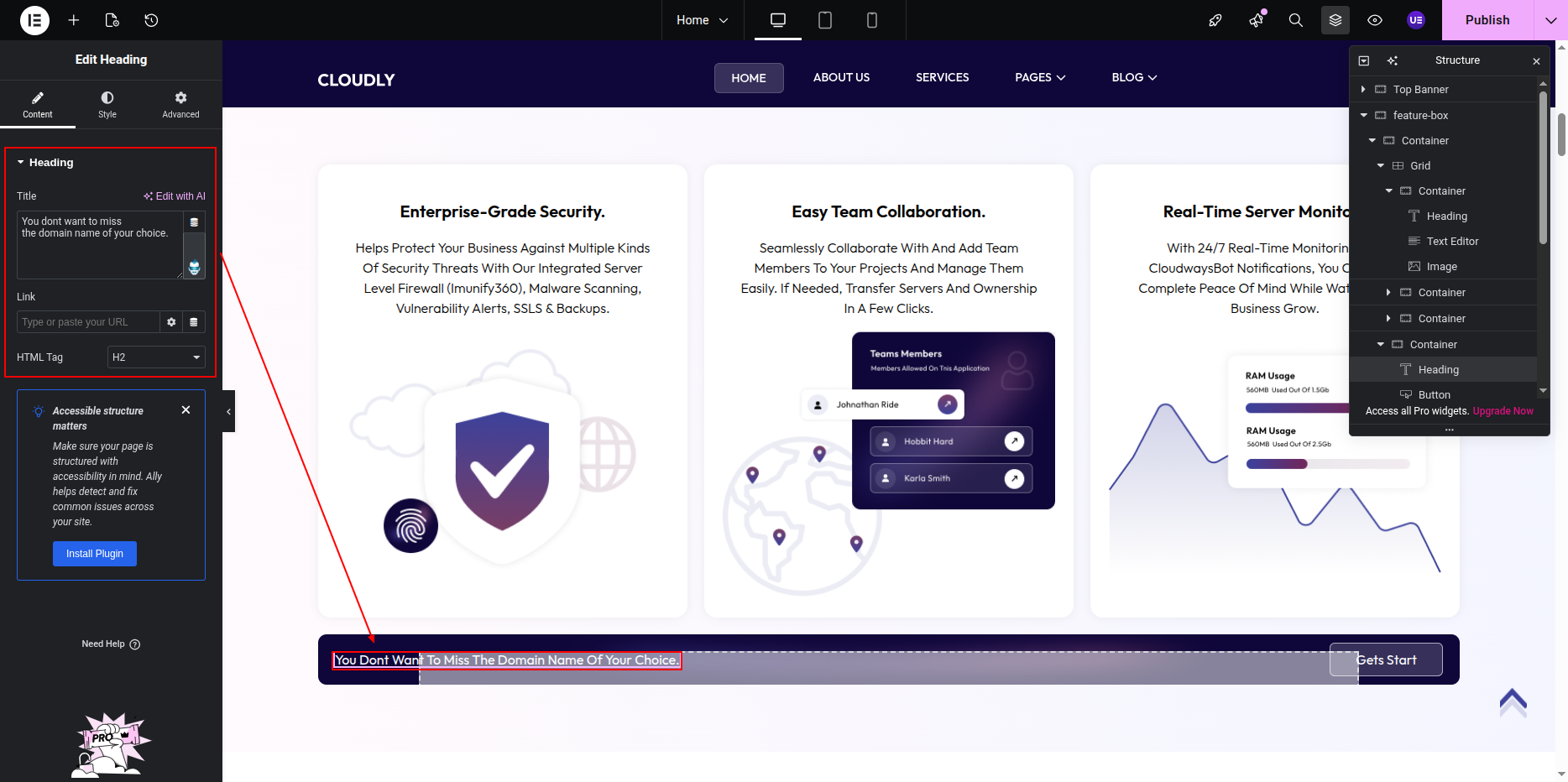
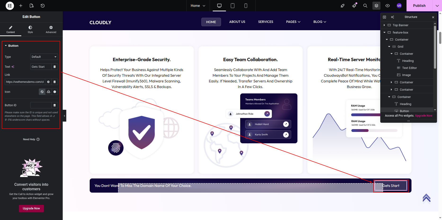
Note: SVG images are fully supported and scale cleanly on all screen sizes.
This is the final view of your section:
About Section
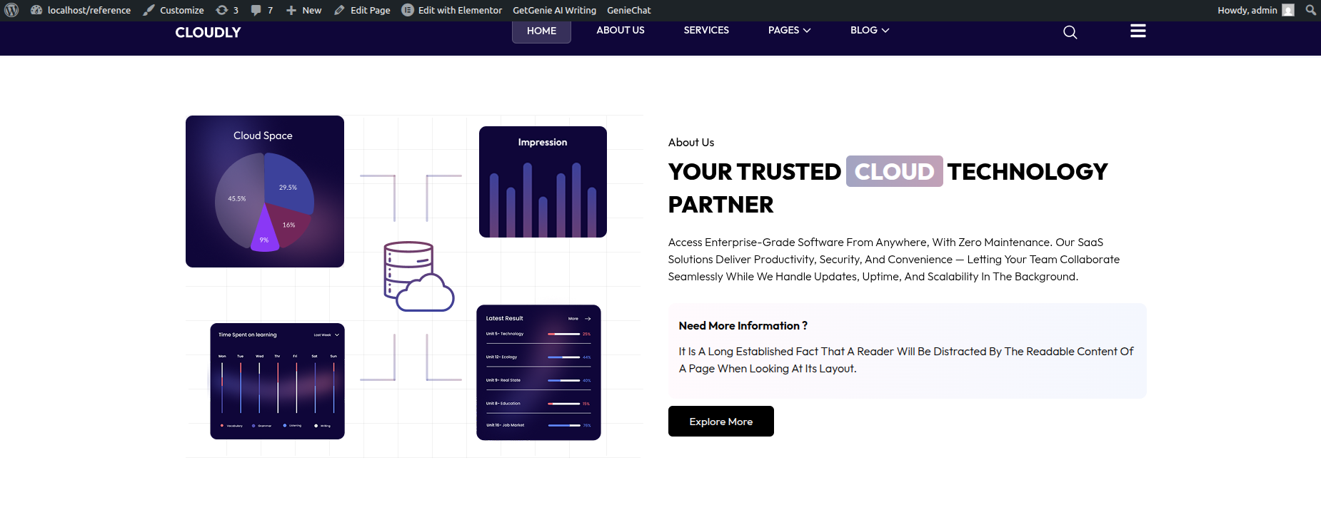
The About Section is used to introduce your company, product, or services. This section combines text content and imagery to explain who you are, what you do, and why users should choose you.
The section typically includes a small title, a main heading, a description, optional extended content, a call-to-action button, and an image.
To edit this section, follow the steps below:
Editing About Section Layout
- Select the main Section widget.
- Inside the section, select the Inner Section.
- Ensure the layout is set to 2 Columns.
-
Column structure:
- Left Column: Image
- Right Column: Text content
Editing About Section Content
The About Section is built using the following Elementor widgets:
- Heading Widget – Small title and main heading
- Text Editor Widget – Description and extended text
- Button Widget – Call-to-action button
- Image Widget – About image
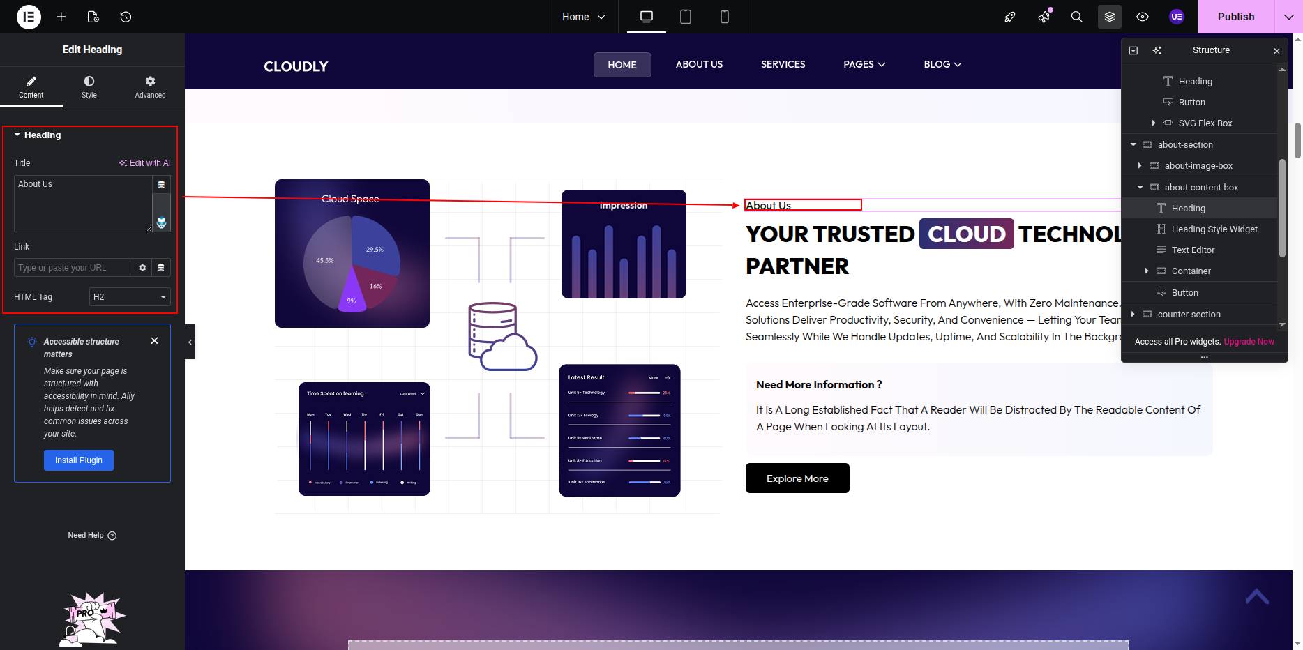
Editing the Section Title
- Select the first Heading Widget.
- Enter the section title text (example below).
- Set the HTML Tag to H6 (recommended).
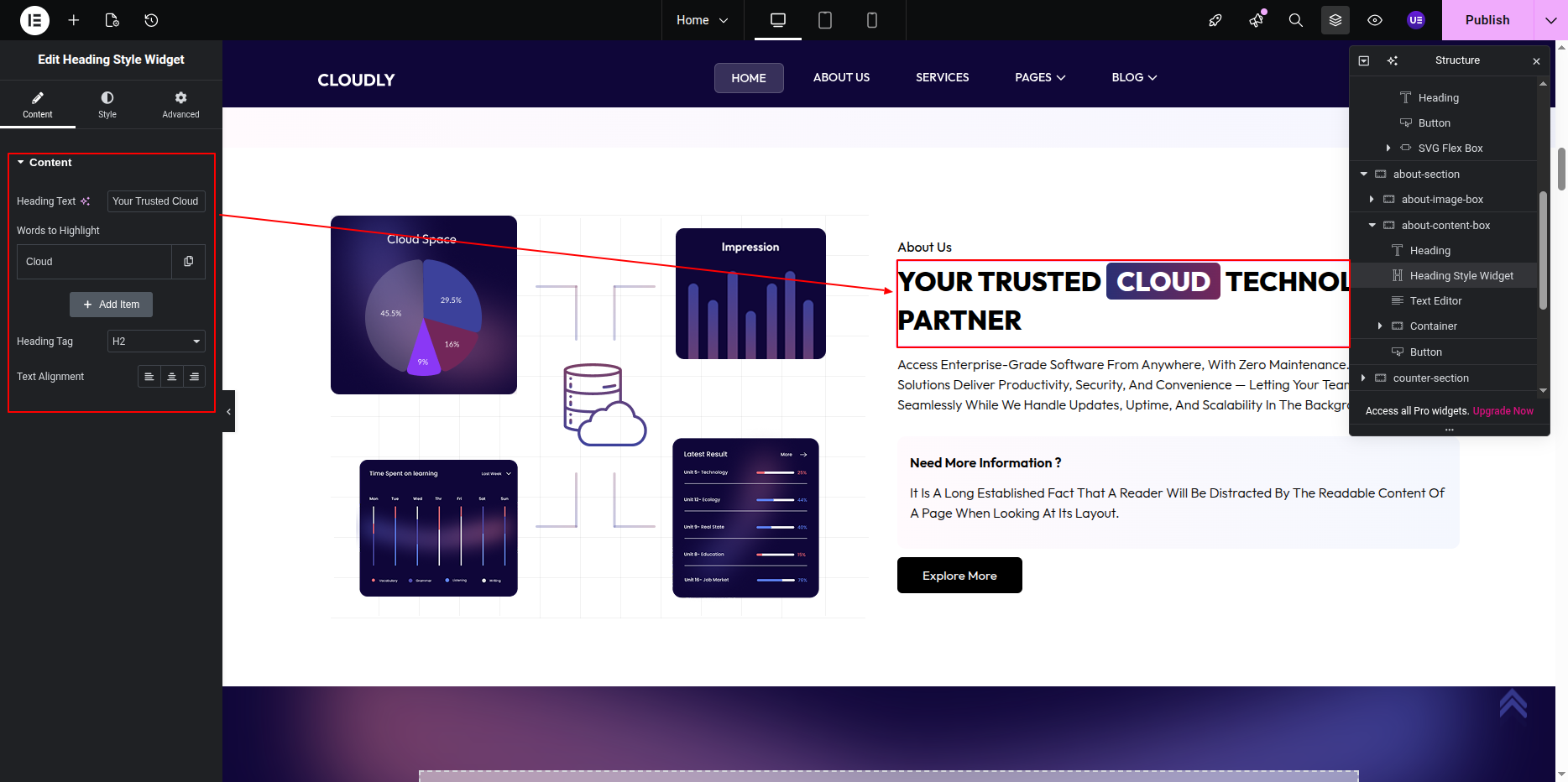
Editing the Main Heading
- Select the second Heading Widget.
- Update the main heading text.
- Set the HTML Tag to H2.
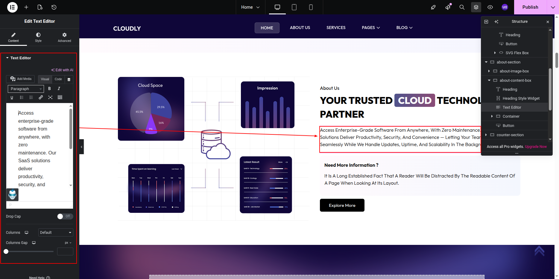
Editing Description Text
- Select the Text Editor Widget below the heading.
- Update the short description text.
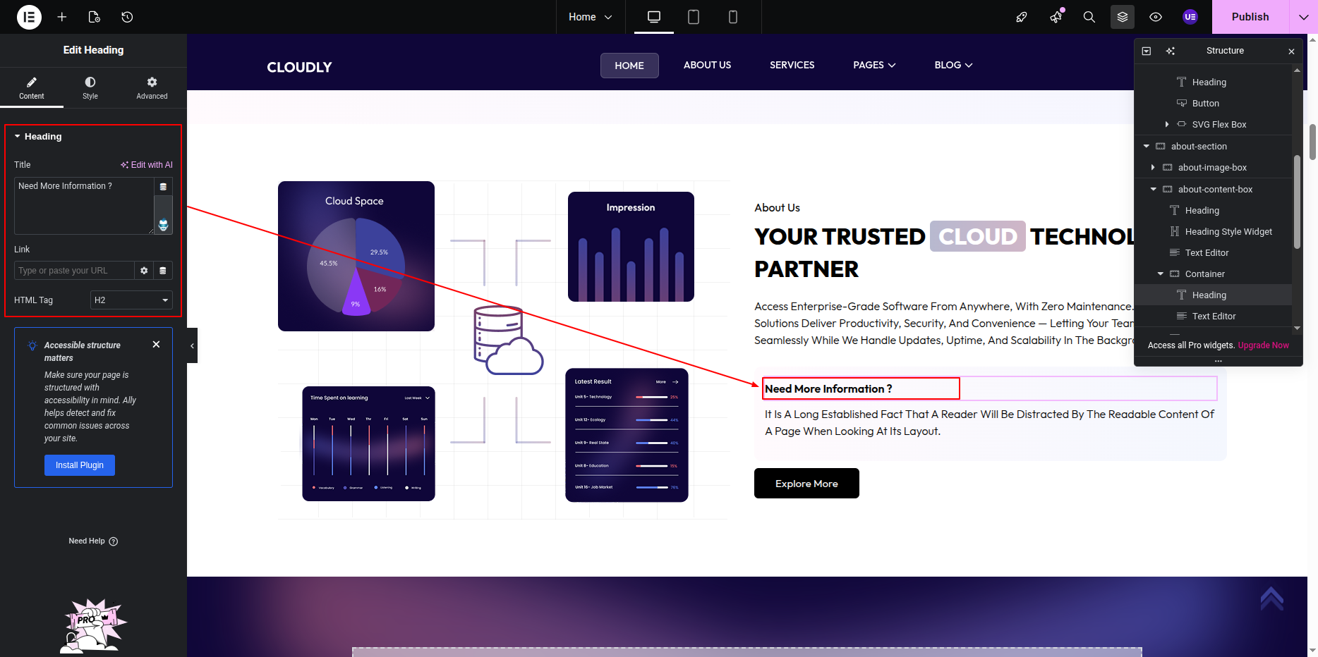
Adding Extended / More Content
- Add or select another Text Editor Widget below the description.
- Use this widget for additional details or “read more” content.
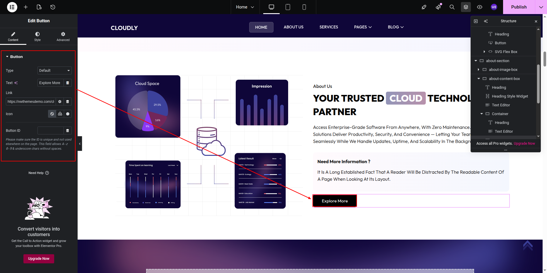
Editing the Button
- Select the Button Widget.
- Update the button text (example below).
- Set the button link to the About or Services page.
- Size: Medium
- Alignment: Left
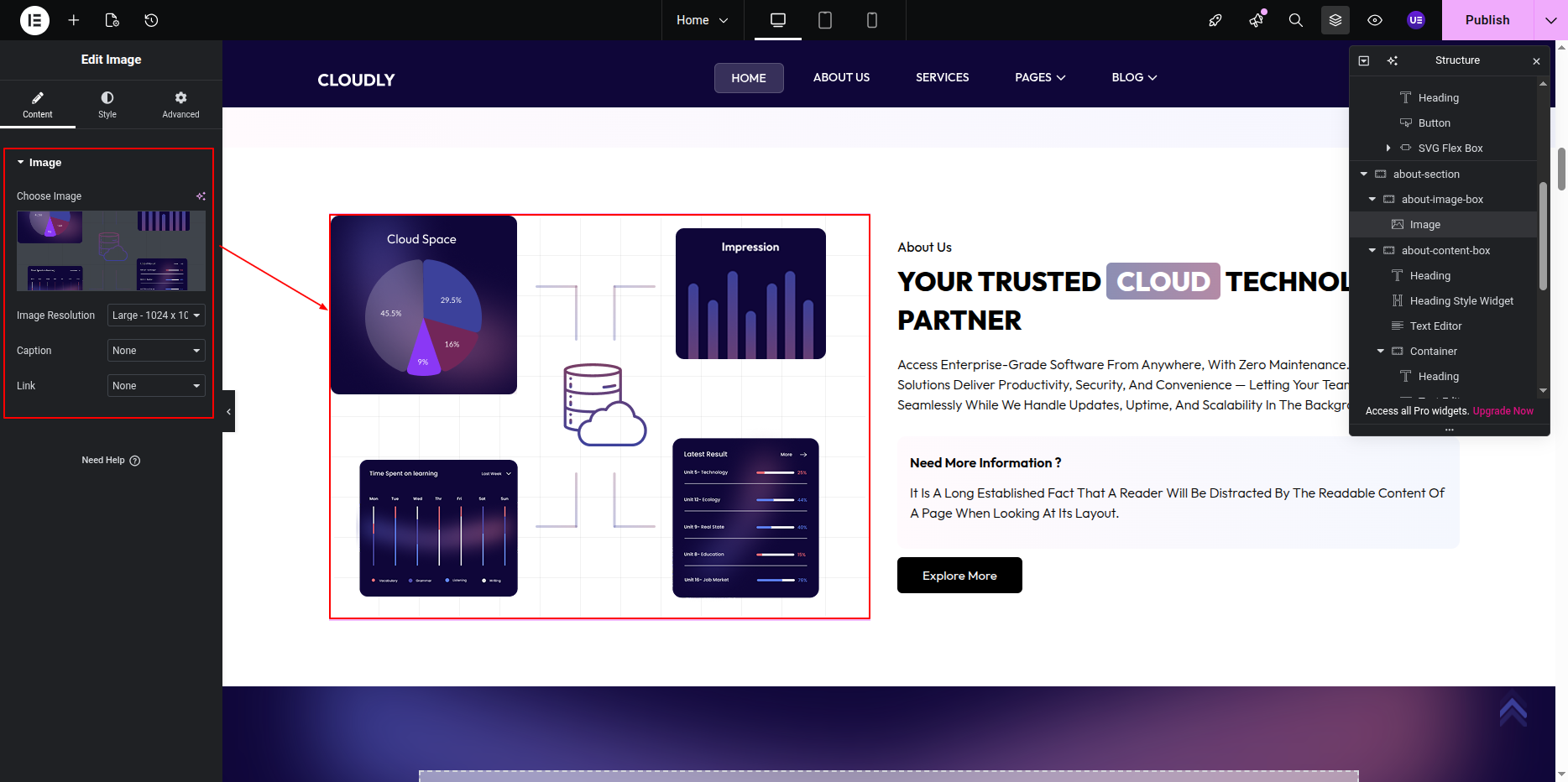
Editing the About Image
- Select the Image Widget in the right column.
- Upload or choose an image from the Media Library.
- Recommended image size: 600 × 500 px.
- Set Image Size to Full or Large.
Tip: Use a professional image that visually represents your brand or services.
This is the final view of your section:
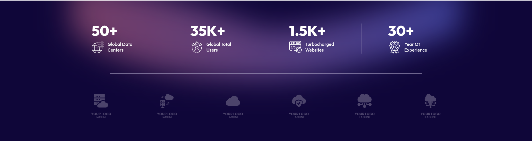
Counter Section
The Counter Section is used to display important statistics such as completed projects, happy clients, years of experience, or awards. This section uses a solid or gradient background color and includes SVG icons, animated counting numbers, a title, and a tagline for each counter.
To edit this section, follow the steps below:
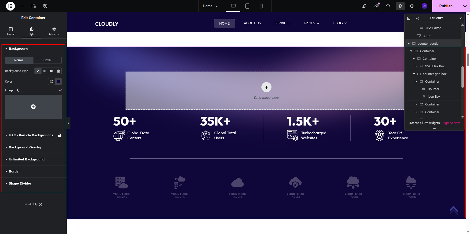
Editing the Counter Section Background
- Select the main Section widget.
- Go to the Style tab.
- Open the Background option.
- Choose a Classic Color or Gradient background.
- Adjust padding under Advanced → Padding if needed.
Editing Counter Layout
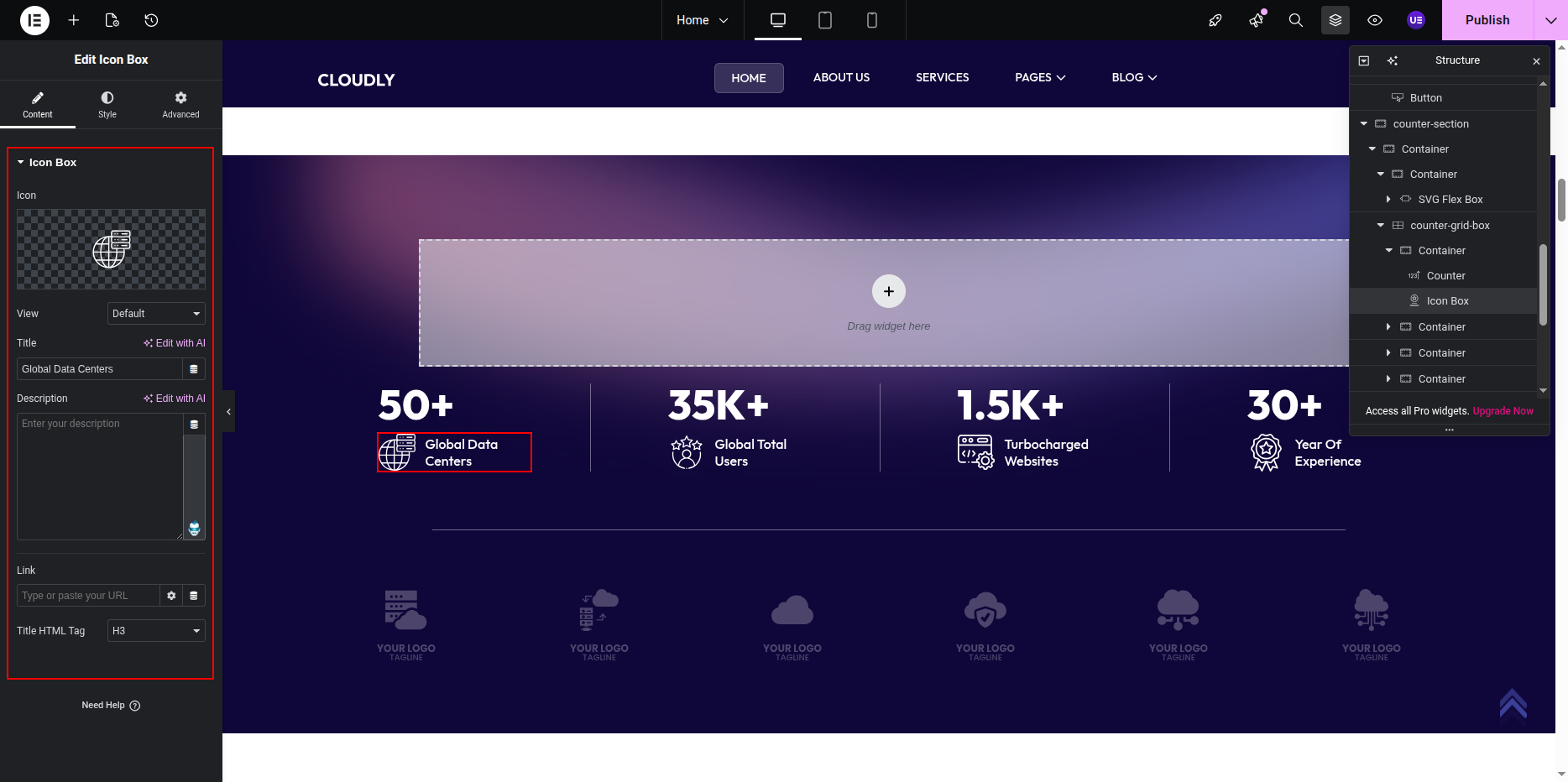
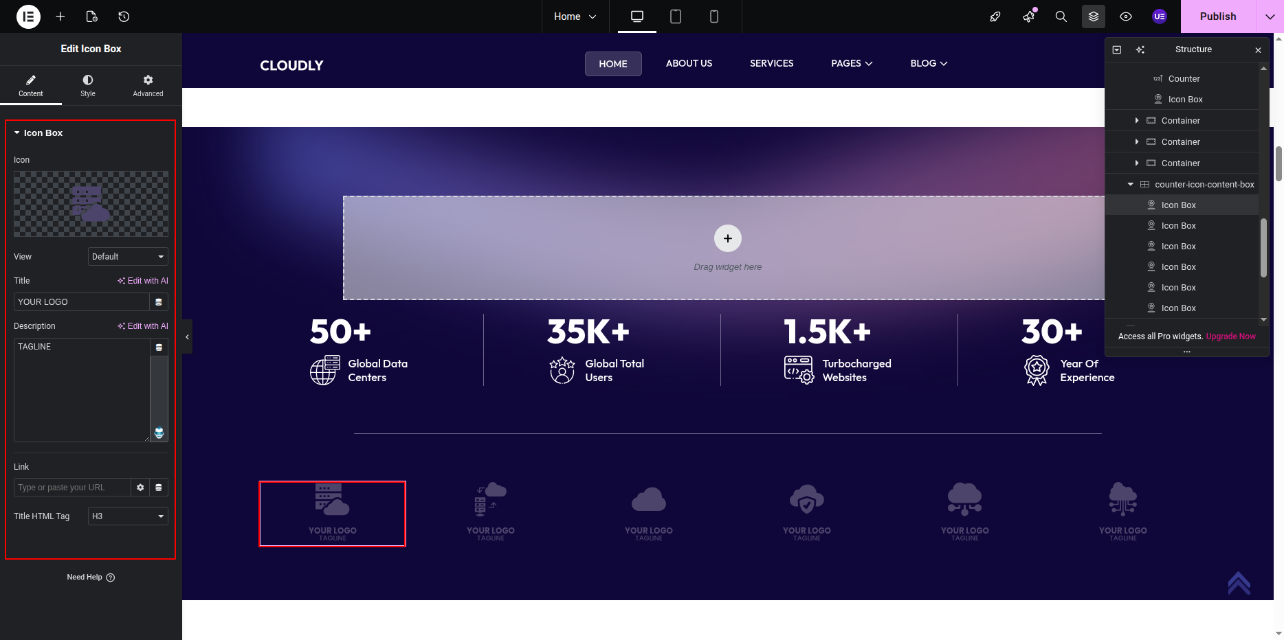
Each counter item is built using the following Elementor widgets:
- Image Widget – Used for SVG icon
- Counter Widget – Used for animated numbers
- Heading Widget – Used for counter title
- Text Editor Widget – Used for tagline
Adding SVG Icon to Counter
- Select the Image Widget inside a counter column.
- Upload or choose an SVG file from the Media Library.
- Set the Alignment to Center.
- Adjust the Width under the Style tab if needed.
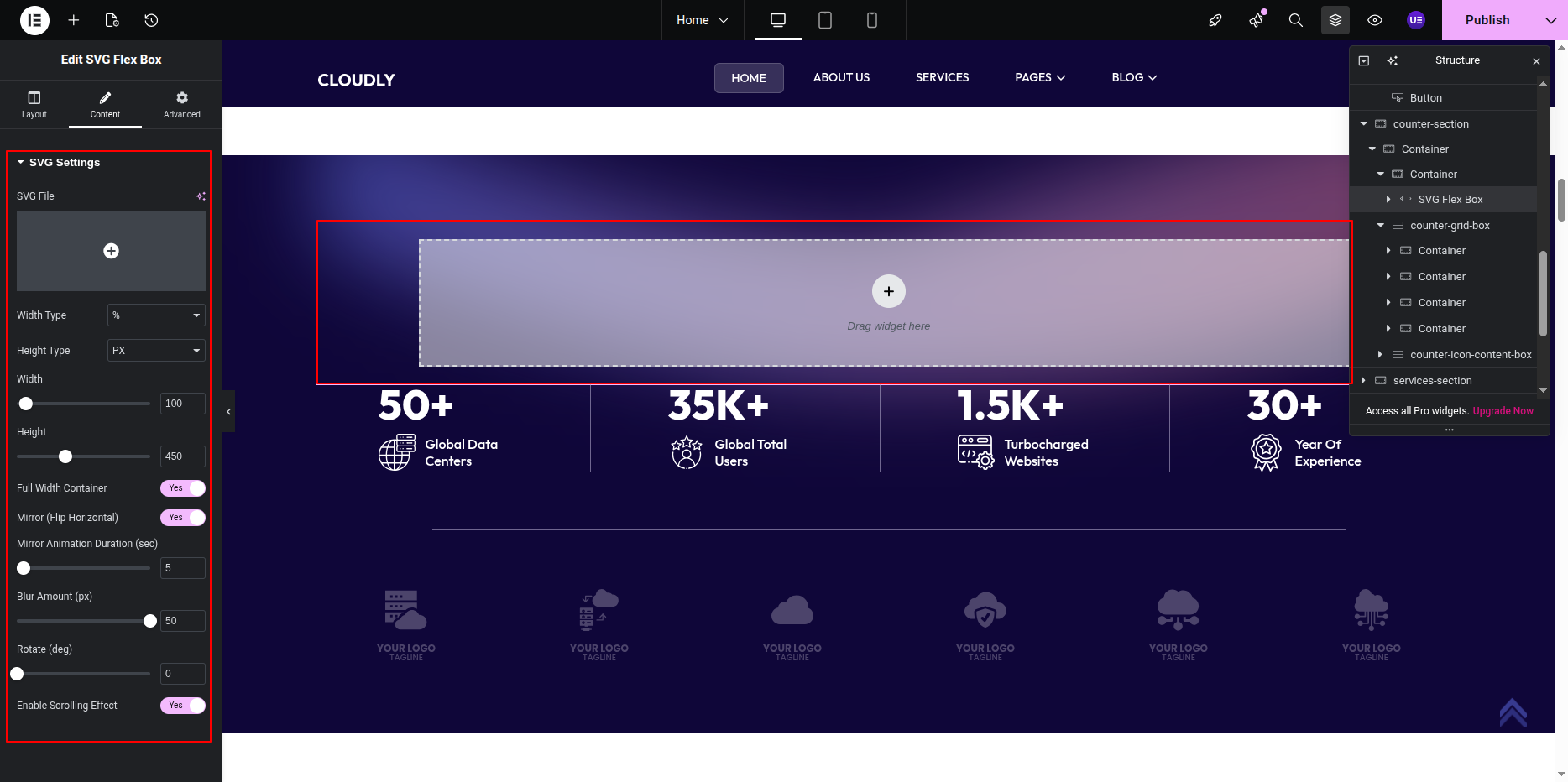
Note: SVG icons are scalable and remain sharp on all screen sizes.
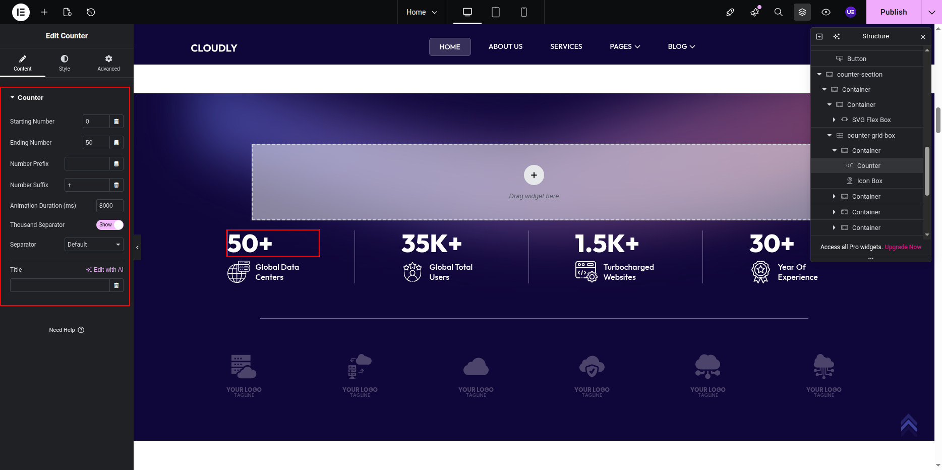
Editing the Counter Number
- Select the Counter Widget.
- Set the following options under the Content tab:
- Starting Number – Example: 0
- Ending Number – Example: 250
- Number Prefix – Optional (e.g. +)
- Number Suffix – Optional (e.g. %)
- Animation Duration – Example: 1500
Editing Counter Title
- Select the Heading Widget below the counter number.
- Enter the counter title text.
- Set the HTML Tag to H4 (recommended).
Editing Counter Tagline
- Select the Text Editor Widget below the title.
- Enter a short tagline or description.
Tip: Use light-colored text on dark backgrounds for improved readability.
This is the final view of your section:
Services Section
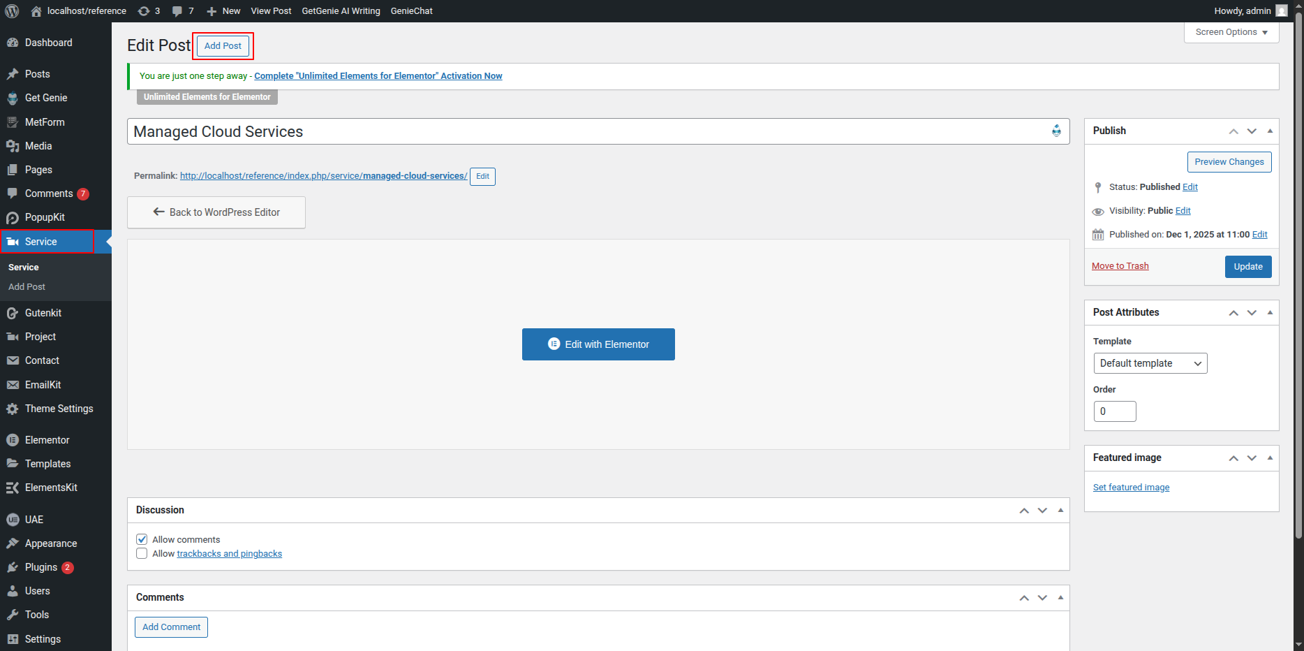
The Services Section displays your services created from the WordPress dashboard. Each service is created as a post and edited individually using Elementor. On the Home page, services are displayed using an Alternating Posts Widget.
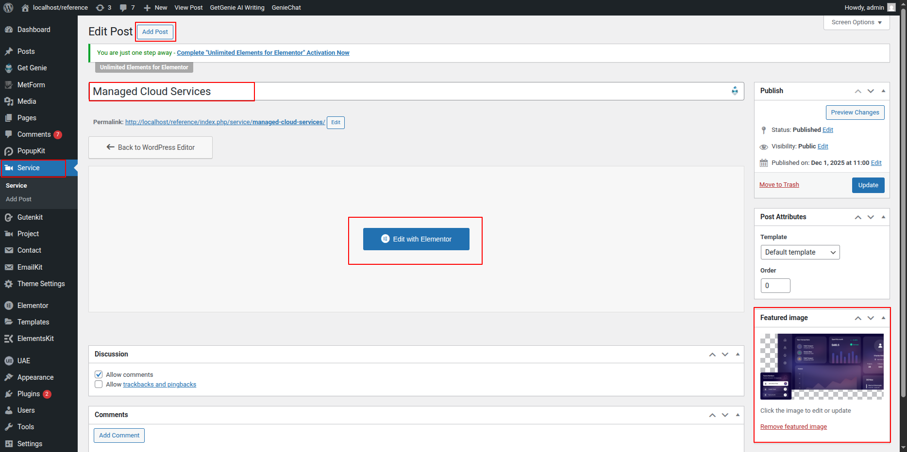
Creating a Service from Dashboard
- Go to WordPress Dashboard → Services.
- Click Add New.
- Enter the Service Title.
- Set a Featured Image.
- Click Publish.
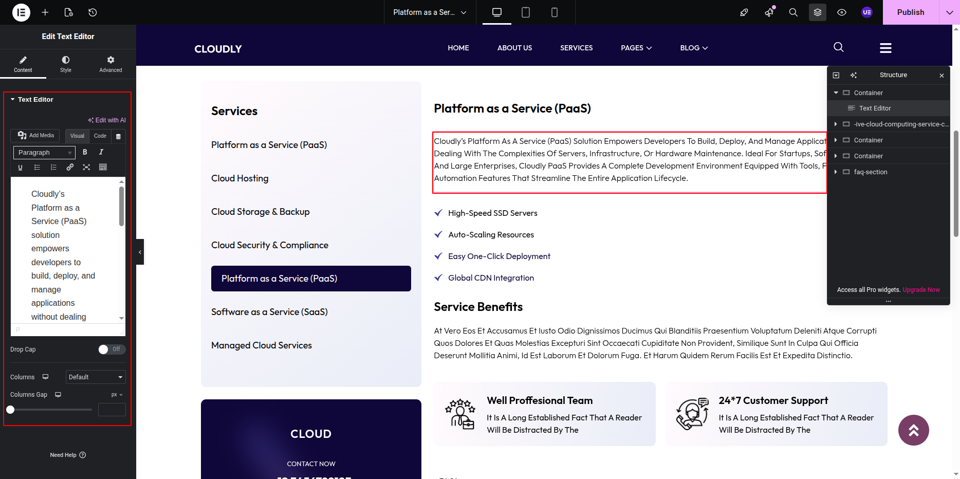
Editing Service Description with Elementor
- From the Services list, hover over a service.
- Click Edit with Elementor.
- Add and edit content using:
- Heading Widget – Section titles
- Text Editor Widget – Service description
- Image Widget – Service images
- Click Update to save changes.
Adding Services Section on Home Page
- Go to the Home Page.
- Click Edit with Elementor.
- Add a new Section where you want the Services Section.
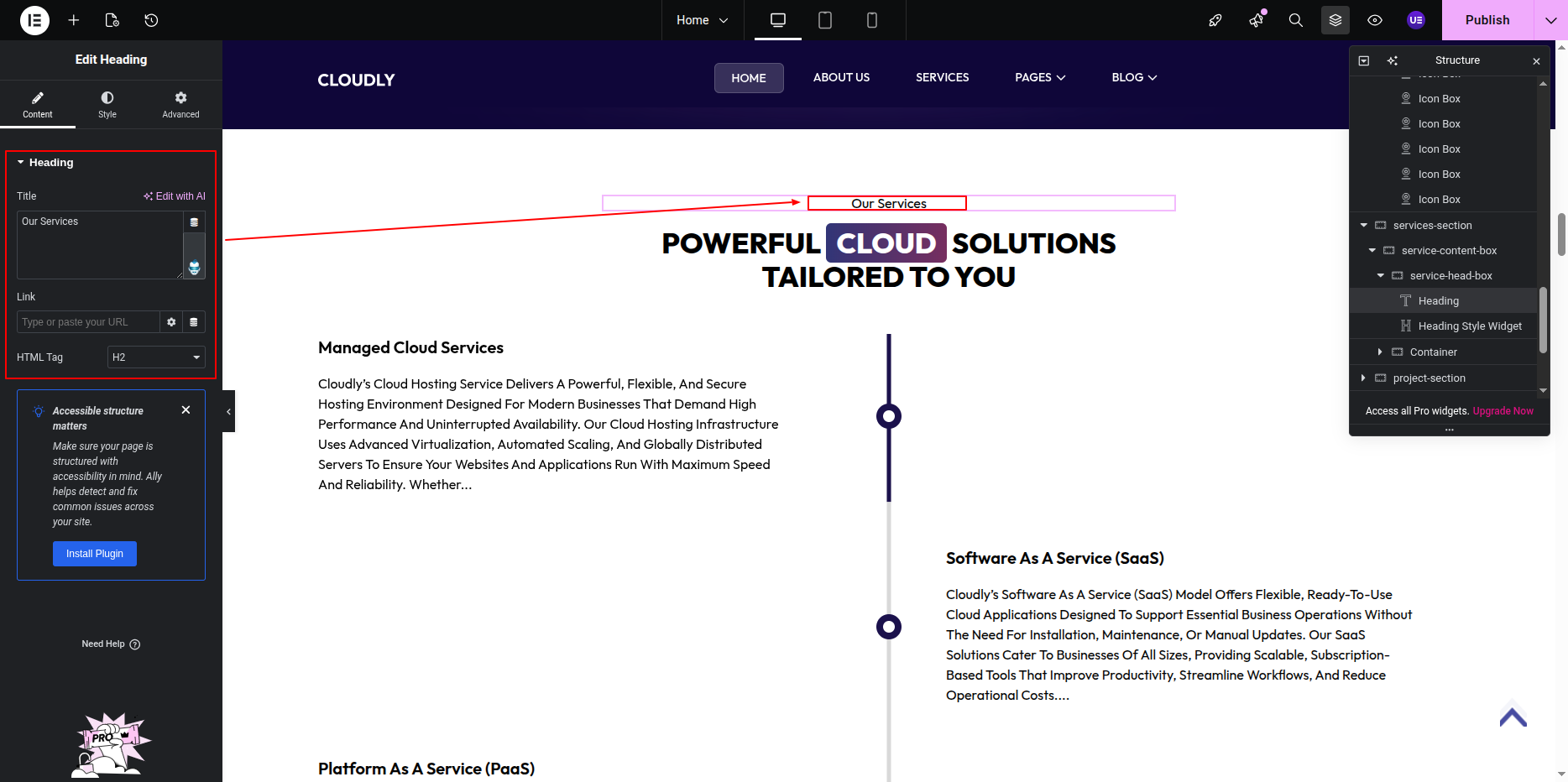
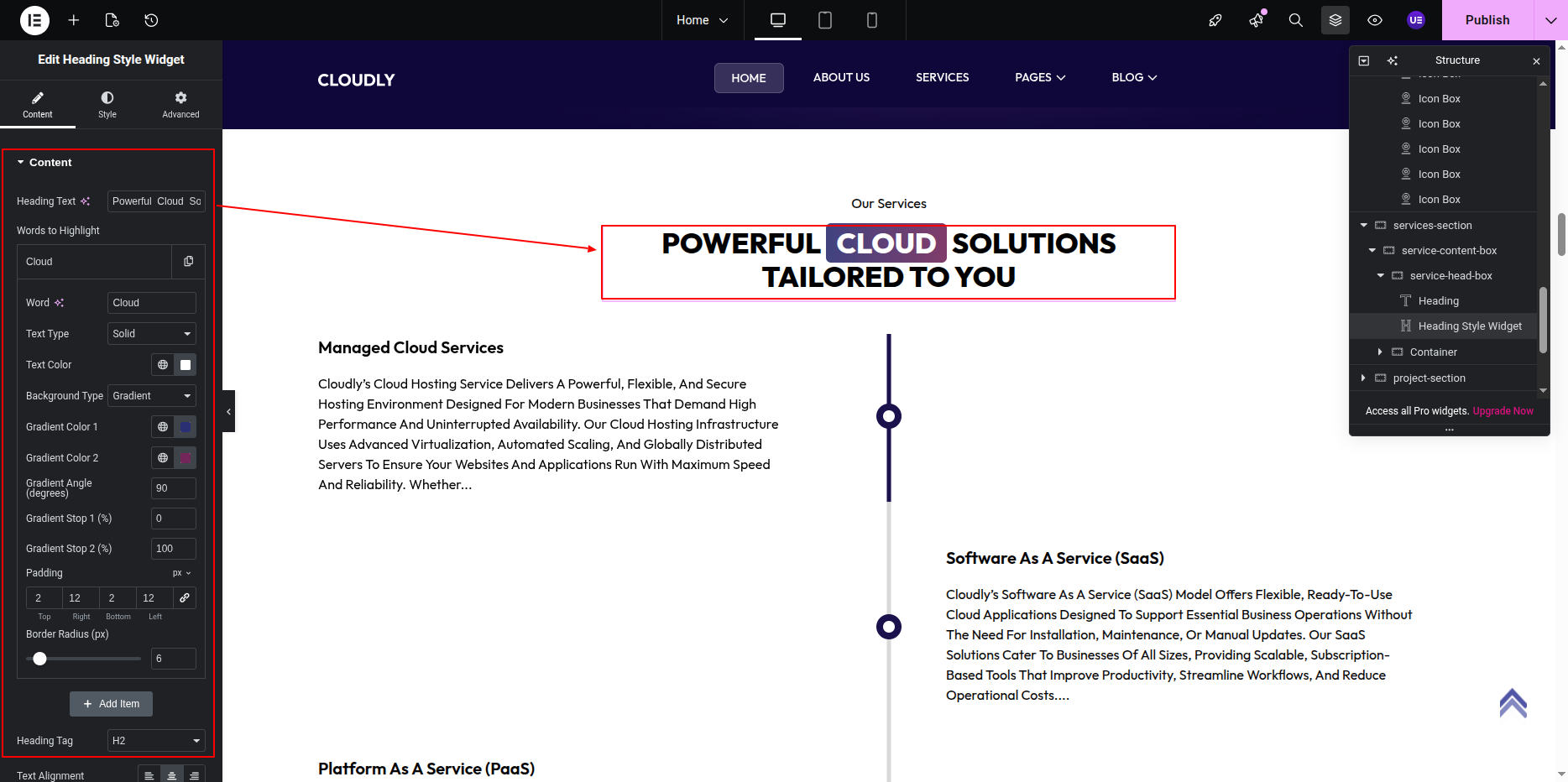
Editing Services Section Title & Heading
- Add a Heading Widget for the section title.
- Add another Heading Widget for the main section heading.
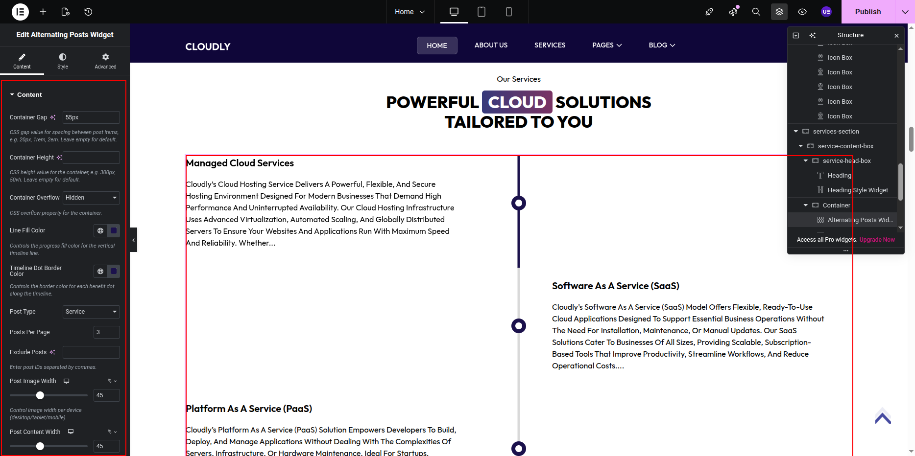
Displaying Services Using Alternating Posts Widget
- Add the Posts Widget (or Loop Grid Widget) below the heading.
- Under Query settings:
- Source: Services
- Posts Per Page: As required
- Enable Alternating Layout (if available in widget options).
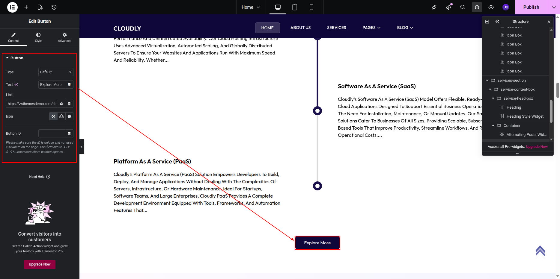
Editing the Button
- Select the Button Widget.
- Update the button text (example below).
- Set the button link to the About or Services page.
- Size: Medium
- Alignment: Center
Tip: Keep alternating layouts consistent for better readability and visual balance.
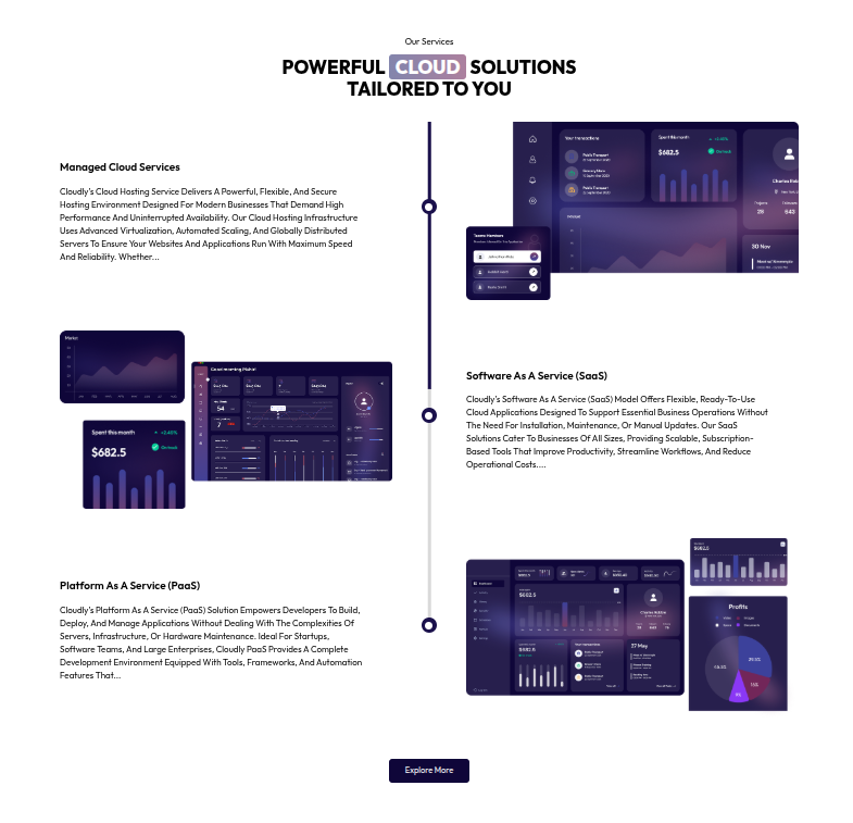
This is the final view of your section:
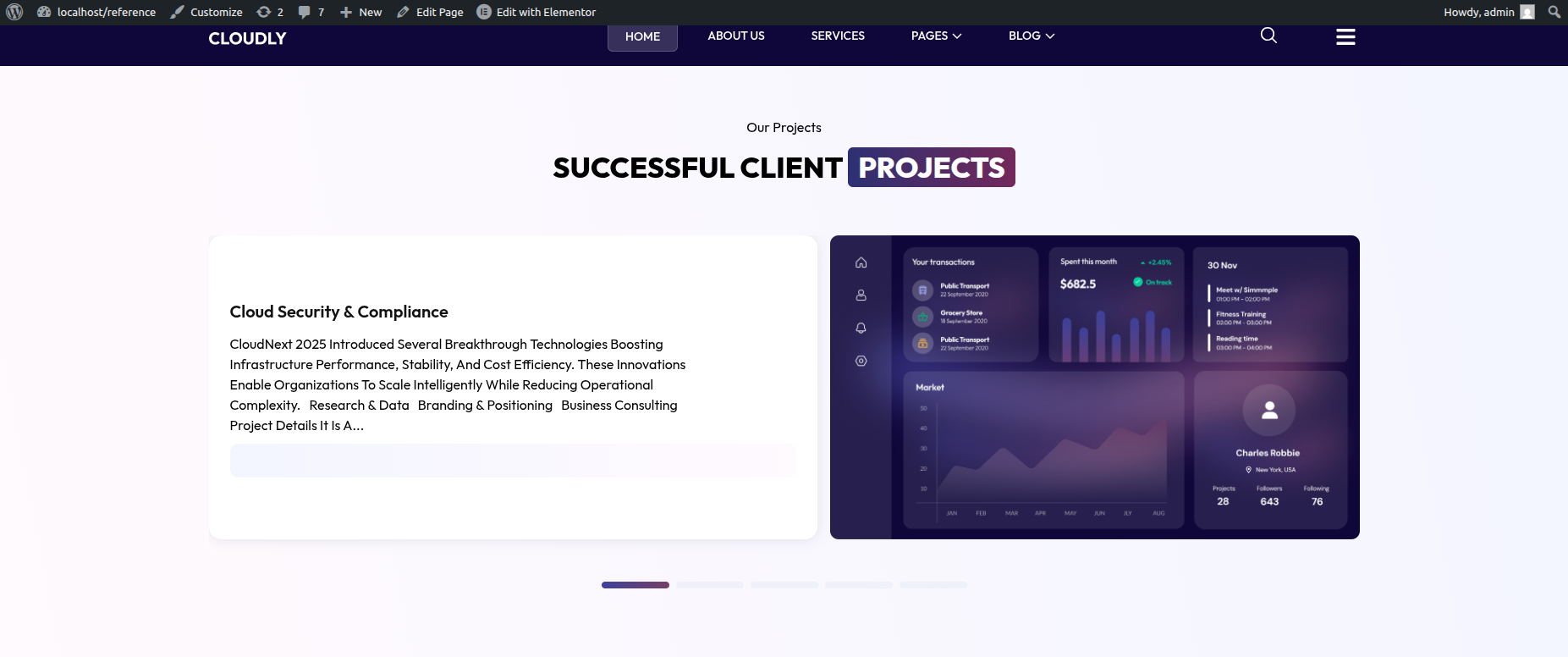
Projects Section
The Projects Section displays your projects created from the WordPress dashboard. Each project is created as a post and edited individually using Elementor. On the Home page, projects are displayed using the Posts Slider Widget.
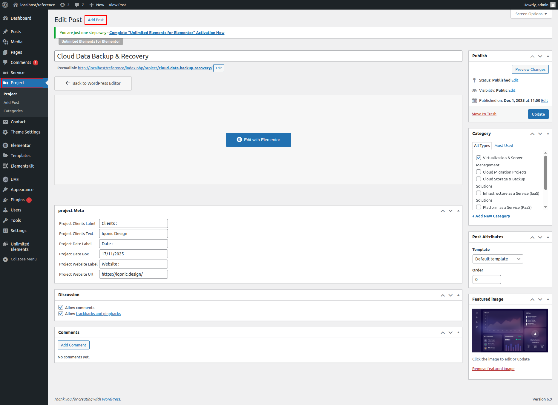
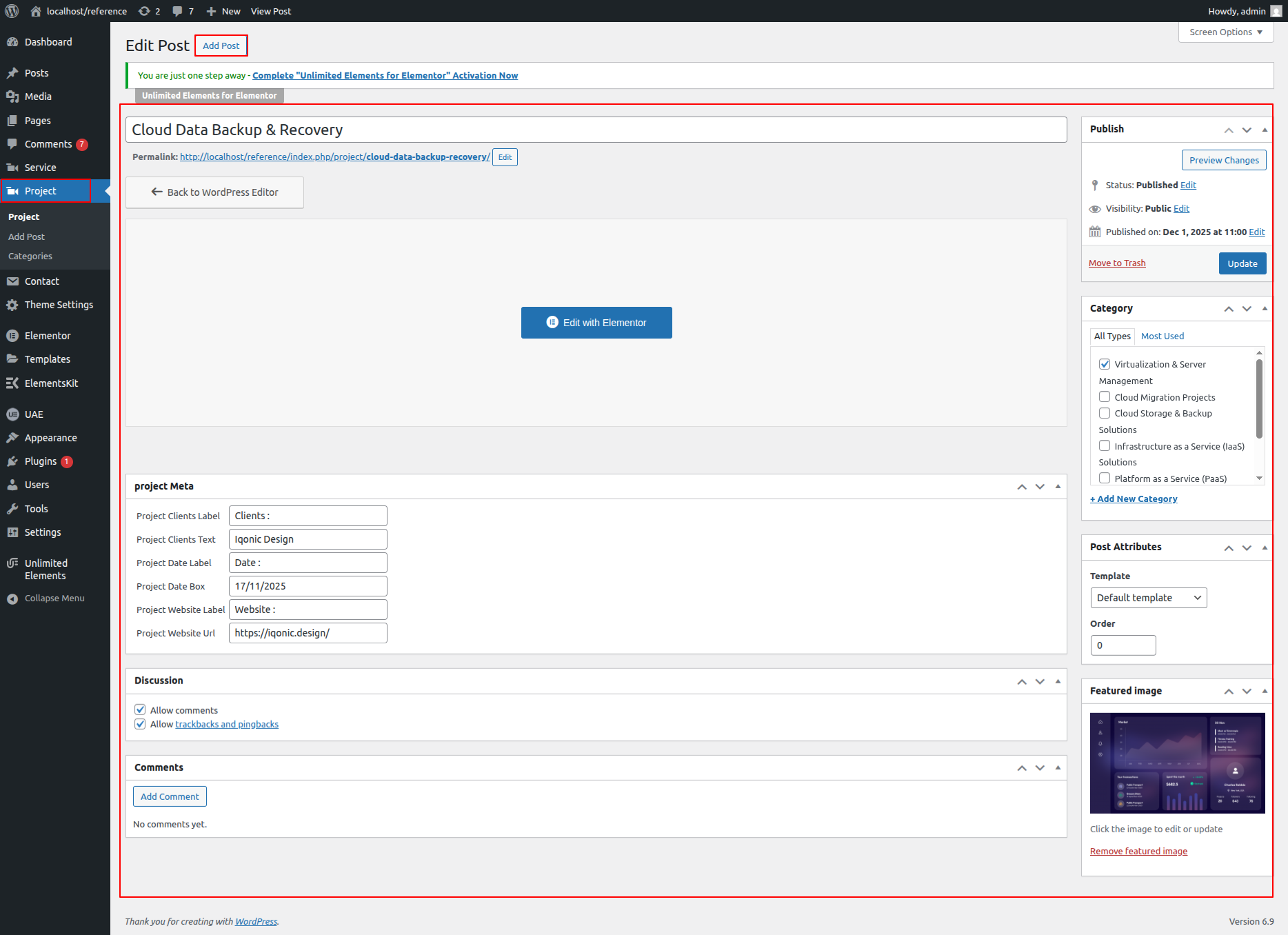
Creating a Project from Dashboard
- Go to WordPress Dashboard → Projects.
- Click Add New.
- Enter the Project Title.
- Set a Featured Image.
- Click Publish.
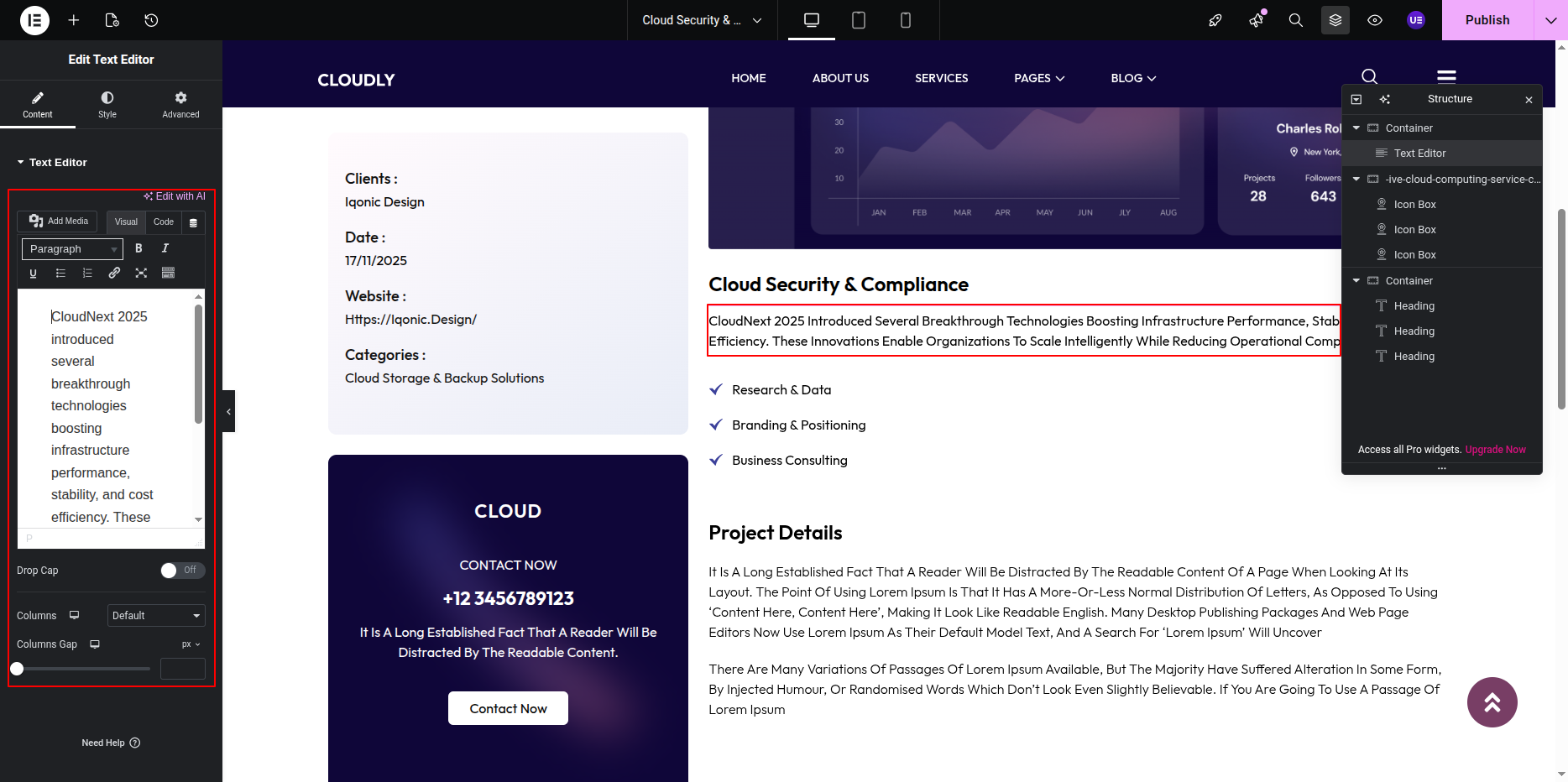
Editing Project Description with Elementor
- From the Projects list, hover over a project.
- Click Edit with Elementor.
- Add and edit content using:
- Heading Widget – Project titles
- Text Editor Widget – Project description
- Image Widget – Project images or galleries
- Click Update to save changes.
Adding Projects Section on Home Page
- Go to the Home Page.
- Click Edit with Elementor.
- Add a new Section where you want the Projects Section.
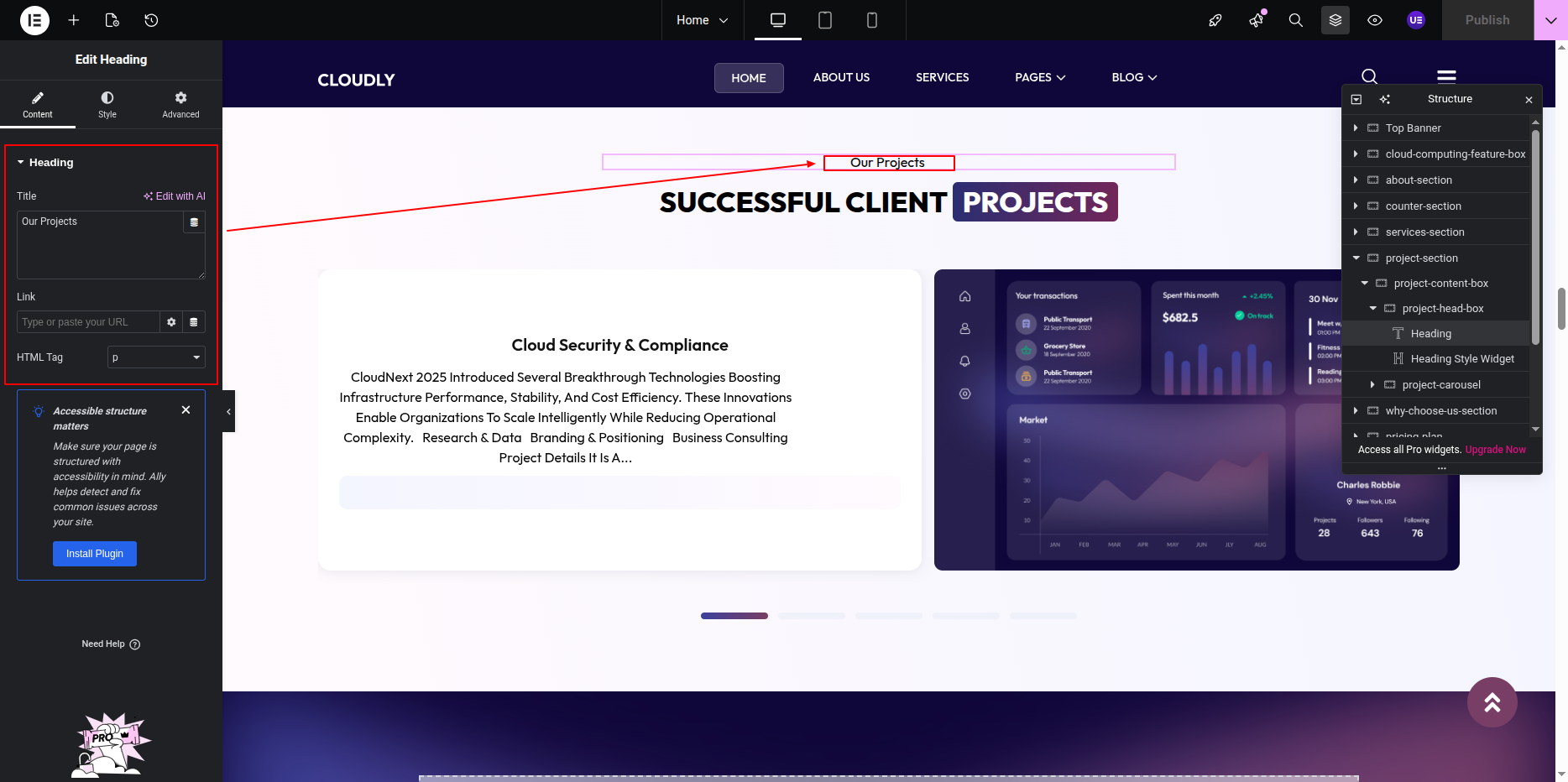
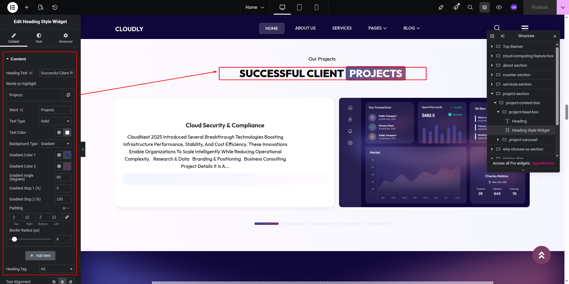
Editing Projects Section Title & Heading
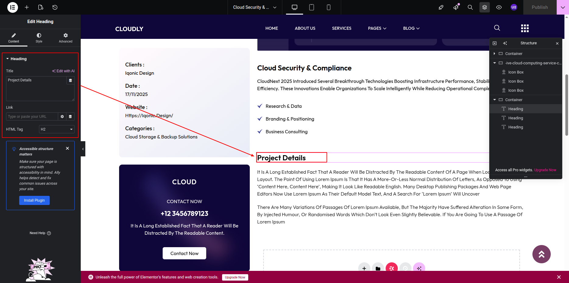
- Add a Heading Widget for the section title.
- Add another Heading Widget for the main section heading.
-
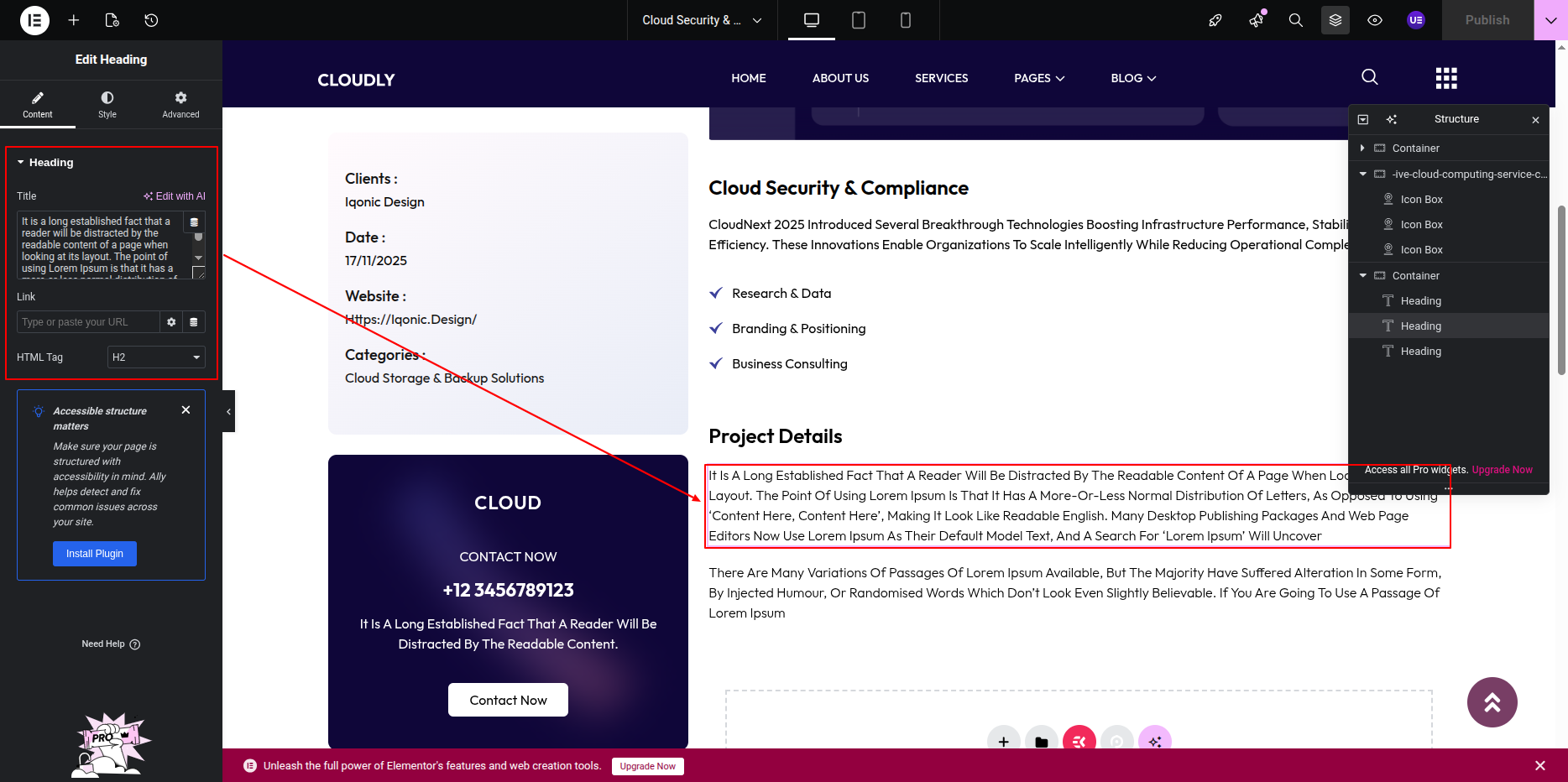
Add a Text Editor Widget to update the project or service description content.
-
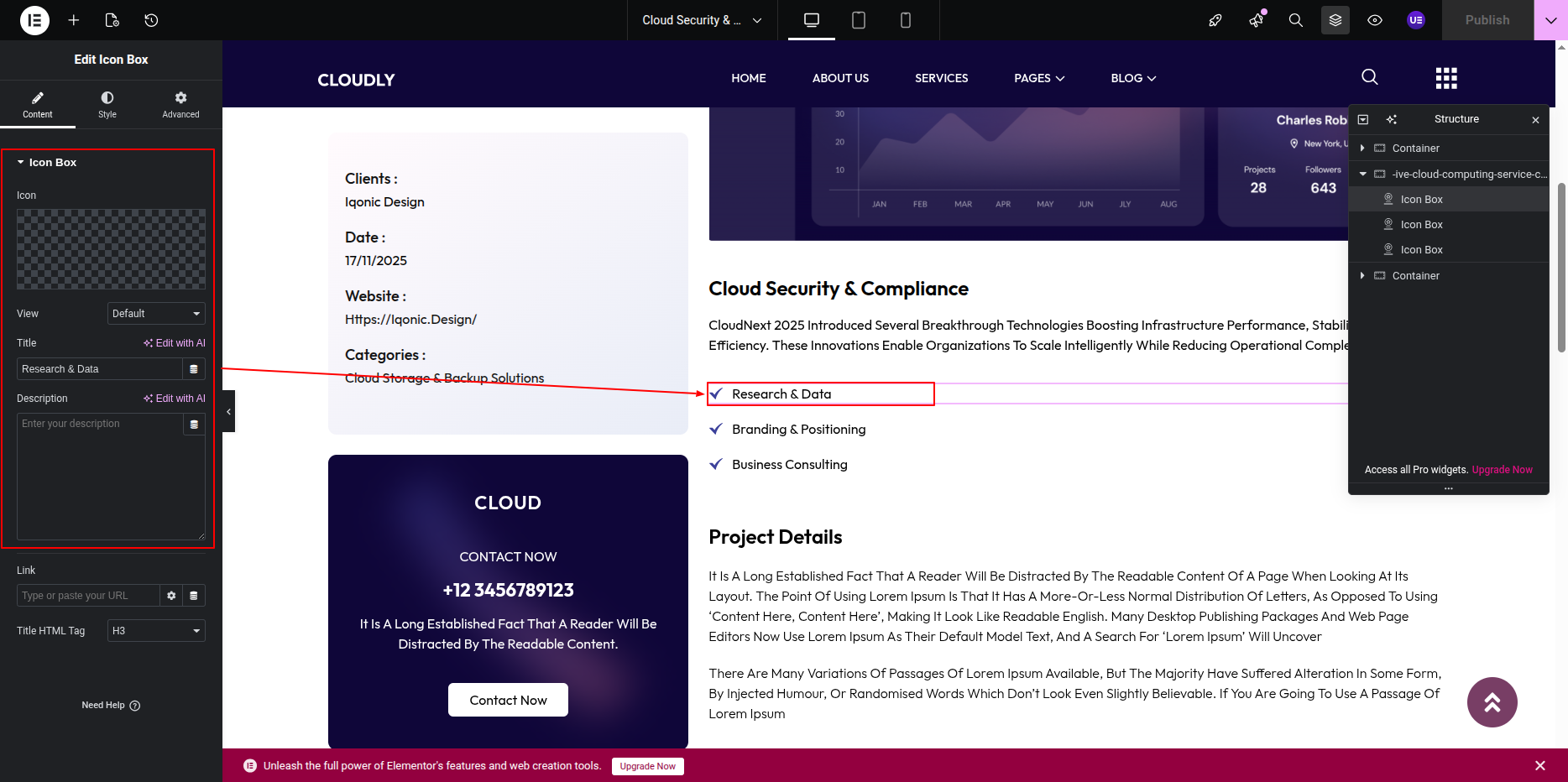
Use the Icon Box Widget to display the service or project features.
- Edit the icon, title, and description for each item.
- You can duplicate icon boxes to add more features.
-
Modify the Service / Project Icon from the icon or image widget as required.
-
Adjust styling such as colors, typography, and hover effects from the Style tab.
-
Control spacing, alignment, and responsiveness from the Advanced tab.
Displaying Projects Using Posts Slider Widget
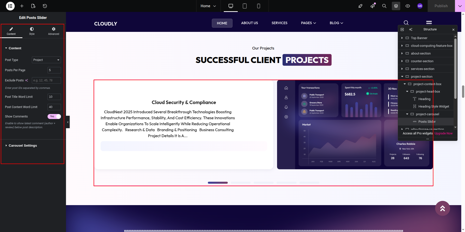
- Add the Posts Slider Widget below the section heading.
- Under Query settings:
- Source: Projects
- Posts Per Page: As required
- Configure slider options such as:
- Slides to Show
- Autoplay
- Navigation Arrows / Dots
Tip: Use consistent image sizes and slider settings to maintain a clean and professional appearance.
This is the final view of your section:
Why Choose Us Section
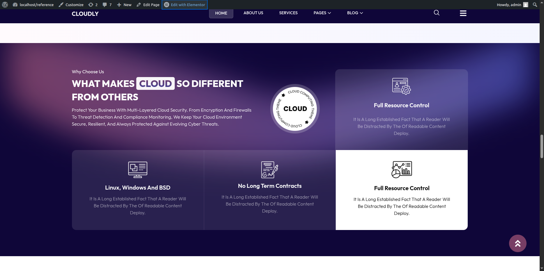
The Why Choose Us Section highlights the key strengths and benefits of your business. This section includes a title, main heading, short description, an SVG image, and four feature cards with icons, titles, and text.
Adding Why Choose Us Section on Home Page
- Go to the Home Page.
- Click Edit with Elementor.
- Add a new Section where you want the Why Choose Us Section.
Editing the Gradient Background
- Select the main Section widget.
- Go to the Style tab.
- Open the Background option.
- Choose Gradient as the background type.
- Adjust the following settings as needed:
- Color 1 – First gradient color
- Color 2 – Second gradient color
- Gradient Type – Linear
- Angle – Adjust to control gradient direction
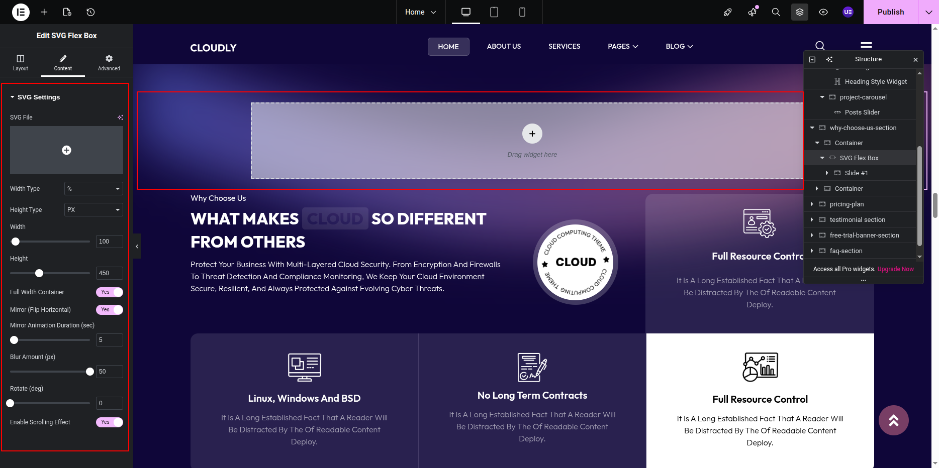
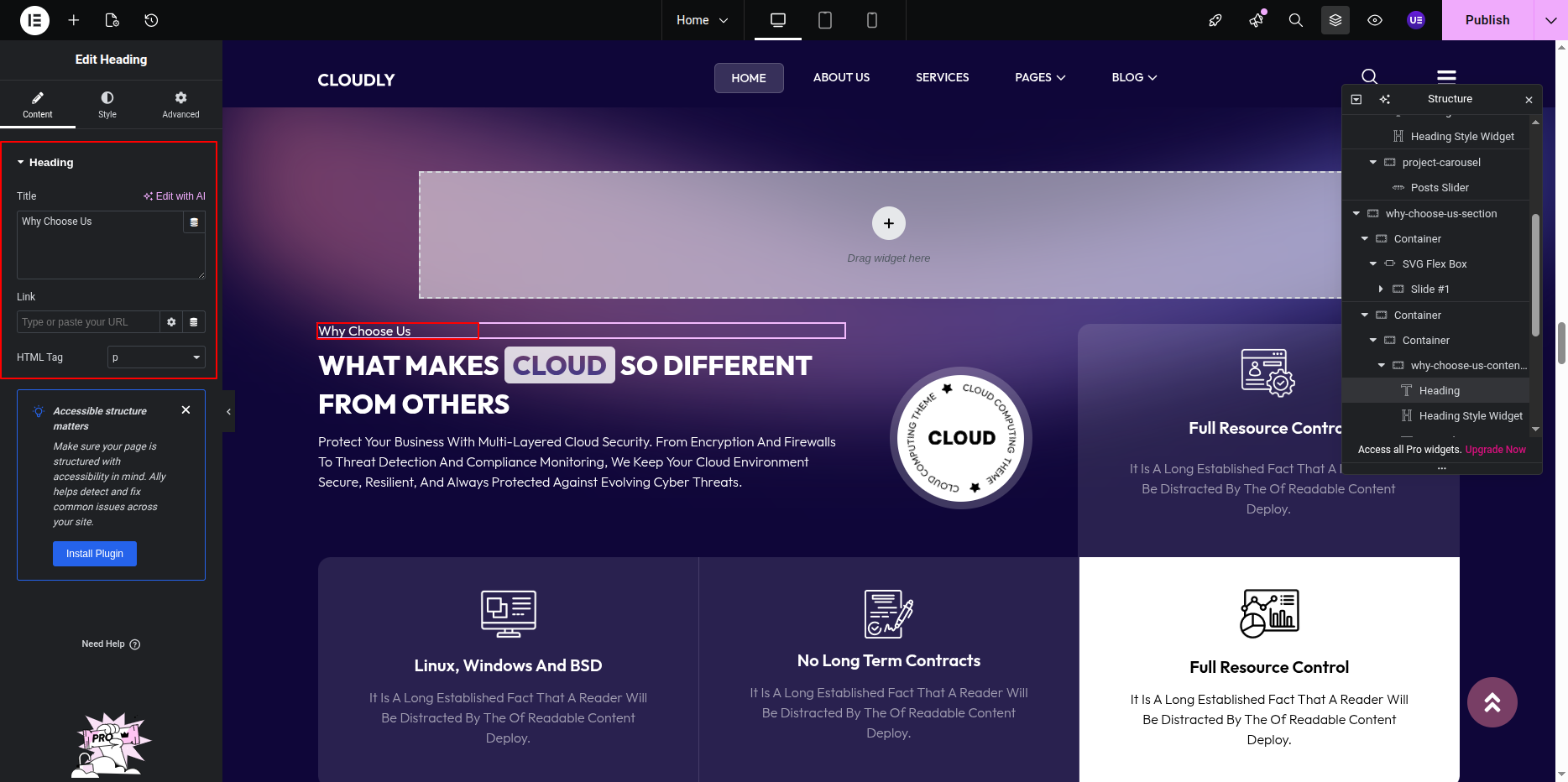
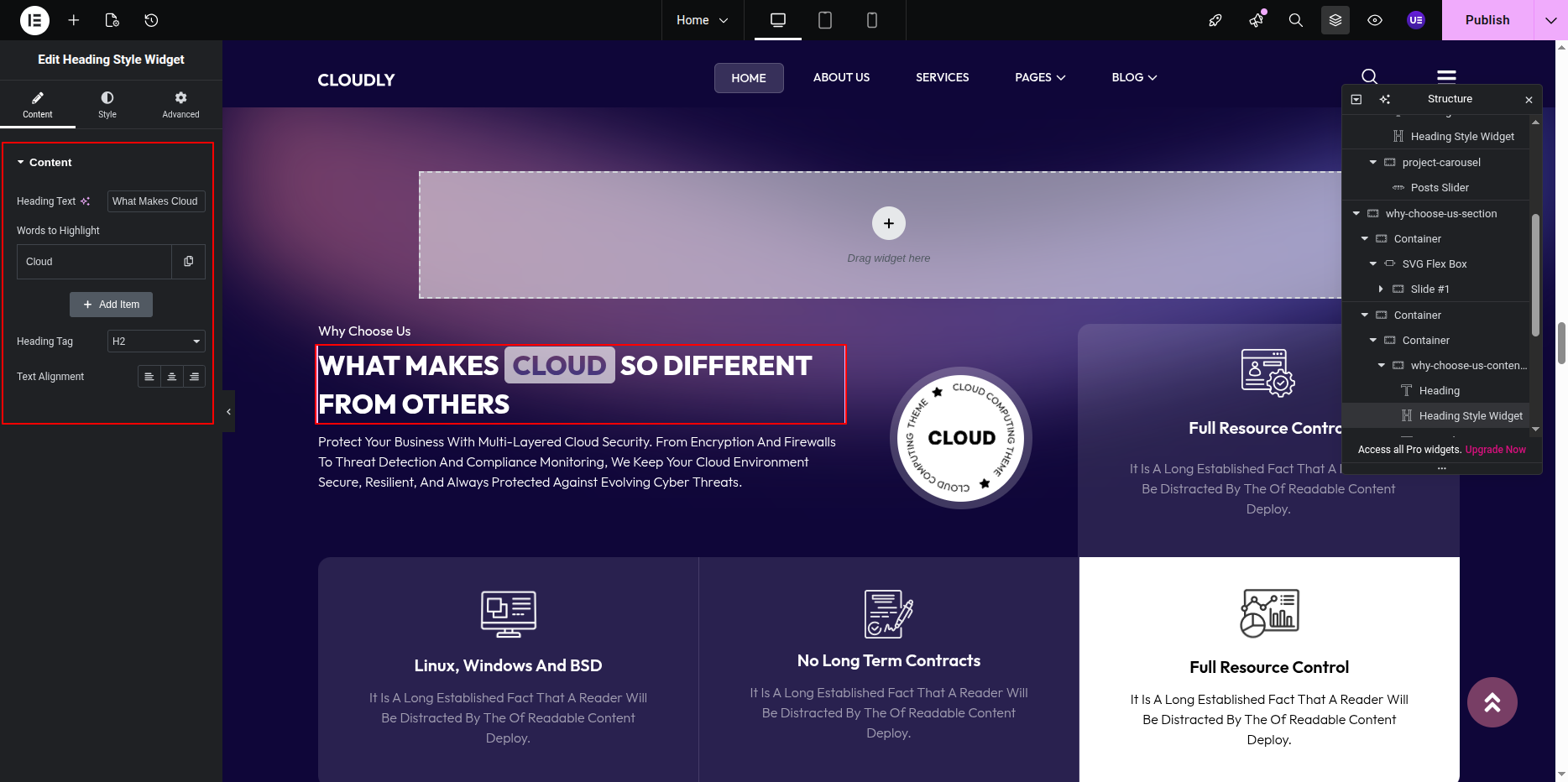
Adding Section Title, Heading & Description
- Add a Heading Widget for the section title.
- Add another Heading Widget for the main heading.
- Add a Text Editor Widget for the section description.
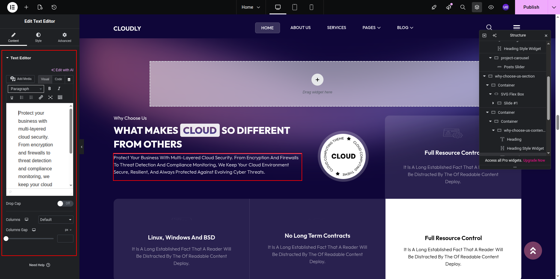
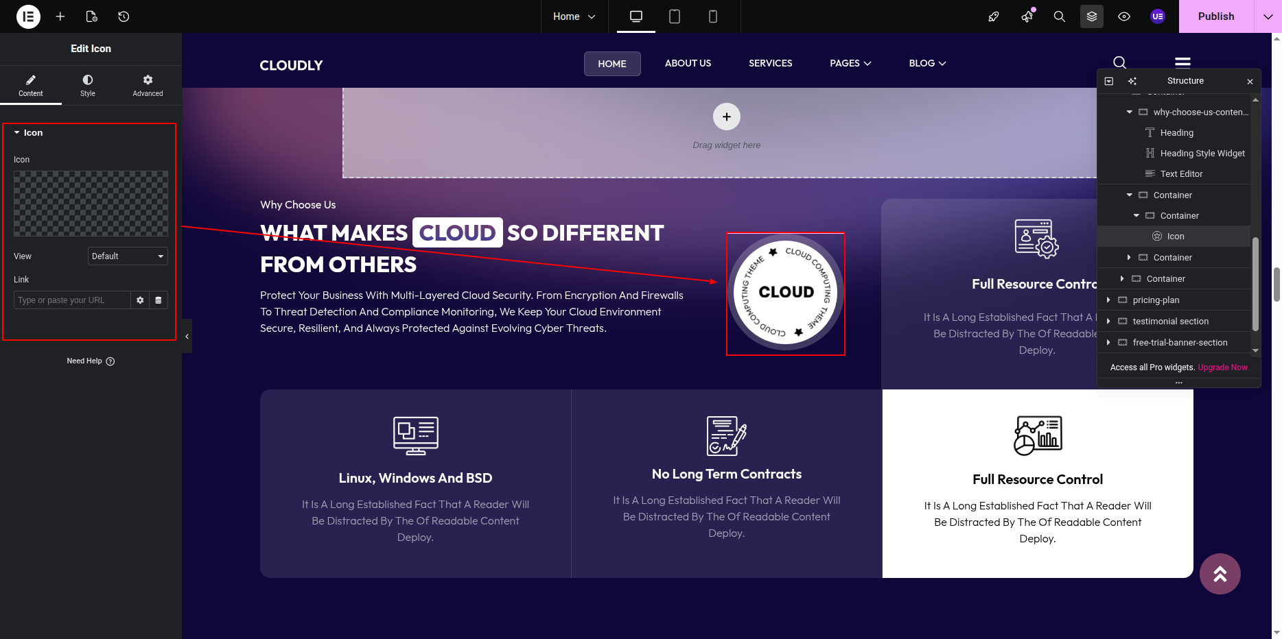
Adding SVG Image
- Add an Image Widget inside the section.
- Upload or select the SVG image from the media library.
- Adjust the alignment and size as required.
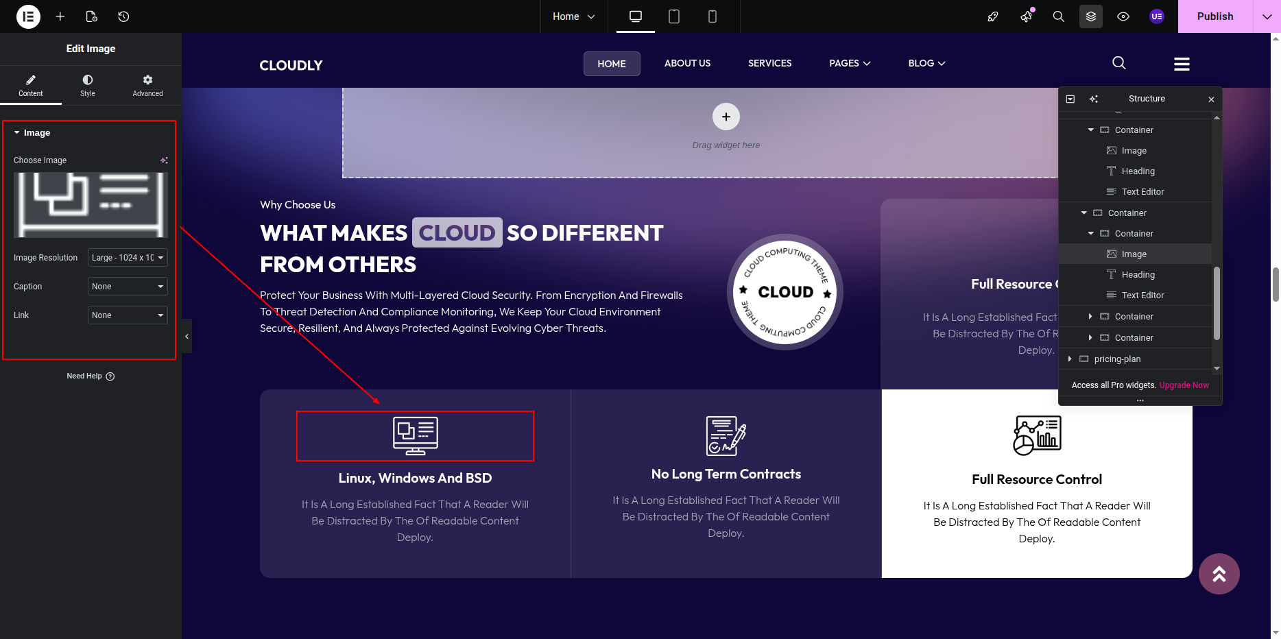
Adding Feature Cards
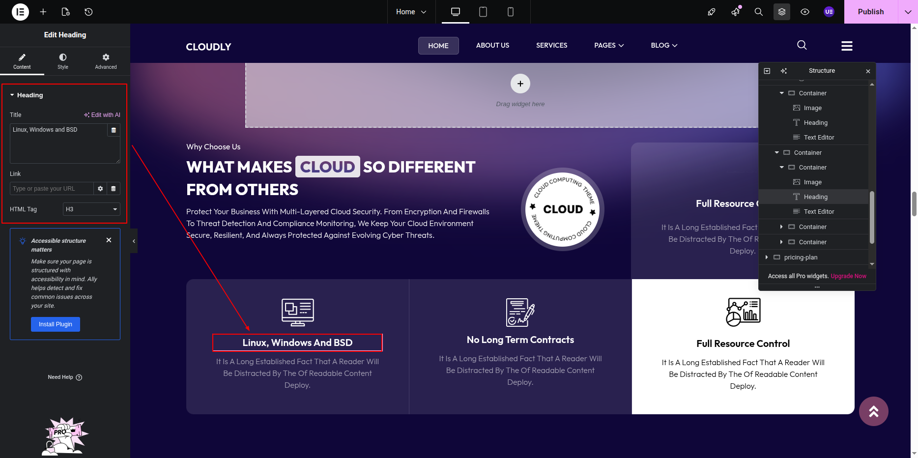
The Why Choose Us section contains 4 feature cards, each displaying an icon, title, and short description.
- Add an Inner Section with four columns.
- In each column, add:
- Image or Icon Widget – Feature icon
- Heading Widget – Feature title
- Text Editor Widget – Feature description
- Repeat the same structure for all four cards.
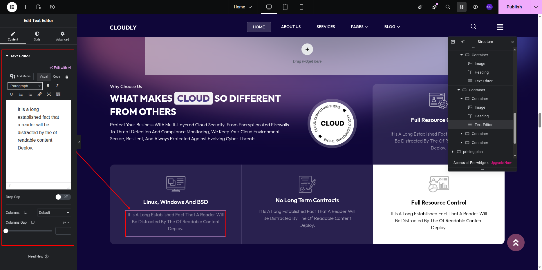
Styling the Cards
- Set background color or gradient for each card.
- Add padding and border radius for better spacing.
- Align content to center or left as required.
- Apply hover effects if needed.
Responsive Settings
- Switch to Tablet and Mobile view.
- Adjust column width and spacing.
- Ensure icons and text remain readable on smaller screens.
Tip: Use consistent icon sizes and concise text to maintain a clean and professional layout.
This is the final view of your section:
Pricing Plan Section
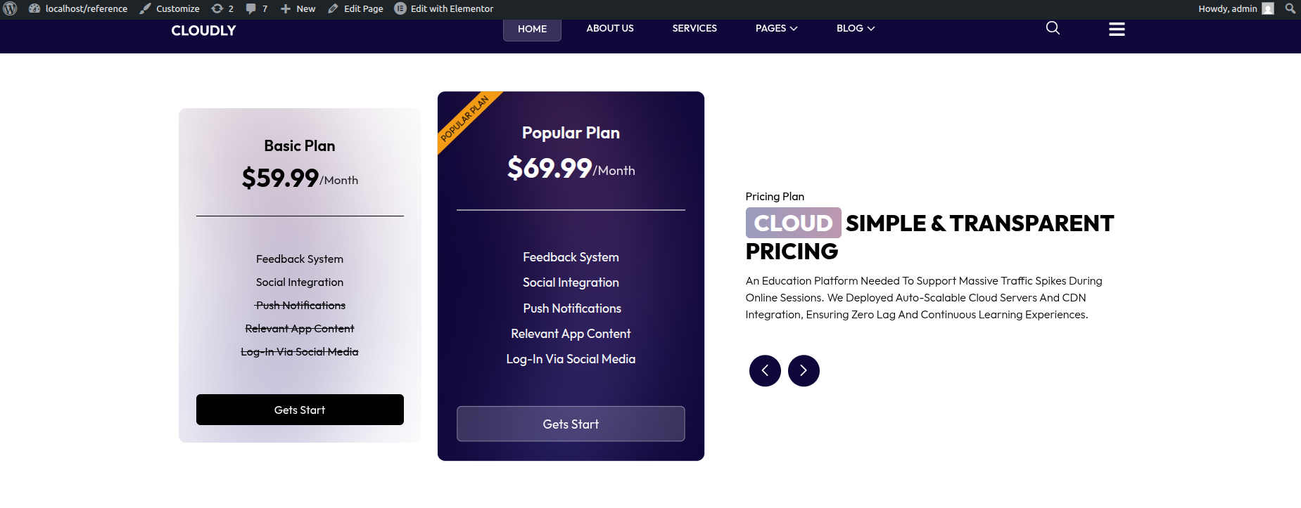
The Pricing Plan Section displays your pricing plans in a slider layout using the SVG Pricing Plan Widget. The pricing plans appear on the left side as a slider, while the right side contains the section title, main heading, description, and navigation arrows.
Adding Pricing Plan Section on Home Page
- Go to the Home Page.
- Click Edit with Elementor.
- Add a new Section where you want the Pricing Plan Section.
Adding Pricing Plans Slider (Left Side)
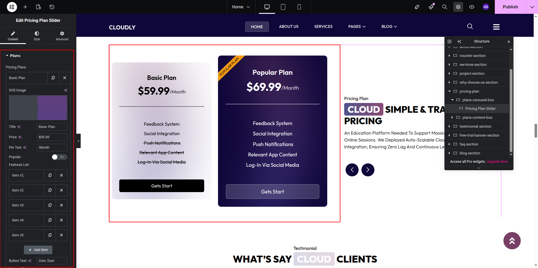
- In the left column, add the SVG Pricing Plan Widget.
- Configure the pricing plans:
- Plan Title
- Price
- Duration (Monthly / Yearly)
- Features list
- CTA Button Text & Link
- Enable Slider option.
- Set the number of visible plans per slide.
Adding Section Title, Heading & Description (Right Side)
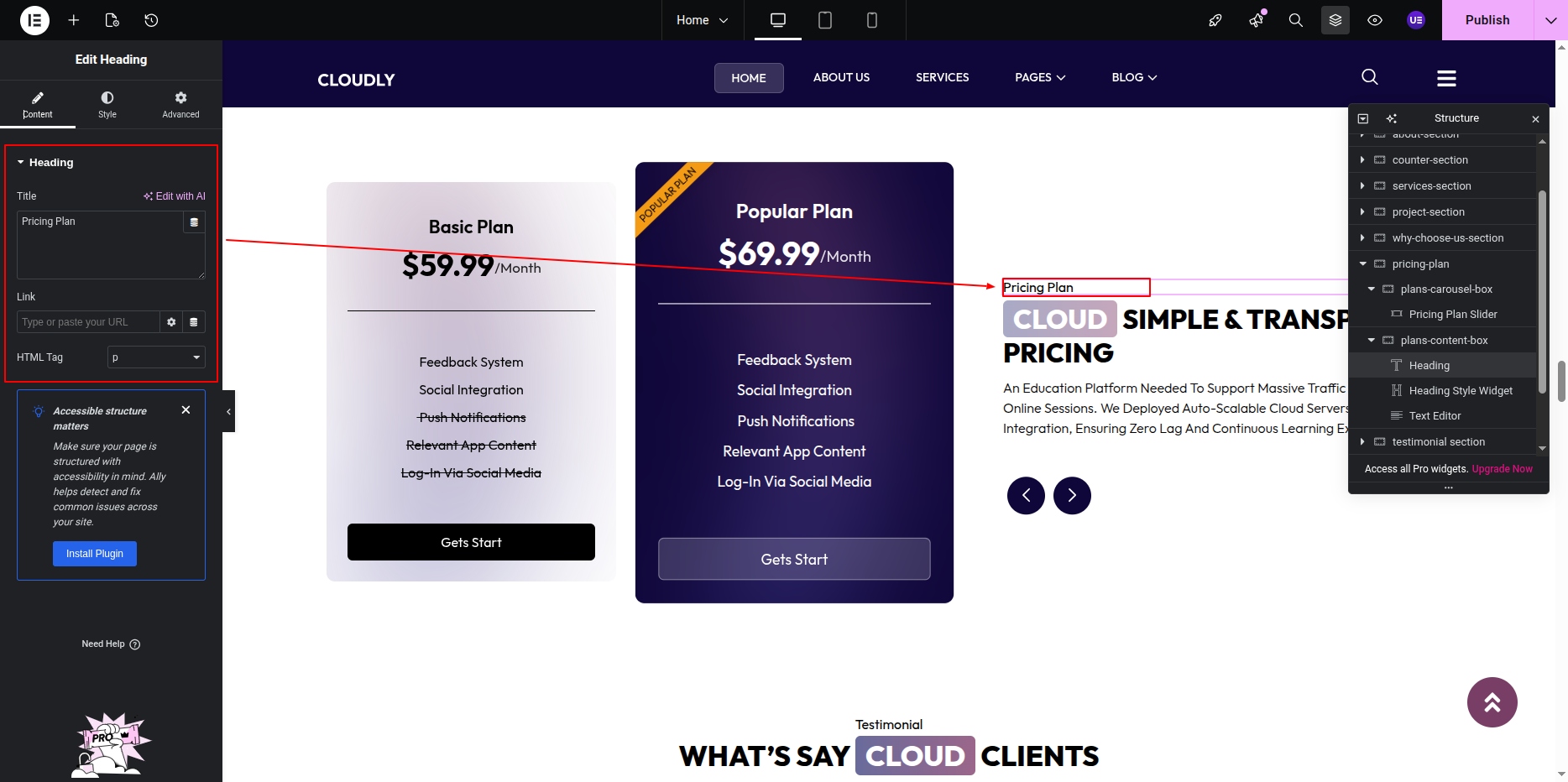
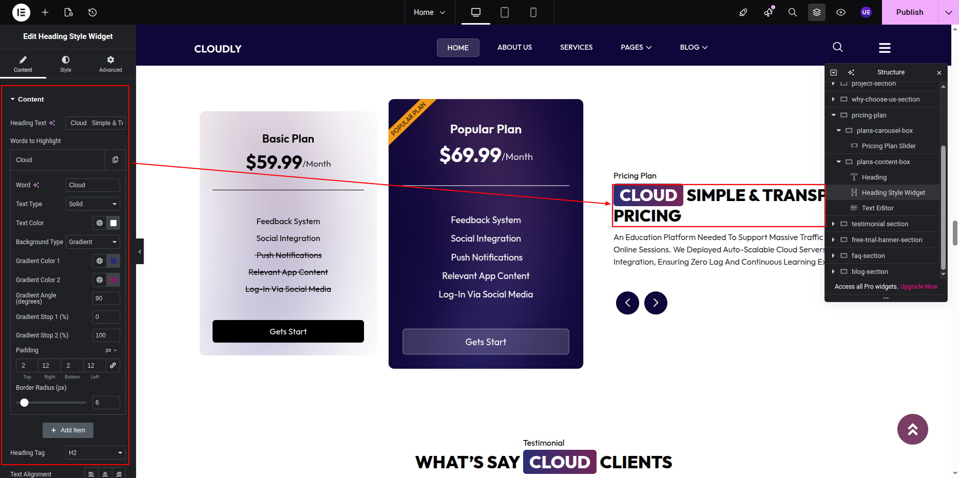
- In the right column, add a Heading Widget for the section title.
- Add another Heading Widget for the main heading.
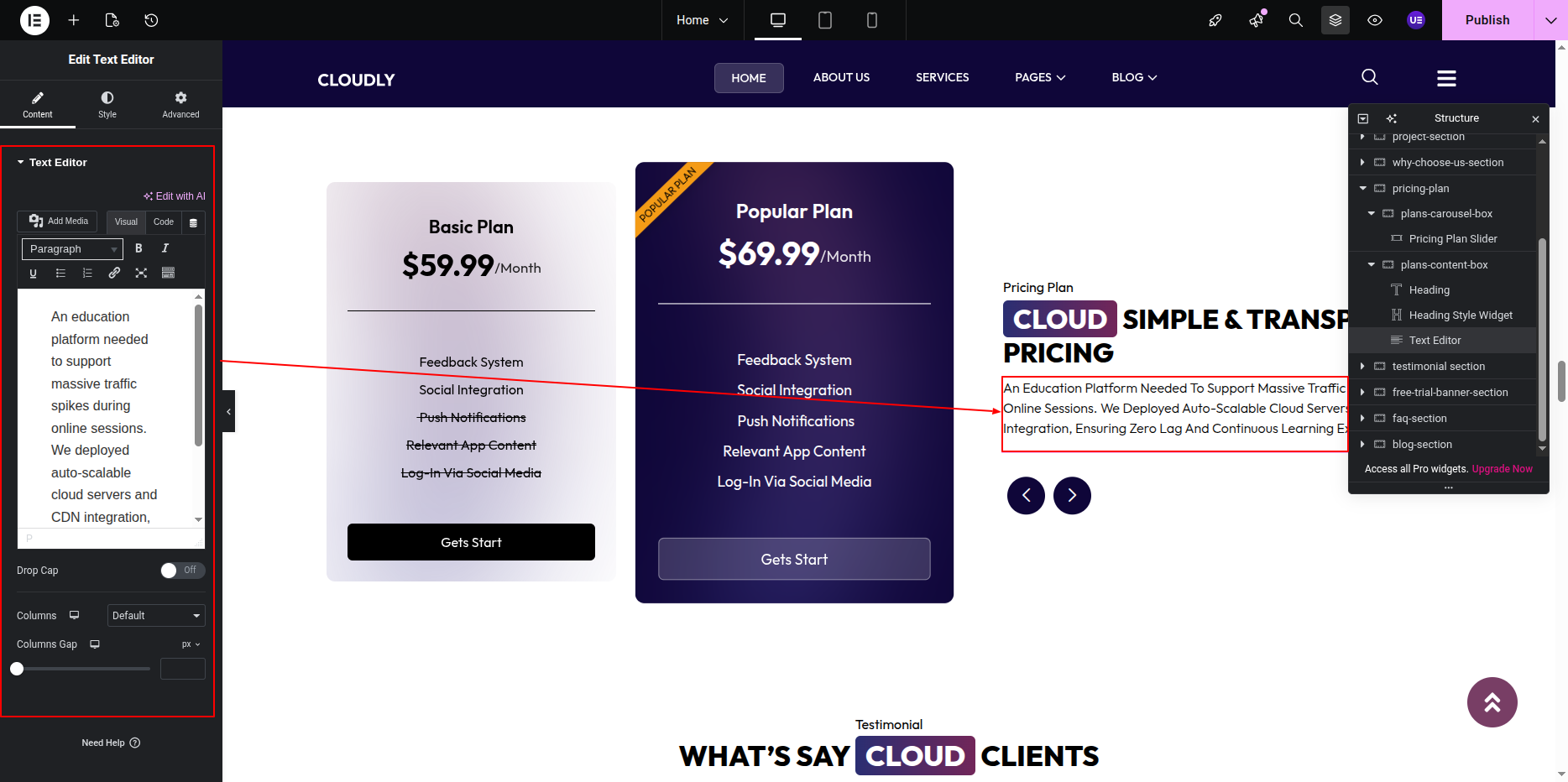
- Add a Text Editor Widget for the description.
Adding Navigation Arrows
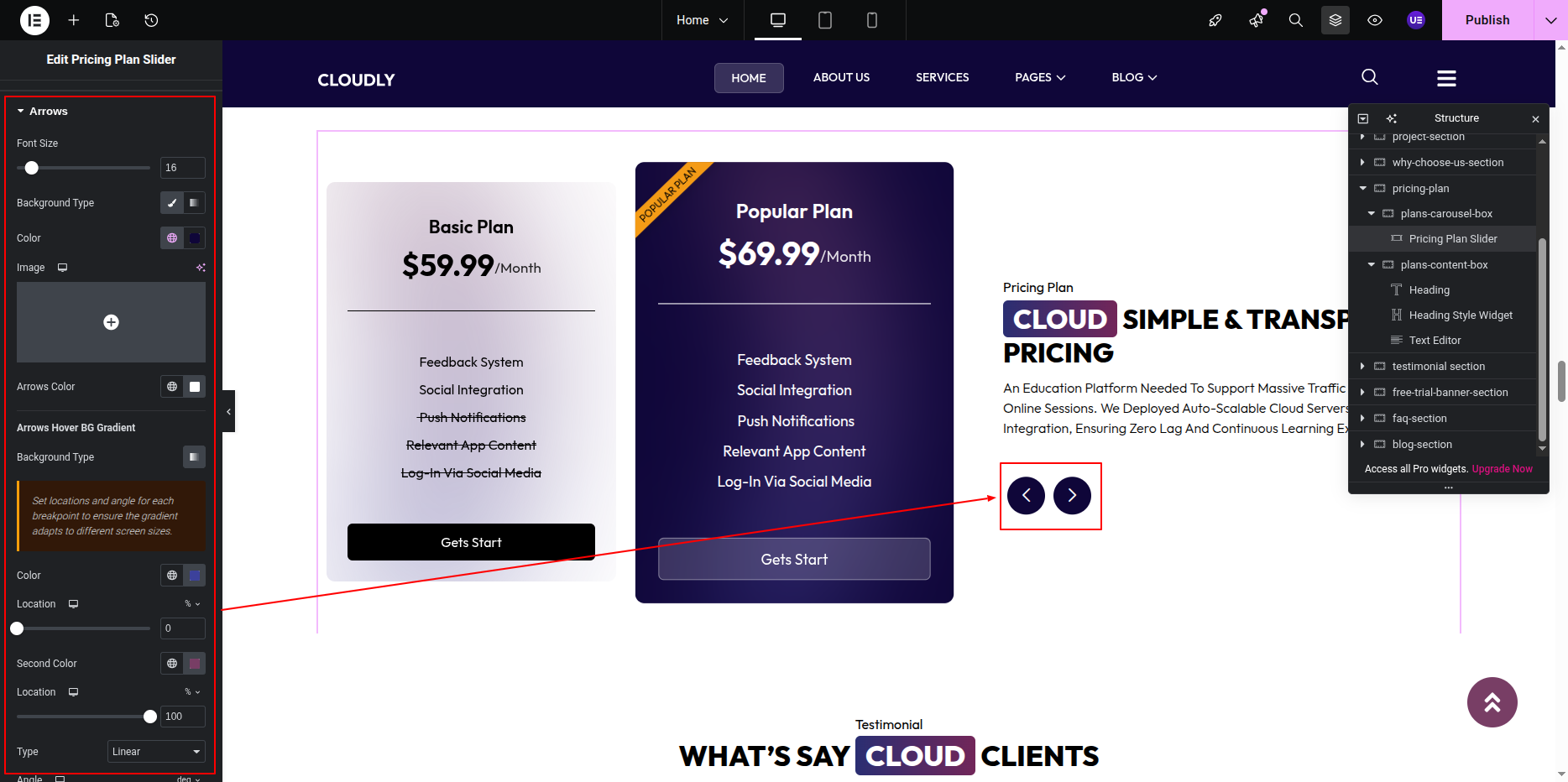
- Enable Navigation Arrows in the SVG Pricing Plan Widget settings.
- Position the arrows on the right column using widget or advanced positioning options.
- Style arrows (color, size, hover effects) to match the theme design.
Styling the Pricing Plans
- Customize plan card background colors or gradients.
- Adjust typography for price, title, and features.
- Highlight a Featured Plan if required.
- Apply hover animations for better interaction.
Responsive Settings
- Switch to Tablet and Mobile view.
- Adjust the number of plans visible per slide.
- Stack content vertically on smaller screens if needed.
Tip: Keep pricing details short and easy to compare for better user experience.
This is the final view of your section:
Testimonial Section
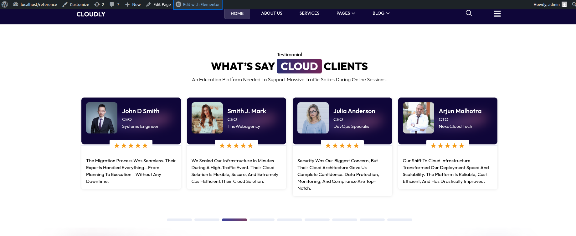
The Testimonial Section displays customer feedback in a slider format using the Testimonial Carousel Widget. This section includes a section title, main heading, short description text, and a testimonial post slider.
Adding Testimonial Section on Home Page
- Go to the Home Page.
- Click Edit with Elementor.
- Add a new Section where you want the Testimonial Section.
Adding Section Title, Heading & Text
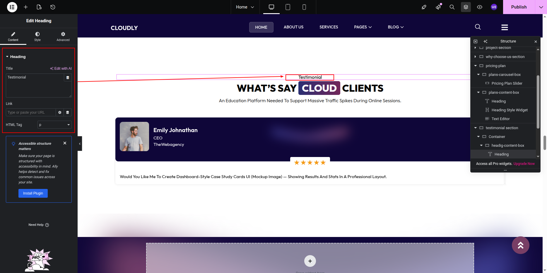
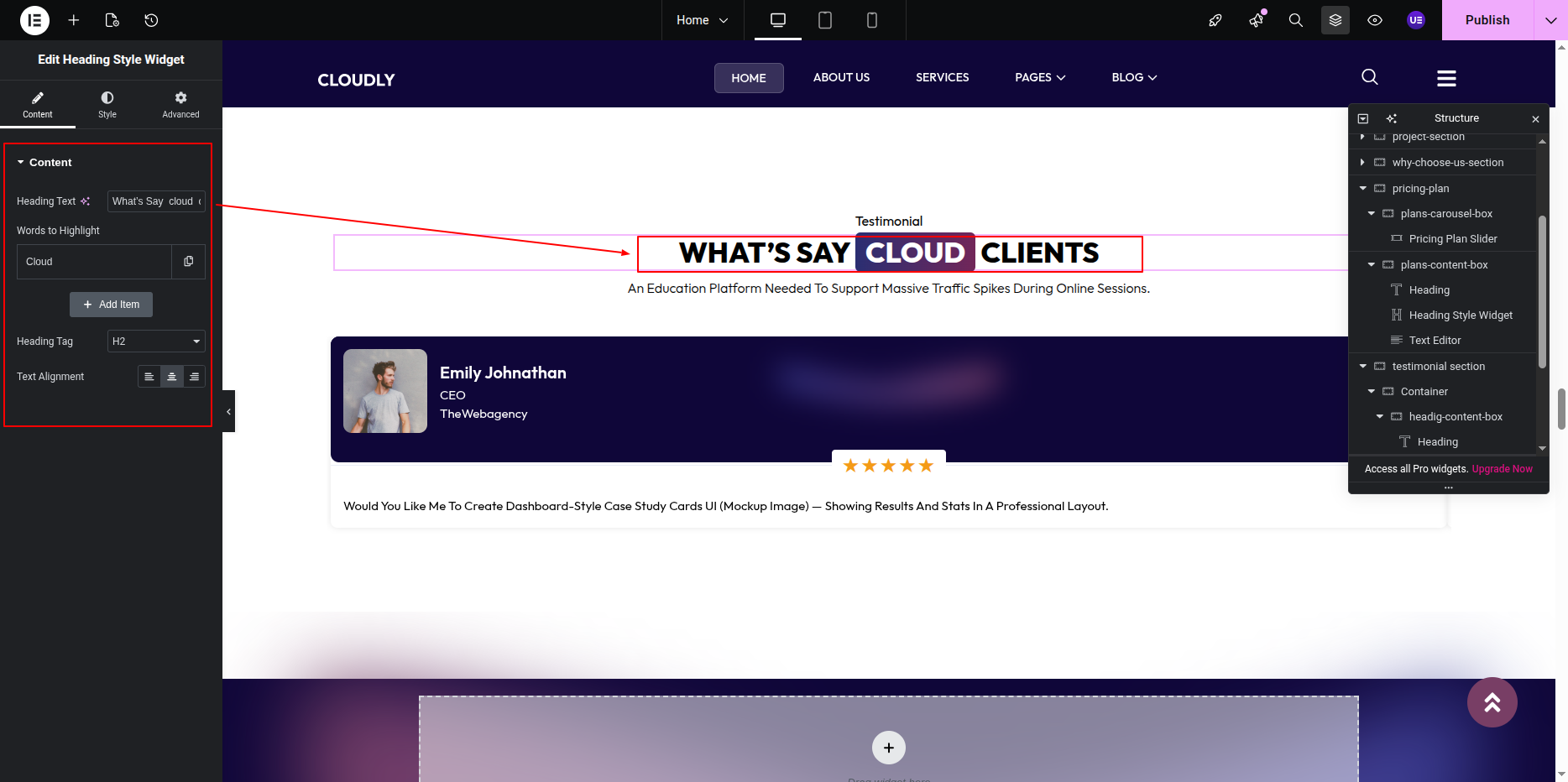
- Add a Heading Widget for the section title.
- Add another Heading Widget for the main heading.
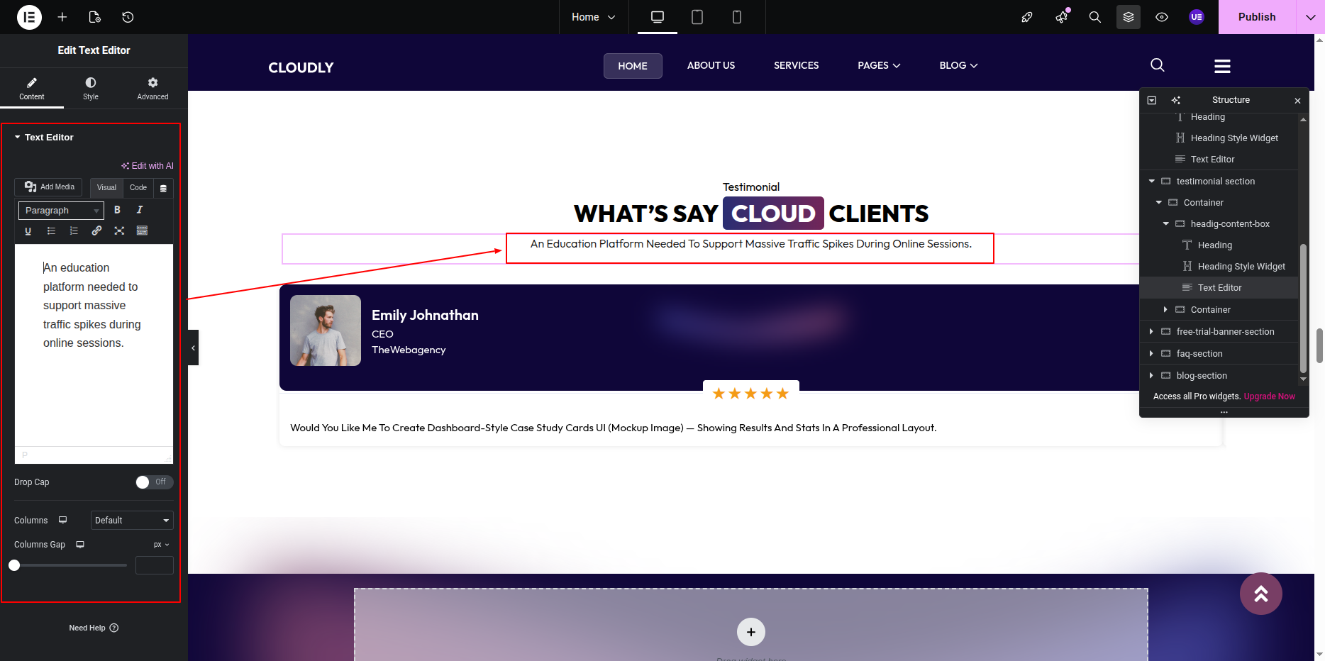
- Add a Text Editor Widget for the short description text.
Adding Testimonial Slider
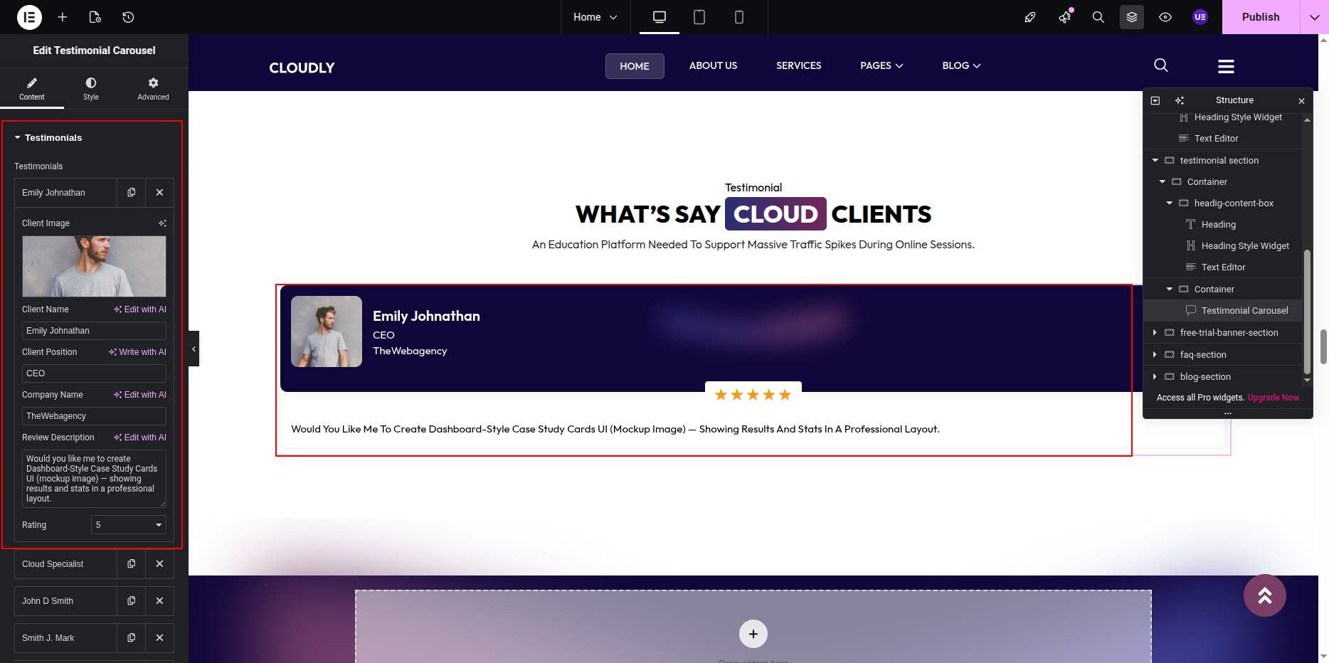
- Add the Testimonial Carousel Widget below the text.
- Configure testimonial content:
- Client Name
- Client Designation
- Client Image
- Testimonial Text
- Enable Slider settings such as:
- Autoplay
- Navigation Arrows
- Dots Pagination
Styling Testimonials
- Customize typography for testimonial text and client name.
- Adjust spacing between slides.
- Style navigation arrows and dots.
- Set background color or card shadow if needed.
Responsive Settings
- Switch to Tablet and Mobile view.
- Adjust the number of visible testimonials per slide.
- Ensure text readability on smaller screens.
Tip: Use genuine testimonials with client photos to increase trust and credibility.
This is the final view of your section:
Free Trial Banner Section
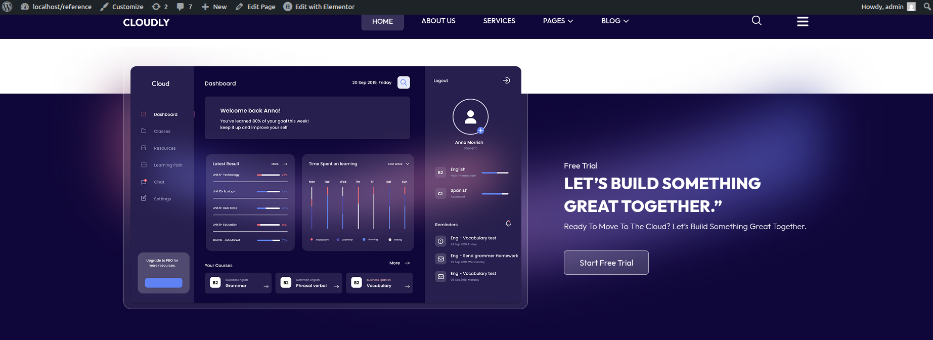
The Free Trial Banner Section is a call-to-action area designed to encourage users to start a free trial. This section features a linear gradient SVG path as the background, a left-side image, and right-side content including a section title, main heading, description text, and a call-to-action button.
Adding Free Trial Banner Section on Home Page
- Go to the Home Page.
- Click Edit with Elementor.
- Add a new Section where you want the Free Trial Banner Section.
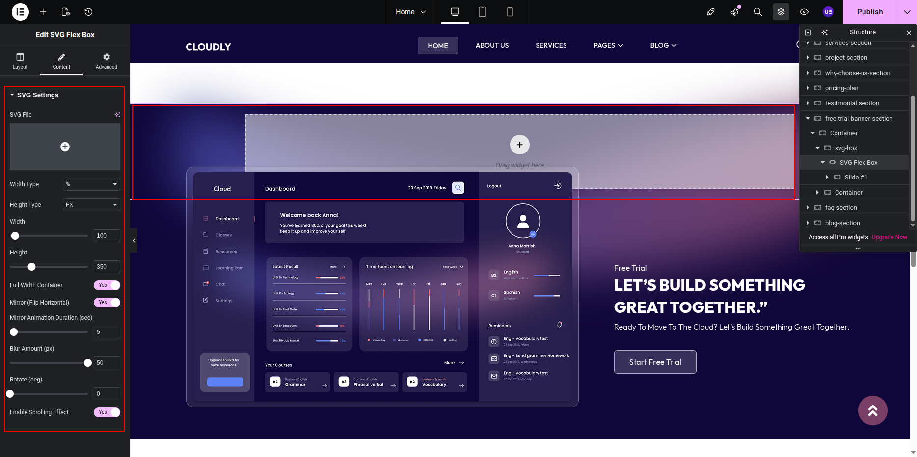
Adding Linear Gradient SVG Background
- Select the Section.
- Go to Style → Background.
- Add the SVG path with linear gradient as a background image.
- Adjust position, repeat, and size for best visual appearance.
Adding Left Side Image
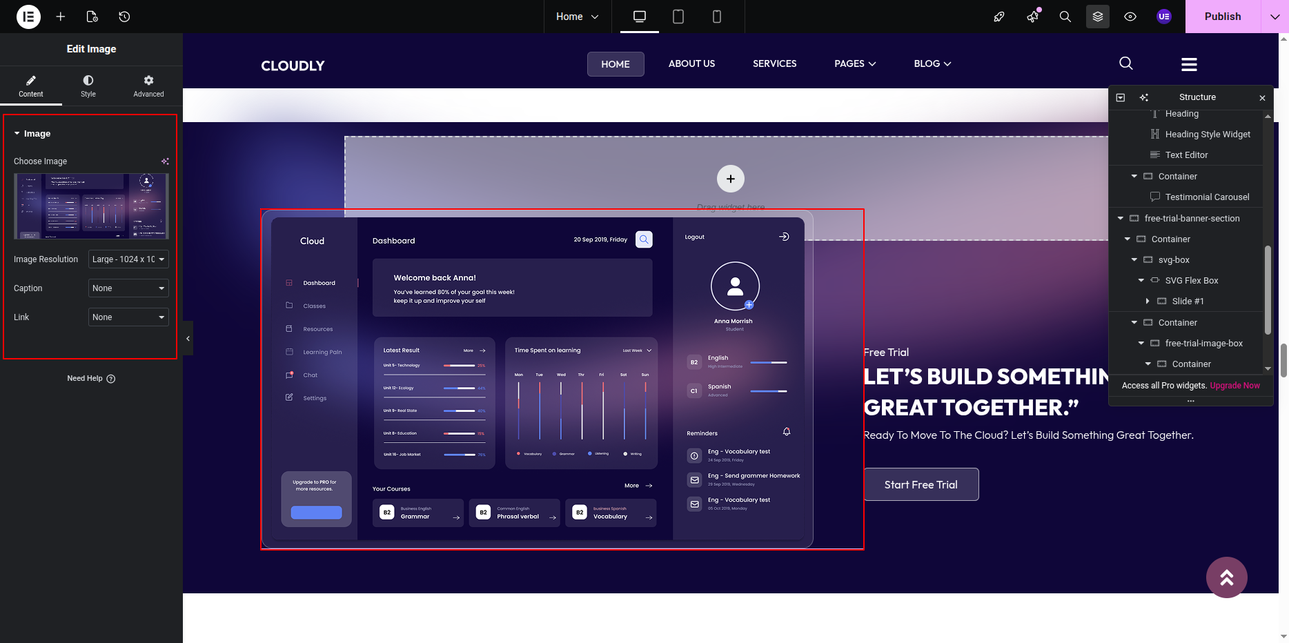
- In the left column, add an Image Widget.
- Upload or select the banner image.
- Adjust image alignment and size.
Adding Right Side Content
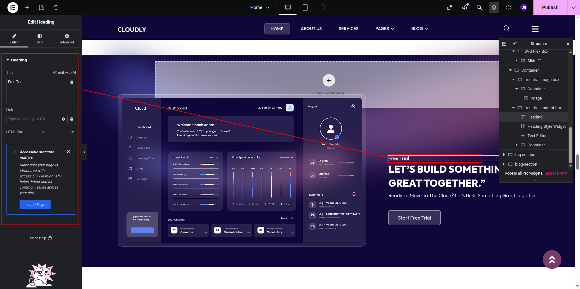
- Add a Heading Widget for the section title.
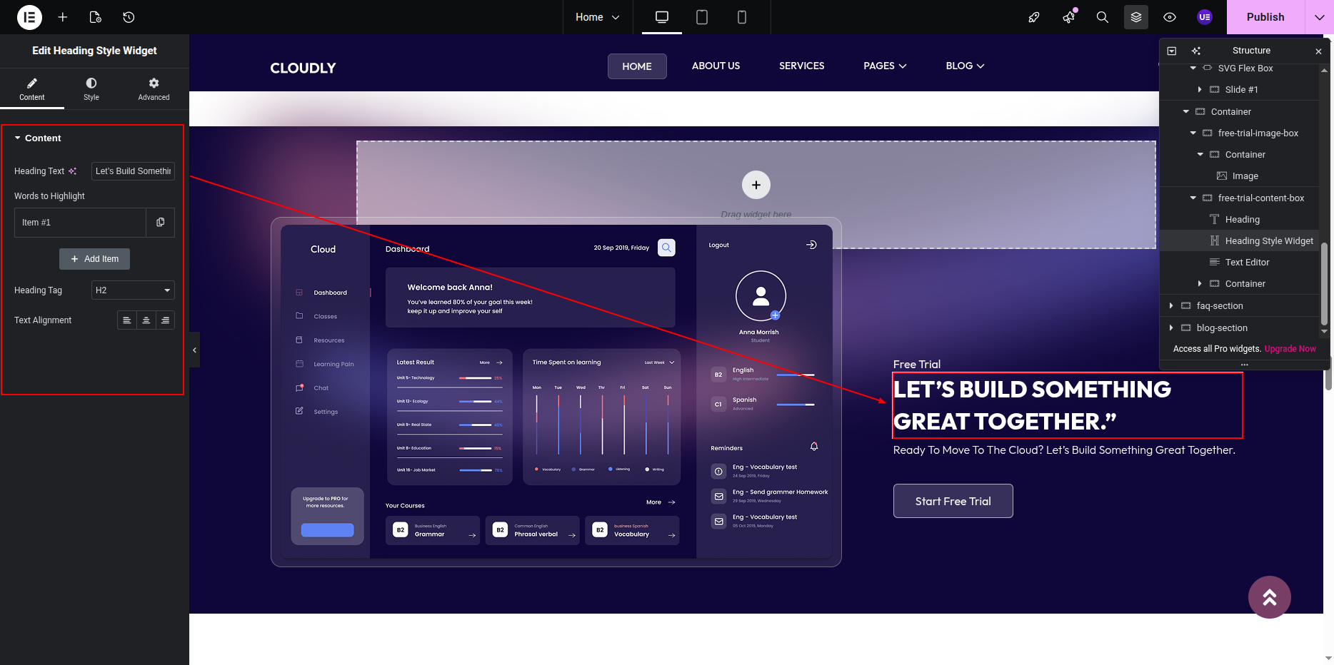
- Add another Heading Widget for the main heading.
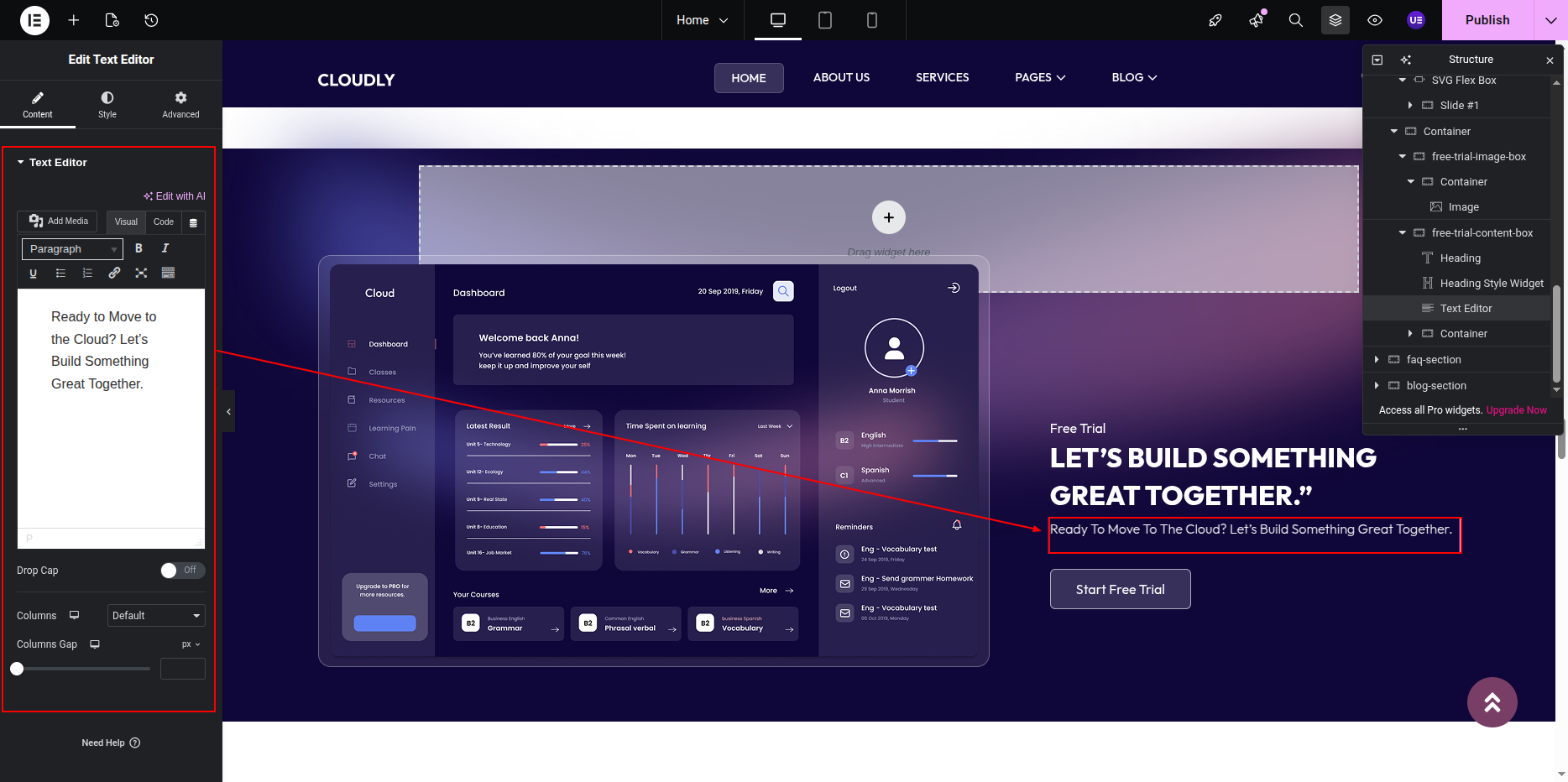
- Add a Text Editor Widget for the description text.
- Add a Button Widget for the call-to-action.
Editing the Button
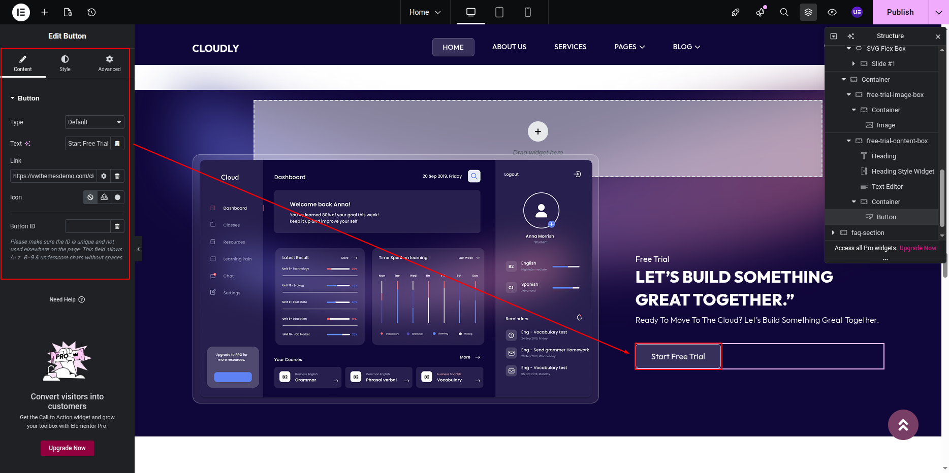
- Select the Button Widget.
- Update the button text (example below).
- Set the button link to the Free Trial or Signup page.
- Size: Medium
- Alignment: Left
Styling & Responsive Settings
- Adjust padding and spacing for better balance.
- Ensure text contrast against the gradient background.
- Switch to Tablet and Mobile view.
- Stack columns vertically on smaller screens if needed.
Tip: Use a strong contrast button color to make the call-to-action stand out.
This is the final view of your section:
FAQ Section
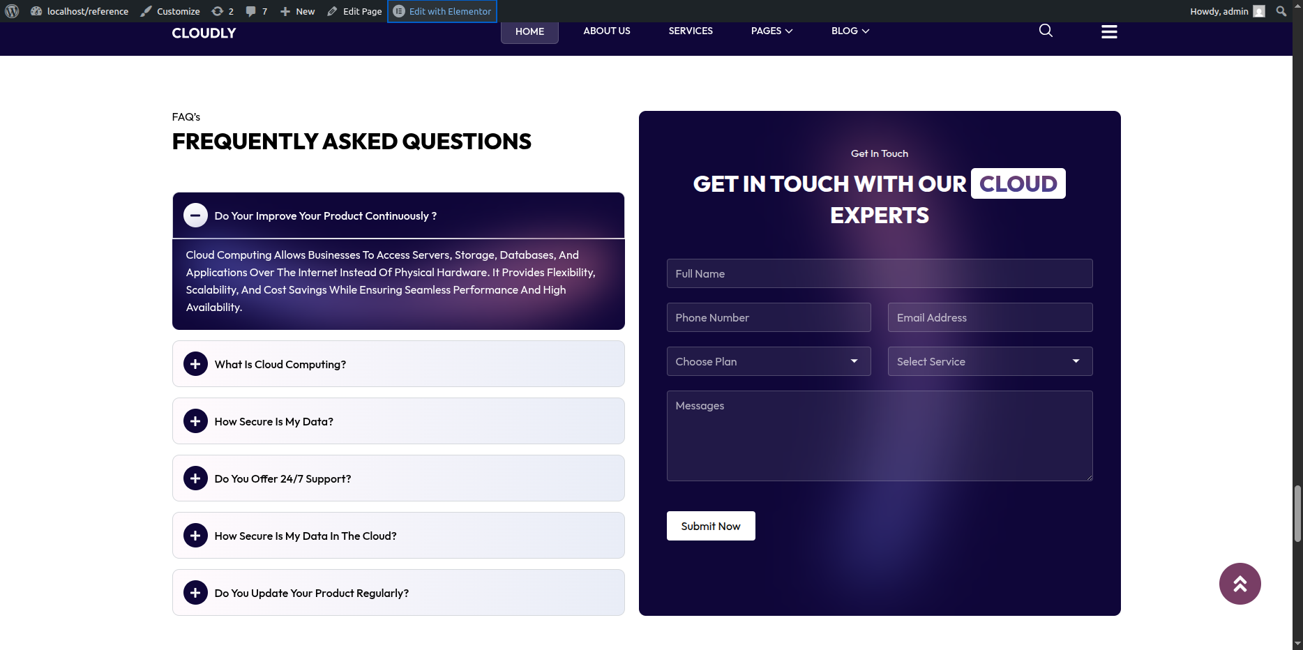
The FAQ Section helps users quickly find answers to common questions. This section features a left-side area with the section title and main heading, and an accordion on the right side containing FAQ titles and their corresponding content.
Adding FAQ Section on Home Page
- Go to the Home Page.
- Click Edit with Elementor.
- Add a new Section where you want the FAQ Section.
Adding Section Title & Heading (Left Side)
- In the left column, add a Heading Widget for the section title.
- Add another Heading Widget for the main heading.
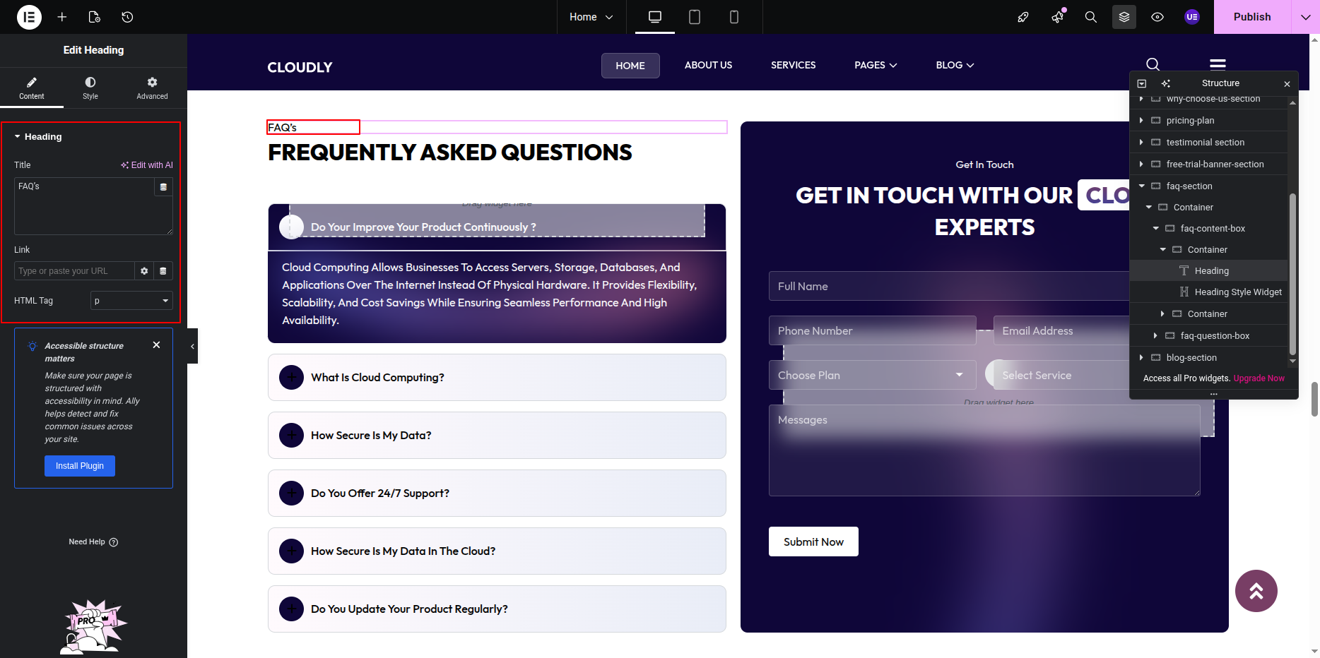
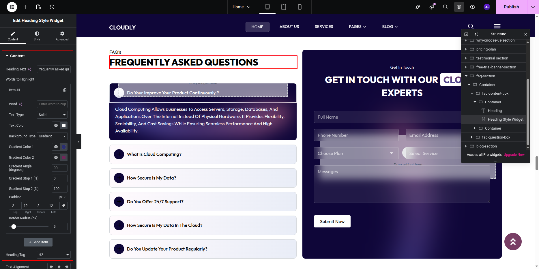
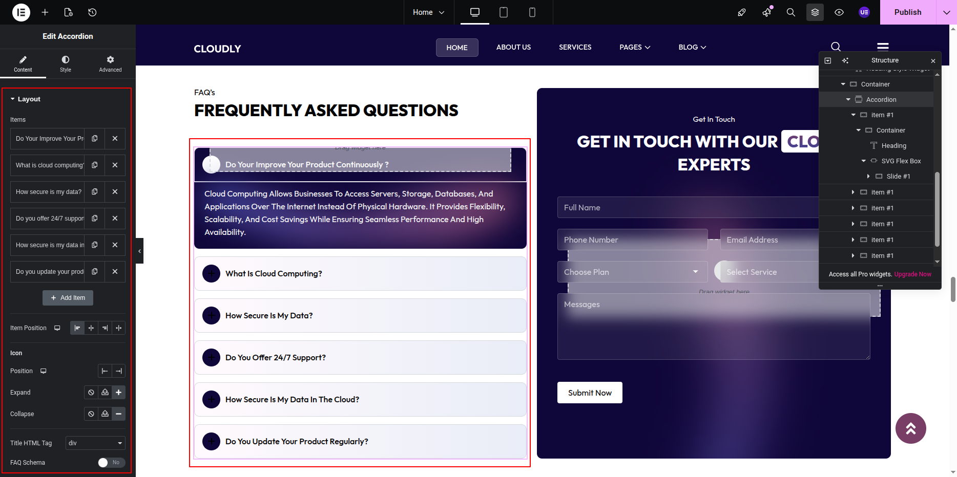
Adding FAQ Accordion (Right Side)
- In the right column, add an Accordion Widget.
- Add FAQ items:
- Title: Question
- Content: Answer text
- Repeat for all FAQ entries.
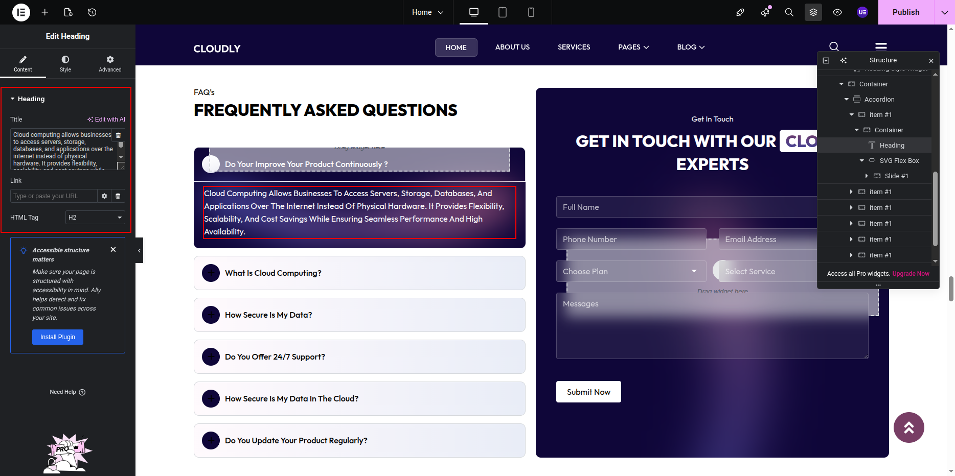
Styling the Accordion
- Customize typography for FAQ titles and content.
- Adjust spacing between accordion items.
- Style icons (plus/minus) and active states.
- Set background color or border for accordion items.
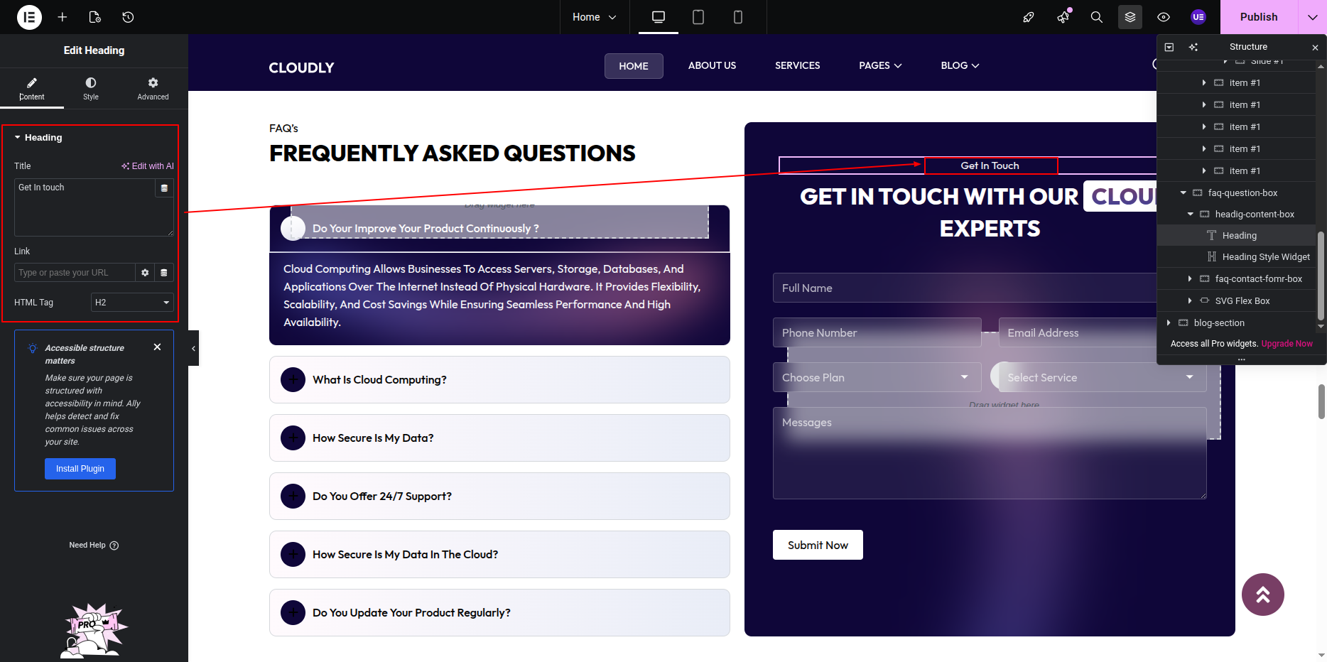
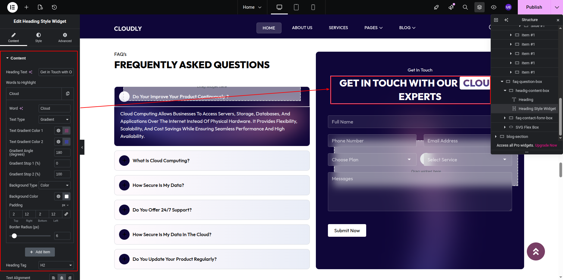
Adding Get in Touch Content (Right Side)
- Add a Heading Widget for the form section title.
- Add another Heading Widget for the main form heading.
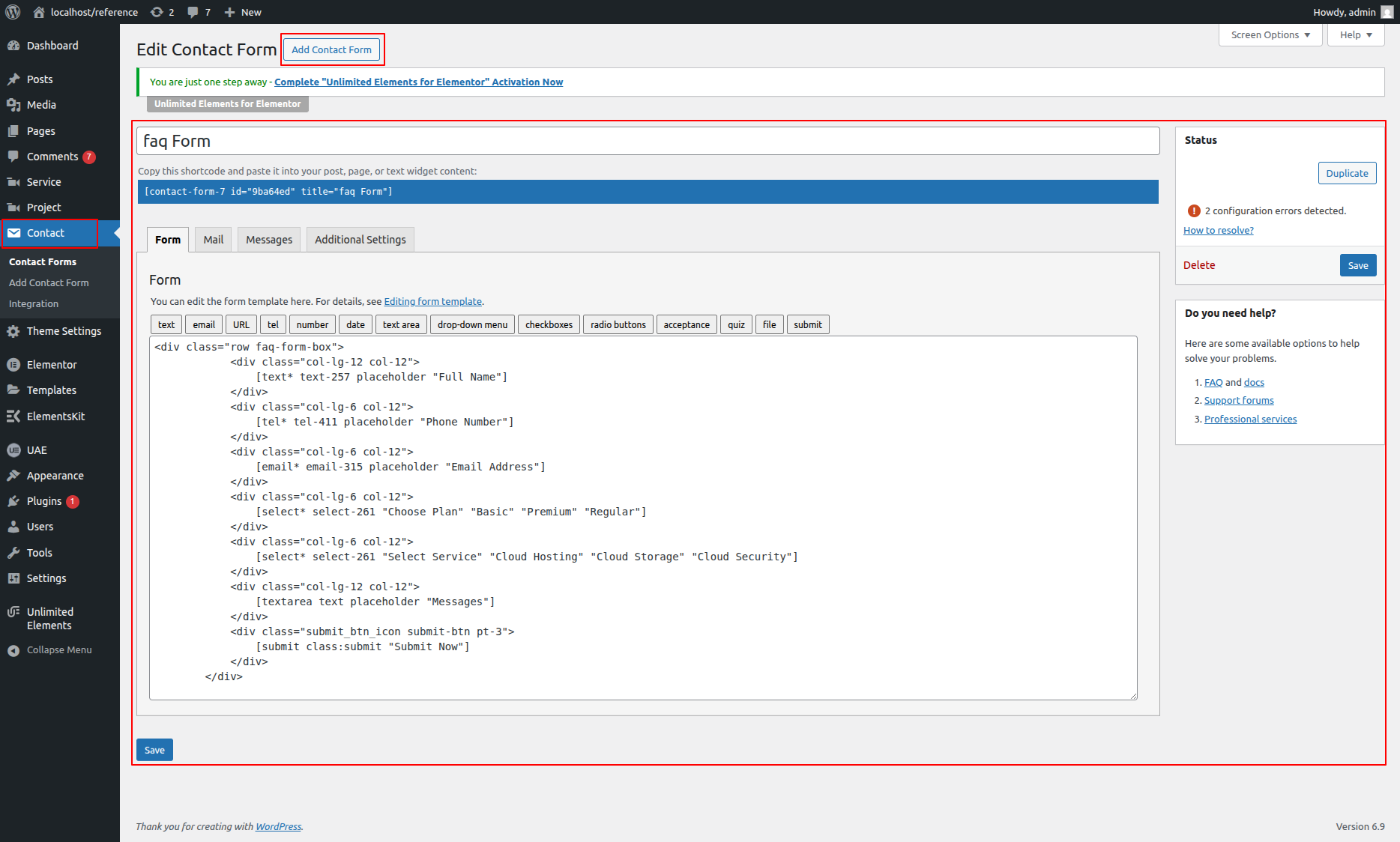
Creating Contact Form Using CF7
- Go to WordPress Dashboard → Contact → Add New.
- Create your contact form fields (Name, Email, Message, etc.).
- Save the form and copy the shortcode.
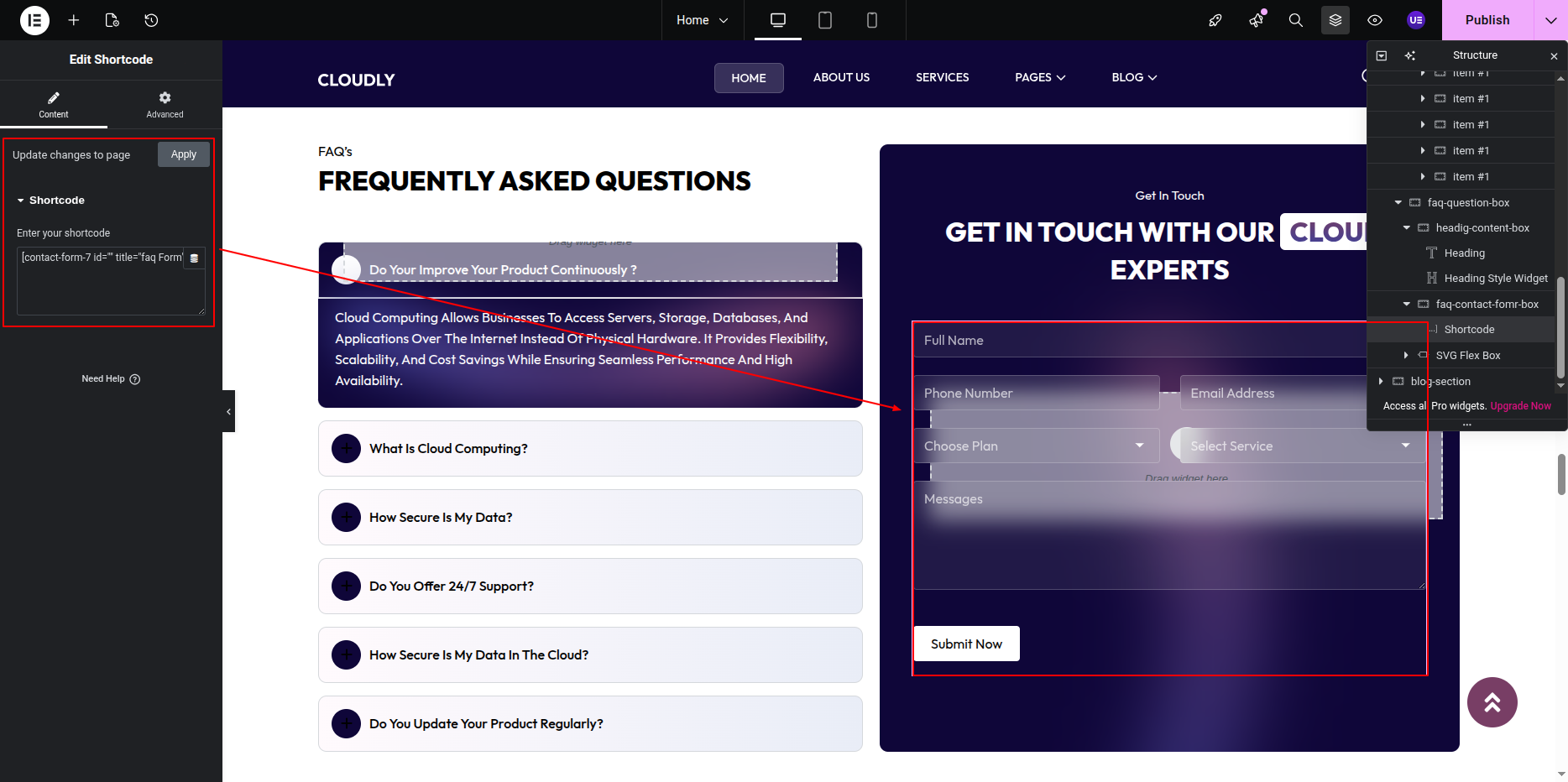
Adding Contact Form in Elementor
- In the right column, add a Shortcode Widget.
- Paste the Contact Form 7 shortcode.
- Update the page to display the form.
Styling the Contact Form
- Style form fields using theme or custom CSS.
- Adjust spacing between input fields.
- Ensure submit button matches the site design.
Responsive Settings
- Switch to Tablet and Mobile view.
- Stack columns vertically for smaller screens.
- Ensure form fields are easy to tap on mobile.
Tip: Keep the form simple to improve user engagement and reduce friction.
Tip: Keep FAQ answers concise and easy to scan for better user experience.
This is the final view of your section:
Blog Section
The Blog Section showcases your latest blog posts in a carousel layout using the Post Query Widget. This section includes a section title, main heading, short description text, and a blog carousel.
Adding Blog Section on Home Page
- Go to the Home Page.
- Click Edit with Elementor.
- Add a new Section where you want the Blog Section.
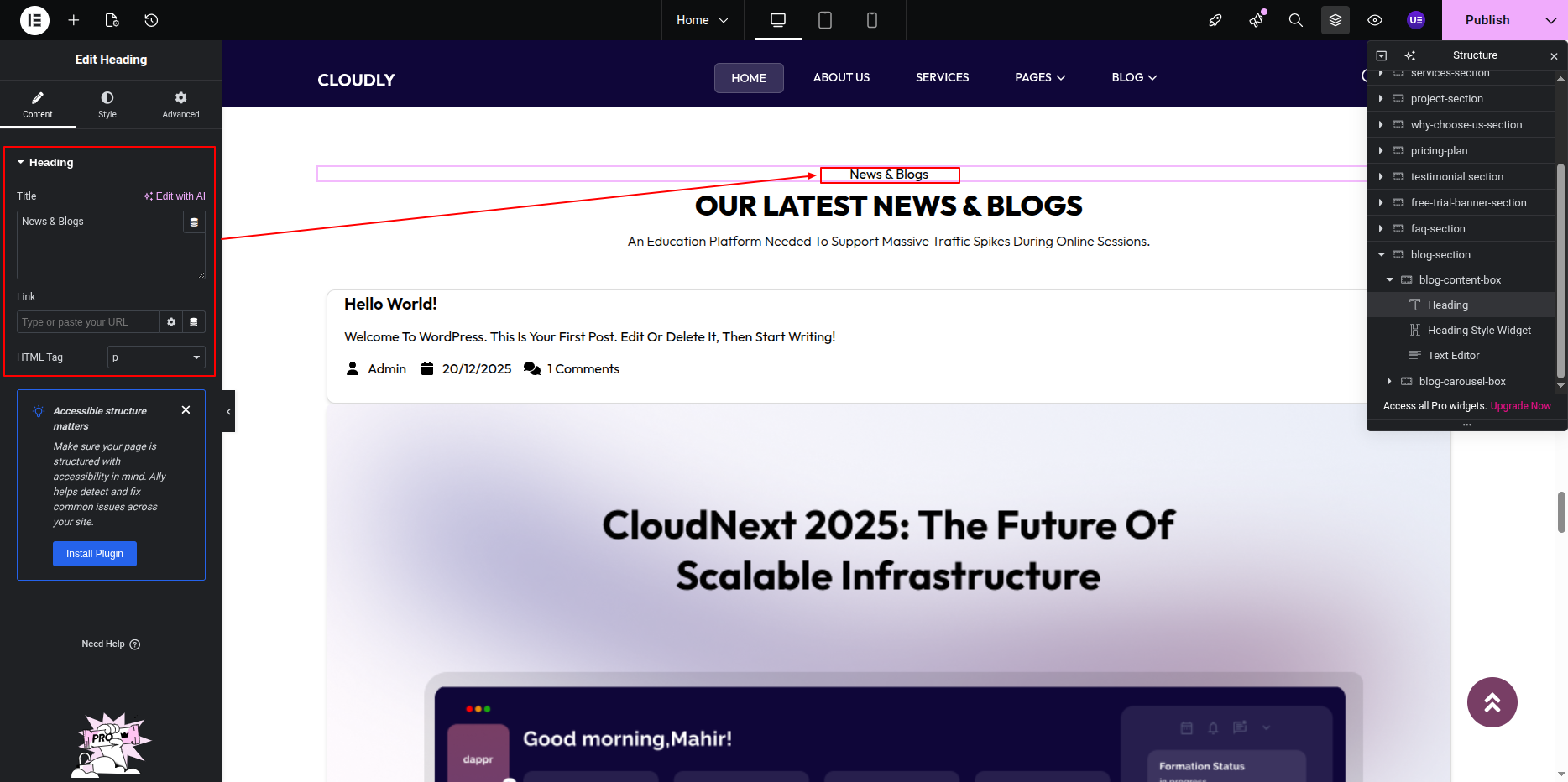
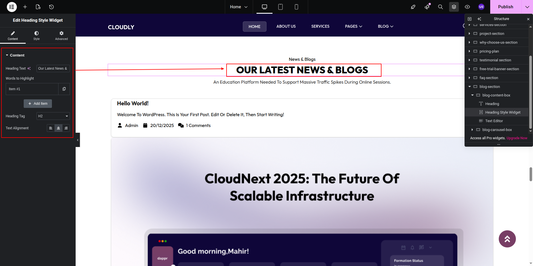
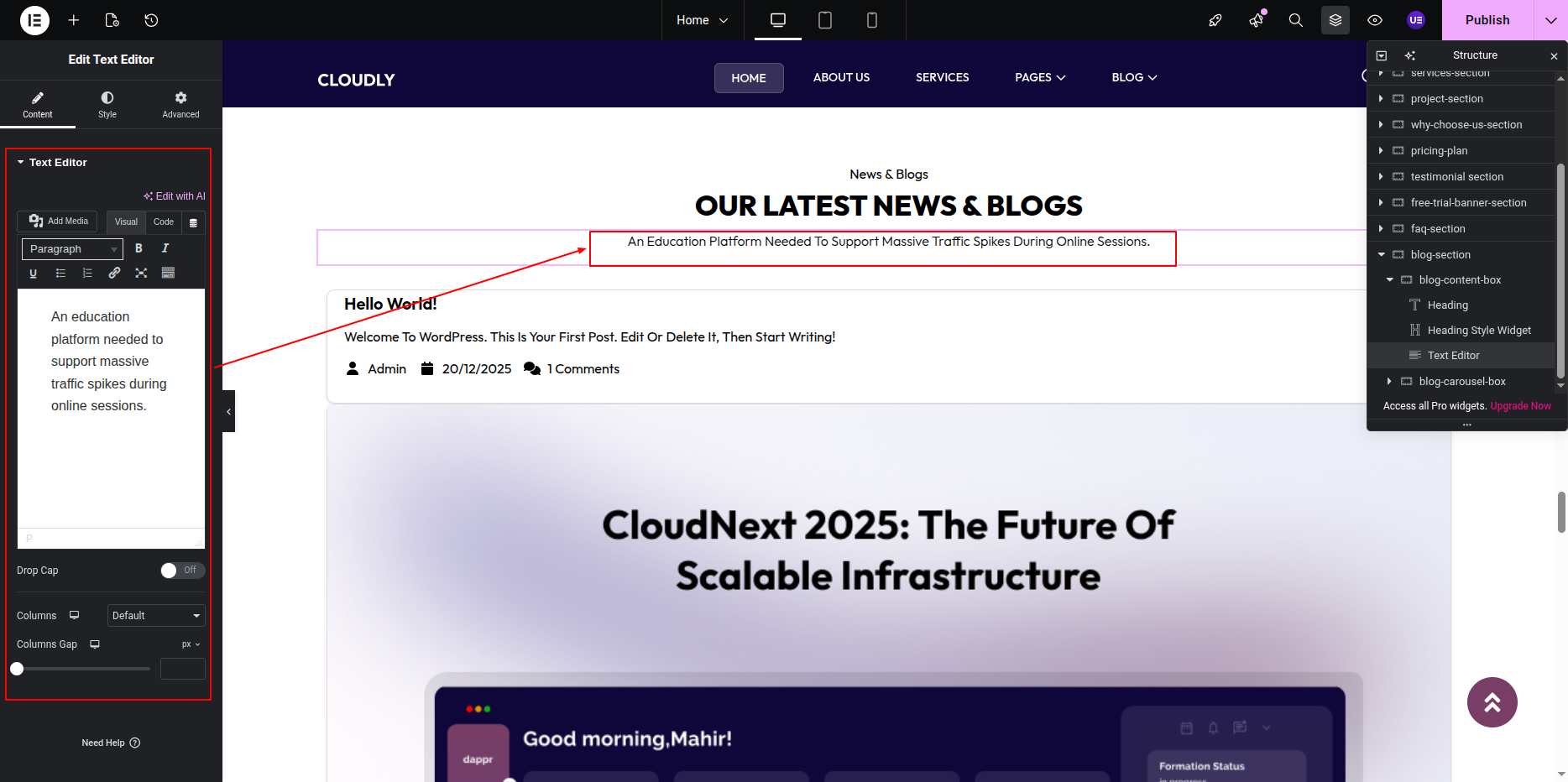
Adding Section Title, Heading & Text
- Add a Heading Widget for the section title.
- Add another Heading Widget for the main heading.
- Add a Text Editor Widget for the short description text.
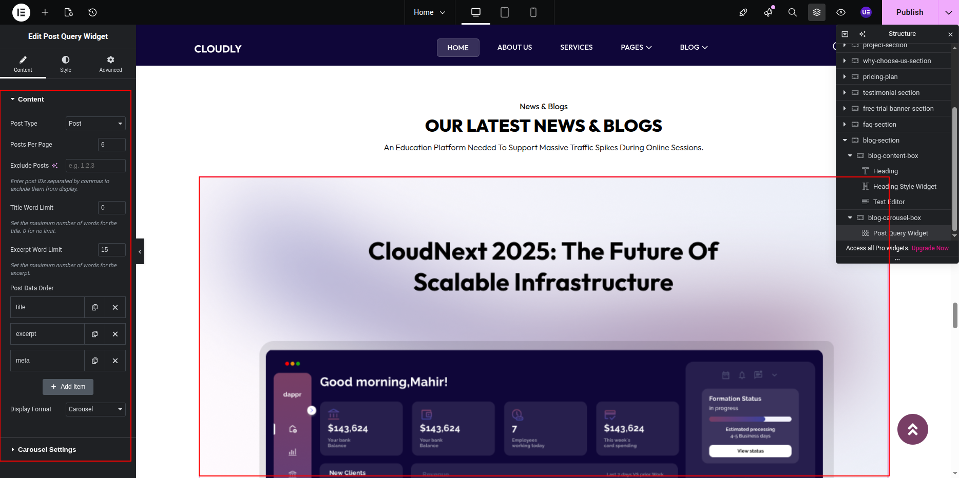
Adding Blog Carousel Using Post Query Widget
- Add the Post Query Widget below the section text.
- Under Query settings:
- Source: Posts
- Posts Per Page: As required
- Order: Latest Posts
- Enable Carousel or Slider layout.
- Configure carousel options such as:
- Slides to Show
- Autoplay
- Navigation Arrows
- Dots Pagination
Styling Blog Posts
- Customize typography for post titles and meta information.
- Adjust spacing between blog cards.
- Style navigation arrows and pagination dots.
- Ensure featured images have consistent dimensions.
Responsive Settings
- Switch to Tablet and Mobile view.
- Adjust the number of visible posts per slide.
- Ensure text readability on smaller screens.
Tip: Display recent or featured posts to keep the blog section fresh and engaging.
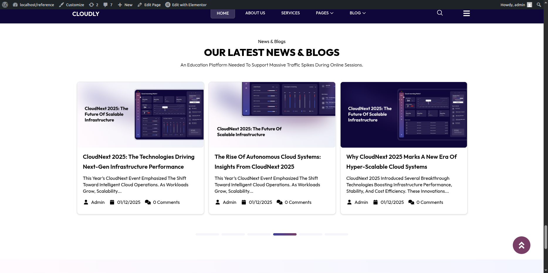
This is the final view of your section:
About – Our Vision and Mission Section
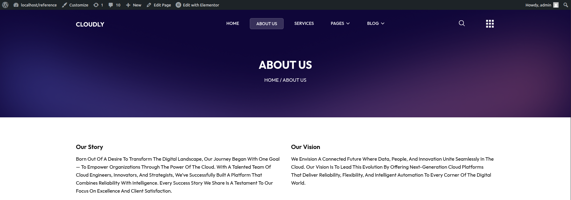
This section displays the company’s vision and mission statements with headings and descriptive paragraphs. You can easily edit the text content using Elementor.
- Editing the Section:
- Go to your WordPress Dashboard and navigate to Pages → About.
- Click on Edit with Elementor to open the page in the Elementor editor.
- Editing the Mission Content:
- Locate the Our Mission section below the vision block.
- Click on the Heading Widget showing “Our Mission.”
- Update the title text under the Content tab.
- Click on the Text Editor Widget under it to modify the mission description.
- Edit or format the text as per your content requirements.
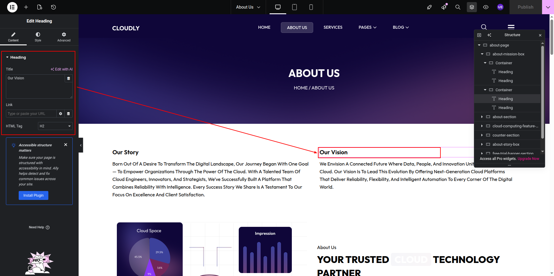
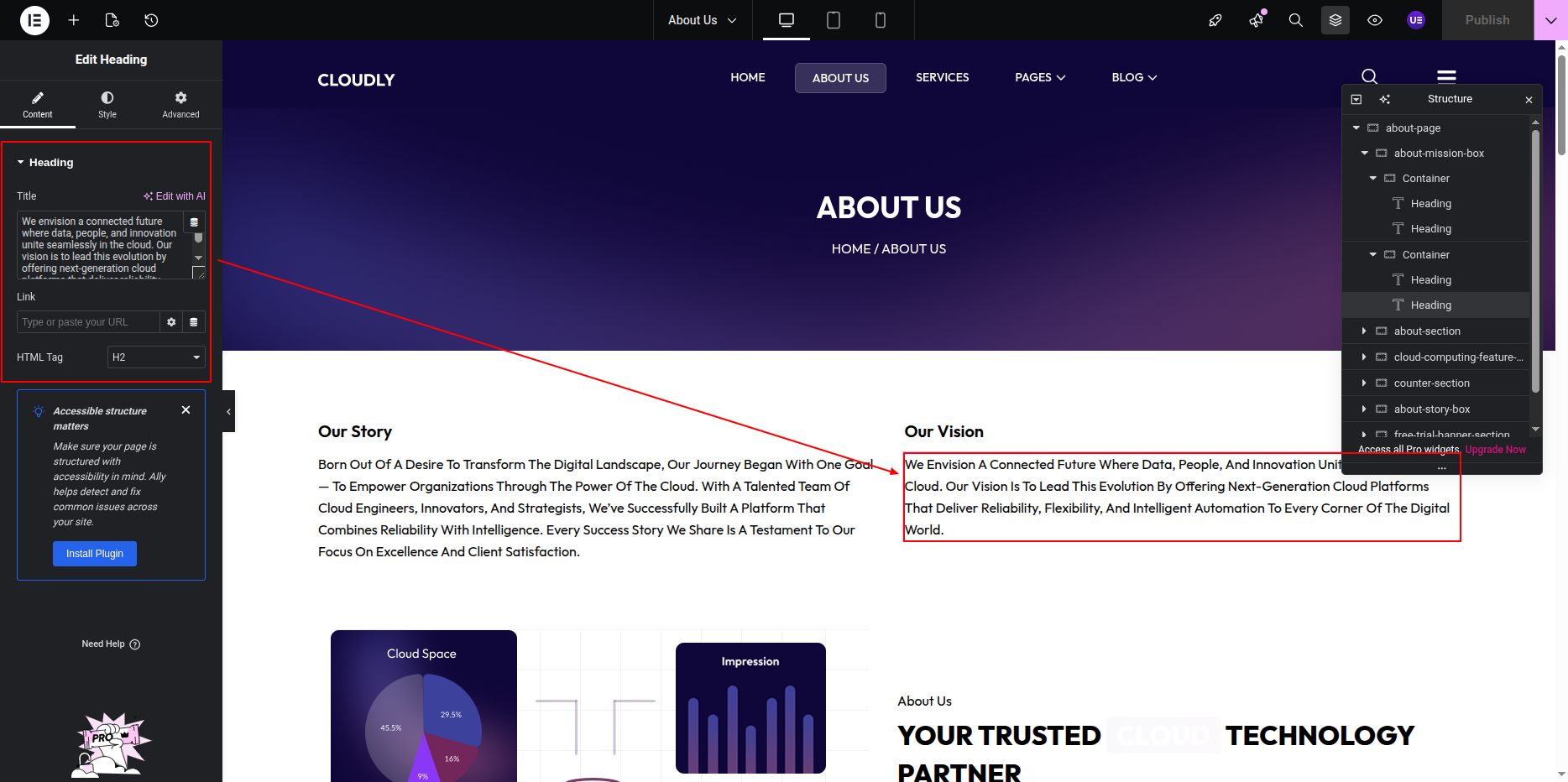
- Editing the Vision Content:
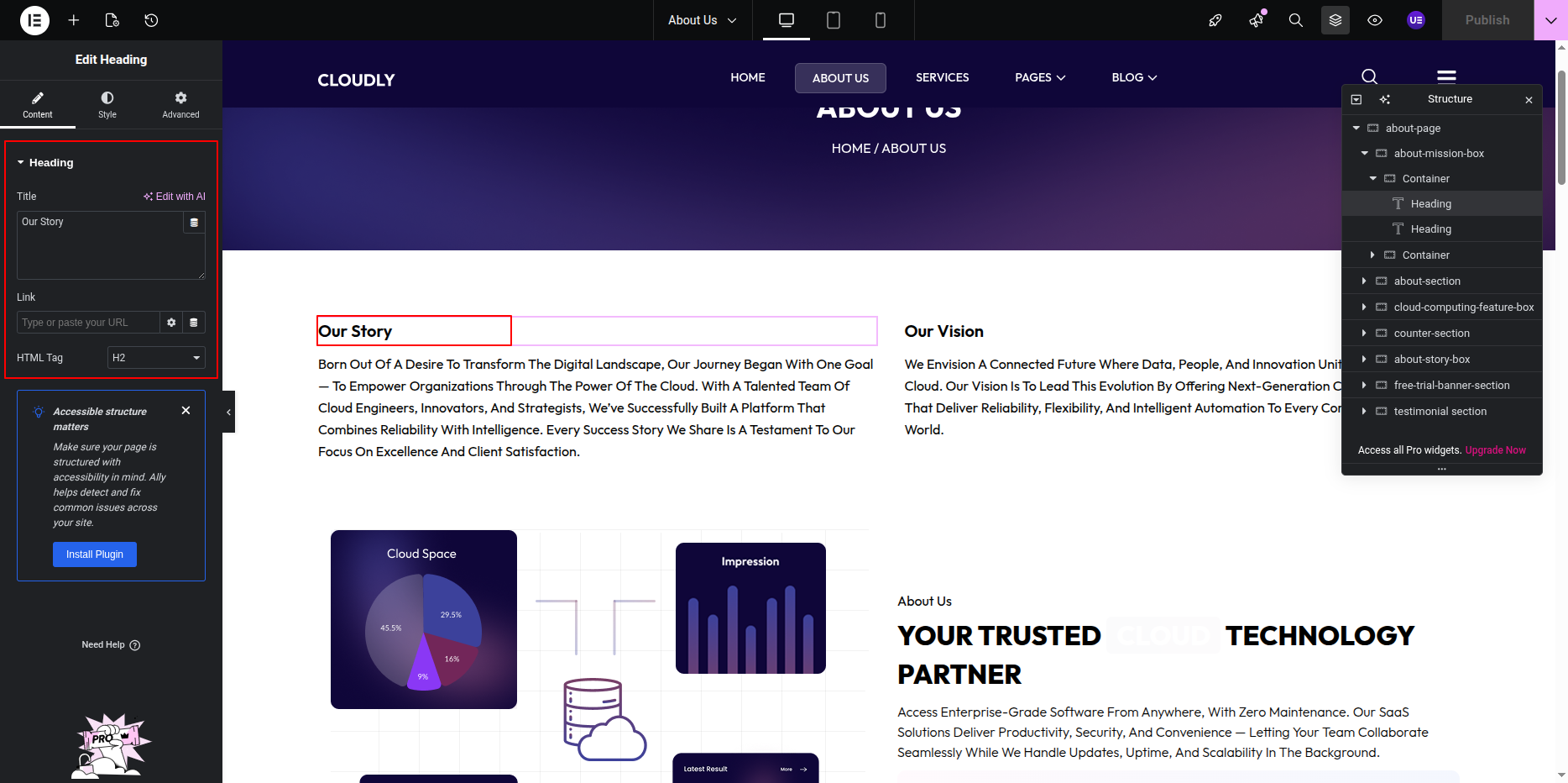
- Scroll down to find the Our Vision section.
- Click on the Heading Widget that displays the title “Our Vision.”
- In the left panel under the Content tab, update the text as per your requirement.
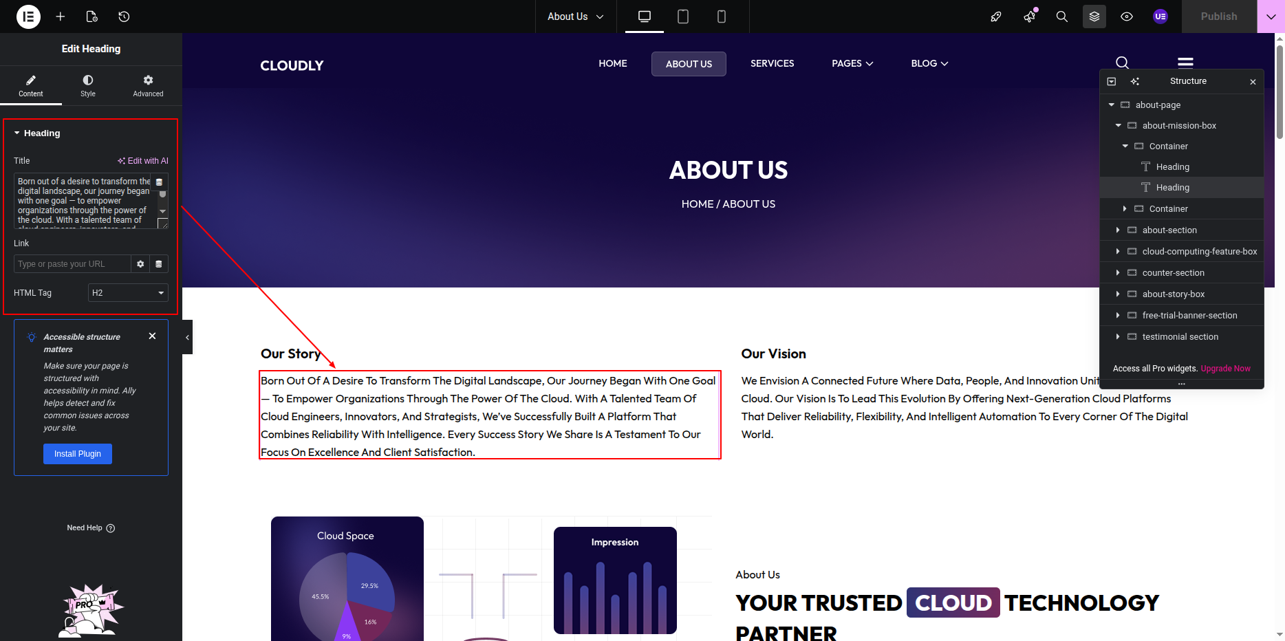
- Next, click on the Text Editor Widget below the heading to edit the vision paragraph text.
- Use the formatting options (bold, italic, lists) as needed to enhance readability.
- Styling Options:
- Click on the Style tab for each widget (Heading or Text Editor).
- Adjust typography, text color, and alignment to match your site’s theme.
- Optionally, add spacing or background color using the Advanced tab for better section layout.
- Saving Changes:
- After completing the edits, click the Update button at the bottom to save your changes.
- Preview the page to ensure the Vision and Mission content appears correctly.
Note: You can duplicate or reorder the Vision and Mission sections if needed by right-clicking on the section handle and selecting Duplicate or Move Up/Down.
The About Section highlights key information about your company, including counters, icons, text, and an introductory video. You can easily edit this section using Elementor.
Follow the steps below to customize the About Section:
About Section
The About Section is used to introduce your company, product, or services. This section combines text content and imagery to explain who you are, what you do, and why users should choose you.
The section typically includes a small title, a main heading, a description, optional extended content, a call-to-action button, and an image.
To edit this section, follow the steps below:
Editing About Section Layout
- Select the main Section widget.
- Inside the section, select the Inner Section.
- Ensure the layout is set to 2 Columns.
-
Column structure:
- Left Column: Image
- Right Column: Text content
Editing About Section Content
The About Section is built using the following Elementor widgets:
- Heading Widget – Small title and main heading
- Text Editor Widget – Description and extended text
- Button Widget – Call-to-action button
- Image Widget – About image
Editing the Section Title
- Select the first Heading Widget.
- Enter the section title text (example below).
- Set the HTML Tag to H6 (recommended).
Editing the Main Heading
- Select the second Heading Widget.
- Update the main heading text.
- Set the HTML Tag to H2.
Editing Description Text
- Select the Text Editor Widget below the heading.
- Update the short description text.
Adding Extended / More Content
- Add or select another Text Editor Widget below the description.
- Use this widget for additional details or “read more” content.
Editing the Button
- Select the Button Widget.
- Update the button text (example below).
- Set the button link to the About or Services page.
- Size: Medium
- Alignment: Left
Editing the About Image
- Select the Image Widget in the right column.
- Upload or choose an image from the Media Library.
- Recommended image size: 600 × 500 px.
- Set Image Size to Full or Large.
Tip: Use a professional image that visually represents your brand or services.
This is the final view of your section:
Features Section
The Features Section is used to showcase the main highlights of your website using a visually appealing linear gradient background and three feature cards. Each feature card includes an image, a title, and a short description.
To edit this section, follow the steps below:
Editing the Gradient Background
- Select the main Section widget.
- Go to the Style tab.
- Open the Background option.
- Choose Gradient as the background type.
- Adjust the following settings as needed:
- Color 1 – First gradient color
- Color 2 – Second gradient color
- Gradient Type – Linear
- Angle – Adjust to control gradient direction
Editing Feature Cards Layout
- Inside the main section, select the Inner Section widget.
- Ensure the layout is set to 3 Columns.
- Each column represents one Feature Card.
Editing Feature Card Content
Each feature card is built using the following Elementor widgets:
To edit a feature card:
- Click on the Image Widget to replace or edit the feature image.
- Click on the Heading Widget to update the feature title text.
- Click on the Text Editor Widget to update the feature description.
Tip: Keep feature titles short and descriptions concise. Always maintain sufficient contrast between text and the gradient background for better readability.
- Click on the Image Widget inside a feature card.
- Upload or select an SVG file from the Media Library.
- Set the Alignment to Center.
- Adjust the Width under the Style tab if needed.
Note: SVG images are fully supported and scale cleanly on all screen sizes.
This is the final view of your section:
Counter Section
The Counter Section is used to display important statistics such as completed projects, happy clients, years of experience, or awards. This section uses a solid or gradient background color and includes SVG icons, animated counting numbers, a title, and a tagline for each counter.
To edit this section, follow the steps below:
Editing the Counter Section Background
- Select the main Section widget.
- Go to the Style tab.
- Open the Background option.
- Choose a Classic Color or Gradient background.
- Adjust padding under Advanced → Padding if needed.
Editing Counter Layout
Each counter item is built using the following Elementor widgets:
- Image Widget – Used for SVG icon
- Counter Widget – Used for animated numbers
- Heading Widget – Used for counter title
- Text Editor Widget – Used for tagline
Adding SVG Icon to Counter
- Select the Image Widget inside a counter column.
- Upload or choose an SVG file from the Media Library.
- Set the Alignment to Center.
- Adjust the Width under the Style tab if needed.
Note: SVG icons are scalable and remain sharp on all screen sizes.
Editing the Counter Number
- Select the Counter Widget.
- Set the following options under the Content tab:
- Starting Number – Example: 0
- Ending Number – Example: 250
- Number Prefix – Optional (e.g. +)
- Number Suffix – Optional (e.g. %)
- Animation Duration – Example: 1500
Editing Counter Title
- Select the Heading Widget below the counter number.
- Enter the counter title text.
- Set the HTML Tag to H4 (recommended).
Editing Counter Tagline
- Select the Text Editor Widget below the title.
- Enter a short tagline or description.
Tip: Use light-colored text on dark backgrounds for improved readability.
This is the final view of your section:
Our Story Section
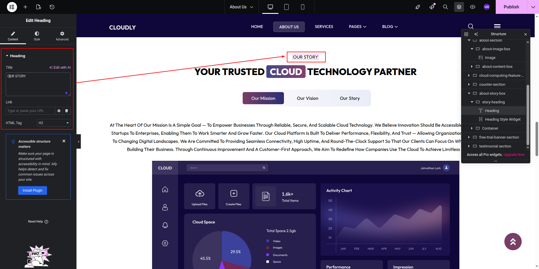
The Our Story Section presents your brand journey and values in a structured tab layout. This section includes a section title, main heading, and tabbed content displaying Our Mission, Our Vision, and Our Story, each with descriptive content and an image.
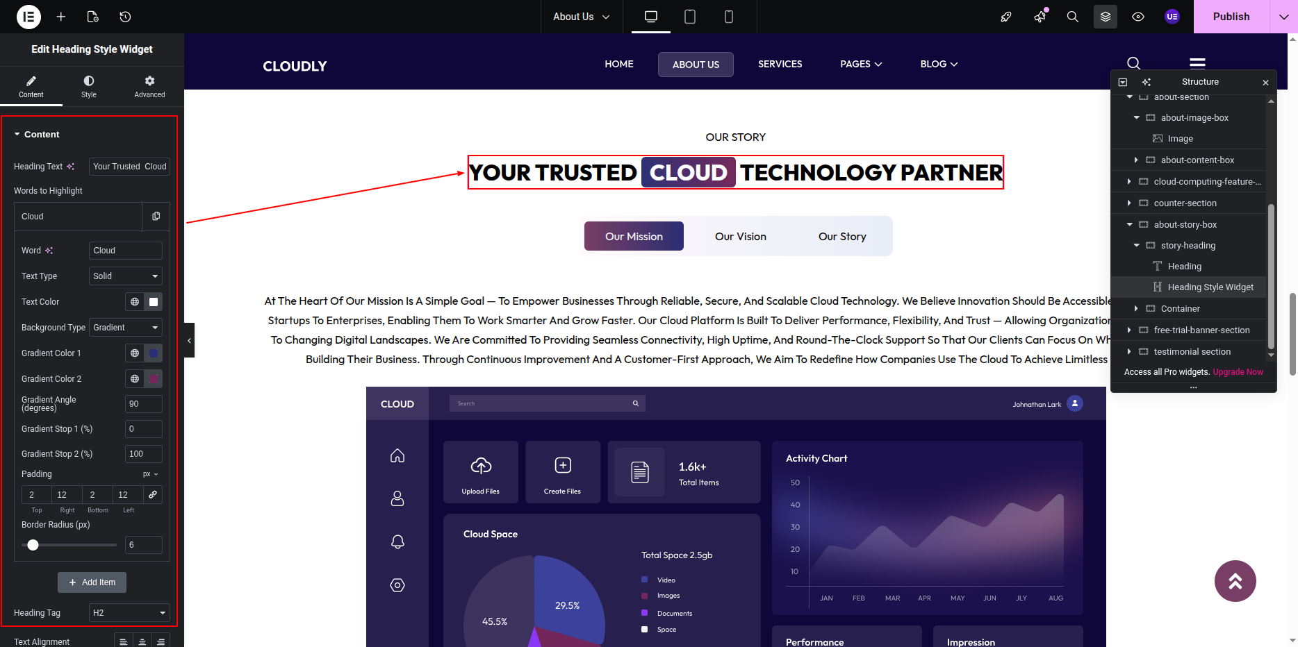
Adding Section Title & Heading
- Add a Heading Widget for the section title.
- Add another Heading Widget for the main heading.
Adding Tabs Widget
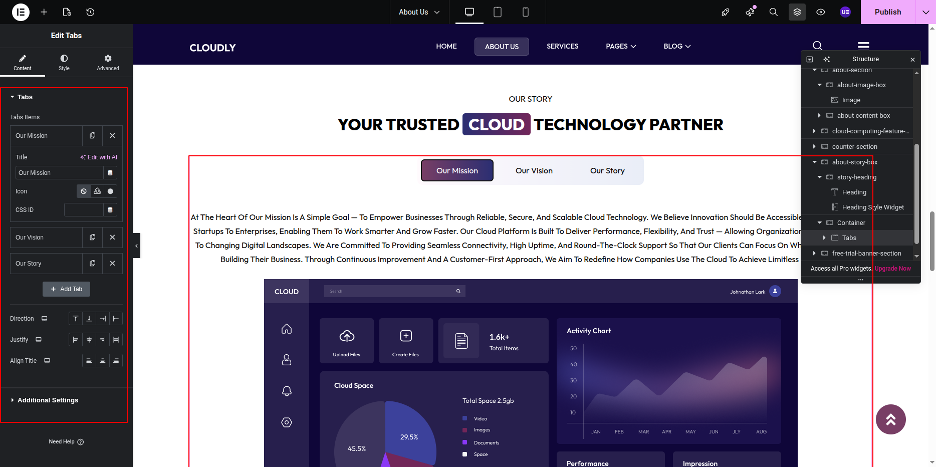
- Add the Tabs Widget below the section heading.
- Create three tabs with the following titles:
- Our Mission
- Our Vision
- Our Story
Adding Tab Content (Text & Image)
Each tab contains descriptive text and an image.
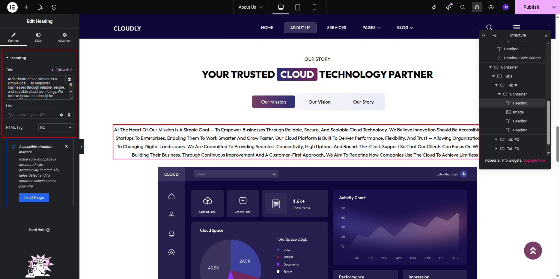
- Select a tab (Mission / Vision / Story).
- Add content using:
- Text Editor Widget – Tab description
- Image Widget – Tab image
- Repeat for all three tabs.
Styling the Tabs
- Customize tab title typography and colors.
- Style active and hover tab states.
- Adjust spacing between tabs and content.
- Ensure image sizes remain consistent across tabs.
Responsive Settings
- Switch to Tablet and Mobile view.
- Adjust tab alignment for smaller screens.
- Ensure text and images scale properly.
Tip: Keep content concise and images relevant to clearly communicate your brand values.
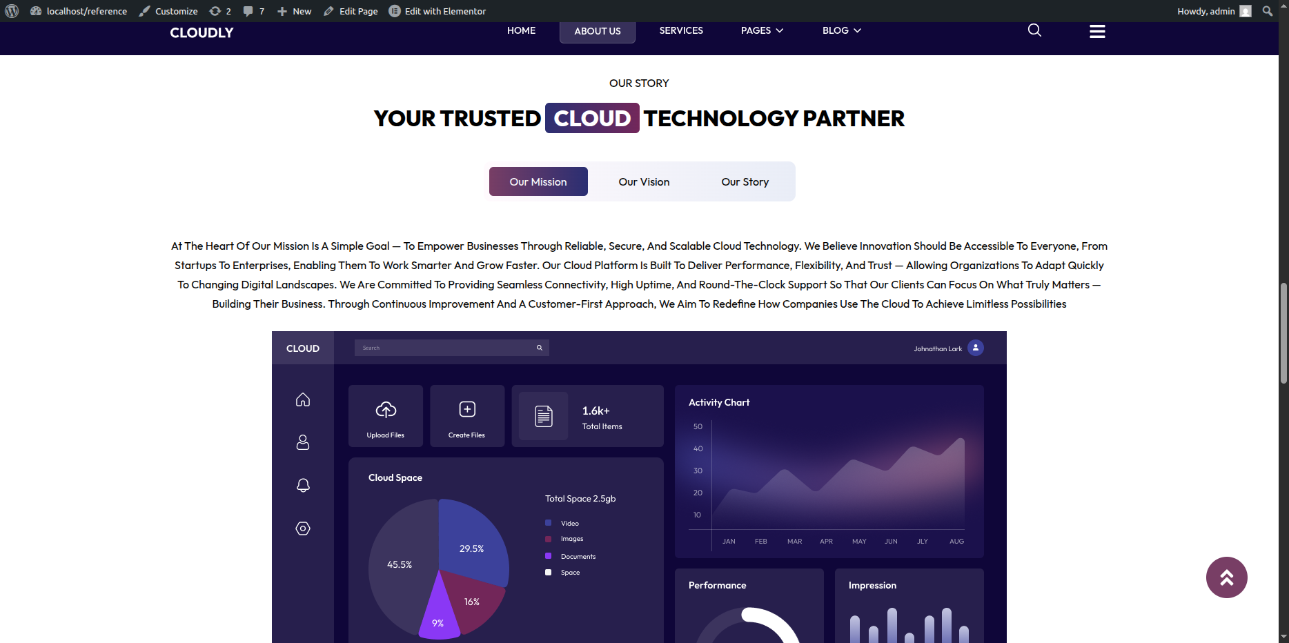
This is the final view of your section:
Free Trial Banner Section
The Free Trial Banner Section is a call-to-action area designed to encourage users to start a free trial. This section features a linear gradient SVG path as the background, a left-side image, and right-side content including a section title, main heading, description text, and a call-to-action button.
Adding Free Trial Banner Section on Home Page
- Go to the Home Page.
- Click Edit with Elementor.
- Add a new Section where you want the Free Trial Banner Section.
Adding Linear Gradient SVG Background
- Select the Section.
- Go to Style → Background.
- Add the SVG path with linear gradient as a background image.
- Adjust position, repeat, and size for best visual appearance.
Adding Left Side Image
- In the left column, add an Image Widget.
- Upload or select the banner image.
- Adjust image alignment and size.
Adding Right Side Content
- Add a Heading Widget for the section title.
- Add another Heading Widget for the main heading.
- Add a Text Editor Widget for the description text.
- Add a Button Widget for the call-to-action.
Editing the Button
- Select the Button Widget.
- Update the button text (example below).
- Set the button link to the Free Trial or Signup page.
- Size: Medium
- Alignment: Left
Styling & Responsive Settings
- Adjust padding and spacing for better balance.
- Ensure text contrast against the gradient background.
- Switch to Tablet and Mobile view.
- Stack columns vertically on smaller screens if needed.
Tip: Use a strong contrast button color to make the call-to-action stand out.
This is the final view of your section:
Testimonial Section
The Testimonial Section displays customer feedback in a slider format using the Testimonial Carousel Widget. This section includes a section title, main heading, short description text, and a testimonial post slider.
Adding Testimonial Section on Home Page
- Go to the Home Page.
- Click Edit with Elementor.
- Add a new Section where you want the Testimonial Section.
Adding Section Title, Heading & Text
- Add a Heading Widget for the section title.
- Add another Heading Widget for the main heading.
- Add a Text Editor Widget for the short description text.
Adding Testimonial Slider
- Add the Testimonial Carousel Widget below the text.
- Configure testimonial content:
- Client Name
- Client Designation
- Client Image
- Testimonial Text
- Enable Slider settings such as:
- Autoplay
- Navigation Arrows
- Dots Pagination
Styling Testimonials
- Customize typography for testimonial text and client name.
- Adjust spacing between slides.
- Style navigation arrows and dots.
- Set background color or card shadow if needed.
Responsive Settings
- Switch to Tablet and Mobile view.
- Adjust the number of visible testimonials per slide.
- Ensure text readability on smaller screens.
Tip: Use genuine testimonials with client photos to increase trust and credibility.
This is the final view of your section:
Service Page
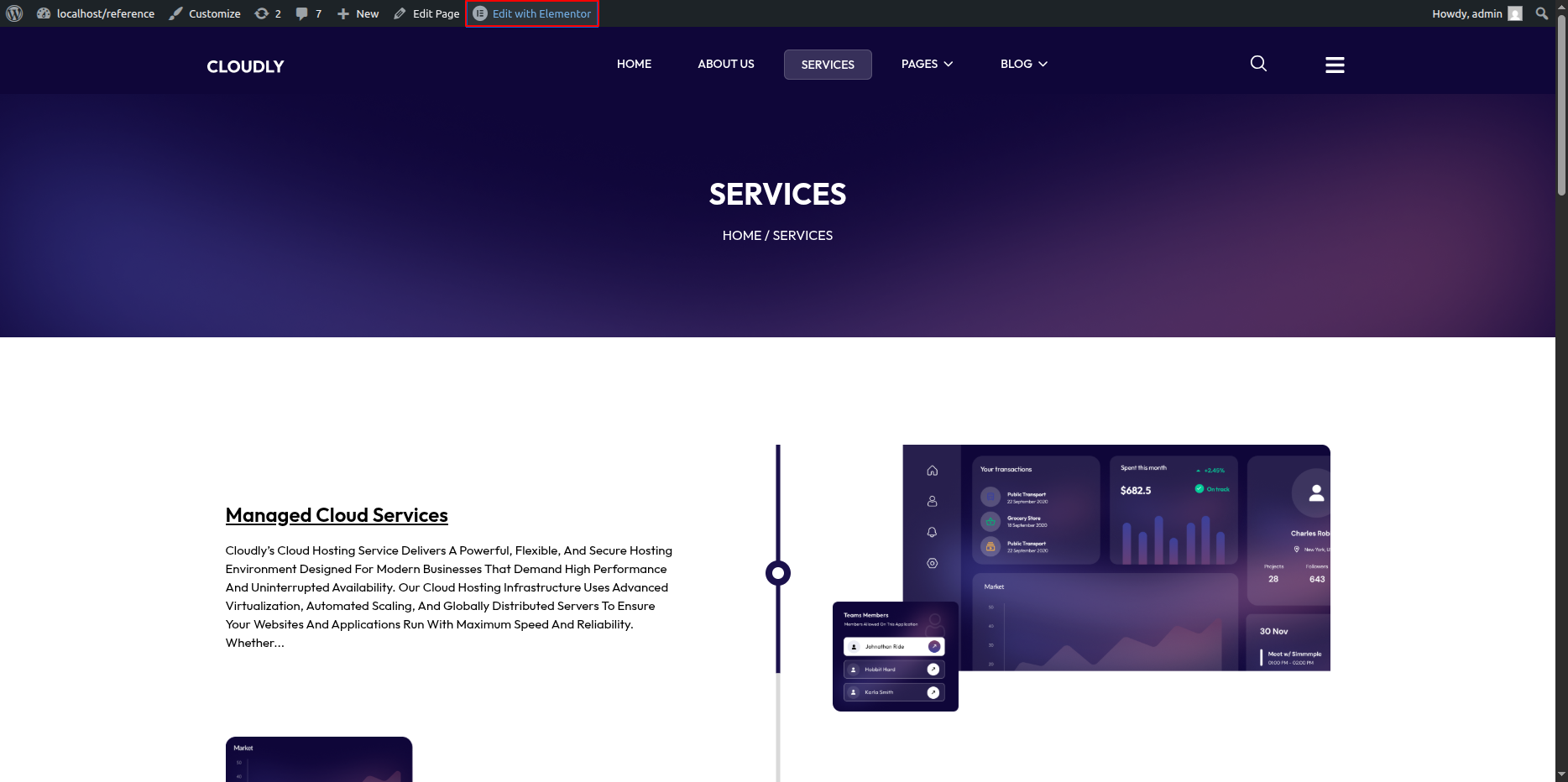
In this section, you can set a background banner image and display the page title along with breadcrumbs using Elementor.
- Editing the Service Page:
- Go to your WordPress Dashboard and navigate to Pages → Service.
- Click on Edit with Elementor to open the page in the Elementor editor.
Service Page – Services Posts Section
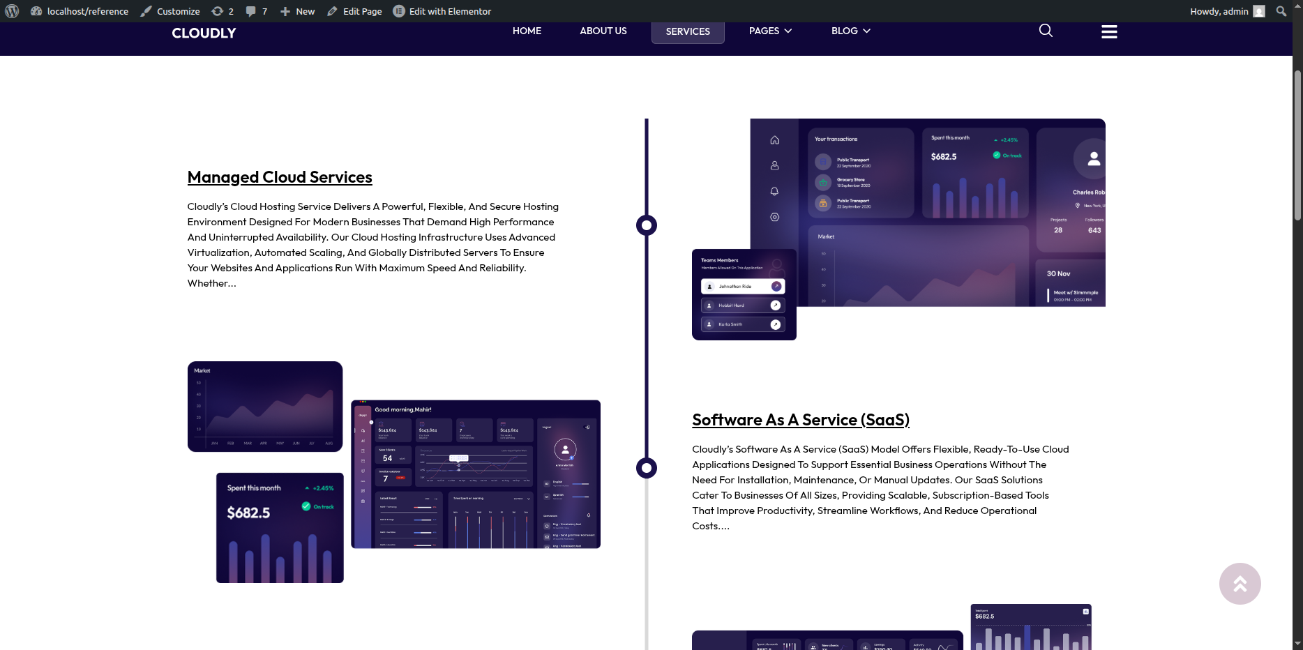
This section displays all the service posts using the Posts Widget in Elementor. You can customize the layout, text, colors, and buttons directly from the widget settings.
- Editing the Section:
- Click on the Posts Widget inside the section.
- In the left panel, under the Content tab, select the Source as Services (or your custom post type for services).
- Adjust the Layout option to choose the desired number of columns or grid style.
- Set the number of posts to display using the Posts Per Page field.
- Enable or disable pagination if you want users to navigate through multiple pages of services.
- Editing Text and Titles:
- In the Content → Query section, make sure your service posts have proper titles and excerpts added from the WordPress Dashboard.
- You can adjust how much text from the description is shown by editing the Excerpt Length setting.
- To change the “Read More” text or button label, edit the Button Text field under the widget’s settings.
- Service Page Content Overview:
-
After importing the demo content, navigate to the Services page and click Edit with Elementor.
-
Service Header Section:
- Edit the Service Title and Description using the heading and text editor widgets.
- Update the Service Icon from the icon or image widget as required.
-
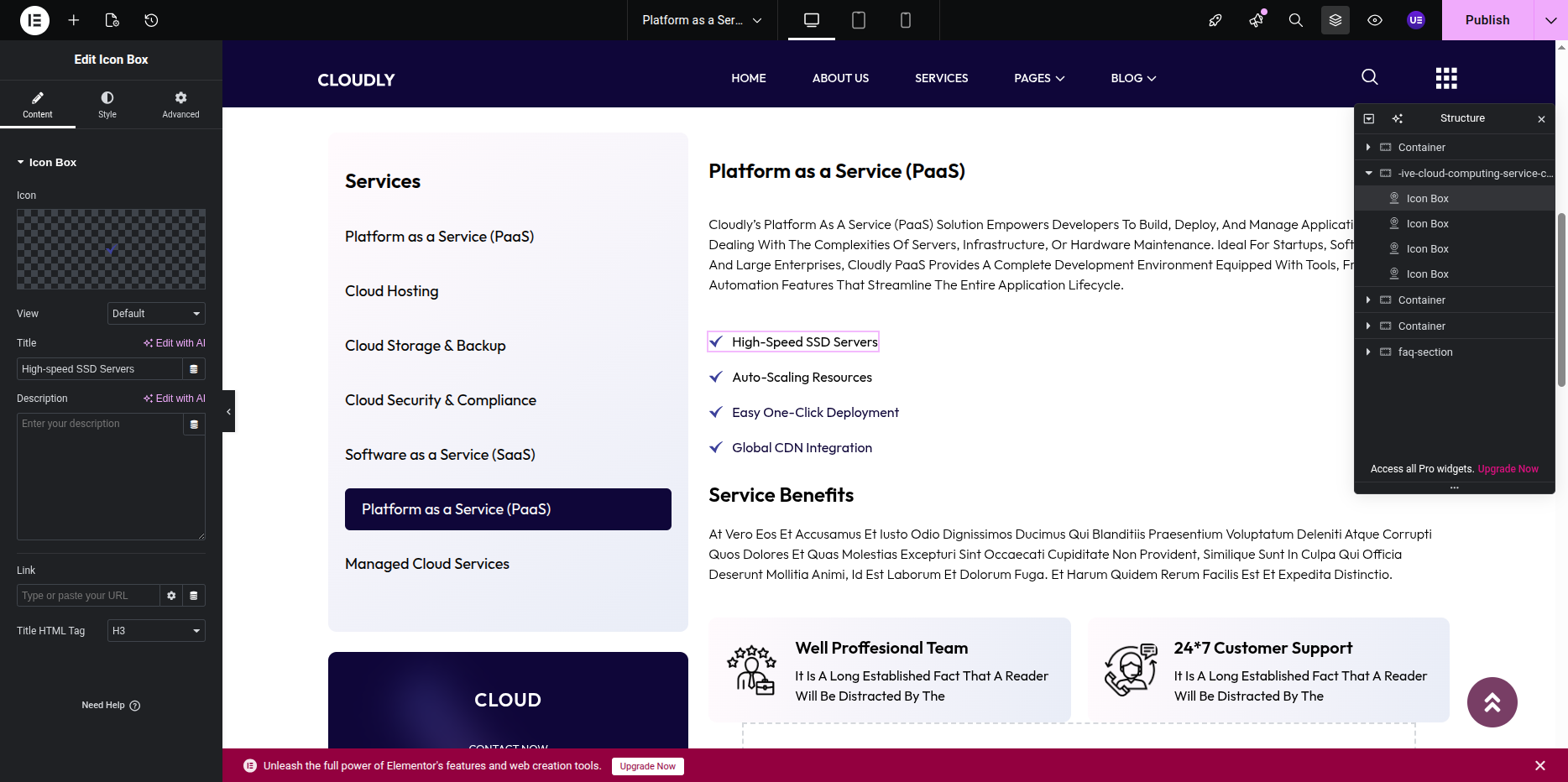
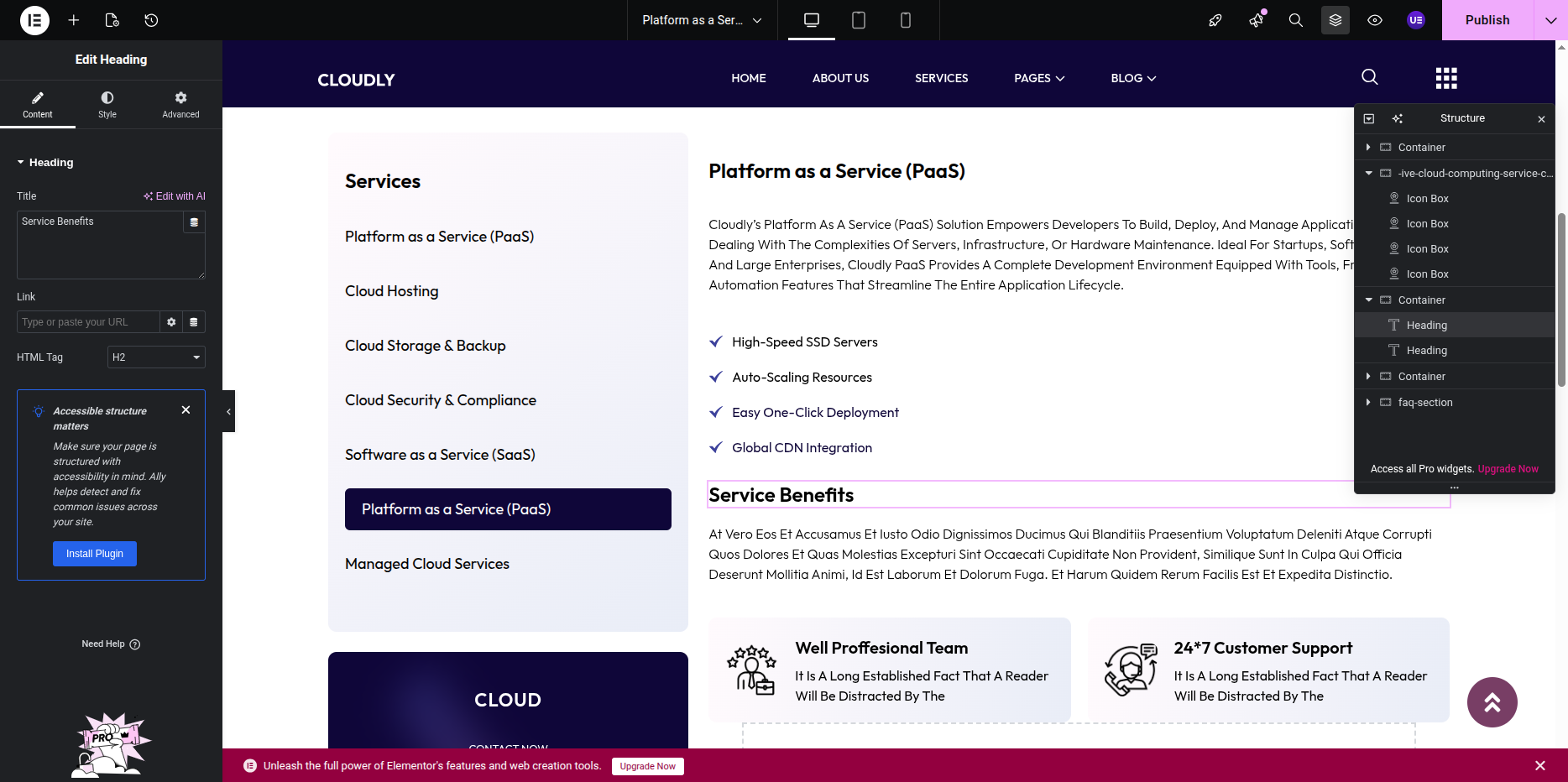
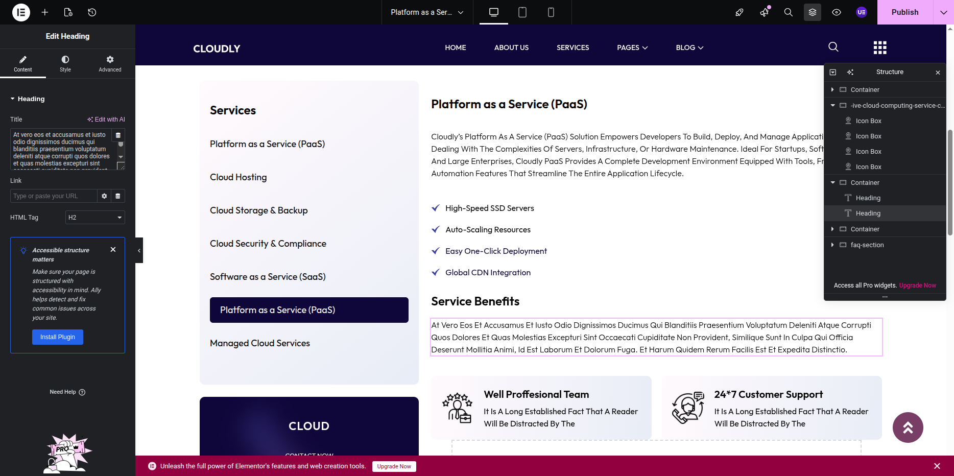
Service Features Section:
- This section contains multiple icon boxes displaying feature icons, titles, and descriptions.
- You can modify the icon/image, title text, and content text individually for each item.
-
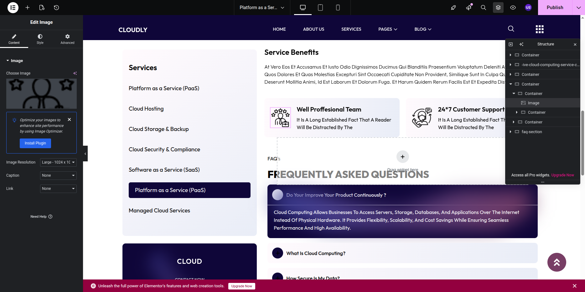
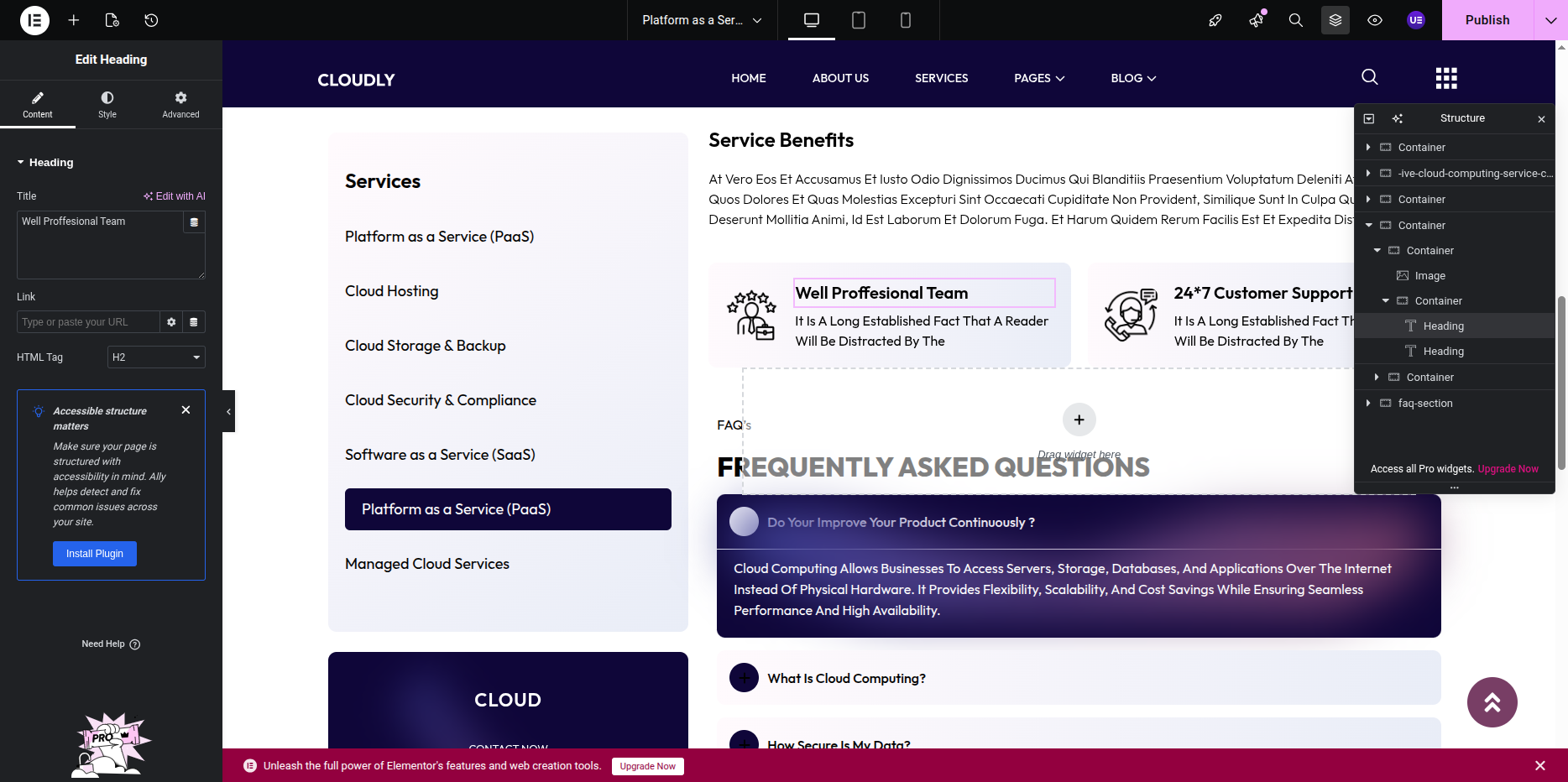
Image with Content Section:
- Update the image from the image widget.
- Edit the accompanying title and description text from the text or heading widgets.
-
FAQ Section:
- The FAQ content is built using the Accordion widget.
- Edit each question and answer by expanding the accordion items.
- Styling options such as colors, typography, and spacing are available under the Style tab.
-
Layout & Spacing:
- Adjust margins, padding, and section spacing from the Advanced tab.
- You may also control alignment and responsiveness for desktop, tablet, and mobile views.
- Button Customization:
- Locate the Button Style section under the Style tab.
- Change the Button Background Color, Text Color, and Hover Color to match your design theme.
- Adjust Border Radius and Padding for button shape and spacing.
- If needed, change the link URL of the button to point to specific service details.
- Saving Changes:
- After making all design and content updates, click the Update button at the bottom of the Elementor panel.
- Preview the page to ensure the service posts are displayed correctly with proper styling and layout.
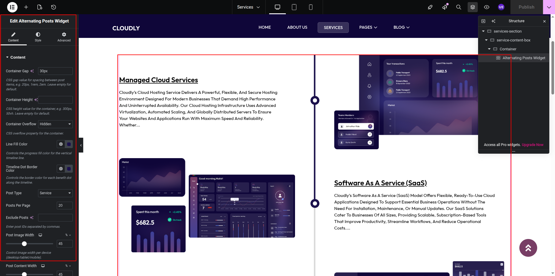
Note: The Posts Widget automatically pulls content from your Service posts. Make sure your service posts are published and have featured images, titles, and short descriptions added from the WordPress Dashboard.
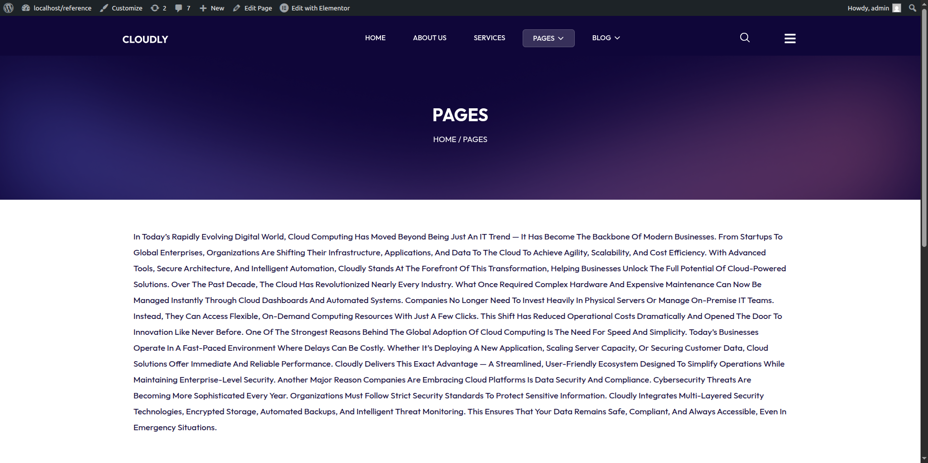
The Page with No Sidebar layout displays only the main content without any sidebar. This layout is ideal for full-width pages such as About Us, Contact, Landing Pages, or any content-focused pages.
Editing the Page with No Sidebar
-
- Go to your WordPress Dashboard → Pages → Page with No Sidebar.
- Click on Edit with Elementor to open the page in the Elementor editor.
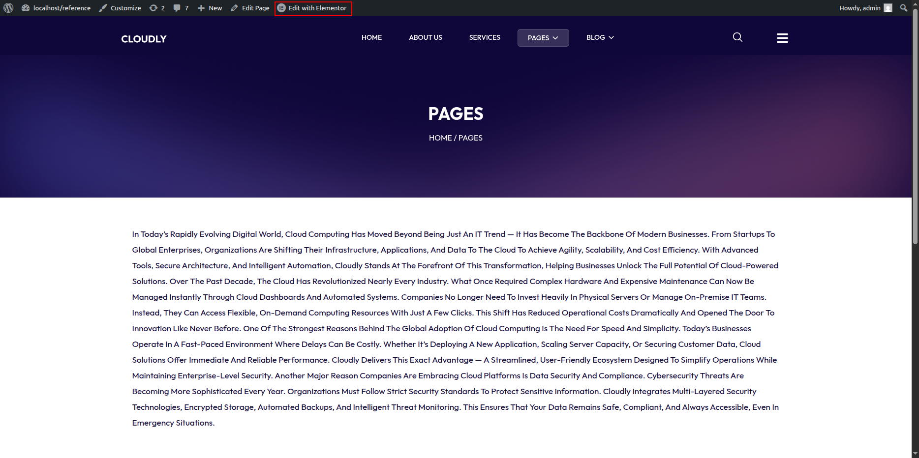
Page with No Sidebar Layout
This layout contains a single-column content area without a sidebar. All content spans the full width of the page, providing a clean and distraction-free reading experience.
Adding Page Content
-
- Add your page content using Elementor widgets such as:
- Heading – Page titles and section headings
- Text Editor – Page content and descriptions
- Image – Images or banners
- Button – Call-to-action buttons
- Posts / Loop Grid Widget – Dynamic content (if required)
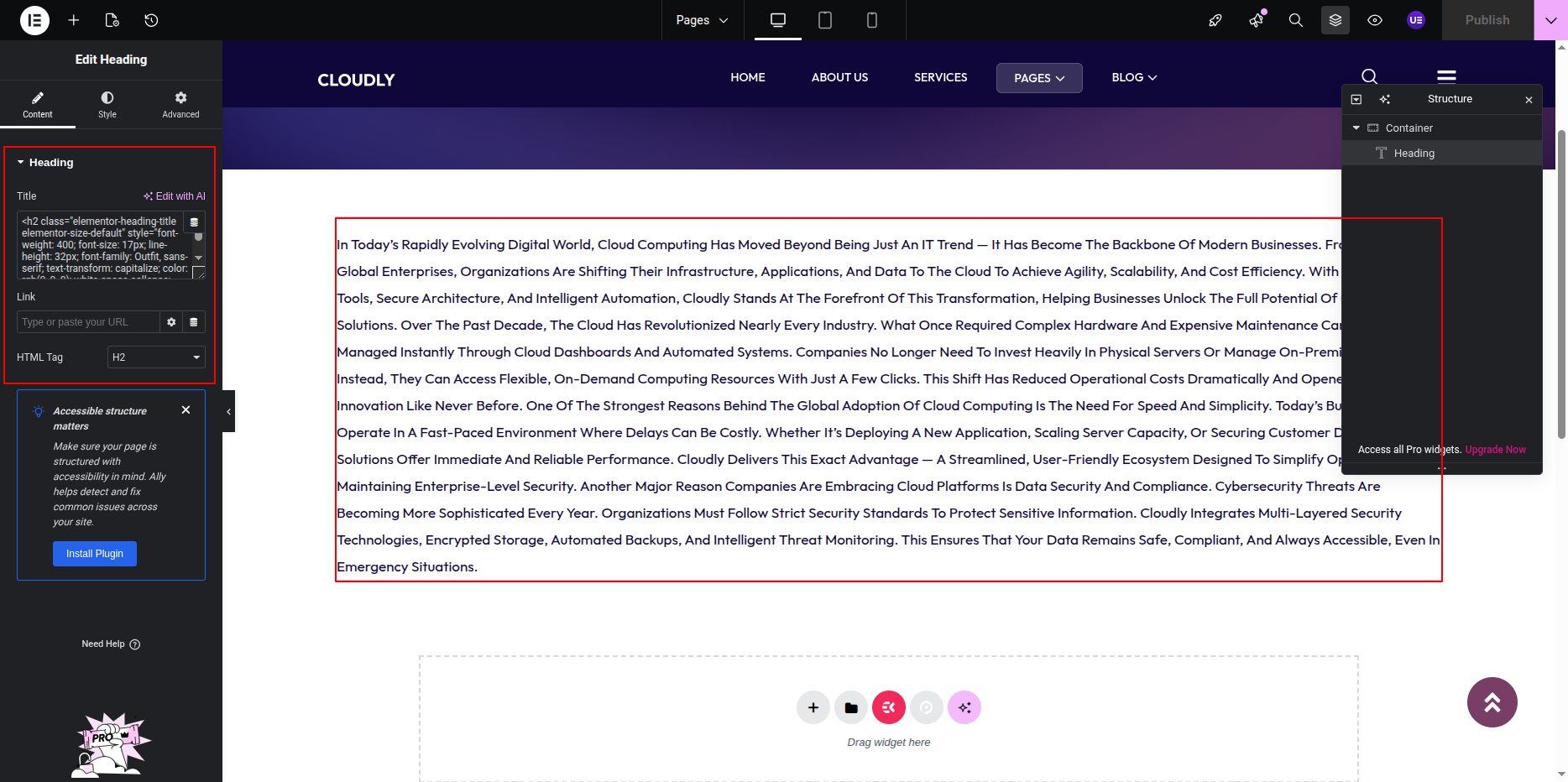
Customizing Page Design
-
- Select the section or widgets to customize styling.
- Use the Style tab to:
- Adjust typography and text color.
- Set background color or image.
- Control spacing using padding and margin.
- Use the Advanced tab for responsive visibility and layout fine-tuning.
Responsive Settings
-
- Switch to Tablet and Mobile views in Elementor.
- Adjust padding and font sizes for smaller screens.
- Ensure content remains readable and well-spaced.
Final Adjustments
-
- Review the page layout and content alignment.
- Ensure there is no unused spacing meant for sidebars.
- Click Update to save the page.
Note: Since this layout does not include a sidebar, all widgets added will appear directly in the main content area.
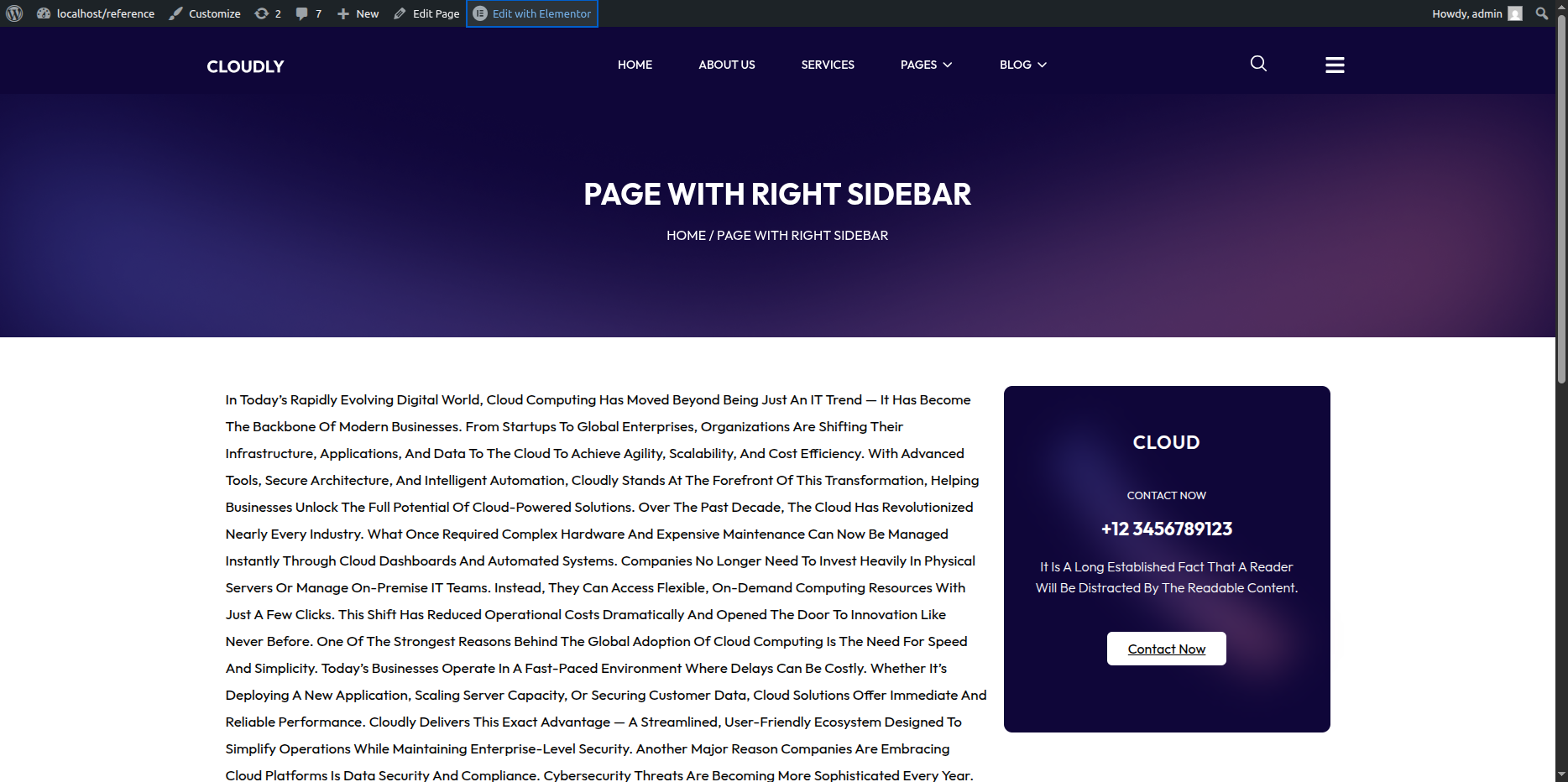
Page with Left Sidebar
- Editing the Page with Left Sidebar Page:
- Go to your WordPress Dashboard and navigate to Pages → Page with Left Sidebar.
- Click on Edit with Elementor to open the page in the Elementor editor.
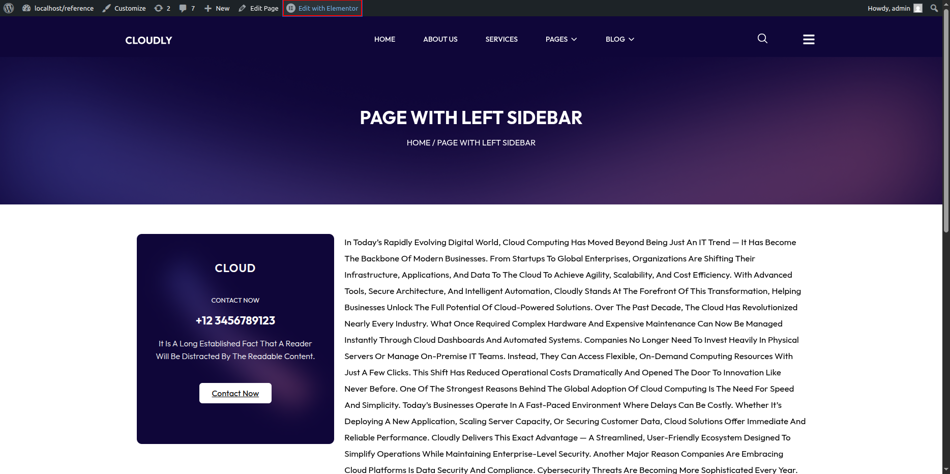
Page with Left Sidebar Page Section
The Page with Left Sidebar Page is displayed when a visitor tries to access a page that does not exist. You can customize the image, message text, and button easily using Elementor.
Page with Left Sidebar
This layout includes a content area with a sidebar positioned on the left side. You can easily select and customize the sidebar widget and add your desired content using Elementor.
- Setting Up the Left Sidebar Layout:
- In the Elementor editor, add a new section with two columns.
- Set the column width:
- Left column (for sidebar): around 25% – 30%
- Right column (for main content): around 70% – 75%
- If the sidebar already exists in your theme, ensure it’s enabled by selecting the appropriate page template that supports sidebars (for example: Page with Sidebar).
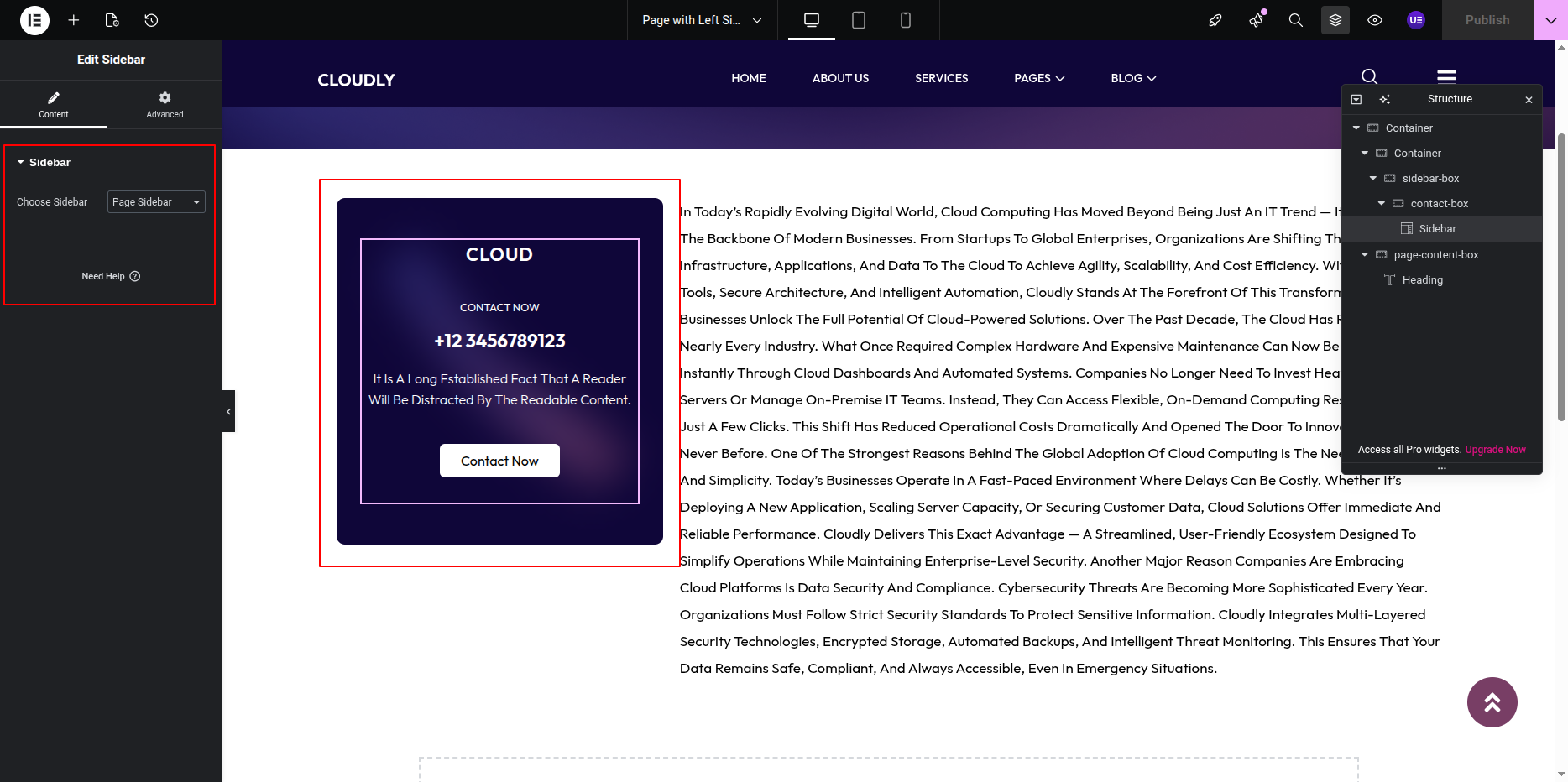
- Adding the Sidebar Widget:
- Click inside the left column to add a widget.
- Search for the Sidebar Widget in the Elementor panel.
- Drag and drop the Sidebar Widget into the left column.
- In the Content tab of the widget settings:
- Select the desired sidebar from the Choose Sidebar dropdown menu (for example: Main Sidebar or Blog Sidebar).
- Adding Contents to the Sidebar:
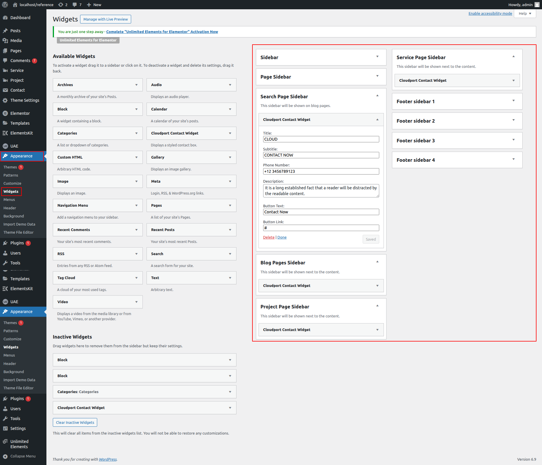
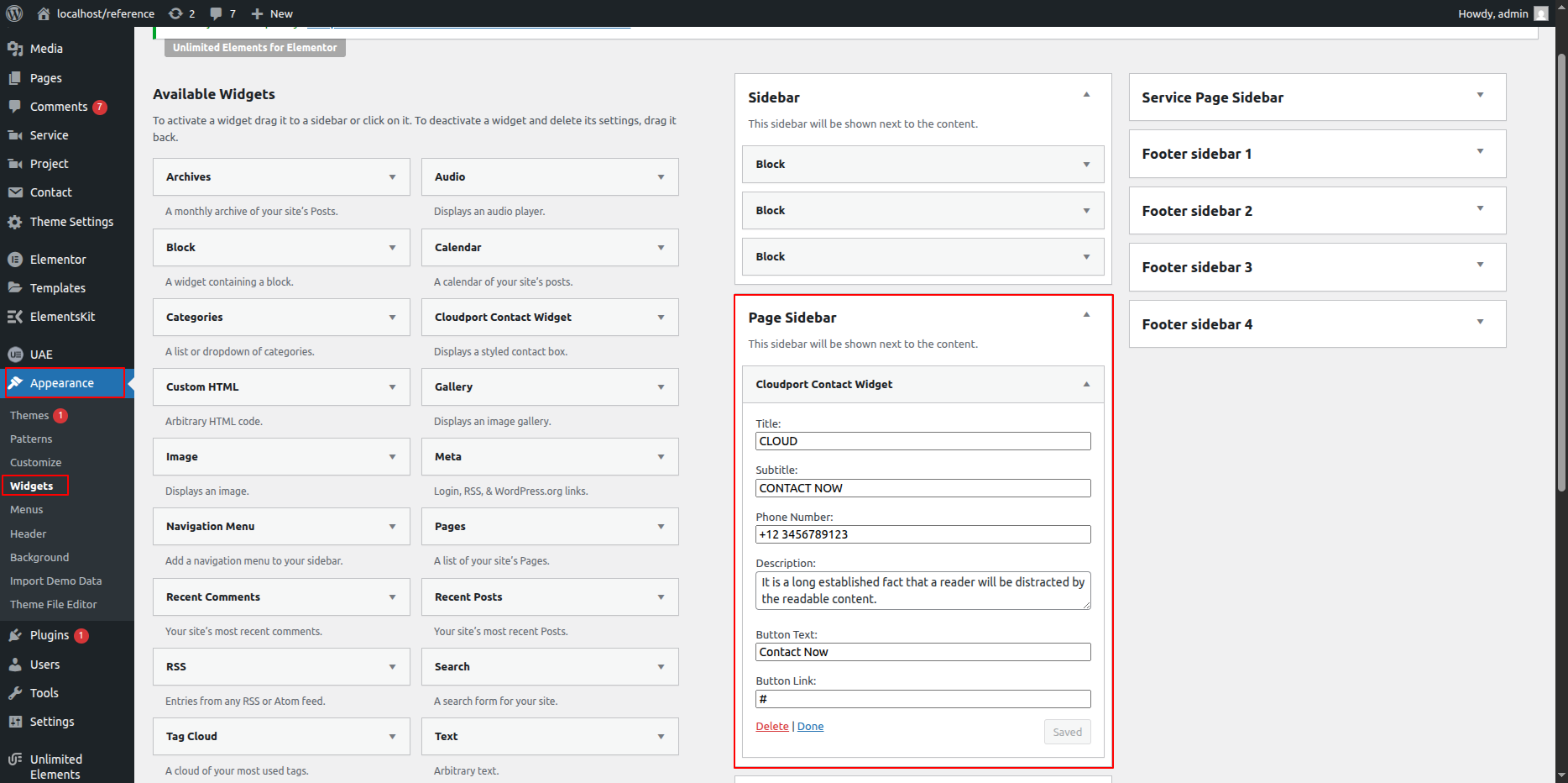
- To edit or add widgets inside the selected sidebar, go to your WordPress Dashboard → Appearance → Widgets.
- Select the sidebar you chose in Elementor (for example: Main Sidebar).
- Add the desired widgets such as:
- Search
- Recent Posts
- Categories
- Custom Text
- Image or HTML Widget
- After adding widgets, click Update in the WordPress Widgets area to save the sidebar content.
- The updated widgets will automatically appear in your Elementor sidebar section.
- Customizing the Sidebar Design:
- In Elementor, select the left column (sidebar area).
- Go to the Style tab to:
- Change background color or add a border.
- Adjust padding and spacing.
- Set typography and text color for sidebar widgets.
- Use the Advanced tab to control margins and responsive visibility.
- Final Adjustments:
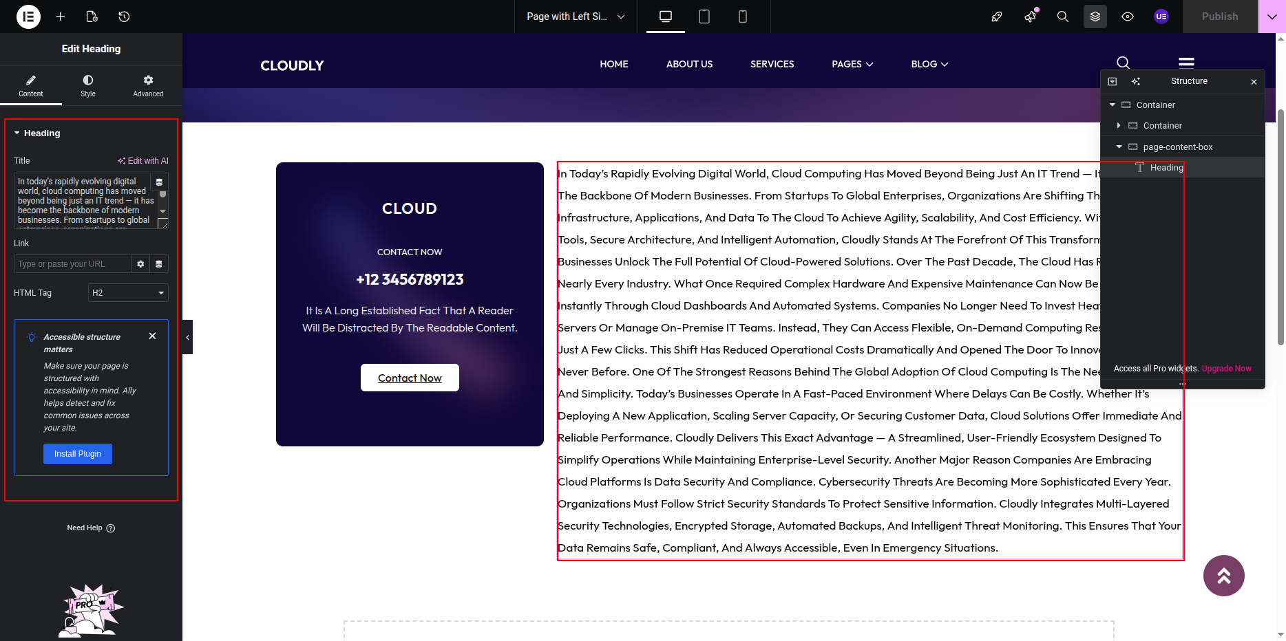
- Add your main page content inside the right column using Elementor widgets like Heading, Text Editor, Image, or Posts Widget.
- Ensure proper alignment between sidebar and main content.
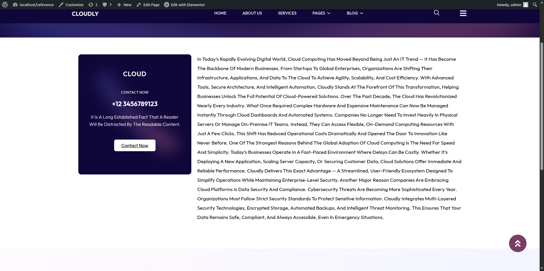
- Click Update to save the layout changes.
Note: The Sidebar Widget dynamically displays widgets assigned in your WordPress Sidebar area. You can manage or reorder sidebar widgets anytime from Appearance → Widgets.
Page with Right Sidebar
- Editing the Page with Right Sidebar Page:
- Go to your WordPress Dashboard and navigate to Pages → Page with Right Sidebar.
- Click on Edit with Elementor to open the page in the Elementor editor.
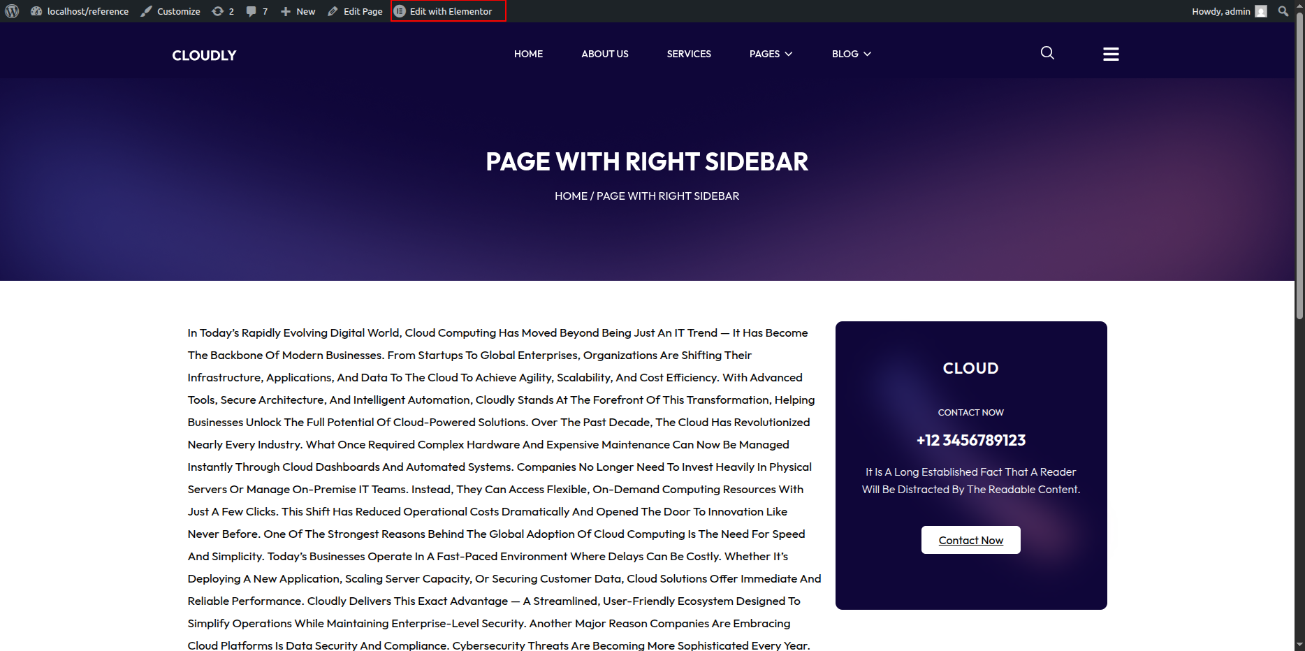
Page with Right Sidebar Page Section
The Page with Right Sidebar Page is displayed when a visitor tries to access a page that does not exist. You can customize the image, message text, and button easily using Elementor.
Page with Right Sidebar
This layout includes a content area with a sidebar positioned on the left side. You can easily select and customize the sidebar widget and add your desired content using Elementor.
- Setting Up the Left Sidebar Layout:
- In the Elementor editor, add a new section with two columns.
- Set the column width:
- Left column (for sidebar): around 25% – 30%
- Right column (for main content): around 70% – 75%
- If the sidebar already exists in your theme, ensure it’s enabled by selecting the appropriate page template that supports sidebars (for example: Page with Sidebar).
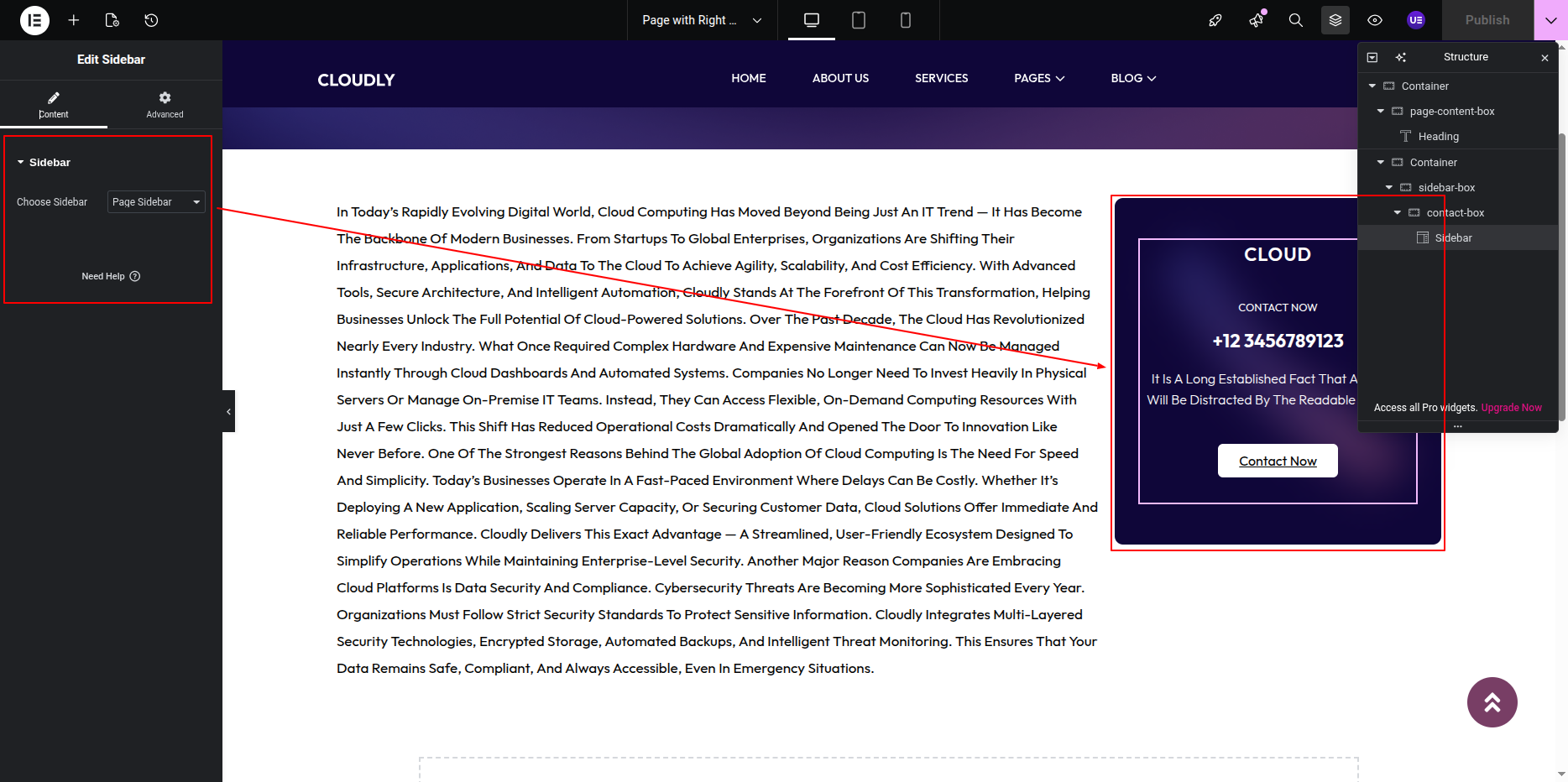
- Adding the Sidebar Widget:
- Click inside the left column to add a widget.
- Search for the Sidebar Widget in the Elementor panel.
- Drag and drop the Sidebar Widget into the left column.
- In the Content tab of the widget settings:
- Select the desired sidebar from the Choose Sidebar dropdown menu (for example: Main Sidebar or Blog Sidebar).
- Adding Contents to the Sidebar:
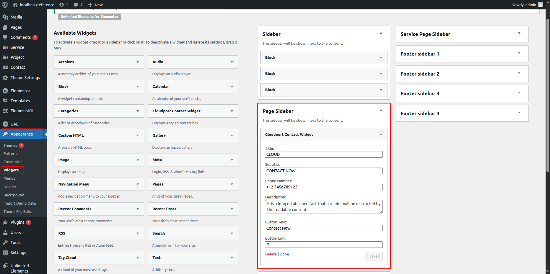
- To edit or add widgets inside the selected sidebar, go to your WordPress Dashboard → Appearance → Widgets.
- Select the sidebar you chose in Elementor (for example: Main Sidebar).
- Add the desired widgets such as:
- Search
- Recent Posts
- Categories
- Custom Text
- Image or HTML Widget
- After adding widgets, click Update in the WordPress Widgets area to save the sidebar content.
- The updated widgets will automatically appear in your Elementor sidebar section.
- Customizing the Sidebar Design:
- In Elementor, select the left column (sidebar area).
- Go to the Style tab to:
- Change background color or add a border.
- Adjust padding and spacing.
- Set typography and text color for sidebar widgets.
- Use the Advanced tab to control margins and responsive visibility.
- Final Adjustments:
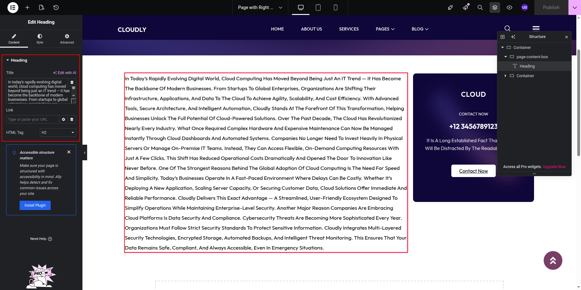
- Add your main page content inside the right column using Elementor widgets like Heading, Text Editor, Image, or Posts Widget.
- Ensure proper alignment between sidebar and main content.
- Click Update to save the layout changes.
Note: The Sidebar Widget dynamically displays widgets assigned in your WordPress Sidebar area. You can manage or reorder sidebar widgets anytime from Appearance → Widgets.
404 Page
- Editing the 404 Page:
- Go to your WordPress Dashboard and navigate to Pages → 404.
- Click on Edit with Elementor to open the page in the Elementor editor.
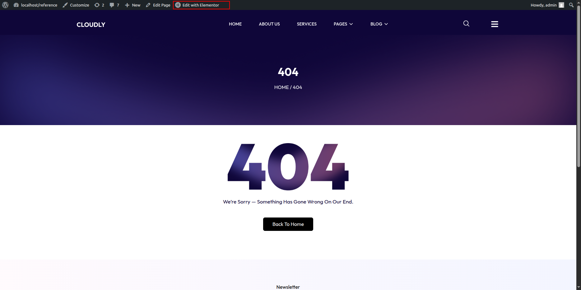
404 Page Section
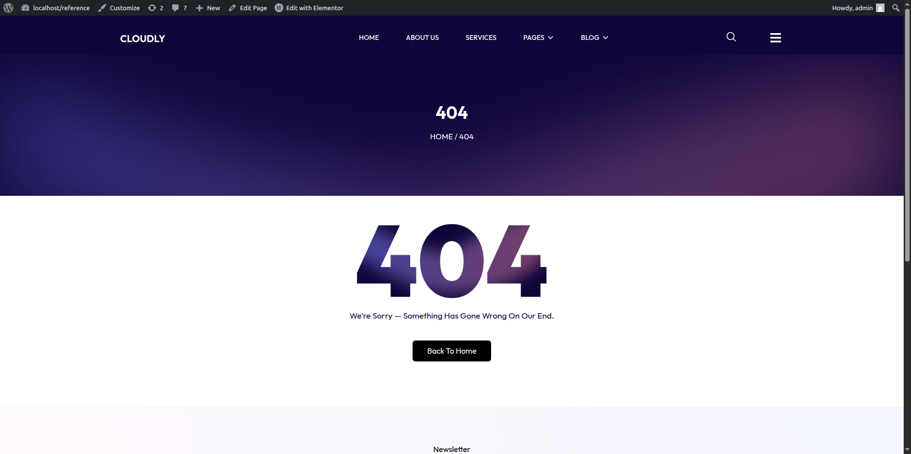
The 404 Page is displayed when a visitor tries to access a page that does not exist. You can customize the image, message text, and button easily using Elementor.
- Editing the 404 Page:
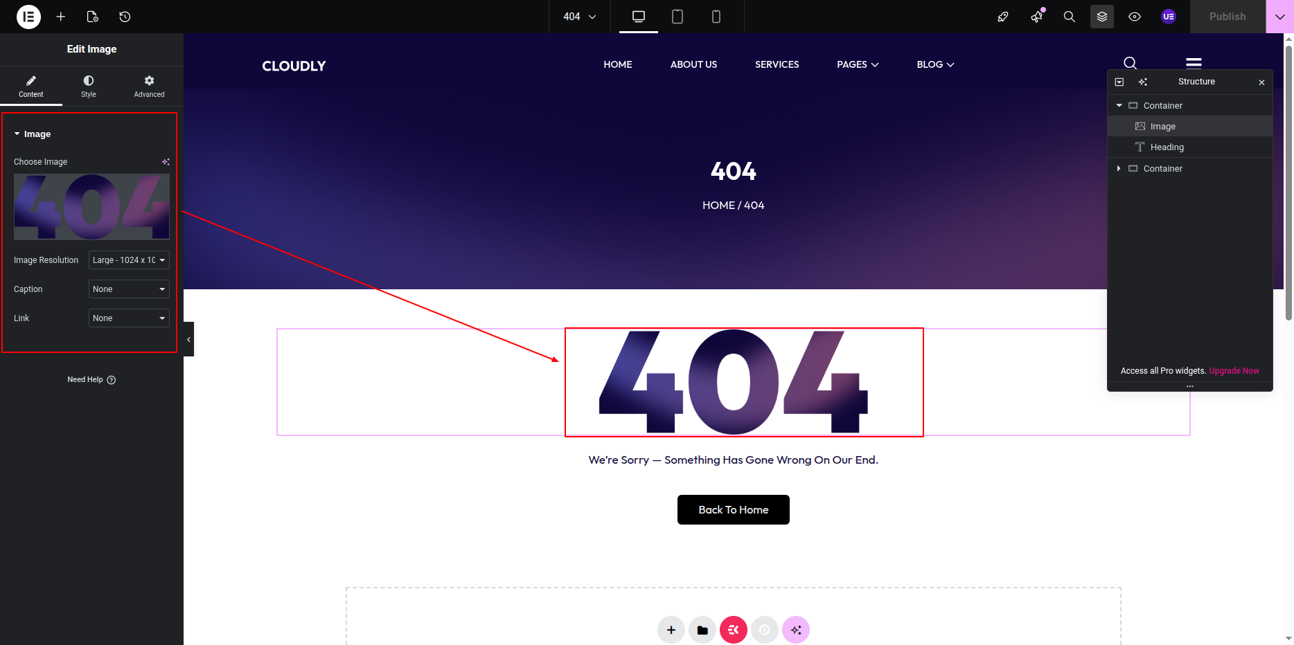
- Locate the Image Widget on the 404 page (usually showing an illustration or “Page Not Found” graphic).
- Click on the image to open the widget settings in the left panel.
- Click on the image thumbnail to open the Media Library.
- Upload a new image or select an existing one to replace the current 404 image.
- Under the Style tab, adjust the image width, alignment, and border radius if needed.
- Editing the Text:
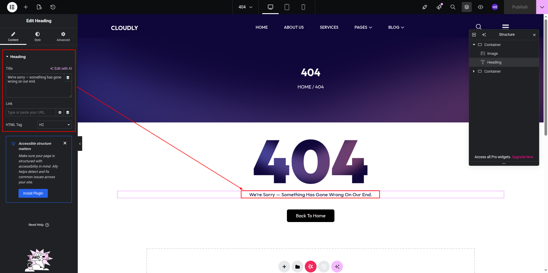
- Click on the Heading Widget displaying text such as “404” or “Page Not Found.”
- In the left panel, under the Content tab, update the title text as per your design (for example: Oops! Page Not Found).
- To edit the description or message text below, click on the Text Editor Widget.
- Edit the paragraph to include your custom message, such as “Sorry, the page you’re looking for doesn’t exist or has been moved.”
- Use the Style tab to customize text color, typography, and alignment.
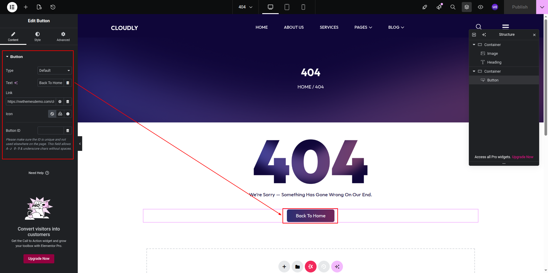
- Editing the Button:
- Click on the Button Widget (commonly labeled “Back to Home” or “Return to Homepage”).
- In the Content tab, edit the Text field to change the button label.
- Set the Link field to your homepage URL (for example: /).
- Under the Style tab, you can:
- Change button text color and background color.
- Adjust typography and padding for better visibility.
- Set hover effects and border radius.
- Final Adjustments:
- Align the image, text, and button properly using section and column settings.
- Use the Advanced tab to manage spacing, margins, and responsive settings for mobile and tablet views.
- Click on the Update button to save your changes.
Note: The 404 page helps users return to your main site instead of encountering a dead end. Make sure the design is simple and includes a clear navigation button.
Contact Page
- Editing the Contact Page:
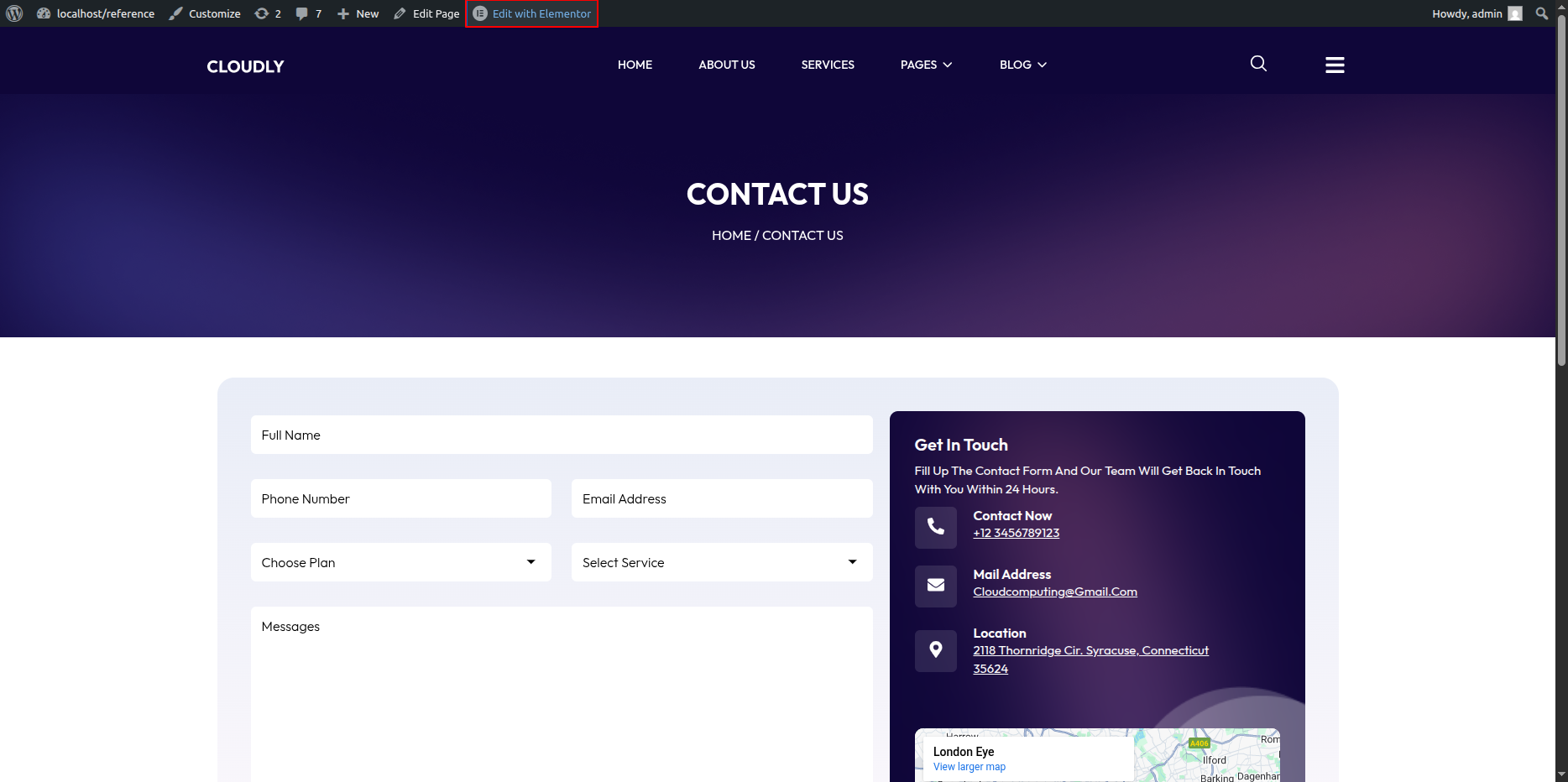
- Go to your WordPress Dashboard and navigate to Pages → Contact.
- Click on Edit with Elementor to open the page in the Elementor editor.
Contact Page Section
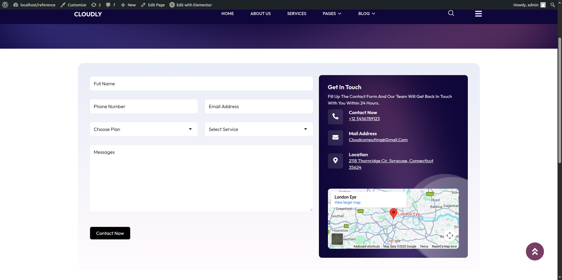
The Contact Page includes a heading, text description, contact form, icon boxes for contact details (phone, mail, and location), and a Google Map. You can easily edit all these elements using Elementor.
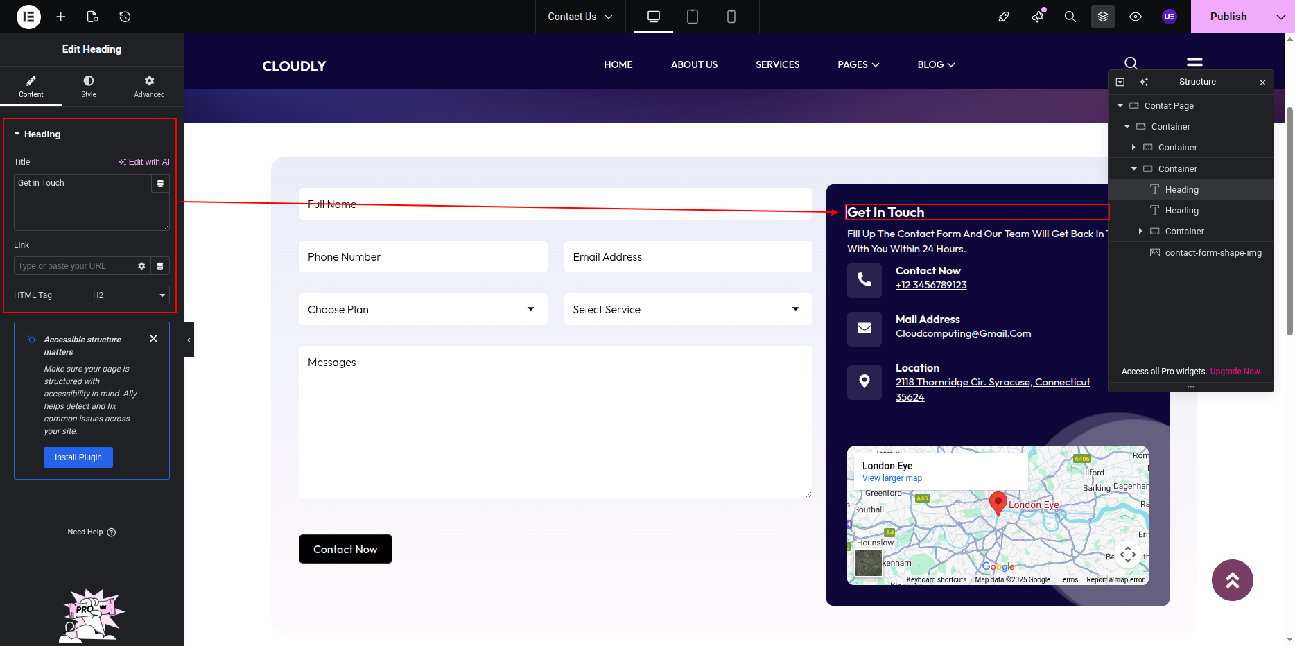
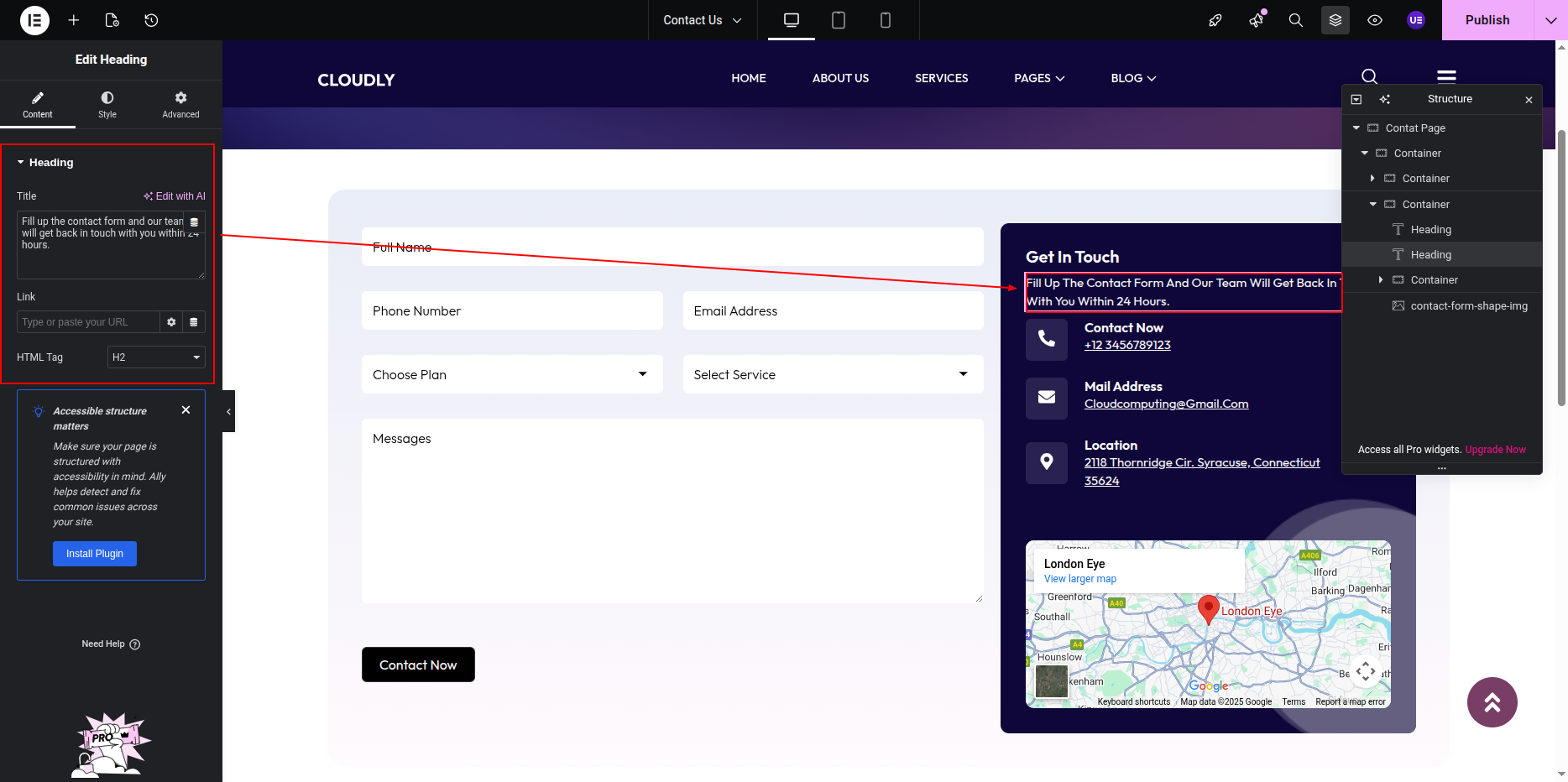
- Editing the Heading and Text:
- Click on the Heading Widget that displays the main title (for example: Get in Touch or Contact Us).
- In the left panel under the Content tab, update the title text as per your preference.
- To edit the paragraph below the heading, click on the Text Editor Widget.
- Modify the text content to include your custom message or instructions (for example: “We’d love to hear from you! Fill out the form or reach us using the details below.”).
- Use the Style tab to customize text color, typography, and alignment.
- Editing the Contact Form:
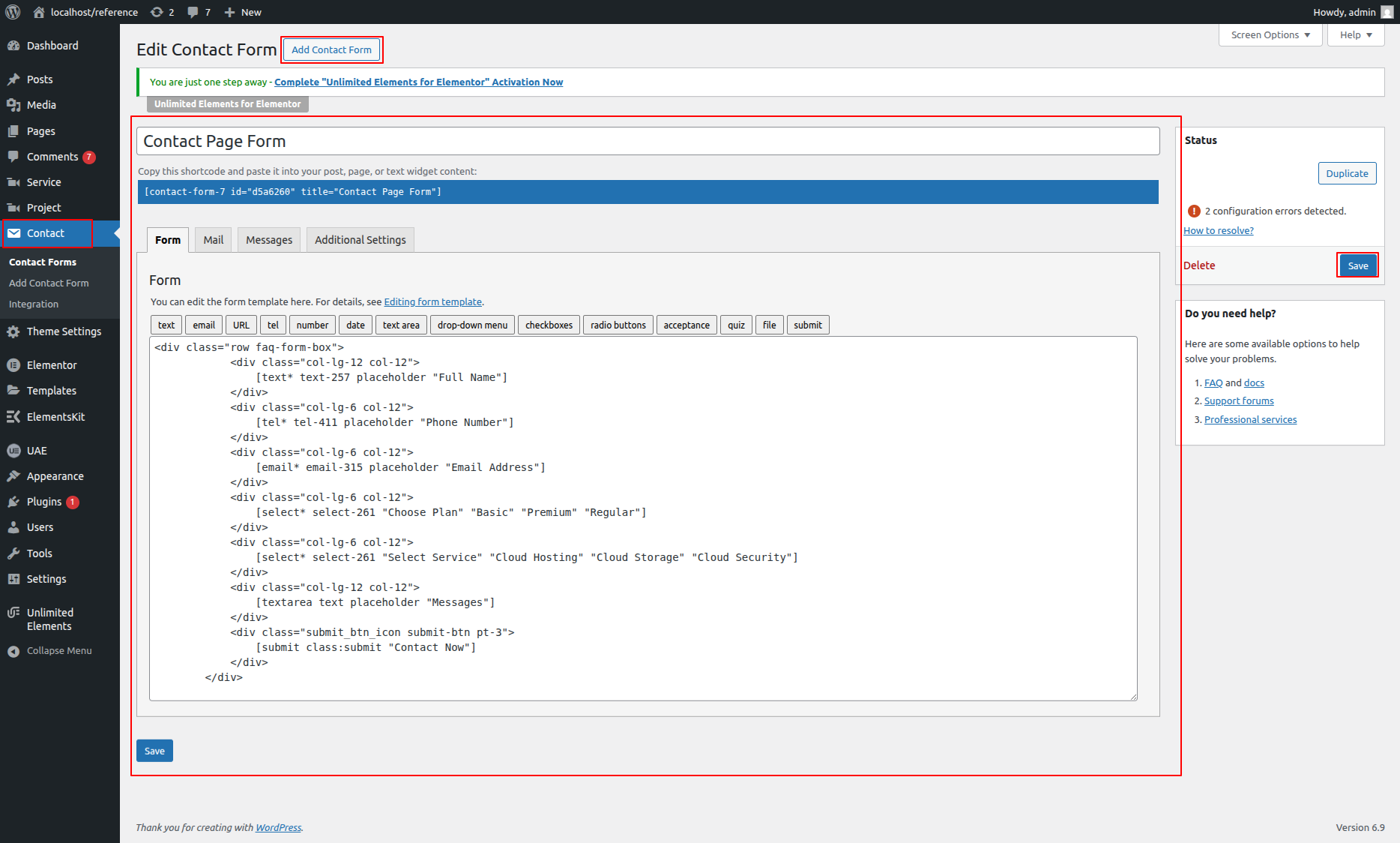
- Click on the Form Widget (usually created using the Contact Form 7 or Elementor Form widget).
- If you’re using Contact Form 7:
- Go to your WordPress Dashboard → Contact → Contact Forms.
- Edit the form fields as required (Name, Email, Message, etc.).
- Copy the form shortcode and paste it back into the Elementor Shortcode Widget if used.
- If using the Elementor Form Widget, click each field to change its label, placeholder text, and field type.
- Use the Style tab to customize input field colors, button style, and spacing.
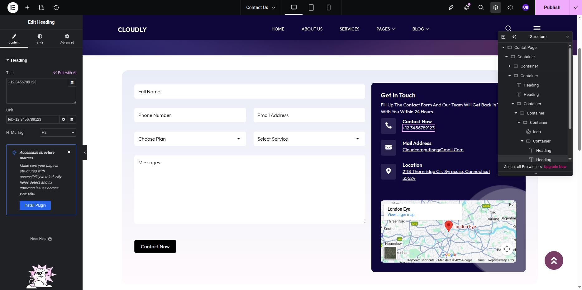
- Editing Icon Boxes (Phone, Mail, and Location):
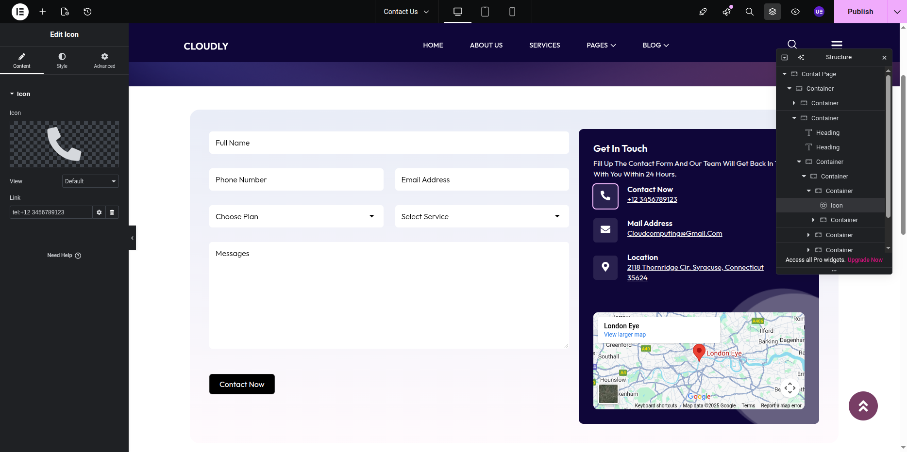
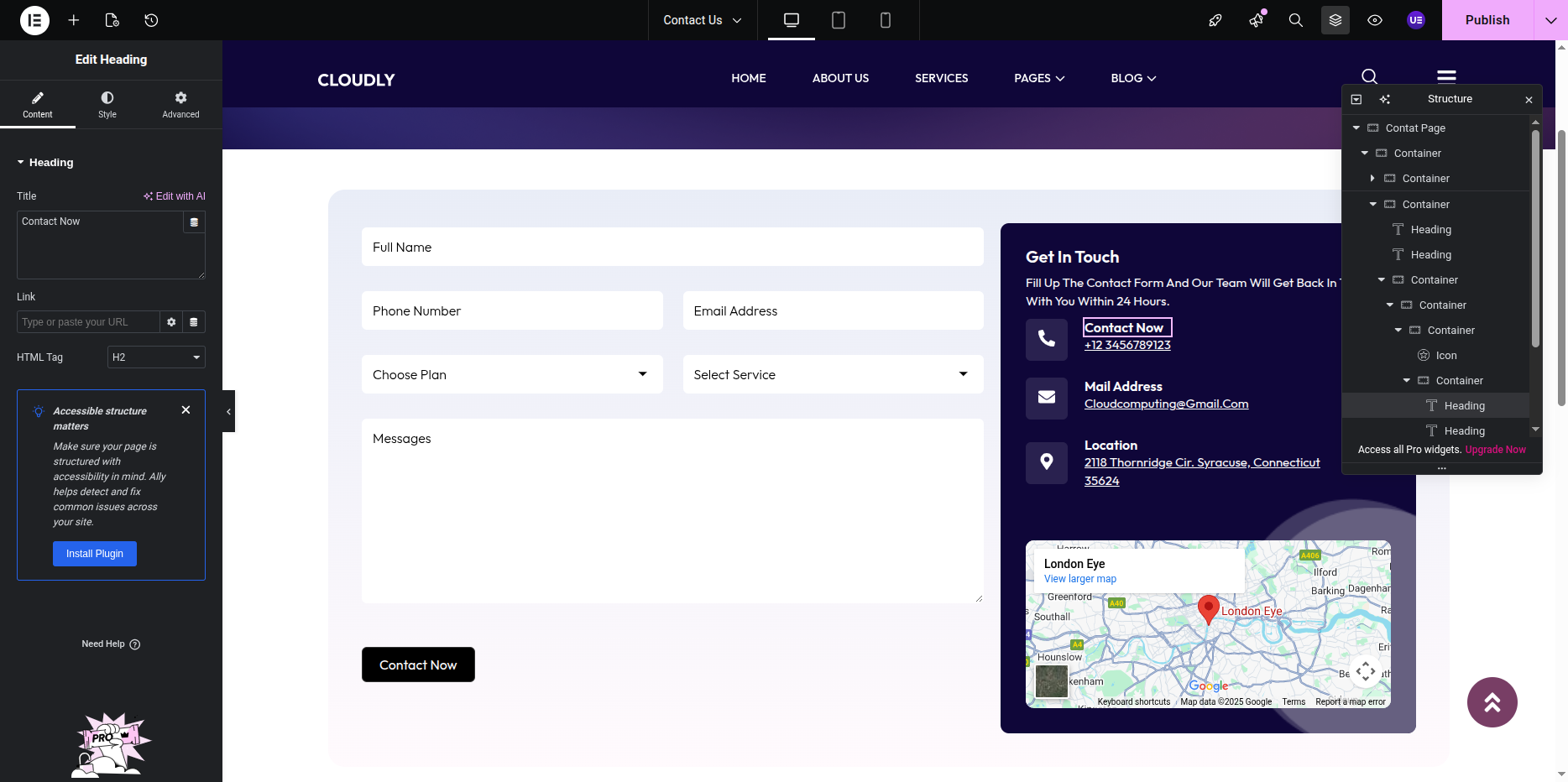
- Each contact detail (Phone, Mail, and Location) is created using the Icon Box Widget.
- Click on an Icon Box Widget to edit it.
- Under the Content tab:
- Click the Icon field and choose the appropriate icon:
- 📞 Phone → fa-phone or phone-call
- ✉️ Mail → fa-envelope
- 📍 Location → fa-map-marker-alt
- Edit the Title (for example: “Call Us,” “Email Us,” or “Visit Us”).
- Edit the Description field to add the respective details (like phone number, email address, or location address).
- Under the Style tab:
- Change icon color, size, and spacing.
- Adjust typography for title and description text.
- Add hover effects or background color if needed.
- Editing the Google Map:
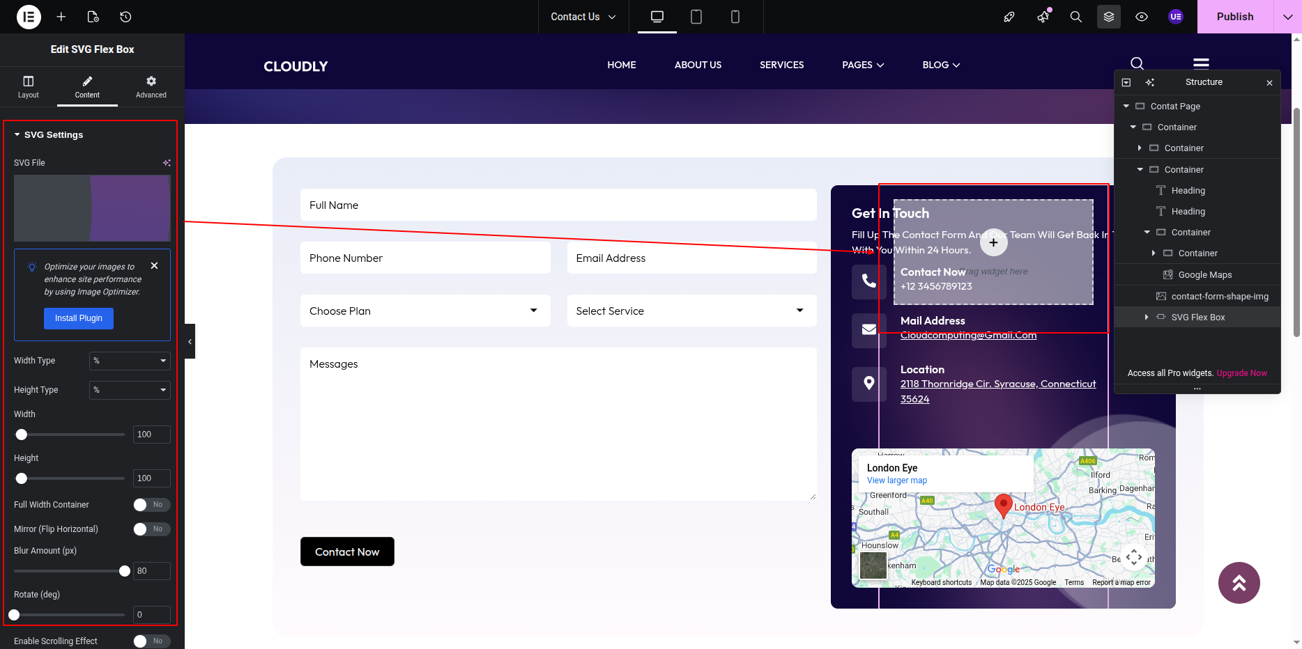
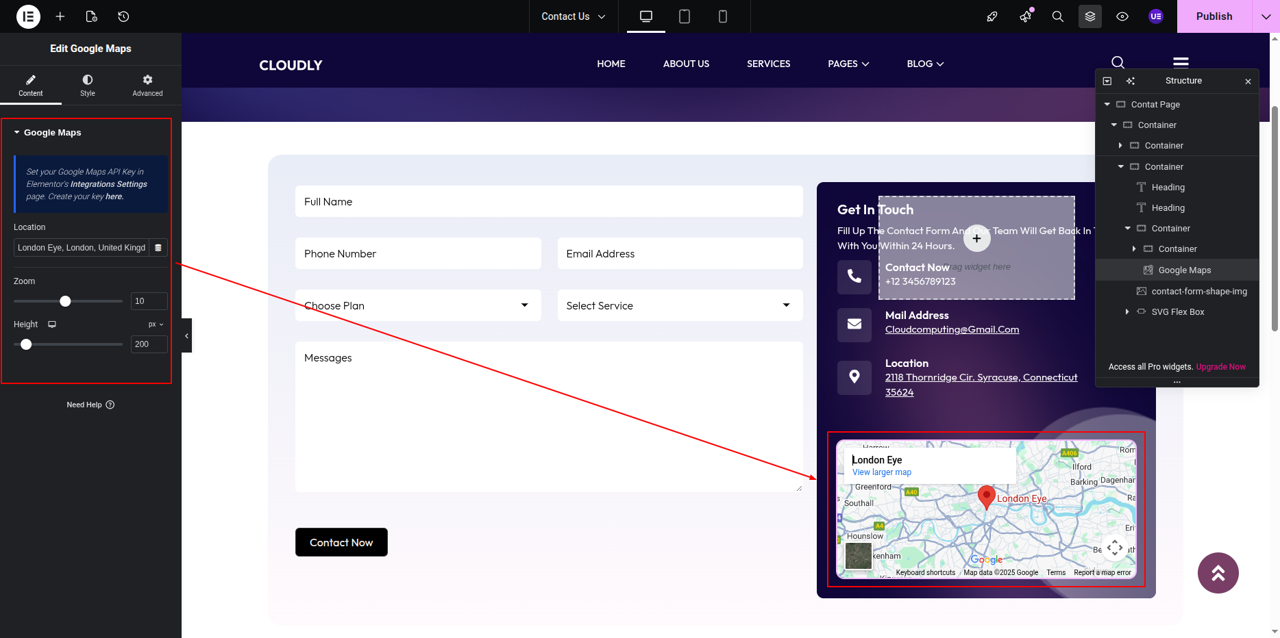
- Scroll to the bottom section of the Contact Page where the Google Map Widget is placed.
- Click on the map to open the widget settings.
- Under the Content tab:
- Enter your desired address or location in the Location field.
- You can also paste the Google Map embed link if required.
- Adjust the Zoom Level to control how close or far the map appears.
- Under the Style tab, you can adjust the map height and border radius for better design alignment.
- Final Adjustments:
- Align all widgets (Heading, Form, Icon Boxes, and Map) properly within columns and sections.
- Use the Advanced tab to control spacing, padding, and responsive layout for mobile and tablet views.
- Click on the Update button to save all changes.
Note: Ensure all contact details are accurate and up to date. The Google Map should display your exact business location for better user accessibility.
In this section, you can set a background banner image and display the page title along with breadcrumbs using Elementor.
- Editing the Blog with No Sidebar Page:
- Go to your WordPress Dashboard and navigate to Pages → Blog with No Sidebar.
- Click on Edit with Elementor to open the page in the Elementor editor.
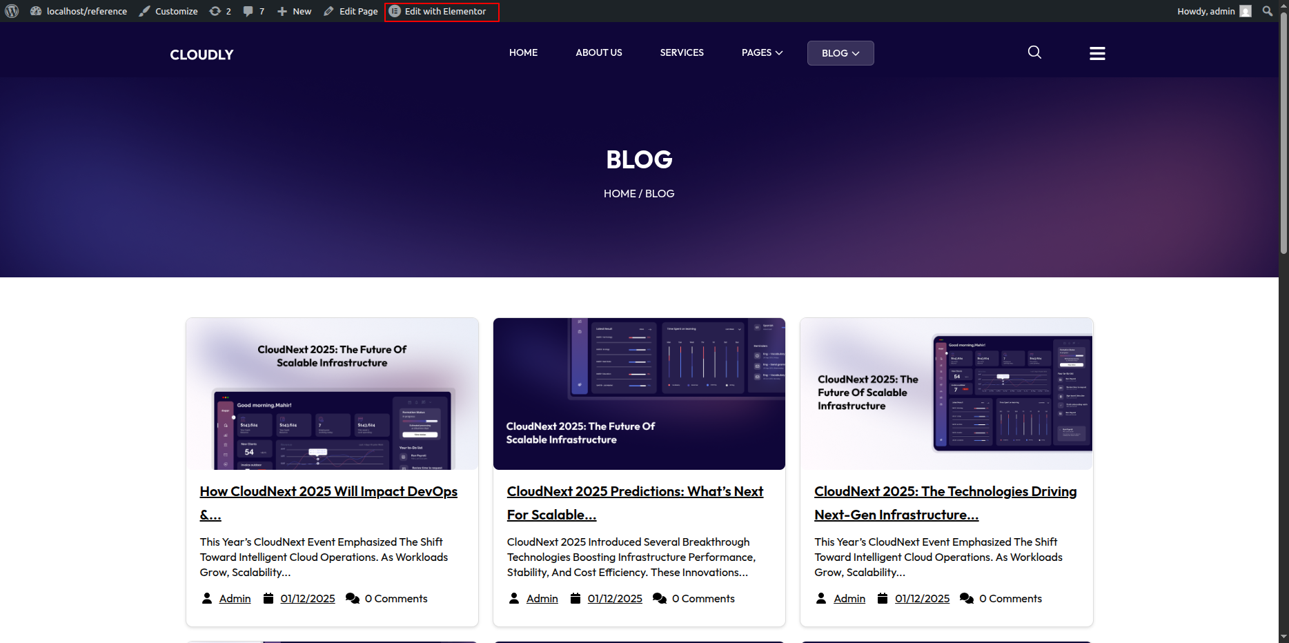
Blog with No Sidebar Page Section
The Blog with No Sidebar Page is displayed when a visitor tries to access a page that does not exist. You can customize the image, message text, and button easily using Elementor.
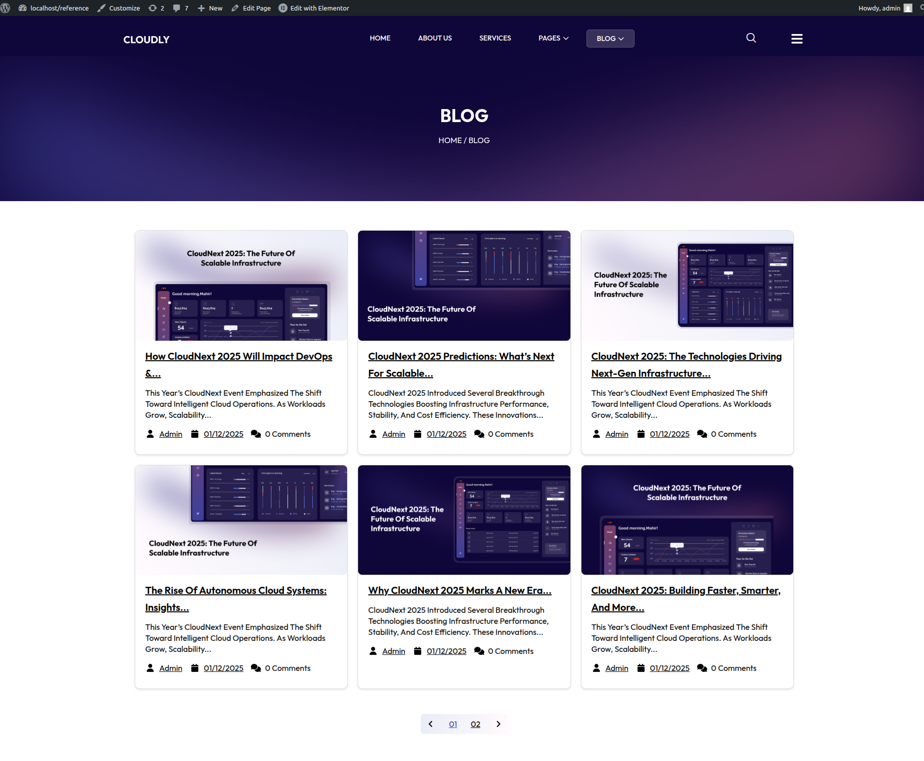
The Blog Page without a sidebar displays all blog posts in a clean, full-width layout using the Posts Widget in Elementor.
- Editing the Blog Page:
- Click the + icon to add a new section.
- Choose a one-column layout for a full-width design.
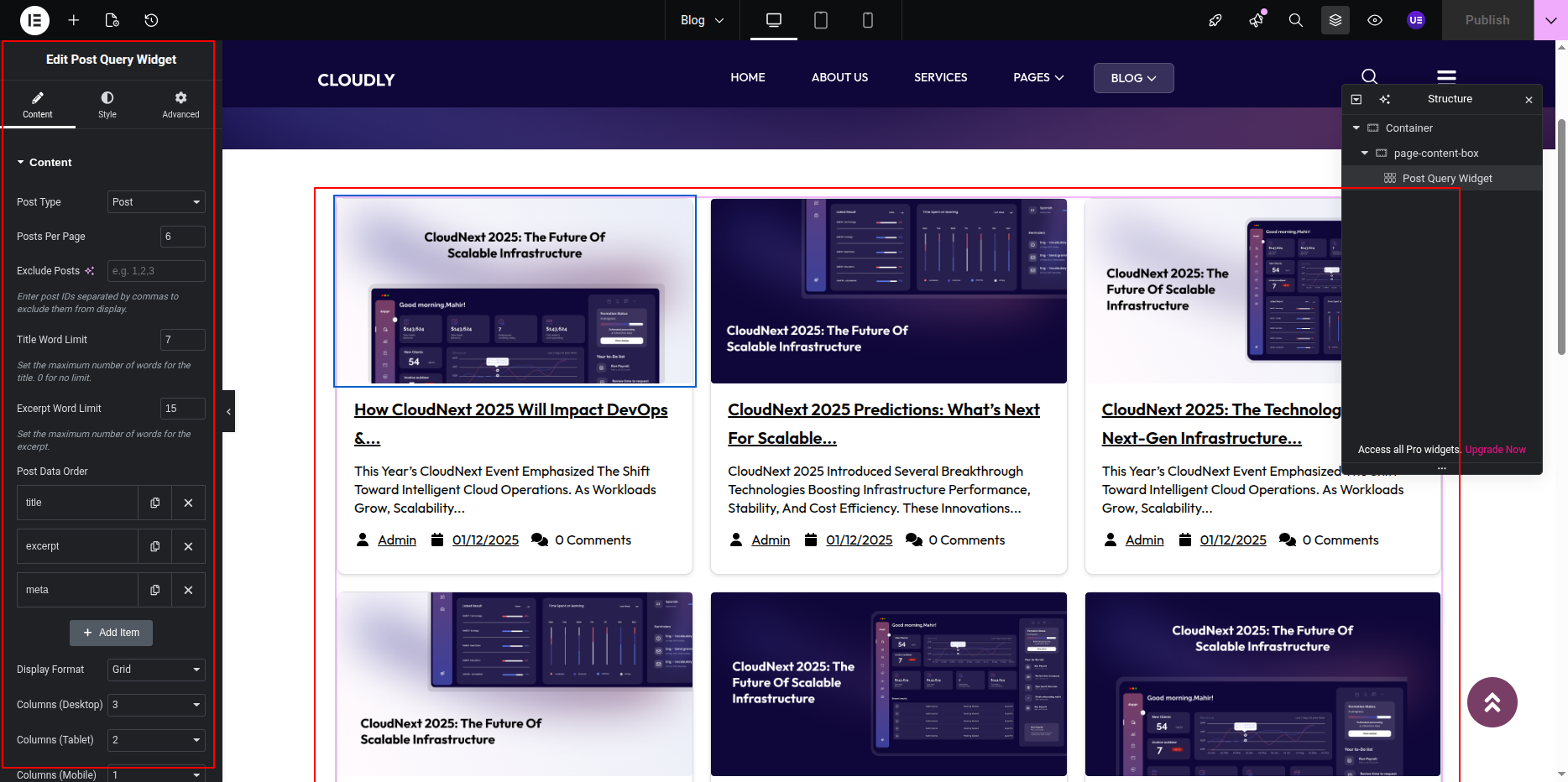
- In the Elementor widgets panel, search for the Posts widget.
- Drag and drop the Posts widget into the section.
- Posts Widget Settings:
- In the Content tab:
- Choose Source: Posts.
- Set the number of posts per page as needed.
- Select the Columns layout (e.g., 2 or 3 columns).
- Enable or disable Pagination as desired.
- In the Query section:
- You can filter posts by category, author, or tags if required.
- Set order by Date or Random depending on your preference.
- In the Layout section:
- Choose from available layout styles (Classic, Cards, Masonry, etc.).
- Adjust the image ratio and alignment of text.
- Styling the Blog Section:
- Go to the Style tab in the Posts widget settings.
- Here you can:
- Change the post title color, typography, and hover effects.
- Adjust spacing between columns and rows.
- Set the excerpt color and button style.
- To modify the read more button:
- Scroll to the Button section under Style.
- Customize button color, typography, border radius, and hover effect.
- Final Adjustments:
- Preview the page to ensure the blog posts display properly in a full-width layout.
- Adjust spacing or section padding as needed using the Advanced tab.
- Click Update to save all changes.
Note: The Posts Widget dynamically pulls blog posts from your WordPress posts section. You can manage or add new posts from Dashboard → Posts → Add New.
In this section, you can set a background banner image and display the page title along with breadcrumbs using Elementor.
- Editing the Blog with Left Sidebar Page:
- Go to your WordPress Dashboard and navigate to Pages → Blog with Left Sidebar.
- Click on Edit with Elementor to open the page in the Elementor editor.
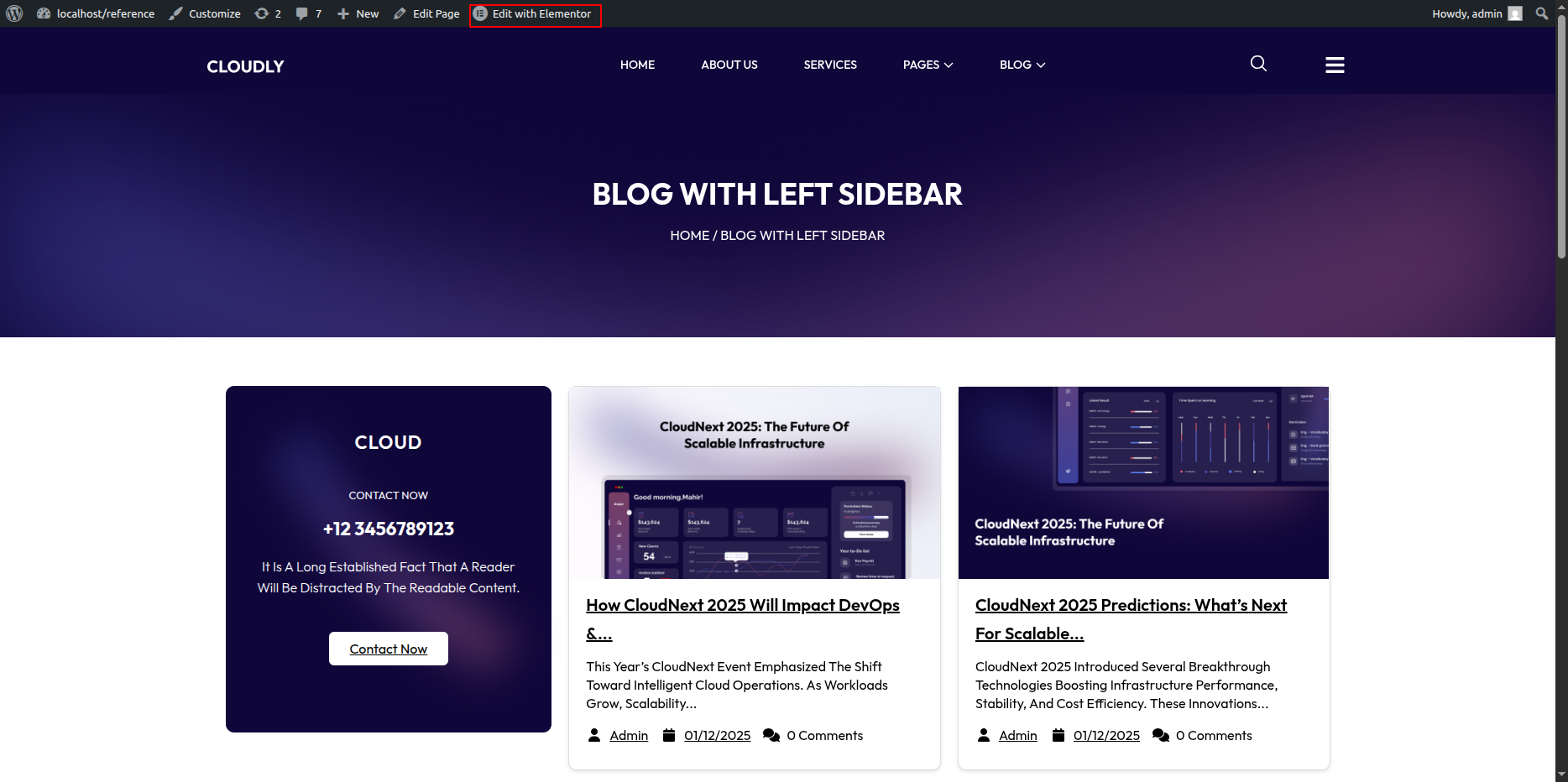
Blog with Left Sidebar Page Section
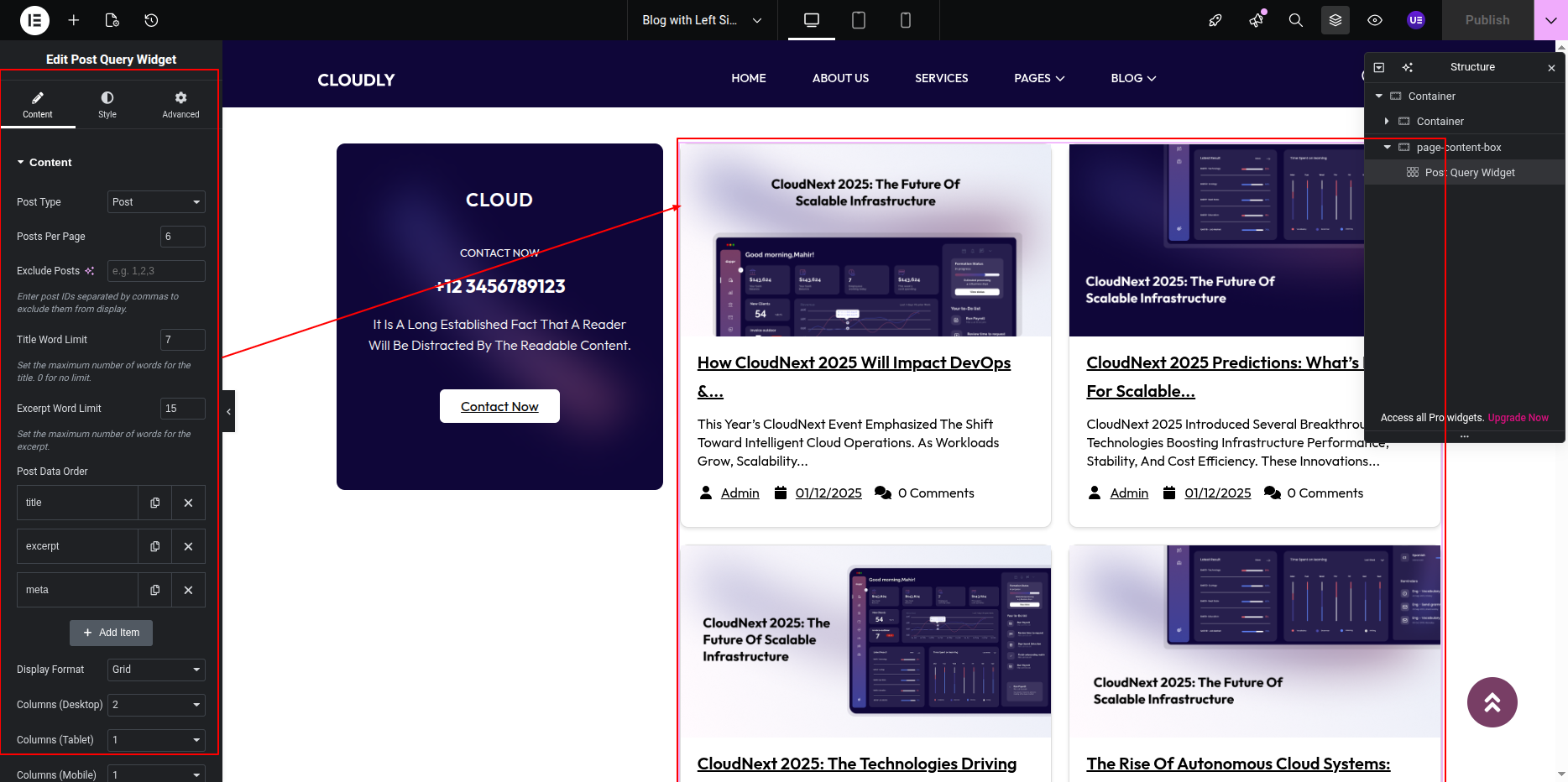
- Editing Blog Posts Section:
- In the Elementor editor, locate the Blog Posts or Posts Widget section.
- Click on the widget to open its settings panel.
- From the Content Tab, adjust:
- Layout: Choose Grid, List, or Masonry layout.
- Columns: Select how many posts you want per row.
- Posts Per Page: Set how many posts display on one page.
- Query: Filter posts by category, tags, or author.
- In the Style Tab, you can modify title color, typography, spacing, and image size.
- Customize the Read More button and Pagination style if available.
- Editing Sidebar Section:
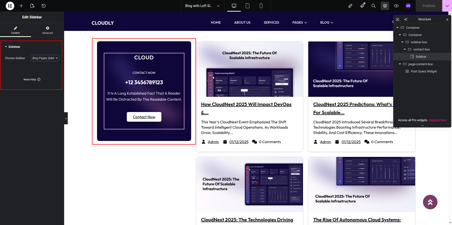
- Locate the Left Sidebar Column in the layout.
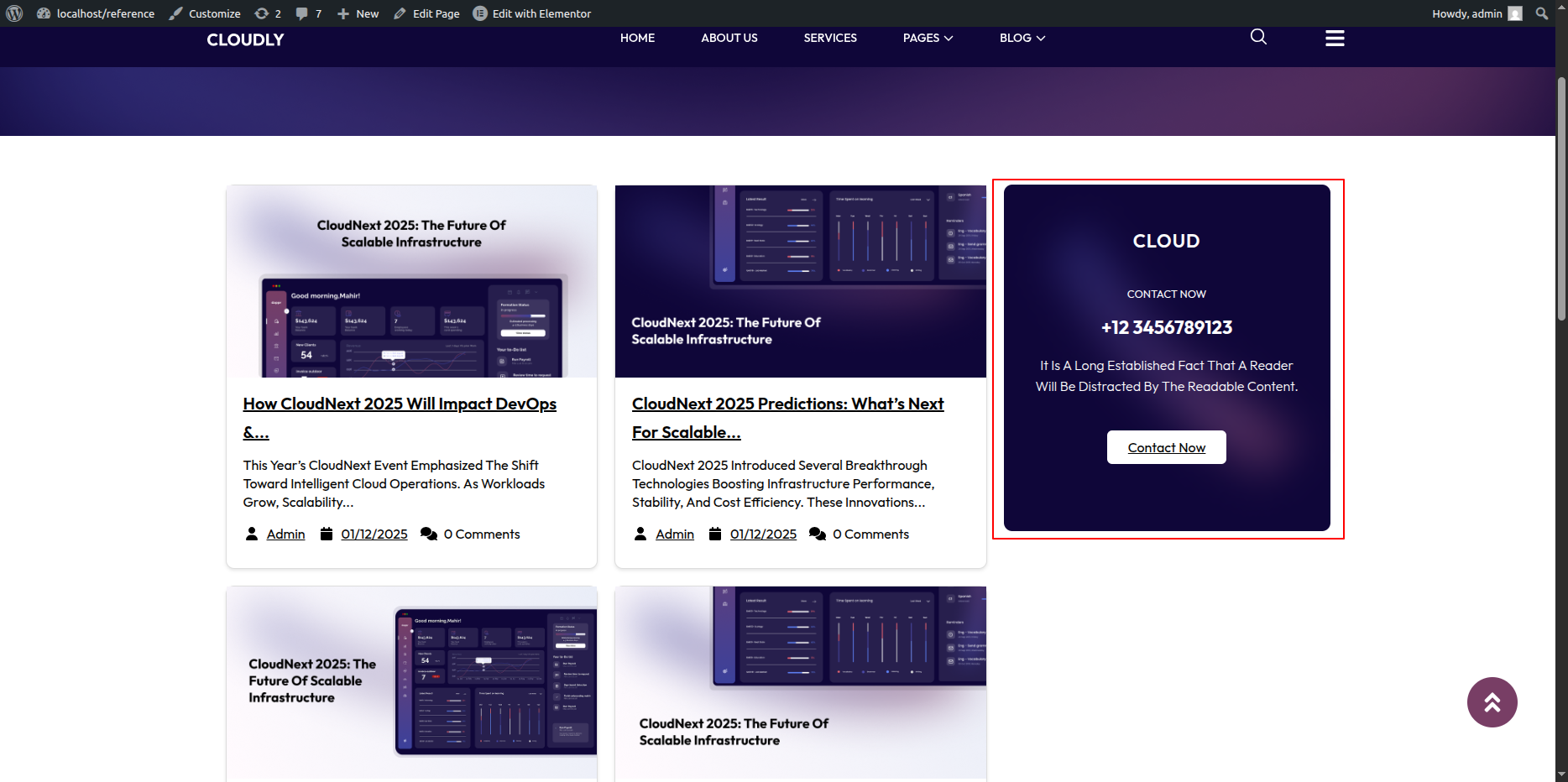
- This area usually contains widgets such as Search, Categories, Recent Posts, or Custom Text.
- Click on any widget to edit its content and style.
- To add a new widget, click the + icon and drag any widget (like Image, Text, or HTML) into the sidebar column.
- To change sidebar background or spacing, click on the Column Handle → open the Style Tab → adjust Background, Border, or Padding.
- Editing Sidebar Widgets via WordPress:
- If your theme uses a dynamic sidebar, go to Appearance → Widgets.
- Find the Sidebar area and add or remove widgets such as Categories, Archives, or Custom HTML.
- These changes automatically appear in your Blog with Left Sidebar layout.
- Adjusting Page Template (Optional):
- In Elementor, click the Settings (⚙️ icon) at the bottom-left corner.
- Under Template, select Default or Page with Left Sidebar.
- Ensure the Sidebar Layout is set to Left Sidebar.
- Saving Changes:
- After making all edits, click the Update button in Elementor.
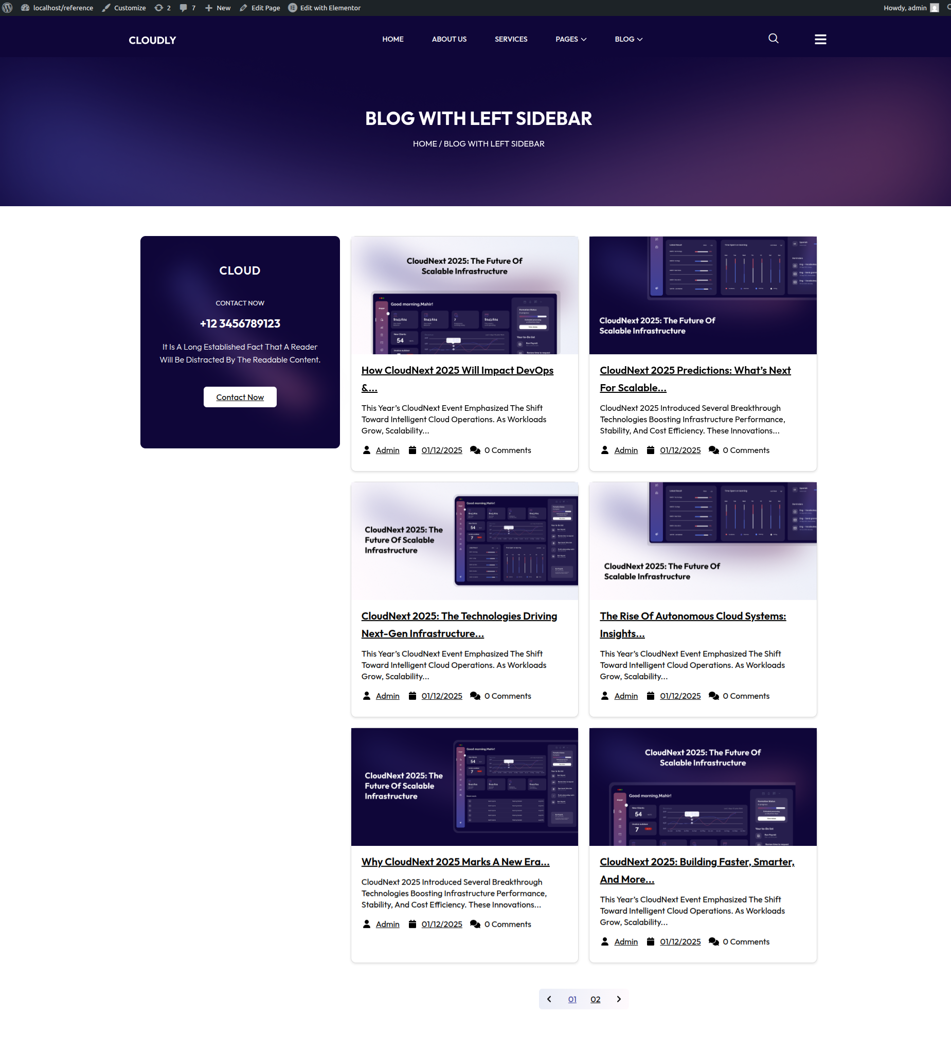
- Preview the page to ensure both the blog posts and sidebar display correctly.
Note: You can manage sidebar widgets either through Elementor or from Appearance → Widgets. Make sure your page template supports the Left Sidebar layout for proper alignment.
- Editing the Blog with Right Sidebar Page:
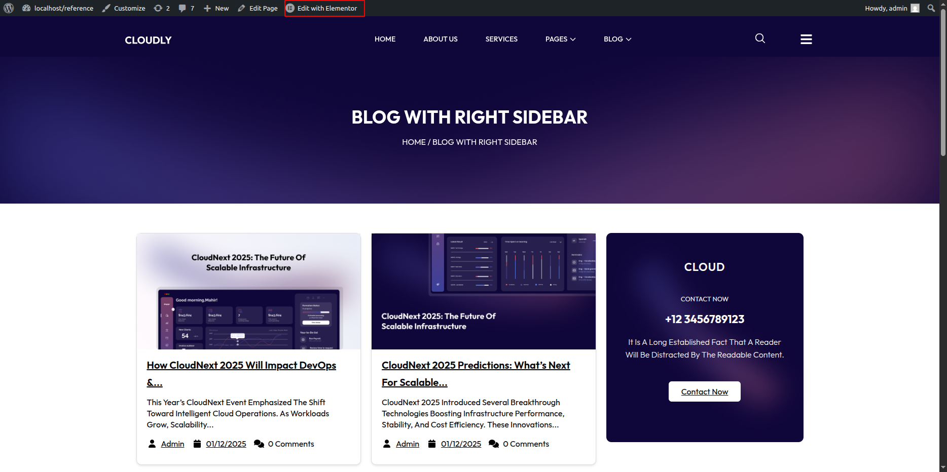
- Go to your WordPress Dashboard and navigate to Pages → Blog with Right Sidebar.
- Click on Edit with Elementor to open the page in the Elementor editor.
Blog with Right Sidebar Page Section
- Editing Blog Posts Section:
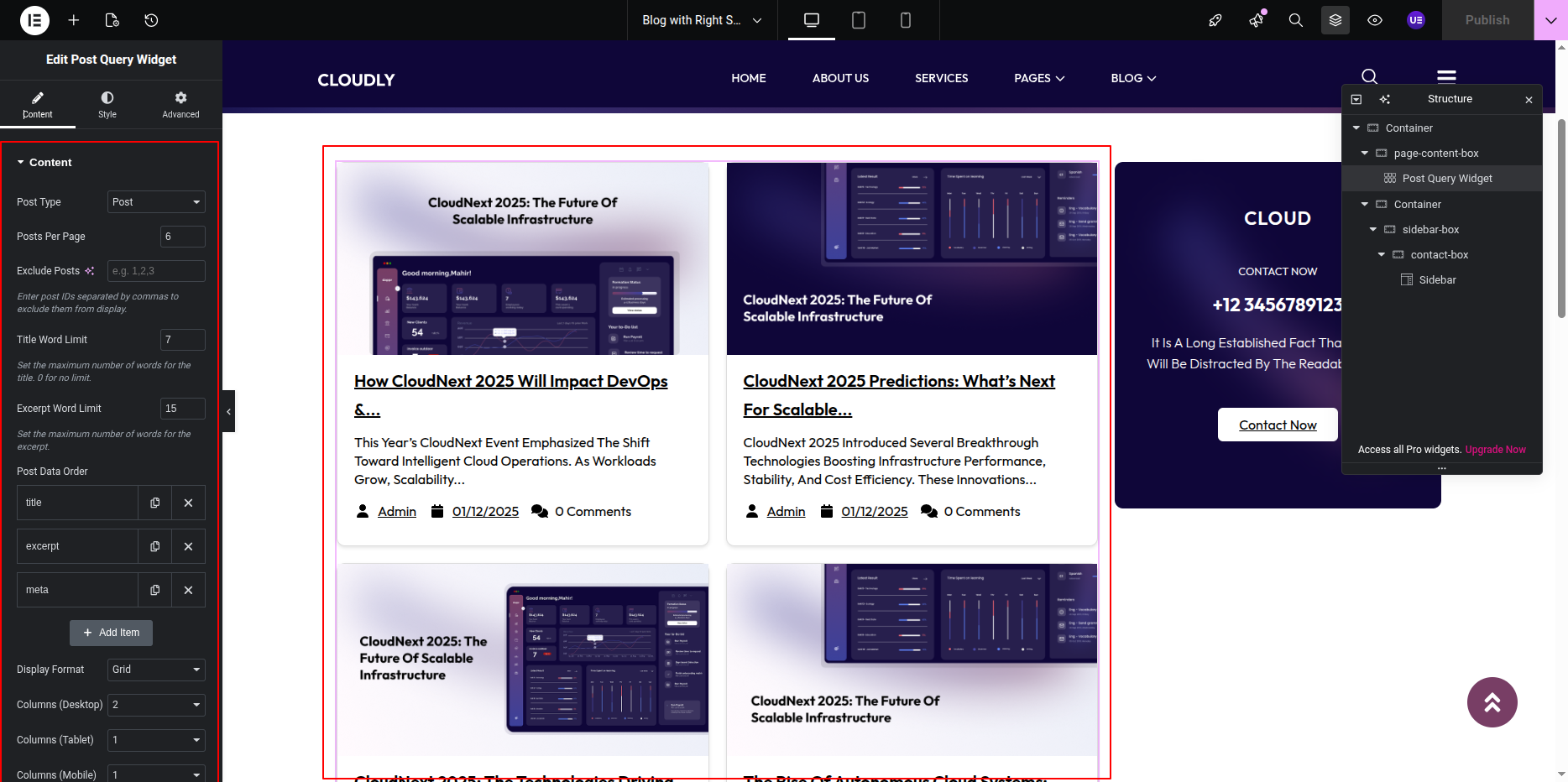
- In the Elementor editor, locate the Blog Posts or Posts Widget section.
- Click on the widget to open its settings panel.
- From the Content Tab, adjust:
- Layout: Choose Grid, List, or Masonry layout.
- Columns: Select how many posts you want per row.
- Posts Per Page: Set how many posts display on one page.
- Query: Filter posts by category, tags, or author.
- In the Style Tab, you can modify title color, typography, spacing, and image size.
- Customize the Read More button and Pagination style if available.
- Editing Sidebar Section:
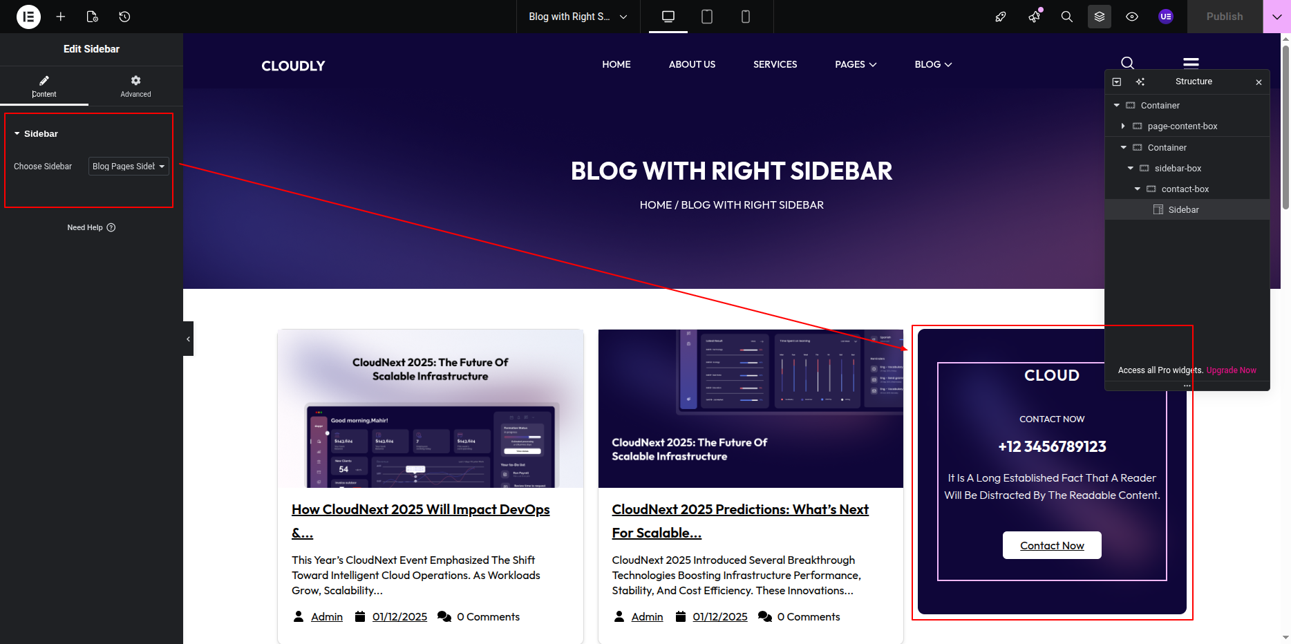
- Locate the Left Sidebar Column in the layout.
- This area usually contains widgets such as Search, Categories, Recent Posts, or Custom Text.
- Click on any widget to edit its content and style.
- To add a new widget, click the + icon and drag any widget (like Image, Text, or HTML) into the sidebar column.
- To change sidebar background or spacing, click on the Column Handle → open the Style Tab → adjust Background, Border, or Padding.
- Editing Sidebar Widgets via WordPress:
- If your theme uses a dynamic sidebar, go to Appearance → Widgets.
- Find the Sidebar area and add or remove widgets such as Categories, Archives, or Custom HTML.
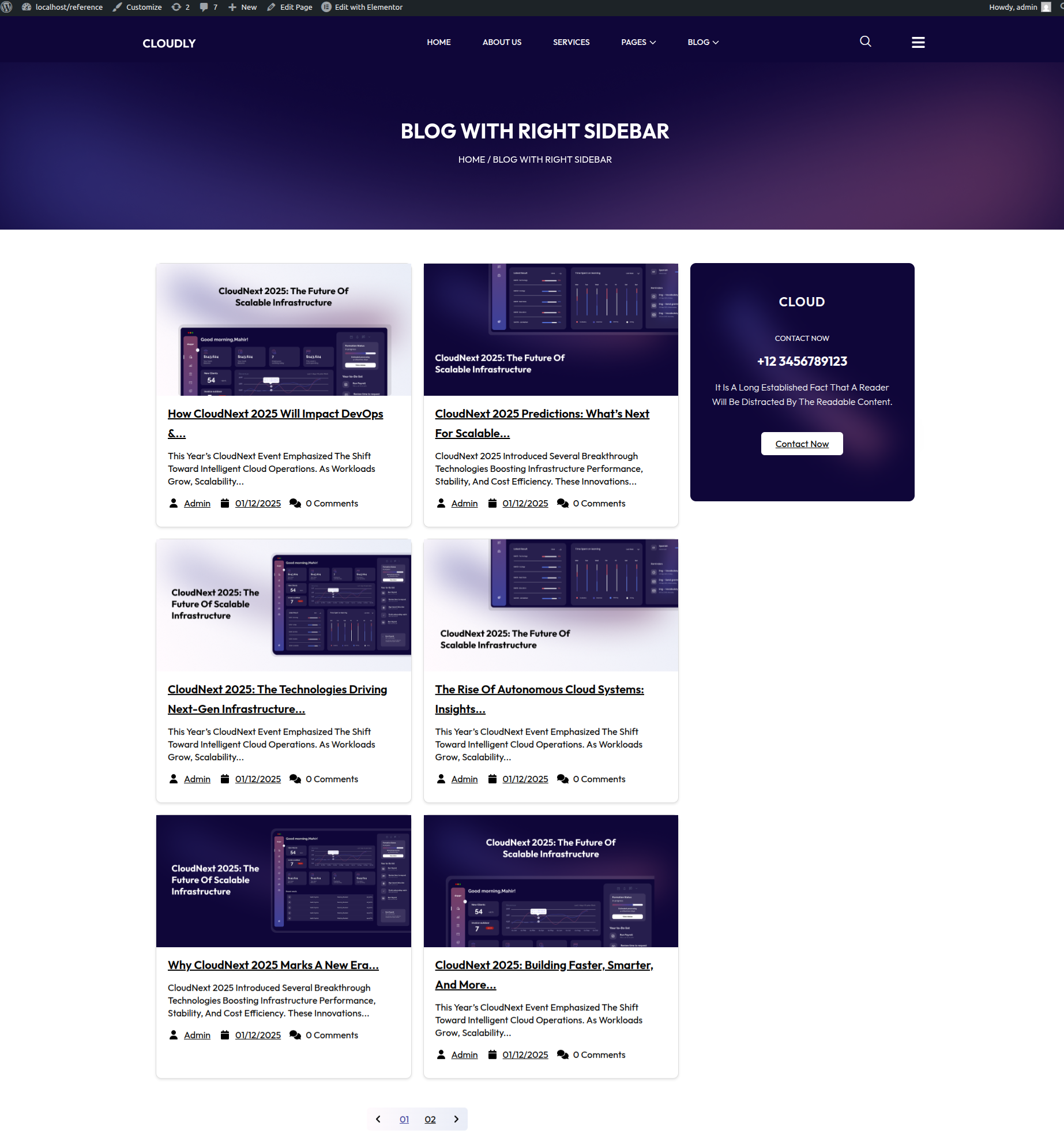
- These changes automatically appear in your Blog with Right Sidebar layout.
- Adjusting Page Template (Optional):
- In Elementor, click the Settings (⚙️ icon) at the bottom-left corner.
- Under Template, select Default or Page with Left Sidebar.
- Ensure the Sidebar Layout is set to Left Sidebar.
- Saving Changes:
- After making all edits, click the Update button in Elementor.
- Preview the page to ensure both the blog posts and sidebar display correctly.
Note: You can manage sidebar widgets either through Elementor or from Appearance → Widgets. Make sure your page template supports the Left Sidebar layout for proper alignment.
Pricing Plan Page
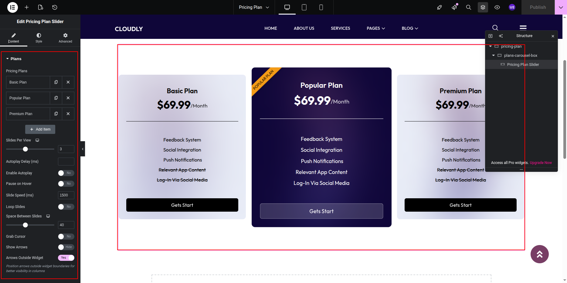
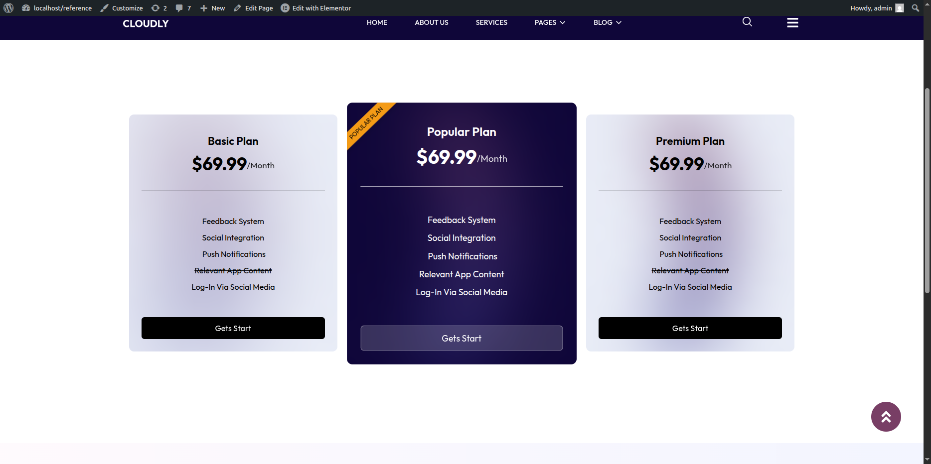
The Pricing Plan Page displays your pricing options in a carousel format using the SVG Styler Pricing Plan Slider Widget. This layout is designed to clearly showcase multiple pricing plans with smooth slider navigation.
Editing the Pricing Plan Page
-
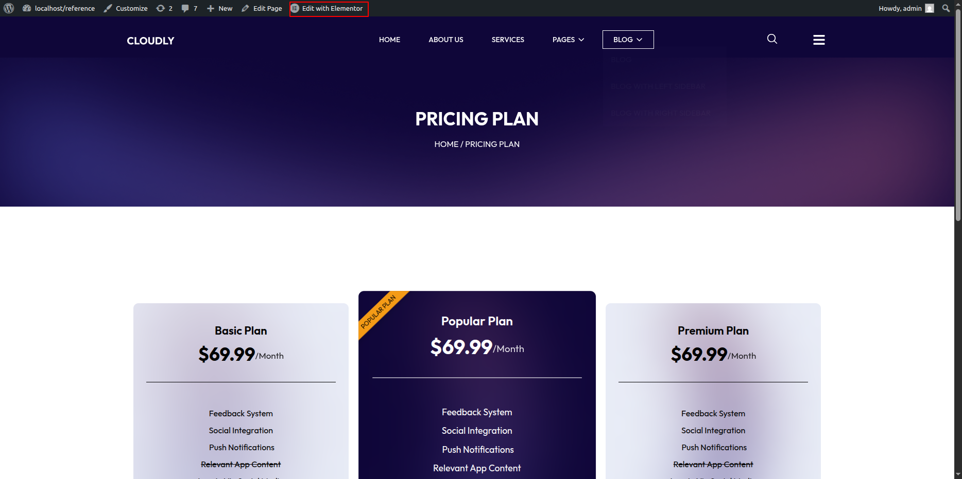
- Go to your WordPress Dashboard → Pages → Pricing Plan.
- Click on Edit with Elementor to open the page in the Elementor editor.
Pricing Plan Page Layout
This page layout primarily focuses on pricing information and includes a plans carousel that allows users to scroll through different pricing options.
Adding Pricing Plans Carousel
-
- Add a new Section in the Elementor editor.
- Select a single-column or full-width layout.
- Drag and drop the SVG Styler Pricing Plan Slider Widget into the section.
Configuring Pricing Plans
-
- Configure each pricing plan with the following details:
- Plan Title
- Price
- Billing Period (Monthly / Yearly)
- Features List
- Call-to-Action Button Text & Link
Slider Settings
-
- Customize slider behavior using widget settings:
- Slides to Show
- Autoplay
- Navigation Arrows
- Dots Pagination
- Loop / Infinite Scroll
Styling the Pricing Plans
-
- Adjust plan card background colors or gradients.
- Customize typography for titles, prices, and features.
- Highlight a Featured Plan if required.
- Apply hover effects or animations.
Responsive Settings
-
- Switch to Tablet and Mobile view.
- Adjust the number of visible plans per slide.
- Ensure pricing cards remain readable on smaller screens.
Final Adjustments
-
- Review plan alignment and spacing.
- Test slider navigation.
- Click Update to save changes.
Note: The SVG Styler Pricing Plan Slider Widget allows you to visually customize pricing plans using SVG-based styles for a modern and engaging appearance.
Privacy Policy Page
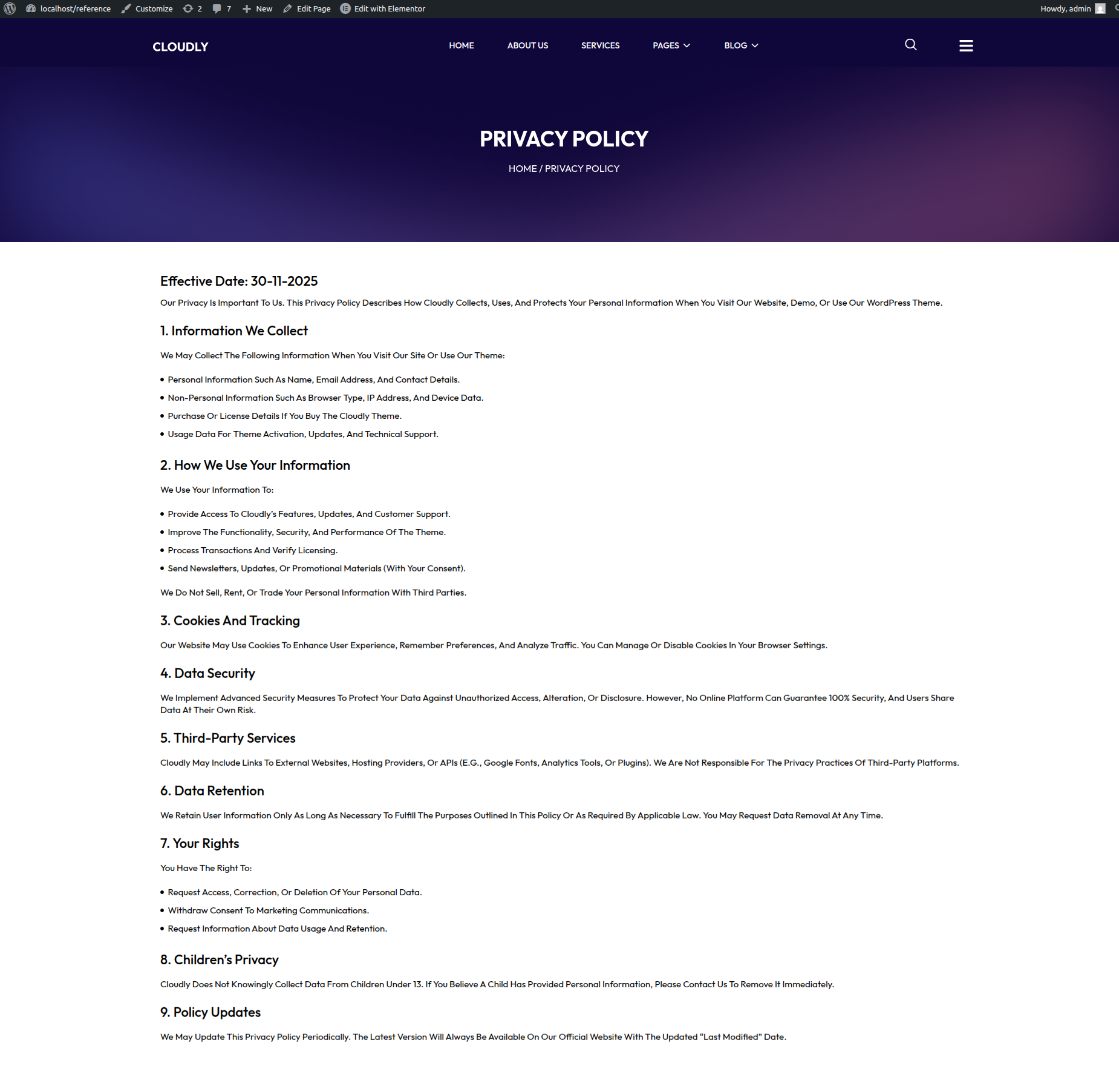
The Privacy Policy Page displays your website’s privacy information, including how user data is collected, used, and protected. This page contains a page title and detailed content only, without any sidebar or additional widgets.
Editing the Privacy Policy Page
-
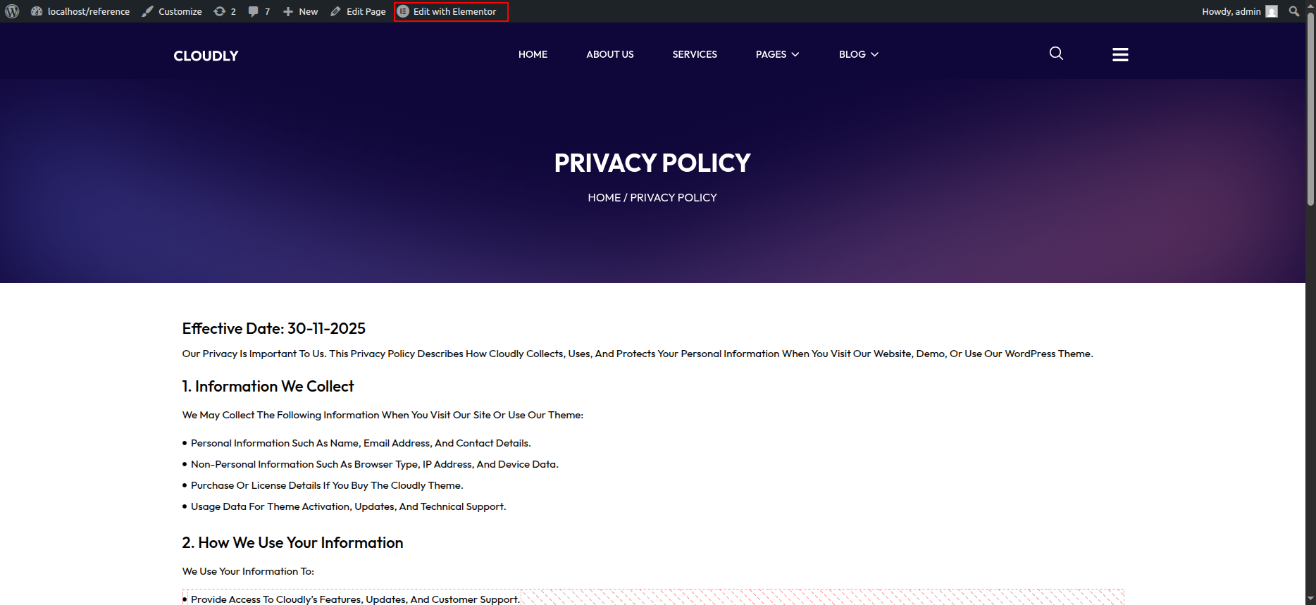
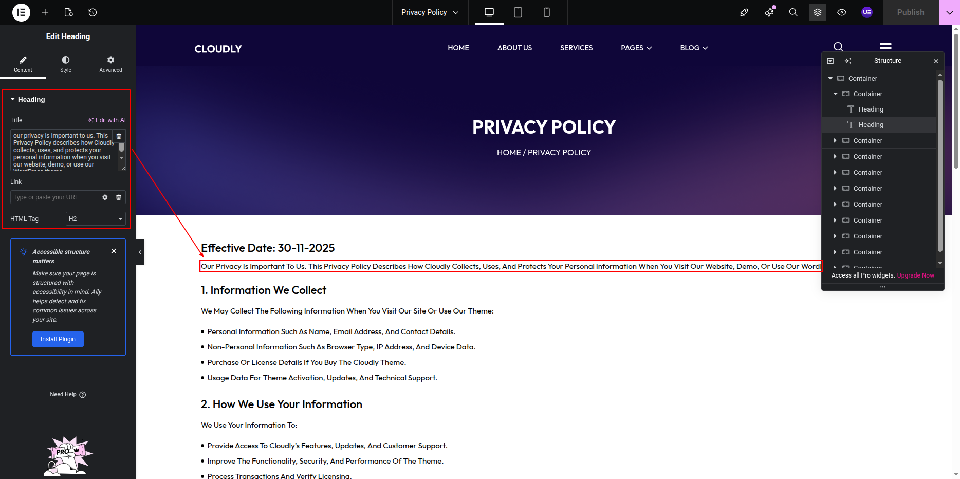
- Go to your WordPress Dashboard → Pages → Privacy Policy.
- Click on Edit with Elementor to open the page in the Elementor editor.
Privacy Policy Page Layout
This page uses a single-column layout focused entirely on text content. It is designed for readability and legal clarity.
Adding Page Title
-
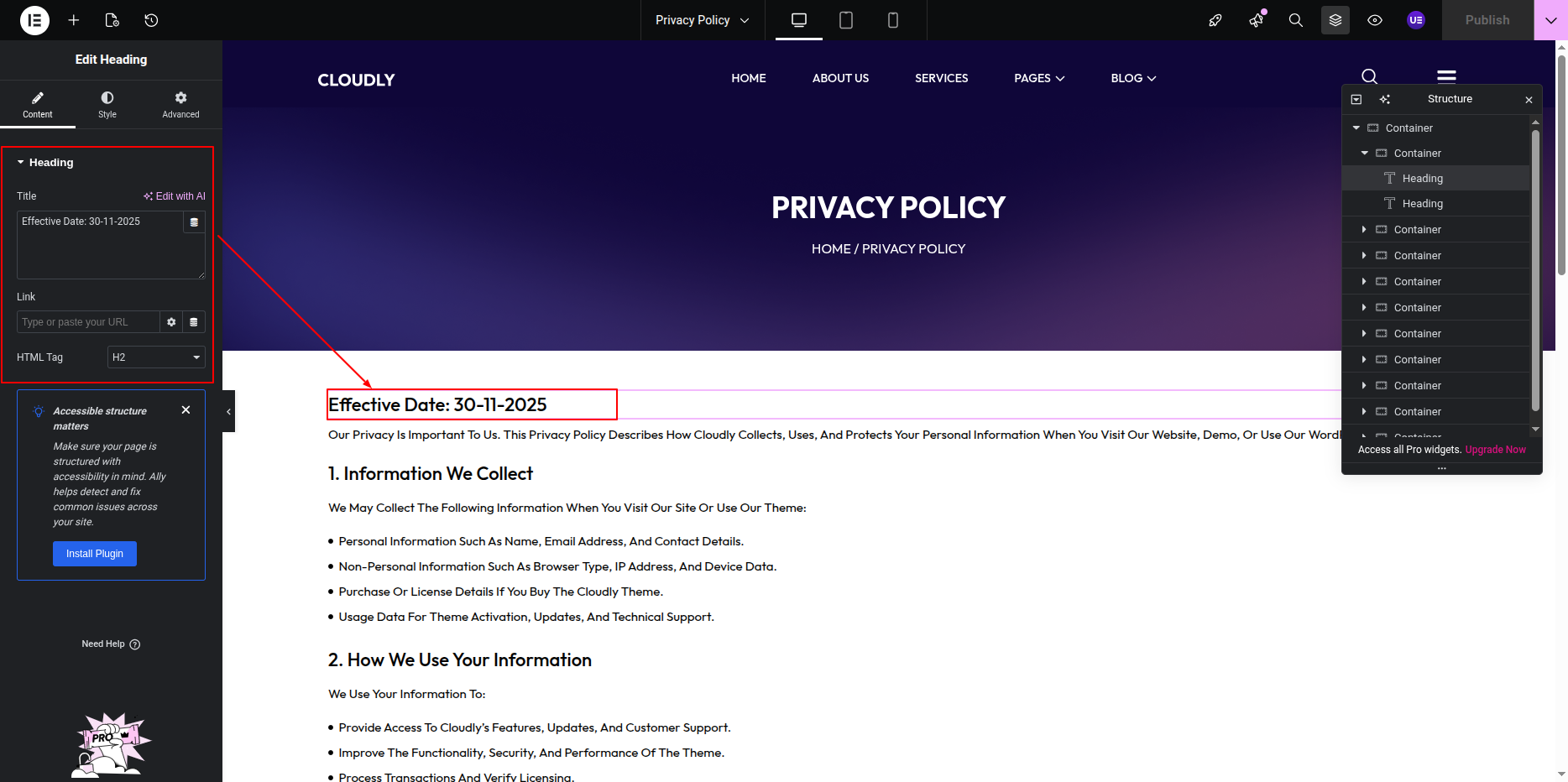
- Add a Heading Widget at the top of the page.
- Use the page title (e.g., Privacy Policy) as the heading text.
- The title will automatically update if the page name is changed in the WordPress Dashboard.
Adding Privacy Policy Content
-
- Add a Text Editor Widget below the page title.
- Enter or paste your privacy policy content.
- Use headings, paragraphs, and lists to structure the content clearly.
Customizing Page Design
-
- Adjust typography for better readability.
- Set line height and spacing between paragraphs.
- Keep background and text colors simple and accessible.
Responsive Settings
-
- Switch to Tablet and Mobile view.
- Ensure text size and spacing remain readable.
Final Adjustments
-
- Review the content for accuracy and compliance.
- Ensure headings are properly structured.
- Click Update to save the page.
Note: WordPress also provides a default privacy policy template, which you can customize further using Elementor.
Terms & Conditions Page
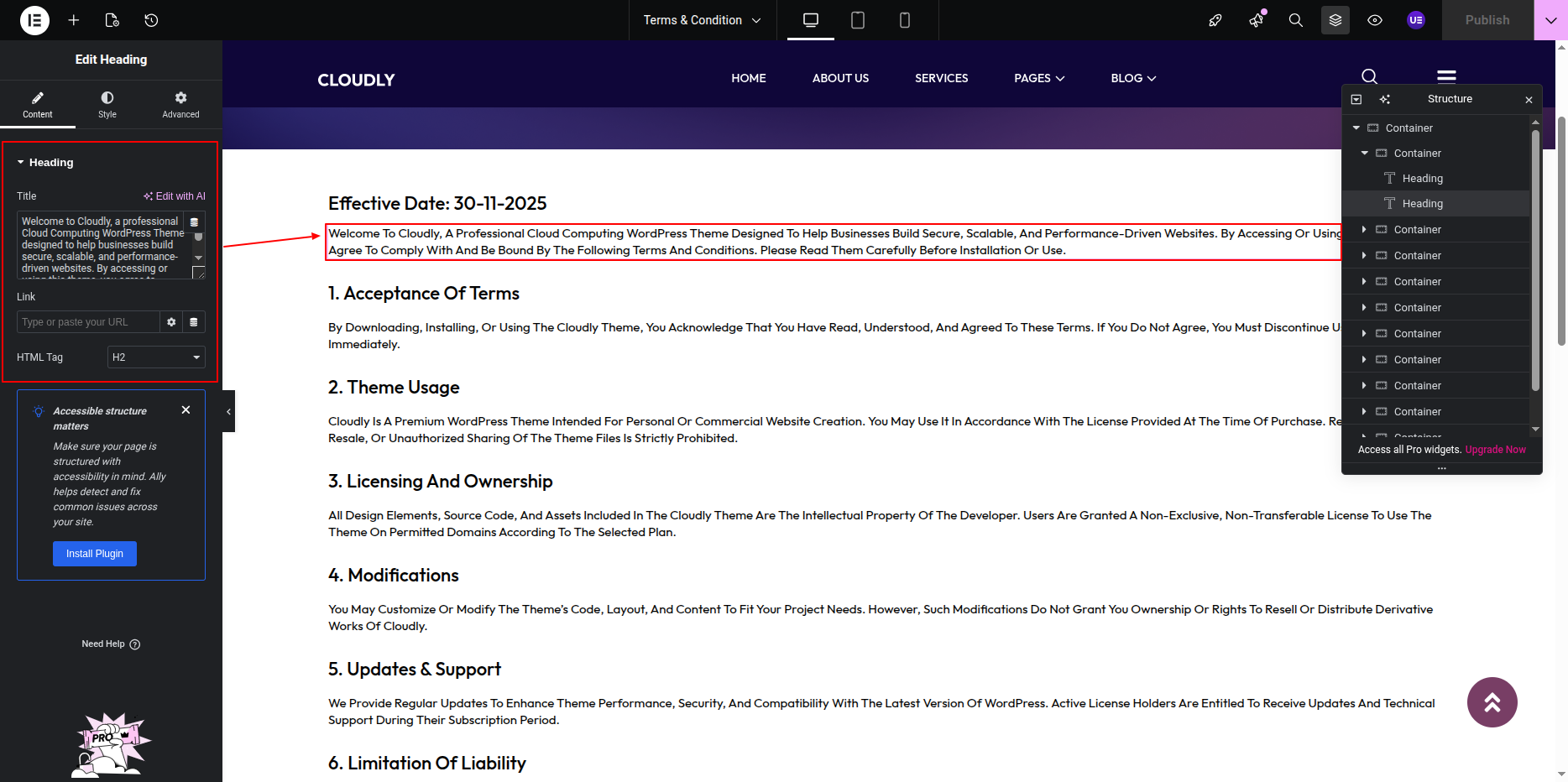
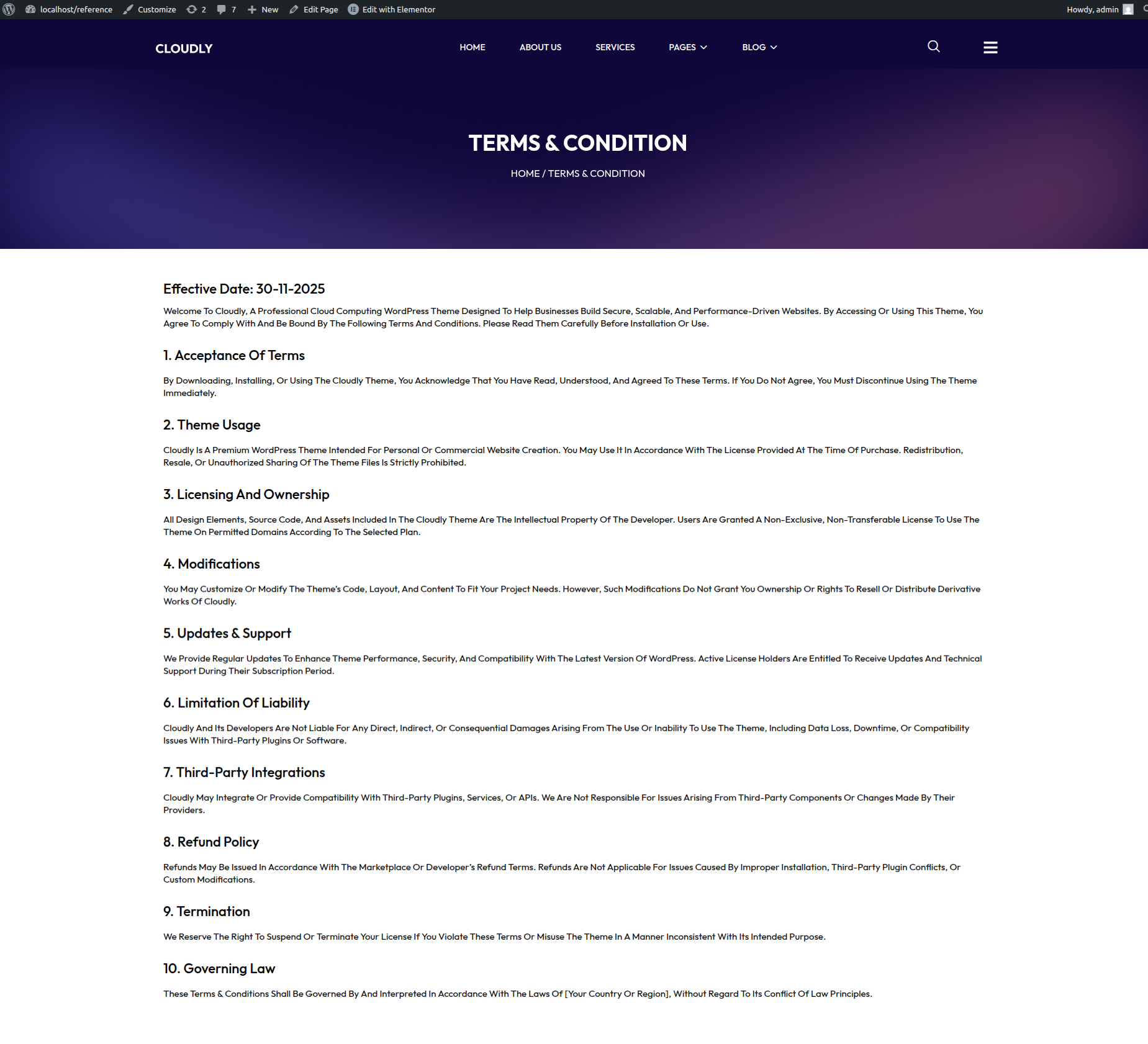
The Terms & Conditions Page outlines the rules, guidelines, and legal terms that users must agree to when using your website. This page includes a page title and detailed content only, without any sidebar.
Editing the Terms & Conditions Page
-
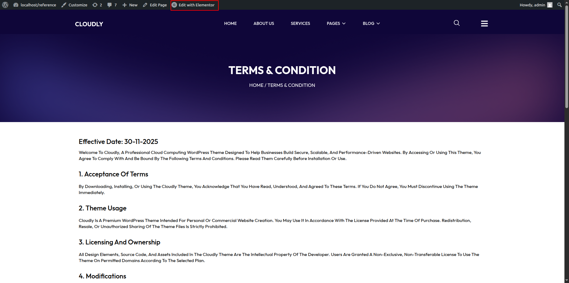
- Go to your WordPress Dashboard → Pages → Terms & Conditions.
- Click on Edit with Elementor to open the page in the Elementor editor.
Terms & Conditions Page Layout
This page uses a single-column layout focused on text content for clarity and readability.
Adding Page Title
-
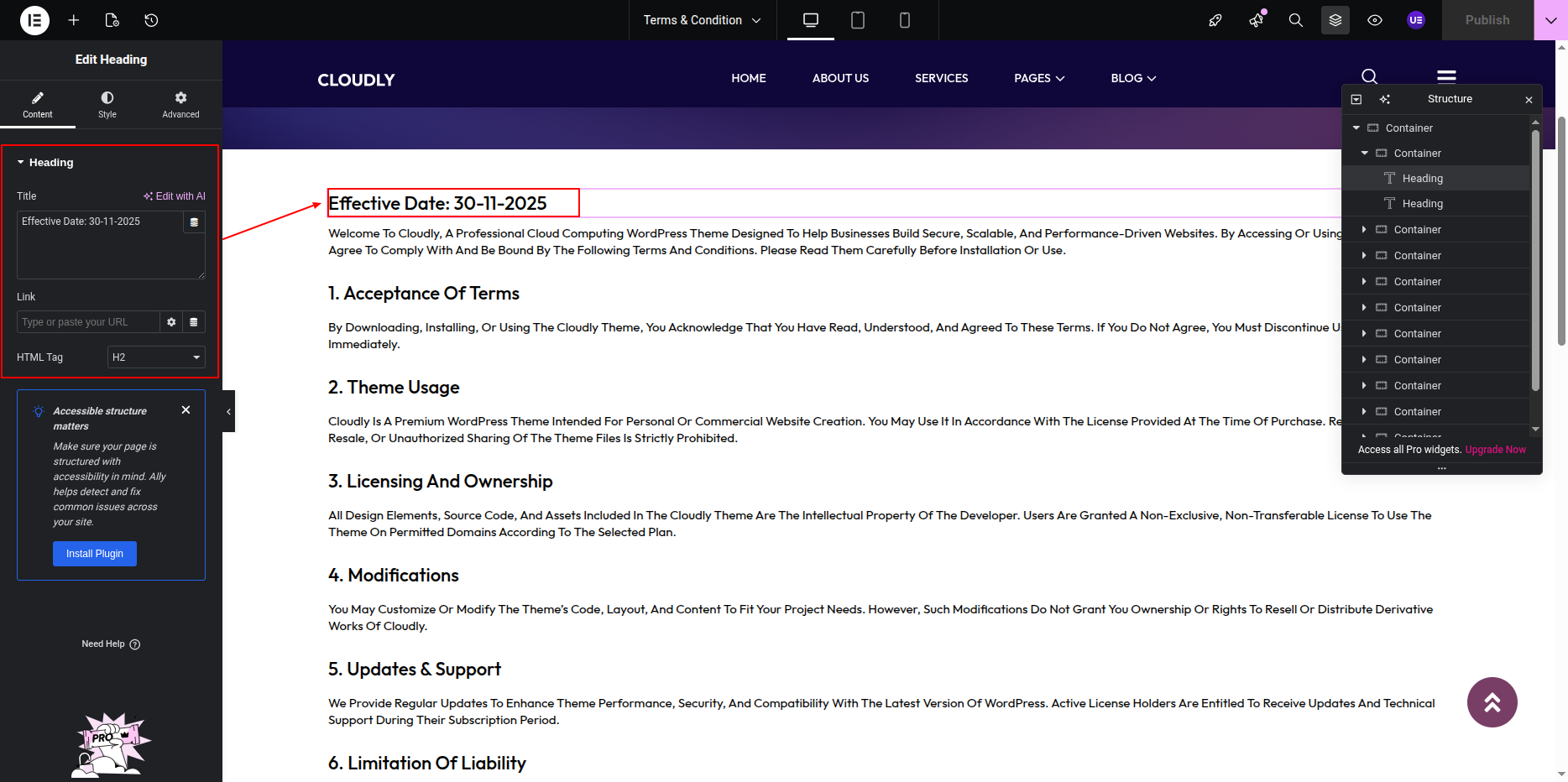
- Add a Heading Widget at the top of the page.
- Use the page title (e.g., Terms & Conditions) as the heading text.
- The title will automatically update if the page name is changed from the WordPress Dashboard.
Adding Terms & Conditions Content
-
- Add a Text Editor Widget below the page title.
- Enter or paste your terms and conditions content.
- Use headings, paragraphs, and lists to organize sections clearly.
Customizing Page Design
-
- Adjust typography for readability.
- Set appropriate line height and spacing.
- Keep background and text colors simple and accessible.
Responsive Settings
-
- Switch to Tablet and Mobile view.
- Ensure text remains legible on smaller screens.
Final Adjustments
-
- Review content for accuracy and legal compliance.
- Ensure consistent heading structure.
- Click Update to save the page.
Note: You can use WordPress’s default Terms & Conditions content as a base and customize it further using Elementor.
Support Page
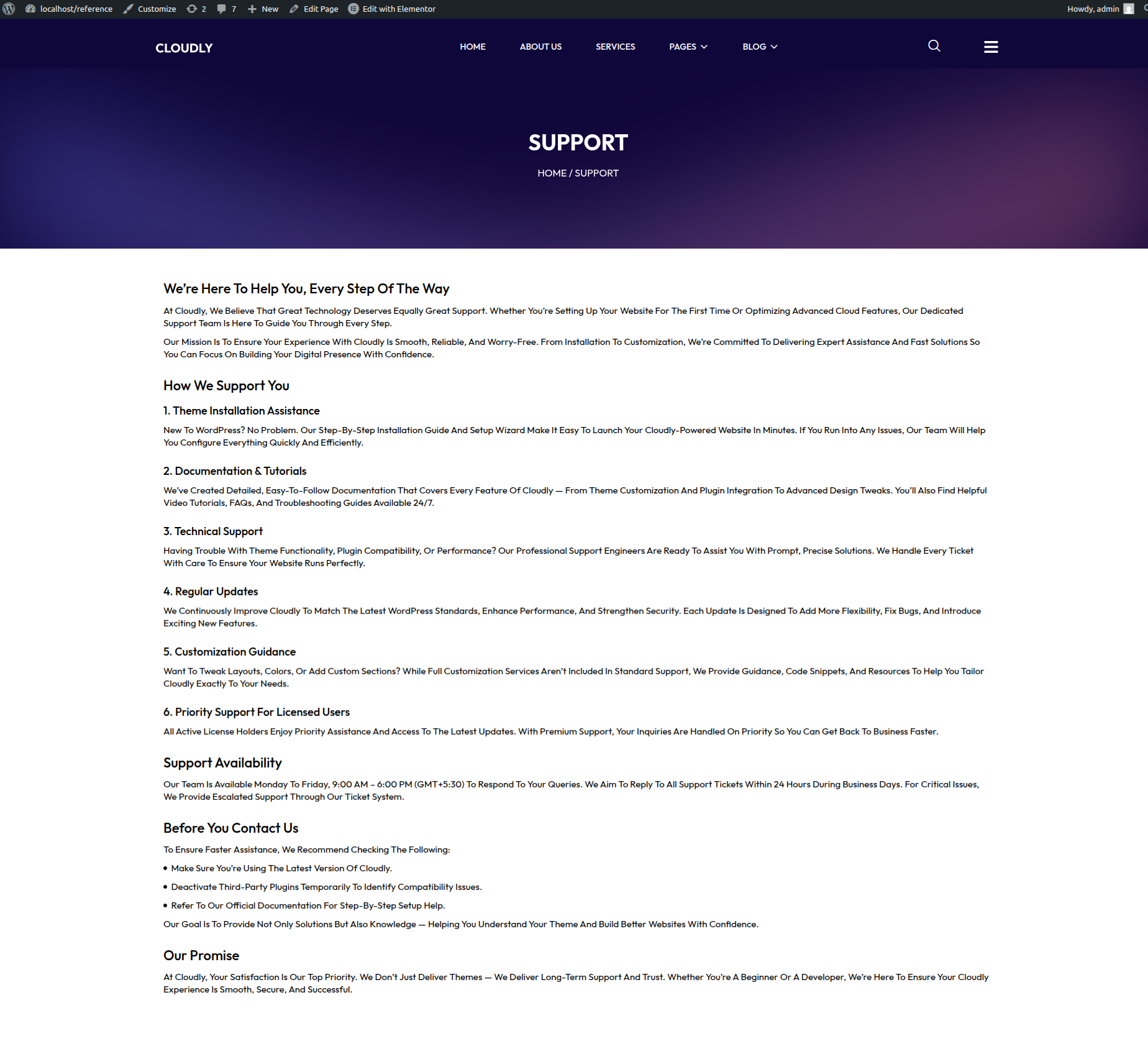
The Support Page helps users get assistance by providing support information, guidance, and contact options. This page typically includes a page title, descriptive content, and support-related sections such as contact details, FAQs, or a support form.
Editing the Support Page
-
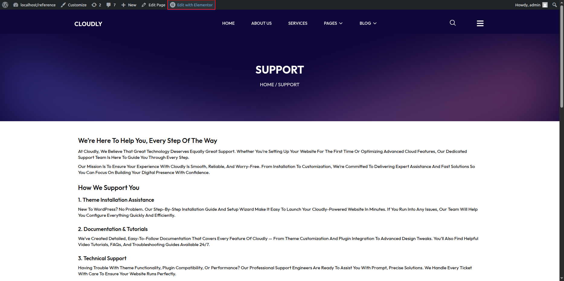
- Go to your WordPress Dashboard → Pages → Support.
- Click on Edit with Elementor to open the page in the Elementor editor.
Support Page Layout
This page usually uses a single-column layout or a simple multi-section layout to clearly present support information.
Adding Page Title
-
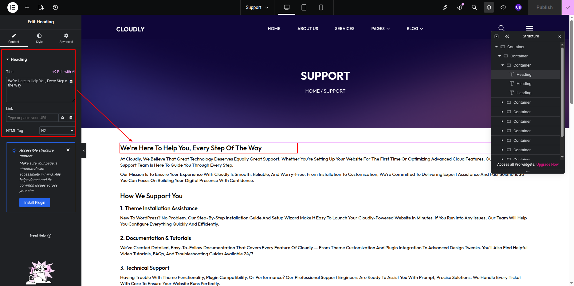
- Add a Heading Widget at the top of the page.
- Use the page title (e.g., Support or Help & Support) as the heading.
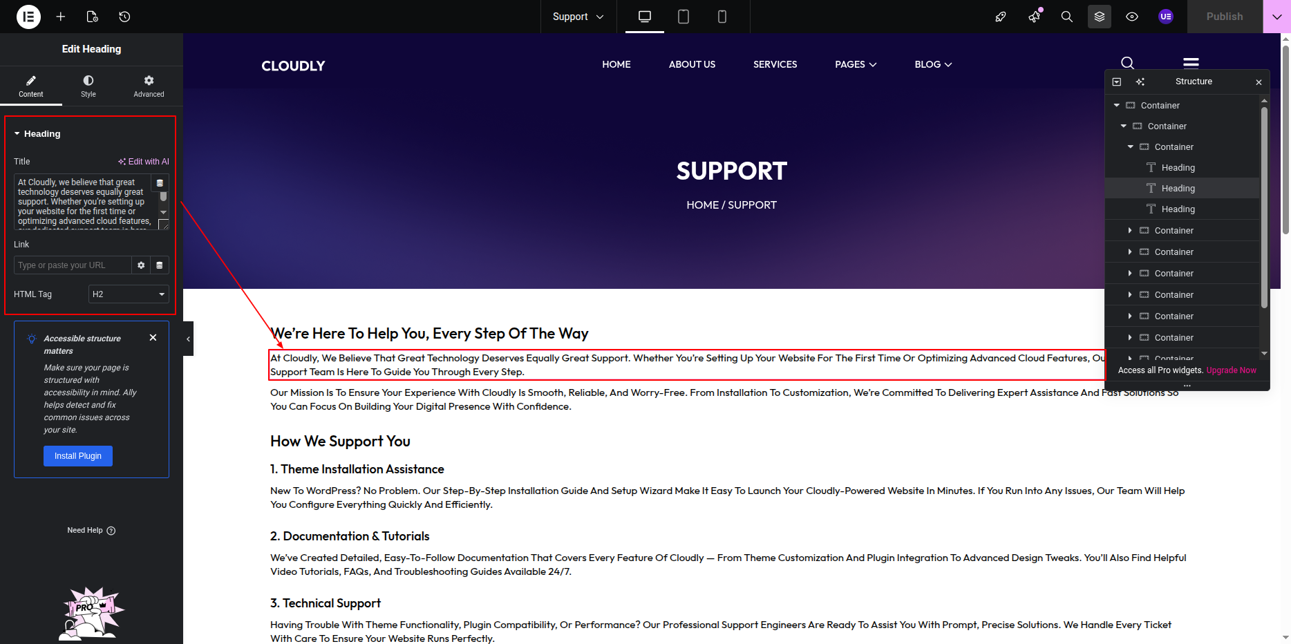
Adding Support Content
-
- Add a Text Editor Widget to describe how users can get help.
- Include information such as:
- Support availability
- Response time expectations
- Contact instructions
Adding Support Options
You can enhance the Support Page by adding one or more of the following:
- Contact Form (using Contact Form 7 or Elementor Form)
- FAQ Section (using Accordion Widget)
- Email or Phone Details
- Support Links (Documentation, Knowledge Base, Tickets)
Styling the Support Page
-
- Adjust typography for clarity.
- Use icons or dividers to separate sections.
- Maintain consistent spacing between sections.
Responsive Settings
-
- Switch to Tablet and Mobile view.
- Ensure buttons and forms are easy to interact with.
Final Adjustments
-
- Test all contact links and forms.
- Ensure support information is accurate.
- Click Update to save the page.
Note: Keep the Support Page simple and easy to navigate so users can quickly find help.
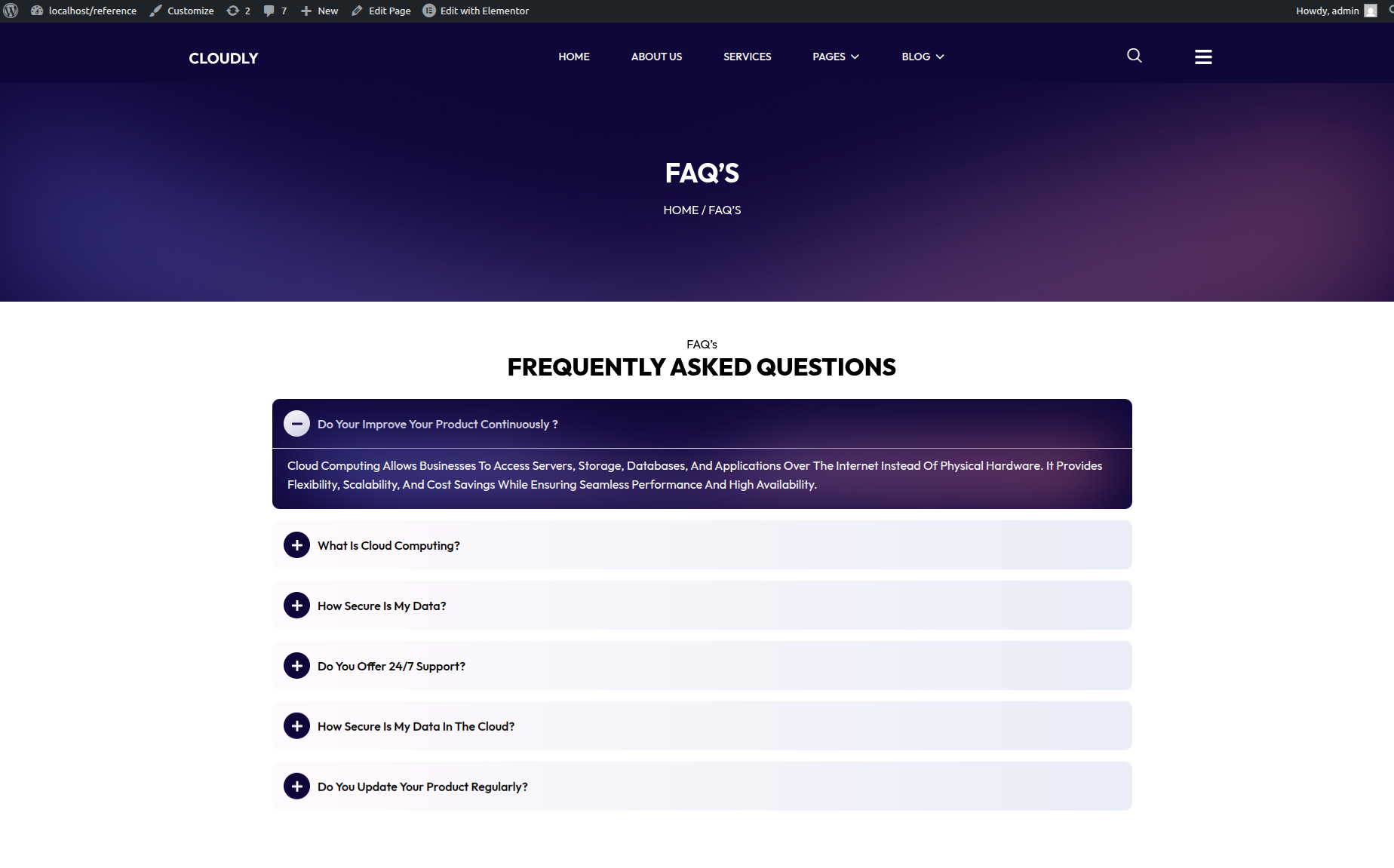
FAQ Page
The FAQ Page provides answers to commonly asked questions in an easy-to-read format. This page includes a page title, a main heading, and an accordion layout created using the Accordion Widget.
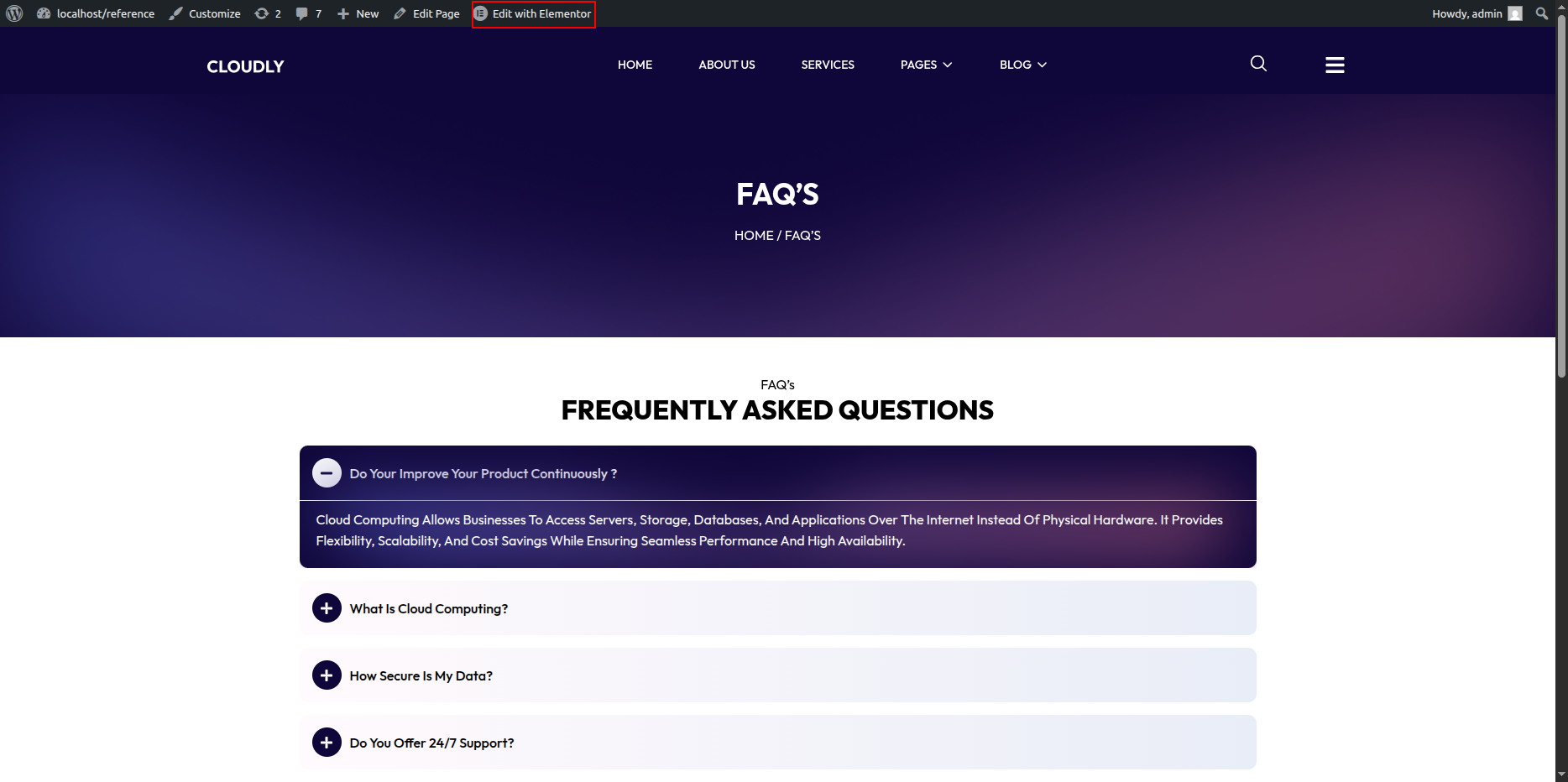
Editing the FAQ Page
-
- Go to your WordPress Dashboard → Pages → FAQ.
- Click on Edit with Elementor to open the page in the Elementor editor.
FAQ Page Layout
This page uses a single-column layout focused on clarity and readability.
Adding Page Title & Heading
-
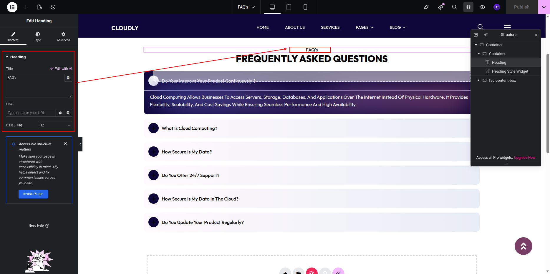
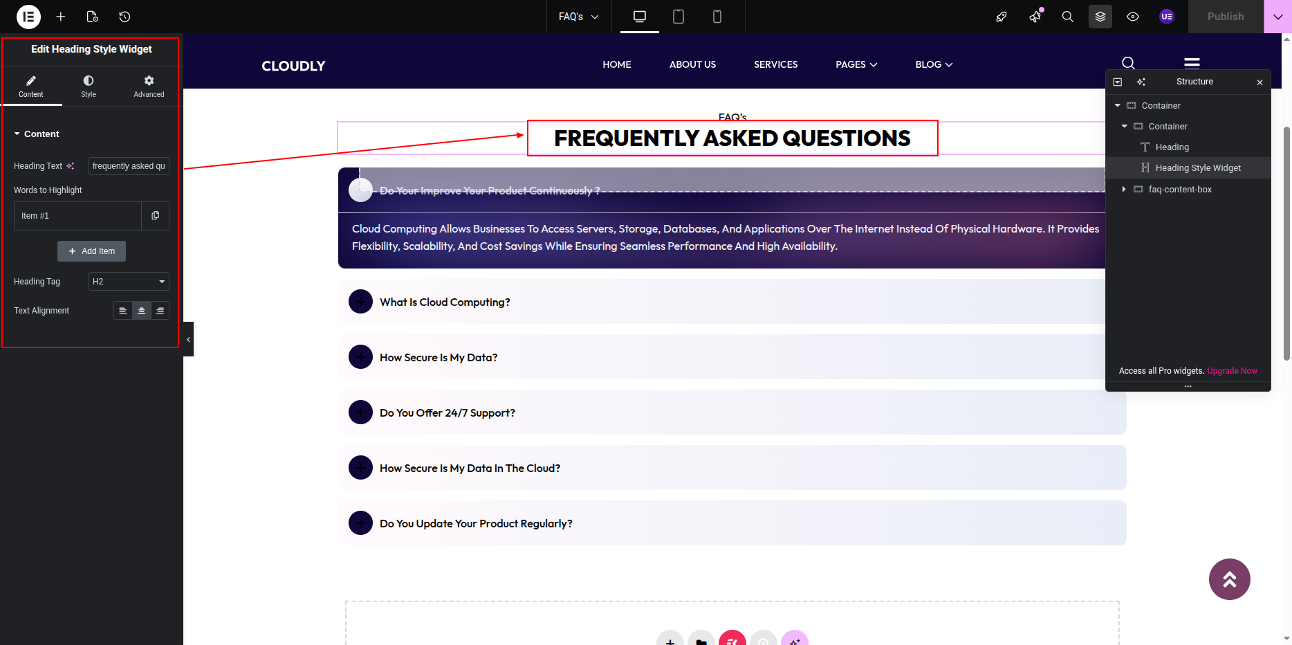
- Add a Heading Widget at the top for the page title.
- Add another Heading Widget for the main section heading.
- The page title will automatically update if the page name is changed in the WordPress Dashboard.
Adding FAQ Accordions
-
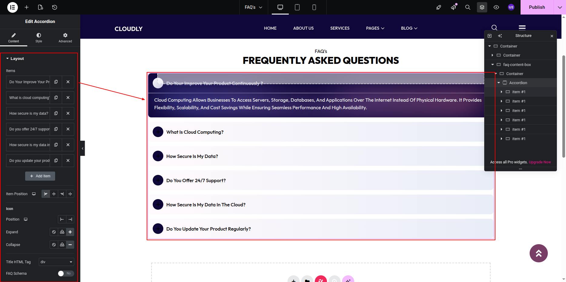
- Add an Accordion Widget below the heading.
- Add FAQ items with the following details:
- Title: Question
- Content: Answer
- Repeat this process for all FAQ entries.
Styling the Accordion
-
- Customize typography for FAQ titles and content.
- Adjust spacing between accordion items.
- Style icons (plus/minus) and active states.
- Set background color or borders if needed.
Responsive Settings
-
- Switch to Tablet and Mobile view.
- Ensure accordion titles remain readable and tappable.
Final Adjustments
-
- Review all questions and answers.
- Ensure consistent formatting.
- Click Update to save the page.
Note: Keep answers concise and organized for a better user experience.