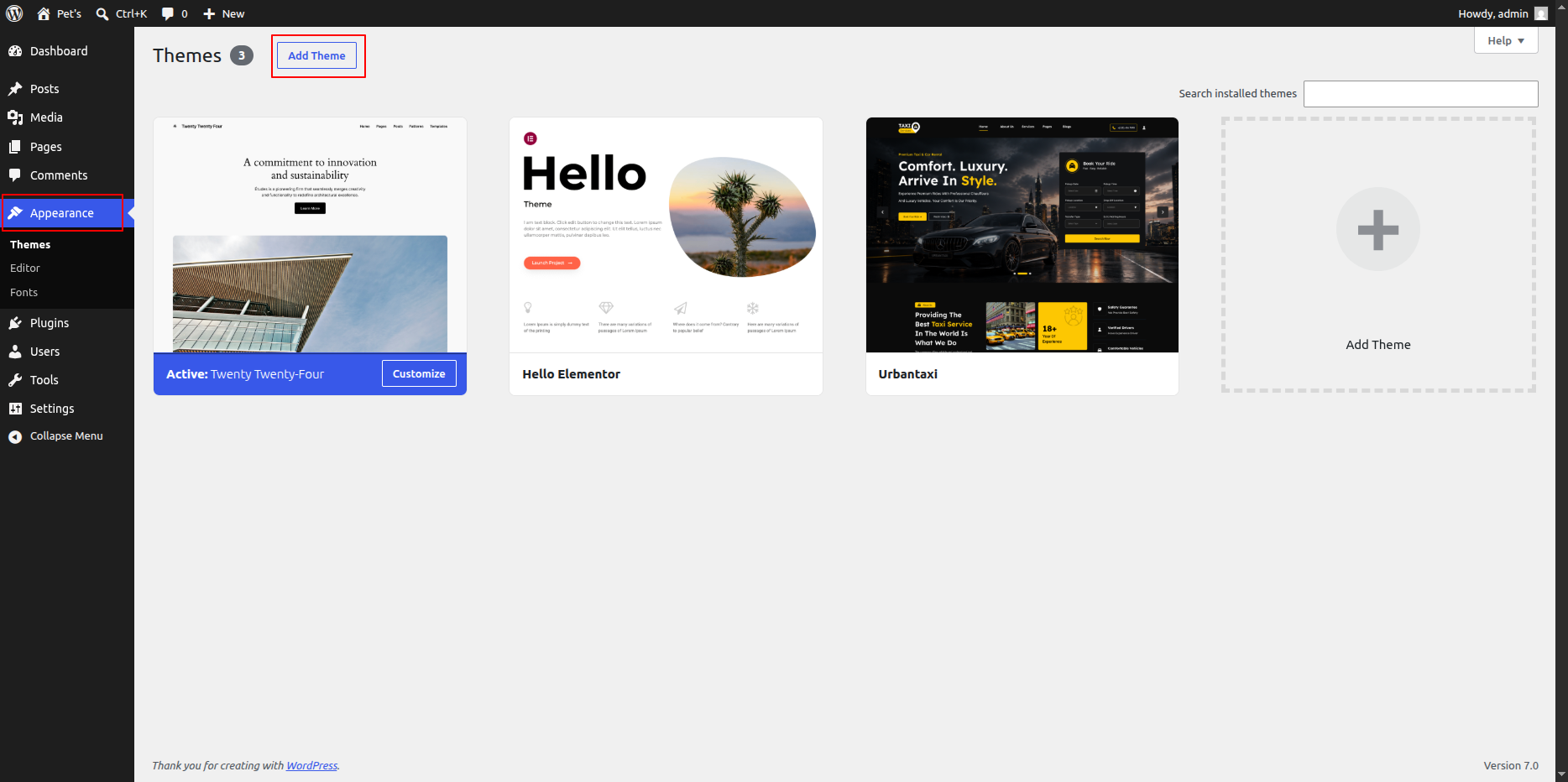
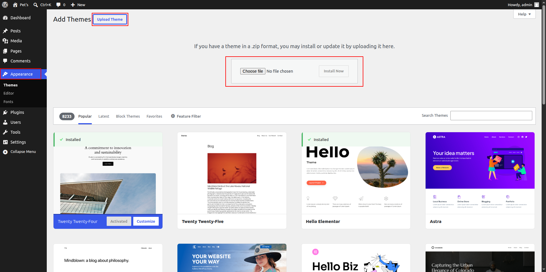
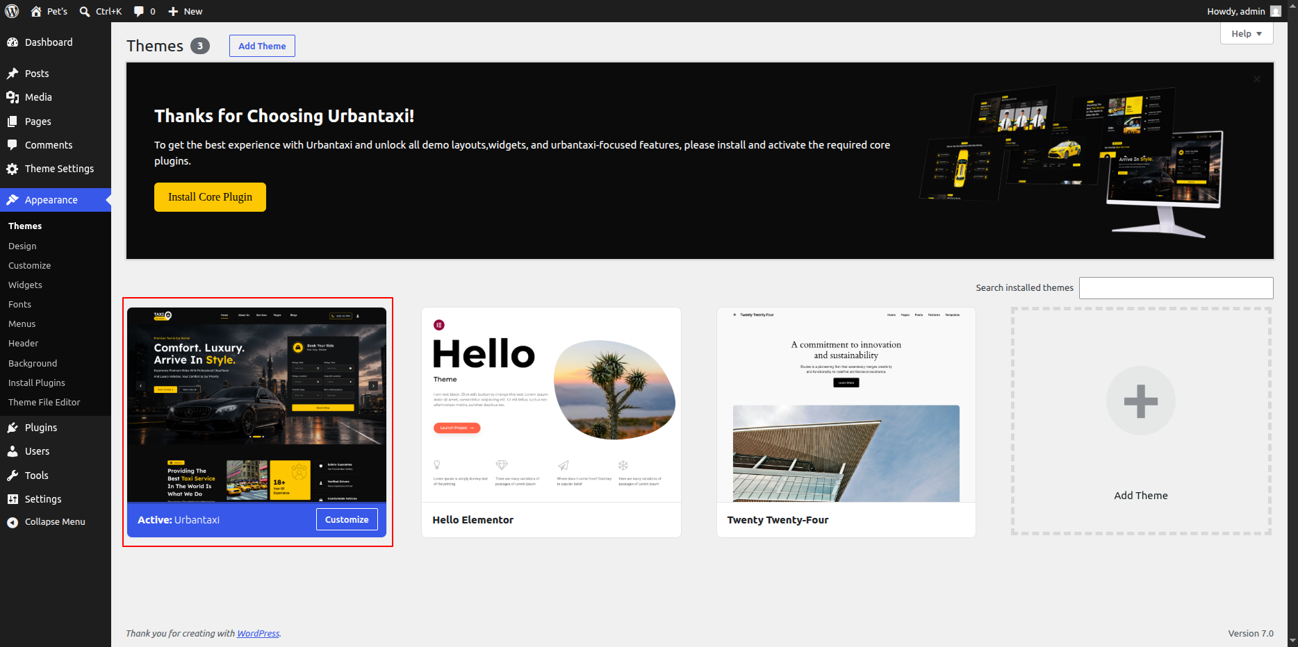
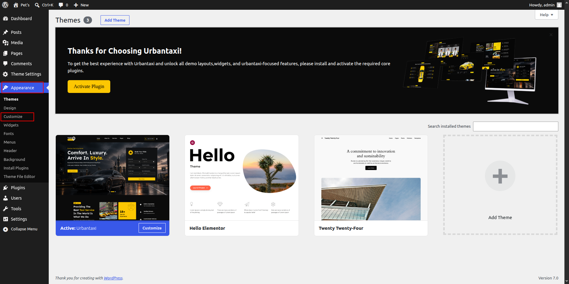
Theme Configuration
Now that you’ve successfully installed the theme, it’s time to explore how to configure and manage it effectively.
This guide will walk you through the key features and customization options available, helping you make the most of your new website.
Key Areas to Explore
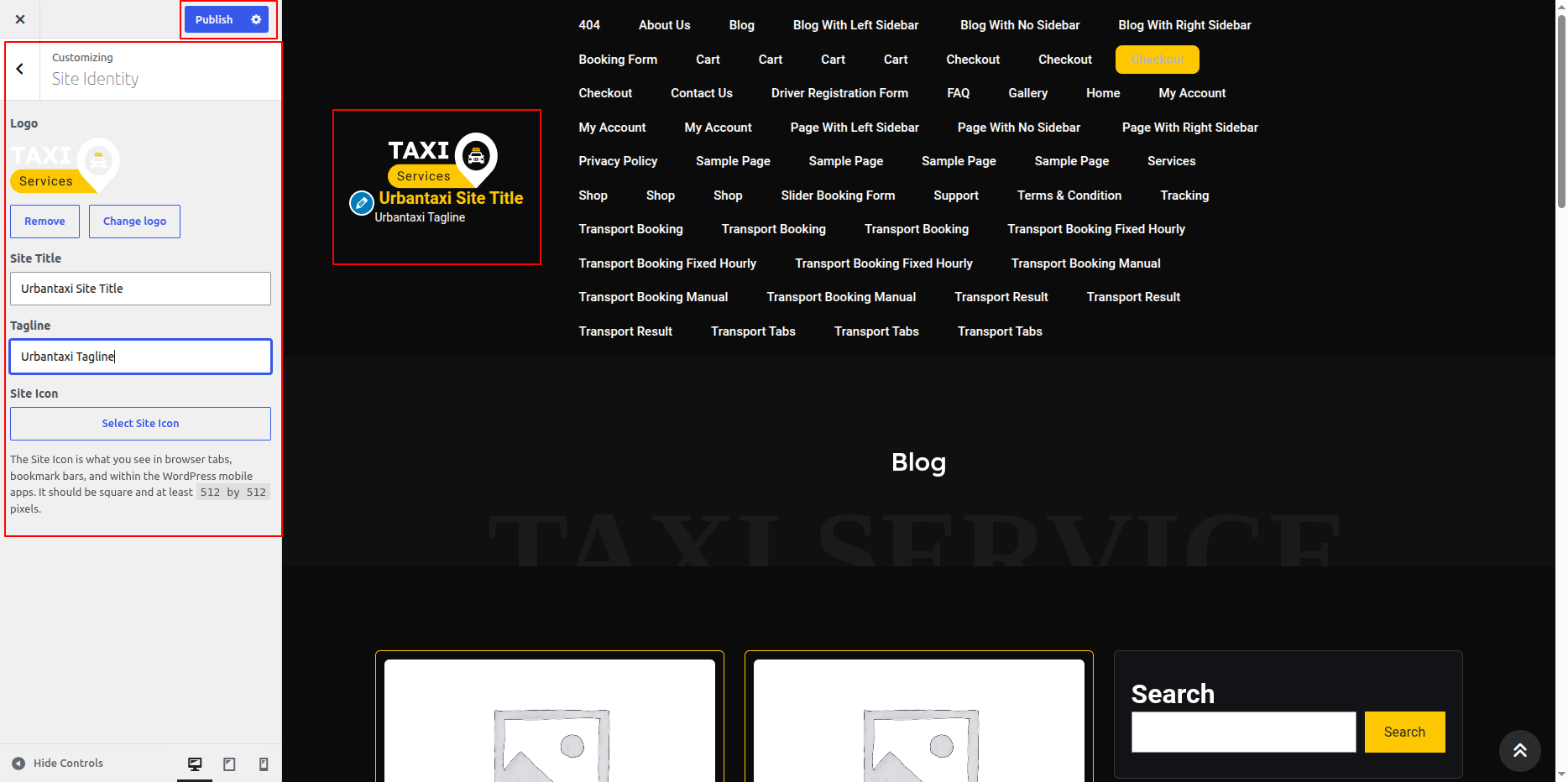
Header Setup – Learn how to configure your site’s header layout, logo, and navigation options.
Menu Creation – Create and organize menus for easy navigation across your pages.
Footer Settings – Customize your footer area with widgets, links, and social icons.
Homepage Sections – Manage and design various homepage sections to highlight your content effectively.
Page Management – Create and edit pages to structure your site’s content.
Additional Features – Discover other useful theme features to enhance the functionality and user experience of your website.
General
Global Colors and Fonts Settings
In this section, you can set your website’s global colors and fonts using Elementor. This helps you maintain a consistent design across all pages.
- Step 1: Open Elementor Editor
- Go to your WordPress Dashboard.
- Navigate to Pages → All Pages.
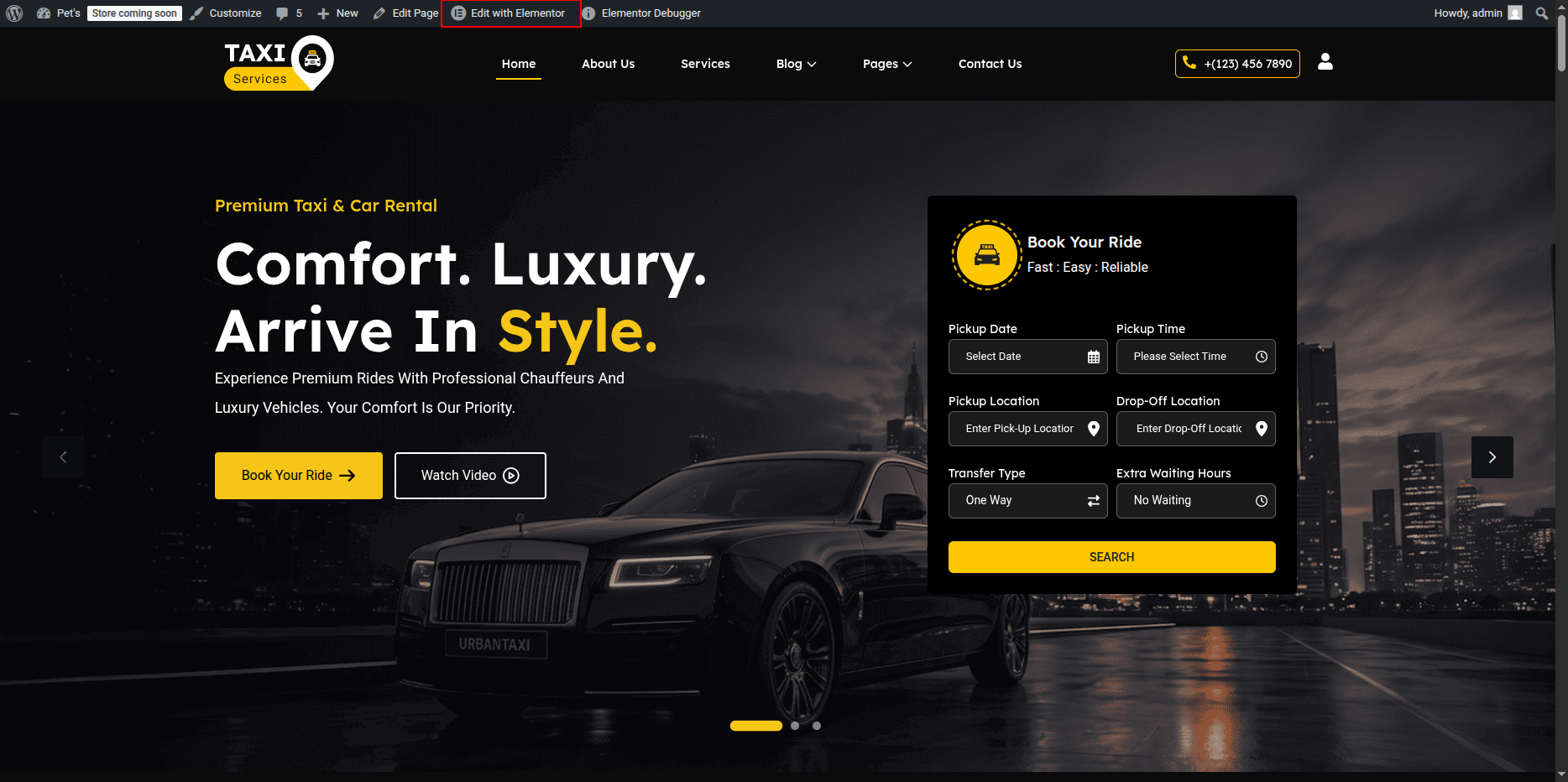
- Hover over the page you want to edit and click on Edit with Elementor.
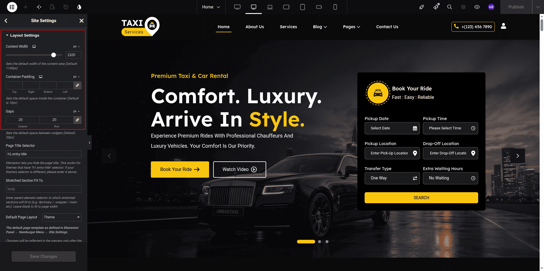
- Step 2: Access Site Settings
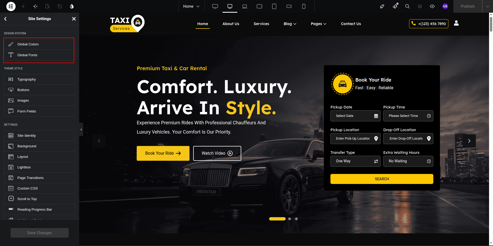
- Once the Elementor editor opens, click on the ☰ (hamburger menu) at the top-left corner of the panel.
- Select Site Settings from the dropdown menu.
- Step 3: Set Global Colors
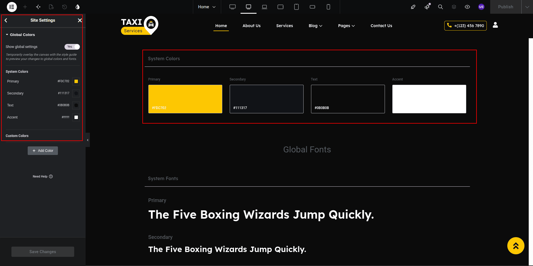
- Click on Global Colors under Site Settings.
- You will see default color options like Primary, Secondary, Text, and Accent.
- Click on a color box to change it or select Add Color to create a new custom color.
- After choosing your preferred colors, click on the Update button to save changes.
Tip: Use global colors in widgets to maintain consistent color styling throughout your website.
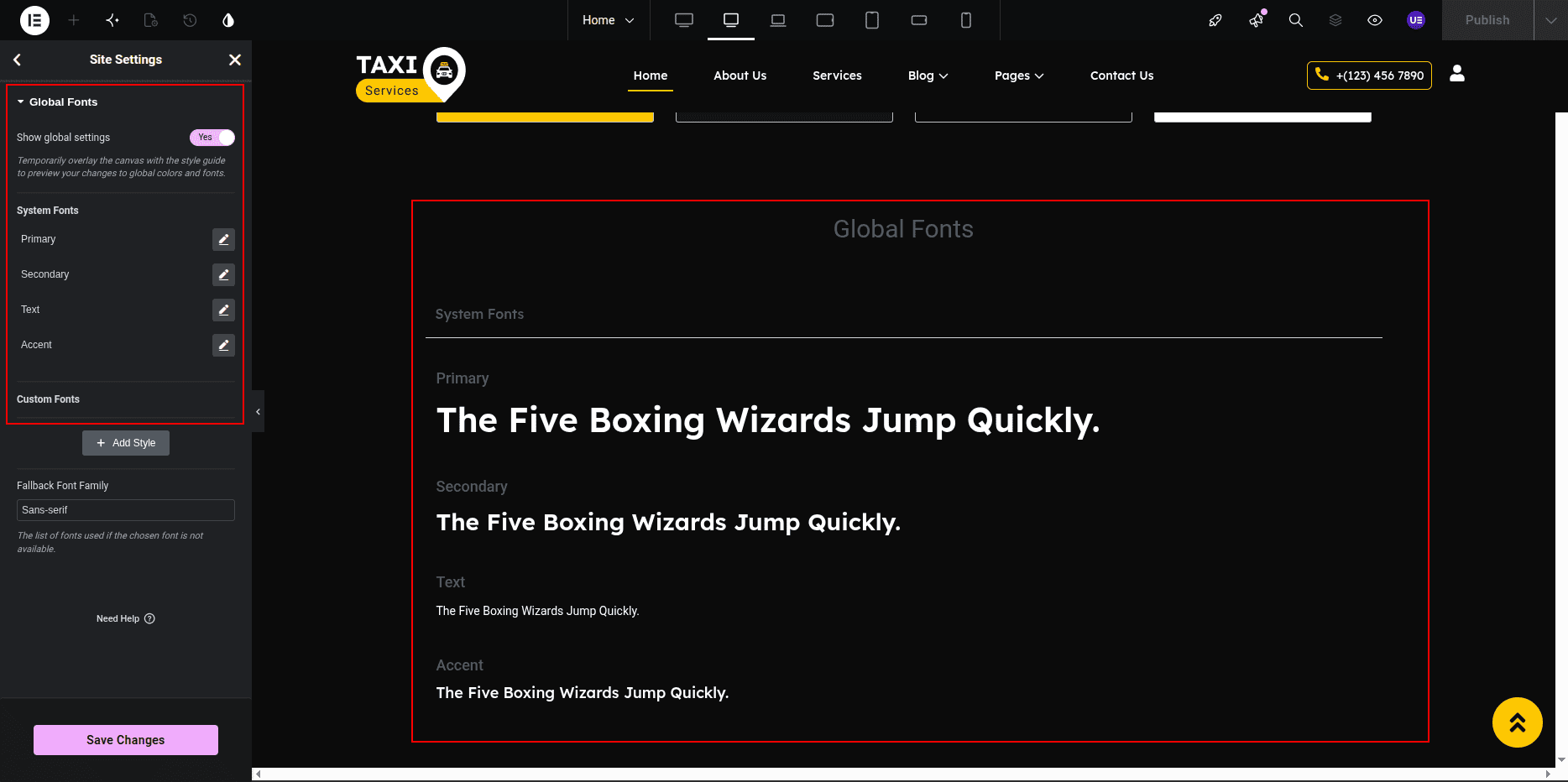
- Step 4: Set Global Fonts
- Go back to the Site Settings panel and click on Global Fonts.
- You will see options such as Primary, Secondary, Text, and Accent.
- Click on each font type to select your desired Font Family, Weight, Size, and Style.
- You can also add a new custom font style by clicking on + Add Style.
- Click Update to save your typography settings.
Tip: Apply global fonts to headings, paragraphs, and buttons for consistent typography.
- Step 5: Apply Global Styles to Widgets
- While editing a widget, go to the Style tab.
- Under Typography or Color, click on the 🌐 Globe icon to select a global color or font.
- Step 6: Save and Exit
- Once you finish setting up your global styles, click on the Update button to save all changes.
- Click the Back Arrow or X icon at the top left to return to the Elementor editor screen.
Result: Your website will now automatically follow the global color and font styles, ensuring design consistency across all pages.
ElementsKit includes a powerful Header Builder that enables you to easily customize the top section of your website using a simple drag-and-drop interface. This feature allows you to design unique and responsive headers without any coding—giving you full control over elements like the logo, navigation menu, contact details, and more.
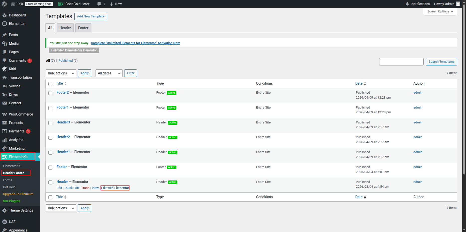
If you want to edit your header content, follow these steps:
1. Go to your WordPress Dashboard.
2. Navigate to ElementsKit → Header Footer.
3. Locate the header template you want to edit.
4. Click on Edit with Elementor to open it in the Elementor editor.
5. Make your desired changes and update the header to save them.
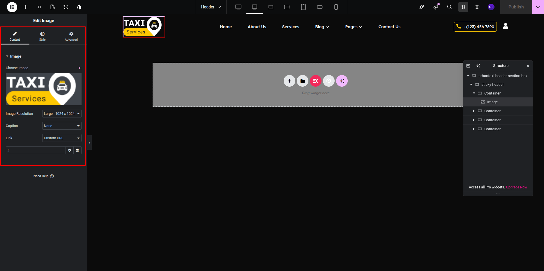
Adding the Logo
To add your company logo:
1. Open your header in Edit with Elementor mode.
2. Drag and drop the Logo element from the ElementsKit widget panel into your header area.
3. Upload your company logo image or select one from the media library.
4. Adjust the logo size settings as needed to fit your design.
5. Save your changes once done.
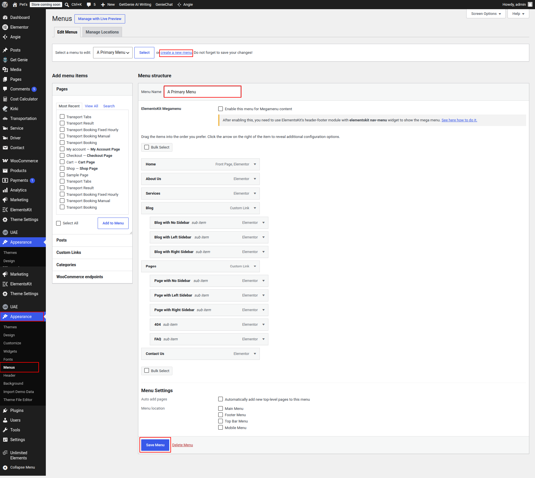
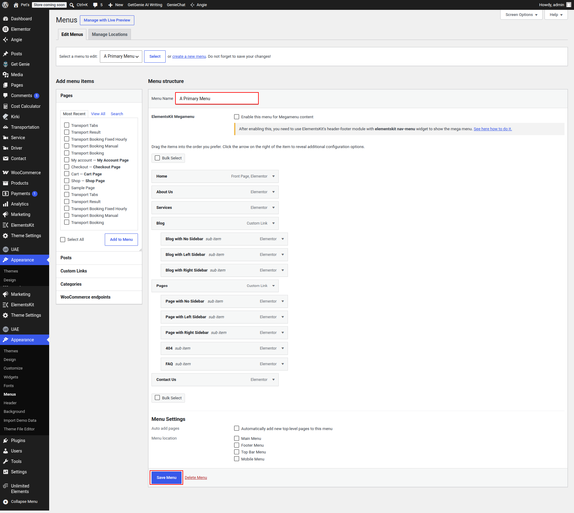
Menu Creation
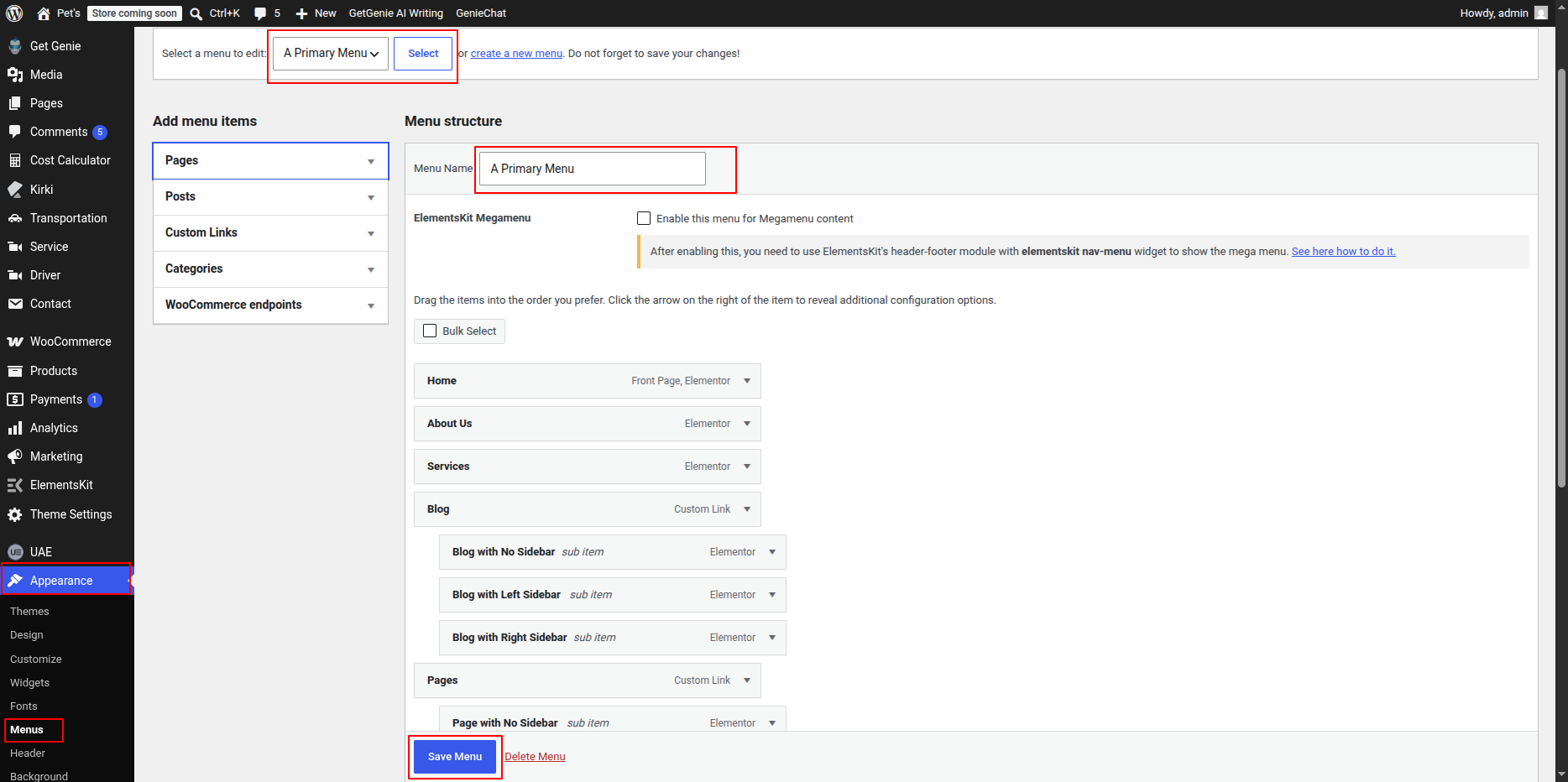
You can easily create and manage your website’s navigation menu through the WordPress Dashboard by following the steps below:
- Go to Appearance → Menus.
- Click on Create a New Menu.
- Enter a name for your menu (e.g., Primary Menu).
- Add pages, posts, categories, or custom links to the menu using the options on the left side.
- Arrange the menu items by dragging and dropping them into your preferred order.
- Choose the appropriate Display Location (such as Header Menu or Footer Menu).
- Click Save Menu to apply your changes.
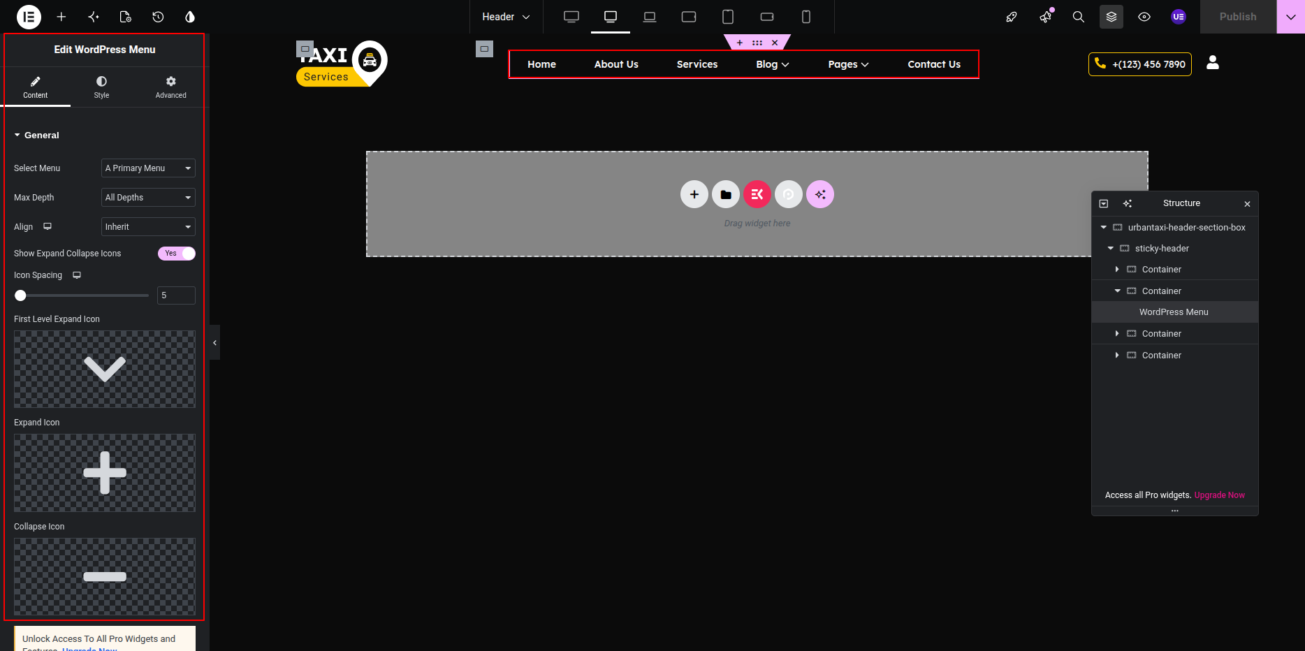
- To customize the menu’s design, open your header in Edit with Elementor mode and adjust it as needed.
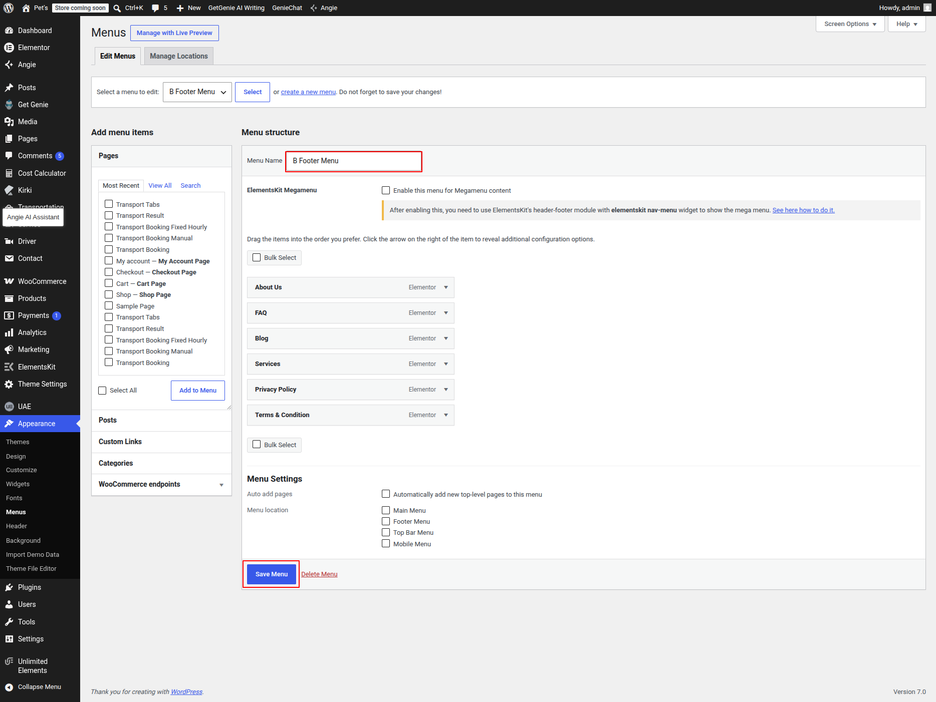
Tip: You can create multiple menus for different areas of your website, such as the footer or mobile navigation.
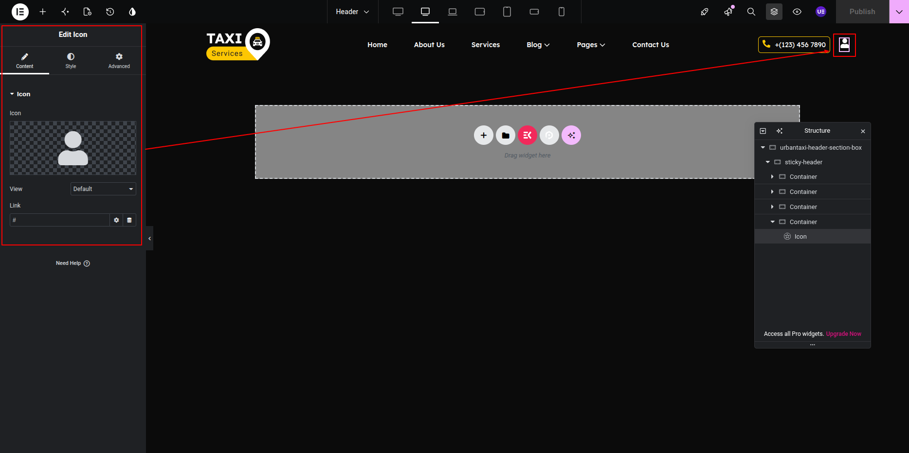
This is the final view of your section:

You can easily customize your website’s footer using the ElementsKit Footer Builder. Follow the steps below to edit your footer content:
- Go to your WordPress Dashboard.
- Navigate to ElementsKit → Header Footer.
- Locate the footer template you want to edit.
- Click on Edit with Elementor to open it in the Elementor editor.
- Make your desired changes and click Update to save them.
Tip: You can add widgets, social icons, copyright text, or any custom section to your footer using Elementor’s drag-and-drop tools.
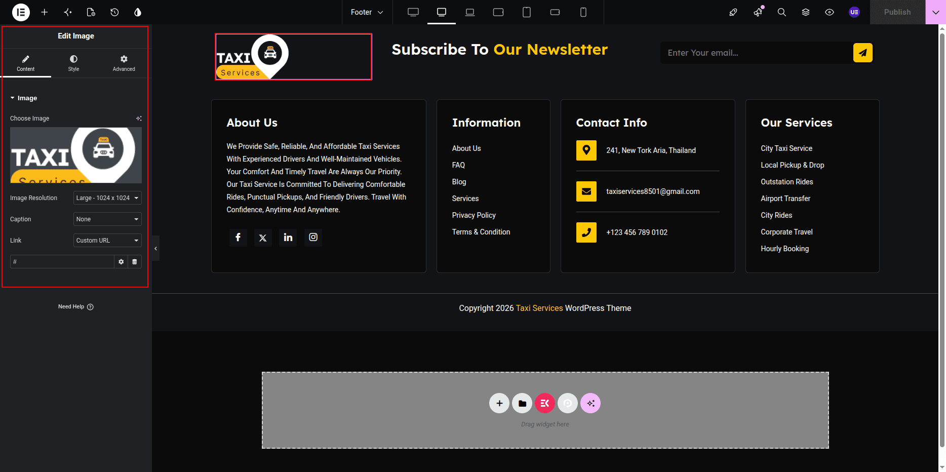
Newsletter Section
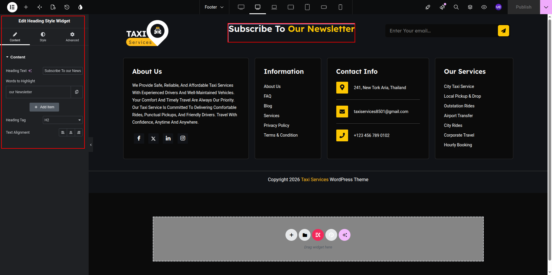
- Editing the Section Heading and Text:
- Open the page with Edit with Elementor.
- Click on the Heading Widget to modify the section heading.
- Click on the Text Editor Widget to edit any description text for the newsletter section.
- Adding the Newsletter Form with CF7:
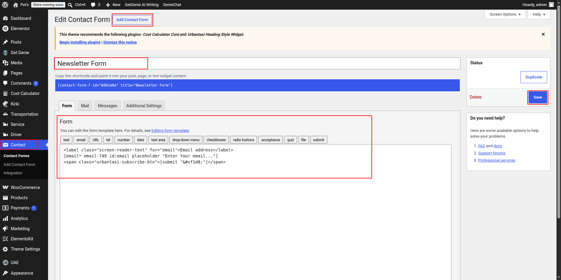
- Make sure you have the Contact Form 7 plugin installed and activated.
- Go to your WordPress Dashboard → Contact → Add New to create a new newsletter form.
- Configure the form fields, such as Name and Email, and save the form.
- Copy the shortcode of the form you created.
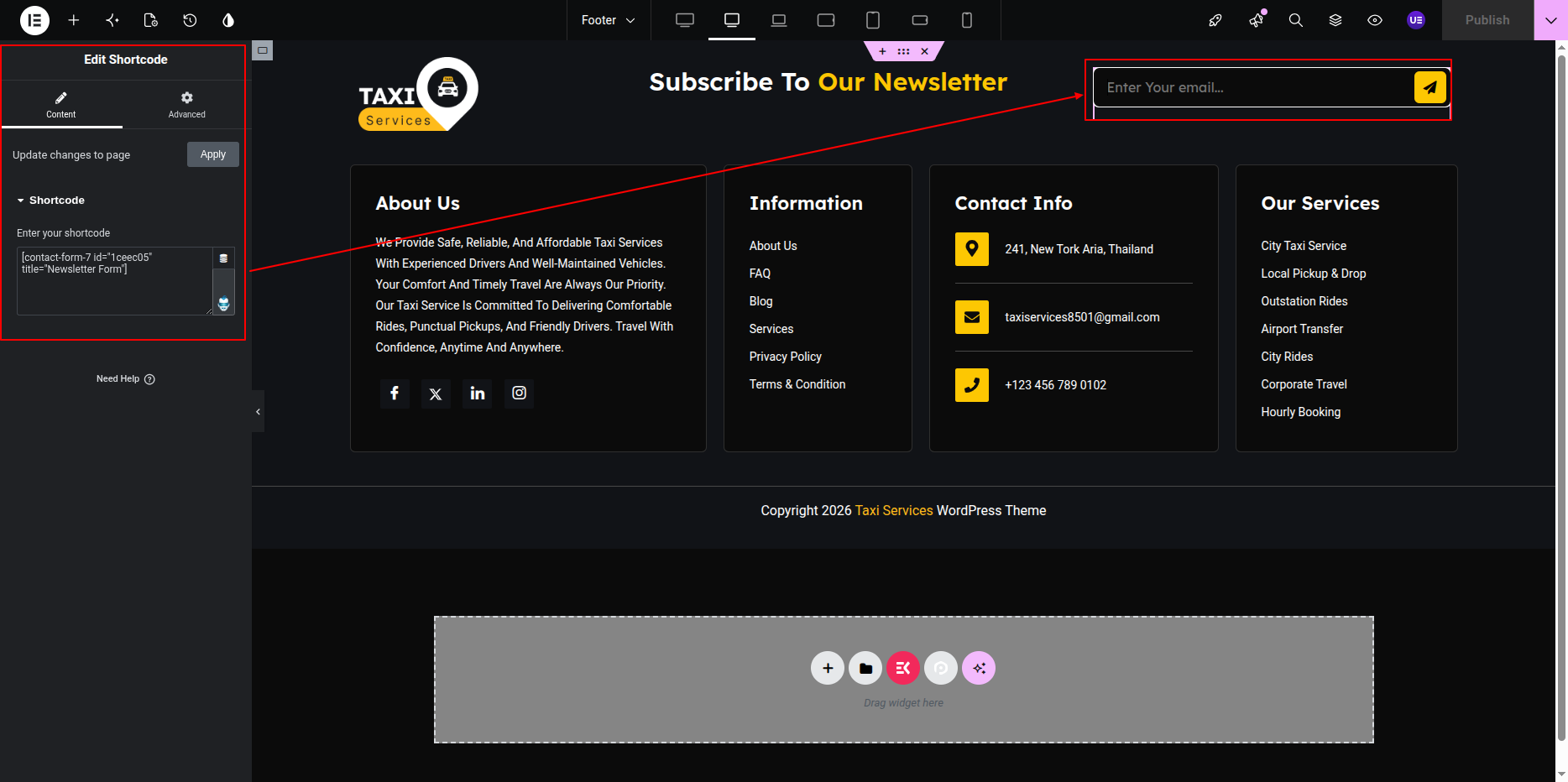
- Back in Elementor, drag and drop the Shortcode Widget into the newsletter section.
- Paste the copied CF7 form shortcode into the widget.
- Customize the styling of the form, including button color, input fields, and spacing, using Elementor style options.
- Click Update to save your changes.
This is the final view of your section:

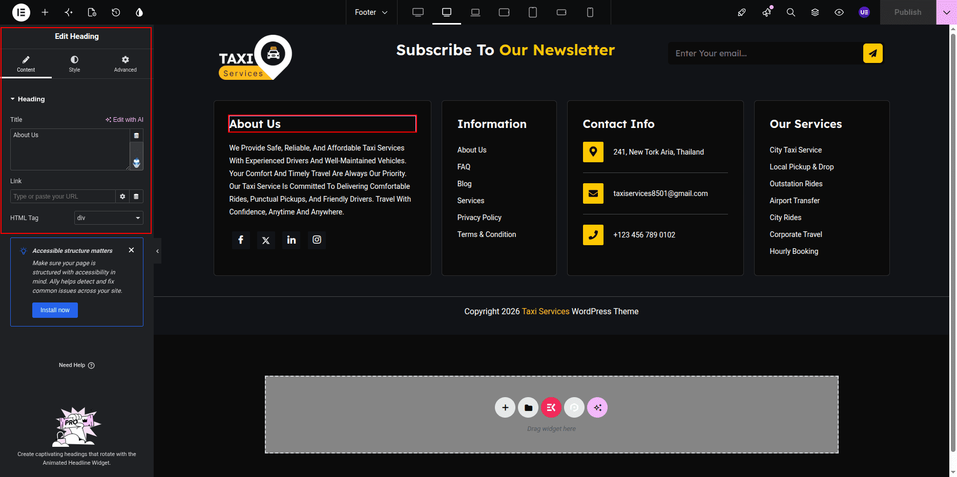
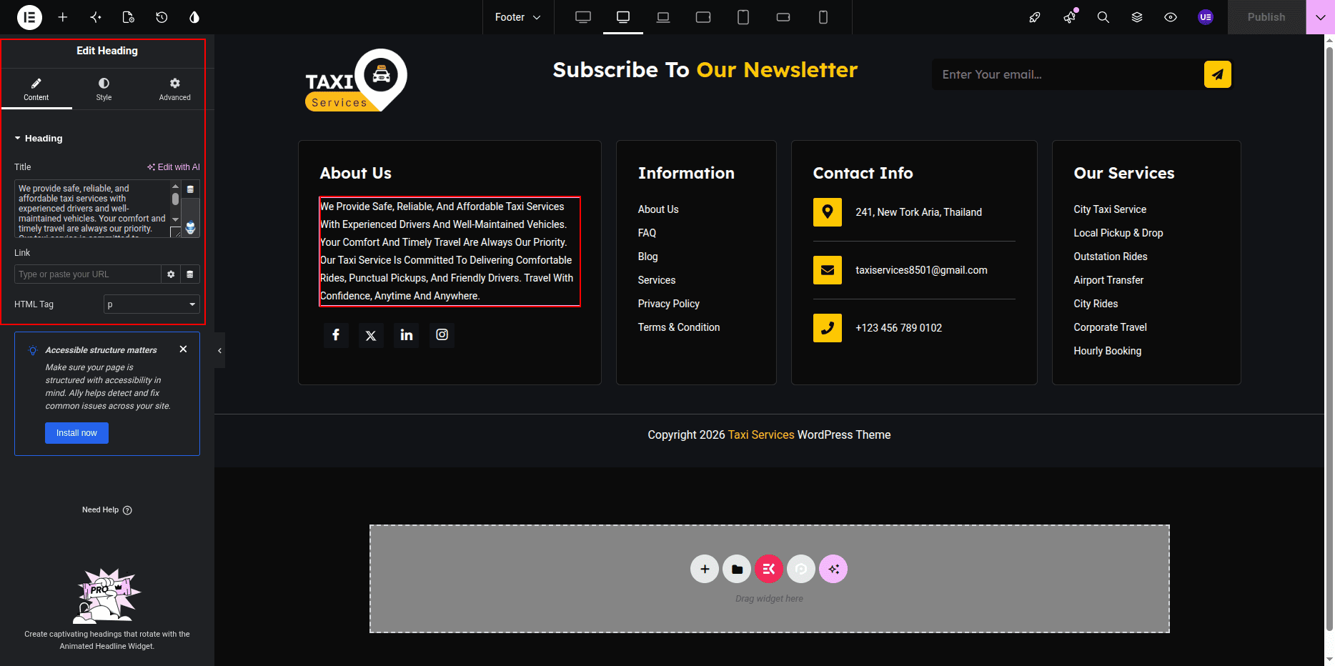
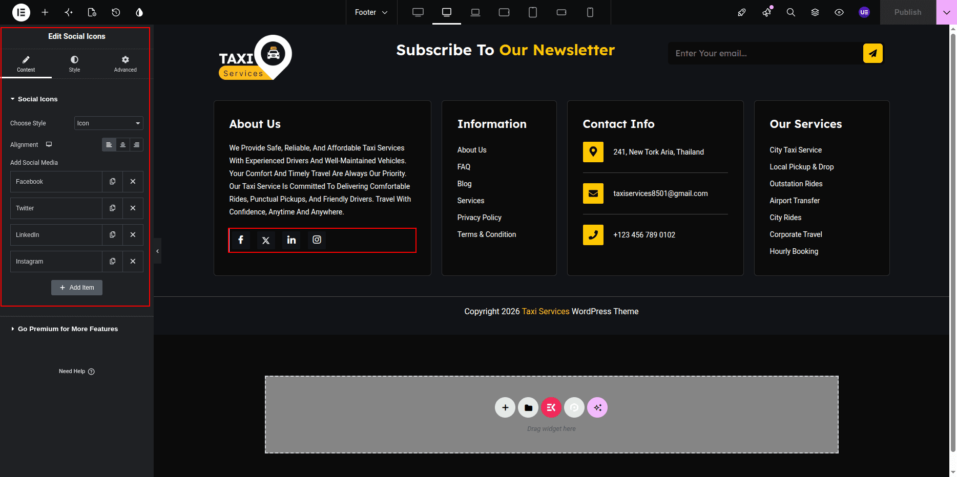
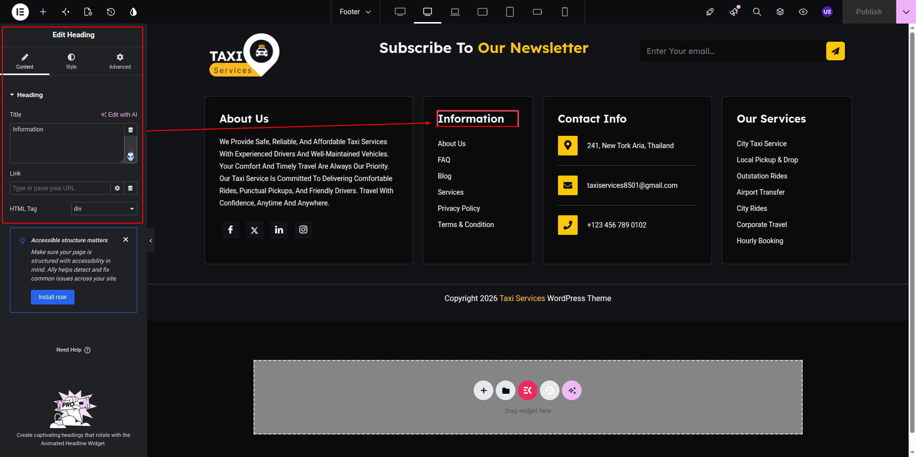
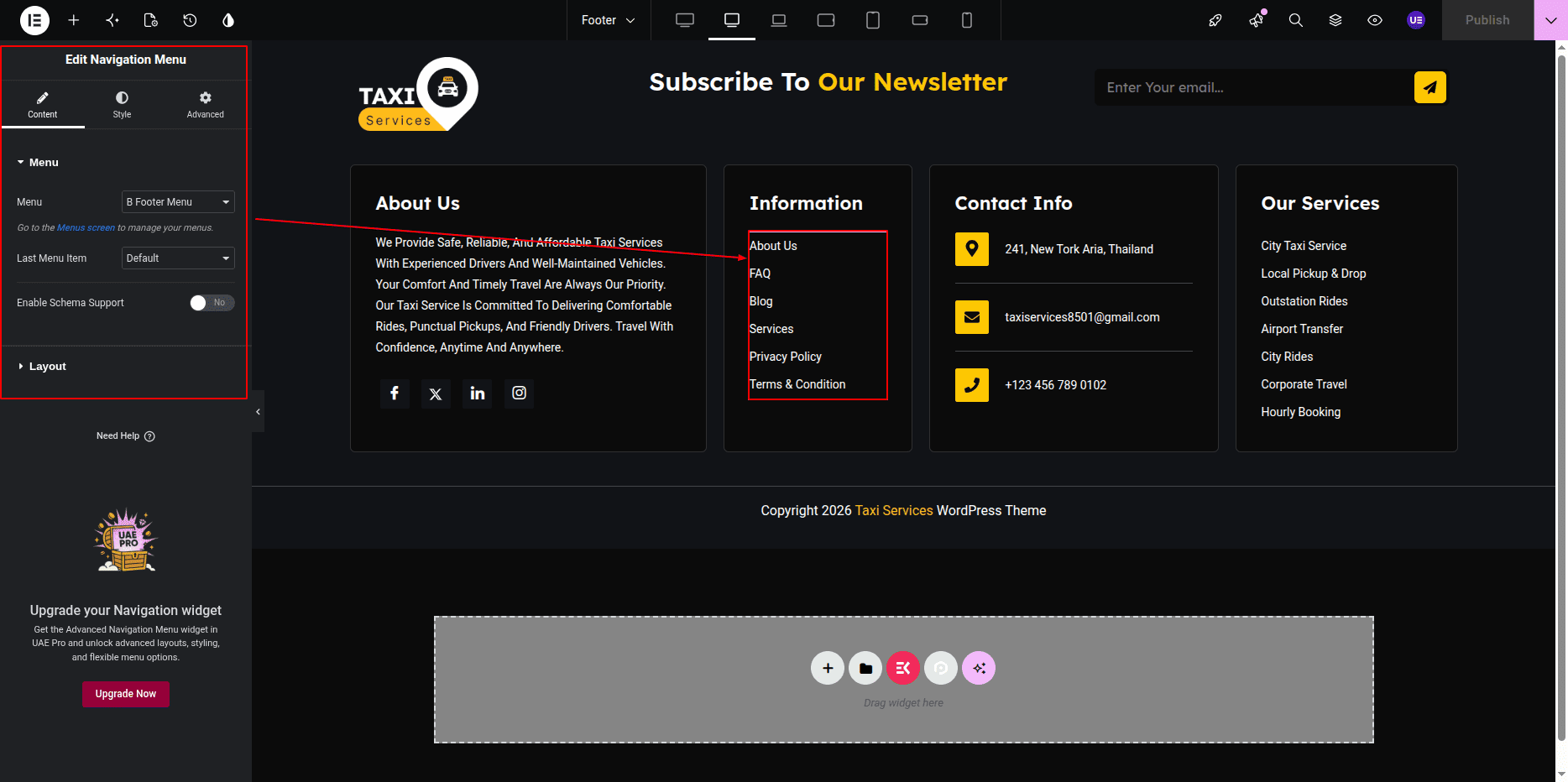
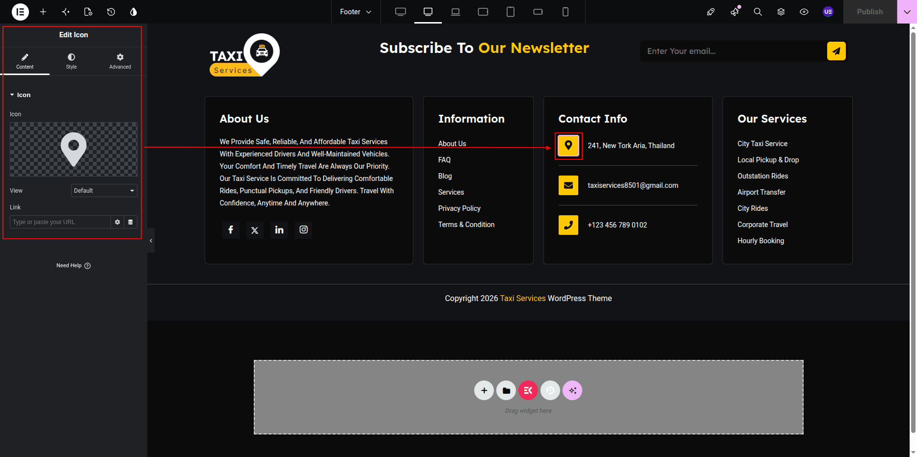
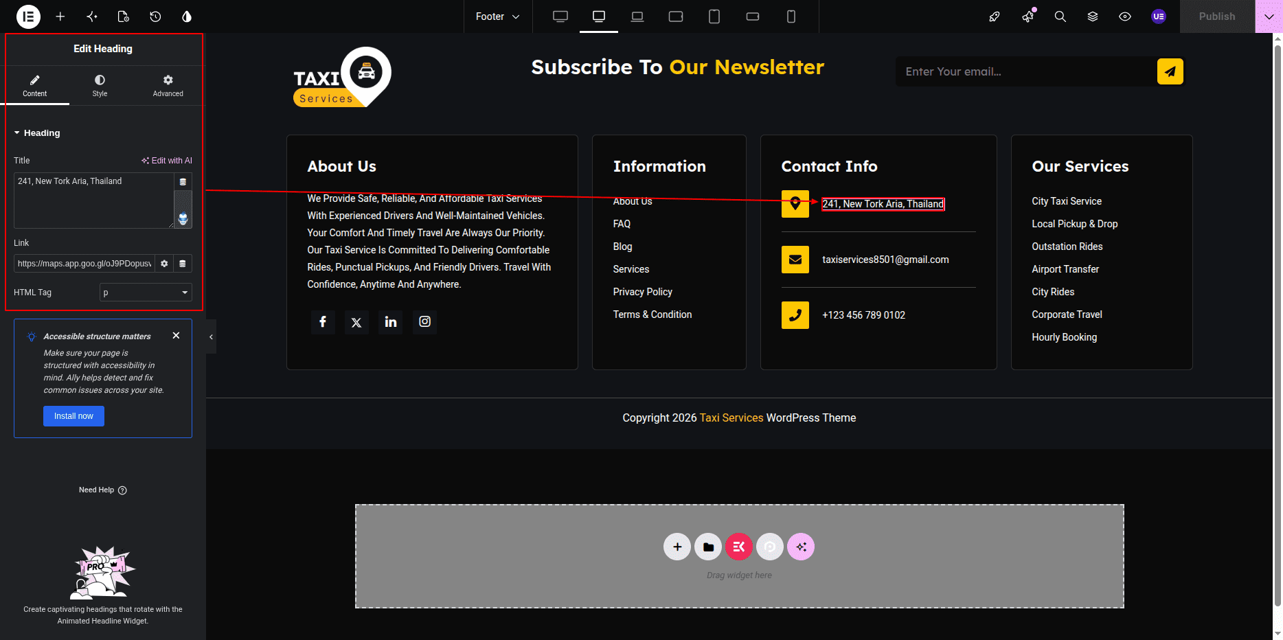
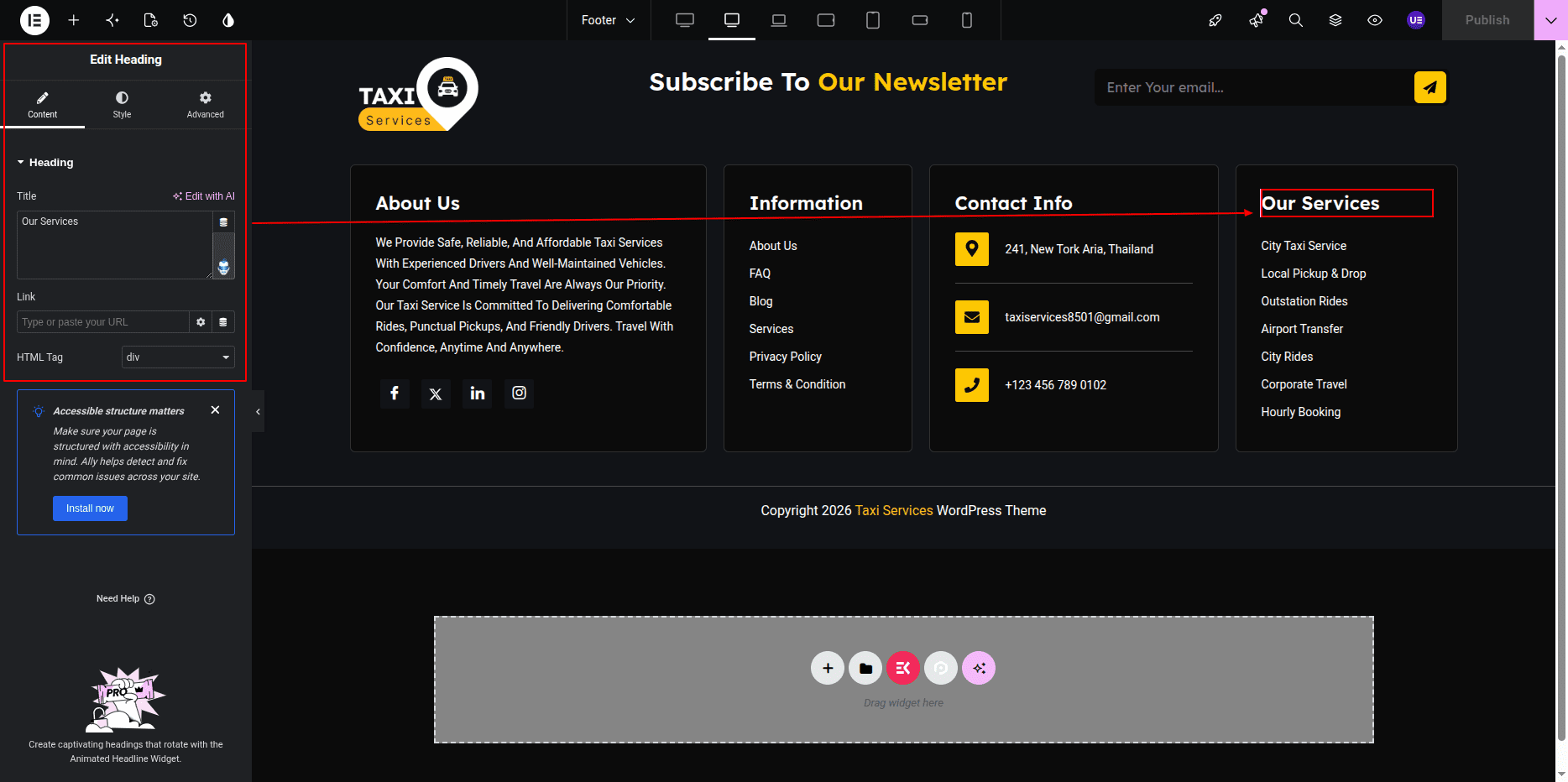
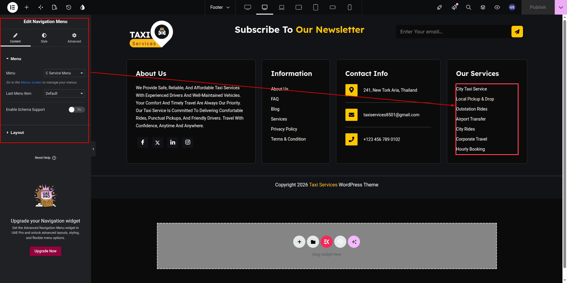
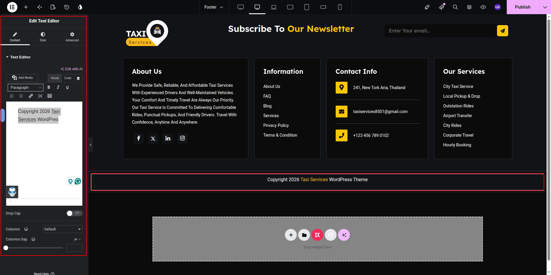
You can edit the remaining footer content, such as text and links, directly from this section.
Widgets and copyright area.
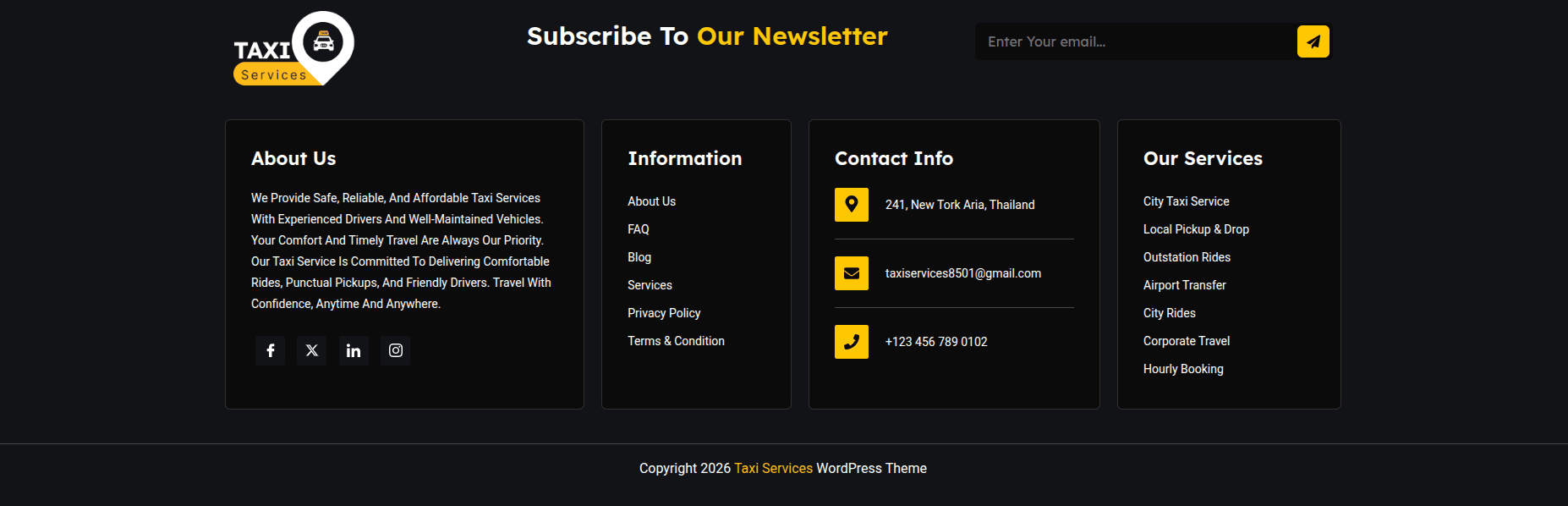
This is the final view of your section:
Hero Slider Section
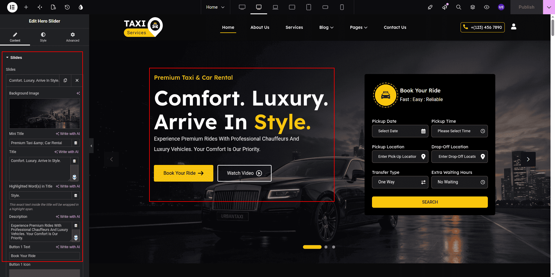
The UrbanTaxi Hero Slider Widget is used to create the homepage hero slider section.
This section contains the subtitle, heading, description, primary button, secondary button,
booking form, form icon, form title, and form heading. All content can be edited using the
widget settings in Elementor.
Adding Hero Slider Section on Home Page
- Go to the Home Page.
- Click Edit with Elementor.
- Drag and drop the UrbanTaxi Hero Slider Widget into the page.
Editing Slider Content
- Select the UrbanTaxi Hero Slider Widget.
- Go to the Content Tab.
- Edit the slider items as required.
Editing Subtitle, Heading & Description
- Select the required slider item.
- Edit the Subtitle.
- Edit the Heading.
- Edit the Description.
Editing Buttons
- Select the required slider item.
- Edit the Primary Button Text and URL.
- Edit the Secondary Button Text and URL.
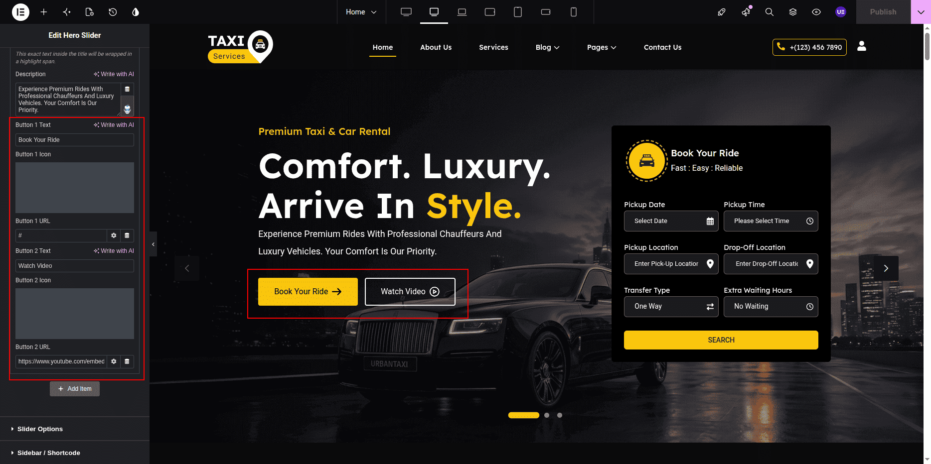
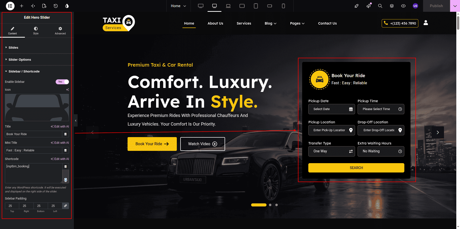
Editing Form Content
- Select the required slider item.
- Edit the Form Icon.
- Edit the Form Title.
- Edit the Form Heading.
- Select the desired form shortcode if available.
Editing Slider Settings
- Select the UrbanTaxi Hero Slider Widget.
- Go to the Content Tab.
- Edit the following slider settings:
-
Slider Items – Add, edit, or remove slider slides.
-
Autoplay – Enable or disable automatic slider movement.
-
Slider Dots – Enable or disable navigation dots.
-
Slider Arrows – Enable or disable navigation arrows.
-
Slider Speed – Control slider transition speed.
-
Loop – Enable continuous slider looping.
Customizing Slider Style
- Go to the Style Tab.
- Edit subtitle typography and colors.
- Edit heading typography and colors.
- Edit description typography and colors.
- Customize button colors, typography, and spacing.
- Customize form styles and icon styles.
- Edit slider navigation styles and spacing.
Responsive Settings
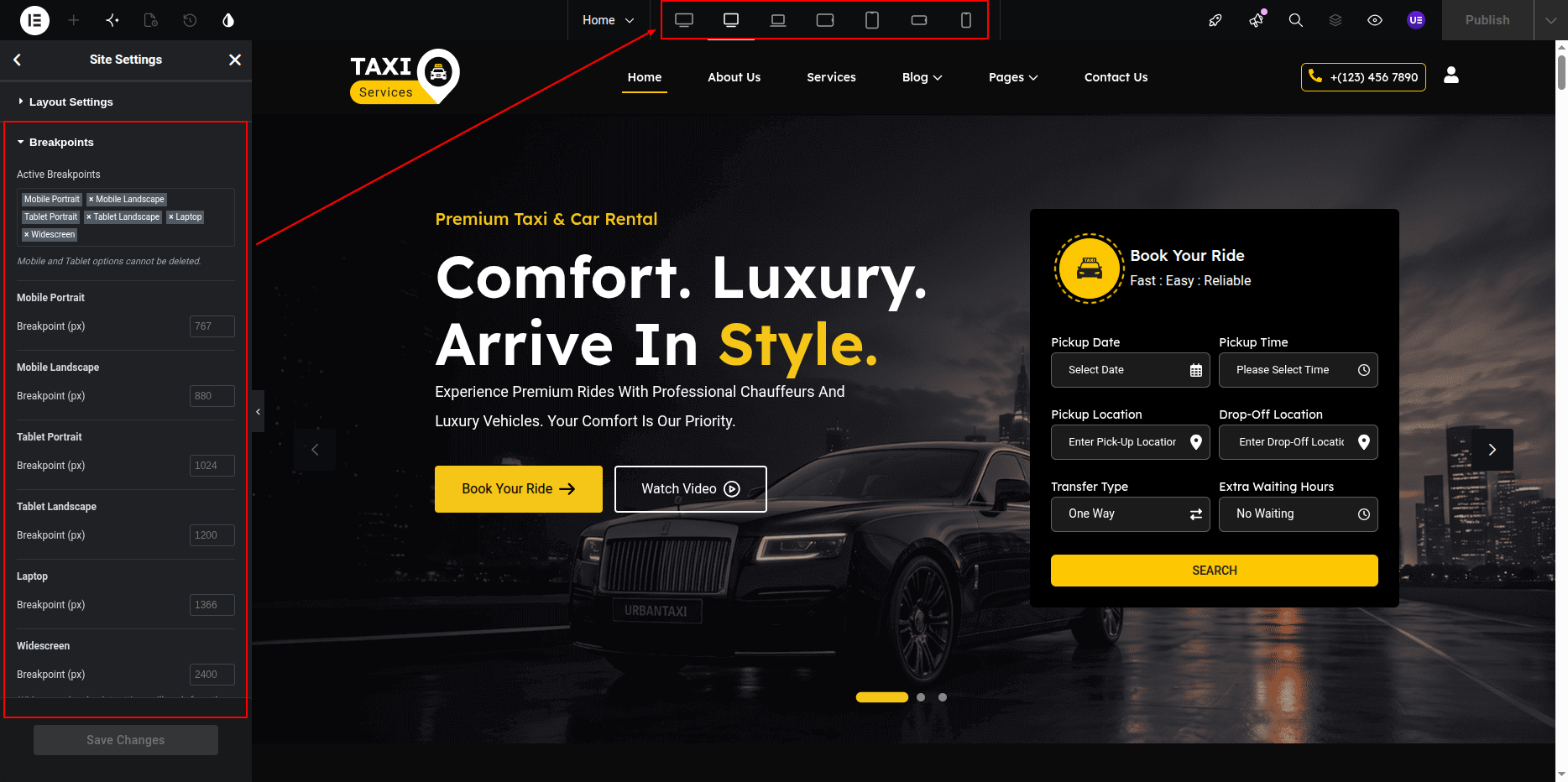
- Switch to Tablet View.
- Switch to Mobile View.
- Check content alignment and spacing.
- Adjust typography and button sizes if required.
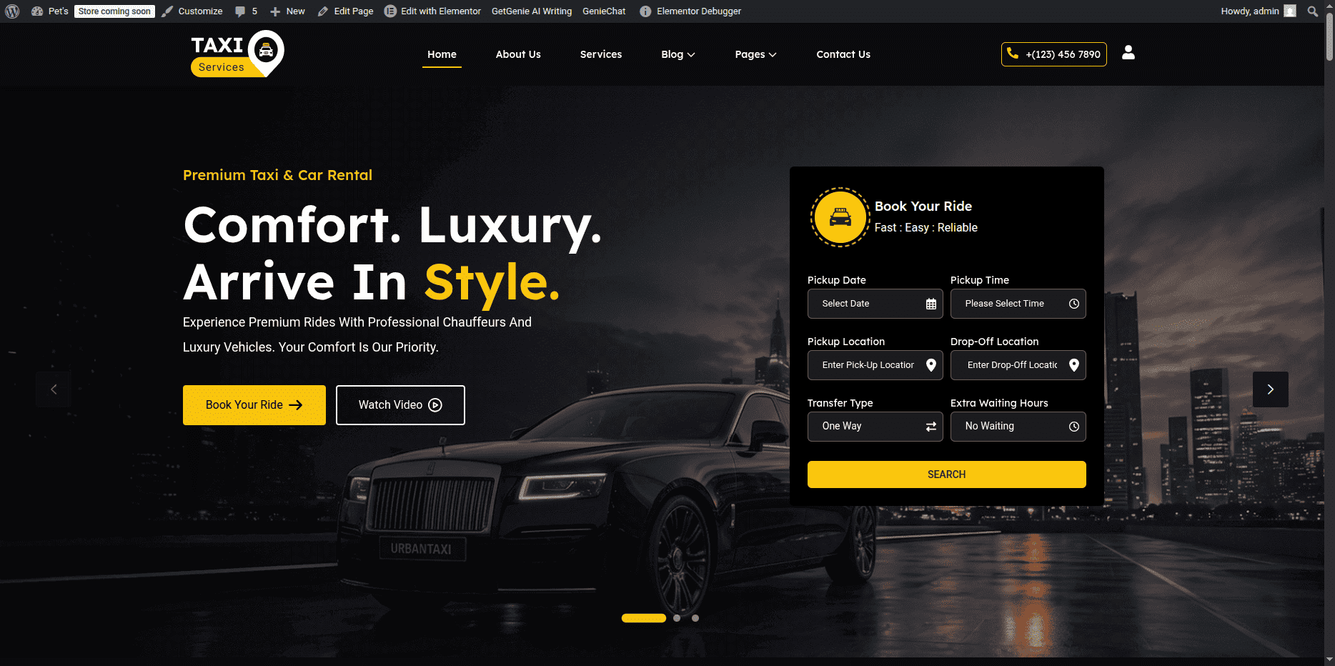
This is the final view of your section:
About Section
The About Section is used to display information about your taxi company,
including section title, heading, description, animated service text,
button, images, and other content. All content in this section can be edited
using Elementor widgets.
Adding About Section on Home Page
- Go to the Home Page.
- Click Edit with Elementor.
- Select the About Section.
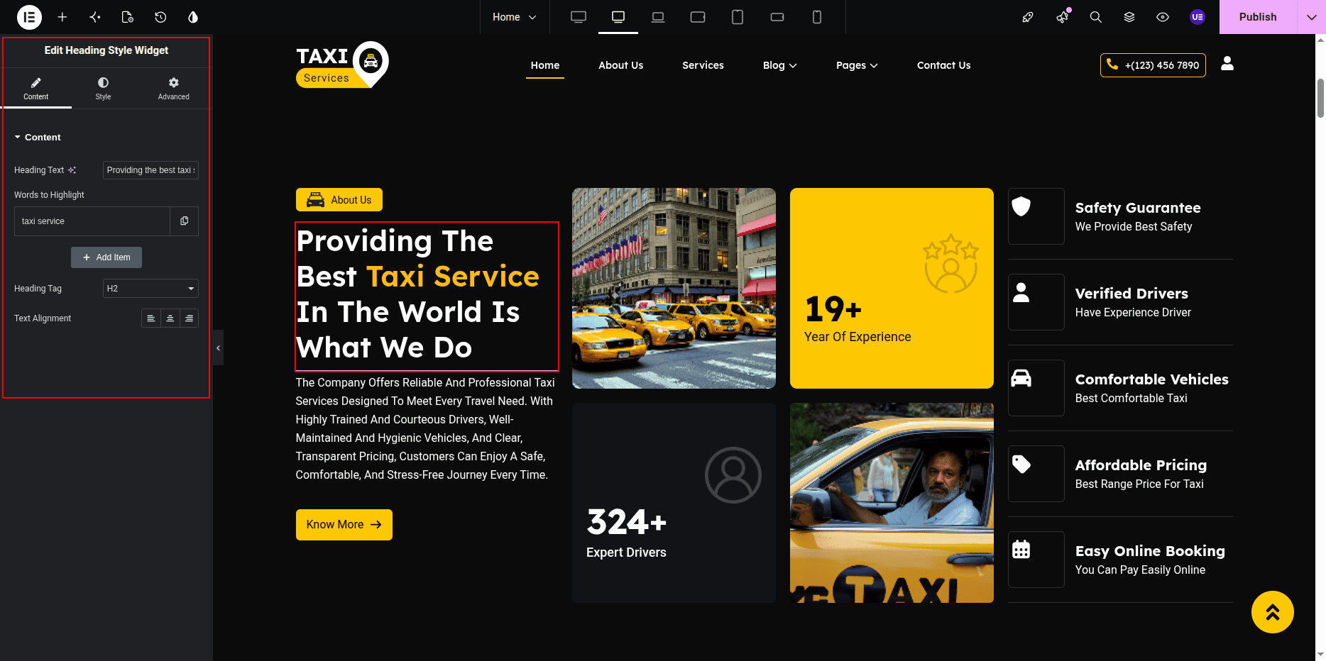
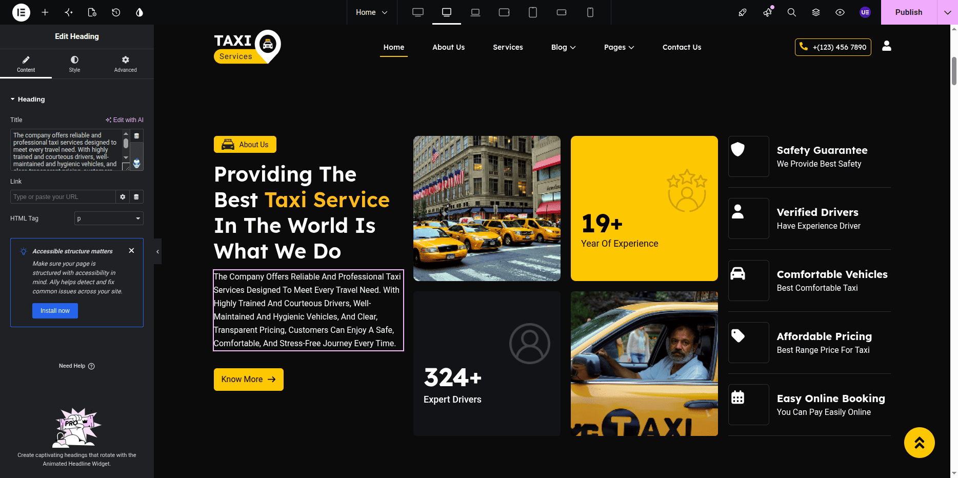
Adding Section Title & Heading
- Select the Heading Widget for the section title.
- Select another Heading Widget for the main heading.
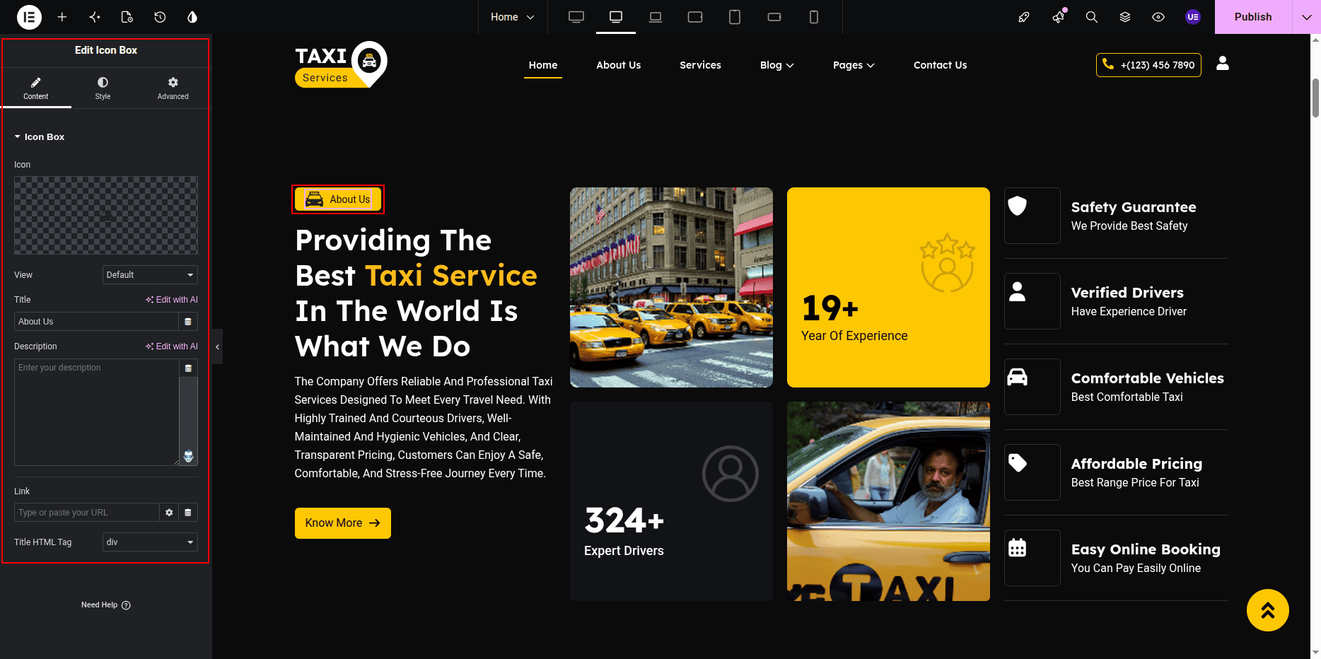
Editing About Button
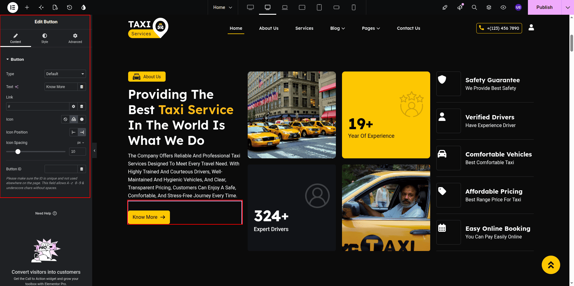
- Select the Button Widget.
- Edit the button text.
- Add button link.
- Change button size if needed.
Settings
- Text → Know More / About Us
- Link → About Page
- Size → Medium
- Alignment → Left / Center
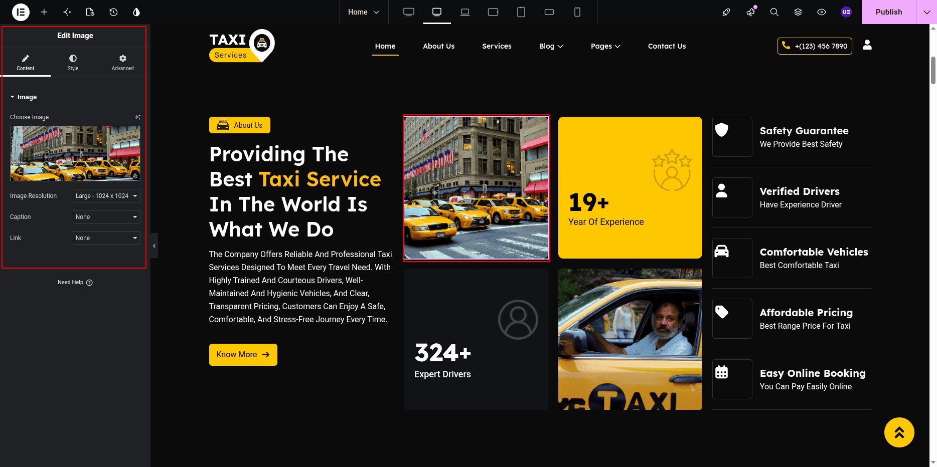
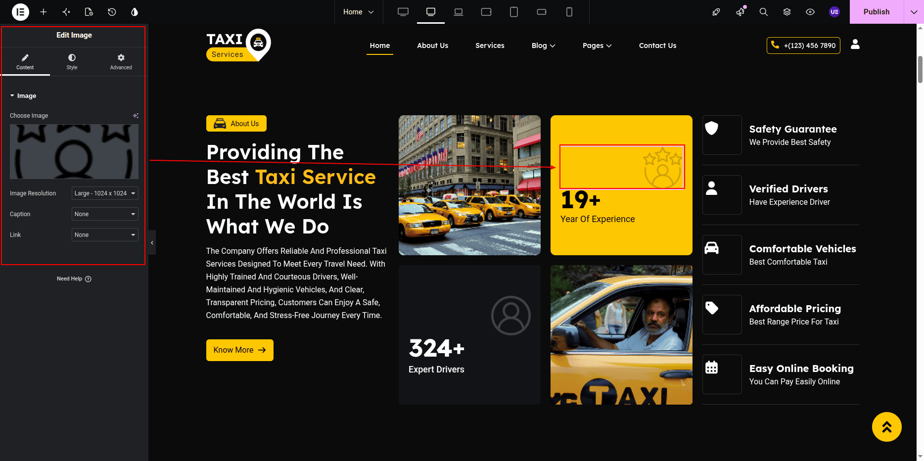
Editing About Image
- Select the Image Widget.
- Upload or change the image.
Editing About Image
- Select the Image Widget inside the About Section.
- Click Choose Image.
- Upload or select a new image from the media library.
Editing About Heading & Description
- Select the Heading Widget to edit the title.
- Select the Text Editor Widget to update the description content.
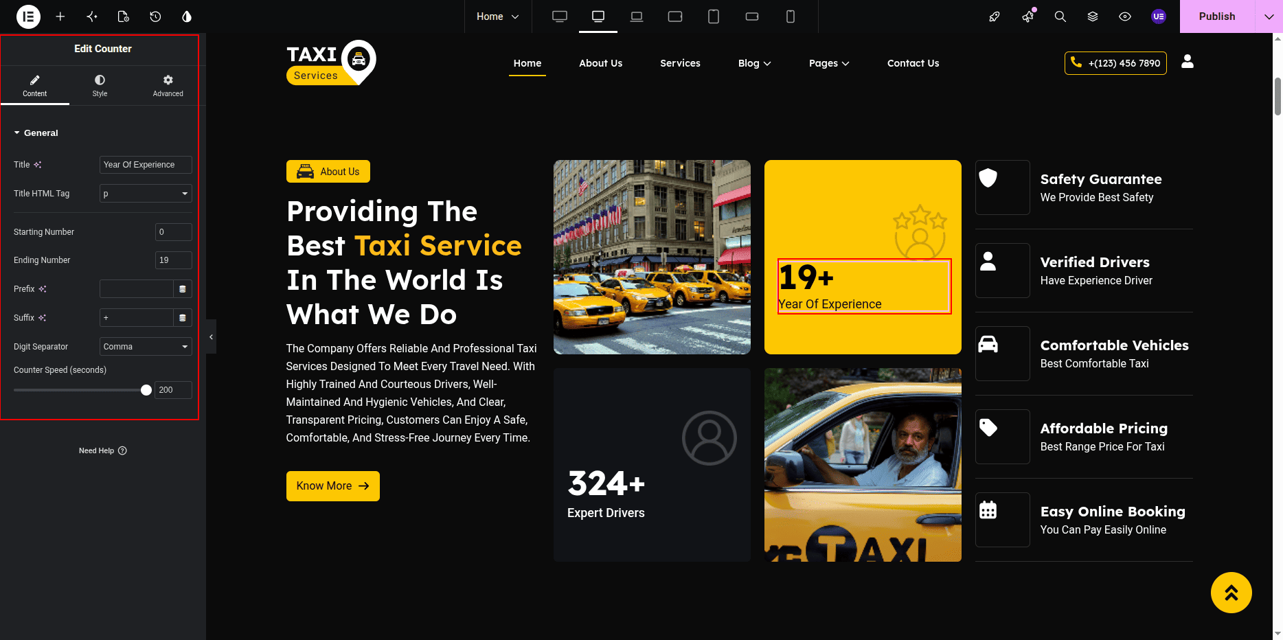
Editing Service Text
- Select the Text Editor Widget.
- Edit the service description text.
Styling Settings
- Adjust typography for heading and text.
- Change colors if needed.
- Do not remove background shapes.
Responsive Settings
- Switch to Tablet view.
- Switch to Mobile view.
- Make sure columns stack properly.
Tip: Keep text short for better layout.
This is the final view of your section:

Services Section
The Services Section displays taxi services created from the dashboard.
Each service is added as a post and displayed on the homepage using the
UrbanTaxi Service Cards Widget.
You can edit service title, image, description, and layout from Elementor.
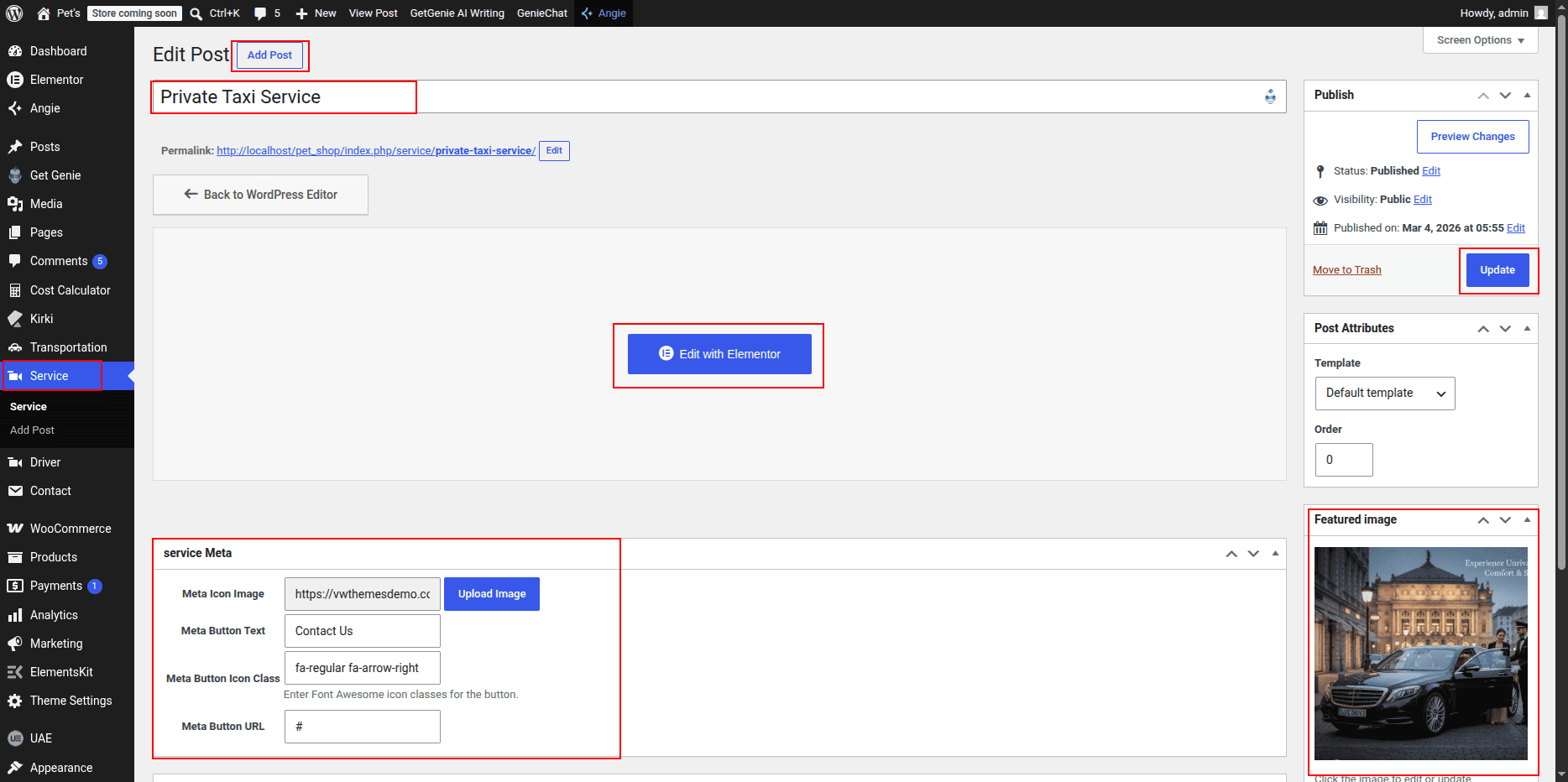
Creating Services from Dashboard
- Go to WordPress Dashboard → Services.
- Click Add New.
- Enter the service title.
- Set a featured image.
- Click Publish.

Editing Service Description
- Go to Services list.
- Click Edit with Elementor.
- Edit content using widgets.
- Heading Widget – title
- Text Editor – description
- Image Widget – service image

Adding Services Section on Home Page
- Open Home Page.
- Click Edit with Elementor.
- Select Services Section.
Editing Section Title & Heading
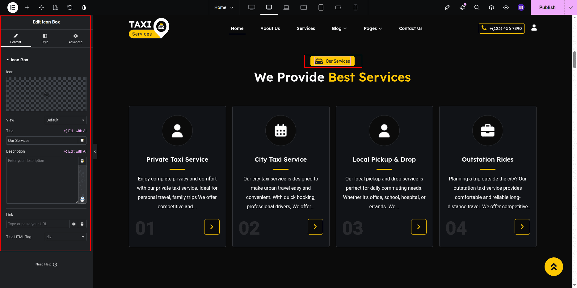
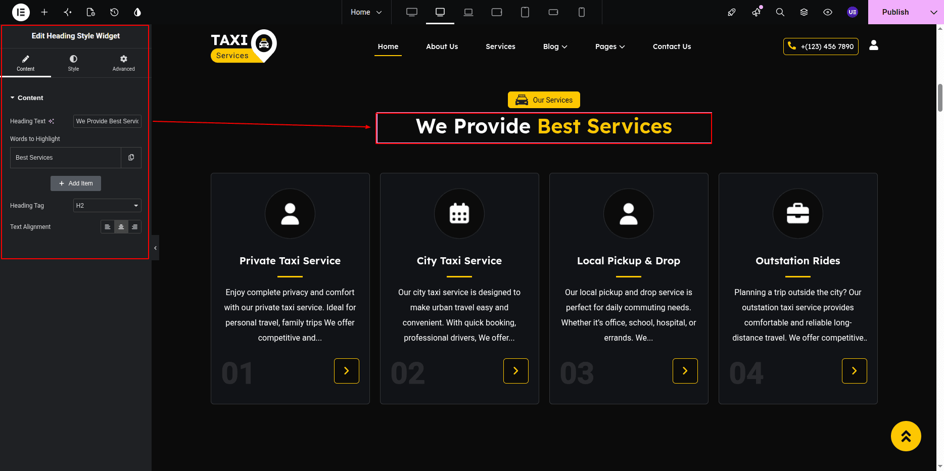
- Select Heading widget for title.
- Select Heading widget for main heading.
Using UrbanTaxi Service Cards Widget
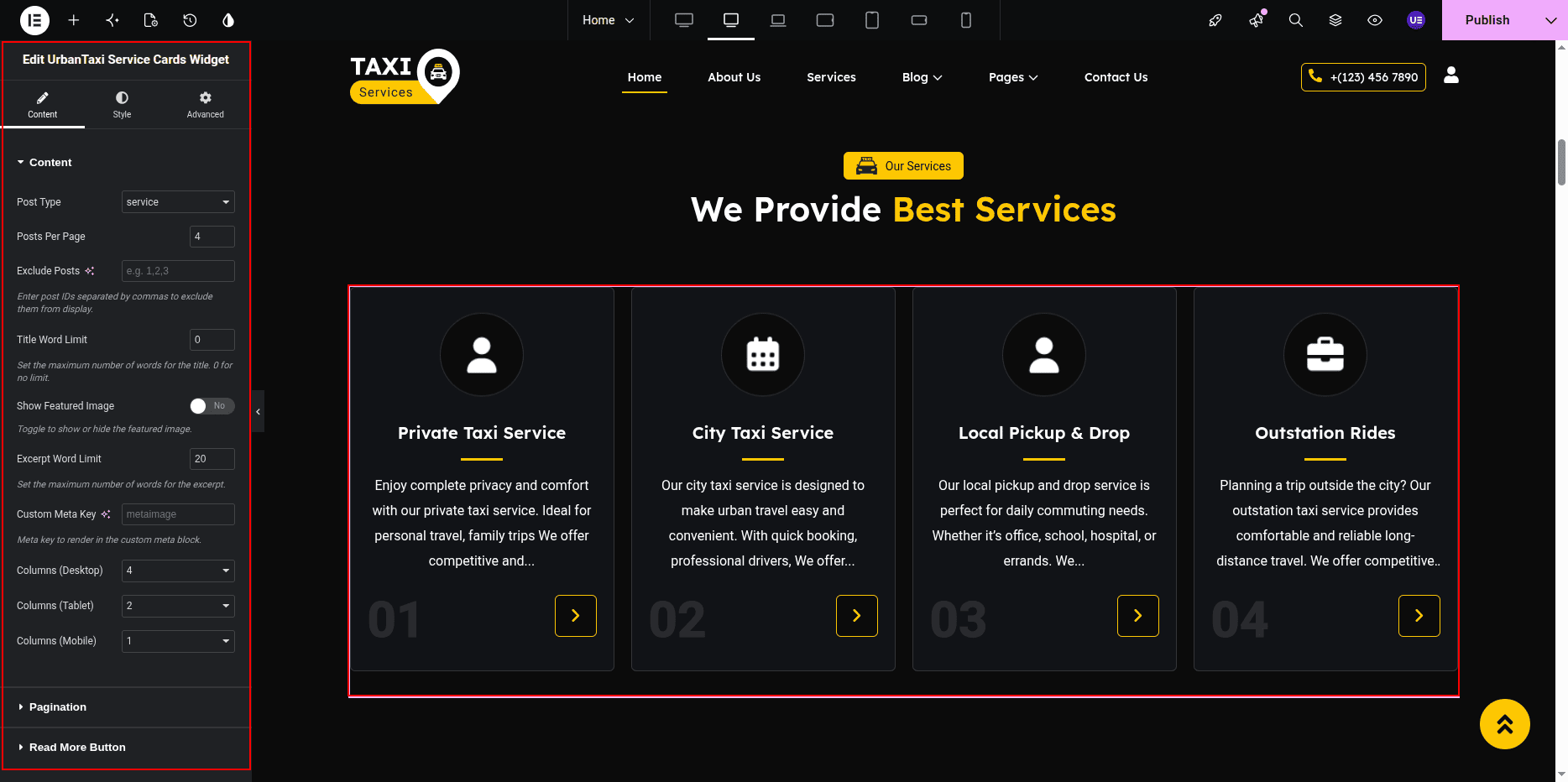
- Search UrbanTaxi Service Cards Widget.
- Drag widget into section.
- Open widget settings.
Settings
- Post Type → Services
- Posts Count → Set number
- Layout → Cards
- Show Image → Yes
- Show Description → Yes
Styling Settings
- Adjust spacing between cards.
- Change colors if needed.
- Do not remove background images.
Responsive Settings
- Switch to Tablet view.
- Switch to Mobile view.
- Check card layout.
Tip: Use the built-in widget for correct design.
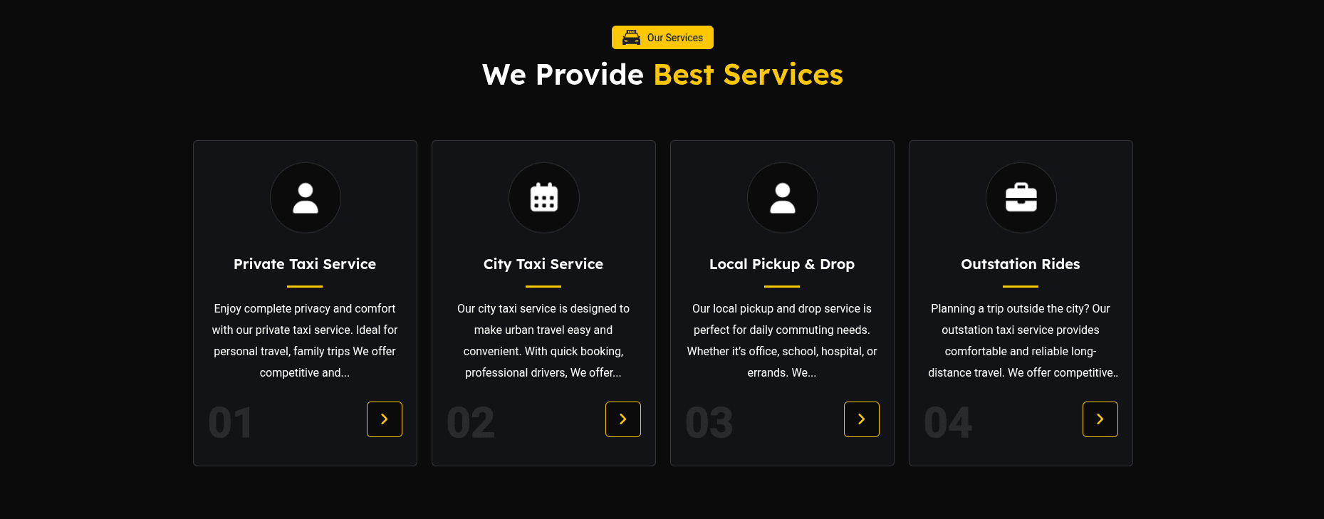
This is the final view of your section:
Taxi / Fleet Section
The Taxi / Fleet Section displays available taxis created using the
E-Cab Taxi Booking Plugin.
Each taxi is added from the dashboard with image, seat capacity, price,
additional passenger charge, and description.
The taxis are shown on the homepage using the fleet / taxi widget.
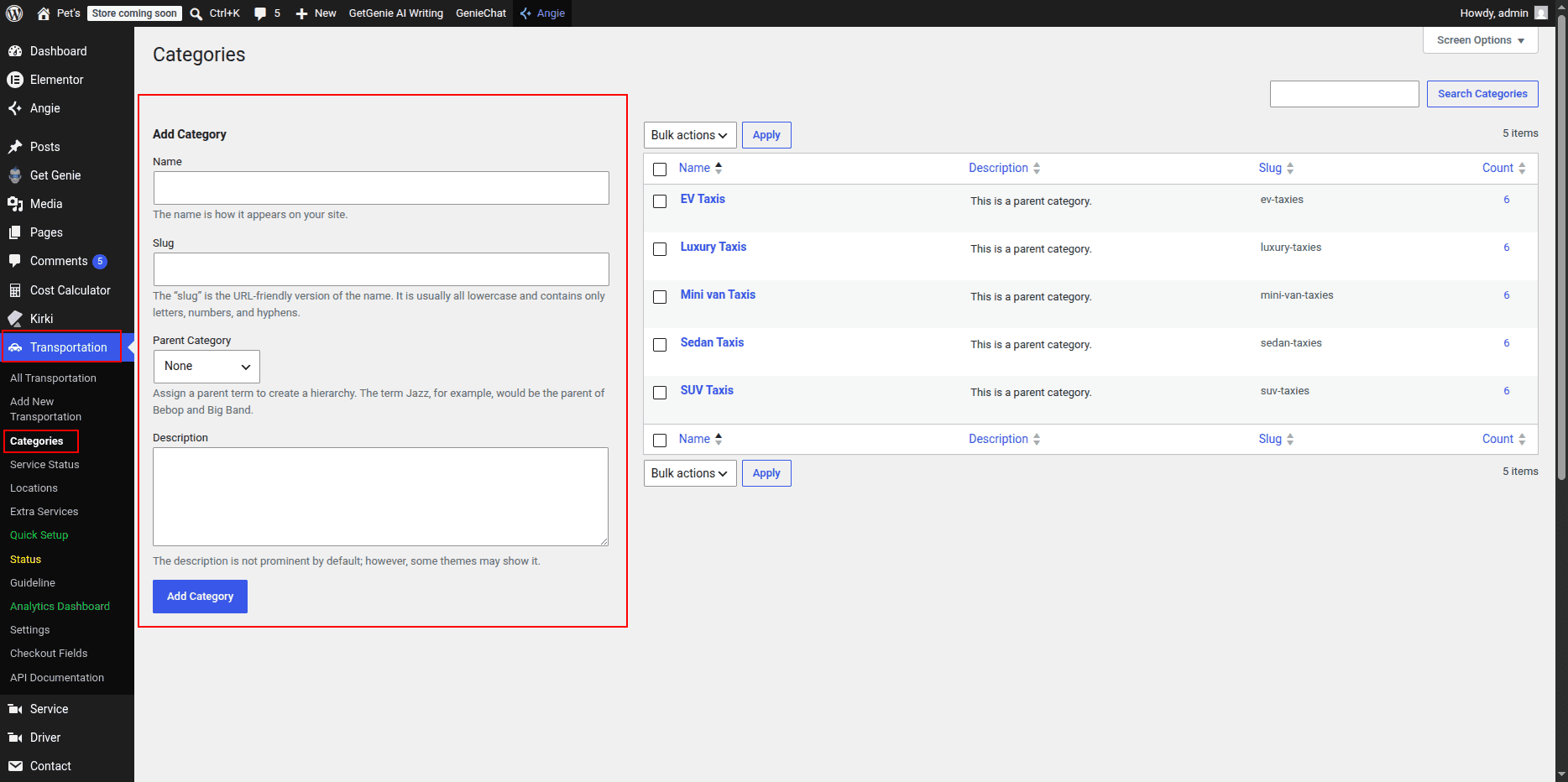
Creating Taxi Categories
- Go to Dashboard → Taxi Categories.
- Click Add New.
- Enter category name.
- Click Publish.
Creating Taxi / Fleet Posts
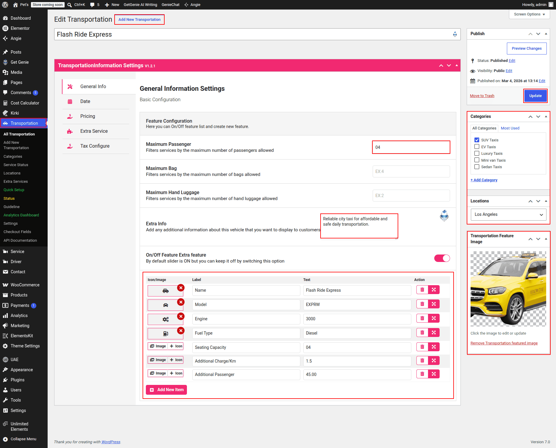
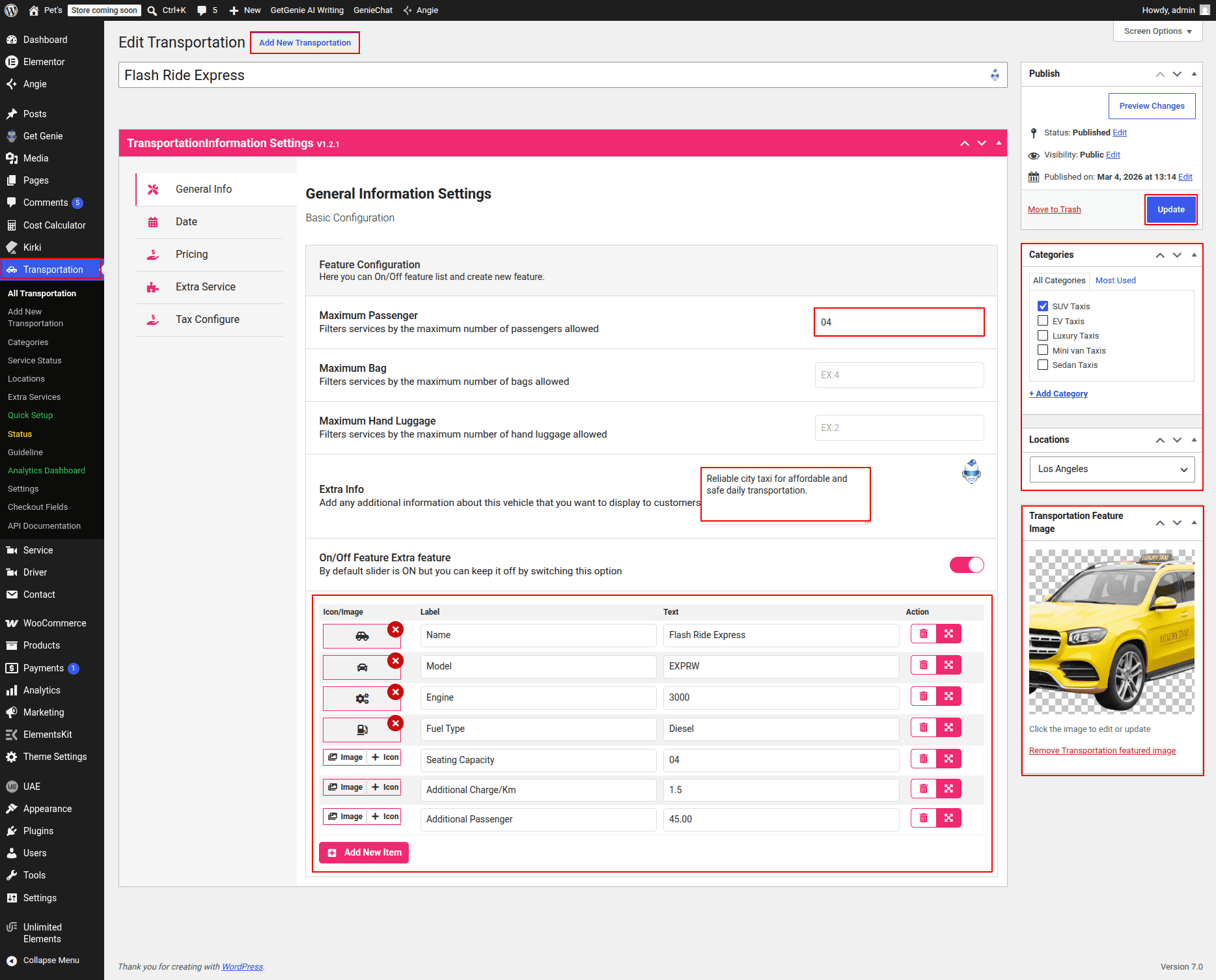
- Go to Dashboard → Taxi / Fleet.
- Click Add New.
- Enter taxi title.
- Add description.
- Set featured image.
- Set seat capacity.
- Set price.
- Set additional passenger charge.
- Select category.
- Click Publish.
Adding Fleet Section on Home Page
- Go to Home Page.
- Click Edit with Elementor.
- Select Taxi / Fleet Section.
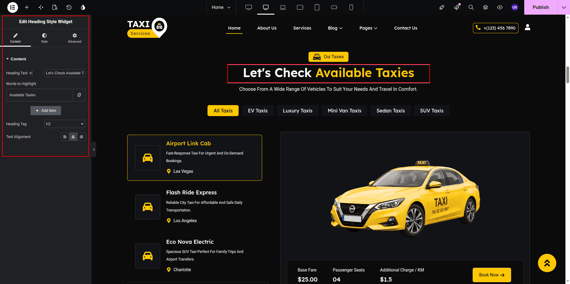
Editing Section Title & Heading
- Select Heading widget.
- Edit title text.
- Edit heading text.
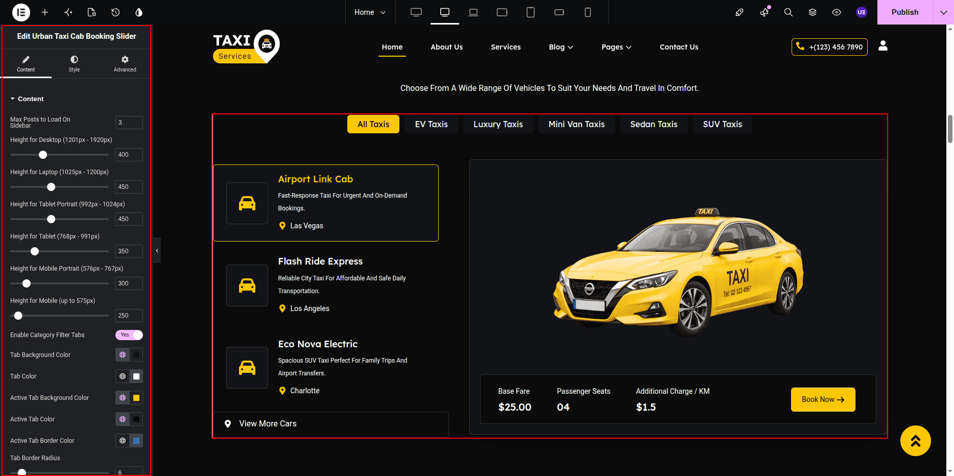
Displaying Taxi Posts Using Widget
- Search Taxi / Fleet Widget.
- Drag widget into section.
- Open widget settings.
Settings
- Post Type → Taxi
- Posts Count → Set number
- Show Price → Yes
- Show Seat → Yes
- Show Image → Yes
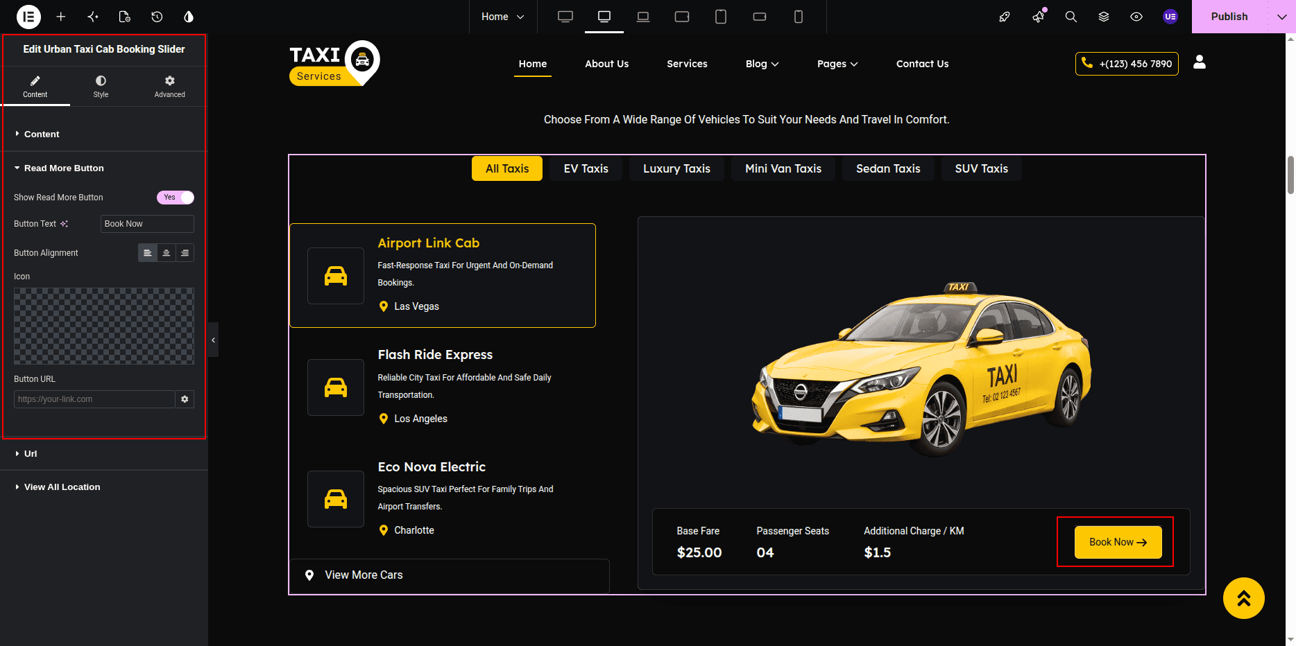
Editing Button
- Select Button widget.
- Edit button text.
- Set link.
Styling Settings
- Adjust card spacing.
- Change colors if needed.
- Do not remove decorative images.
Responsive Settings
- Switch to Tablet view.
- Switch to Mobile view.
- Check card layout.
Tip: Add featured image for every taxi.
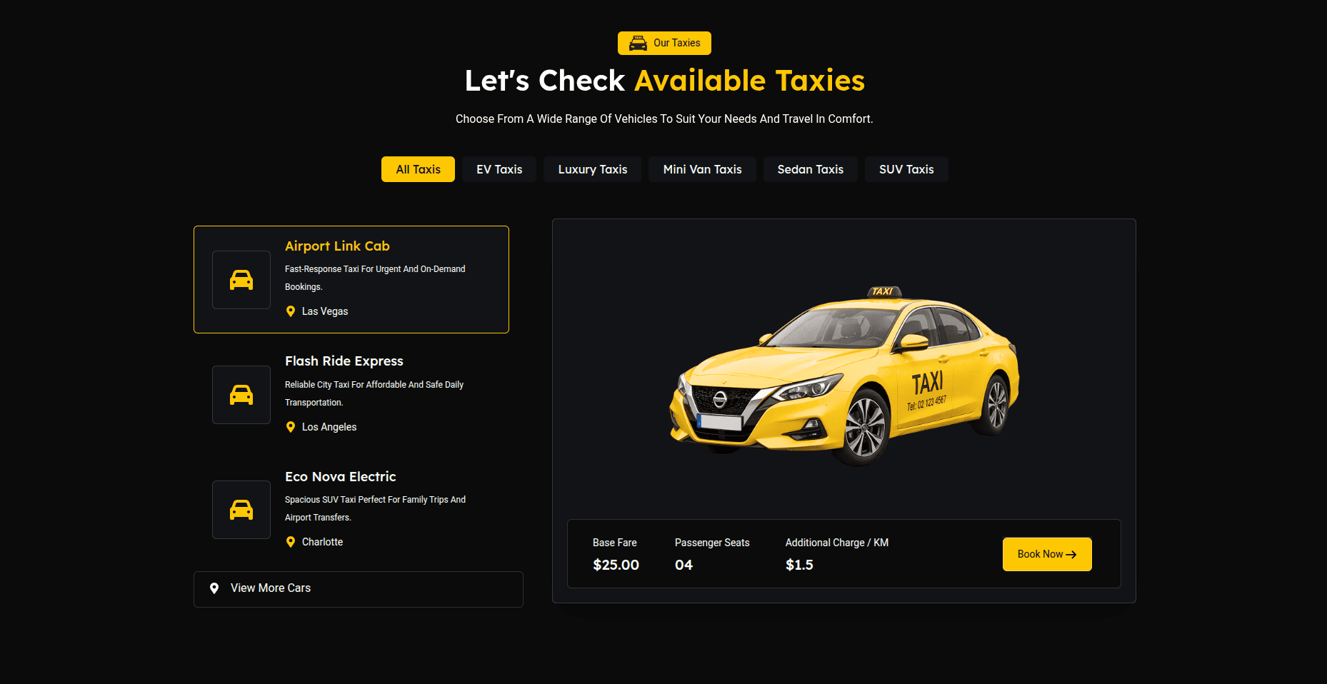
This is the final view of your section:
Tip:
Always use the built-in Taxi Widget to display taxis.
Manual posts or loop widgets may break the layout.
Gallery Section
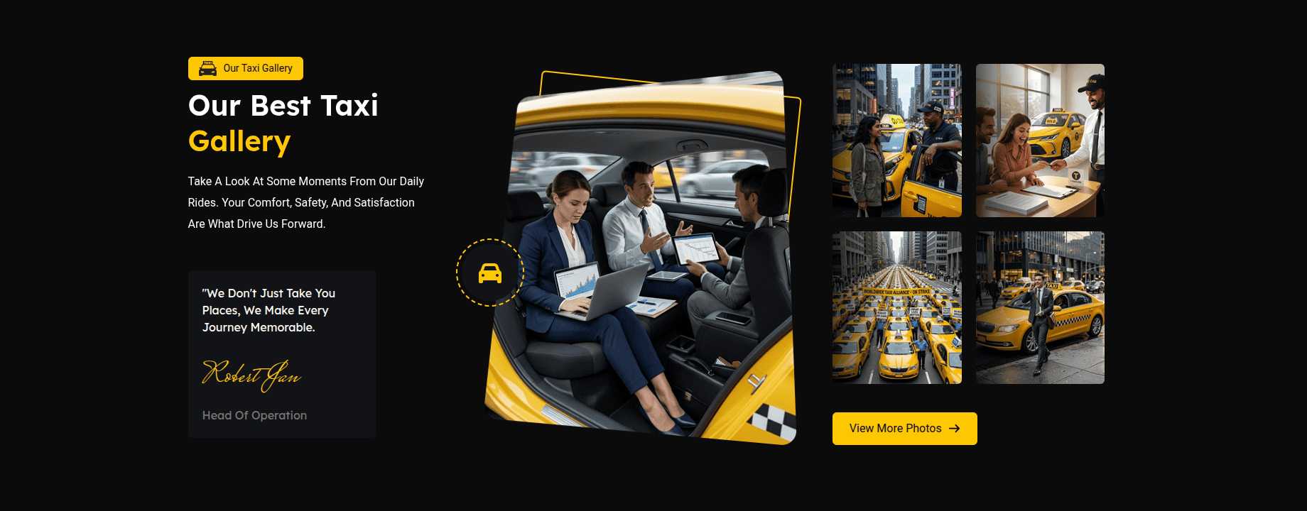
The Gallery Section displays taxi and service images in a slider layout.
This section includes section title, heading, animated heading,
gallery images, and bottom decorative image.
Images are shown using the
UrbanTaxi Gallery Slider Widget.
Adding Gallery Section on Home Page
- Go to the Home Page.
- Click Edit with Elementor.
- Select the Gallery Section.
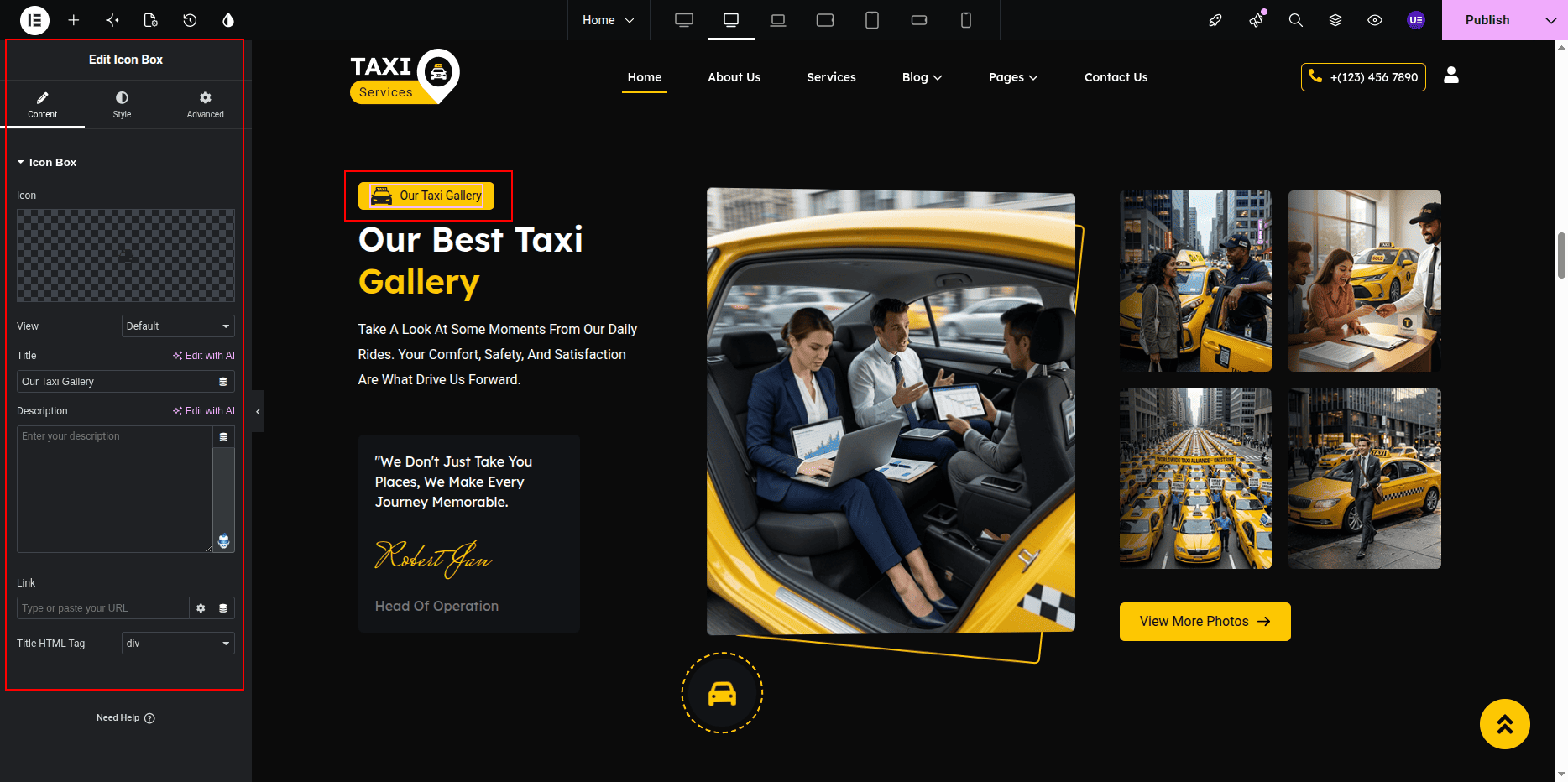
Editing Section Title & Heading
- Select the Heading Widget for title.
- Select another Heading Widget for main heading.
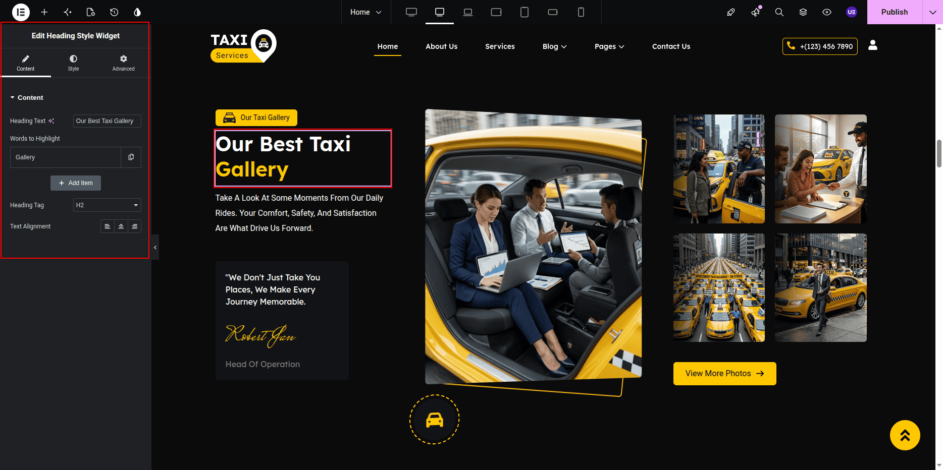
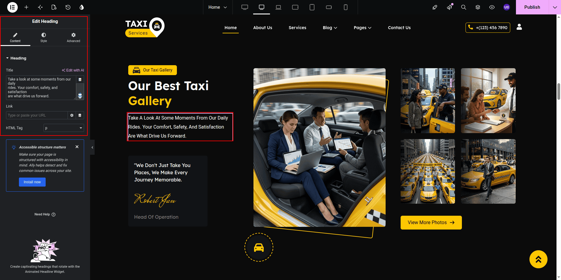
Adding Gallery Slider Widget
- Search UrbanTaxi Gallery Slider Widget.
- Drag the widget into the section.
- Open widget settings.
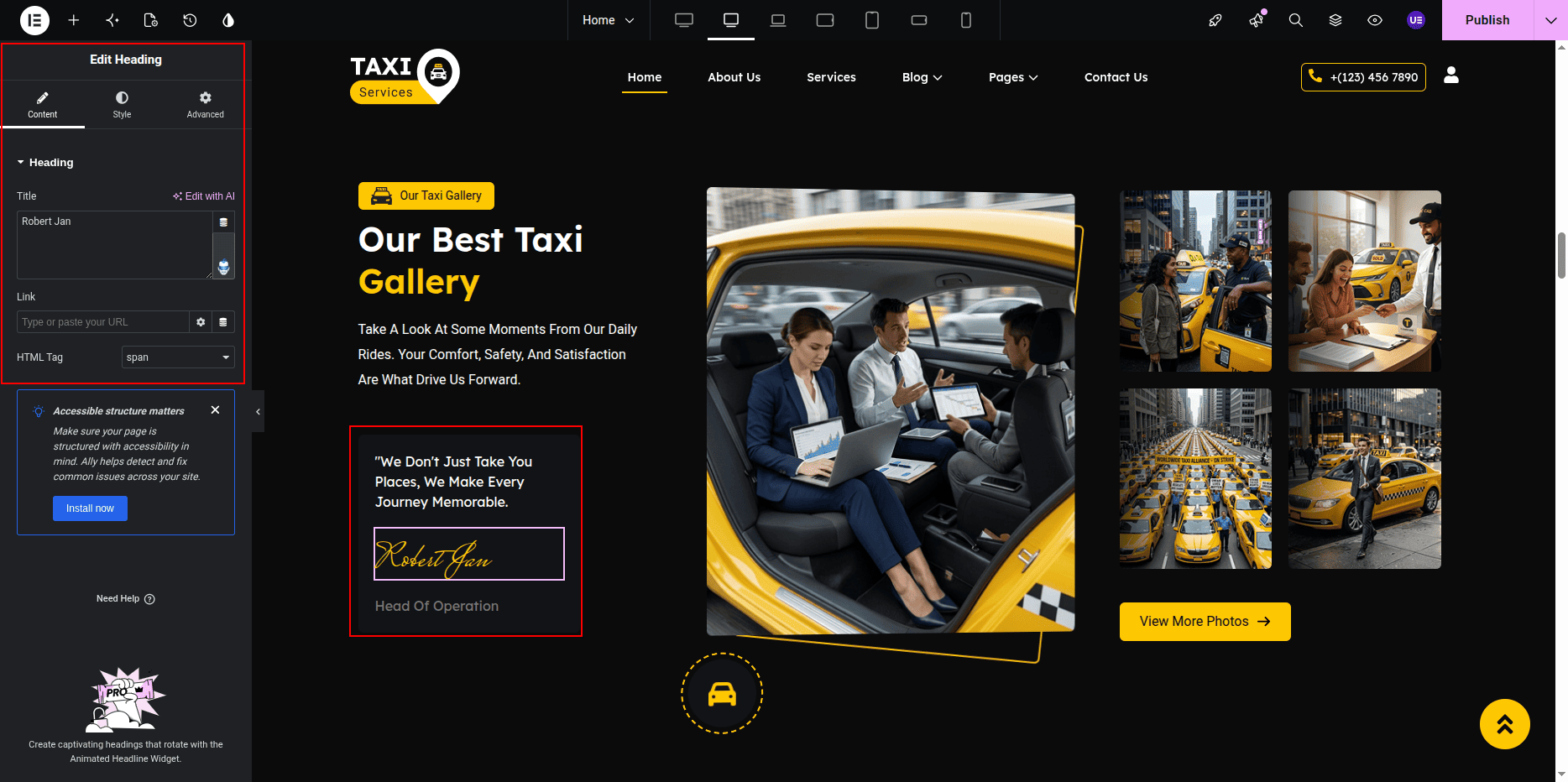
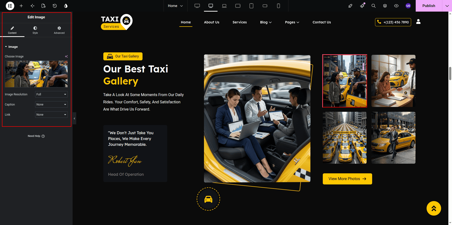
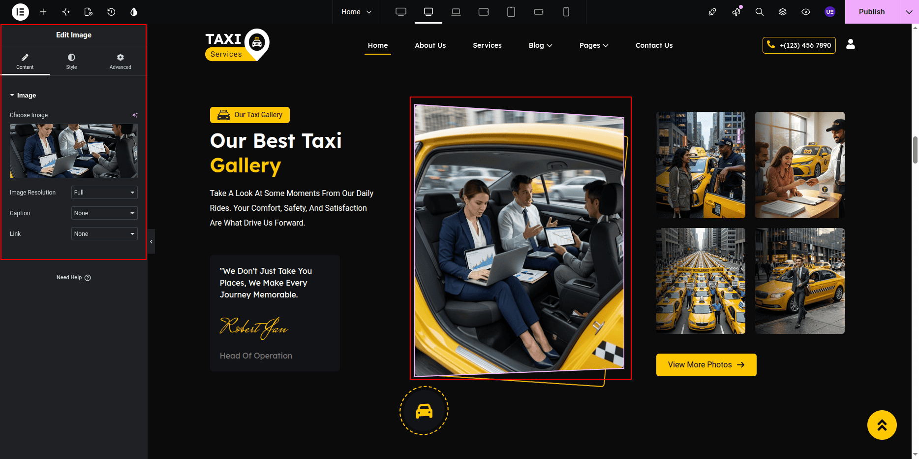
Adding Gallery Images
- Go to widget content tab.
- Click Add Item.
- Select image.
- Repeat for multiple images.
Styling Settings
- Adjust spacing between images.
- Change typography if needed.
- Enable slider autoplay if required.
Responsive Settings
- Switch to Tablet view.
- Switch to Mobile view.
- Set slider to show fewer images.
Tip: Use same image size for best layout.
This is the final view of your section:
How It Works Section
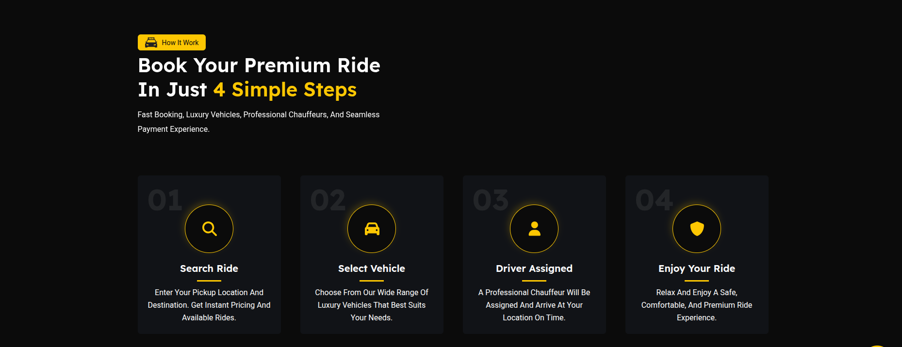
The How It Works Section is designed to explain the service process in a clear and user-friendly manner.
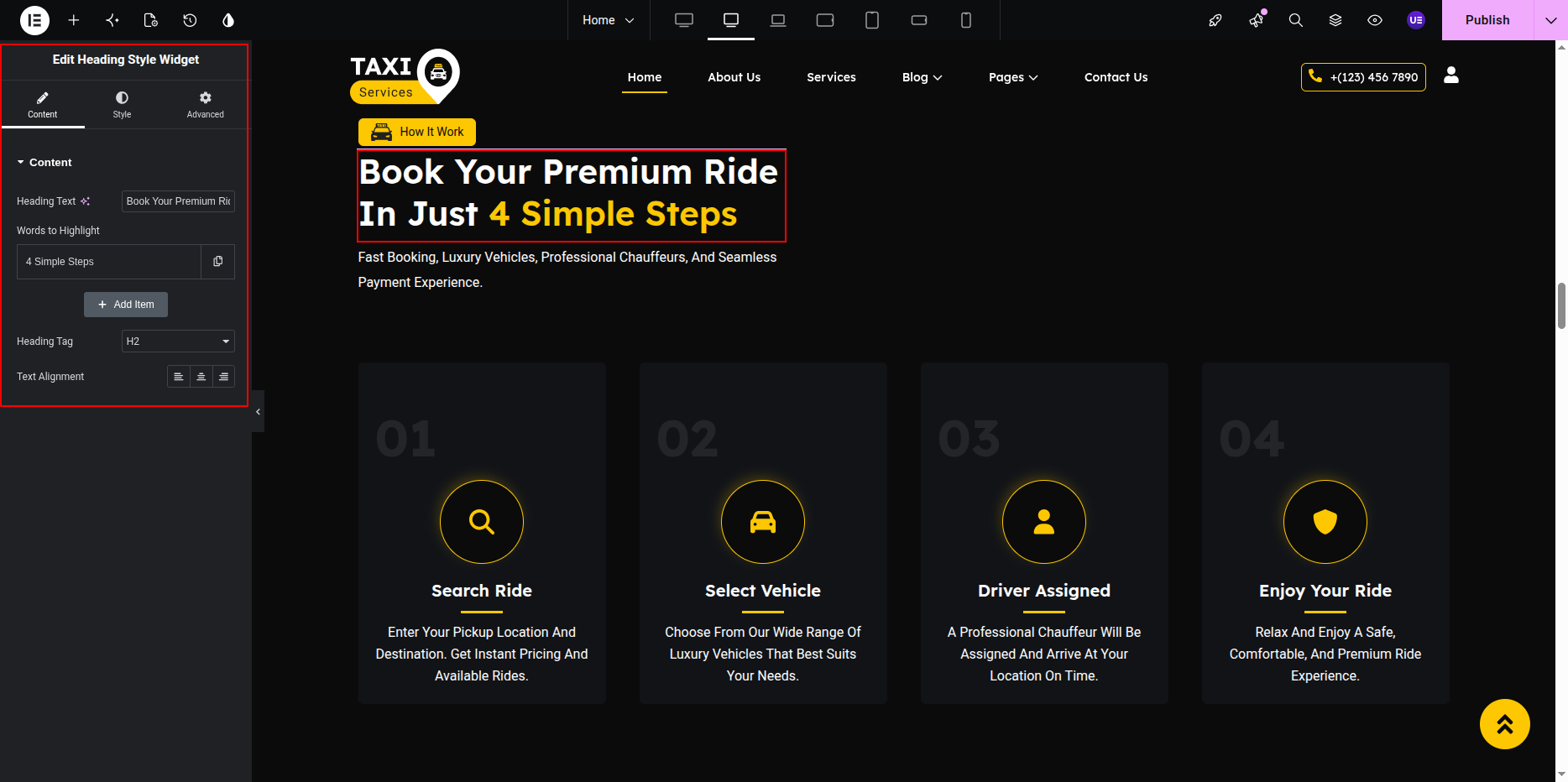
This section includes a subtitle, heading, description, four process cards, and supporting images.
Each card represents a step in the workflow and contains a count number, icon image, title, and description to help users understand the process easily.
Section Elements
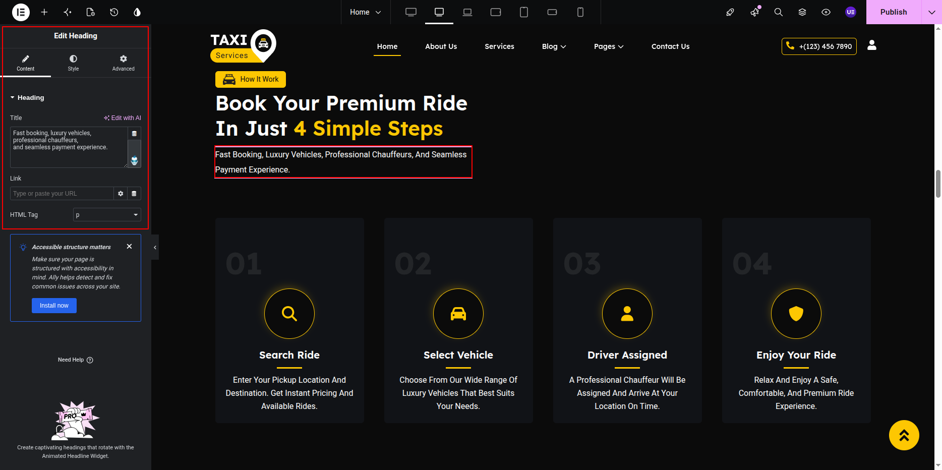
- Subtitle: Displays a short introductory text above the main heading.
- Heading: Displays the primary title of the section.
- Paragraph: Provides a brief overview of the service process.
- Process Cards: Four cards that explain each step of the workflow.
- Section Images: Decorative or illustrative images displayed within the section to enhance visual appeal.
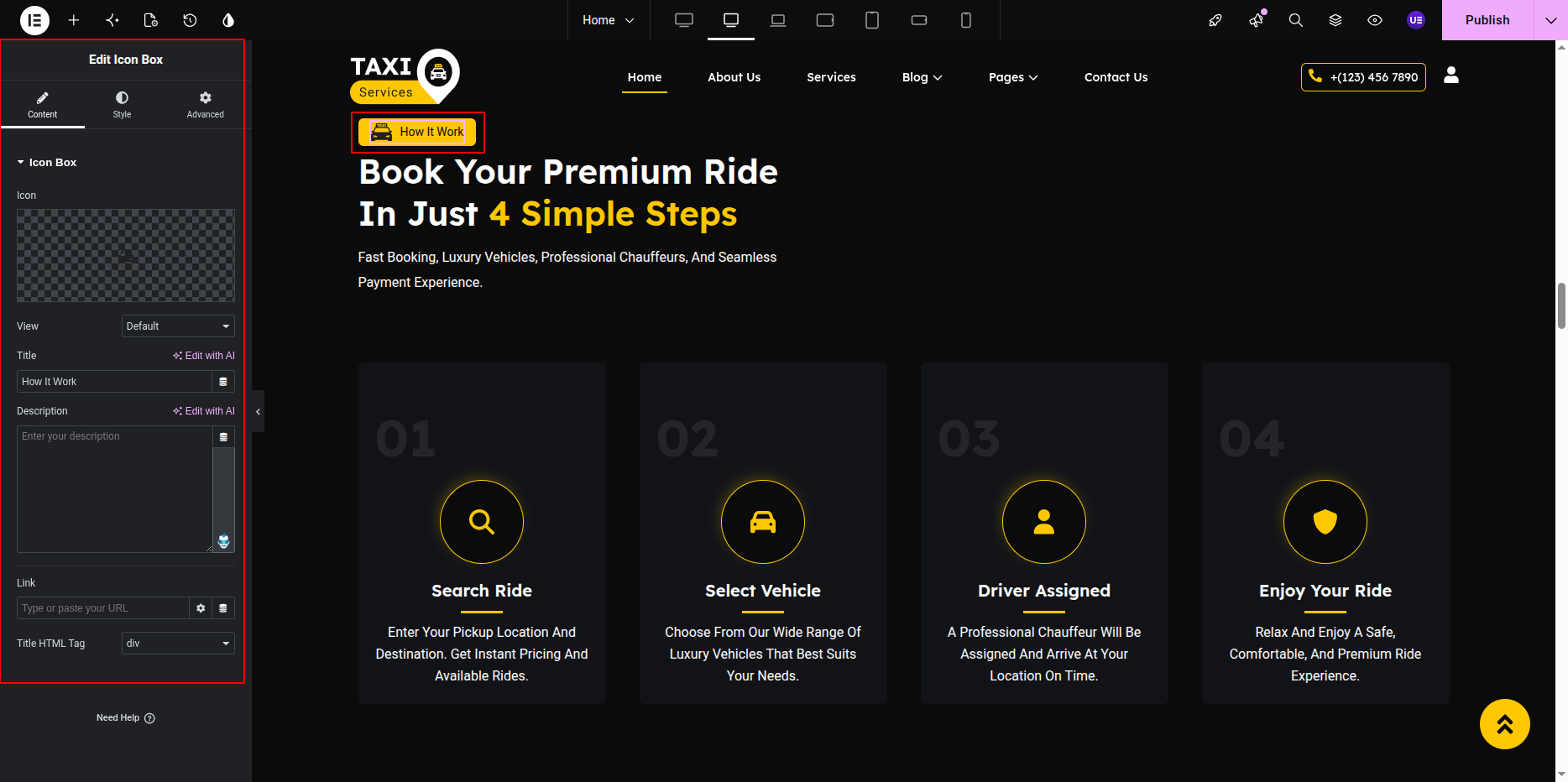
Card Elements
Each process card contains the following components:
- Count Number: Displays the step sequence number (01, 02, 03, 04).
- Icon Image: Visual representation of the process step.
- Card Title: Displays the title of the process step.
- Card Description: Provides a short explanation of the step.
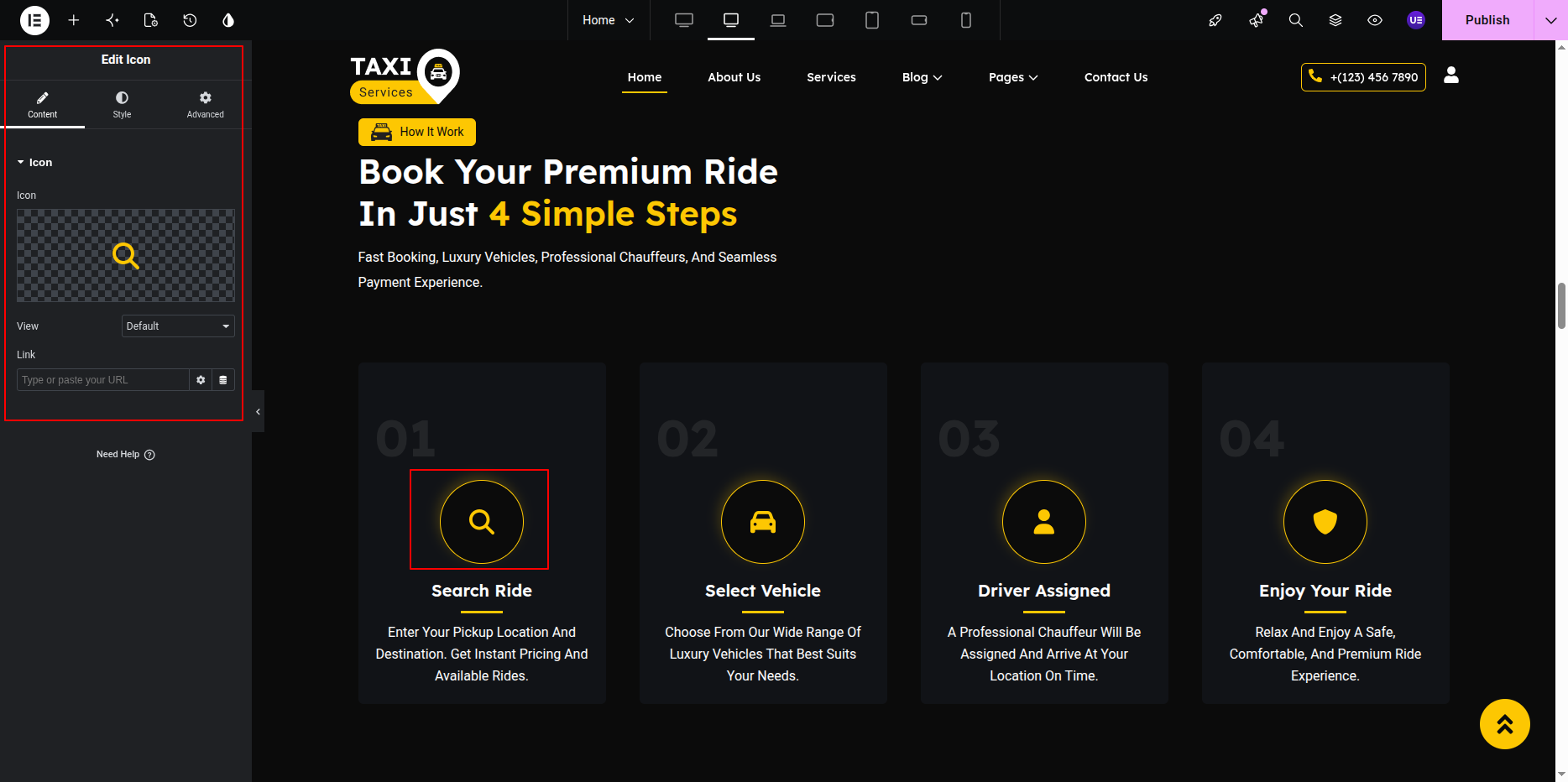
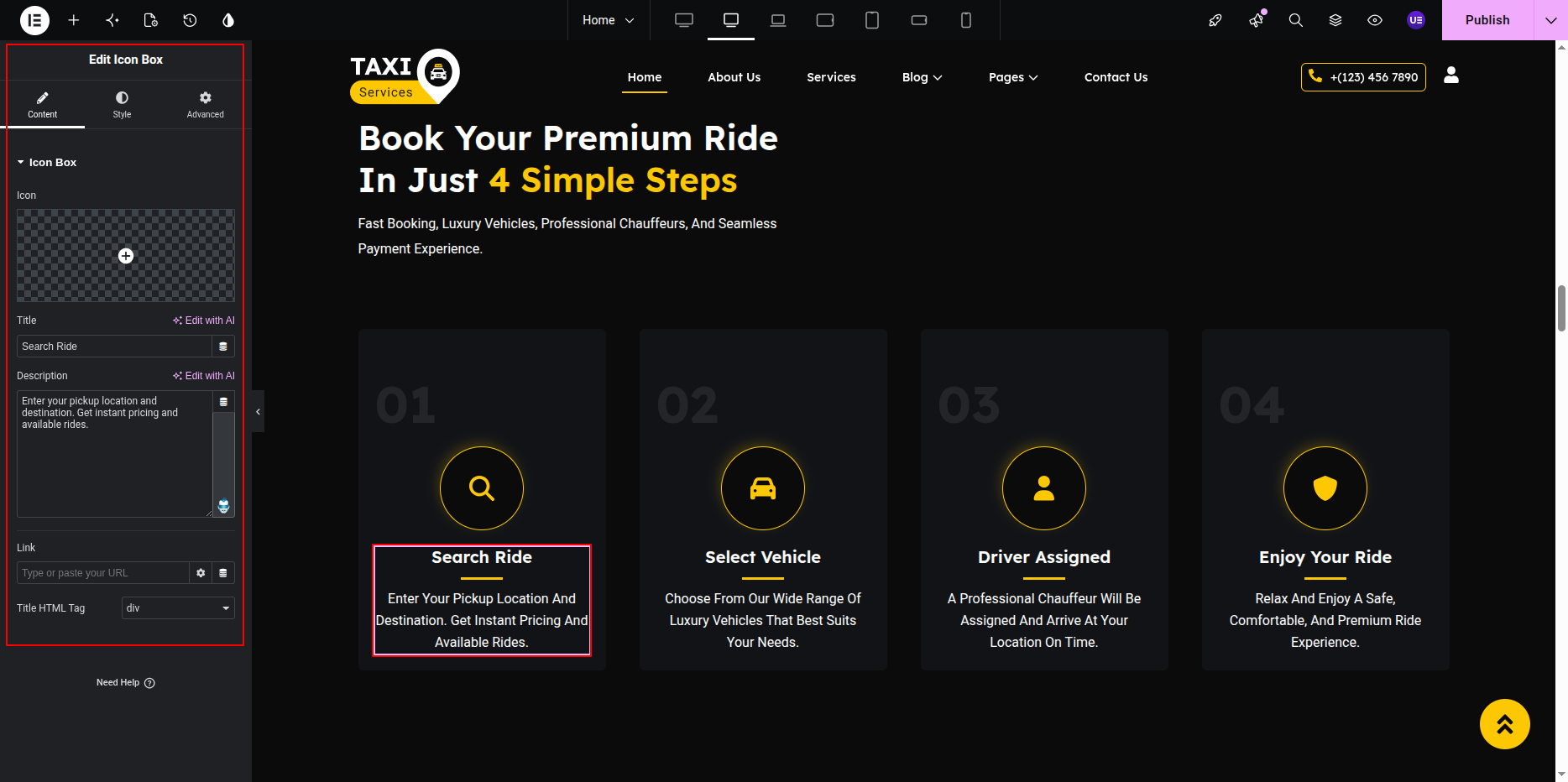
Image Elements
- Main Image: Displays the primary illustration or promotional image related to the service.
- Shape/Decorative Images: Additional images used for design enhancement and visual styling.
Customization Options
- Edit the section subtitle.
- Update the main heading text.
- Modify the section description paragraph.
- Change the count number for each process card.
- Replace the icon image for any card.
- Update the card title and description.
- Upload or replace the main section image.
- Upload or replace decorative/shape images.
- Manage the display order of all four process cards.
The How It Works Section helps visitors understand the complete service process through visual illustrations and step-by-step guidance, creating a more engaging and informative user experience.
This is the final view of your section:
Offer Section
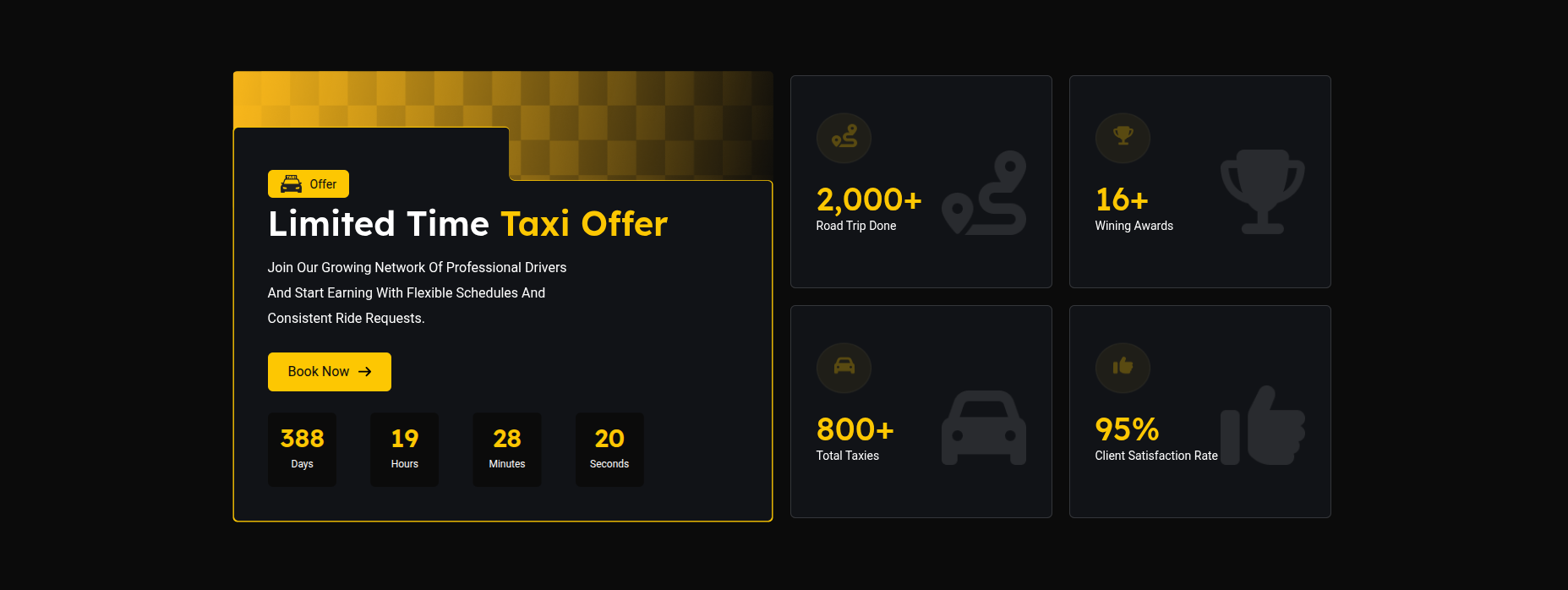
The Offer Section is used to display promotional taxi offers,
discount details, booking information, and service highlights.
This section contains a title with car icon, heading, paragraph text,
Book Now button, offer timer, and feature counter boxes on the right side.
All content can be edited using Elementor widgets.
Adding Offer Section on Home Page
- Go to the Home Page.
- Click Edit with Elementor.
- Select the Offer Section.
Editing Section Title & Car Icon
- Select the Icon/Image Widget to change the car icon.
- Select the Heading Widget to edit the section title.
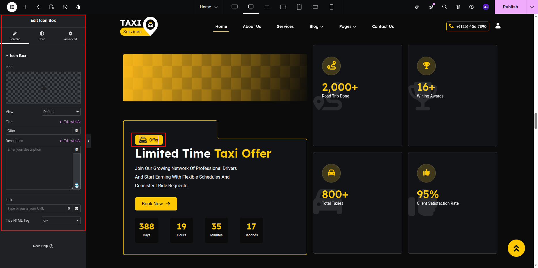
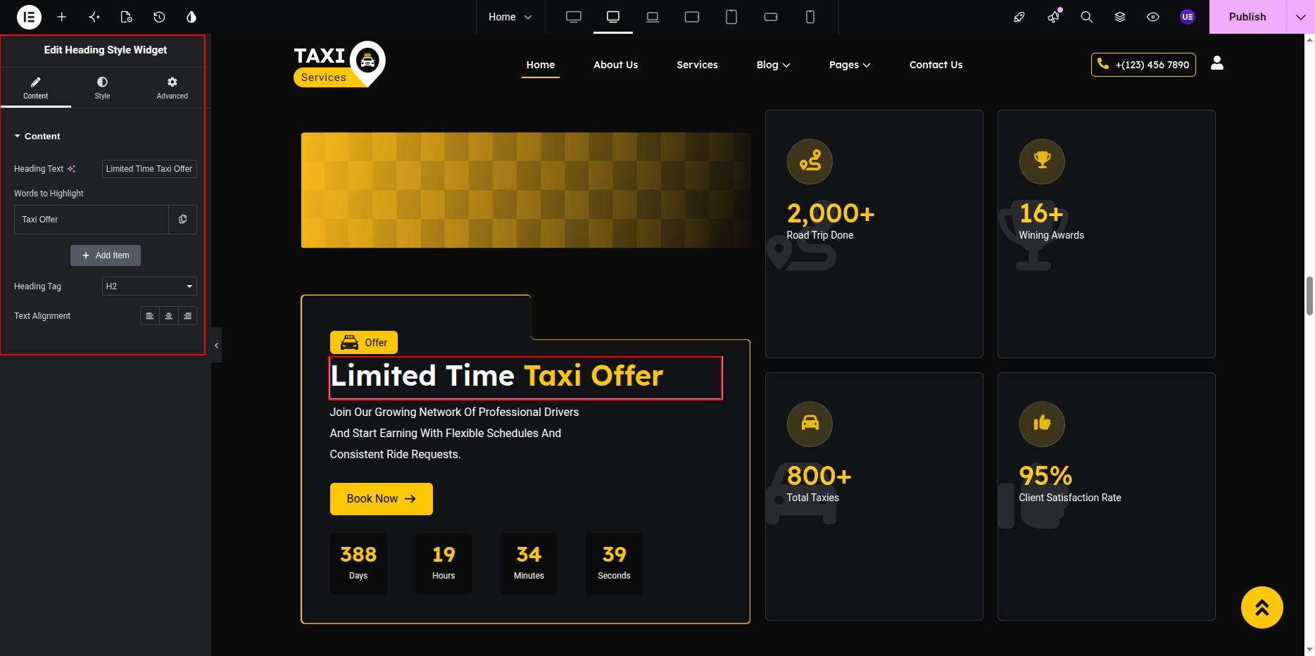
Editing Heading & Paragraph Text
- Select the Heading Widget to edit the main heading.
- Select the Text Editor Widget to update the paragraph text.
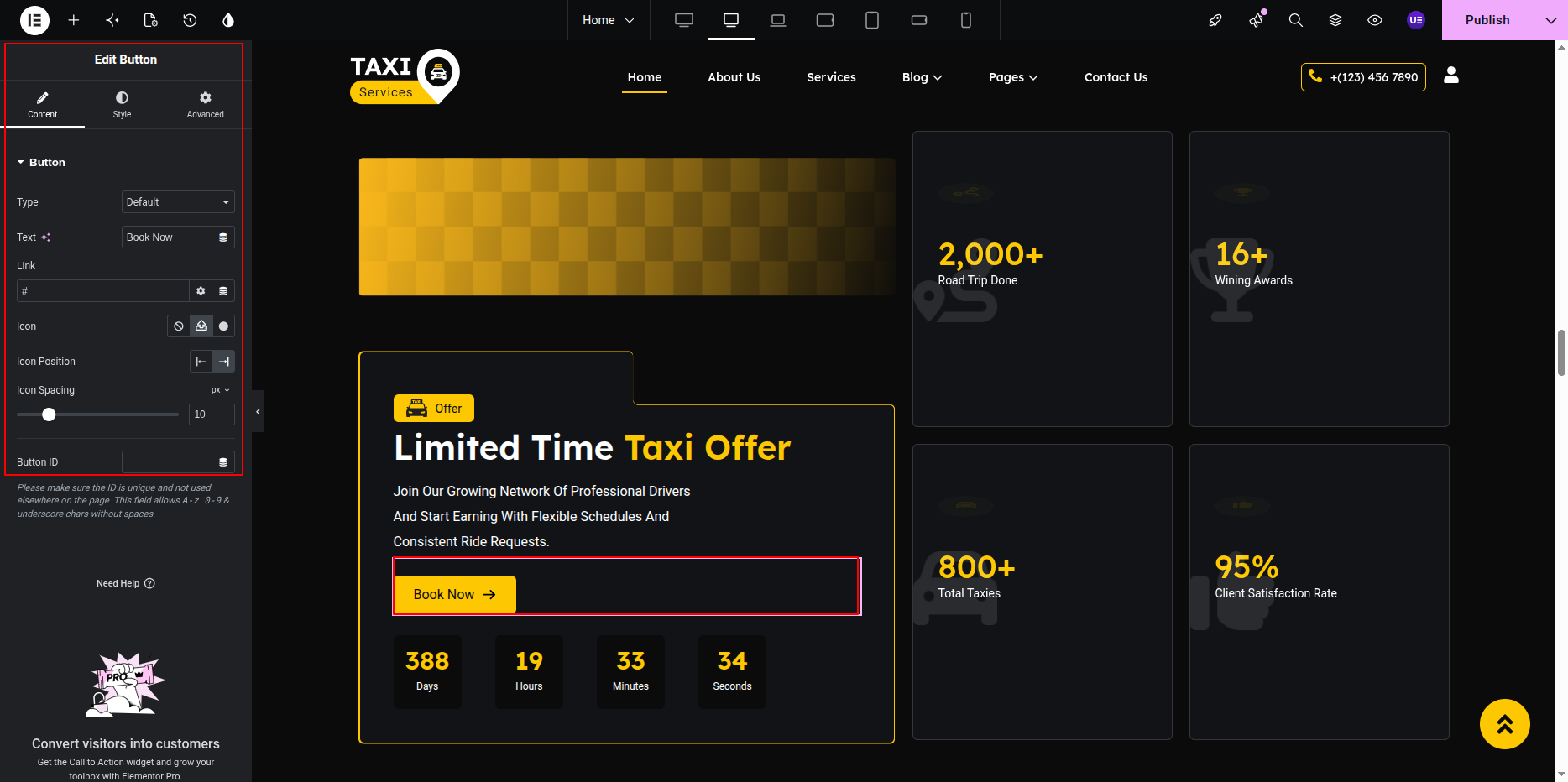
Editing Book Now Button
- Select the Button Widget.
- Edit button text and link.
- Customize button style if needed.
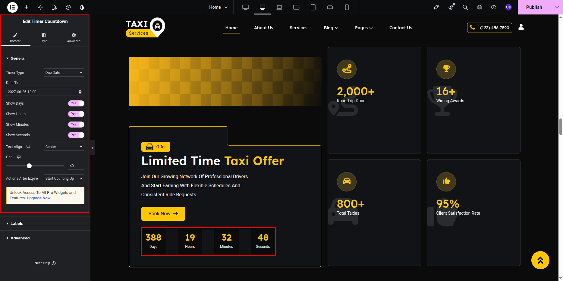
Editing Offer Timer
- Select the Countdown Widget.
- Set the offer ending date and time.
- Customize timer layout and style.
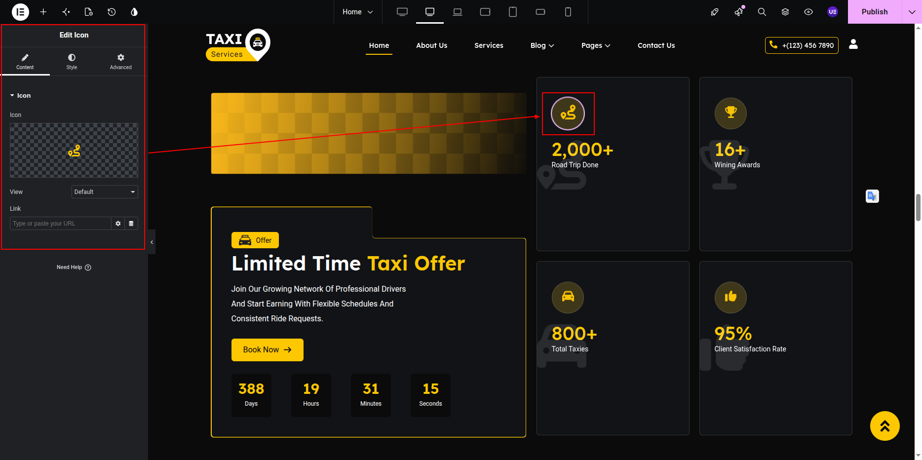
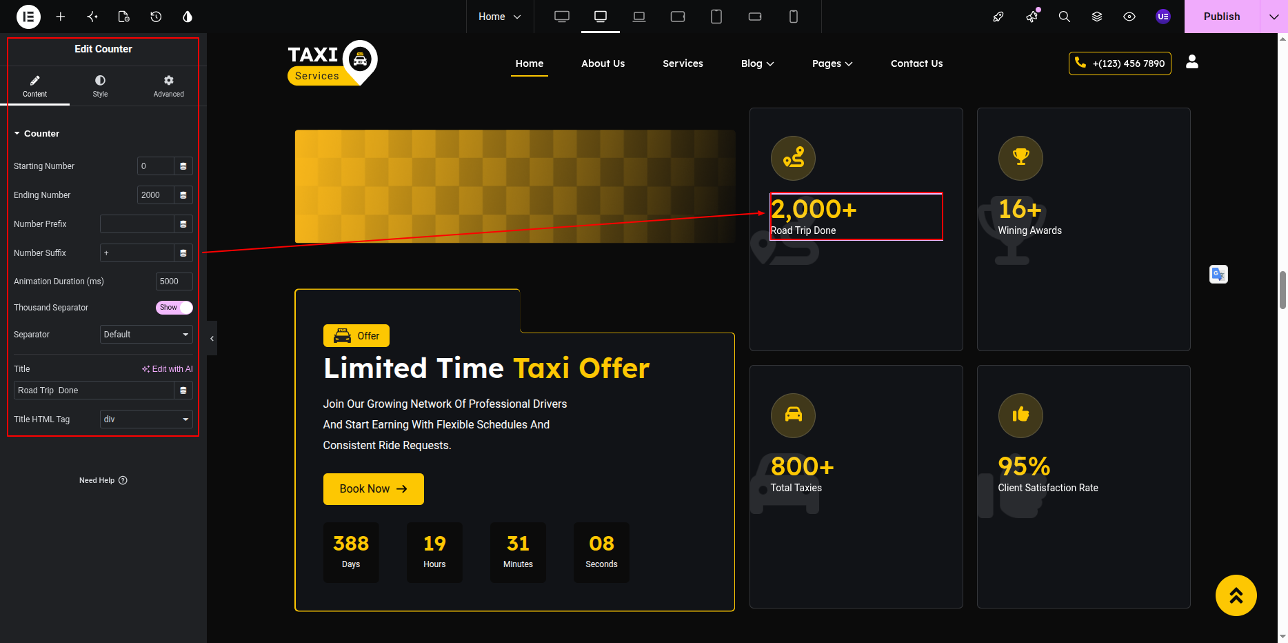
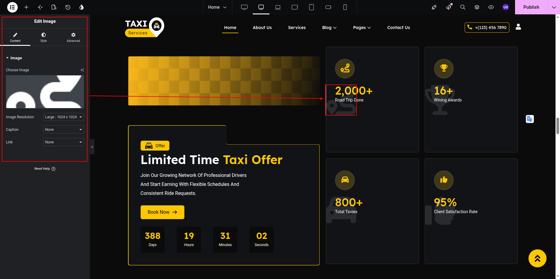
Editing Right Side Counter Boxes
The right side contains 4 different feature boxes.
Each box includes an icon image, counter number, and title text.
- Select the Image Widget to change the icon image.
- Select the Counter Widget to update the counter number.
- Select the Heading Widget to edit the title text.
- Repeat the same steps for all 4 boxes.
Styling Settings
- Adjust spacing between content and counter boxes.
- Customize typography and colors.
- Change icon image size if needed.
- Keep counter boxes aligned properly.
Responsive Settings
- Switch to Tablet view.
- Switch to Mobile view.
- Make counter boxes stack properly on smaller devices.
Tip: Use equal icon sizes and counter spacing for a clean layout.
This is the final view of your section:
Tip:
Do not remove the timer or counter boxes.
These elements are important for the section layout and promotional design.
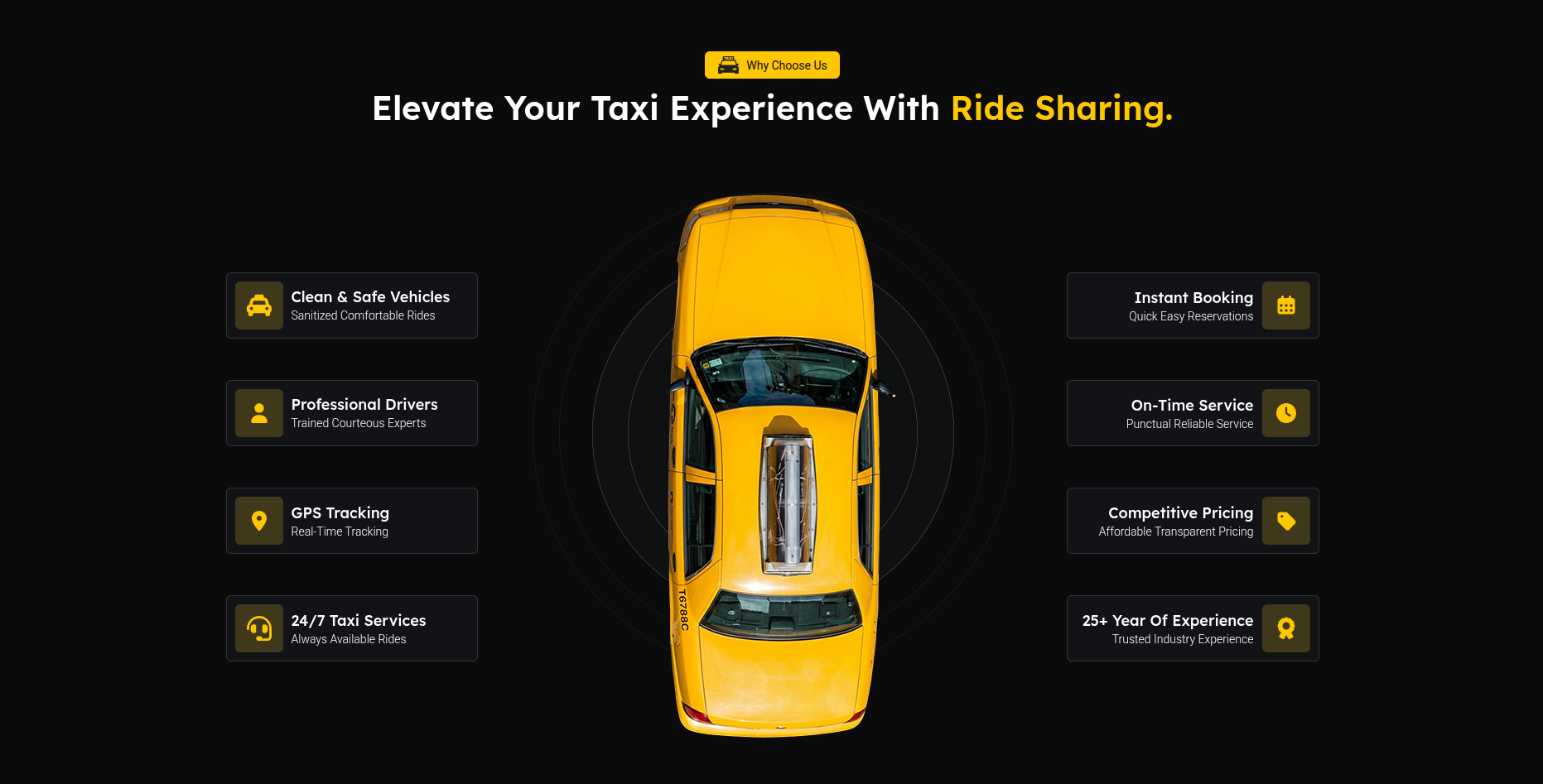
Why Choose Us Section
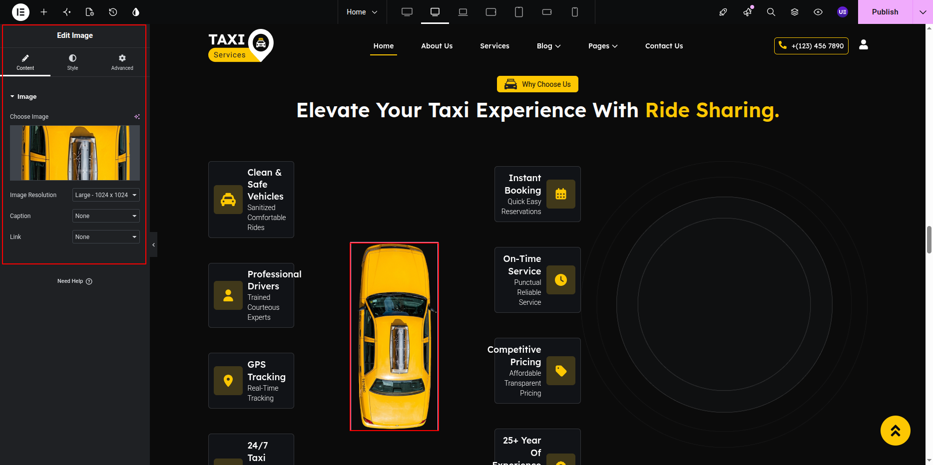
The Why Choose Us Section displays the advantages of your taxi service.
This section contains section title, heading, icon box items,
arrow / path image, taxi image, and bottom decorative image.
All content can be edited using Elementor widgets.
Adding Why Choose Us Section on Home Page
- Go to the Home Page.
- Click Edit with Elementor.
- Select the Why Choose Us Section.
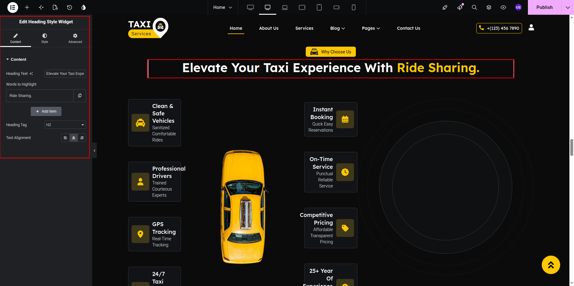
Editing Section Title & Heading
- Select the Heading Widget for title.
- Select another Heading Widget for heading.
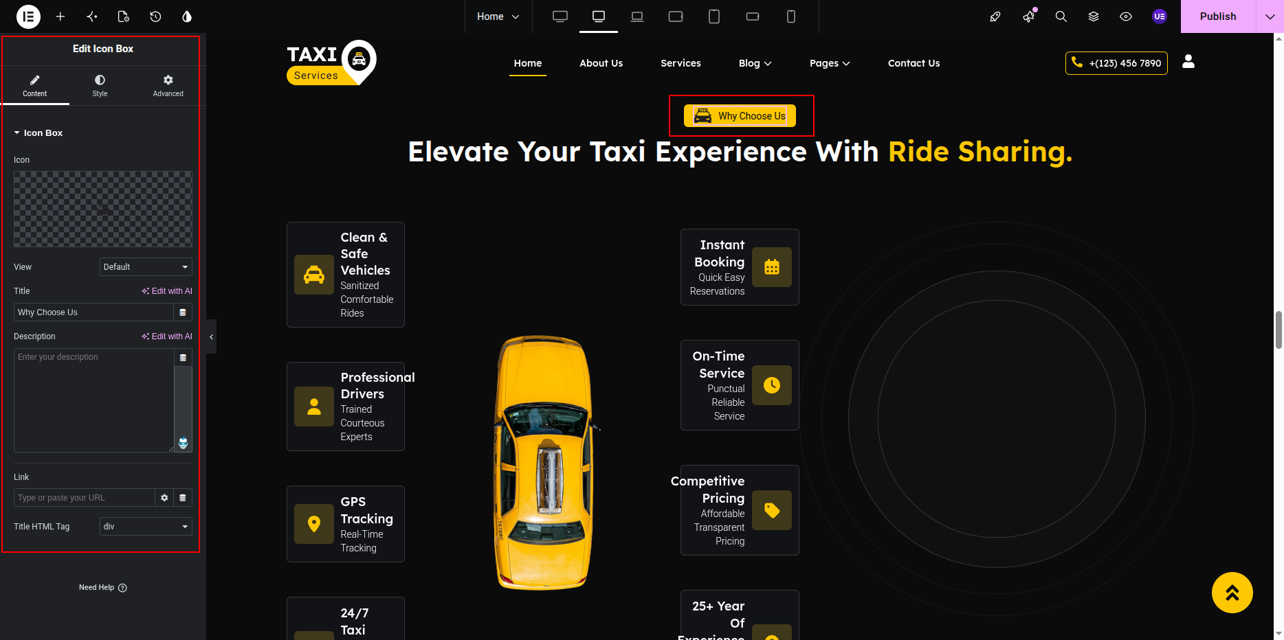
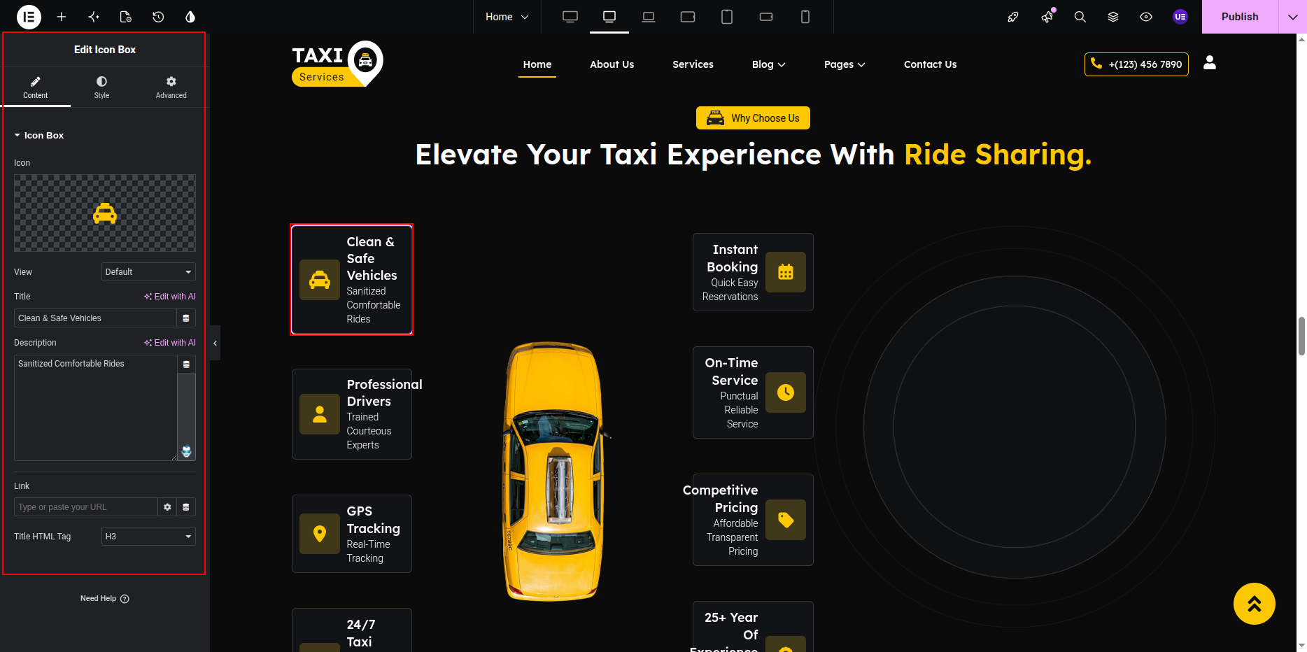
Editing Why Choose Items
This section uses Icon Box widgets.
Each item contains icon, title, and text.
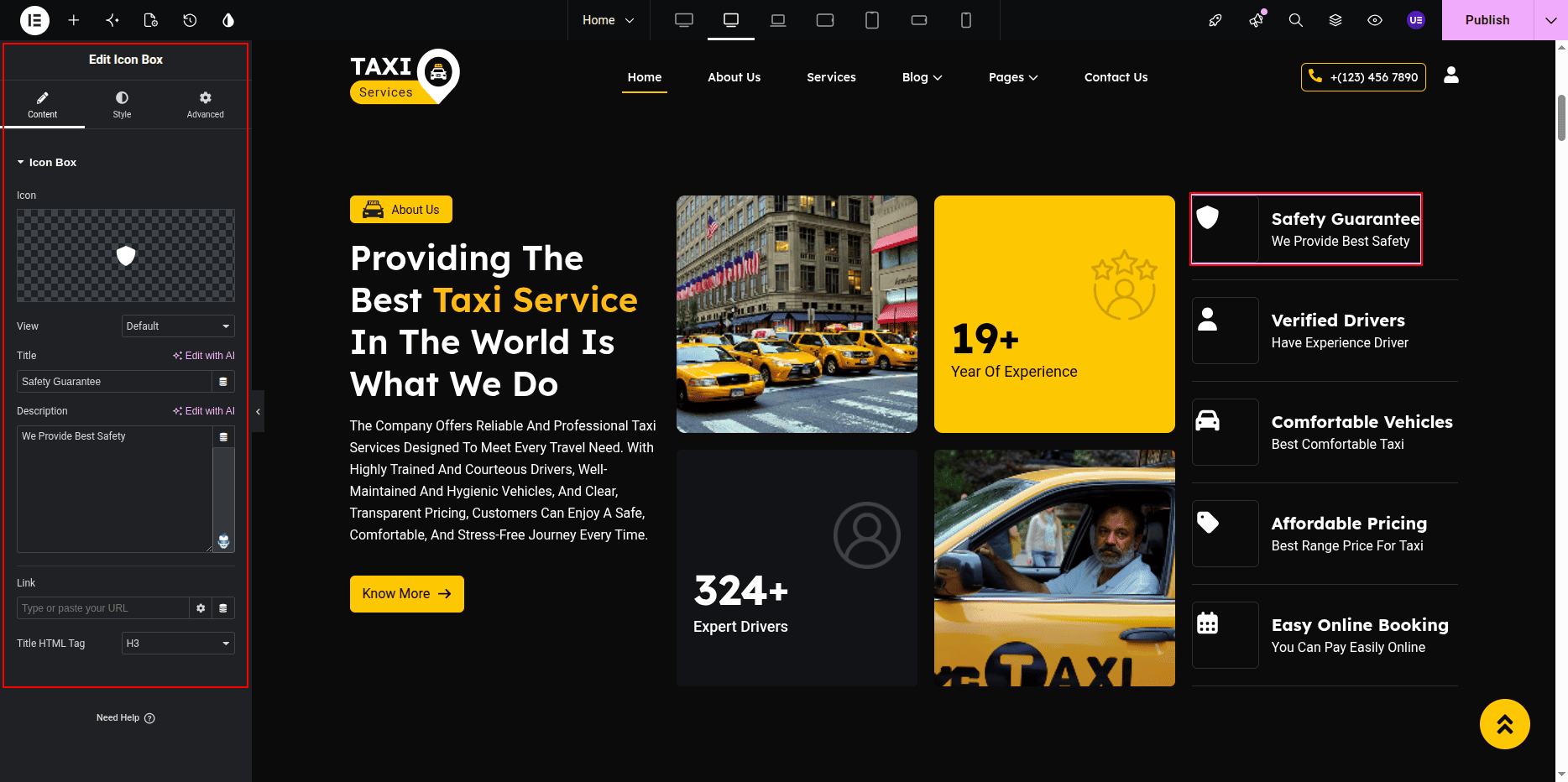
- Select Icon Box widget.
- Edit title.
- Edit text.
- Change icon image.
- Repeat for all items.
Styling Settings
- Adjust icon size.
- Change typography if needed.
- Keep spacing equal.
Responsive Settings
- Switch to Tablet view.
- Switch to Mobile view.
- Stack items vertically.
Tip: Use equal text length for best layout.
This is the final view of your section:
Tip:
Do not remove the arrow image, taxi image, or bottom image.
These elements are required for the design layout.
Changing position settings may break the section design.
Team Section
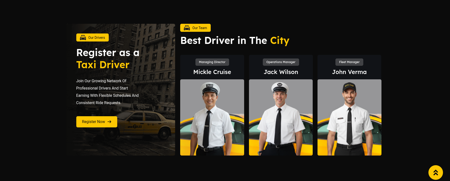
The Team Section displays team members in a carousel layout.
This section contains section title, heading,
and team members created using the
Team Member Widget.
Each member includes image, name, designation,
and social icons.
Adding Team Section on Home Page
- Go to the Home Page.
- Click Edit with Elementor.
- Select the Team Section.
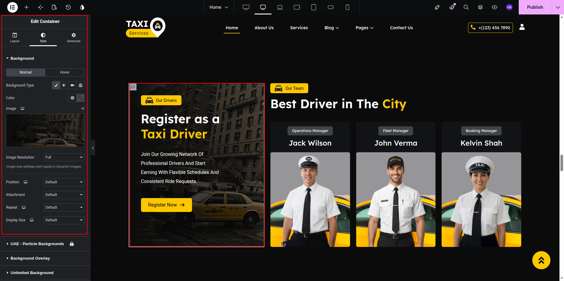
Editing Left Content Box
The left side content box contains background image, icon title,
heading, paragraph text, and button.
- Select the Container for the left content box.
- Go to the Style Tab.
- Change the background image if needed.
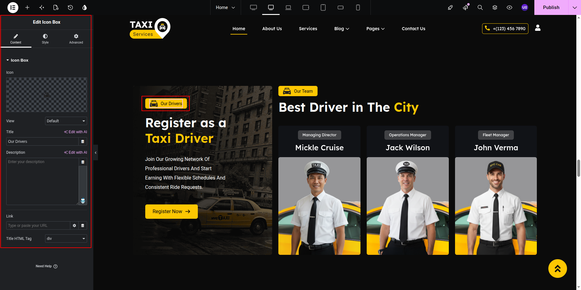
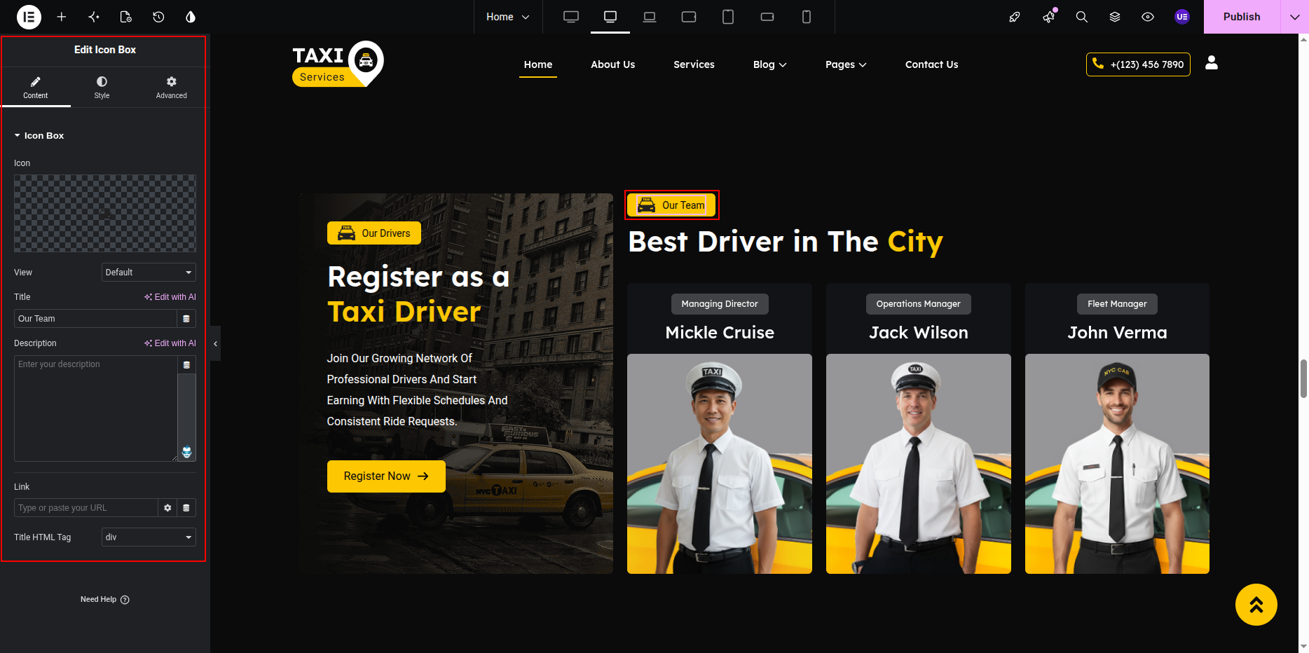
Editing Title with Icon
- Select the Icon/Image Widget to change the icon.
- Select the Heading Widget to edit the small title.
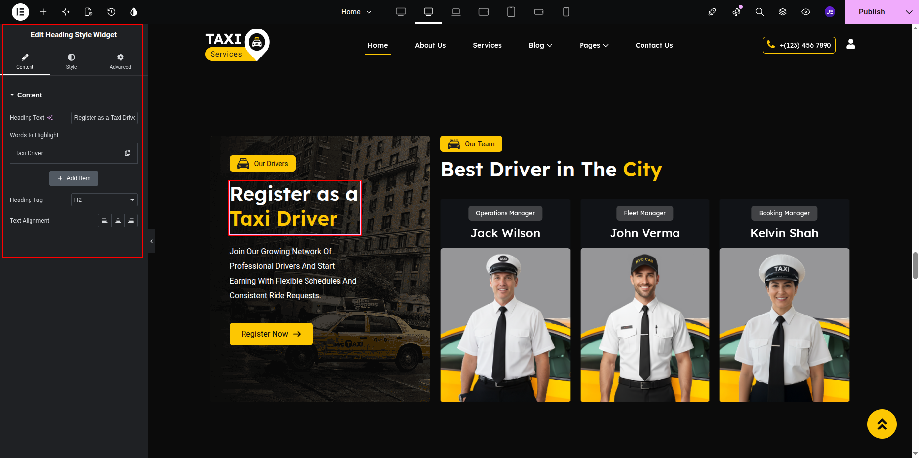
Editing Heading & Paragraph Text
- Select the Heading Widget for the main heading.
- Select the Text Editor Widget to edit the paragraph text.
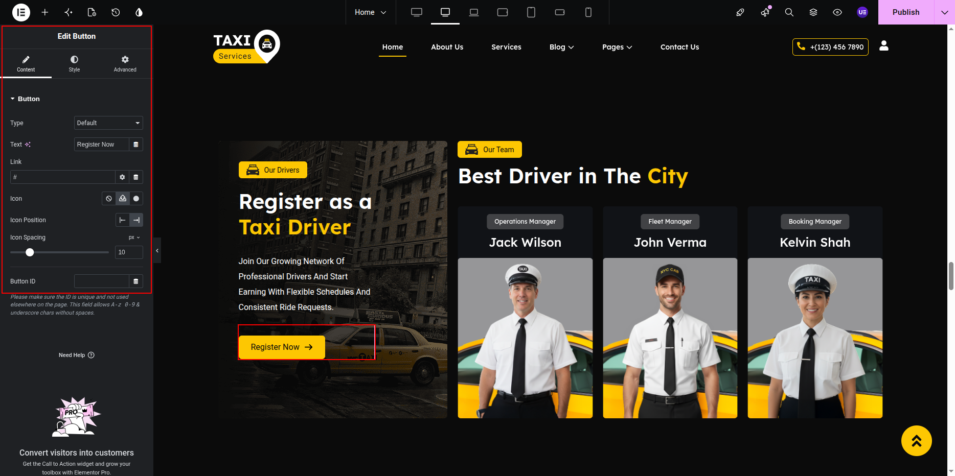
Editing Button
- Select the Button Widget.
- Edit button text and link.
- Customize button style if needed.
Editing Section Title & Heading
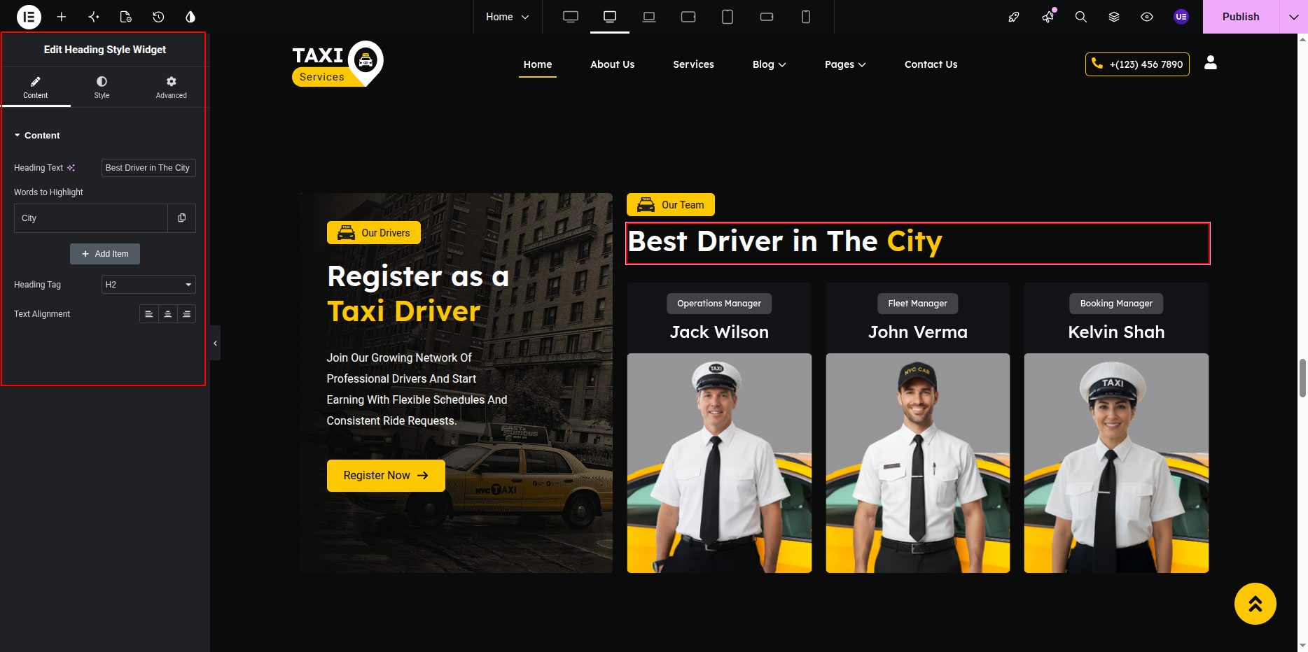
- Select the Heading Widget for title.
- Select another Heading Widget for main heading.
Adding Team Members
- Search Team Member Widget.
- Drag widget into section.
- Open widget settings.
Editing Team Member Content
- Click Add Item.
- Add member name.
- Add designation.
- Upload member image.
- Add social icons.
- Repeat for all members.
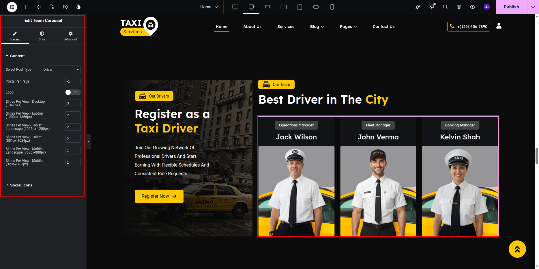
Carousel Settings
- Slides to show → 3
- Autoplay → Yes
- Loop → Yes
- Navigation → Arrows / Dots
Styling Settings
- Adjust image size.
- Change text typography.
- Set spacing between cards.
Responsive Settings
- Tablet → 2 slides
- Mobile → 1 slide
- Center align text.
Tip: Use same size images for all members.
This is the final view of your section:
Tip:
Use the Team Member Widget to keep the carousel layout working correctly.
Removing slider settings may break the design.
Testimonial Section
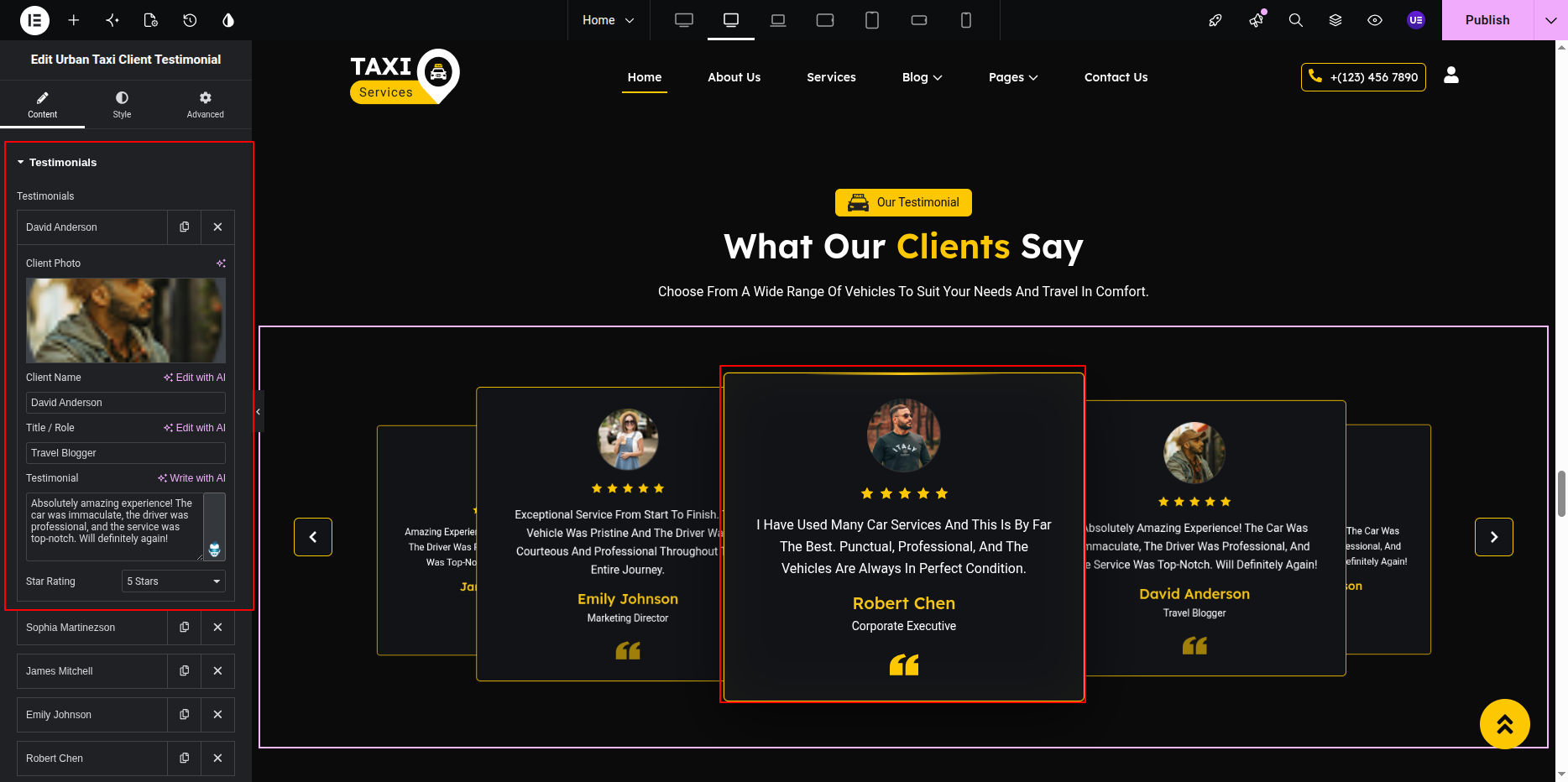
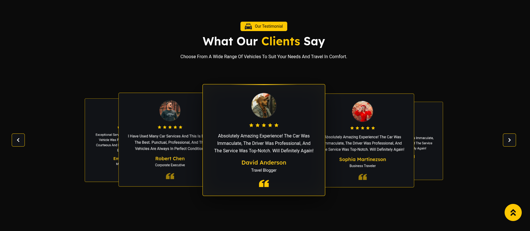
The Testimonial Section displays customer reviews in slider layout.
This section contains section title, heading,
and testimonials created using the
UrbanTaxi Smart Testimonial Widget.
Each testimonial includes name, text, image,
and rating or designation.
Adding Testimonial Section on Home Page
- Go to the Home Page.
- Click Edit with Elementor.
- Select the Testimonial Section.
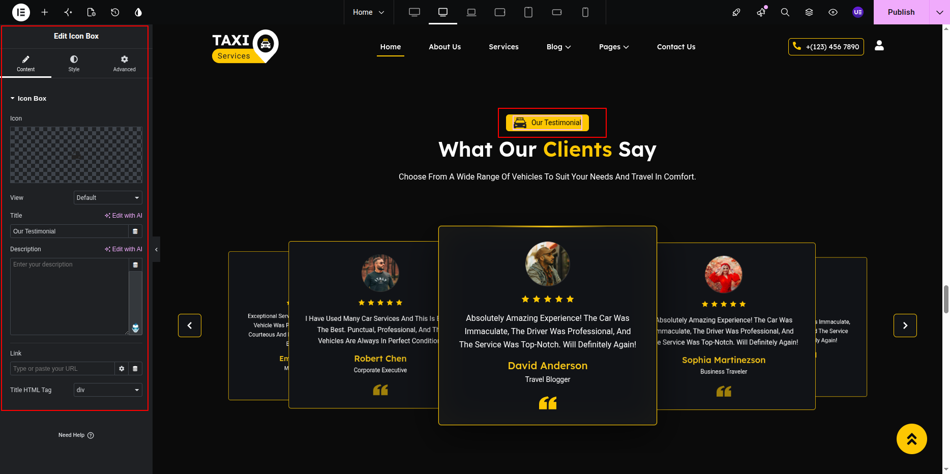
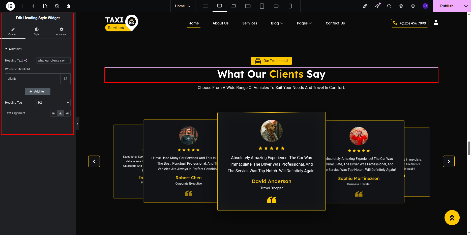
Editing Section Title & Heading
- Select the Heading Widget for title.
- Select another Heading Widget for main heading.
Adding Testimonial Widget
- Search UrbanTaxi Smart Testimonial.
- Drag widget into section.
- Open widget settings.
Editing Testimonial Content
- Click Add Item.
- Add customer name.
- Add testimonial text.
- Upload customer image.
- Add designation if needed.
- Repeat for all testimonials.
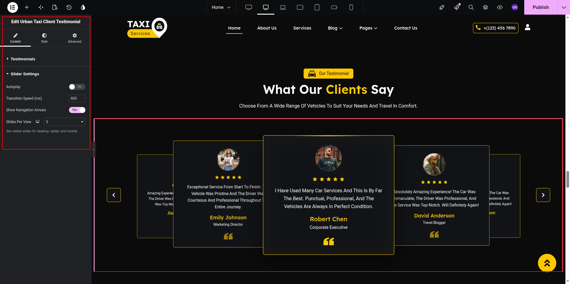
Slider Settings
- Slides to show → 1 / 2
- Autoplay → Yes
- Loop → Yes
- Navigation → Enabled
Styling Settings
- Adjust text typography.
- Change image size.
- Set spacing between slides.
Responsive Settings
- Tablet → 1 slide
- Mobile → 1 slide
- Center align text.
Tip: Keep testimonials short for better layout.
This is the final view of your section:
Tip:
Always use the UrbanTaxi Smart Testimonial Widget.
Using other widgets may break the slider layout.
Cost Calculator Section
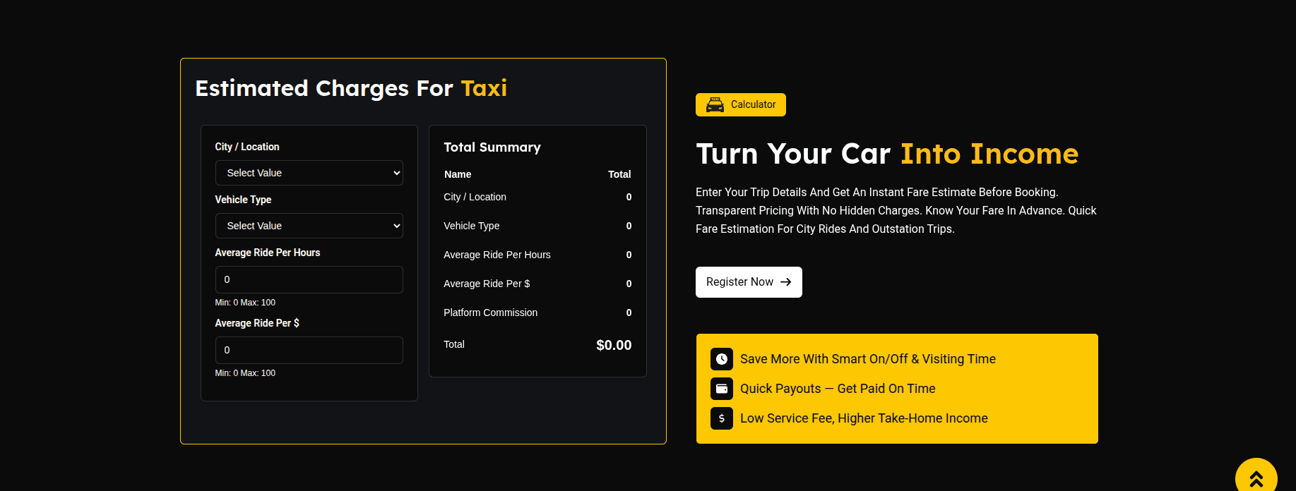
The Cost Calculator Section allows visitors to quickly estimate transportation costs using a custom Cost Calculator widget.
This section consists of a calculator form on the left side and informational content on the right side.
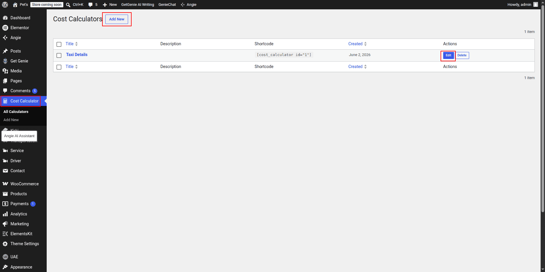
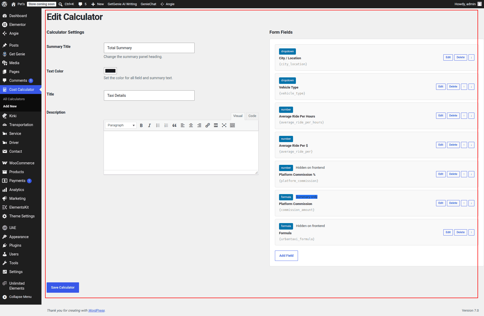
The calculator form can be fully managed from the WordPress dashboard through the Cost Calculator plugin.
Left Side – Calculator Form
- Form Title: Displays the calculator heading above the form.
- Cost Calculator Form: Allows users to enter trip details and calculate estimated costs.
- Form Management: The calculator form can be edited, updated, or newly created from Dashboard → Cost Calculator → Add New / Edit Calculator.
Right Side – Content Area
- Title: Displays a small section title or label.
- Heading: Displays the main content heading.
- Paragraph: Provides a brief description or additional information.
- Button: Displays a call-to-action button with customizable text and link.
- Feature Lists: Displays a list of service highlights, benefits, or important information.
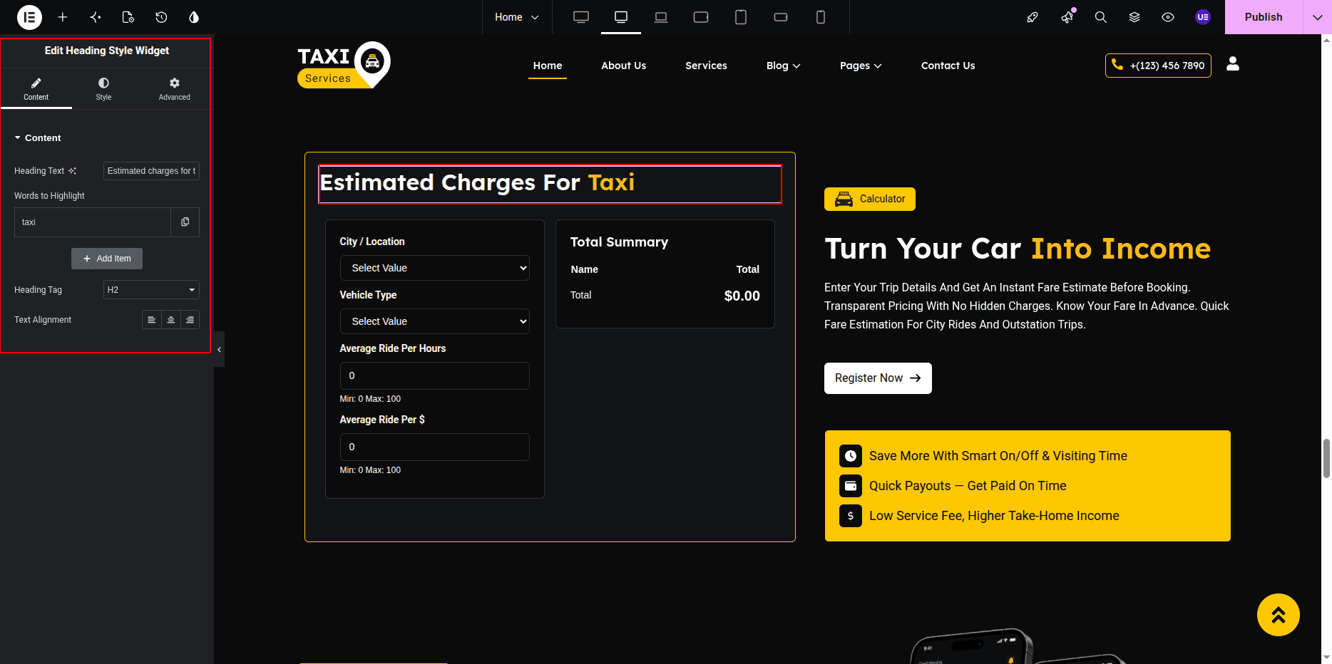
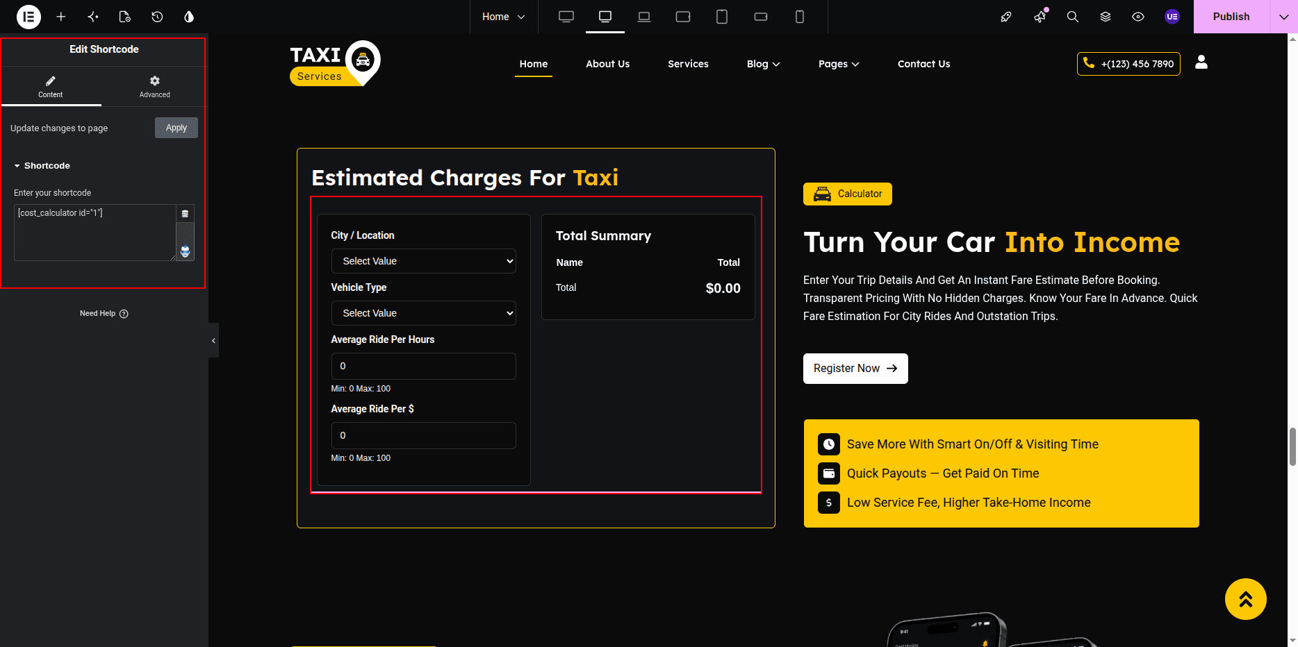
Customization Options
- Edit the calculator form title.
- Create a new calculator form or modify an existing one from Dashboard → Cost Calculator.
- Update the right-side title text.
- Change the heading content.
- Modify the descriptive paragraph.
- Update button text and destination URL.
- Add, edit, or remove list items.
- Control the display order of content elements.
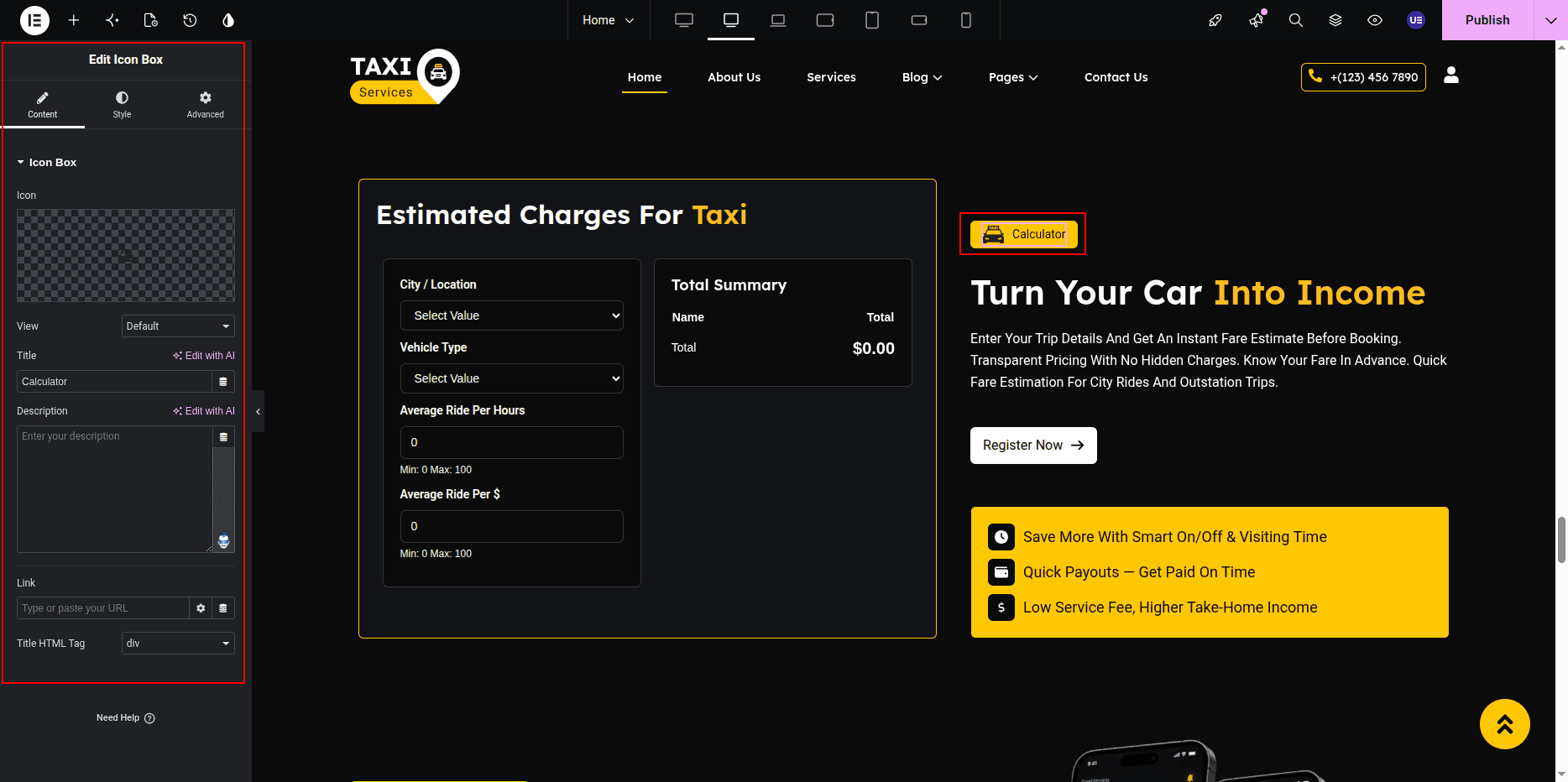
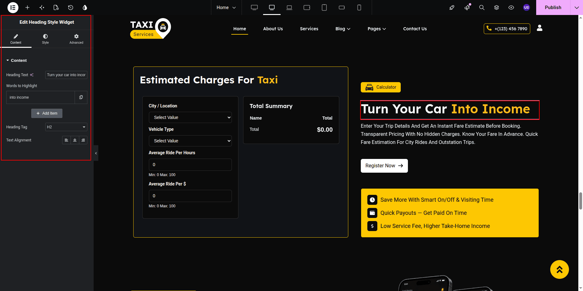
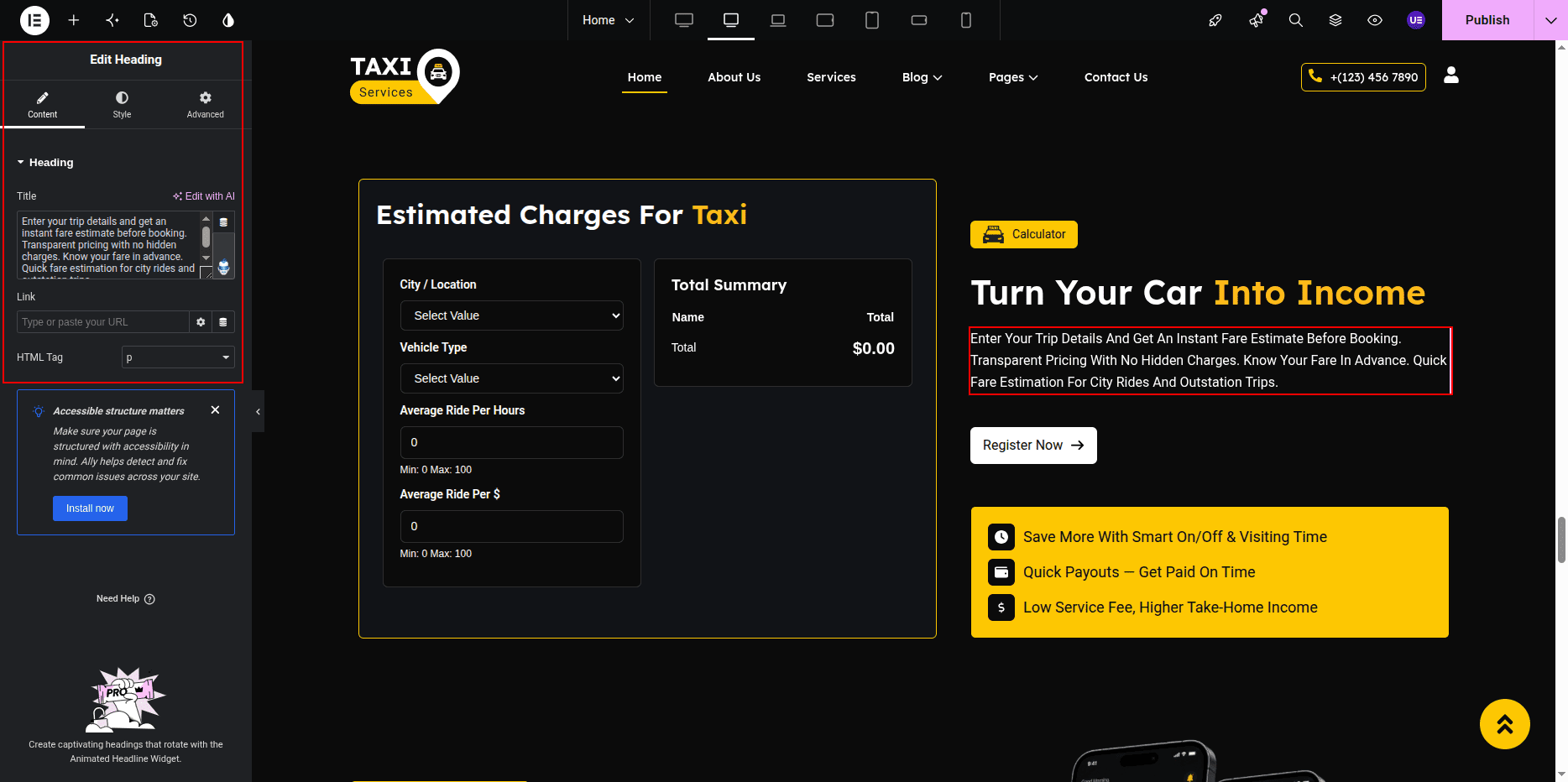
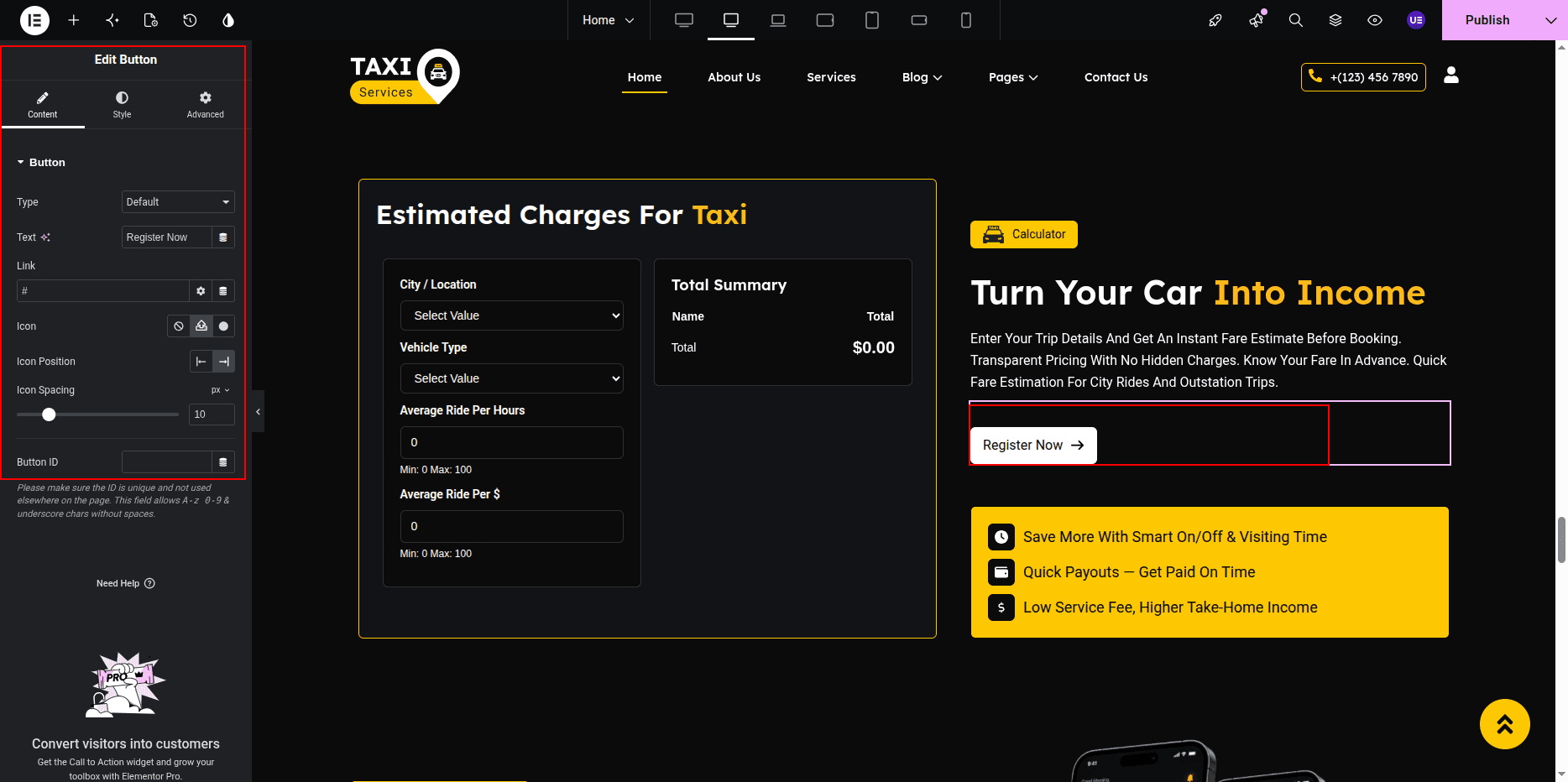
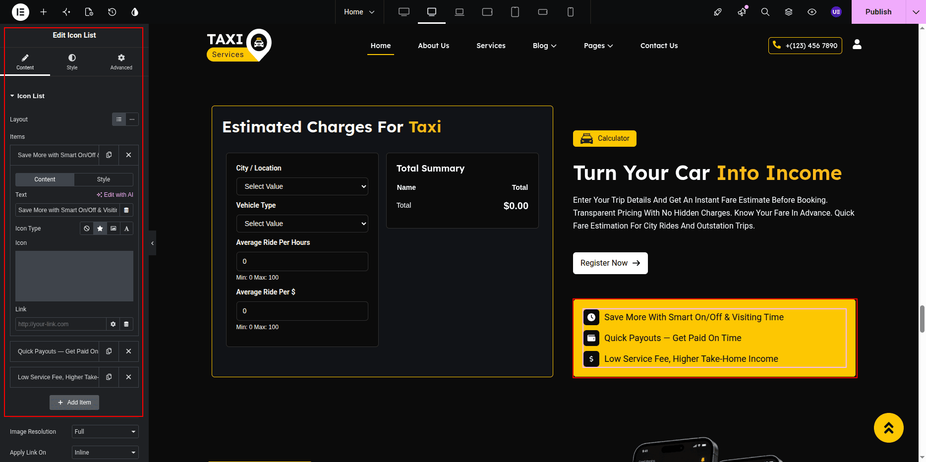
This section helps users estimate service costs instantly while providing additional information and benefits, improving user engagement and encouraging conversions.
This is the final view of your section:
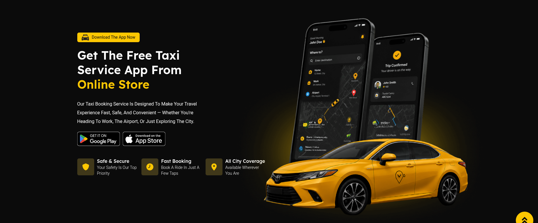
Taxi Service App Section
The Taxi Service App Section displays mobile app promotion content.
This section contains section title, heading, description text,
Google Play / App Store icons, mobile image,
bottom road image, and taxi image.
All content can be edited using Elementor widgets.
Adding Taxi Service App Section on Home Page
- Go to the Home Page.
- Click Edit with Elementor.
- Select the Taxi Service App Section.
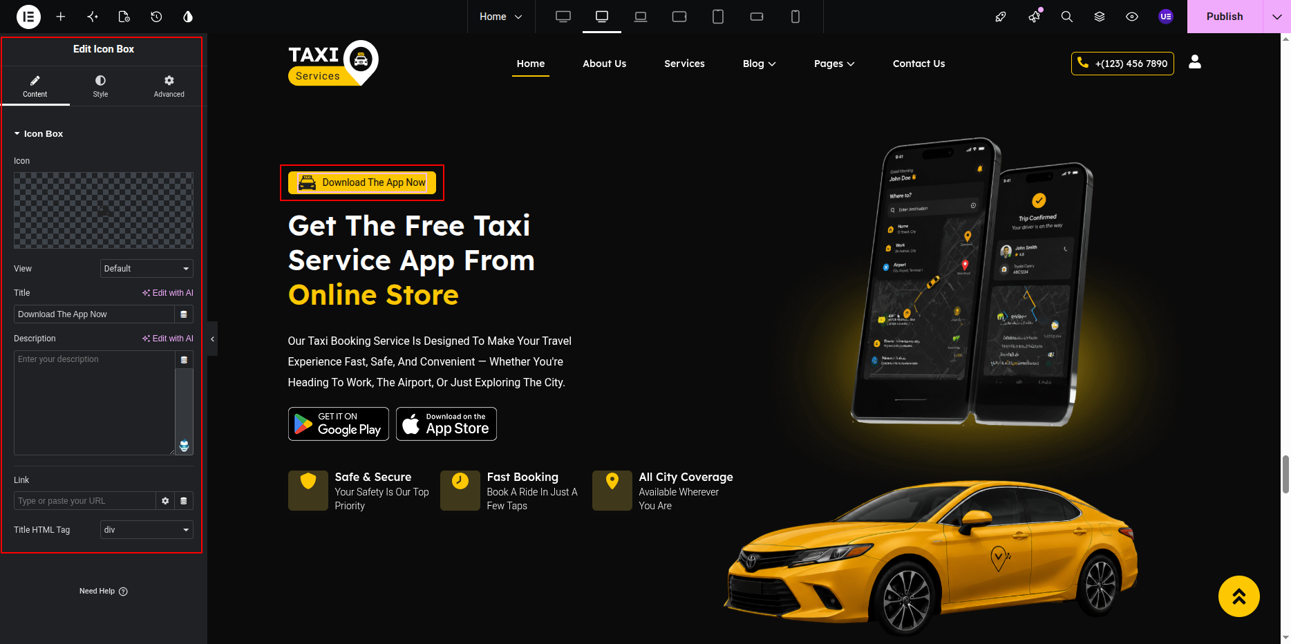
Editing Section Title & Heading
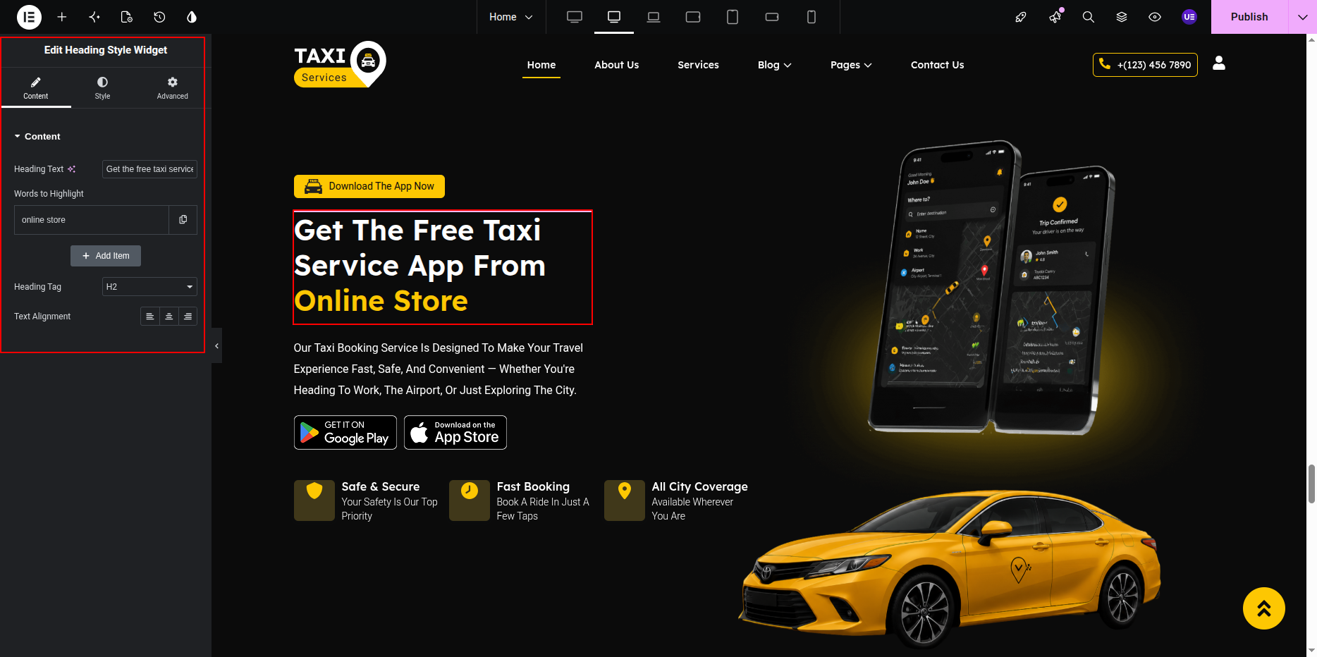
- Select the Heading Widget for title.
- Select another Heading Widget for main heading.
Editing Description Text
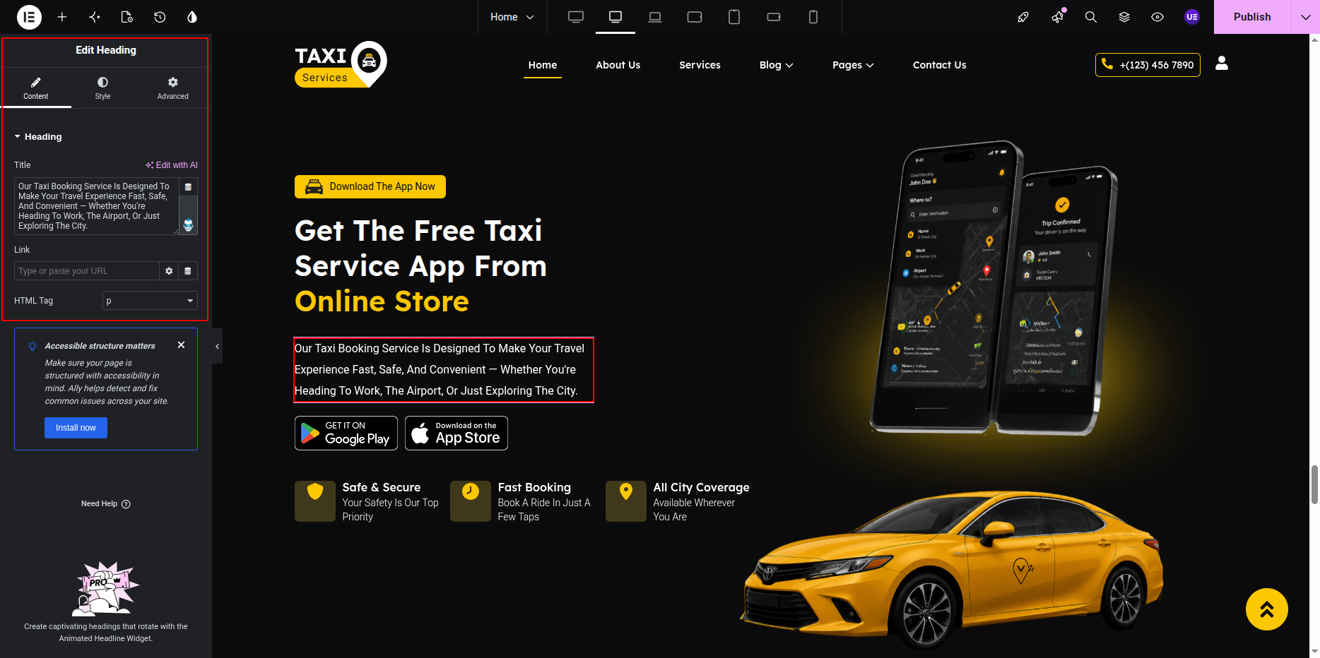
- Select the Text Editor Widget.
- Edit the text content.
Editing Store Icons
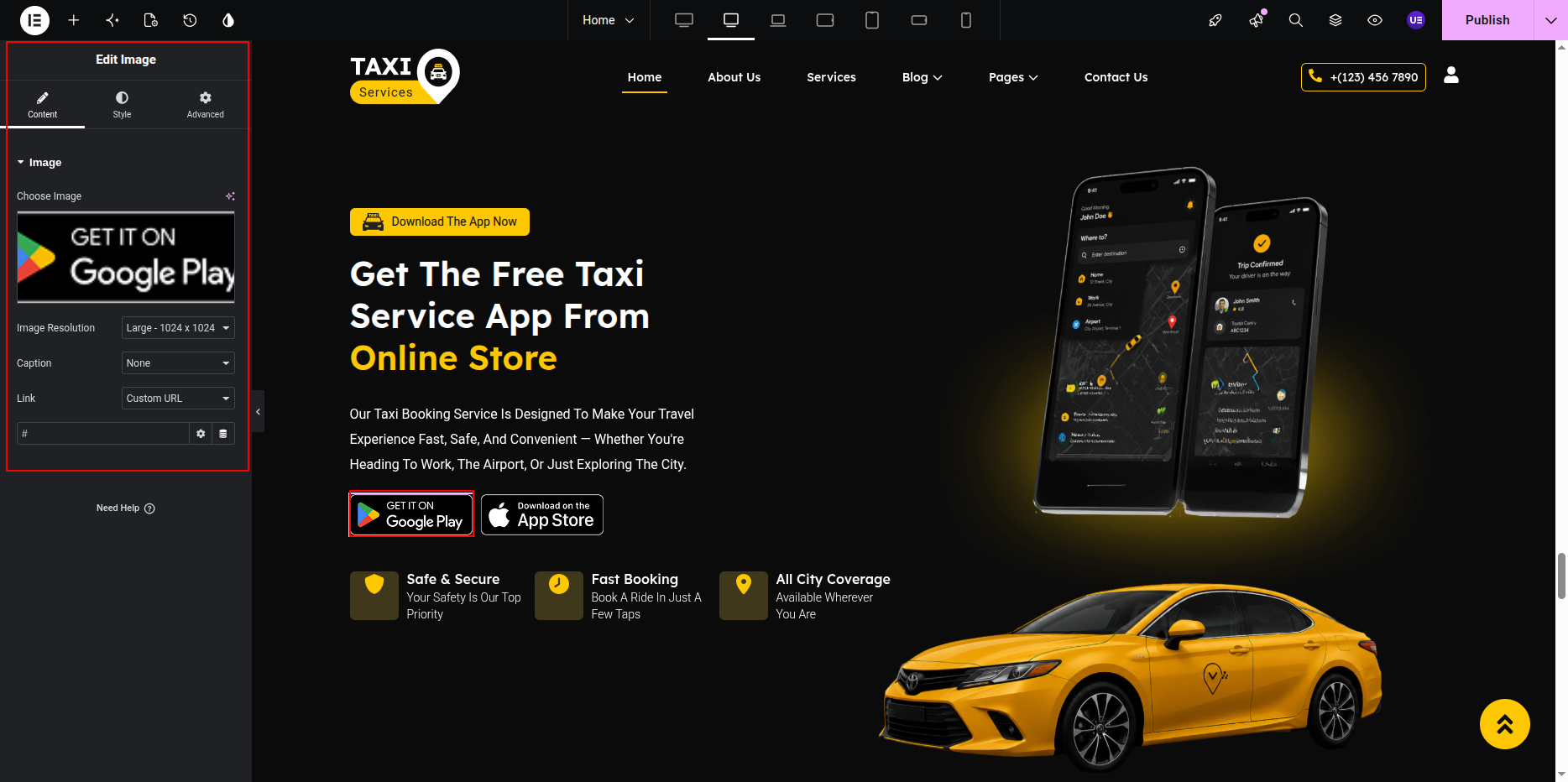
Google Play and App Store icons are image widgets.
- Select icon image.
- Replace image if needed.
- Add link to app store.
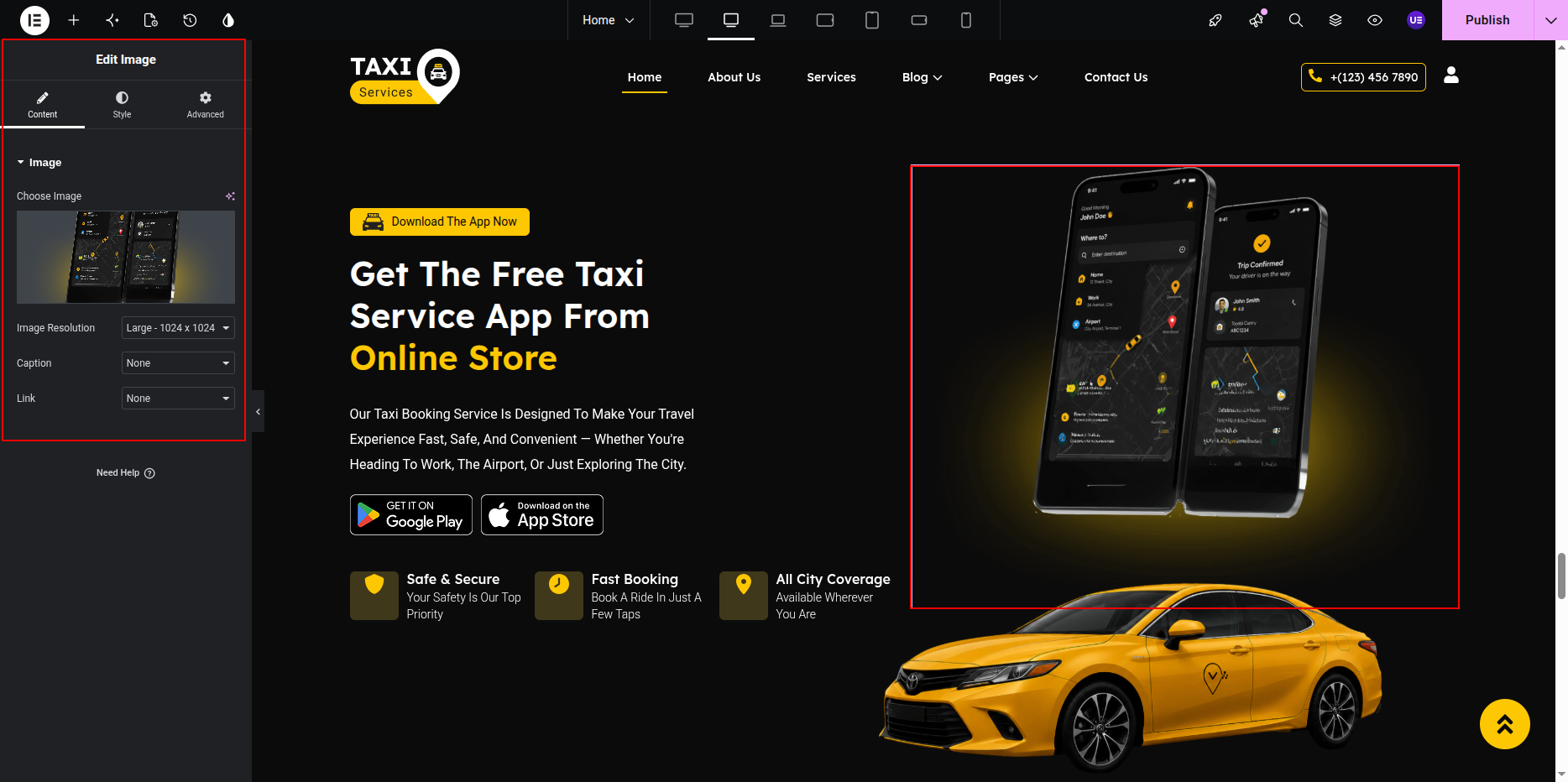
Editing Mobile Image
- Select the mobile image widget.
- Upload new image if needed.
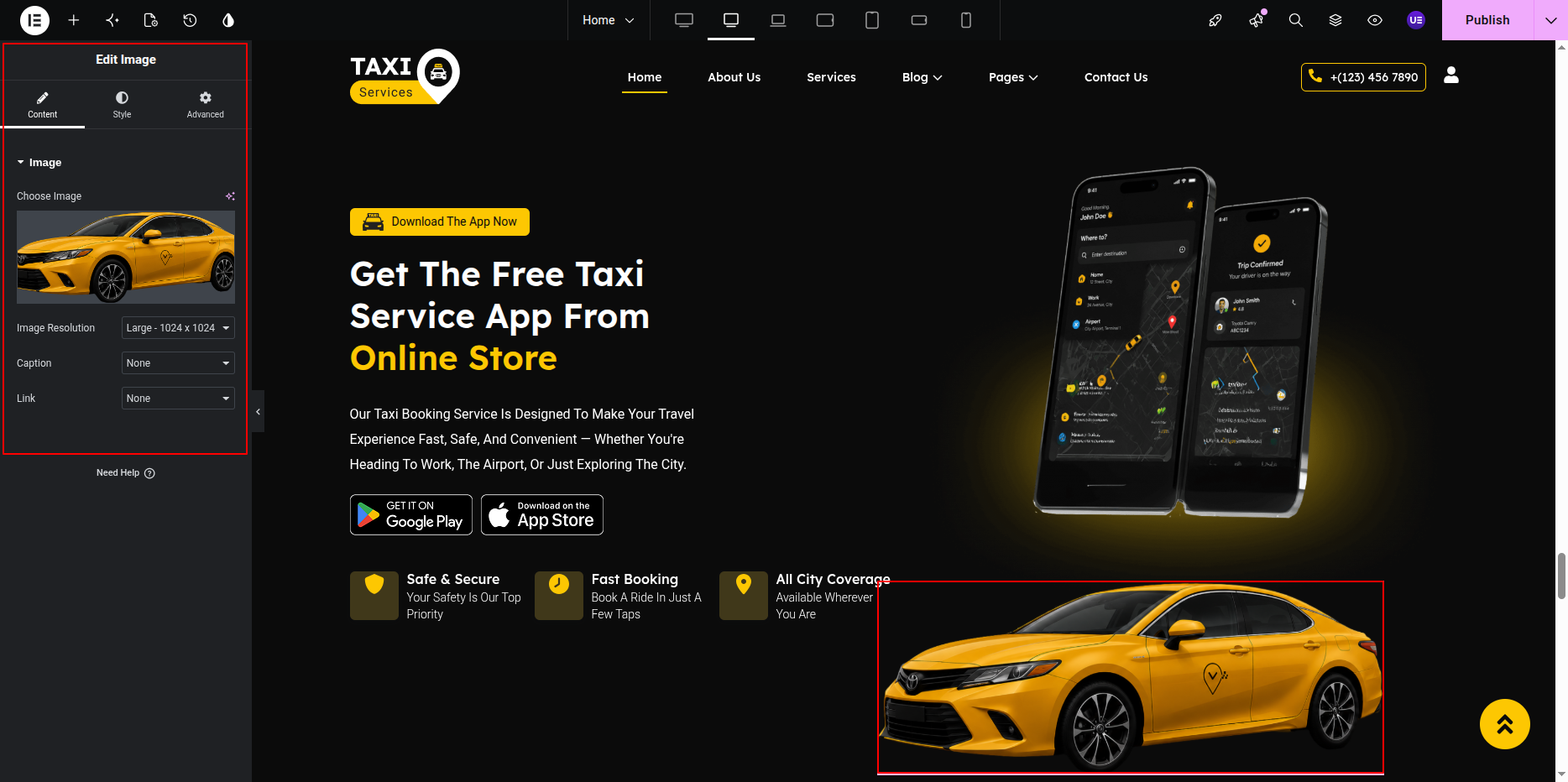
Taxi Image on Road
Taxi image is placed on the road for design.
Animation may be applied.
Do not remove animation settings.
Styling Settings
- Adjust spacing between text and image.
- Change typography if needed.
- Keep bottom images aligned.
Responsive Settings
- Switch to Tablet view.
- Switch to Mobile view.
- Stack columns vertically.
Tip: Use same size icons for store buttons.
This is the final view of your section:
Blog Section
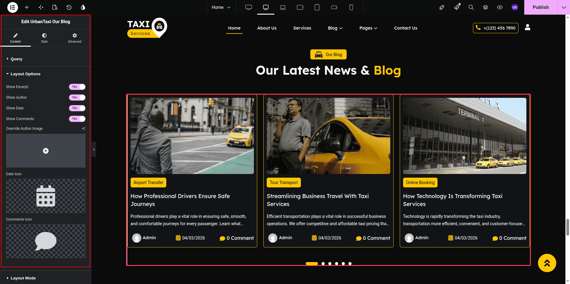
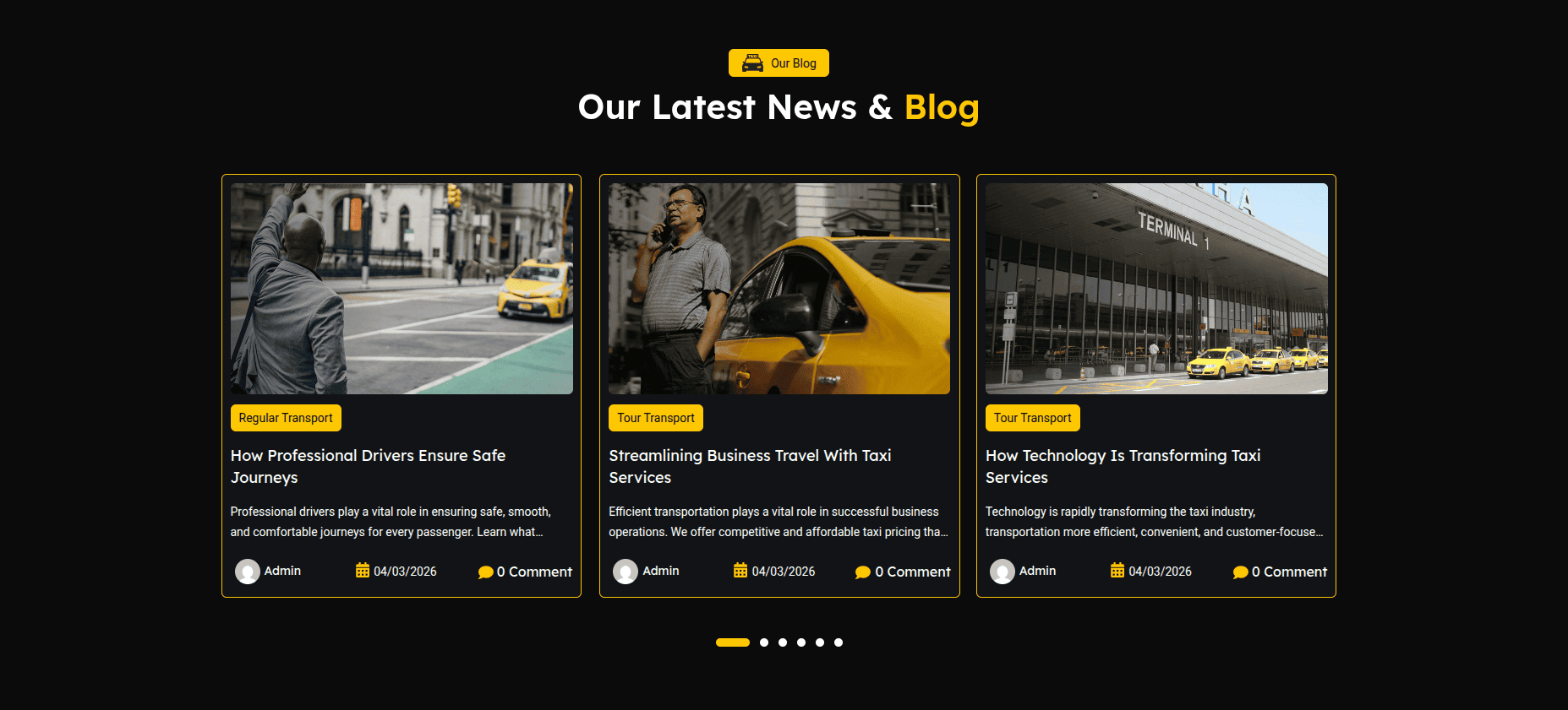
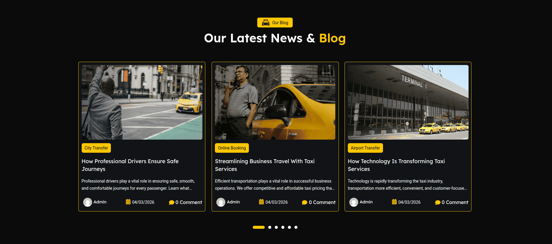
The Blog Section displays latest posts from WordPress blog.
This section contains section title, heading,
and blog posts shown using the Posts widget.
Each post shows image, title, date, and short description.
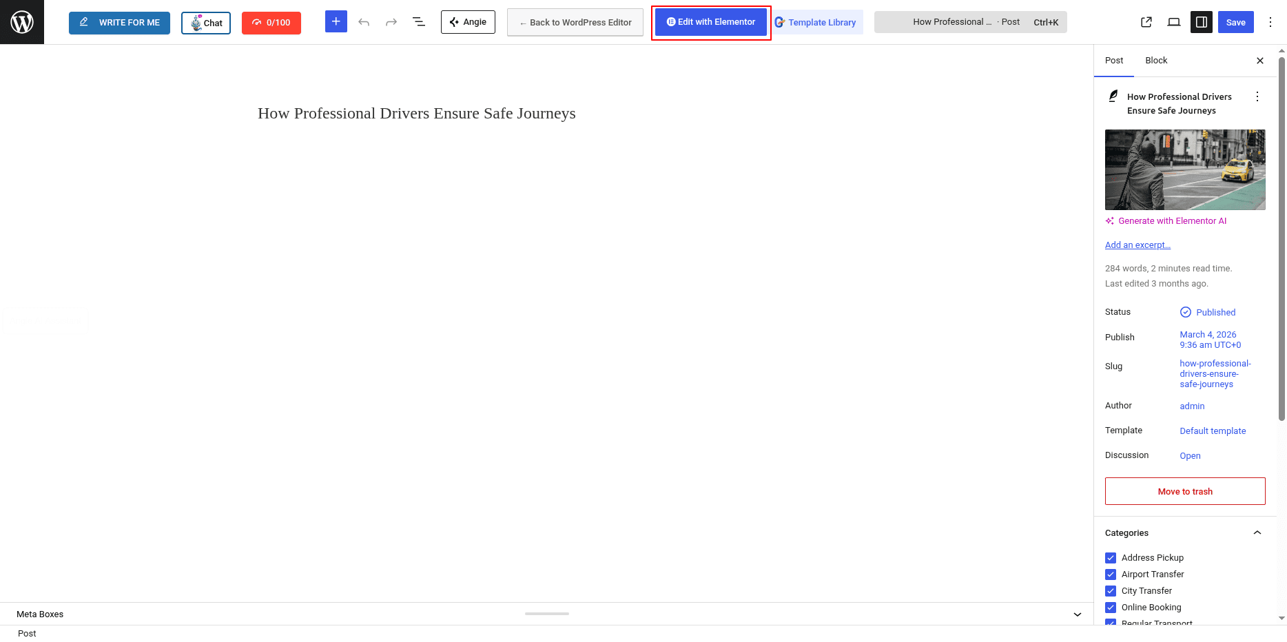
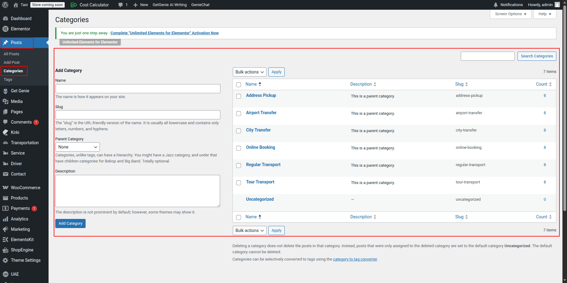
Adding Categories for Blog Posts
- Go to Dashboard → Posts → Categories.
- Enter category name.
- Add slug (optional).
- Click Add New Category.
Categories help organize blog posts and allow filtering in blog layouts.
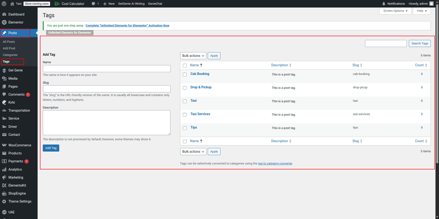
Adding Tags for Blog Posts
- Go to Dashboard → Posts → Tags.
- Enter tag name.
- Add slug (optional).
- Click Add New Tag.
Tags help group related posts together.
You can assign multiple tags to one post.
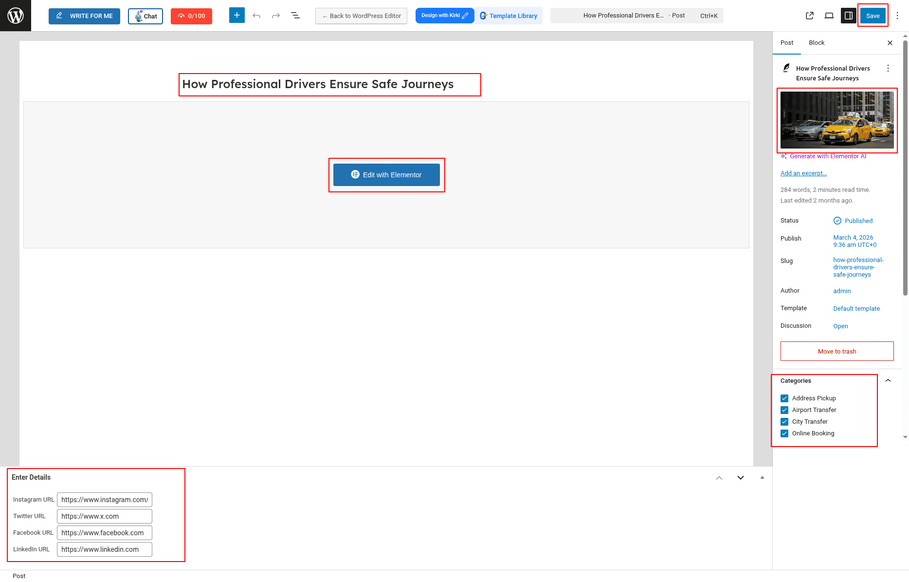
Assign Category & Tags to Post
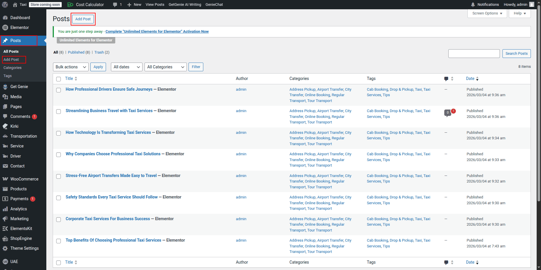
- Go to Dashboard → Posts.
- Click Edit on a post.
- Select category from right sidebar.
- Add tags in Tags field.
- Click Update.
Adding Blog Section on Home Page
- Go to Home Page.
- Click Edit with Elementor.
- Select the Blog Section.
Editing Section Title & Heading
- Select Heading widget.
- Edit title.
- Edit heading.
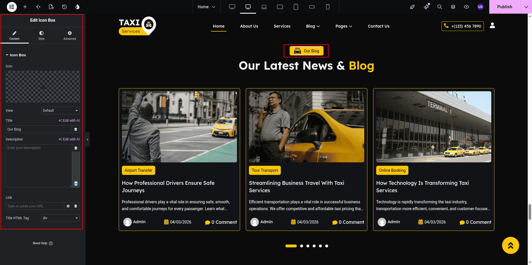
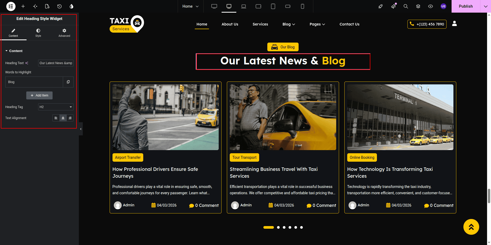
Displaying Blog Posts
- Add Posts Widget.
- Open widget settings.
Settings
- Post Type → Posts
- Posts Count → 3
- Show Image → Yes
- Show Excerpt → Yes
- Show Date → Yes
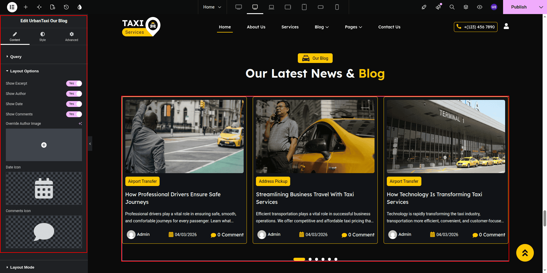
Styling Settings
- Adjust spacing between posts.
- Change typography.
- Set image size.
Responsive Settings
- Tablet → 2 posts
- Mobile → 1 post
- Center align text.
Tip: Always set featured image for posts.
This is the final view of your section:
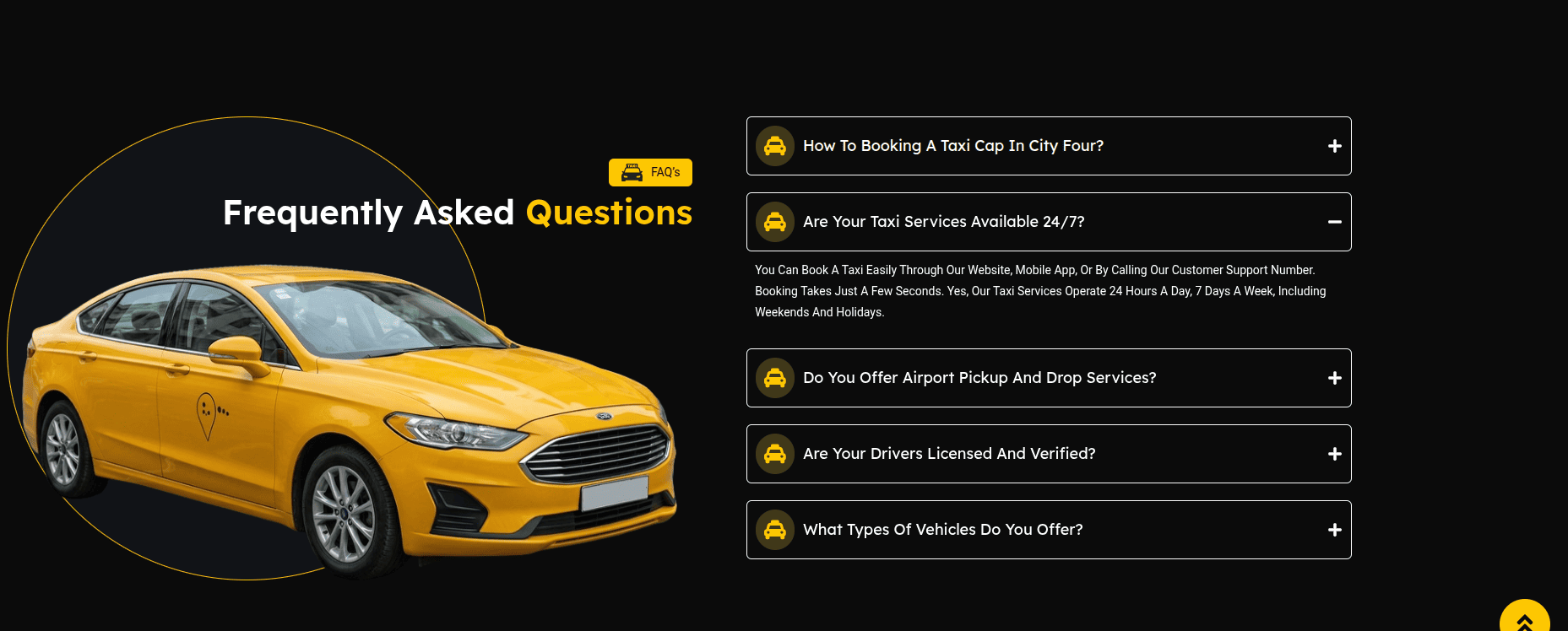
FAQ Section
The FAQ Section helps users quickly find answers to common questions.
This section contains a left side area with section title and heading,
and a right side accordion with questions and answers.
The accordion is created using the Elementor Accordion Widget.
Adding FAQ Section on Home Page
- Go to the Home Page.
- Click Edit with Elementor.
- Select the FAQ Section.
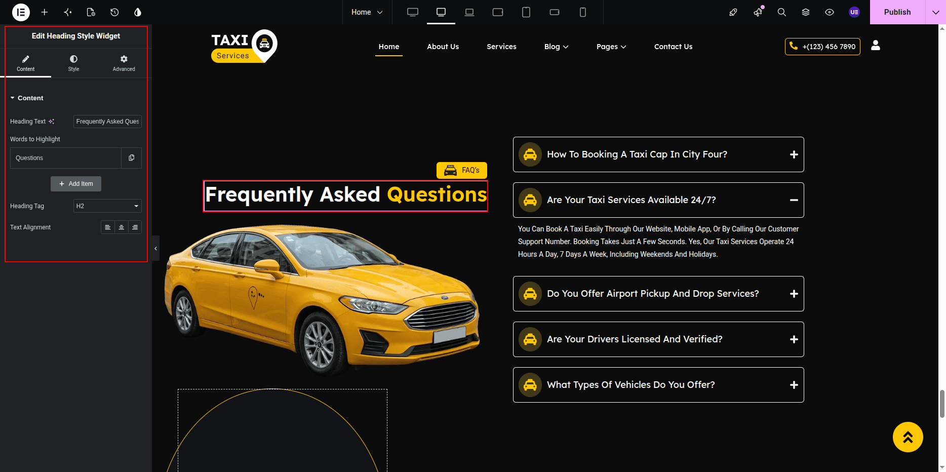
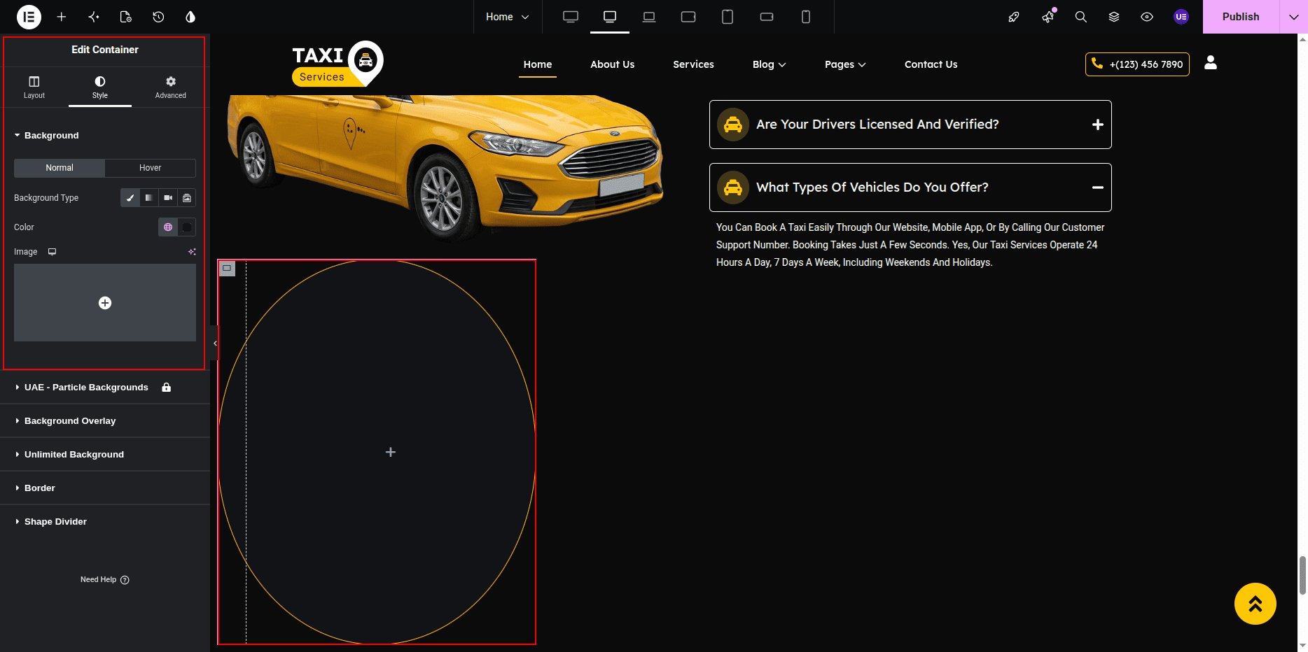
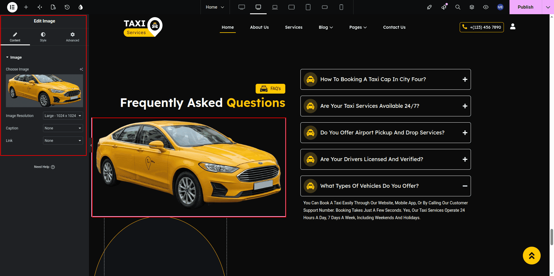
Editing Section Title & Heading
- Select the Heading Widget for title.
- Select another Heading Widget for main heading.
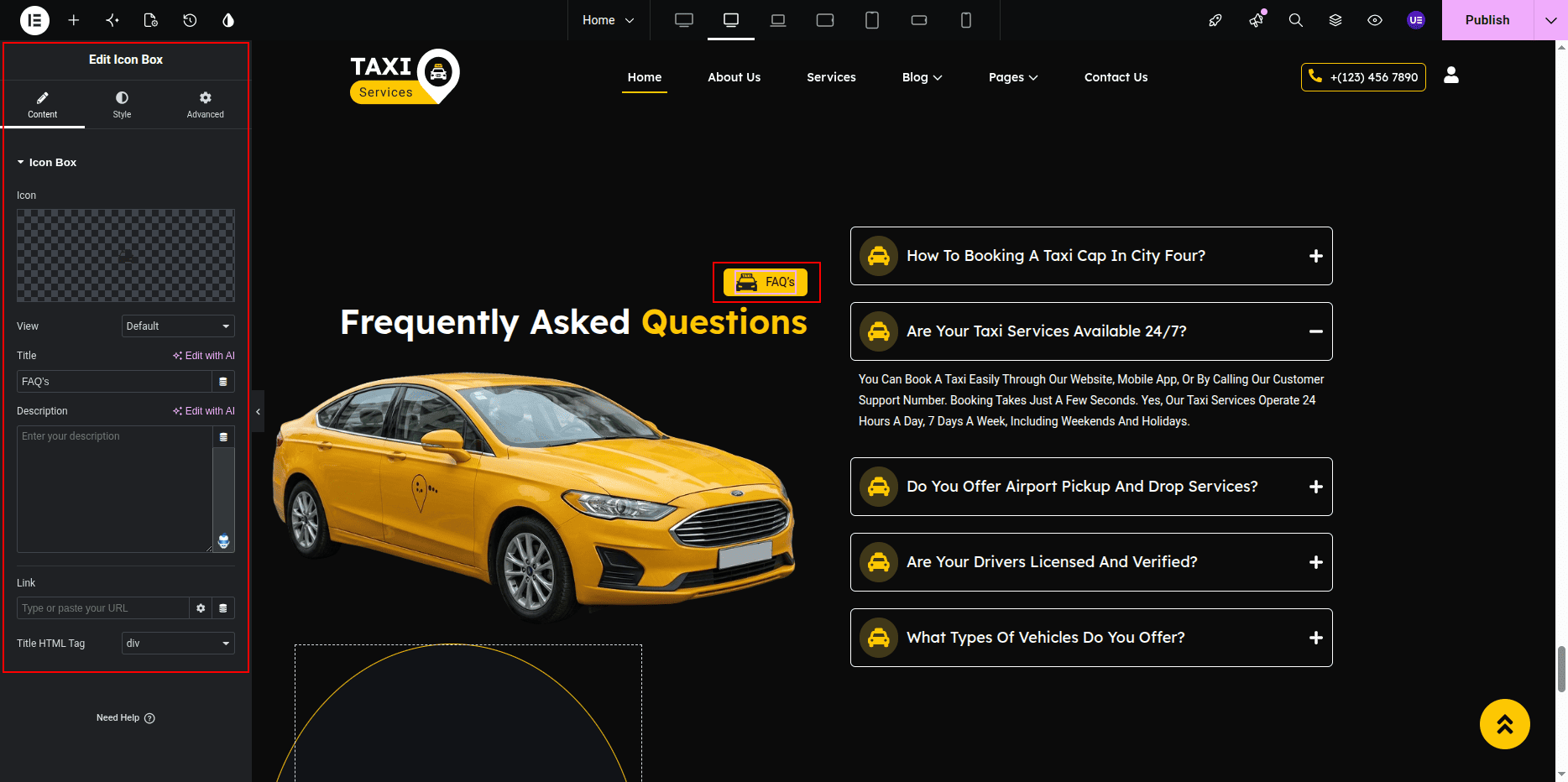
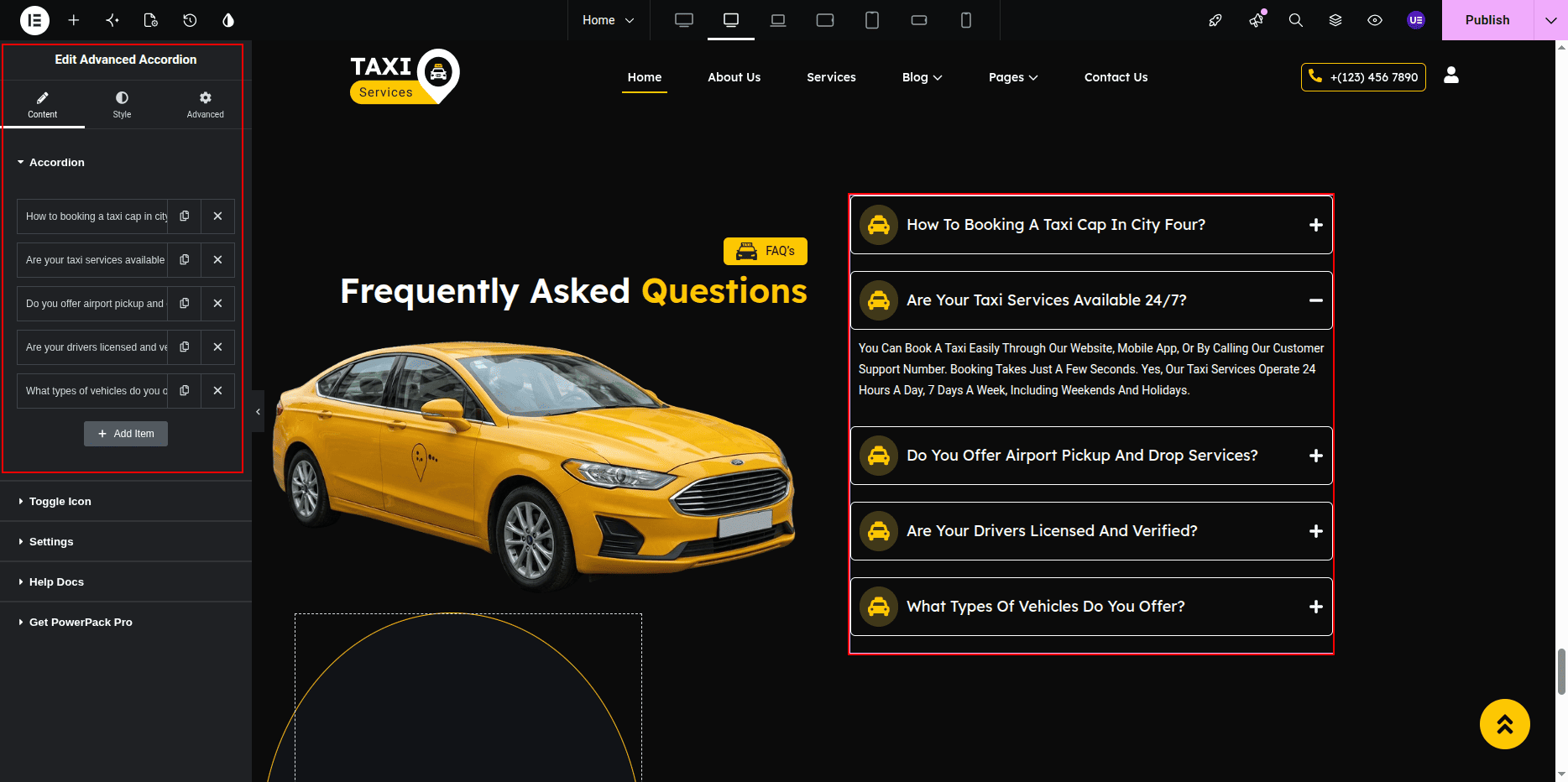
Adding FAQ Accordion
- Select the right column.
- Add Accordion Widget.
- Click Add Item.
Settings for each item
- Title → Question
- Content → Answer text

Editing FAQ Items
- Click accordion item.
- Edit title.
- Edit content.
- Repeat for all questions.
Styling Settings
- Change typography for title.
- Adjust spacing between items.
- Change icon style.
- Set background or border.
Responsive Settings
- Switch to Tablet view.
- Switch to Mobile view.
- Stack columns vertically.
- Check accordion spacing.
Tip: Keep answers short for better readability.
This is the final view of your section:
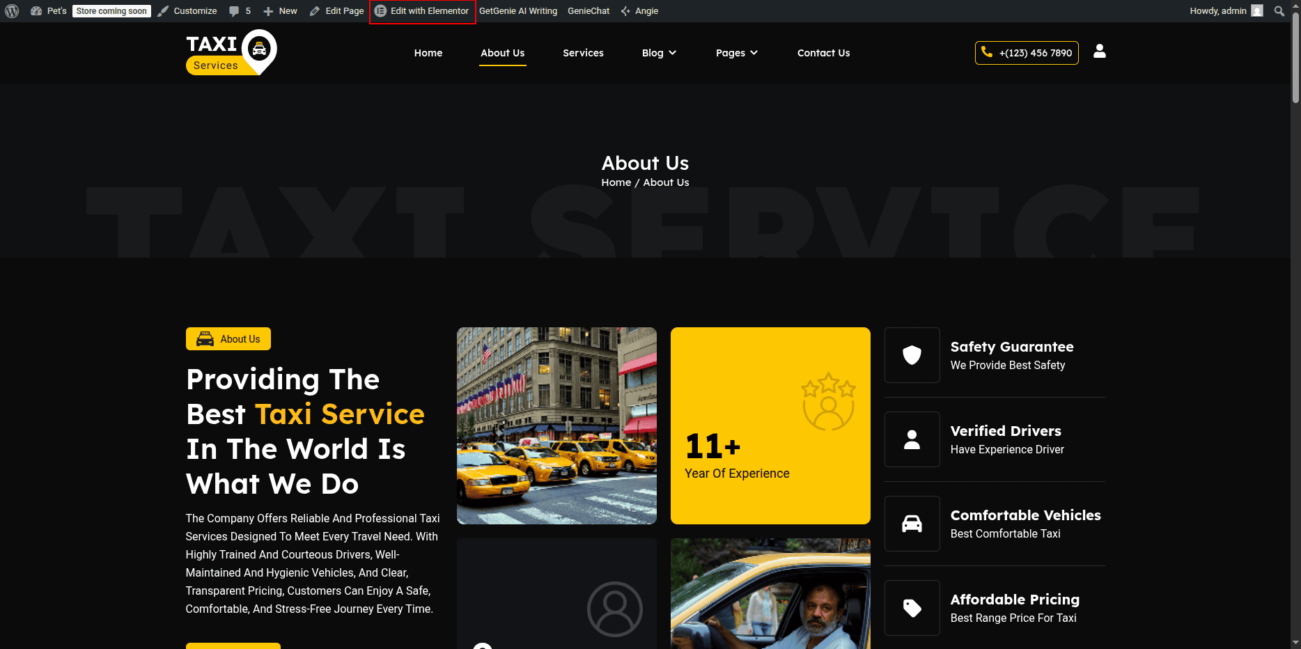
About Page
The About Page is used to display information about your taxi company,
including section title, heading, description, animated service text,
images, and other content. All content on this page can be edited
using Elementor widgets.
Editing About Page
- Go to Dashboard → Pages.
- Click on About Page.
- Click Edit.
- Click Edit with Elementor.
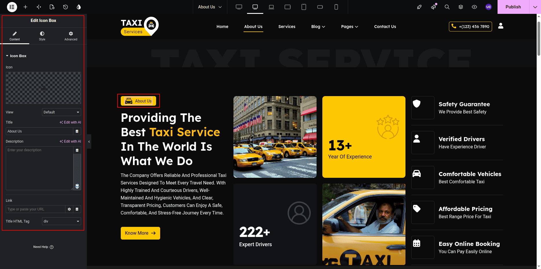
Editing Section Title & Heading
- Select the Heading Widget for the section title.
- Select another Heading Widget for the main heading.
- Edit the text as needed.
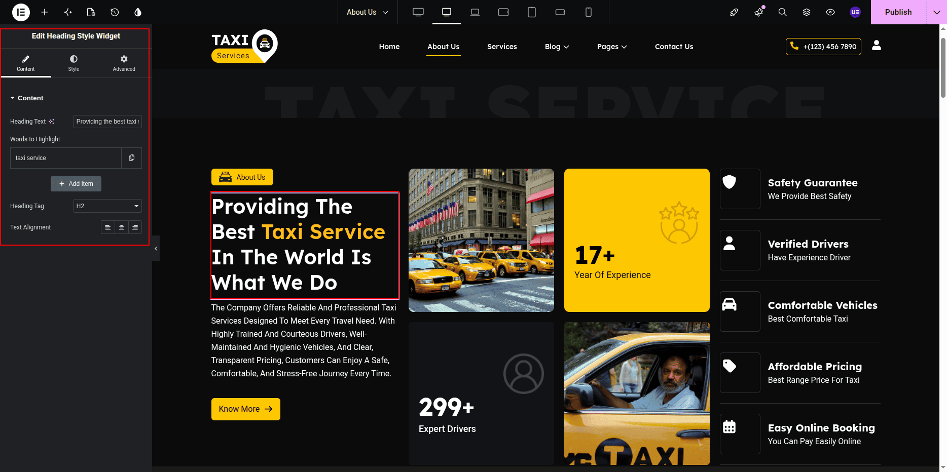
Editing About Description
- Select the Text Editor Widget.
- Edit the description text.
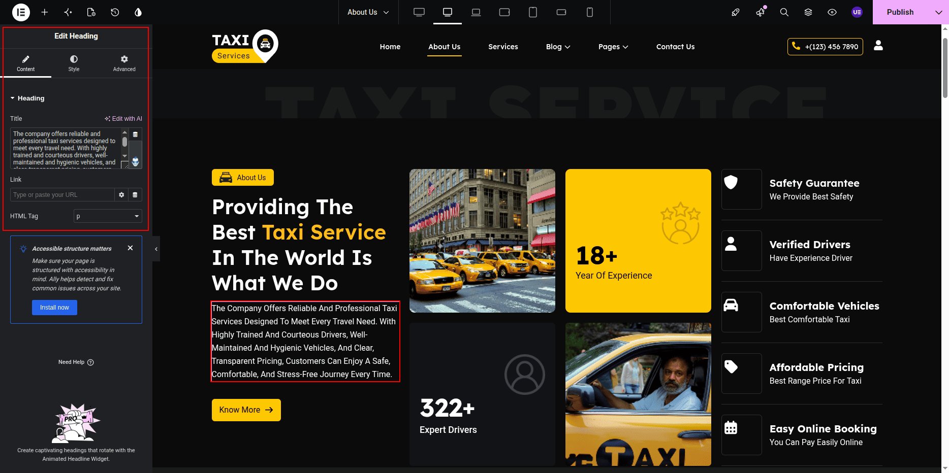
Editing About Button
- Select the Button Widget.
- Edit the button text.
- Add button link.
- Change button size if needed.
Settings
- Text → Know More / About Us
- Link → About Page
- Size → Medium
- Alignment → Left / Center
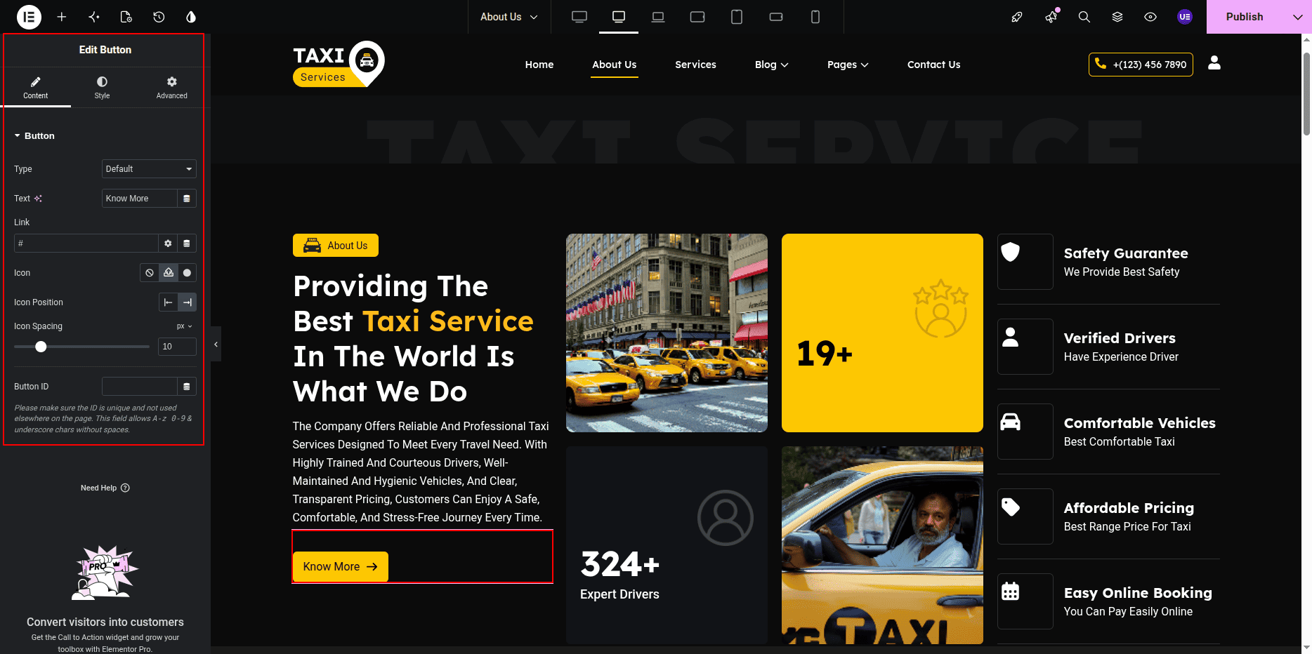
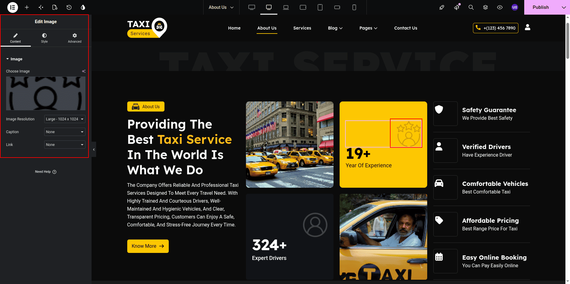
Editing About Image
- Select the Image Widget.
- Upload or change the image.
Adding Animated Service Text
This section includes animated service text to highlight important
services provided by your taxi company.
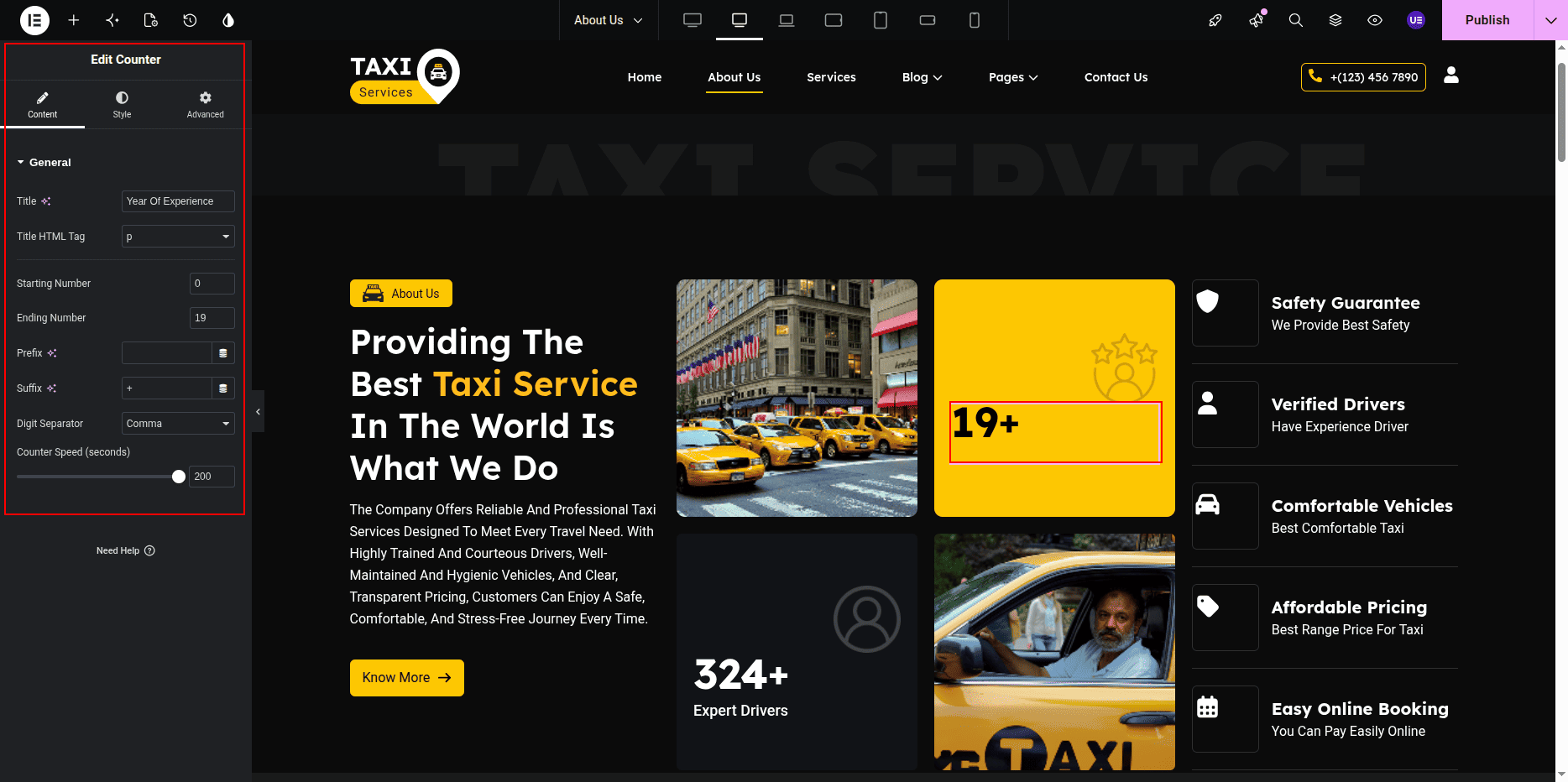
- Select the Animated Heading Widget.
- Edit the animated service text.
- Add multiple service words or phrases.
- Select animation style if needed.
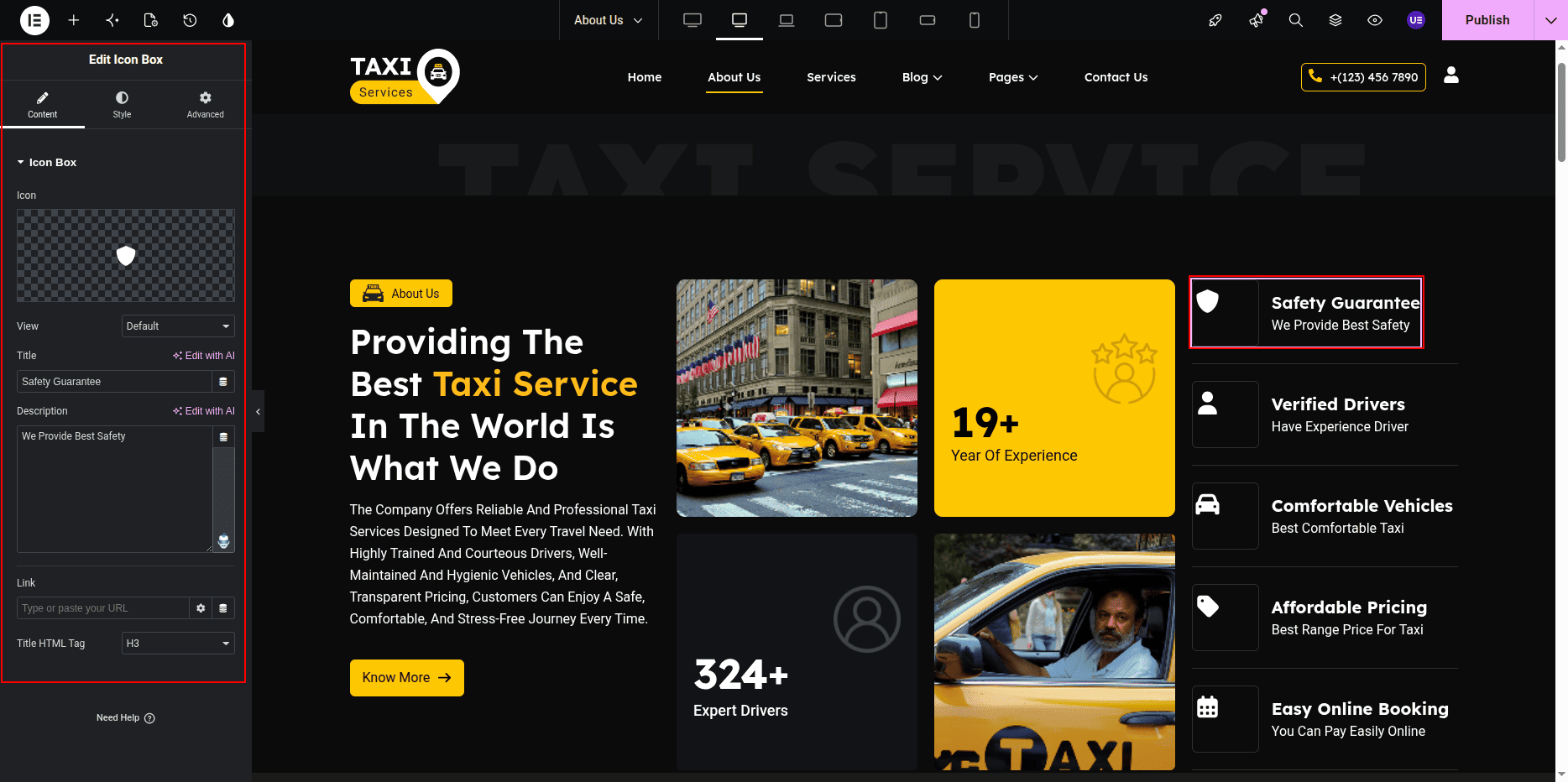
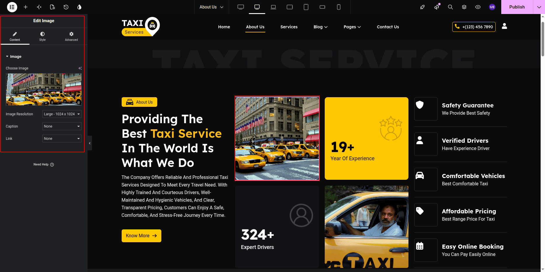
Editing About Image
- Select the Image Widget.
- Upload or change the image.
Styling Settings
- Adjust typography for heading and text.
- Change colors if needed.
- Do not remove background shapes.
Responsive Settings
- Switch to Tablet view.
- Switch to Mobile view.
- Make sure columns stack properly.
Tip: Keep text short for better layout.
This is the final view of your page:

Our Vision / Our Mission
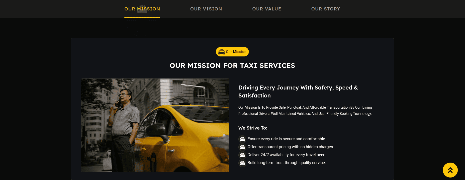
The Our Vision / Our Mission / Our Story / Our Value Section is created using the
urbantaxi-sticky-mission custom widget.
This section displays title, heading, description,
and list items for mission and vision content.
Editing Our Vision / Our Mission / Our Story / Our Value Section
- Go to Dashboard → Pages.
- Click About Page.
- Click Edit.
- Click Edit with Elementor.
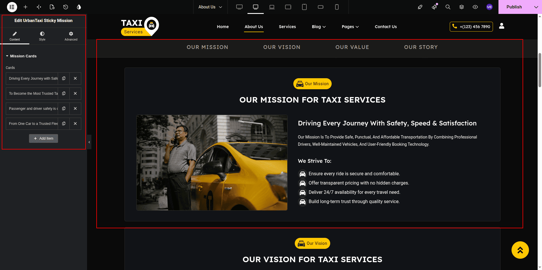
- Select the urbantaxi-sticky-mission Widget.
Editing Title & Heading
- Edit the Section Title.
- Edit the Main Heading.
Editing Description
- Edit the description text from widget settings.
Editing List Items
- Add new list items.
- Edit existing items.
- Remove items if needed.
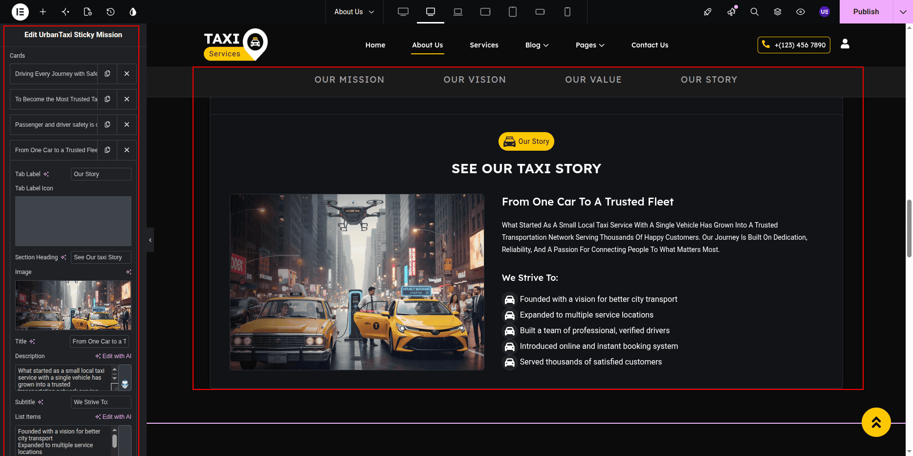
Settings
- Title → Our Mission / Our Vision
- Heading → Your heading text
- Description → Your description
- List Items → Add multiple points
Styling Settings
- Change typography.
- Adjust spacing.
- Change colors if needed.
Responsive Settings
- Check Tablet view.
- Check Mobile view.
- Make sure content stacks properly.
This is the final view of your page:
Our History Section
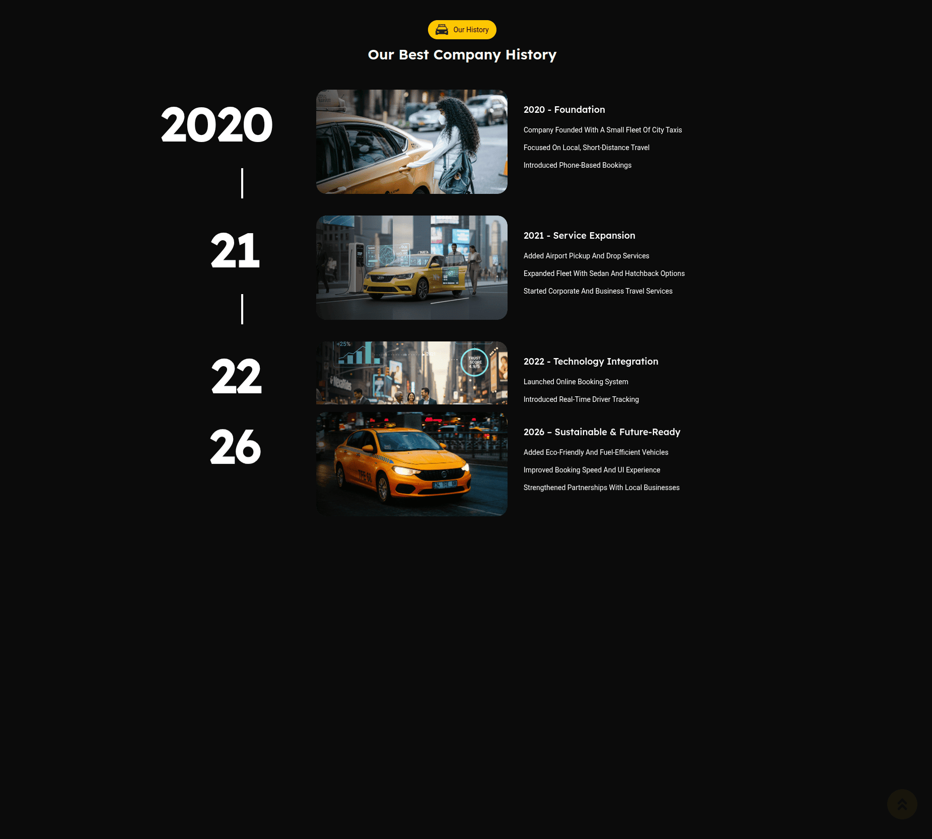
The Our History Section displays company history in timeline format.
This section contains section title, heading, and timeline items.
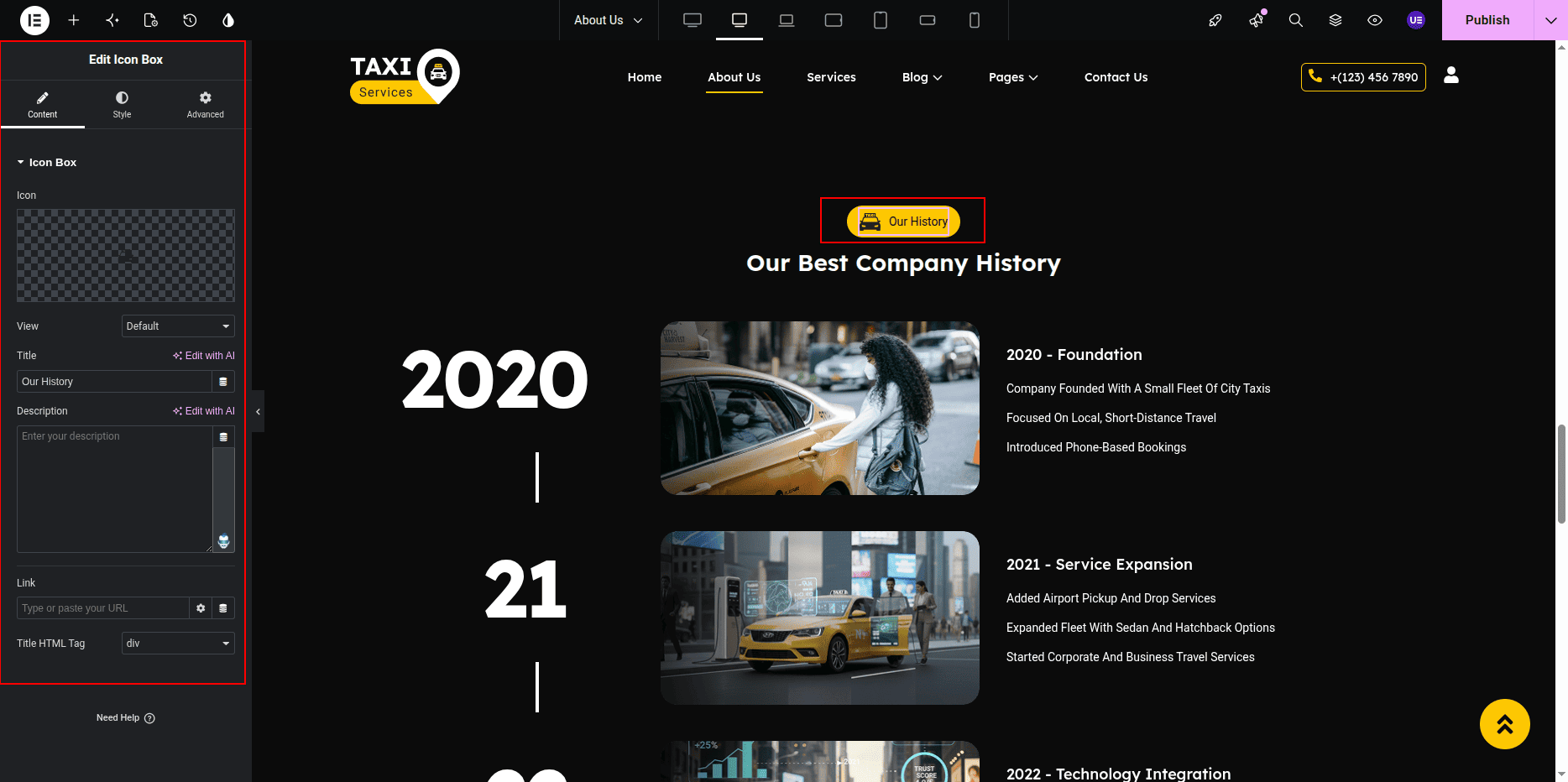
Title is created using the Icon Box Widget and
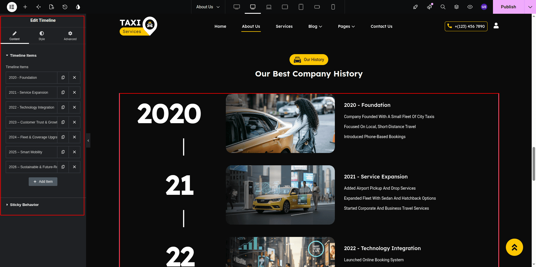
timeline is created using the urbantaxi-timeline custom widget.
Editing History Section
- Go to Dashboard → Pages.
- Click About Page.
- Click Edit.
- Click Edit with Elementor.
- Scroll to History Section.
Editing Section Title
- Select the Icon Box Widget.
- Edit the title text.
- Change icon if needed.
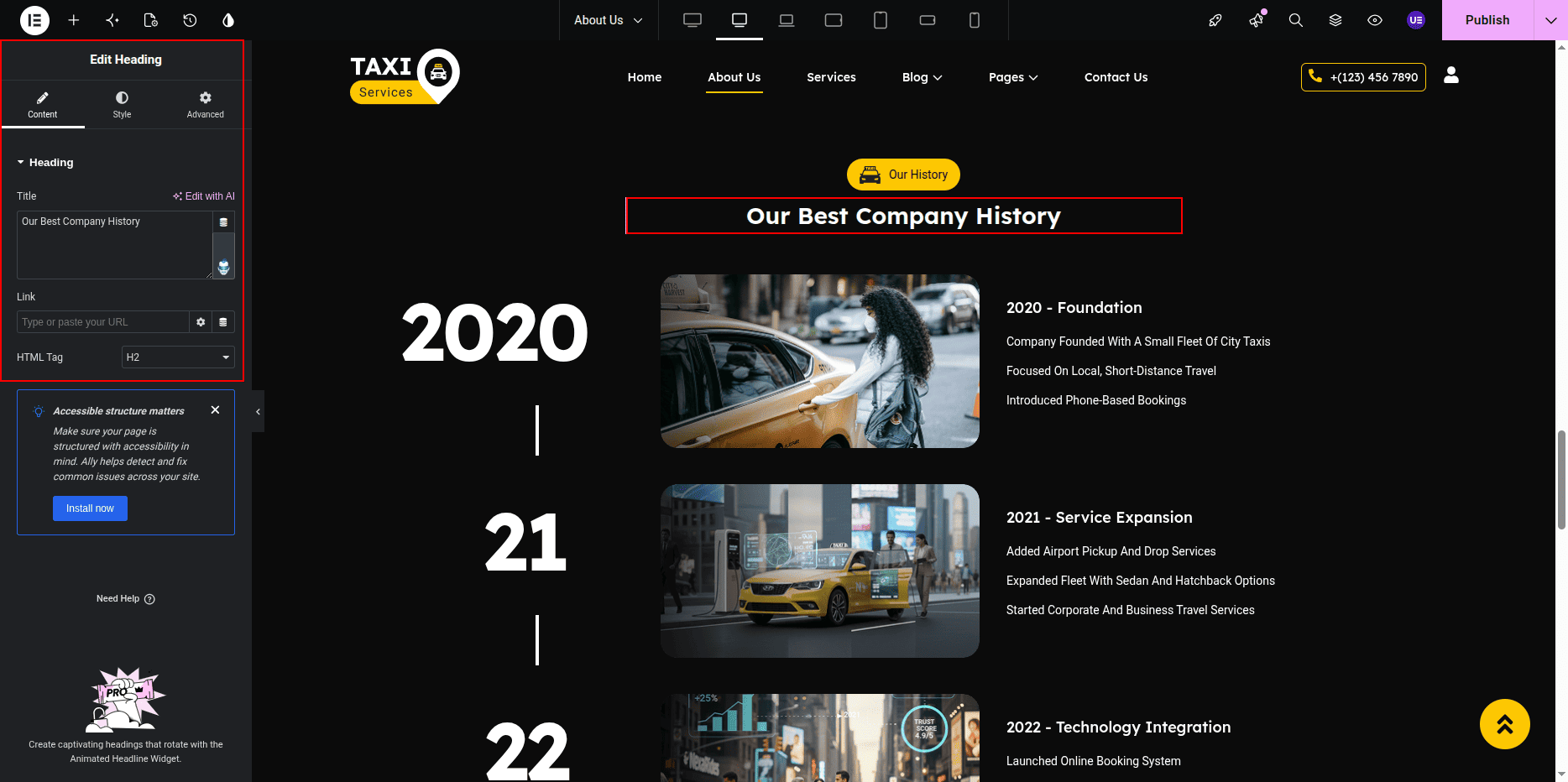
Editing Section Heading
- Select the Heading Widget.
- Edit the heading text.
Editing Timeline Items
Timeline items are created using the
urbantaxi-timeline custom widget.
- Select the urbantaxi-timeline Widget.
- Edit existing items.
- Add new items.
- Remove items if needed.
Settings
- Year / Title
- Content Text
- Icon / Image (if available)
Styling Settings
- Change typography.
- Adjust spacing.
- Change colors if needed.
Responsive Settings
- Switch to Tablet view.
- Switch to Mobile view.
- Make sure timeline layout looks correct.
This is the final view of your section:
Service Page
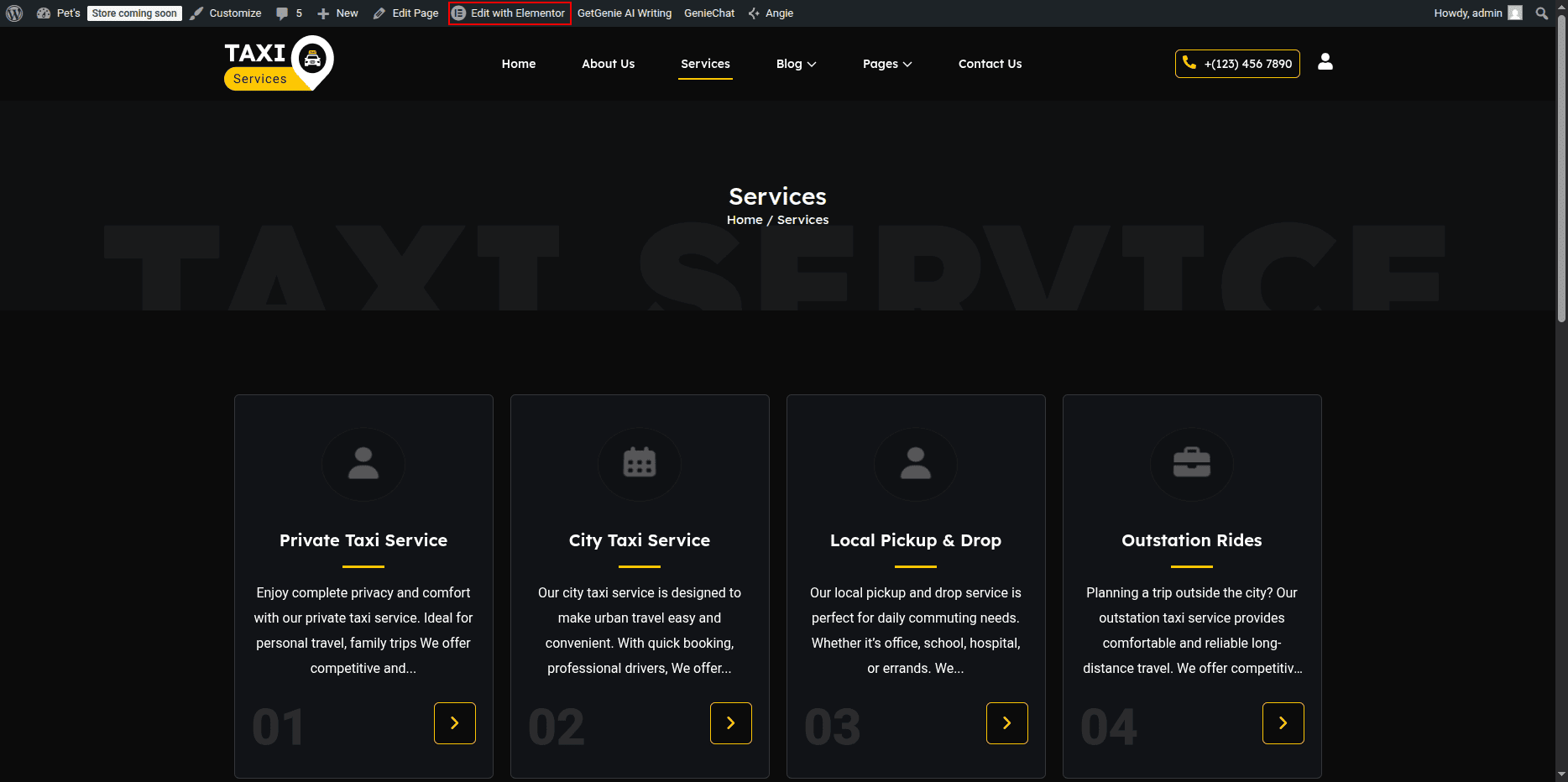
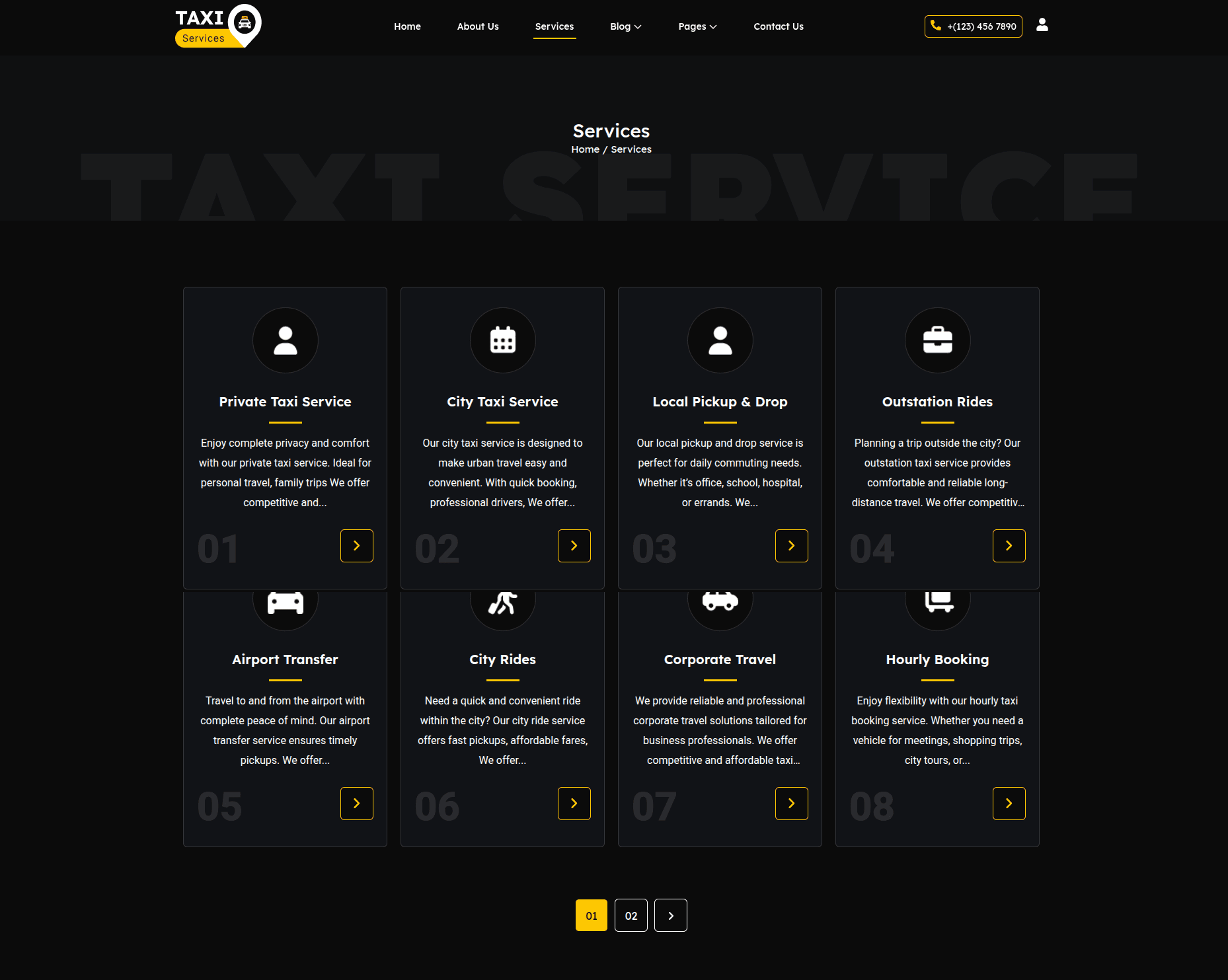
The Service Page displays all taxi services using
the urbantaxi-service-cards custom widget.
Each service card shows icon, title, description, and button.
All services can be edited using Elementor widget settings.
Editing Service Page
- Go to Dashboard → Pages.
- Click Service Page.
- Click Edit.
- Click Edit with Elementor.
Editing Service Cards
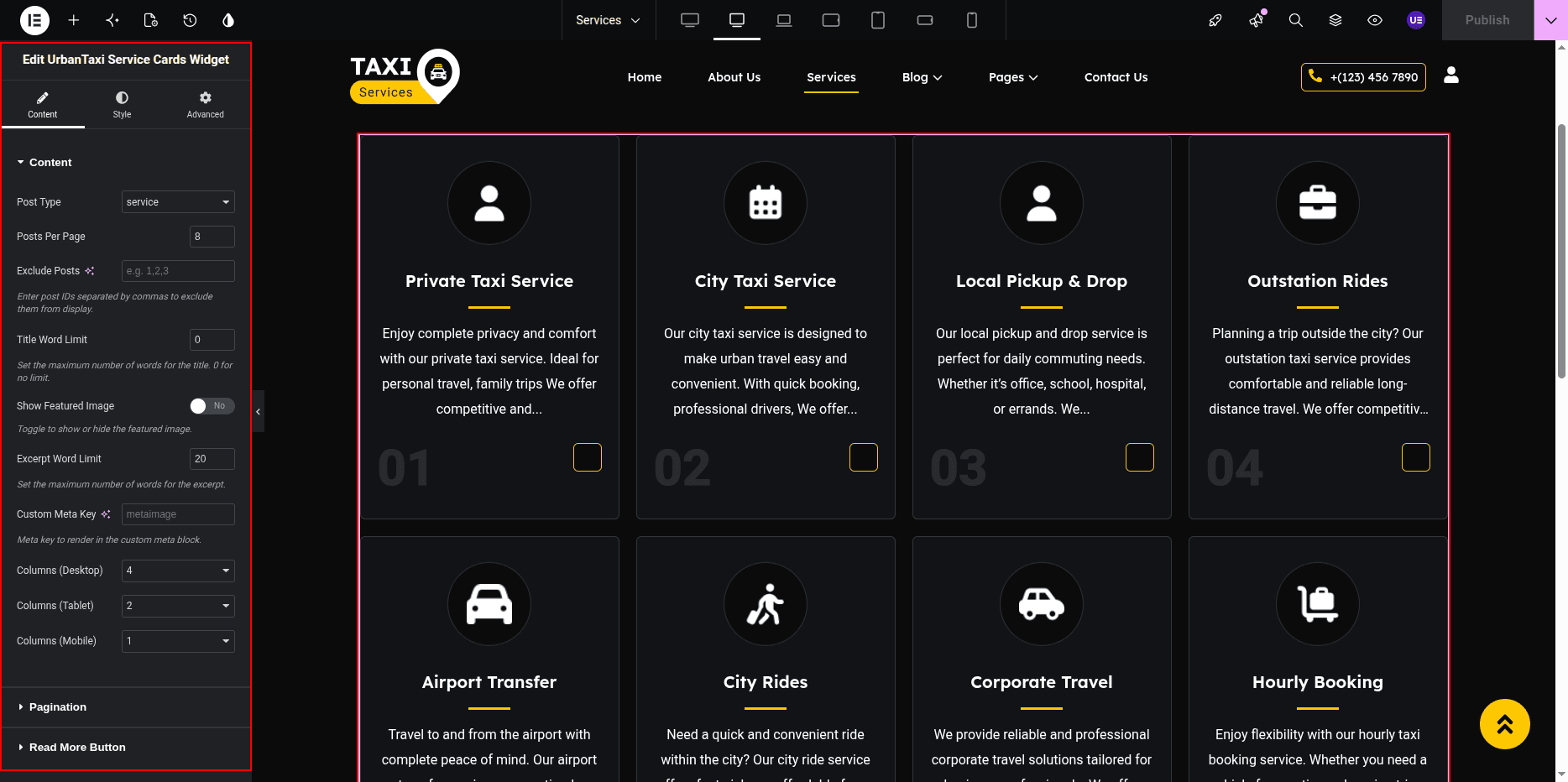
Service cards are created using the
urbantaxi-service-cards custom widget.
- Select the urbantaxi-service-cards Widget.
- Edit existing service items.
- Add new service items.
- Remove items if needed.
Settings
- Icon / Image
- Service Title
- Description
- Button Text
- Button Link
Styling Settings
- Change typography.
- Adjust spacing.
- Change colors if needed.
Responsive Settings
- Switch to Tablet view.
- Switch to Mobile view.
- Make sure cards stack properly.
Tip: Keep service titles short for better layout.
This is the final view of your page:
Single Service Page
The Single Service Page displays detailed information about an individual taxi service.
It includes service title, featured image, meta icon, description, keywords,
icon list, and additional images.
This page is controlled using both the WordPress Dashboard and Elementor Editor.
Accessing & Editing Service Page
- Go to Dashboard → Services.
- Click Edit on any service.
- Click Edit with Elementor to modify layout and content.
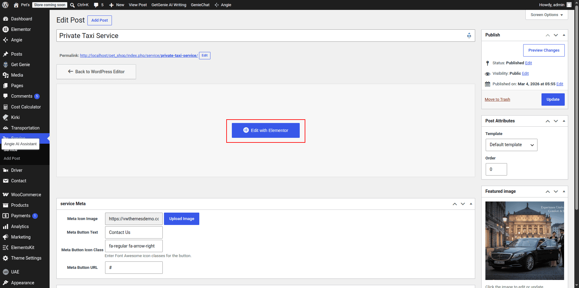
Service Title (Dashboard Controlled)
The service title is automatically pulled from the post title in the dashboard.
- Go to Services → Edit Service.
- Update the Title.
- Click Update.
Featured Image (Dashboard Controlled)
The main service image is managed using the featured image option in the dashboard.
- Go to Services → Edit Service.
- Set or change the Featured Image.
- Click Update.
Recommended Size: 1200 × 700 px
Service Meta Icon (Dashboard - Custom Field)
Each service includes a custom meta icon which is controlled from the dashboard.
This icon is displayed alongside service details.
- Go to Services → Edit Service.
- Scroll to the Service Meta Fields section.
- Select or upload the Service Icon.
- Click Update.
If no icon is selected, the icon will not appear on the front-end.
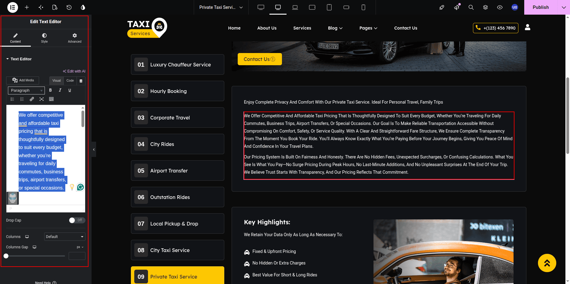
Service Content (Elementor Controlled)
The main service description and layout are edited using Elementor.
- Click Edit with Elementor.
- Select the Text Editor Widget.
- Edit service description.
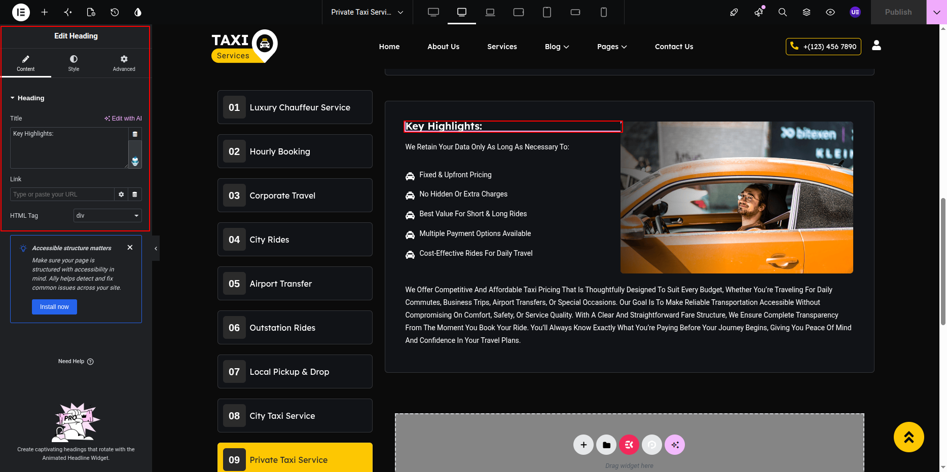
Service Keywords & Heading
Keywords, headings, and structured content are managed inside Elementor.
- Select Heading Widget.
- Edit keywords or section titles.
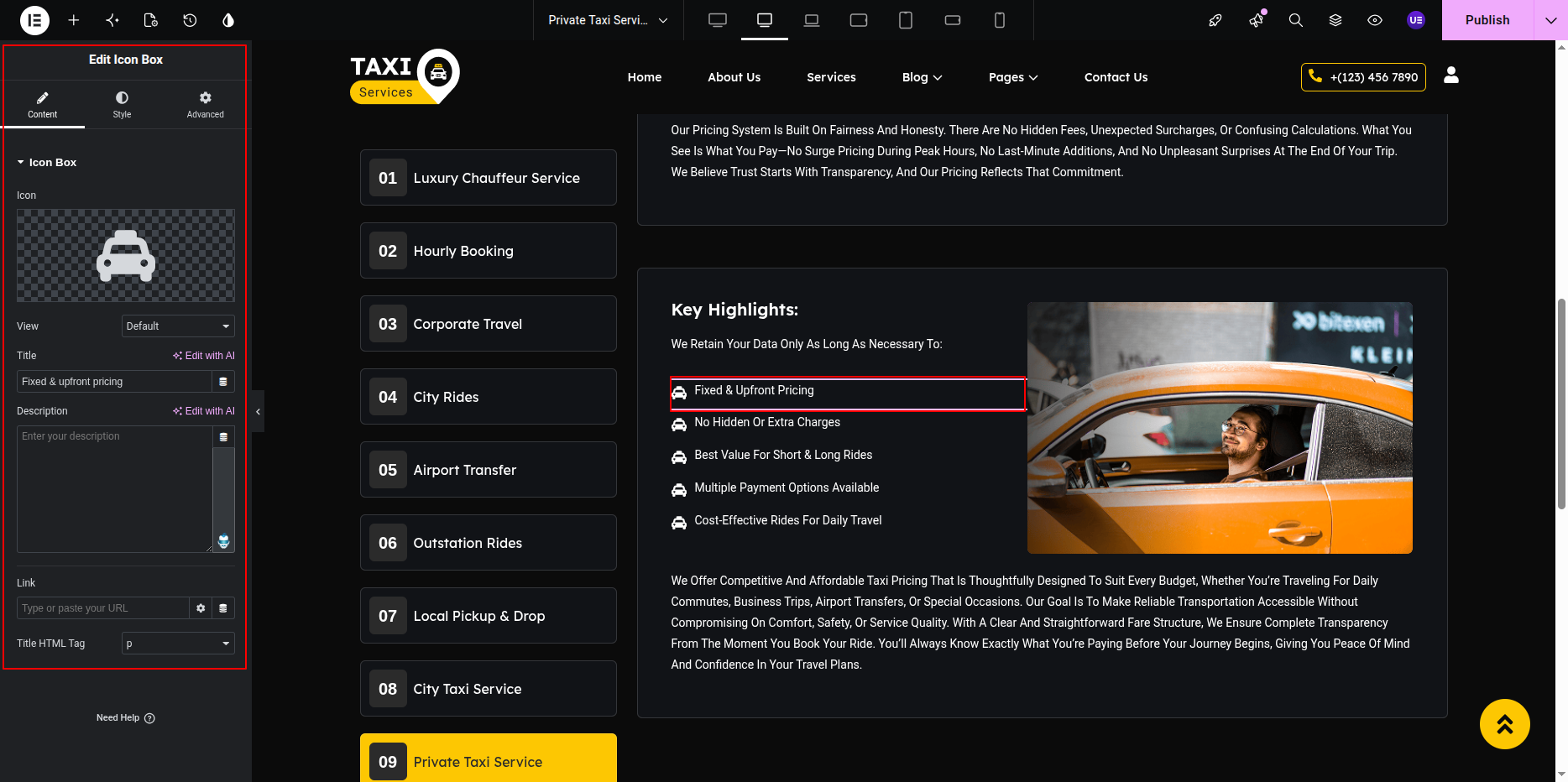
Icon List / Features Section
Service features are displayed using icon boxes or list widgets.
- Select Icon Box Widget or Icon List Widget.
- Edit:
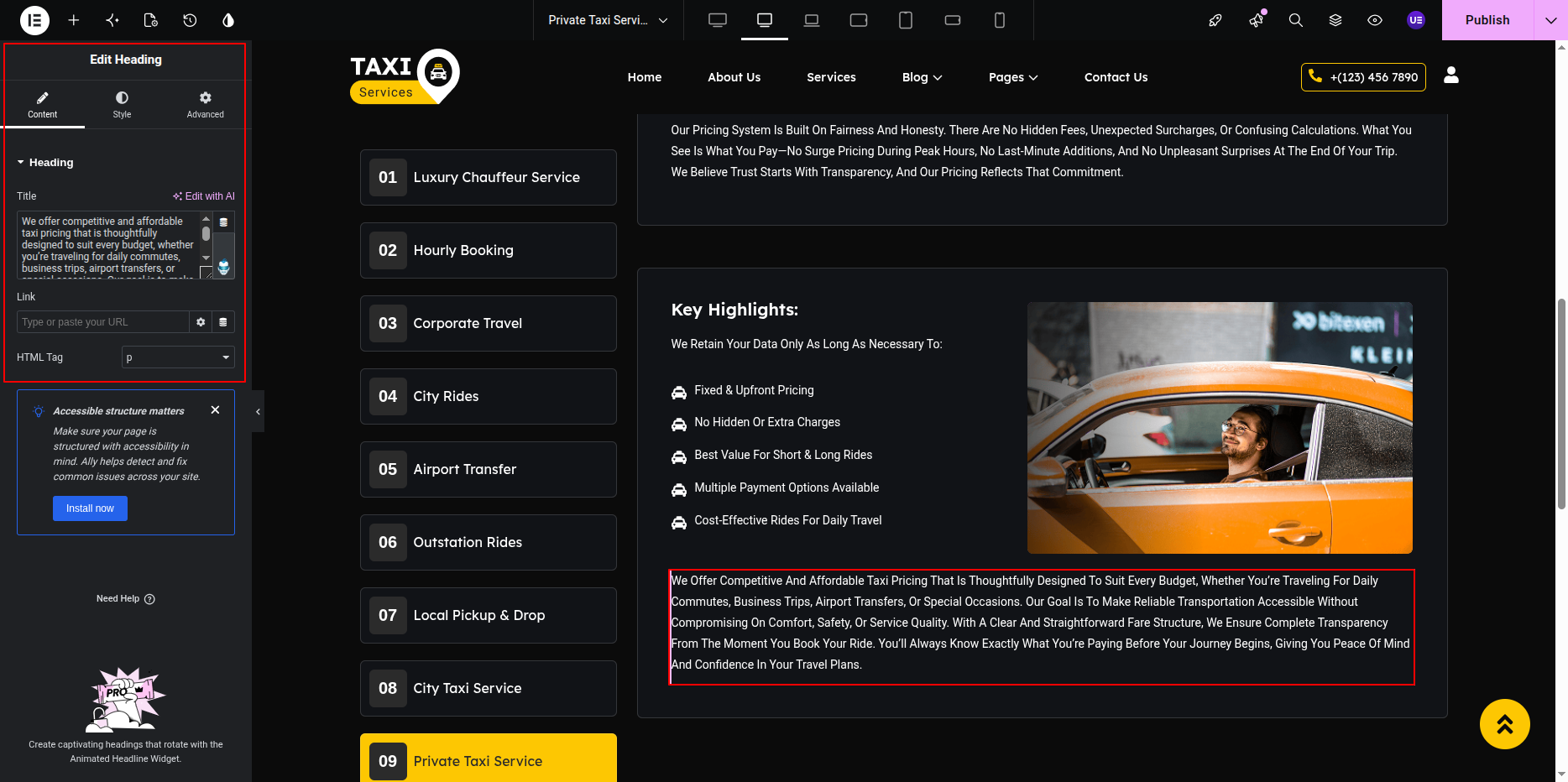
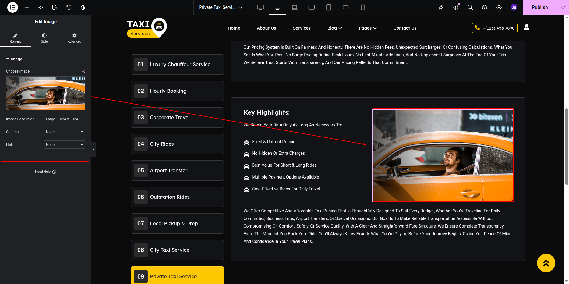
Service Image (Inside Content)
Additional images inside the service page are managed using Elementor.
- Select Image Widget.
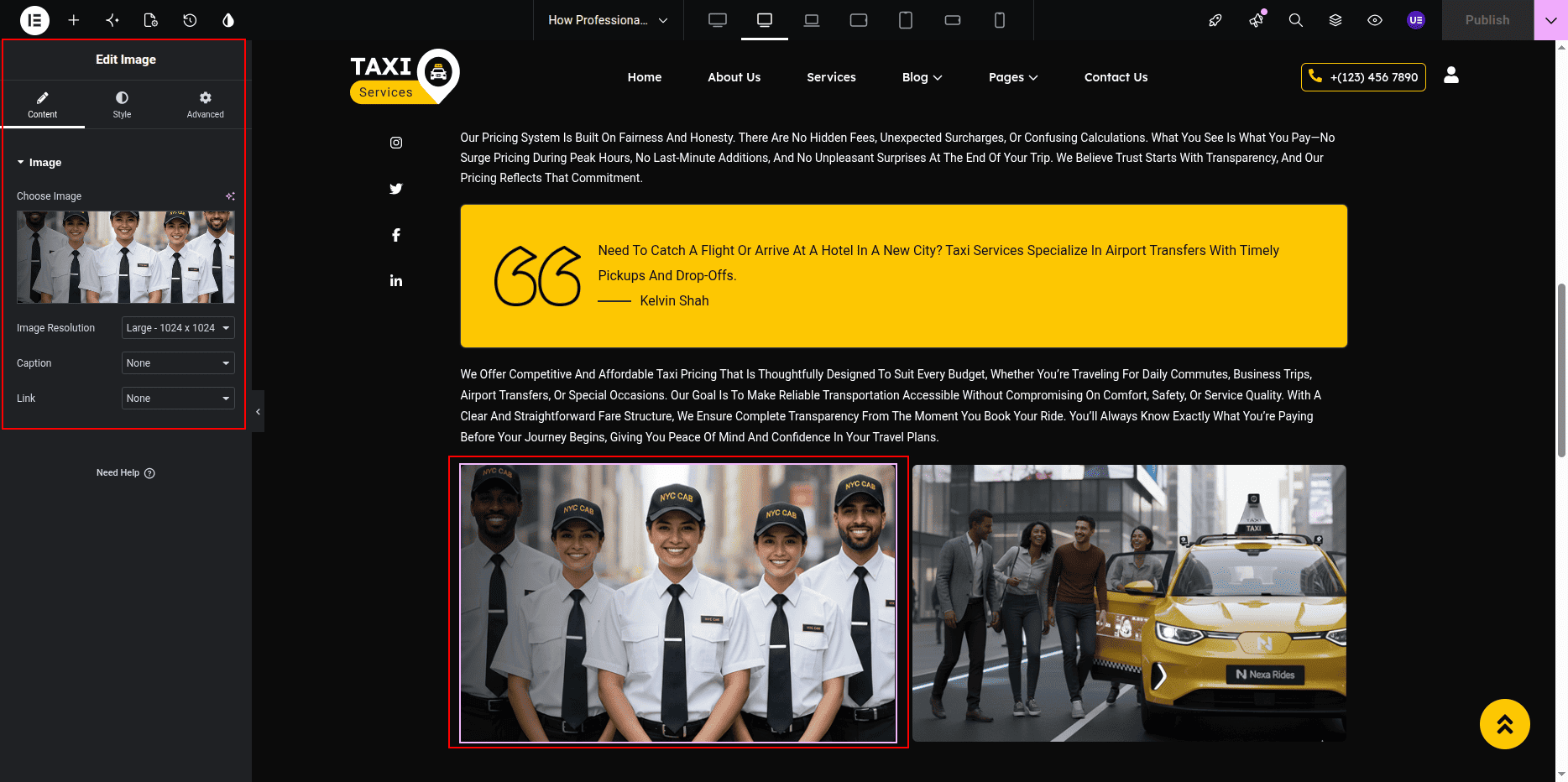
- Upload or replace image.
What is Controlled from Dashboard vs Elementor
- Dashboard Controlled:
- Service Title
- Featured Image
- Service Meta Icon (Custom Field)
- Elementor Controlled:
- Service Description
- Keywords & Headings
- Icon List / Features
- Inner Images
- Layout & Styling
Responsive Settings
- Switch to Tablet view.
- Switch to Mobile view.
- Ensure content stacks properly.
- Adjust font sizes
- Reduce spacing
- Stack icon boxes vertically
Tip: Keep service descriptions clear and highlight key features using icons.
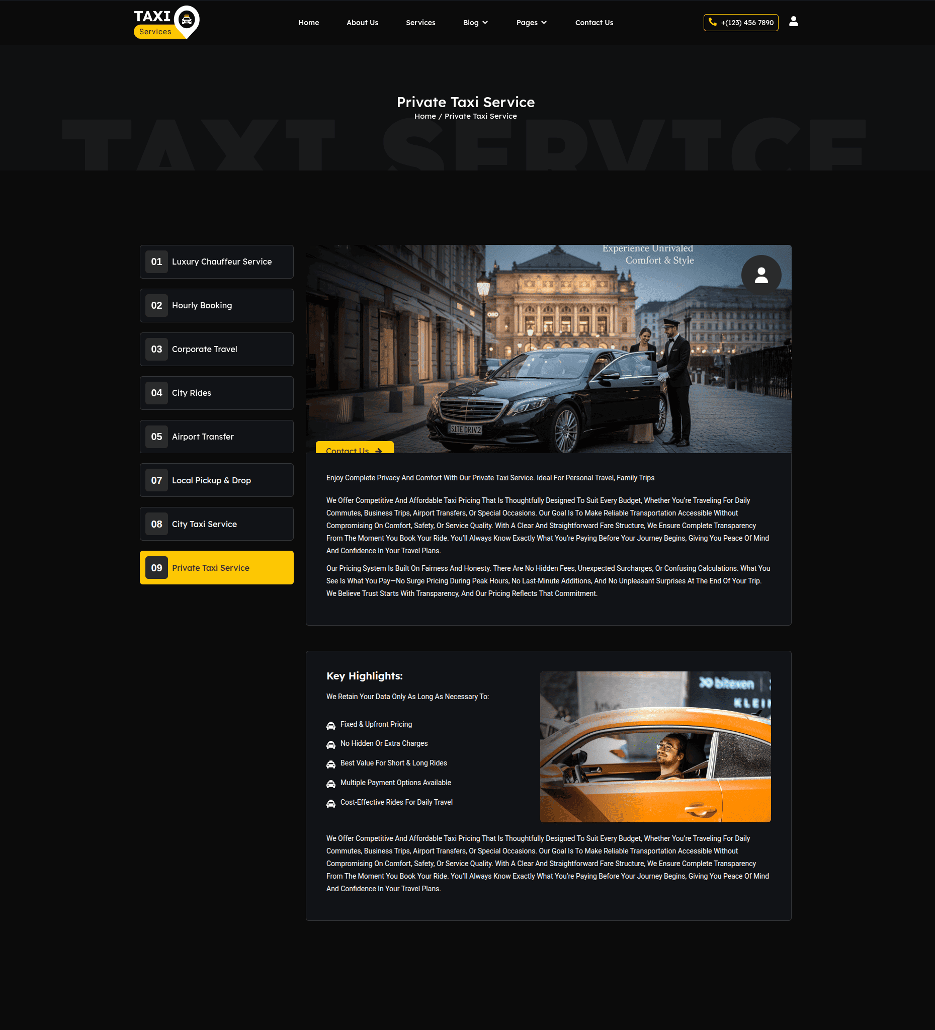
This is the final view of your page:
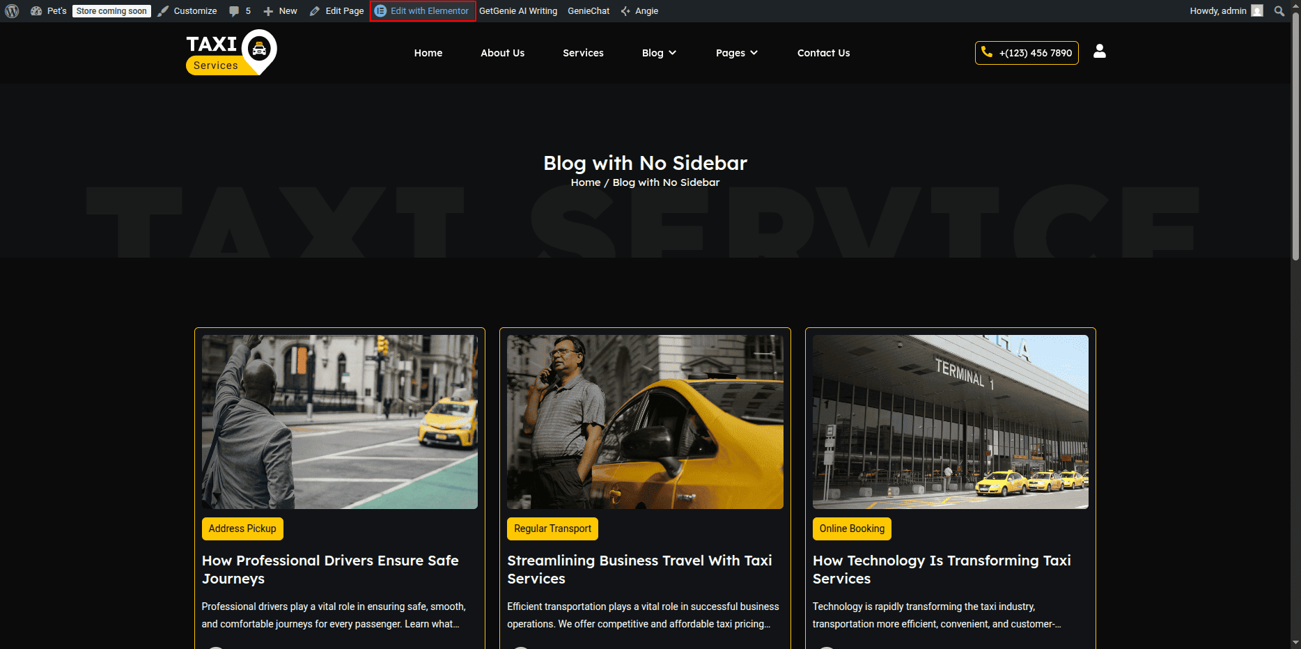
In this section, you can set a background banner image and display the page title along with breadcrumbs using Elementor.
- Editing the Blog with No Sidebar Page:
- Go to your WordPress Dashboard and navigate to Pages → Blog with No Sidebar.
- Click on Edit with Elementor to open the page in the Elementor editor.
Blog with No Sidebar Page Section
The Blog with No Sidebar Page is displayed when a visitor tries to access a page that does not exist. You can customize the image, message text, and button easily using Elementor.
The Blog Page without a sidebar displays all blog posts in a clean, full-width layout using the Posts Widget in Elementor.
- Editing the Blog Page:
- Click the + icon to add a new section.
- Choose a one-column layout for a full-width design.
- In the Elementor widgets panel, search for the Posts widget.
- Drag and drop the Posts widget into the section.
- Posts Widget Settings:
- In the Content tab:
- Choose Source: Posts.
- Set the number of posts per page as needed.
- Select the Columns layout (e.g., 2 or 3 columns).
- Enable or disable Pagination as desired.
- In the Query section:
- You can filter posts by category, author, or tags if required.
- Set order by Date or Random depending on your preference.
- In the Layout section:
- Choose from available layout styles (Classic, Cards, Masonry, etc.).
- Adjust the image ratio and alignment of text.
- Styling the Blog Section:
- Go to the Style tab in the Posts widget settings.
- Here you can:
- Change the post title color, typography, and hover effects.
- Adjust spacing between columns and rows.
- Set the excerpt color and button style.
- To modify the read more button:
- Scroll to the Button section under Style.
- Customize button color, typography, border radius, and hover effect.
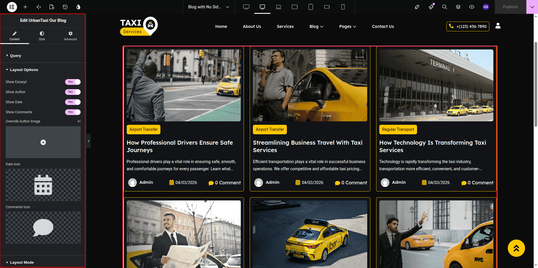
- Final Adjustments:
- Preview the page to ensure the blog posts display properly in a full-width layout.
- Adjust spacing or section padding as needed using the Advanced tab.
- Click Update to save all changes.
Note: The Posts Widget dynamically pulls blog posts from your WordPress posts section. You can manage or add new posts from Dashboard → Posts → Add New.
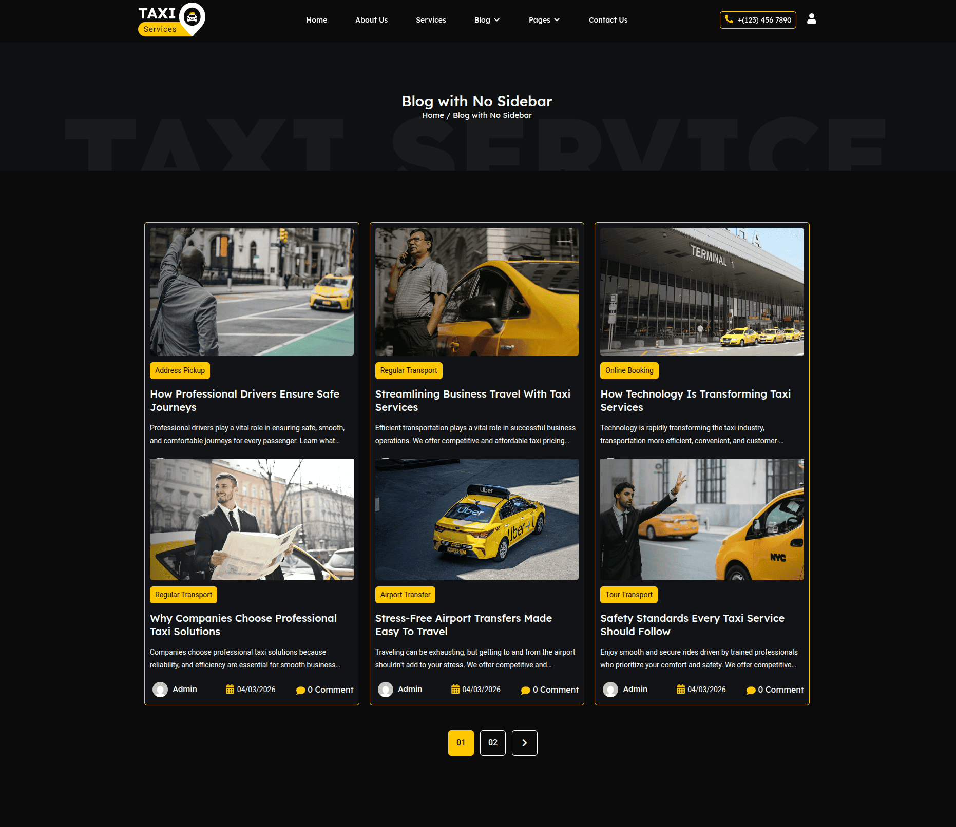
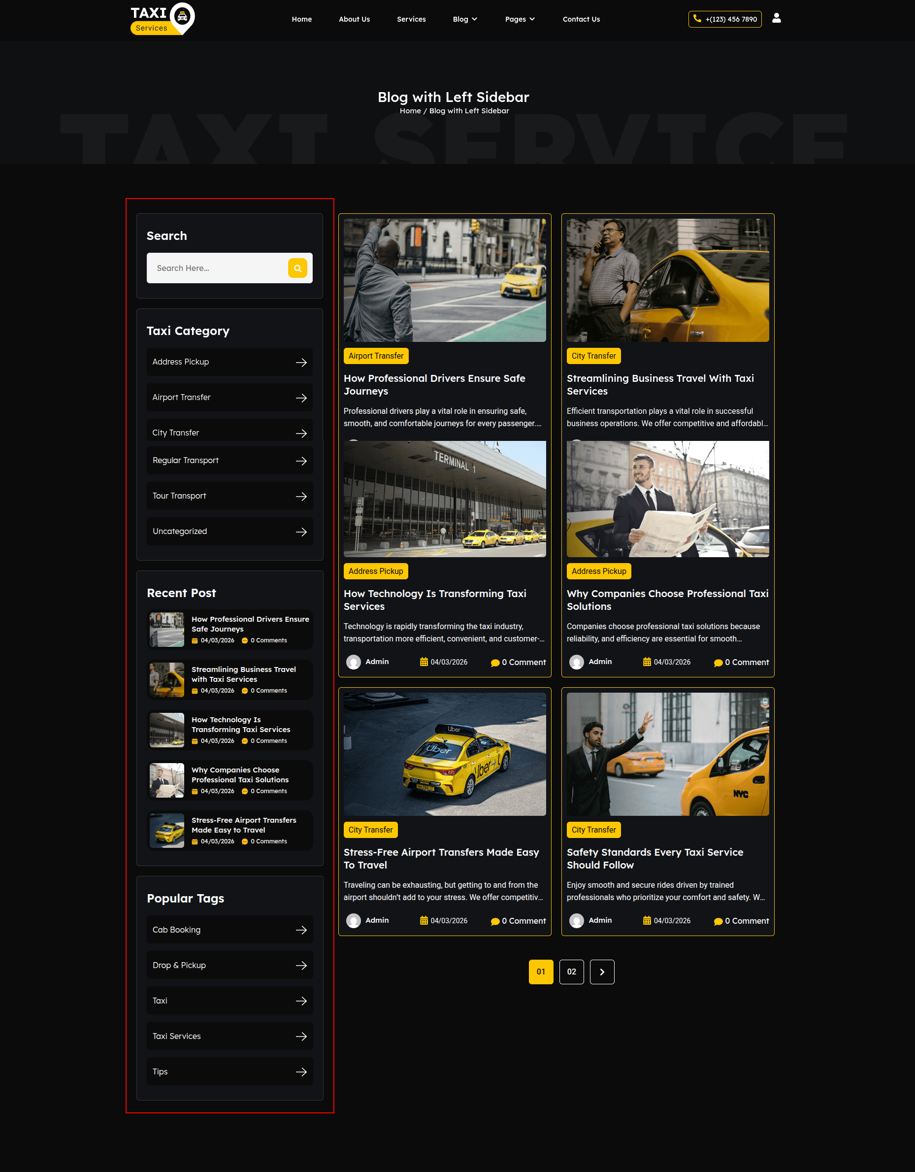
In this section, you can set a background banner image and display the page title along with breadcrumbs using Elementor.
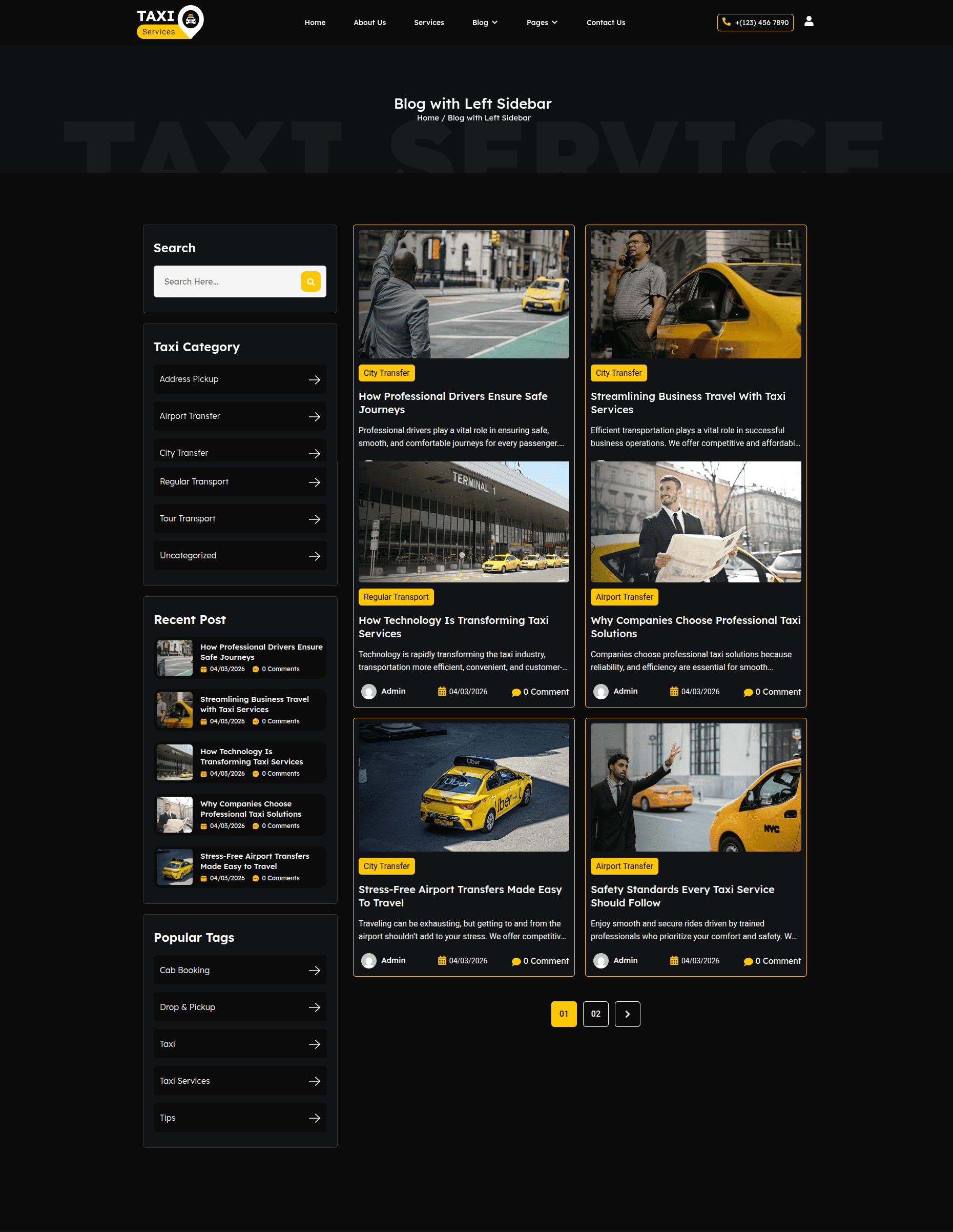
- Editing the Blog with Left Sidebar Page:
- Go to your WordPress Dashboard and navigate to Pages → Blog with Left Sidebar.
- Click on Edit with Elementor to open the page in the Elementor editor.
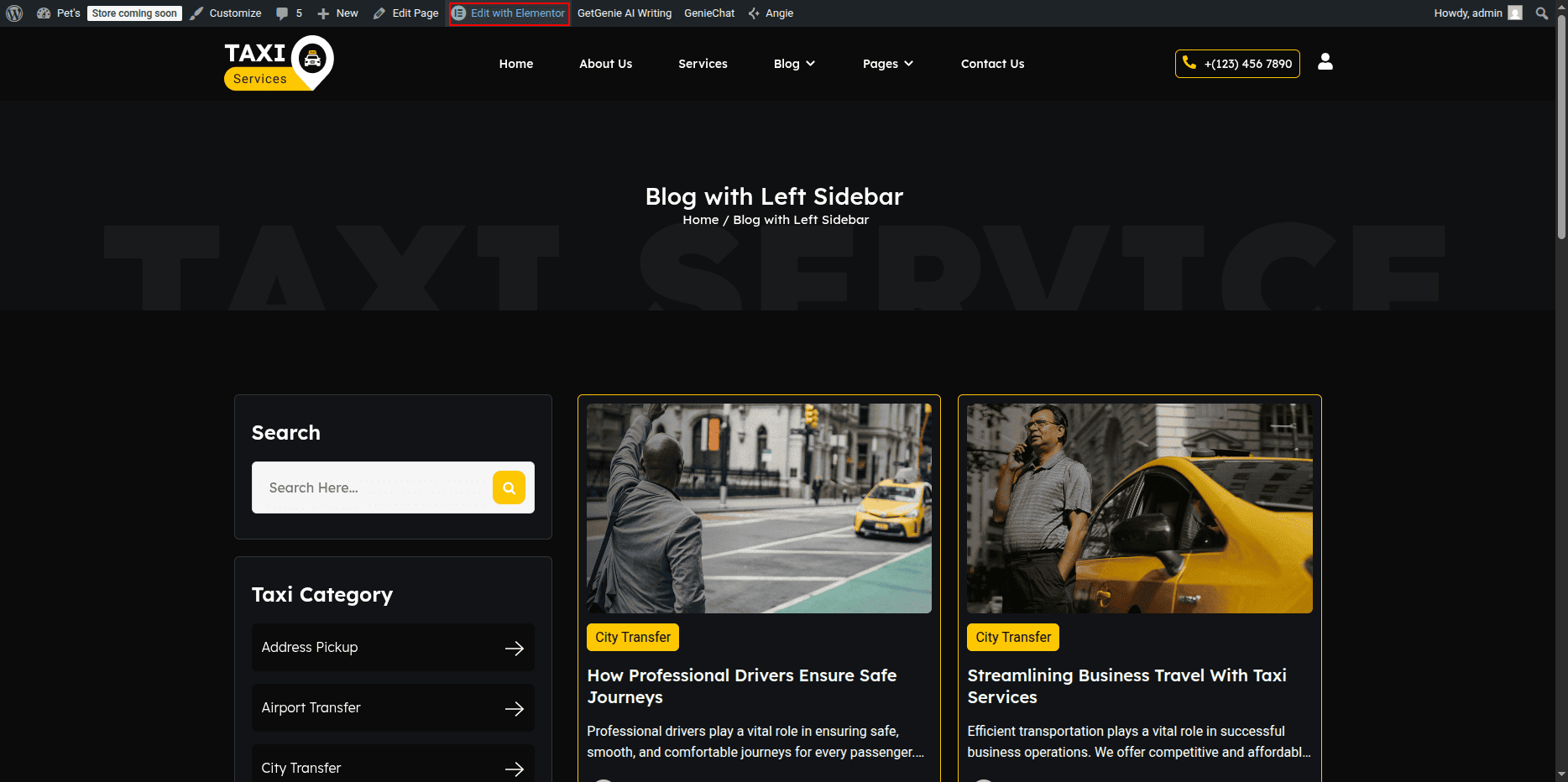
Blog with Left Sidebar Page Section
- Editing Blog Posts Section:
- In the Elementor editor, locate the Blog Posts or Posts Widget section.
- Click on the widget to open its settings panel.
- From the Content Tab, adjust:
- Layout: Choose Grid, List, or Masonry layout.
- Columns: Select how many posts you want per row.
- Posts Per Page: Set how many posts display on one page.
- Query: Filter posts by category, tags, or author.
- In the Style Tab, you can modify title color, typography, spacing, and image size.
- Customize the Read More button and Pagination style if available.
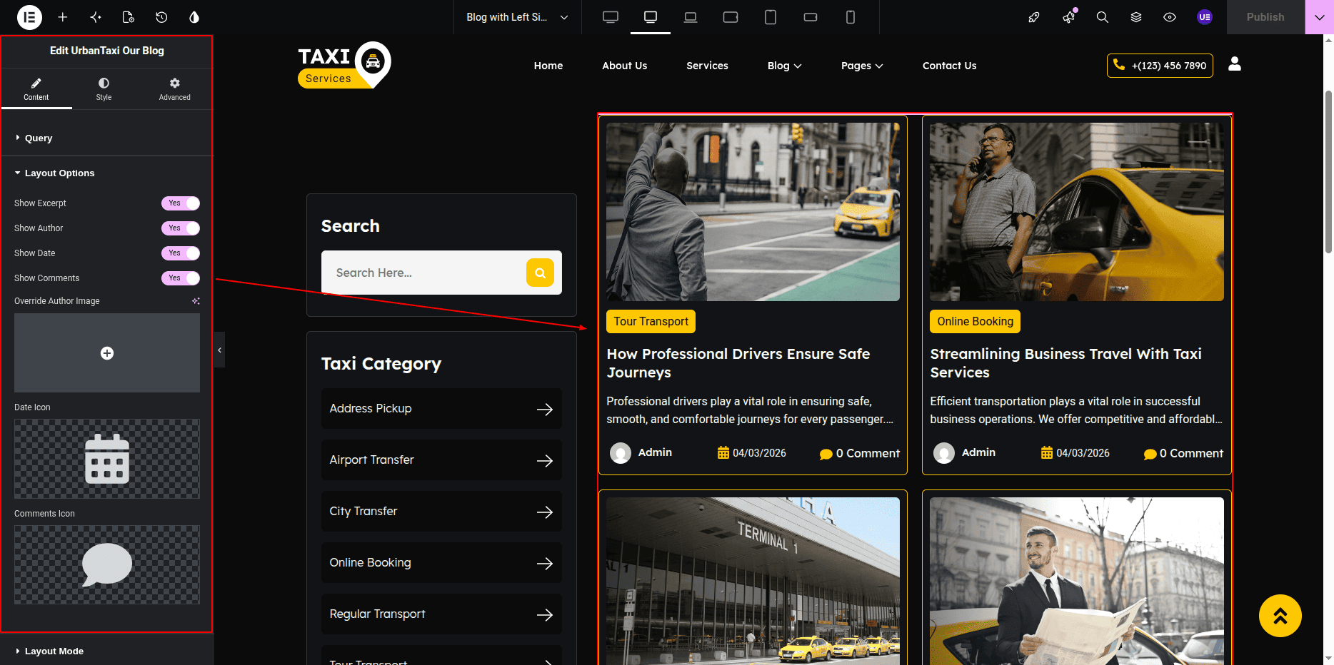
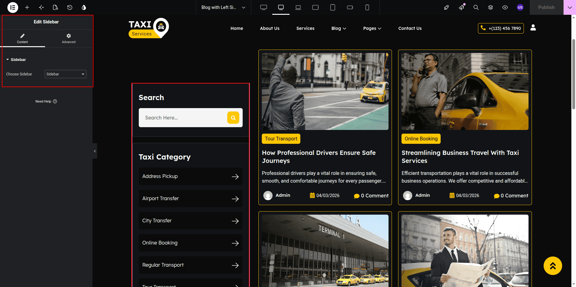
- Editing Sidebar Section:
- Locate the Left Sidebar Column in the layout.
- This area usually contains widgets such as Search, Categories, Recent Posts, or Custom Text.
- Click on any widget to edit its content and style.
- To add a new widget, click the + icon and drag any widget (like Image, Text, or HTML) into the sidebar column.
- To change sidebar background or spacing, click on the Column Handle → open the Style Tab → adjust Background, Border, or Padding.
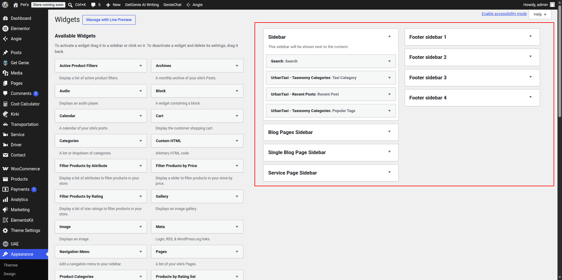
- Editing Sidebar Widgets via WordPress:
- If your theme uses a dynamic sidebar, go to Appearance → Widgets.
- Find the Sidebar area and add or remove widgets such as Categories, Archives, or Custom HTML.
- These changes automatically appear in your Blog with Left Sidebar layout.
- Adjusting Page Template (Optional):
- In Elementor, click the Settings (⚙️ icon) at the bottom-left corner.
- Under Template, select Default or Page with Left Sidebar.
- Ensure the Sidebar Layout is set to Left Sidebar.
- Saving Changes:
- After making all edits, click the Update button in Elementor.
- Preview the page to ensure both the blog posts and sidebar display correctly.
Note: You can manage sidebar widgets either through Elementor or from Appearance → Widgets. Make sure your page template supports the Left Sidebar layout for proper alignment.
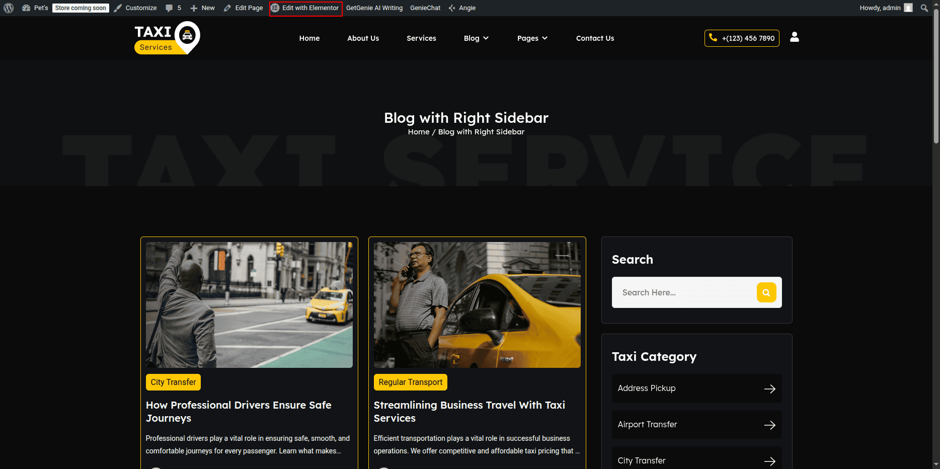
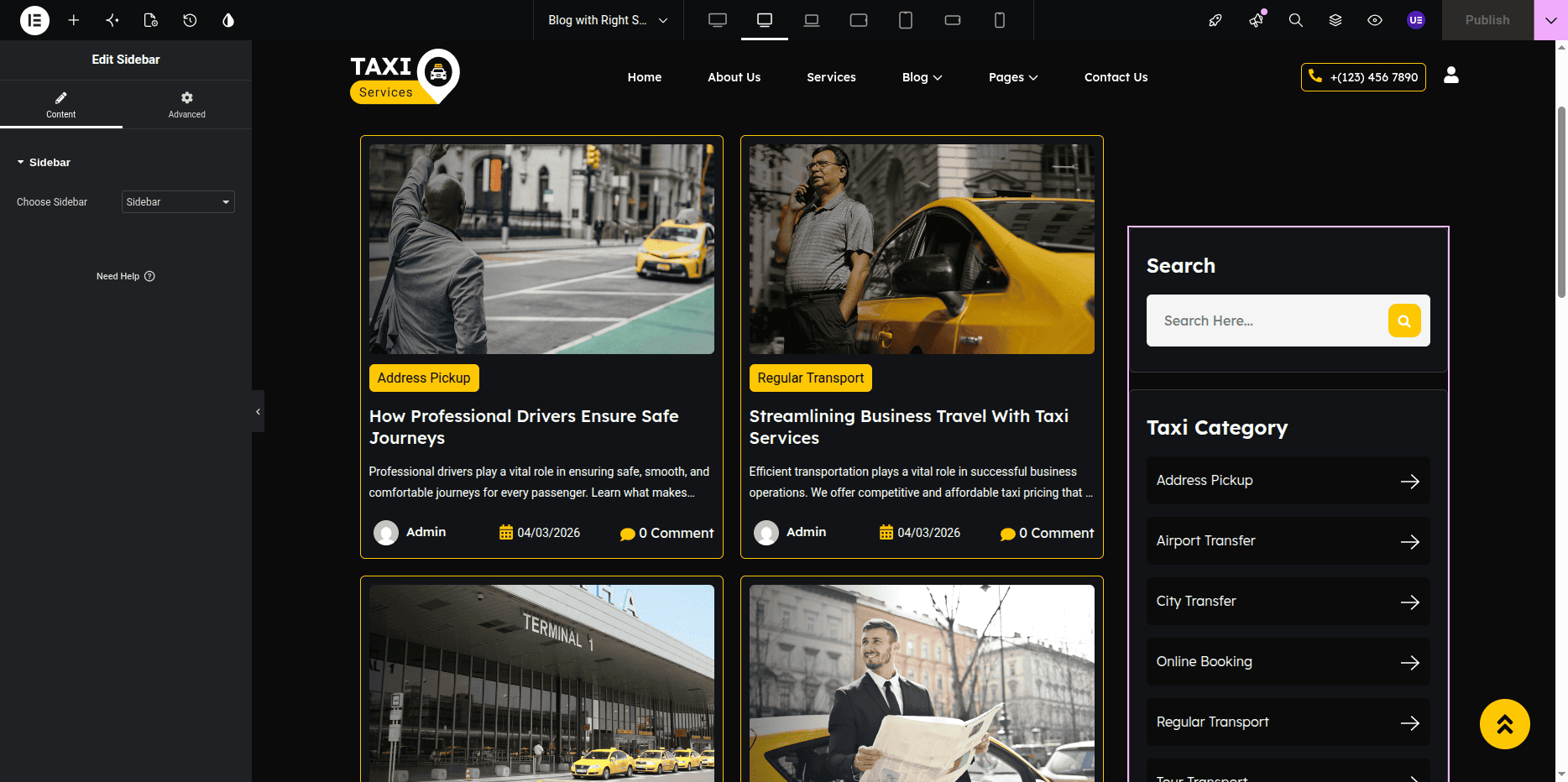
- Editing the Blog with Right Sidebar Page:
- Go to your WordPress Dashboard and navigate to Pages → Blog with Right Sidebar.
- Click on Edit with Elementor to open the page in the Elementor editor.
Blog with Right Sidebar Page Section
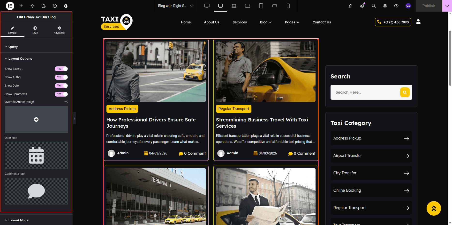
- Editing Blog Posts Section:
- In the Elementor editor, locate the Blog Posts or Posts Widget section.
- Click on the widget to open its settings panel.
- From the Content Tab, adjust:
- Layout: Choose Grid, List, or Masonry layout.
- Columns: Select how many posts you want per row.
- Posts Per Page: Set how many posts display on one page.
- Query: Filter posts by category, tags, or author.
- In the Style Tab, you can modify title color, typography, spacing, and image size.
- Customize the Read More button and Pagination style if available.
- Editing Sidebar Section:
- Locate the Left Sidebar Column in the layout.
- This area usually contains widgets such as Search, Categories, Recent Posts, or Custom Text.
- Click on any widget to edit its content and style.
- To add a new widget, click the + icon and drag any widget (like Image, Text, or HTML) into the sidebar column.
- To change sidebar background or spacing, click on the Column Handle → open the Style Tab → adjust Background, Border, or Padding.
- Editing Sidebar Widgets via WordPress:
- If your theme uses a dynamic sidebar, go to Appearance → Widgets.
- Find the Sidebar area and add or remove widgets such as Categories, Archives, or Custom HTML.
- These changes automatically appear in your Blog with Right Sidebar layout.
- Adjusting Page Template (Optional):
- In Elementor, click the Settings (⚙️ icon) at the bottom-left corner.
- Under Template, select Default or Page with Left Sidebar.
- Ensure the Sidebar Layout is set to Left Sidebar.
- Saving Changes:
- After making all edits, click the Update button in Elementor.
- Preview the page to ensure both the blog posts and sidebar display correctly.
Note: You can manage sidebar widgets either through Elementor or from Appearance → Widgets. Make sure your page template supports the Left Sidebar layout for proper alignment.
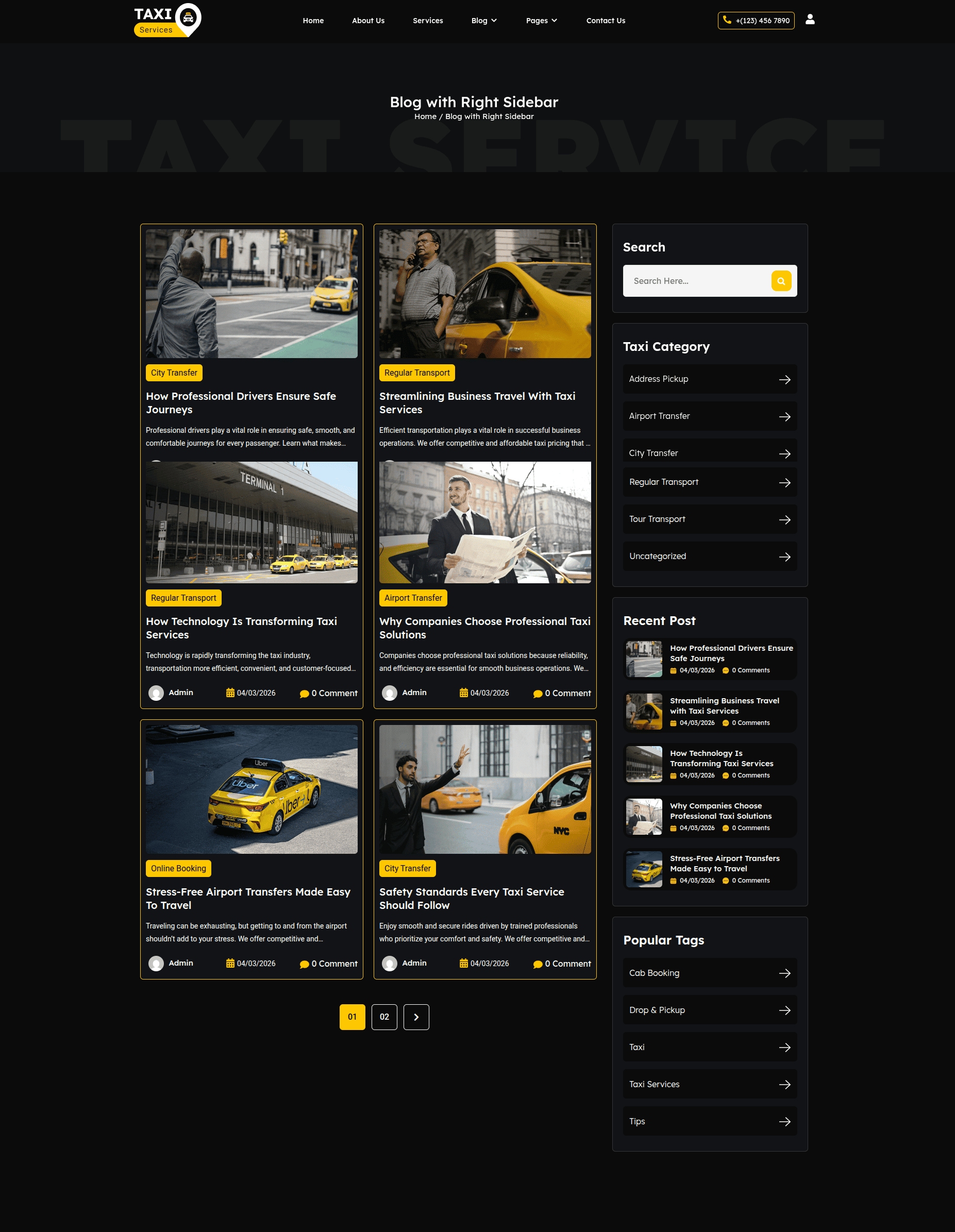
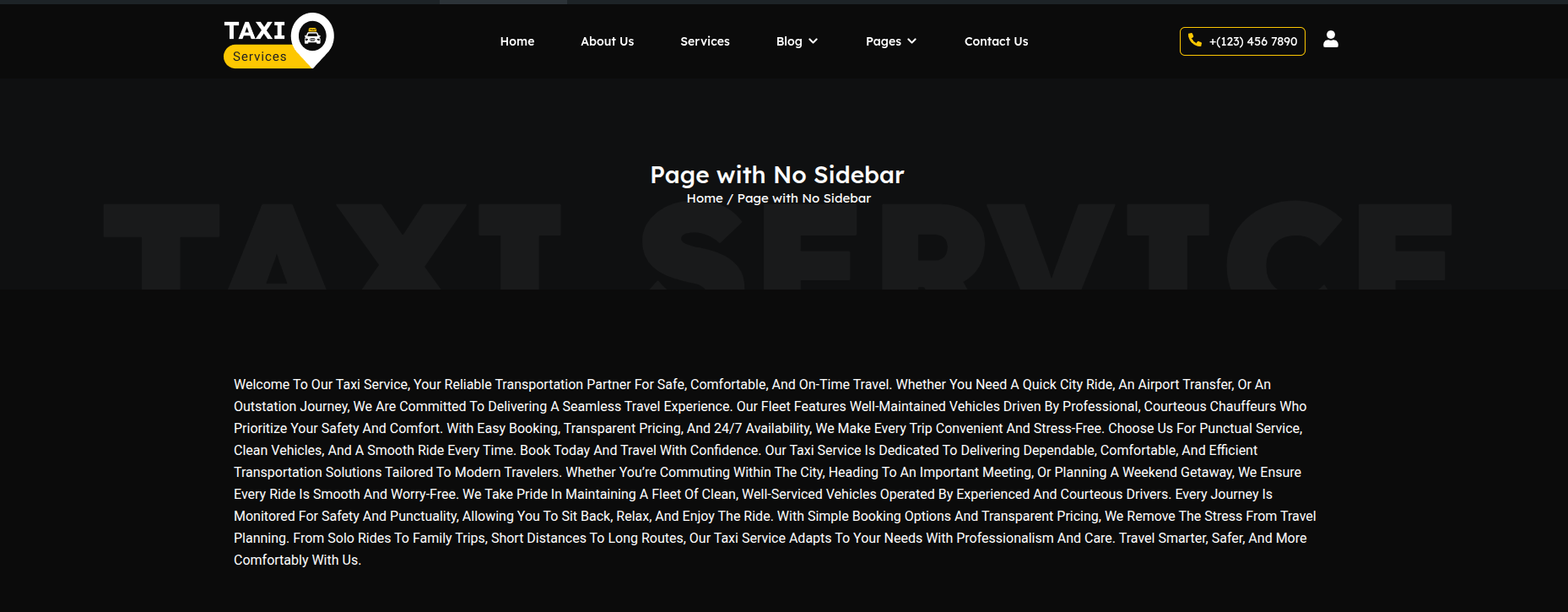
The Page with No Sidebar layout displays only the main content without any sidebar. This layout is ideal for full-width pages such as About Us, Contact, Landing Pages, or any content-focused pages.
Editing the Page with No Sidebar
-
- Go to your WordPress Dashboard → Pages → Page with No Sidebar.
- Click on Edit with Elementor to open the page in the Elementor editor.
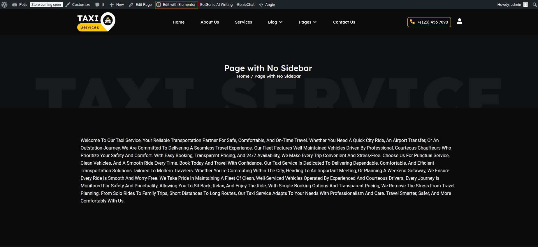
Page with No Sidebar Layout
This layout contains a single-column content area without a sidebar. All content spans the full width of the page, providing a clean and distraction-free reading experience.
Adding Page Content
-
- Add your page content using Elementor widgets such as:
- Heading – Page titles and section headings
- Text Editor – Page content and descriptions
- Image – Images or banners
- Button – Call-to-action buttons
- Posts / Loop Grid Widget – Dynamic content (if required)
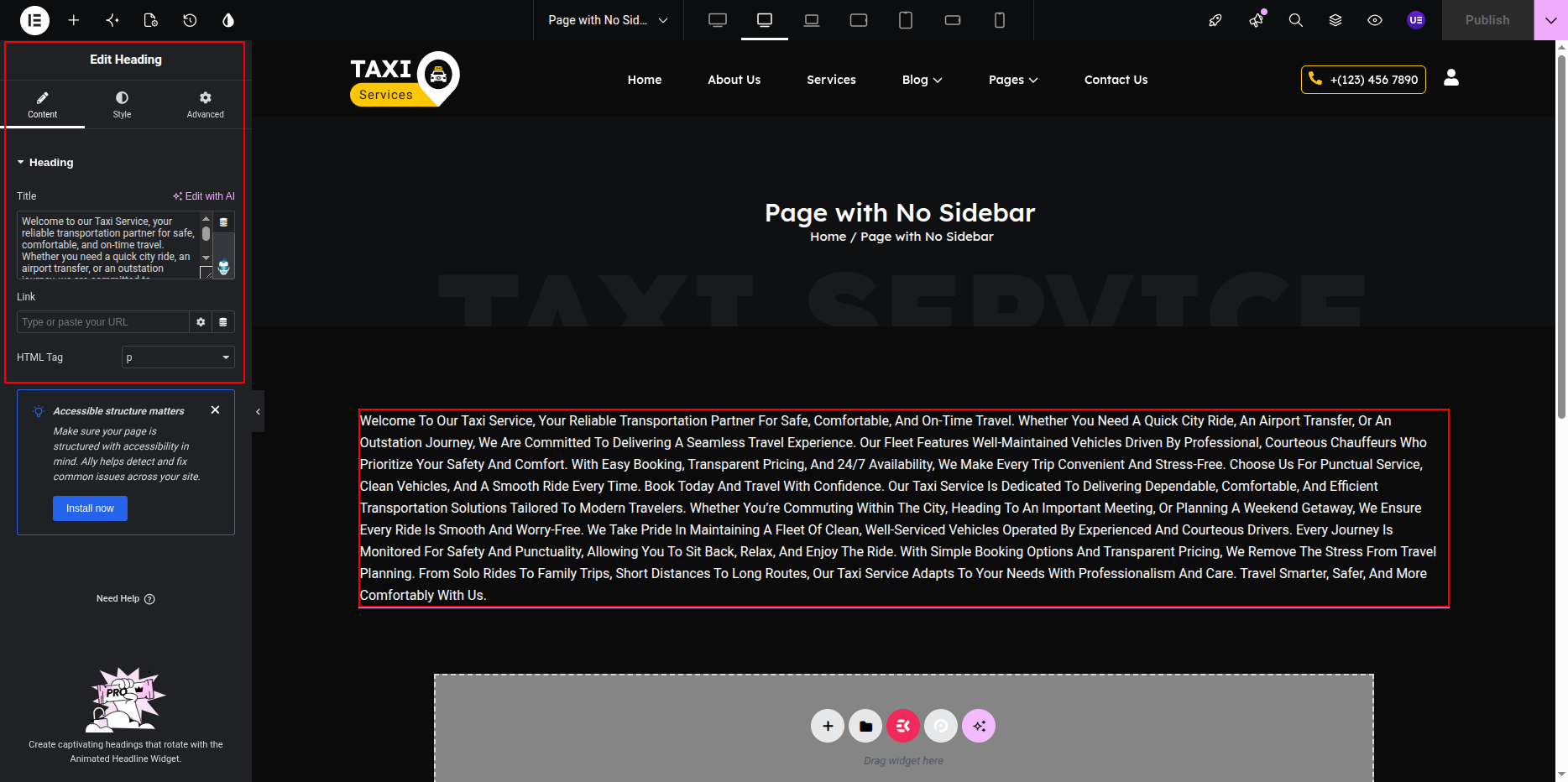
Customizing Page Design
-
- Select the section or widgets to customize styling.
- Use the Style tab to:
- Adjust typography and text color.
- Set background color or image.
- Control spacing using padding and margin.
- Use the Advanced tab for responsive visibility and layout fine-tuning.
Responsive Settings
-
- Switch to Tablet and Mobile views in Elementor.
- Adjust padding and font sizes for smaller screens.
- Ensure content remains readable and well-spaced.
Final Adjustments
-
- Review the page layout and content alignment.
- Ensure there is no unused spacing meant for sidebars.
- Click Update to save the page.
Note: Since this layout does not include a sidebar, all widgets added will appear directly in the main content area.
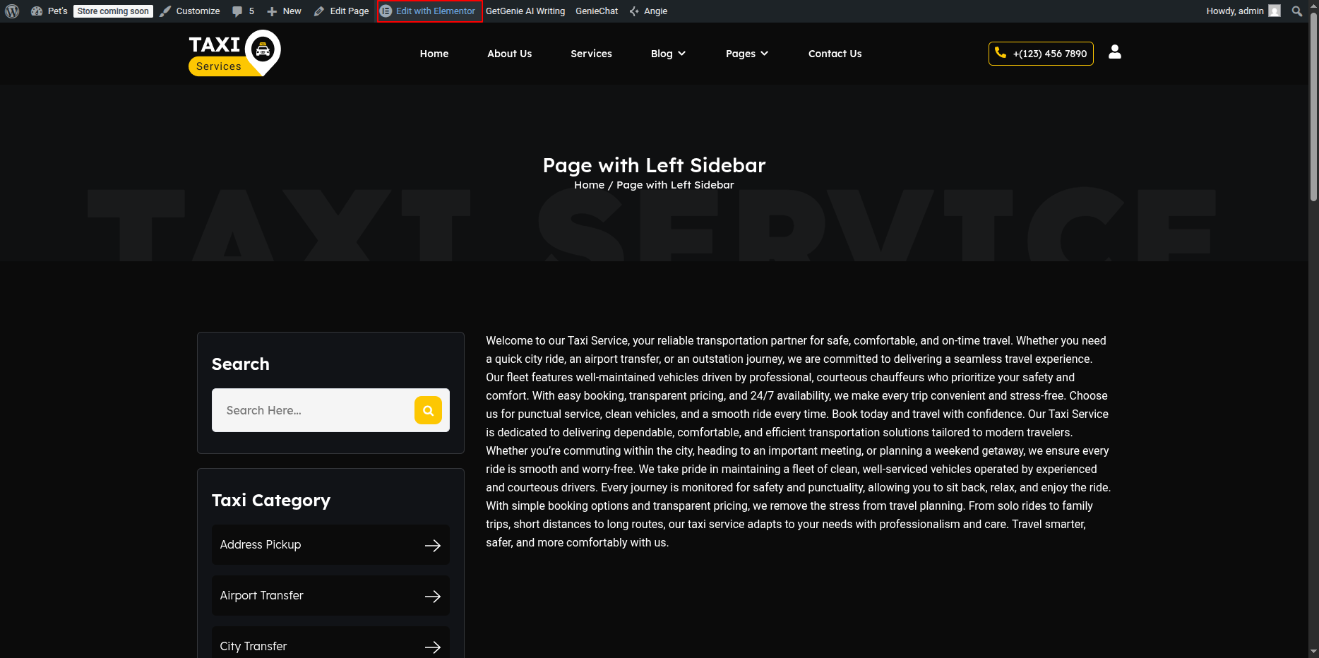
Page with Left Sidebar
- Editing the Page with Left Sidebar Page:
- Go to your WordPress Dashboard and navigate to Pages → Page with Left Sidebar.
- Click on Edit with Elementor to open the page in the Elementor editor.
Page with Left Sidebar Page Section
The Page with Left Sidebar Page is displayed when a visitor tries to access a page that does not exist. You can customize the image, message text, and button easily using Elementor.
Page with Left Sidebar
This layout includes a content area with a sidebar positioned on the left side. You can easily select and customize the sidebar widget and add your desired content using Elementor.
- Setting Up the Left Sidebar Layout:
- In the Elementor editor, add a new section with two columns.
- Set the column width:
- Left column (for sidebar): around 25% – 30%
- Right column (for main content): around 70% – 75%
- If the sidebar already exists in your theme, ensure it’s enabled by selecting the appropriate page template that supports sidebars (for example: Page with Sidebar).
- Adding the Sidebar Widget:
- Click inside the left column to add a widget.
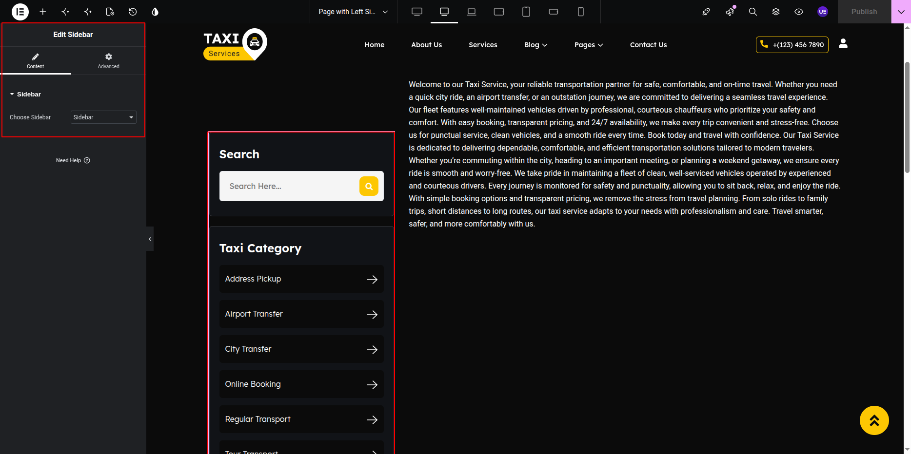
- Search for the Sidebar Widget in the Elementor panel.
- Drag and drop the Sidebar Widget into the left column.
- In the Content tab of the widget settings:
- Select the desired sidebar from the Choose Sidebar dropdown menu (for example: Main Sidebar or Blog Sidebar).
- Adding Contents to the Sidebar:
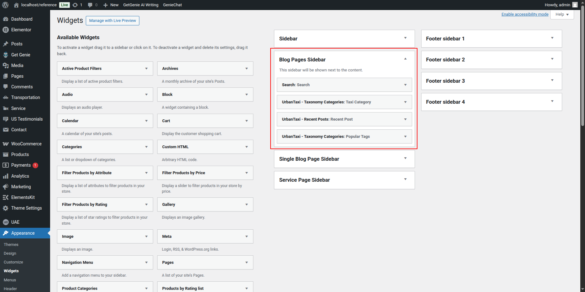
- To edit or add widgets inside the selected sidebar, go to your WordPress Dashboard → Appearance → Widgets.
- Select the sidebar you chose in Elementor (for example: Main Sidebar).
- Add the desired widgets such as:
- Search
- Recent Posts
- Categories
- Custom Text
- Image or HTML Widget
- After adding widgets, click Update in the WordPress Widgets area to save the sidebar content.
- The updated widgets will automatically appear in your Elementor sidebar section.
- Customizing the Sidebar Design:
- In Elementor, select the left column (sidebar area).
- Go to the Style tab to:
- Change background color or add a border.
- Adjust padding and spacing.
- Set typography and text color for sidebar widgets.
- Use the Advanced tab to control margins and responsive visibility.
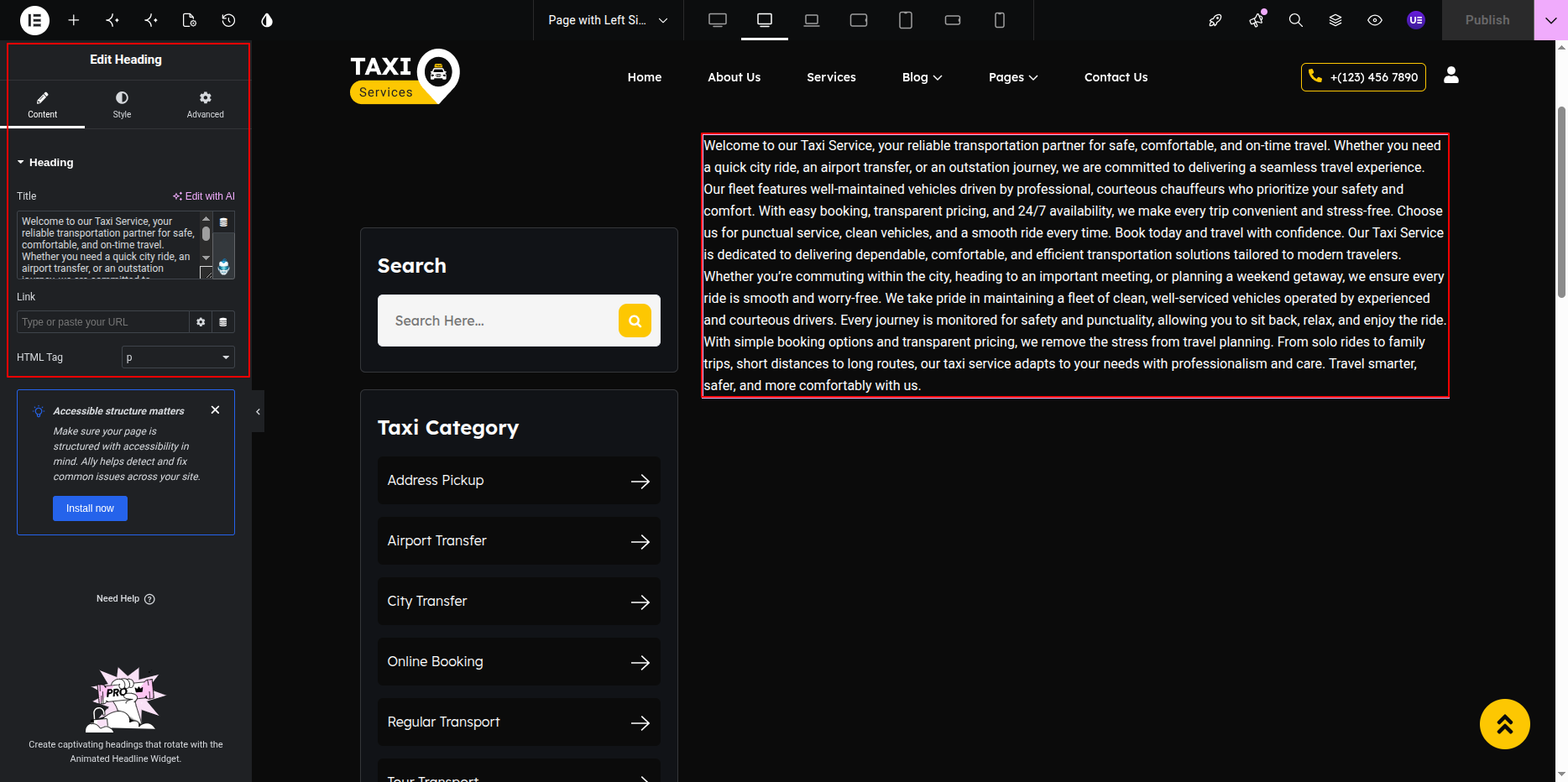
- Final Adjustments:
- Add your main page content inside the right column using Elementor widgets like Heading, Text Editor, Image, or Posts Widget.
- Ensure proper alignment between sidebar and main content.
- Click Update to save the layout changes.
Note: The Sidebar Widget dynamically displays widgets assigned in your WordPress Sidebar area. You can manage or reorder sidebar widgets anytime from Appearance → Widgets.
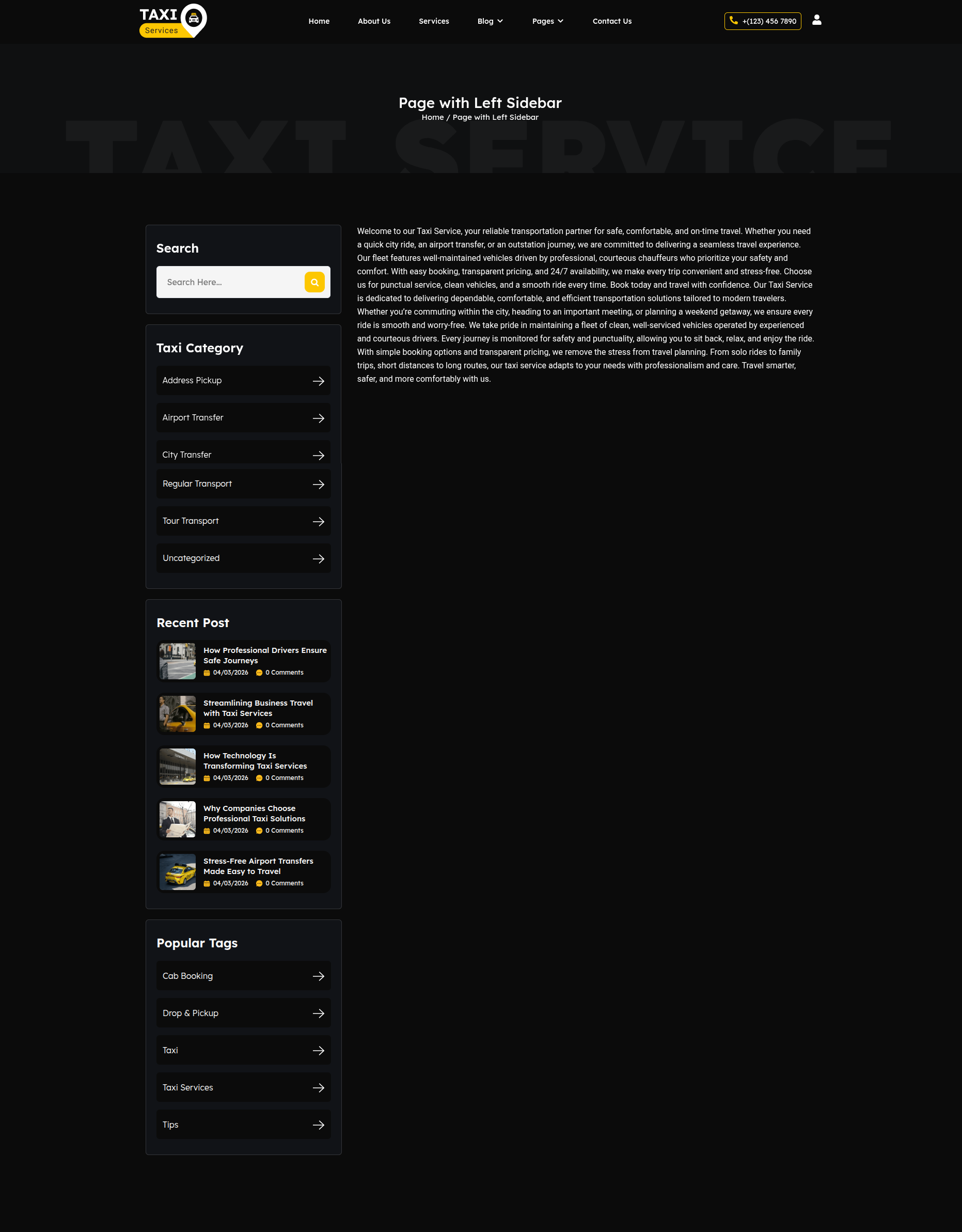
Page with Right Sidebar
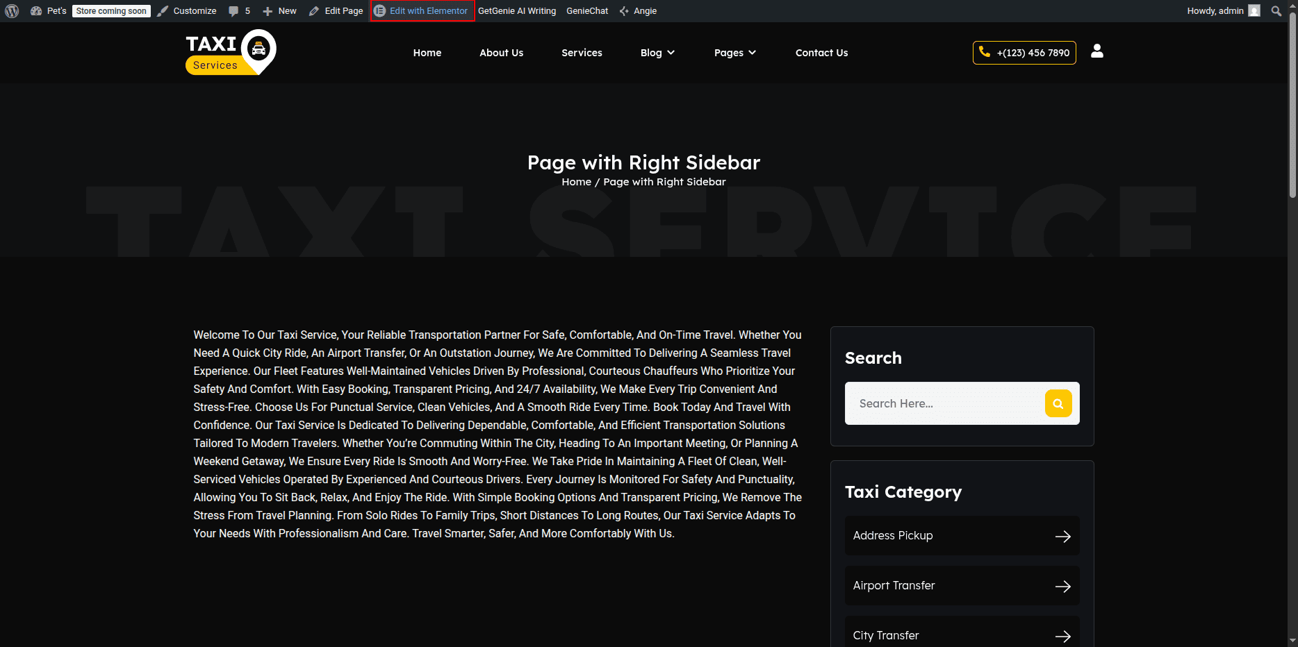
- Editing the Page with Right Sidebar Page:
- Go to your WordPress Dashboard and navigate to Pages → Page with Right Sidebar.
- Click on Edit with Elementor to open the page in the Elementor editor.
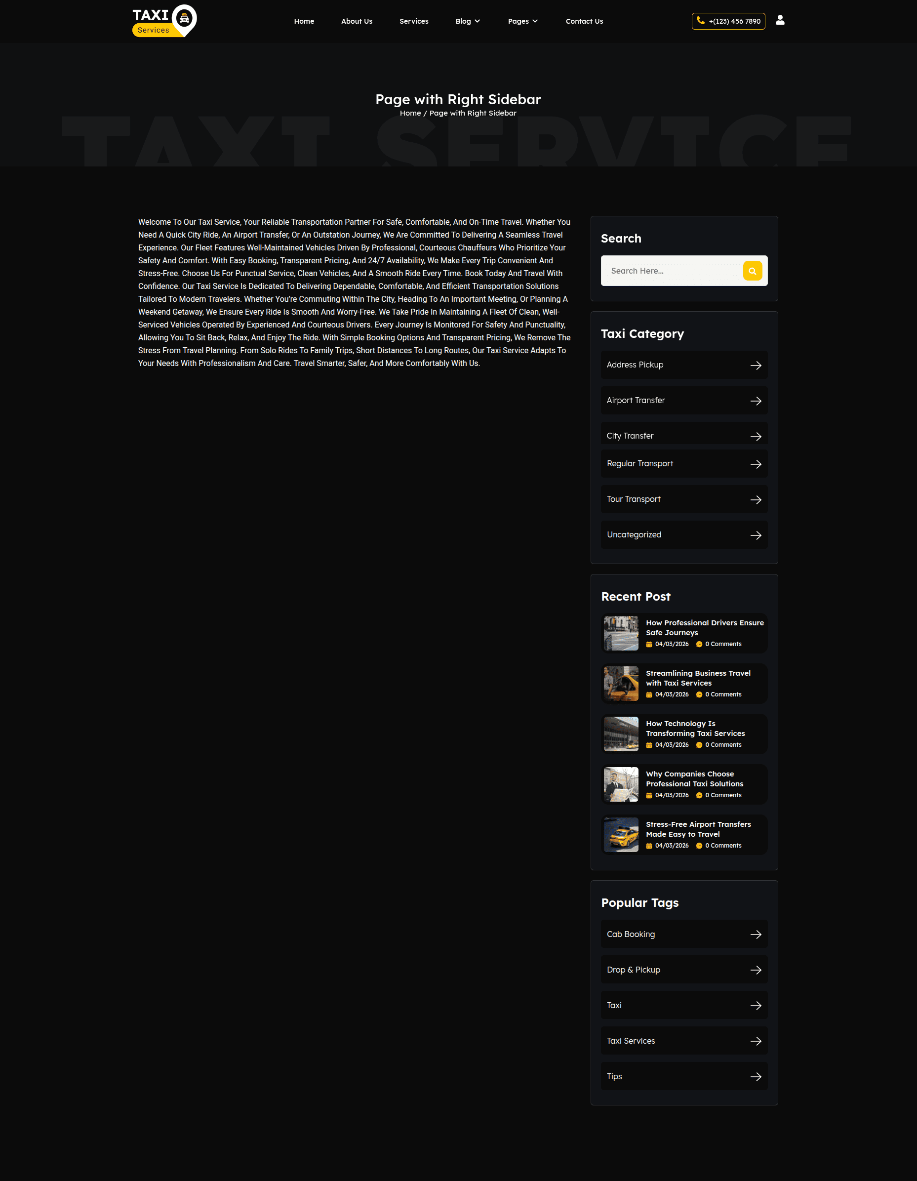
Page with Right Sidebar Page Section
The Page with Right Sidebar Page is displayed when a visitor tries to access a page that does not exist. You can customize the image, message text, and button easily using Elementor.
Page with Right Sidebar
This layout includes a content area with a sidebar positioned on the left side. You can easily select and customize the sidebar widget and add your desired content using Elementor.
- Setting Up the Left Sidebar Layout:
- In the Elementor editor, add a new section with two columns.
- Set the column width:
- Left column (for sidebar): around 25% – 30%
- Right column (for main content): around 70% – 75%
- If the sidebar already exists in your theme, ensure it’s enabled by selecting the appropriate page template that supports sidebars (for example: Page with Sidebar).
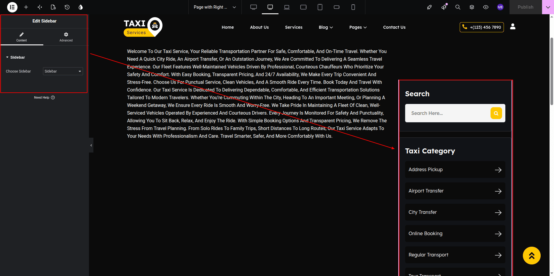
- Adding the Sidebar Widget:
- Click inside the left column to add a widget.
- Search for the Sidebar Widget in the Elementor panel.
- Drag and drop the Sidebar Widget into the left column.
- In the Content tab of the widget settings:
- Select the desired sidebar from the Choose Sidebar dropdown menu (for example: Main Sidebar or Blog Sidebar).
- Adding Contents to the Sidebar:
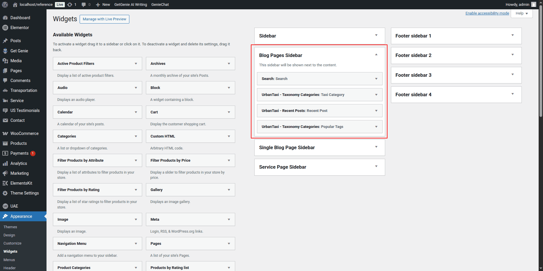
- To edit or add widgets inside the selected sidebar, go to your WordPress Dashboard → Appearance → Widgets.
- Select the sidebar you chose in Elementor (for example: Main Sidebar).
- Add the desired widgets such as:
- Search
- Recent Posts
- Categories
- Custom Text
- Image or HTML Widget
- After adding widgets, click Update in the WordPress Widgets area to save the sidebar content.
- The updated widgets will automatically appear in your Elementor sidebar section.
- Customizing the Sidebar Design:
- In Elementor, select the left column (sidebar area).
- Go to the Style tab to:
- Change background color or add a border.
- Adjust padding and spacing.
- Set typography and text color for sidebar widgets.
- Use the Advanced tab to control margins and responsive visibility.
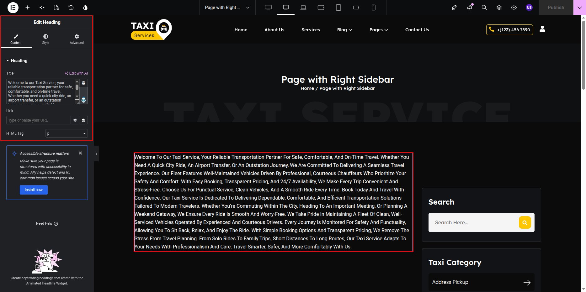
- Final Adjustments:
- Add your main page content inside the right column using Elementor widgets like Heading, Text Editor, Image, or Posts Widget.
- Ensure proper alignment between sidebar and main content.
- Click Update to save the layout changes.
Note: The Sidebar Widget dynamically displays widgets assigned in your WordPress Sidebar area. You can manage or reorder sidebar widgets anytime from Appearance → Widgets.
FAQ Page
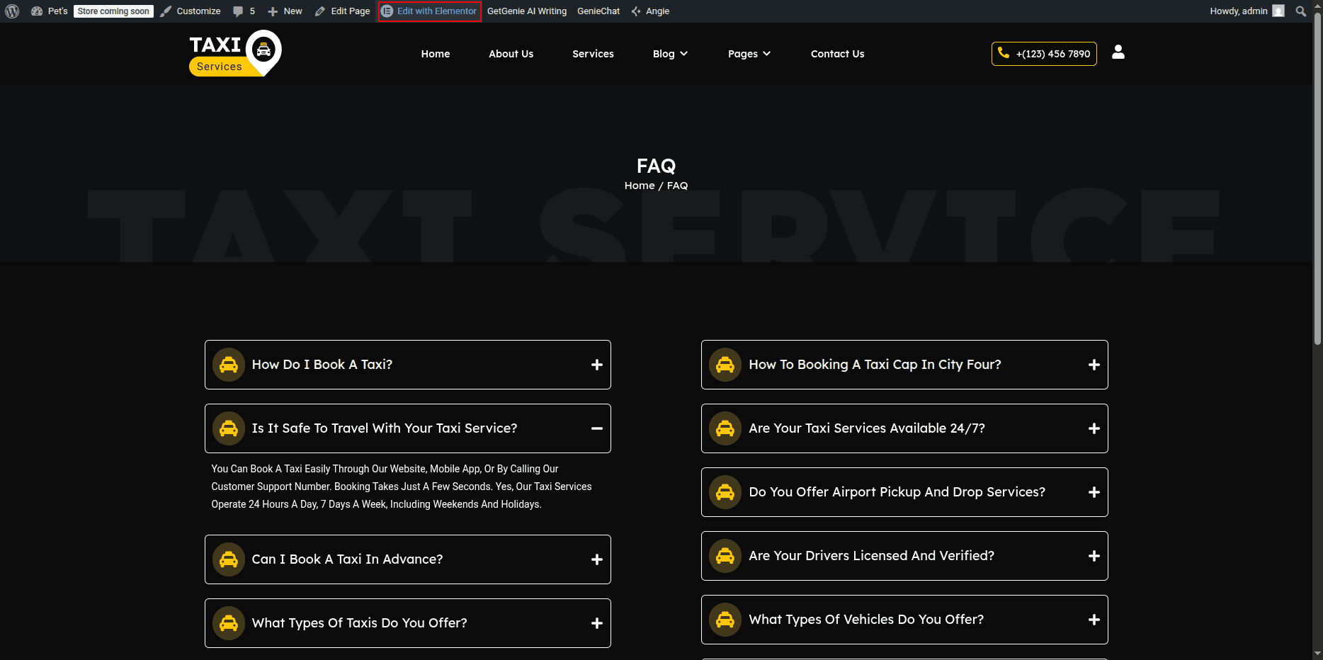
The FAQ Page displays frequently asked questions using
the Accordion Widget.
Each FAQ item contains question title and answer content.
You can edit FAQ items using Elementor.
Editing FAQ Page
- Go to Dashboard → Pages.
- Click FAQ Page.
- Click Edit.
- Click Edit with Elementor.
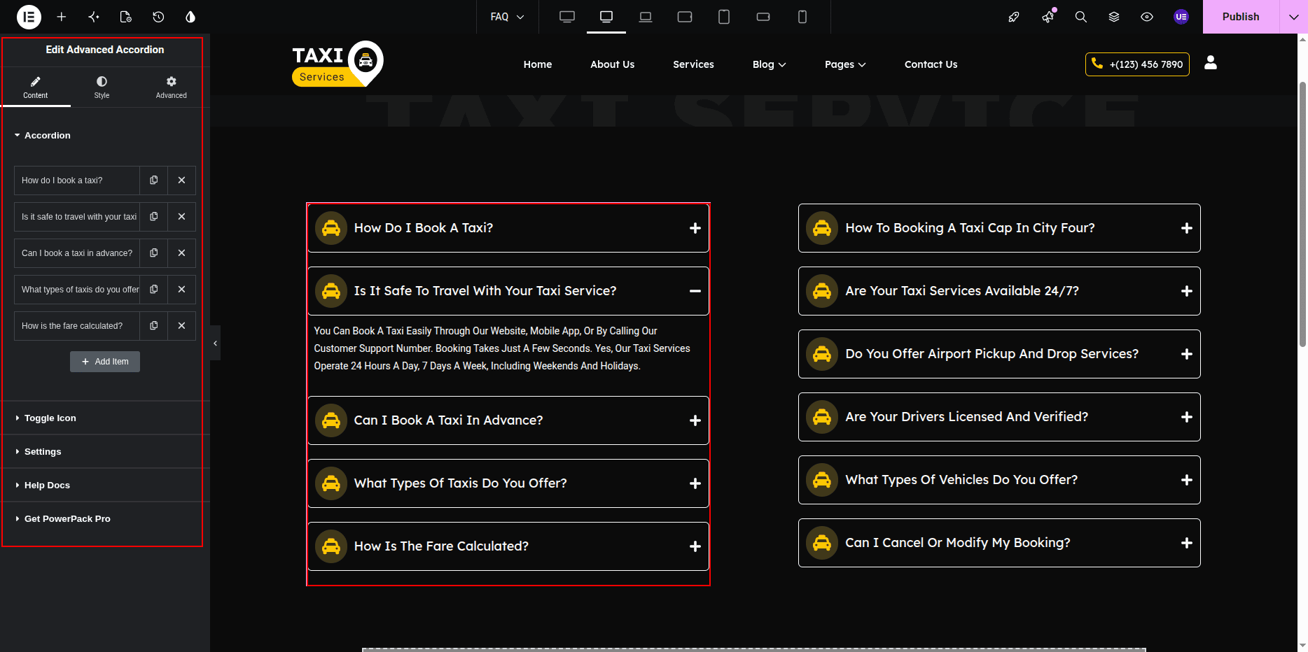
Editing FAQ Items
- Select the Accordion Widget.
- Edit existing FAQ items.
- Add new FAQ item.
- Remove item if needed.
Settings
- Title → Question
- Content → Answer
- Default Active → Yes / No
Styling Settings
- Change typography.
- Adjust spacing.
- Change icon style.
- Change colors.
Responsive Settings
- Switch to Tablet view.
- Switch to Mobile view.
- Make sure accordion works properly.
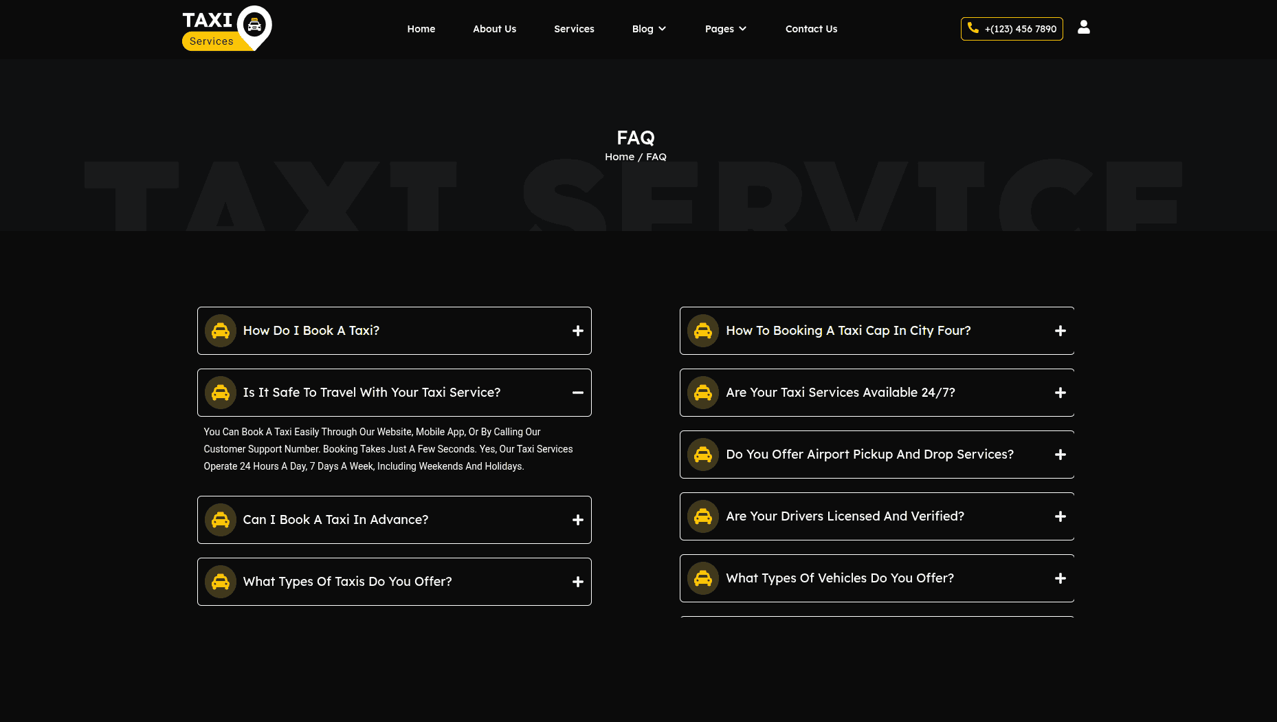
This is the final view of your page:
404 Page
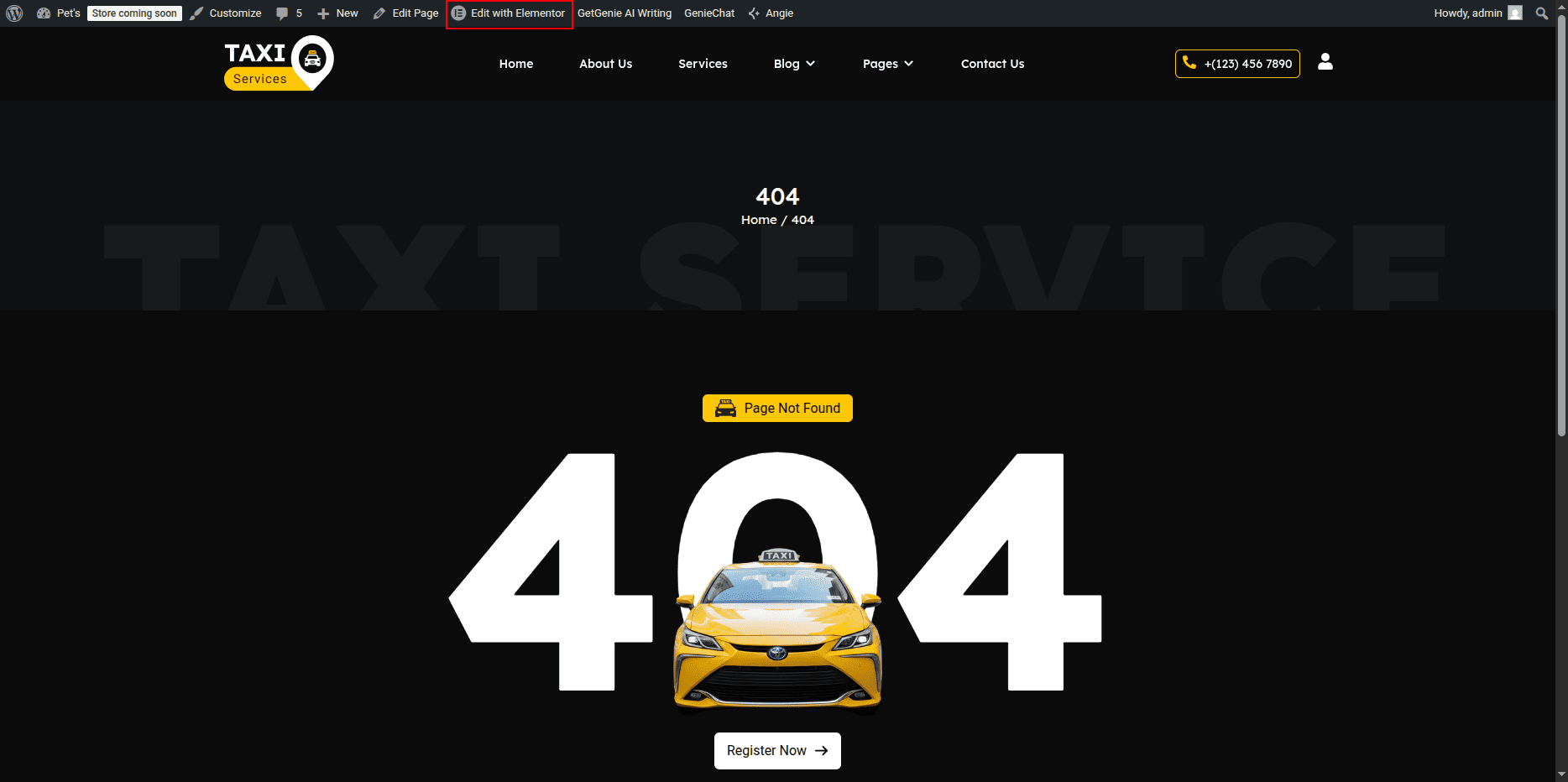
- Editing the 404 Page:
- Go to your WordPress Dashboard and navigate to Pages → 404.
- Click on Edit with Elementor to open the page in the Elementor editor.
404 Page Section
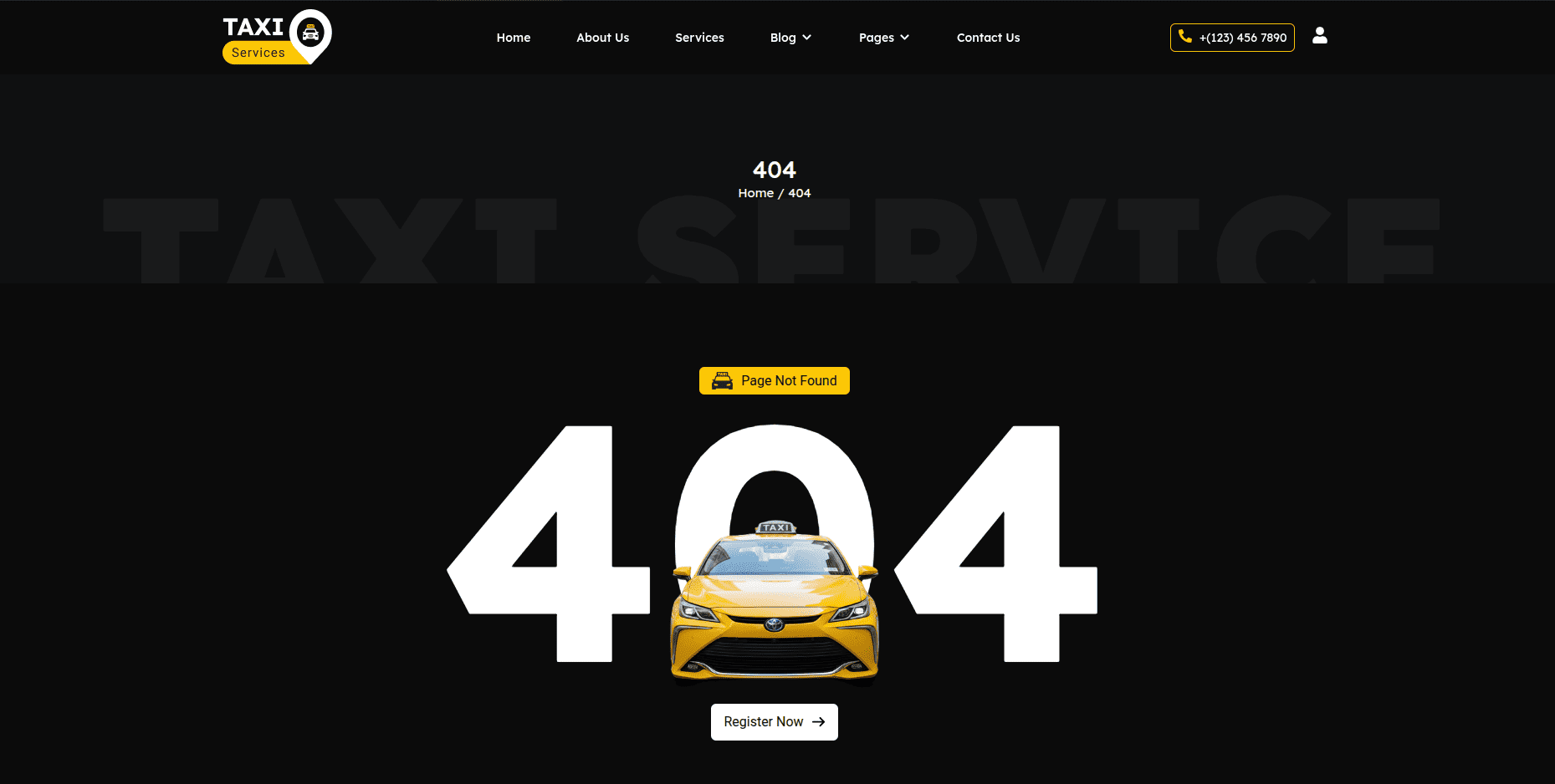
The 404 Page is displayed when a visitor tries to access a page that does not exist. You can customize the image, message text, and button easily using Elementor.
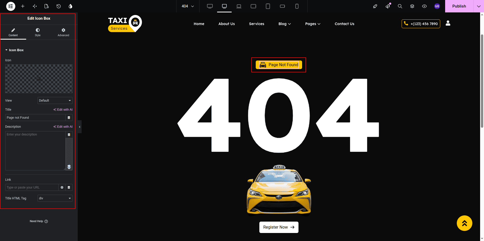
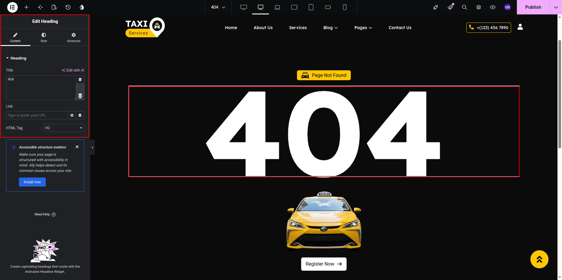
- Editing the Text:
- Click on the Heading Widget displaying text such as “404” or “Page Not Found.”
- In the left panel, under the Content tab, update the title text as per your design (for example: Oops! Page Not Found).
- To edit the description or message text below, click on the Text Editor Widget.
- Edit the paragraph to include your custom message, such as “Sorry, the page you’re looking for doesn’t exist or has been moved.”
- Use the Style tab to customize text color, typography, and alignment.
- Editing the 404 Page:
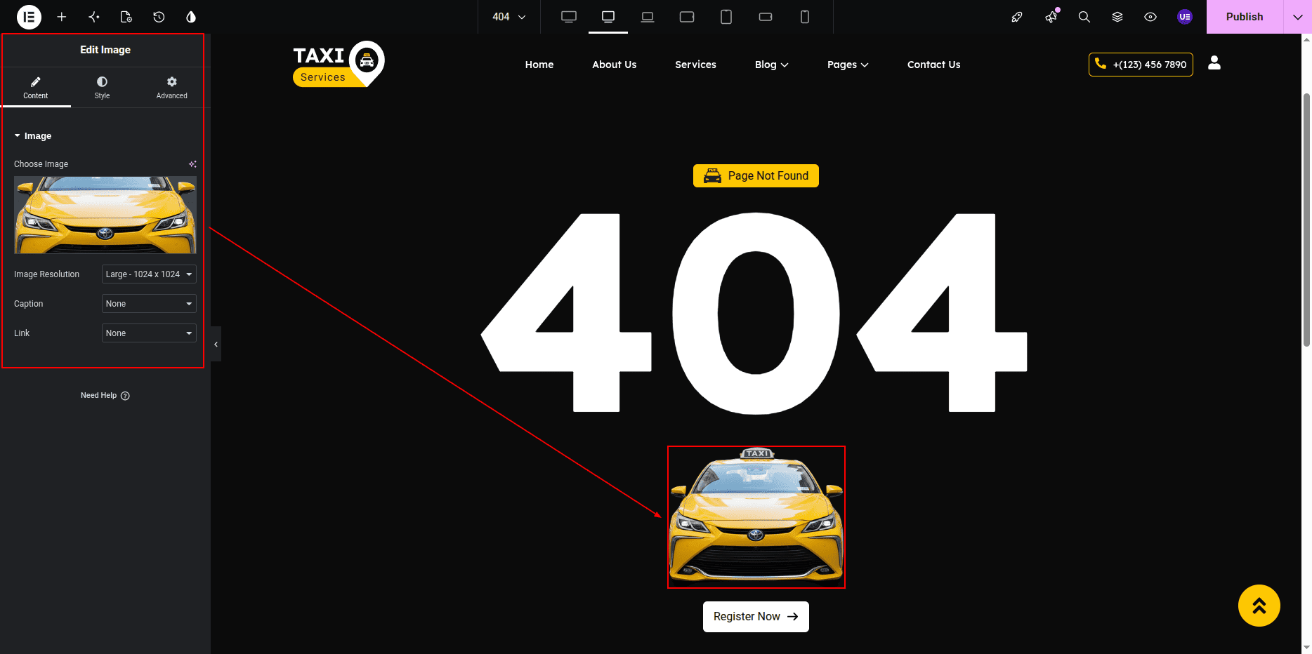
- Locate the Image Widget on the 404 page (usually showing an illustration or “Page Not Found” graphic).
- Click on the image to open the widget settings in the left panel.
- Click on the image thumbnail to open the Media Library.
- Upload a new image or select an existing one to replace the current 404 image.
- Under the Style tab, adjust the image width, alignment, and border radius if needed.
- Editing the Button:
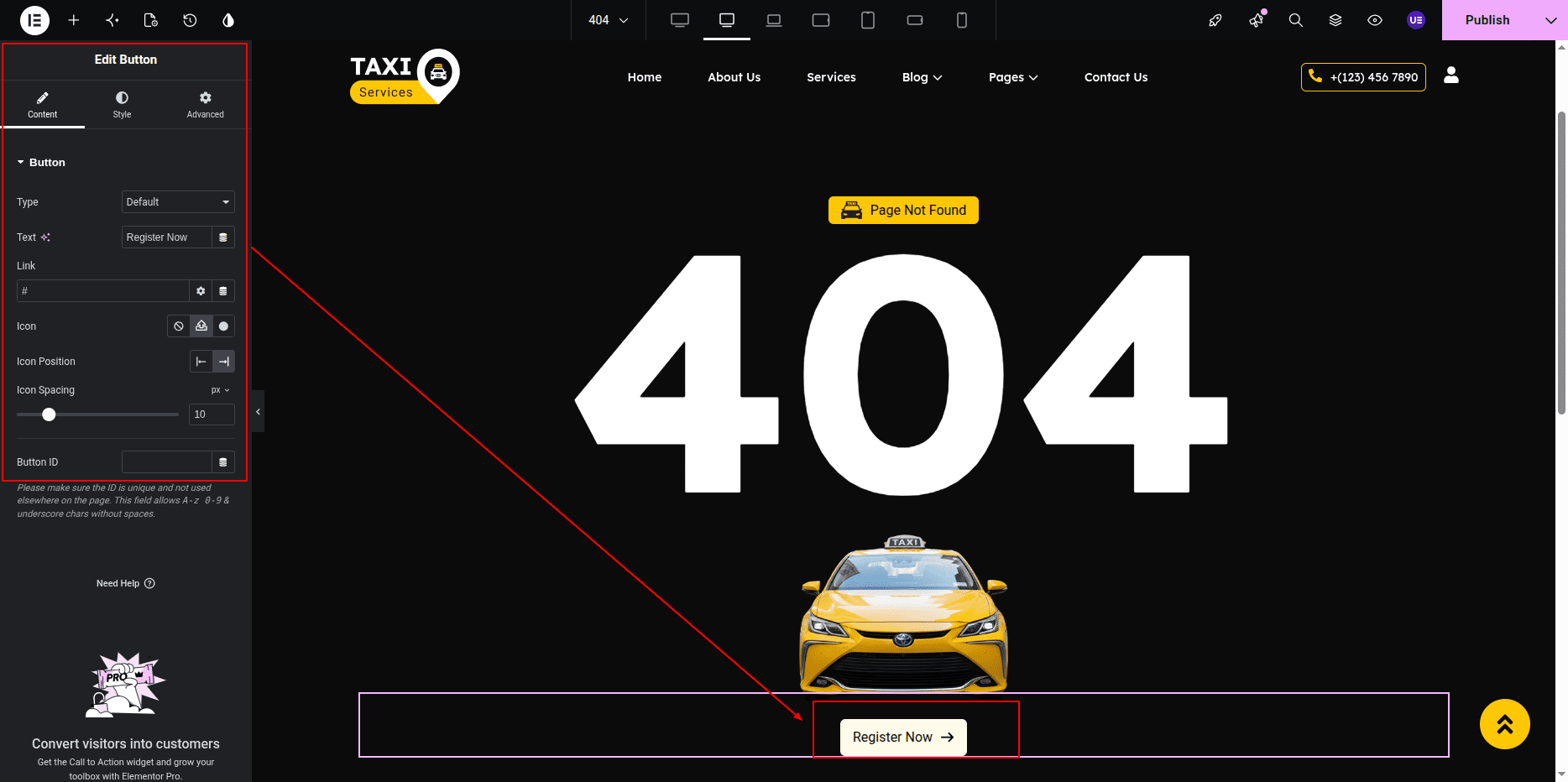
- Click on the Button Widget (commonly labeled “Back to Home” or “Return to Homepage”).
- In the Content tab, edit the Text field to change the button label.
- Set the Link field to your homepage URL (for example: /).
- Under the Style tab, you can:
- Change button text color and background color.
- Adjust typography and padding for better visibility.
- Set hover effects and border radius.
- Final Adjustments:
- Align the image, text, and button properly using section and column settings.
- Use the Advanced tab to manage spacing, margins, and responsive settings for mobile and tablet views.
- Click on the Update button to save your changes.
Note: The 404 page helps users return to your main site instead of encountering a dead end. Make sure the design is simple and includes a clear navigation button.
Contact Page
- Editing the Contact Page:
- Go to your WordPress Dashboard and navigate to Pages → Contact.
- Click on Edit with Elementor to open the page in the Elementor editor.
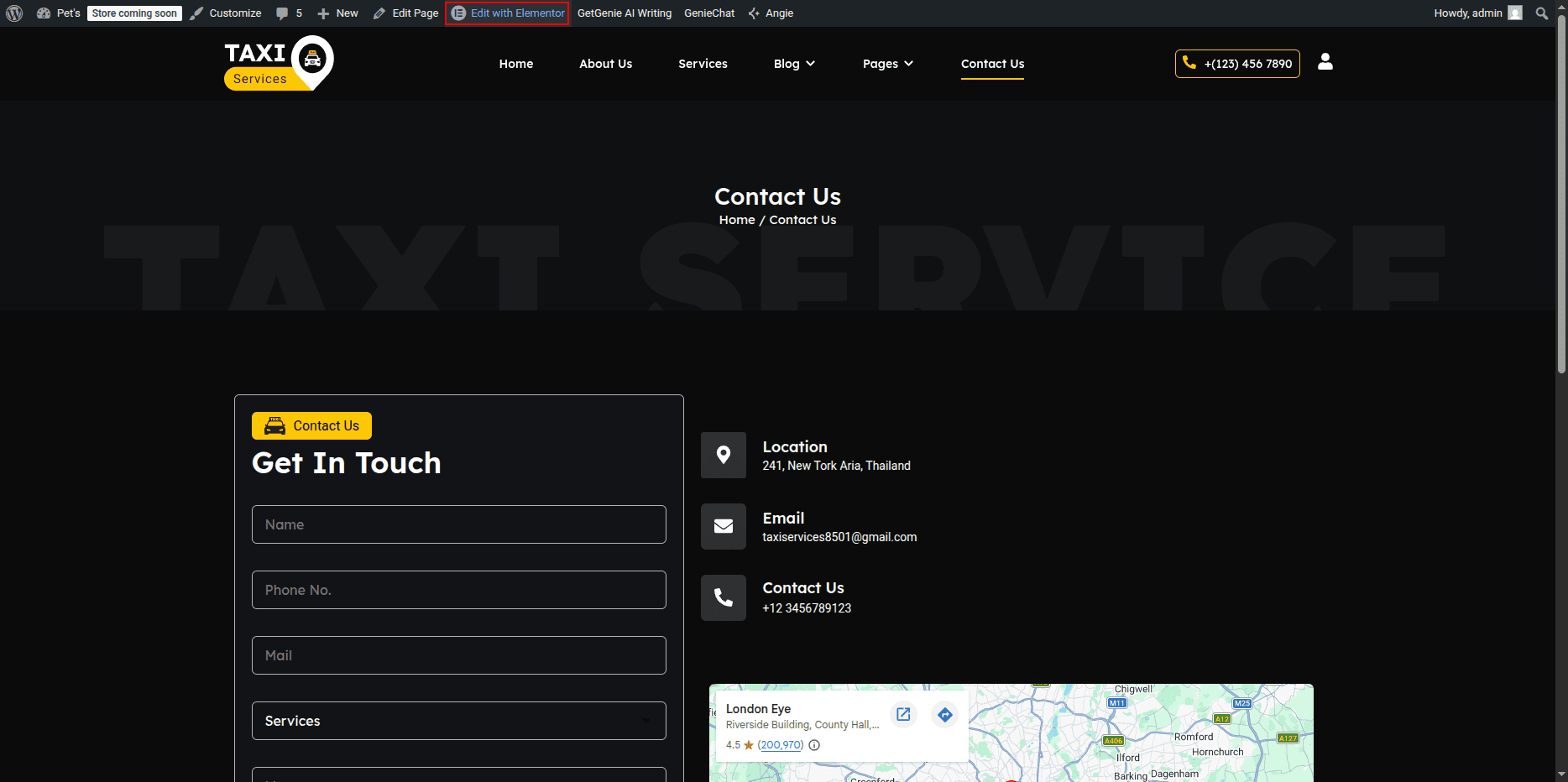
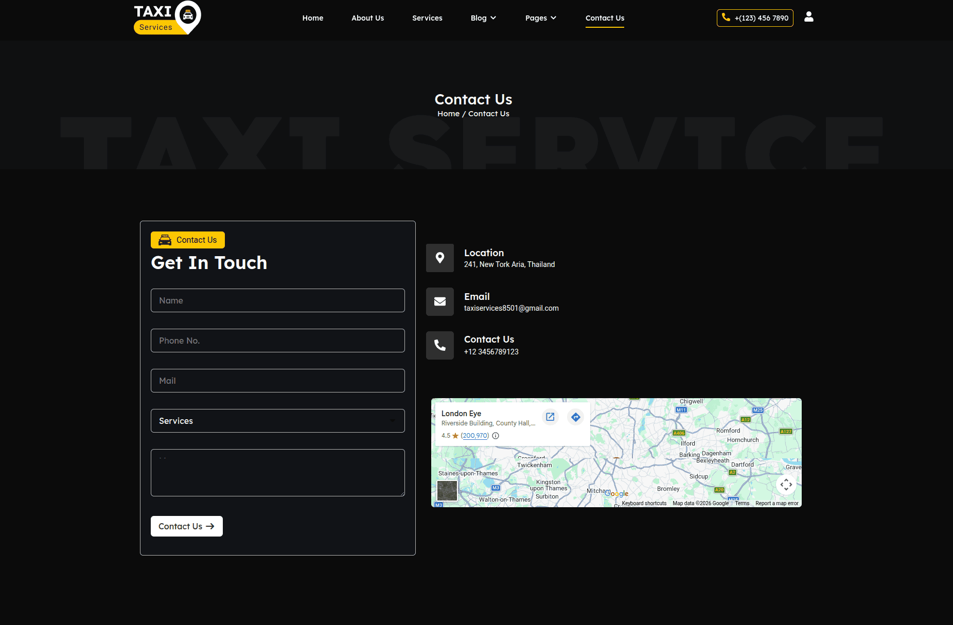
Contact Page Section
The Contact Page includes a heading, text description, contact form, icon boxes for contact details (phone, mail, and location), and a Google Map. You can easily edit all these elements using Elementor.
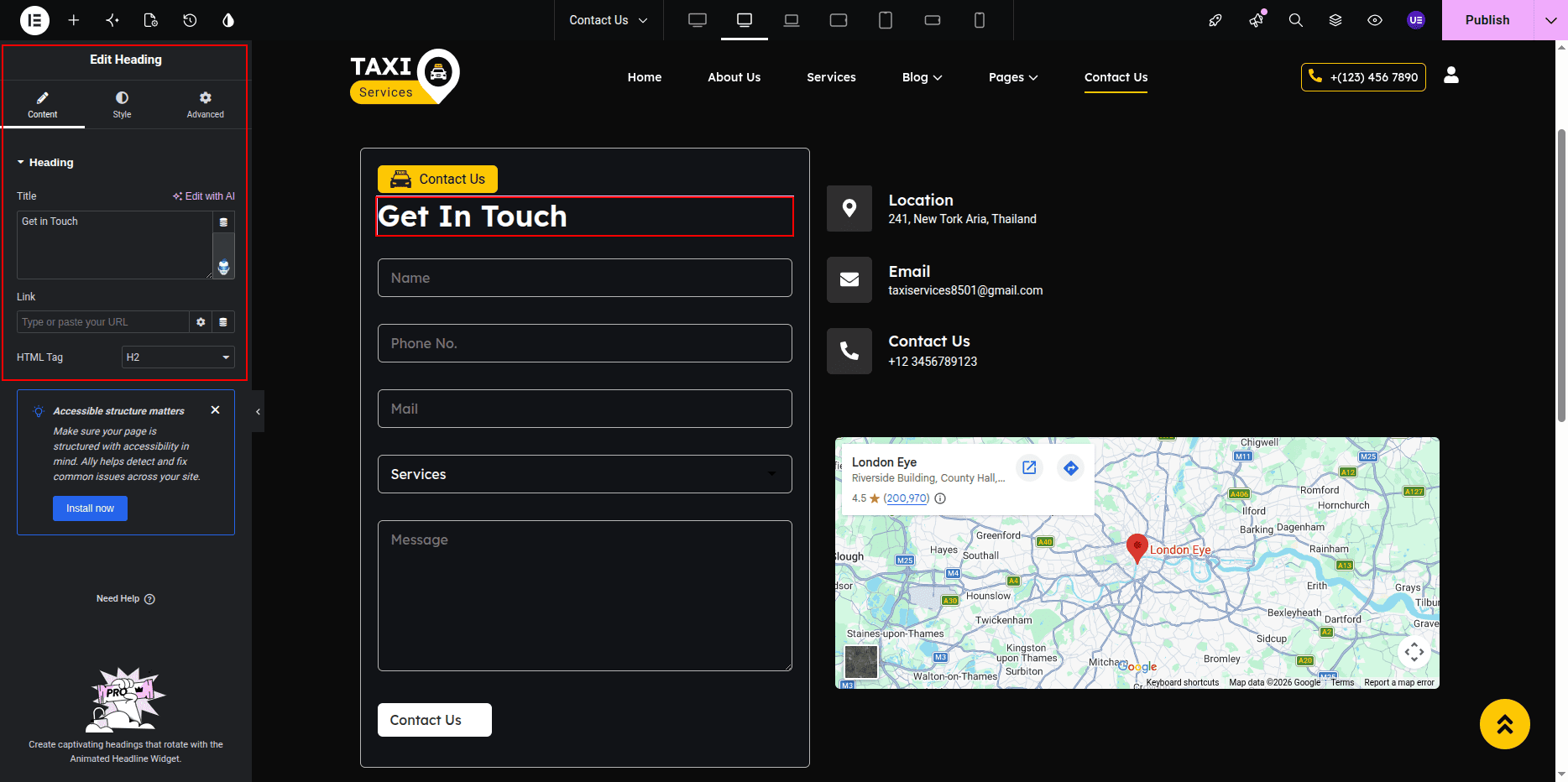
- Editing the Heading and Text:
- Click on the Heading Widget that displays the main title (for example: Get in Touch or Contact Us).
- In the left panel under the Content tab, update the title text as per your preference.
- To edit the paragraph below the heading, click on the Text Editor Widget.
- Modify the text content to include your custom message or instructions (for example: “We’d love to hear from you! Fill out the form or reach us using the details below.”).
- Use the Style tab to customize text color, typography, and alignment.
- Editing the Contact Form:
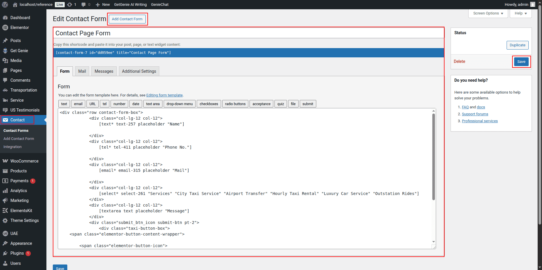
- Click on the Form Widget (usually created using the Contact Form 7 or Elementor Form widget).
- If you’re using Contact Form 7:
- Go to your WordPress Dashboard → Contact → Contact Forms.
- Edit the form fields as required (Name, Email, Message, etc.).
- Copy the form shortcode and paste it back into the Elementor Shortcode Widget if used.
- If using the Elementor Form Widget, click each field to change its label, placeholder text, and field type.
- Use the Style tab to customize input field colors, button style, and spacing.
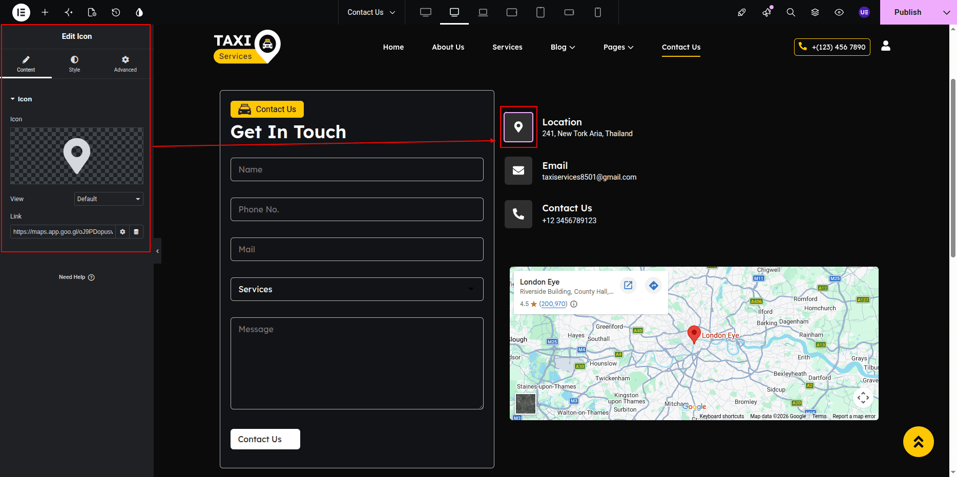
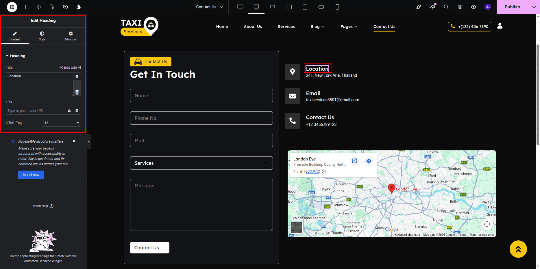
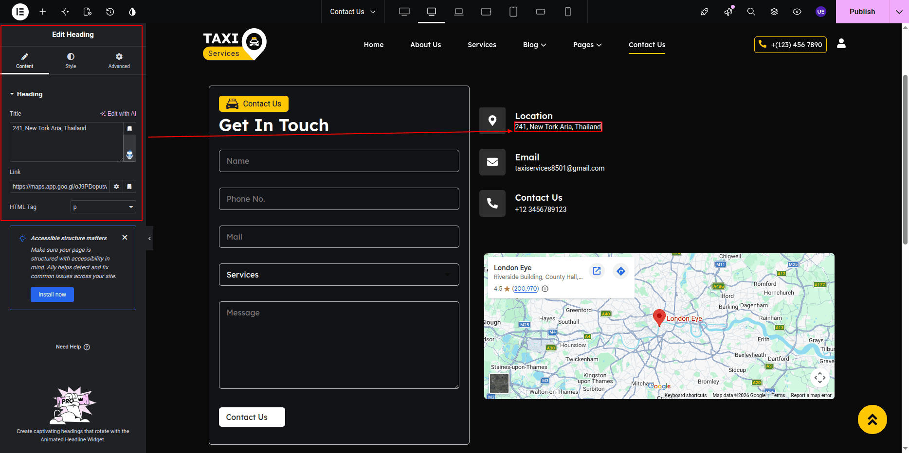
- Editing Icon Boxes (Phone, Mail, and Location):
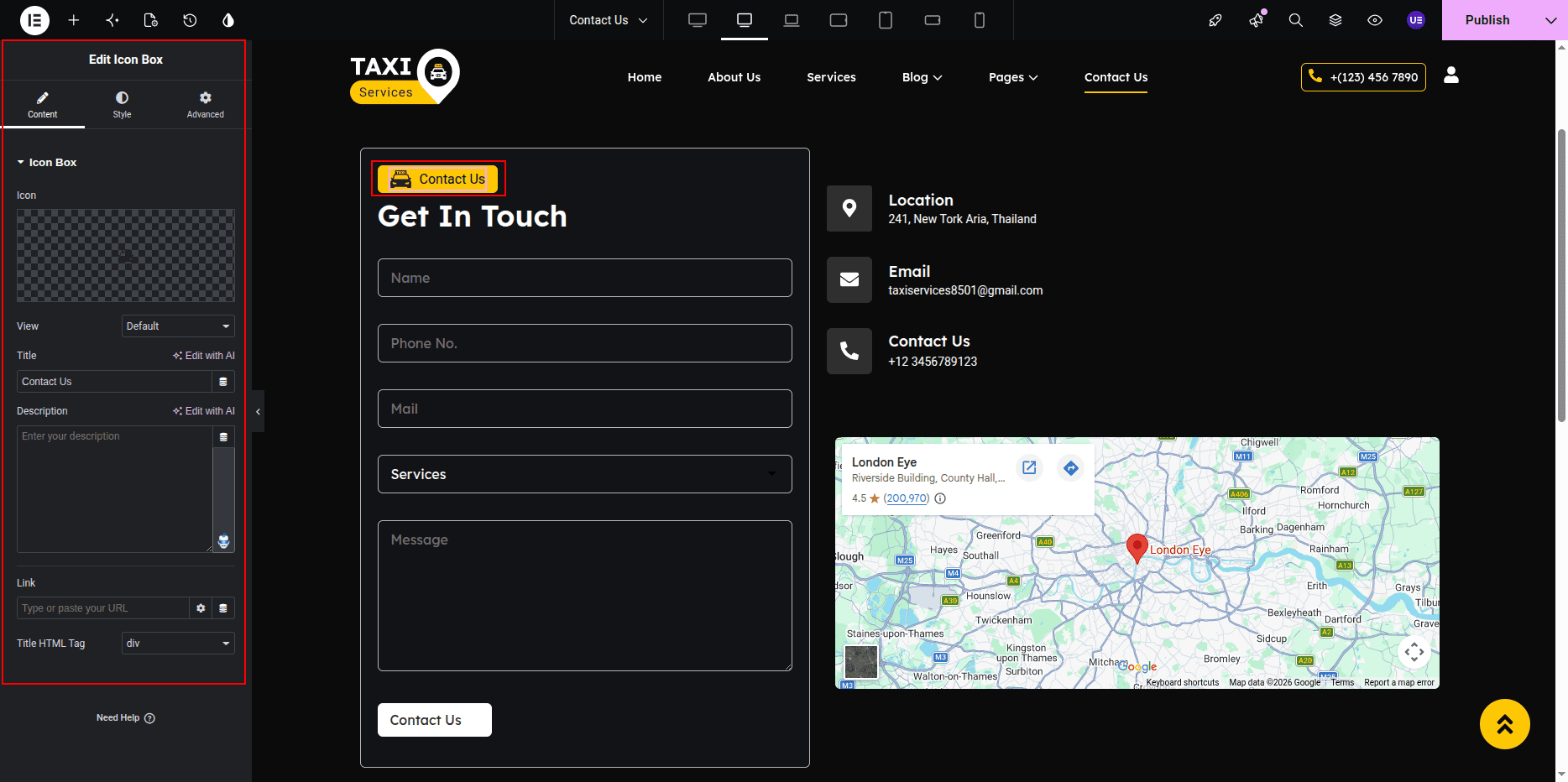
- Each contact detail (Phone, Mail, and Location) is created using the Icon Box Widget.
- Click on an Icon Box Widget to edit it.
- Under the Content tab:
- Click the Icon field and choose the appropriate icon:
- 📞 Phone → fa-phone or phone-call
- ✉️ Mail → fa-envelope
- 📍 Location → fa-map-marker-alt
- Edit the Title (for example: “Call Us,” “Email Us,” or “Visit Us”).
- Edit the Description field to add the respective details (like phone number, email address, or location address).
- Under the Style tab:
- Change icon color, size, and spacing.
- Adjust typography for title and description text.
- Add hover effects or background color if needed.
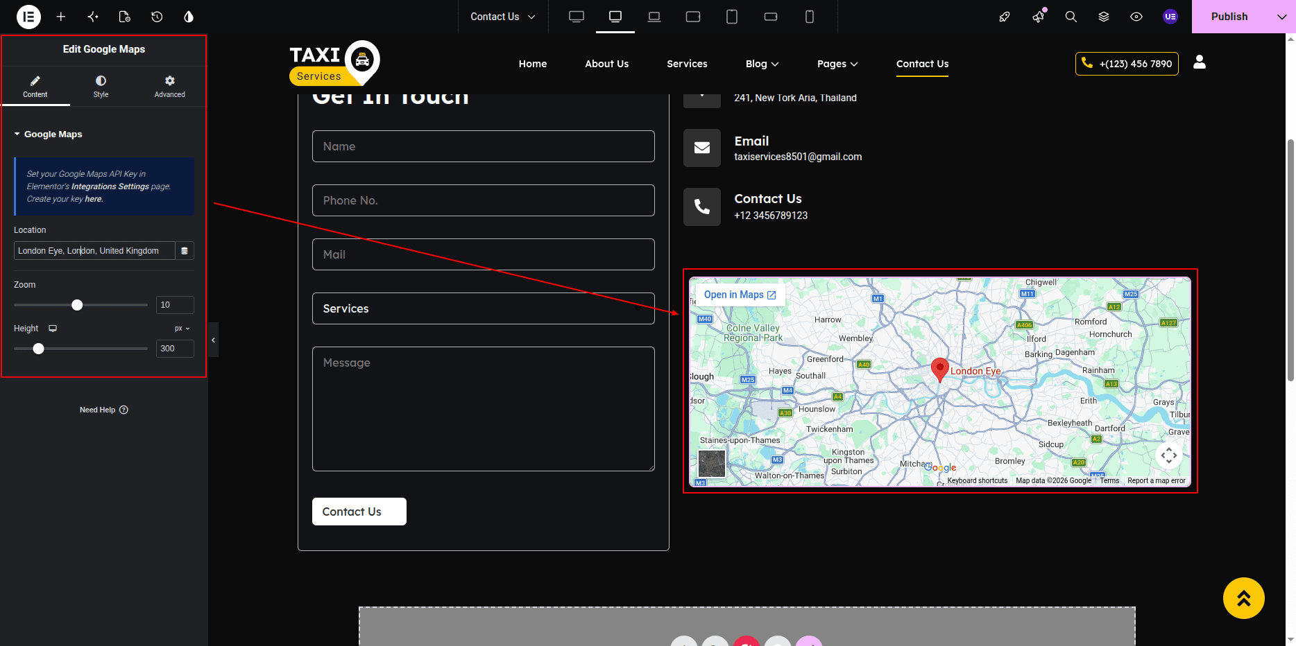
- Editing the Google Map:
- Scroll to the bottom section of the Contact Page where the Google Map Widget is placed.
- Click on the map to open the widget settings.
- Under the Content tab:
- Enter your desired address or location in the Location field.
- You can also paste the Google Map embed link if required.
- Adjust the Zoom Level to control how close or far the map appears.
- Under the Style tab, you can adjust the map height and border radius for better design alignment.
- Final Adjustments:
- Align all widgets (Heading, Form, Icon Boxes, and Map) properly within columns and sections.
- Use the Advanced tab to control spacing, padding, and responsive layout for mobile and tablet views.
- Click on the Update button to save all changes.
Note: Ensure all contact details are accurate and up to date. The Google Map should display your exact business location for better user accessibility.
Gallery Page
- Editing the Gallery Page:
- Go to your WordPress Dashboard and navigate to Pages → Gallery.
- Click on Edit with Elementor to open the page in the Elementor editor.
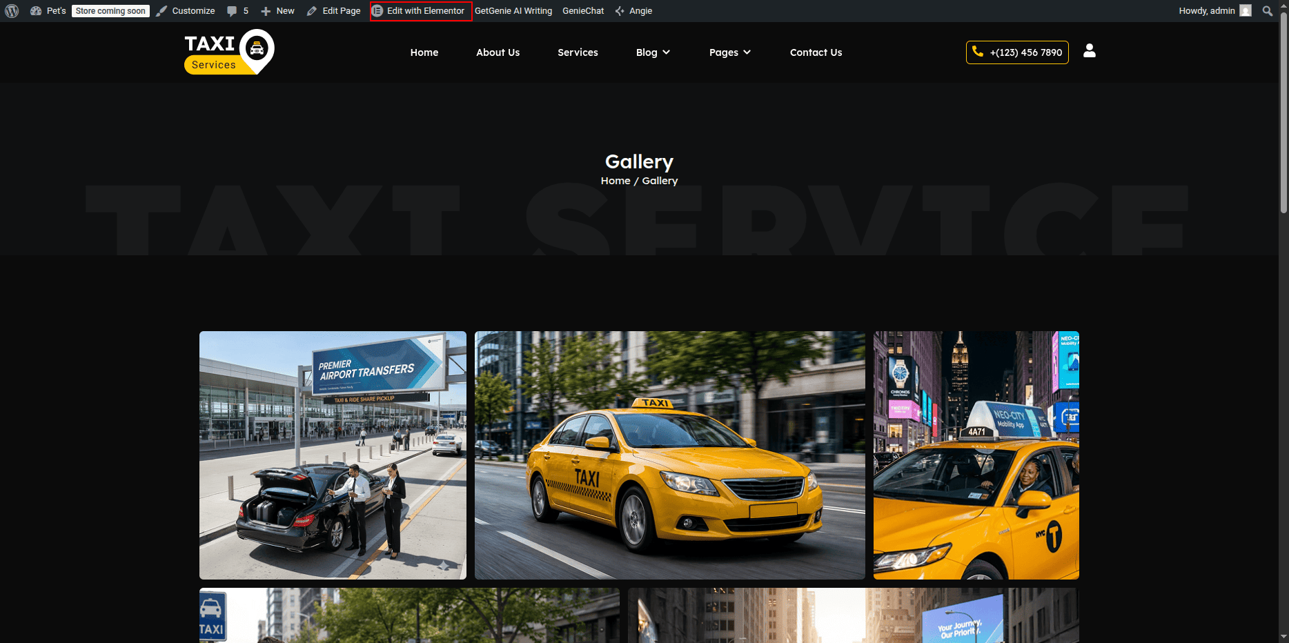
Gallery Page Section
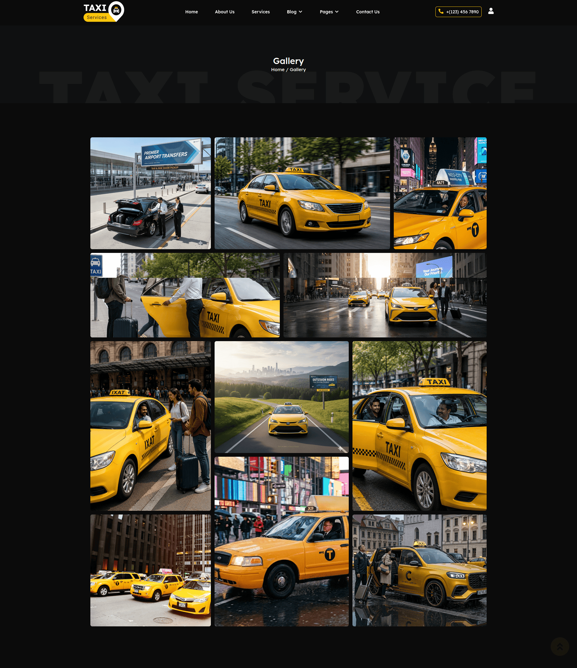
The Gallery Page displays a collection of images in an attractive gallery layout.
This section includes a page heading, description text, gallery image grid, and gallery items.
All content can be easily managed using Elementor widgets.
- Editing the Heading and Description:
- Click on the Heading Widget to edit the main gallery title.
- Modify the heading text from the Content tab in Elementor.
- To edit the description below the heading, click on the Text Editor Widget.
- Update the text content according to your requirements.
- Use the Style tab to customize typography, colors, and alignment.
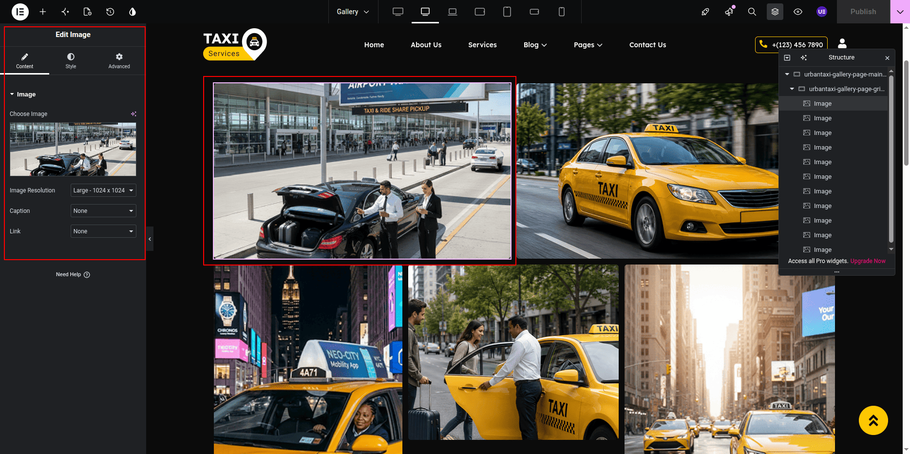
- Editing Gallery Images:
- Click on the Gallery Widget in Elementor.
- In the Content tab, click on the gallery images section.
- Add new images by clicking the Add Images button.
- Remove existing images by selecting and deleting them from the gallery.
- Reorder images using drag-and-drop functionality.
- You can also edit image captions, titles, and links if required.
- Customizing Gallery Layout:
- Use the widget settings to control the number of columns and image spacing.
- Adjust image size, hover effects, and border radius from the Style tab.
- Configure lightbox settings to allow visitors to view larger image previews.
- Customize gallery appearance to match your website design.
Shop Page
The Shop Page is a custom page created using Elementor and standard WordPress pages.
This page is not connected to WooCommerce products and is fully managed through the Page Editor and Elementor Editor.
The page can be used to showcase products, merchandise, promotional items, or any custom shop-related content.
Editing the Shop Page
To edit the Shop Page:
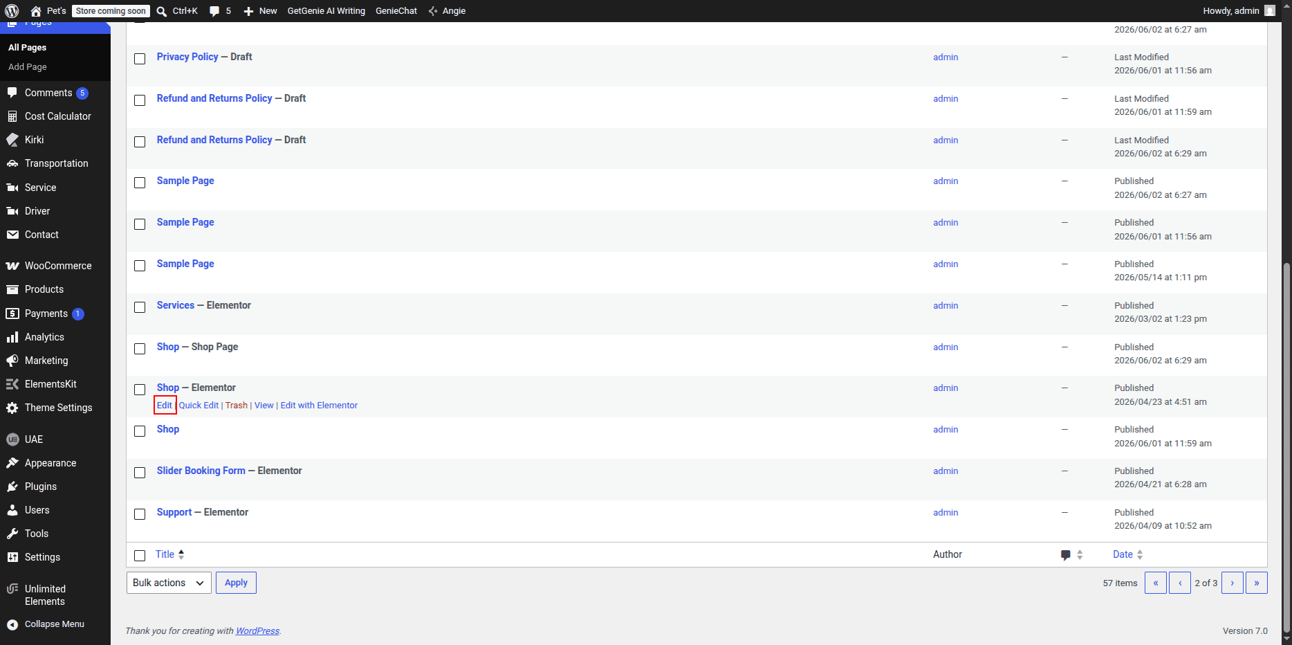
- Go to Dashboard → Pages → Shop Page.
- Click Edit with Elementor.
- Modify page sections, content, images, buttons, and layouts as required.
- Update and publish the page after making changes.
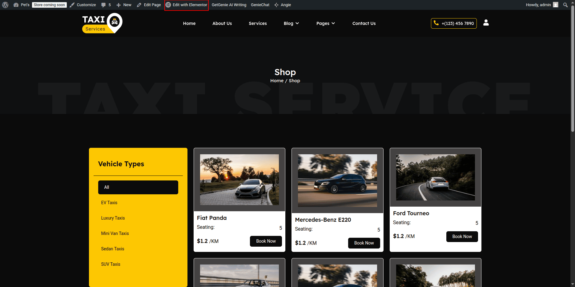
Managing Page Content
All content displayed on the Shop Page can be edited directly through Elementor.
Users can update headings, text content, images, buttons, and other design elements without affecting any WooCommerce functionality.
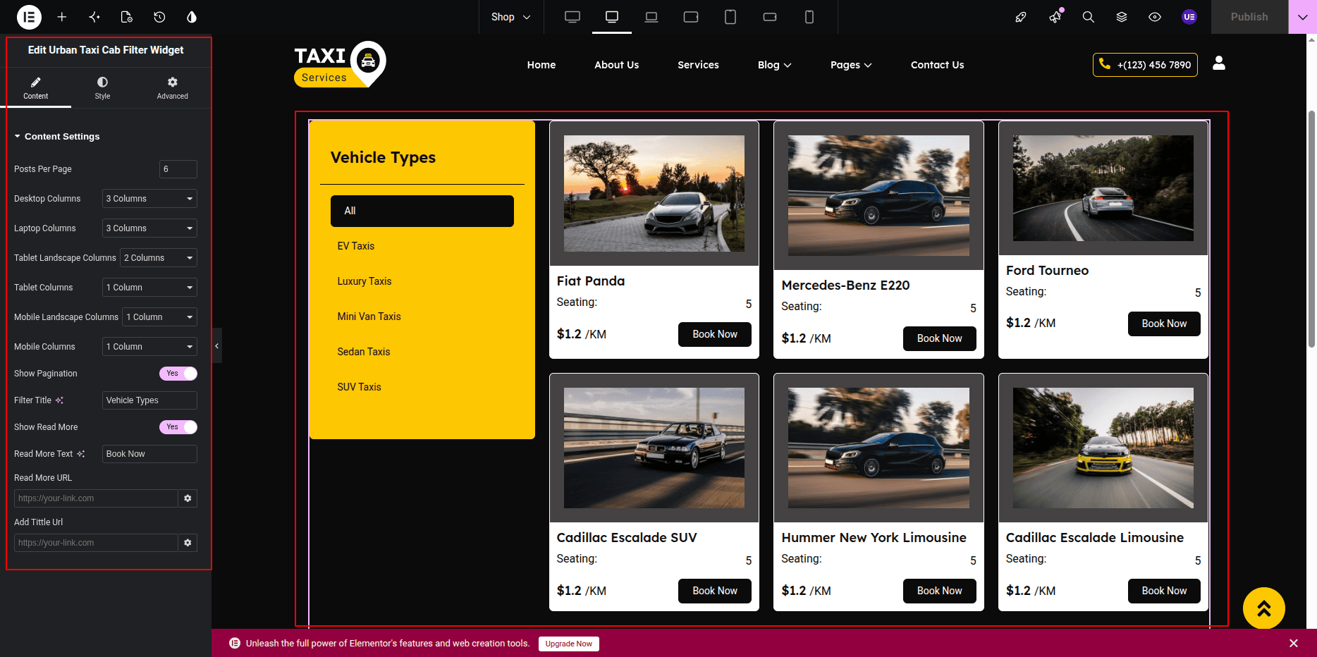
Page Elements
- Section Title: Displays a small introductory title.
- Main Heading: Displays the primary page heading.
- Description: Provides information about products or services.
- Product/Service Images: Displays featured images and promotional visuals.
- Buttons: Call-to-action buttons with customizable text and links.
- Content Sections: Custom content blocks created using Elementor widgets.
Customization Options
- Edit all headings and text content.
- Replace or upload new images.
- Update button text and destination URLs.
- Modify section layouts and spacing.
- Add new Elementor widgets and content blocks.
- Change background colors, typography, and styling.
- Reorder sections according to requirements.
Frontend Preview
The Shop Page displays all customized content exactly as designed in Elementor.
Any changes made in the editor are reflected immediately on the frontend after updating the page.
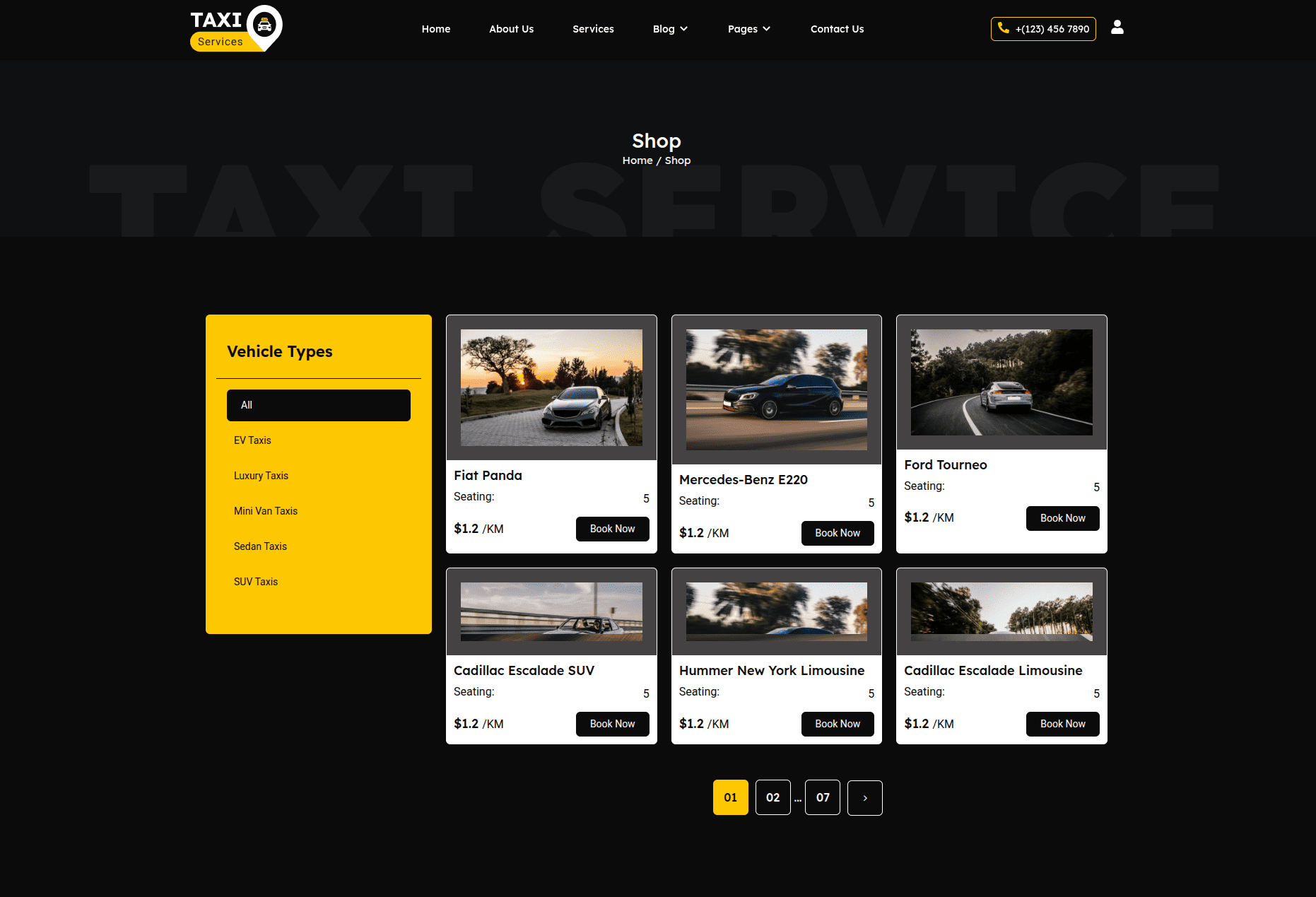
This custom Shop Page provides complete flexibility for displaying products, services, promotions, and business information without requiring WooCommerce integration.
Single Driver Post Page
The Single Driver Post Page displays detailed information about an individual driver.
Each driver profile is created as a separate post and contains personal information, social media links, contact details, skills, experience indicators, and other profile-related content.
All content can be managed directly from the WordPress dashboard.
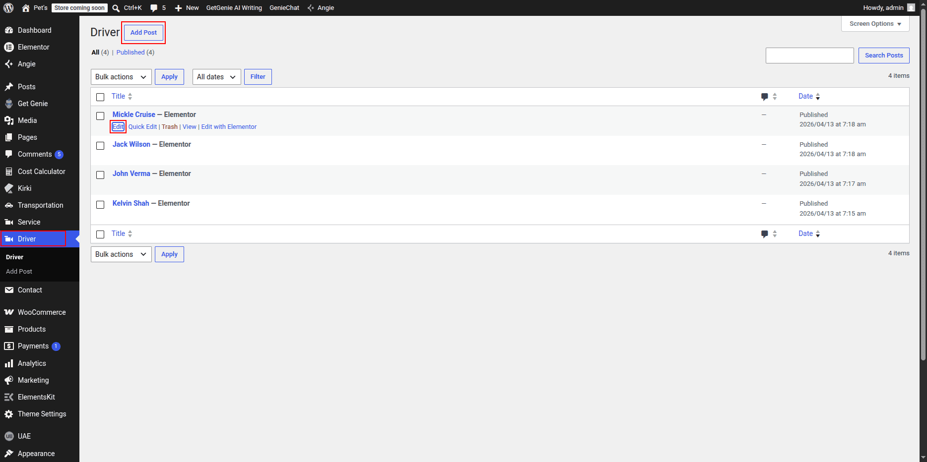
Editing a Driver Profile
To edit an existing Driver Post:
- Go to Dashboard → Drivers.
- Select the driver profile you want to edit.
- Update the driver's information, images, contact details, and other content.
- Click Update to save the changes.
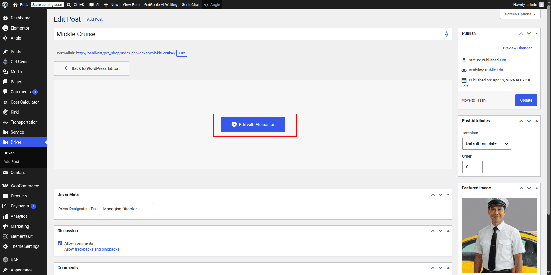
Driver Post Editor
The Driver Post Editor allows administrators to manage all profile information displayed on the frontend.
Custom fields and content areas can be updated according to project requirements.
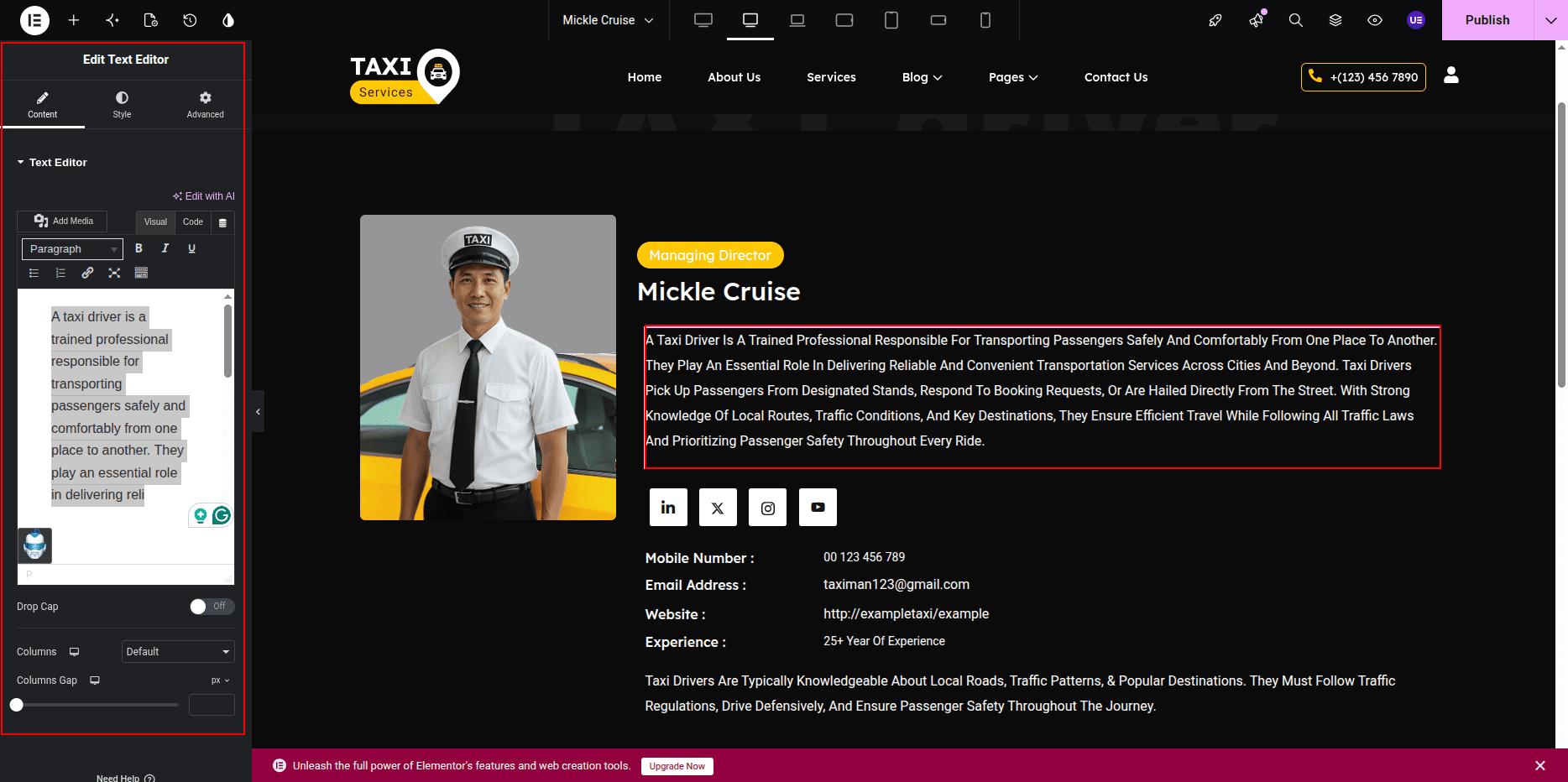
Profile Content
- Driver Name: Displays the driver's full name.
- Designation: Displays the driver's role or position.
- Description: Provides detailed information about the driver.
- Profile Image: Displays the driver's featured image.
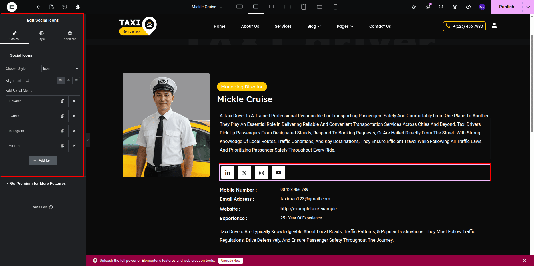
Social Media Icons
The profile includes social media links that allow visitors to connect with the driver on various platforms.
These icons and links can be updated from the driver post editor.
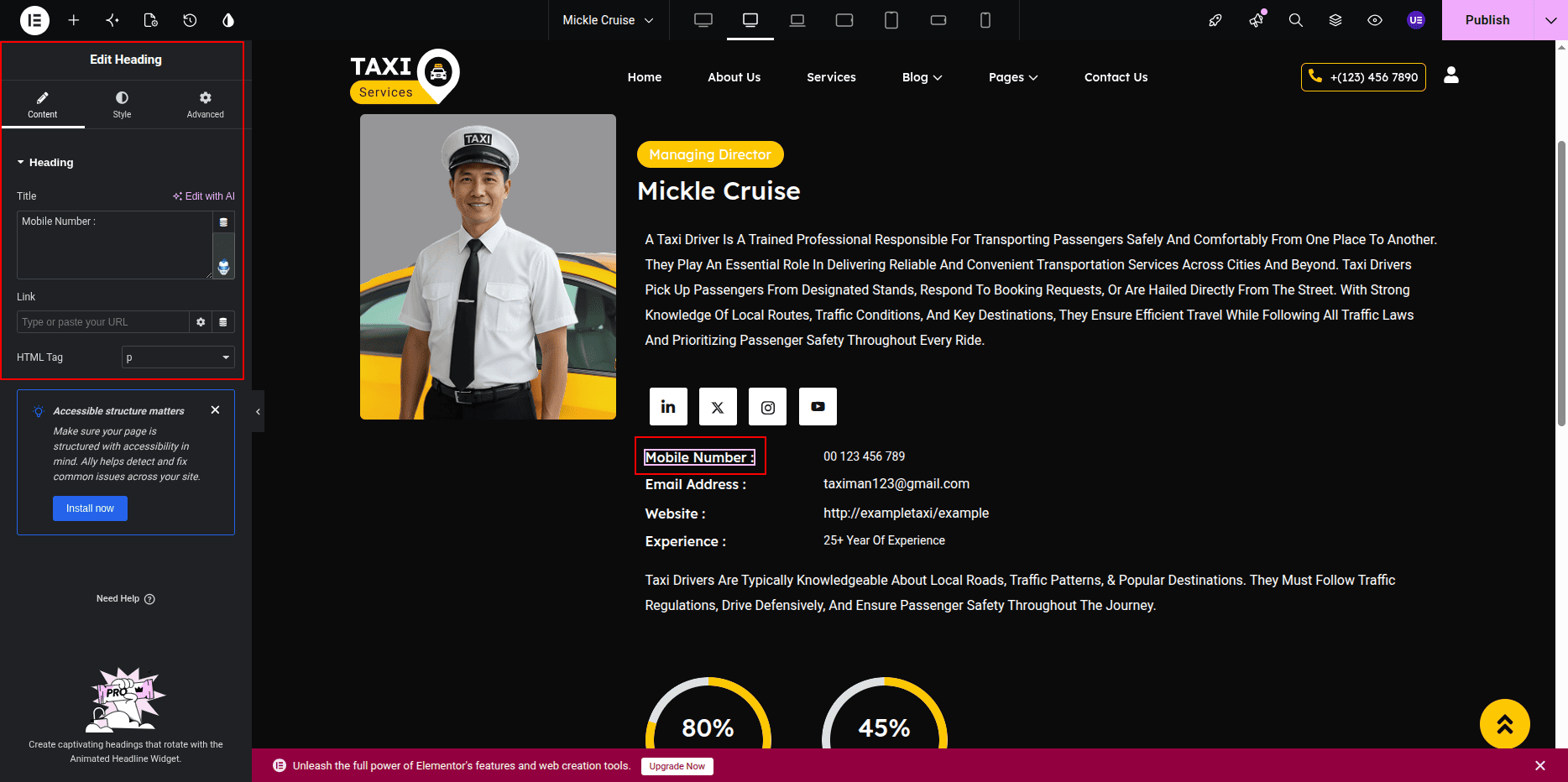
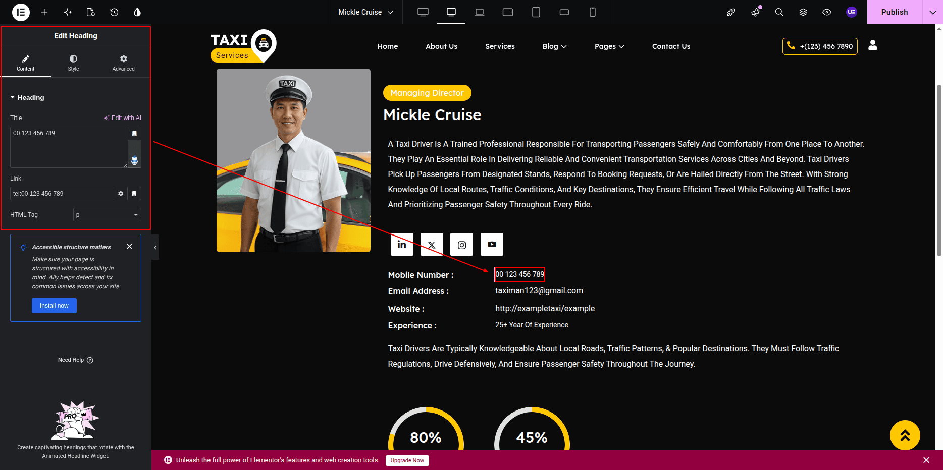
Contact Information
The contact section displays driver-related contact information.
Administrators can update the section title and contact details from the post editor.
- Contact Section Title
- Phone Number
- Email Address (if available)
Skills & Progress Bars
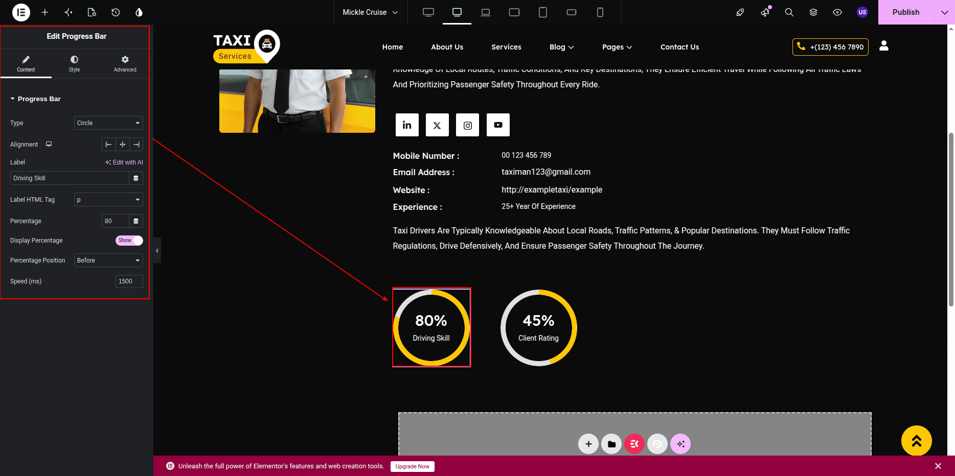
The driver profile may include skill indicators displayed through animated progress bars.
These values can be customized to represent driving experience, customer satisfaction, safety ratings, or other performance metrics.
Customization Options
- Edit driver name and designation.
- Update profile description and biography.
- Change featured image.
- Add or modify social media links.
- Update contact section title.
- Modify phone number and contact information.
- Edit skill titles and progress percentages.
- Add or remove profile content as needed.
Frontend Preview
The Single Driver Post Page displays the complete driver profile with all associated information, social links, contact details, and skill indicators.
Any changes made in the Driver Post Editor are reflected automatically on the frontend after updating the post.
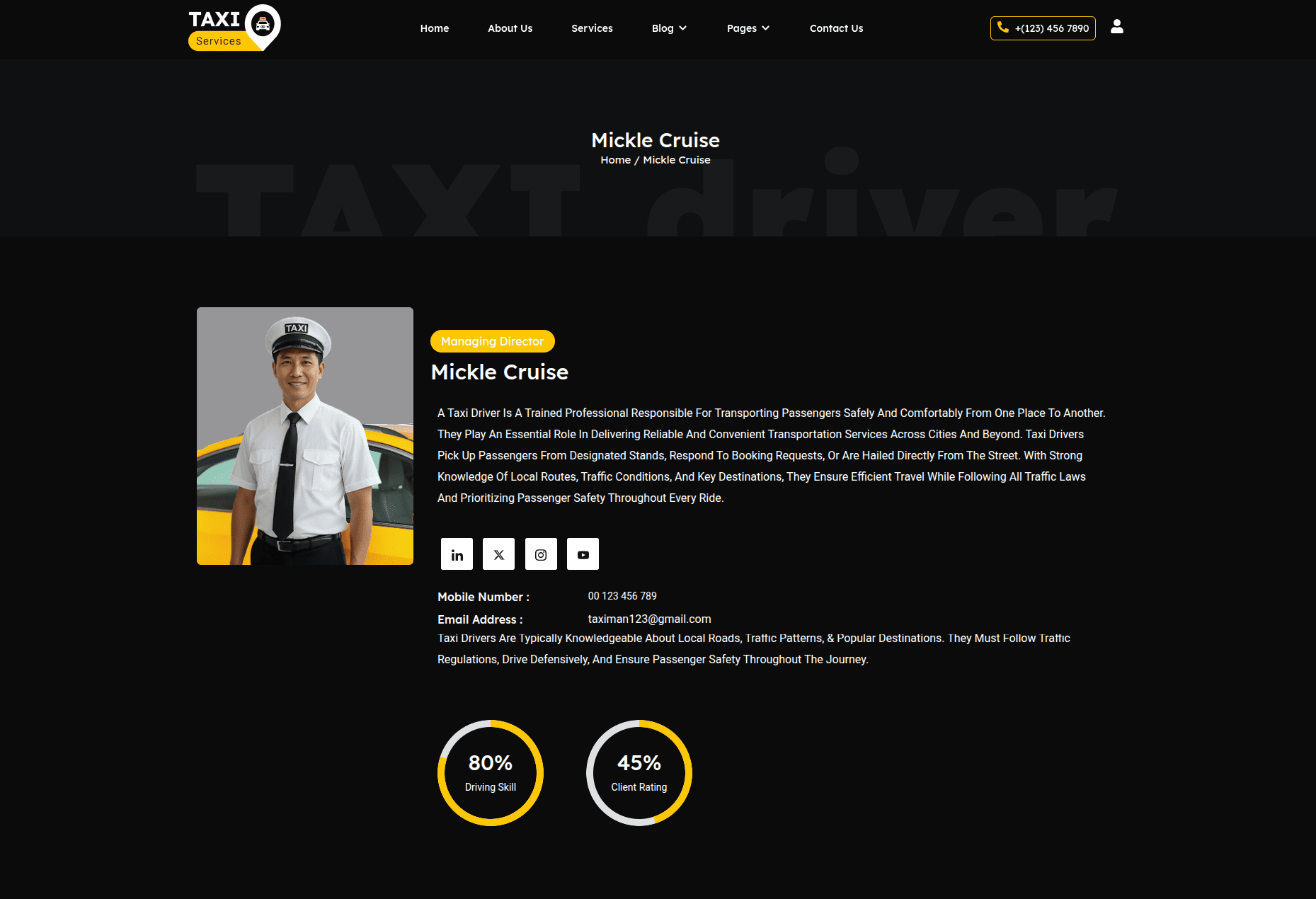
This page provides visitors with detailed information about individual drivers, helping build trust and allowing users to learn more about the driver's experience, skills, and contact information.
Driver Registration Page
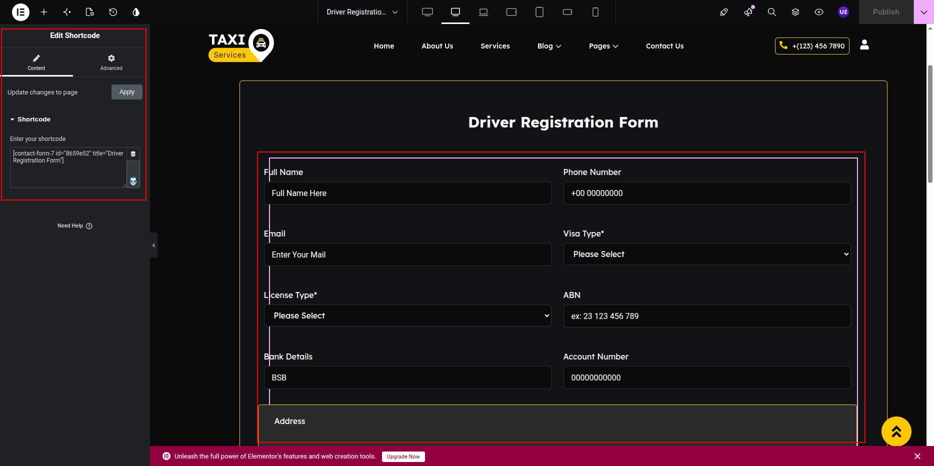
The Driver Registration Page allows potential drivers to submit their registration details through a Contact Form 7 (CF7) form.
This page includes a section title, heading, registration form, supporting content, and images.
The registration form is created and managed using the Contact Form 7 plugin and is displayed on the page through Elementor.
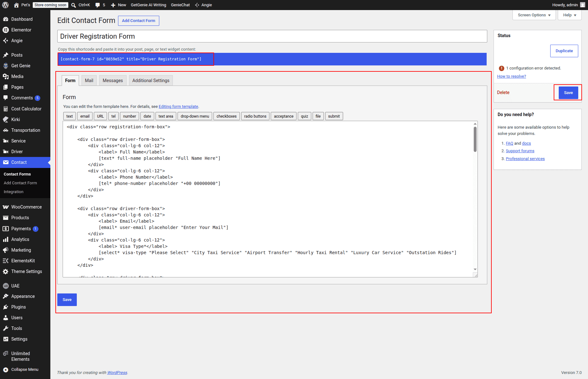
Creating the Registration Form
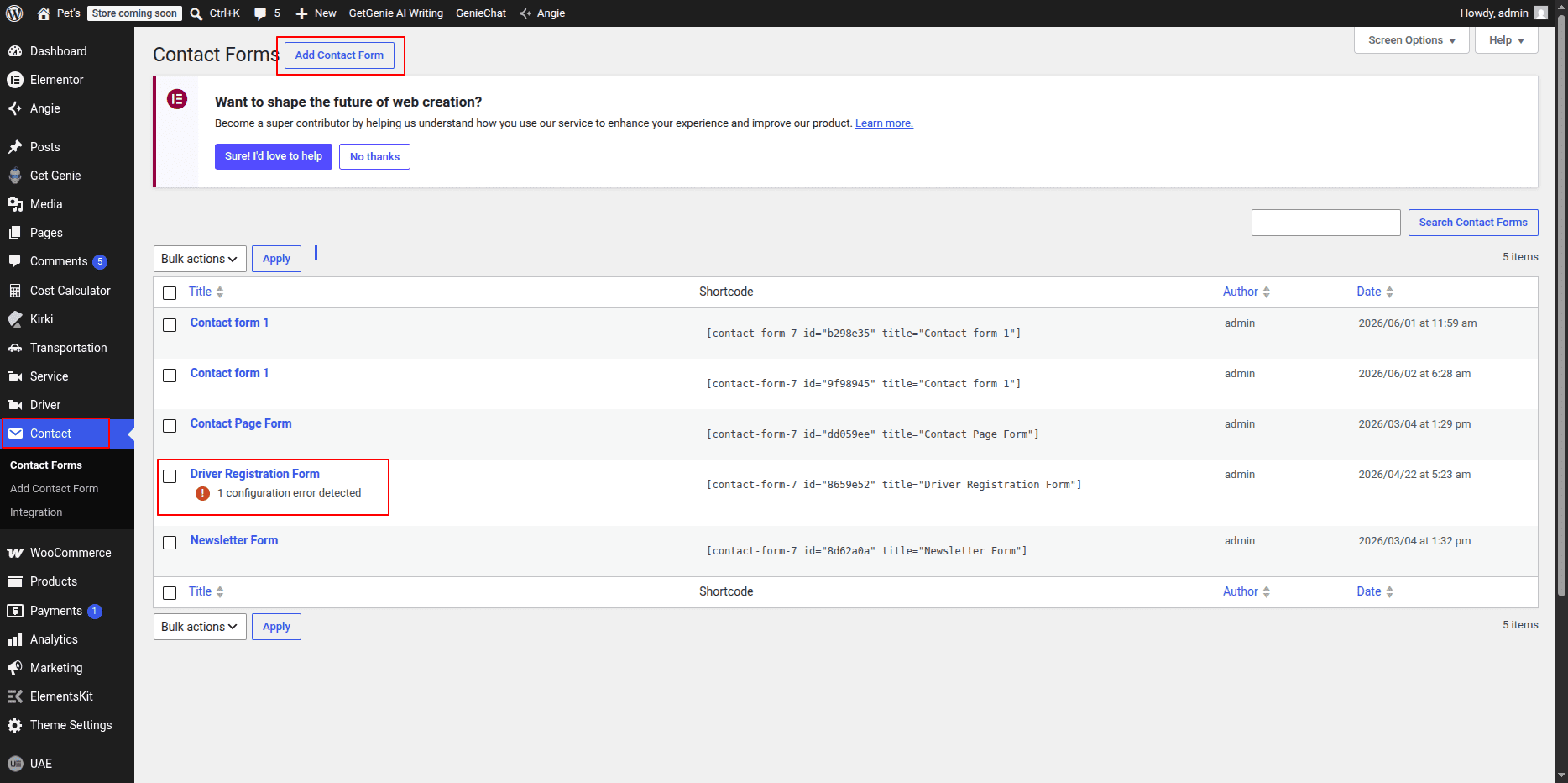
To create or manage the Driver Registration Form:
- Go to Dashboard → Contact → Add New.
- Create a new registration form or edit an existing form.
- Add required form fields such as Name, Email, Phone Number, Driving Experience, License Number, Vehicle Details, and Message.
- Configure email notifications and form settings.
- Save the form and copy the generated shortcode.
Adding the Form in Elementor
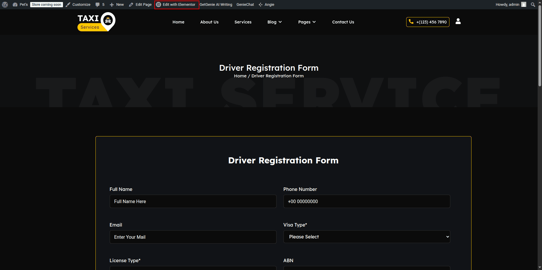
After creating the Contact Form 7 form, it can be displayed on the Driver Registration Page using Elementor.
- Go to Pages → Driver Registration → Edit with Elementor.
- Drag and drop the Contact Form 7 Widget into the desired section.
- Select the created Driver Registration Form from the dropdown list.
- Update and publish the page.
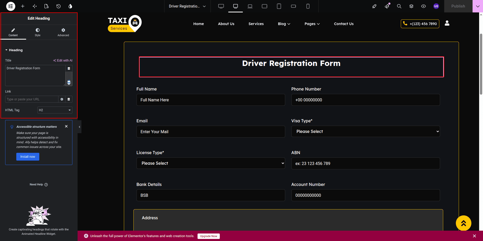
Page Elements
- Section Title: Displays a small introductory title.
- Main Heading: Displays the primary page heading.
- Registration Form: Allows drivers to submit their registration details.
- Supporting Content: Displays additional information about driver registration.
- Images: Displays registration-related images and illustrations.
Form Fields
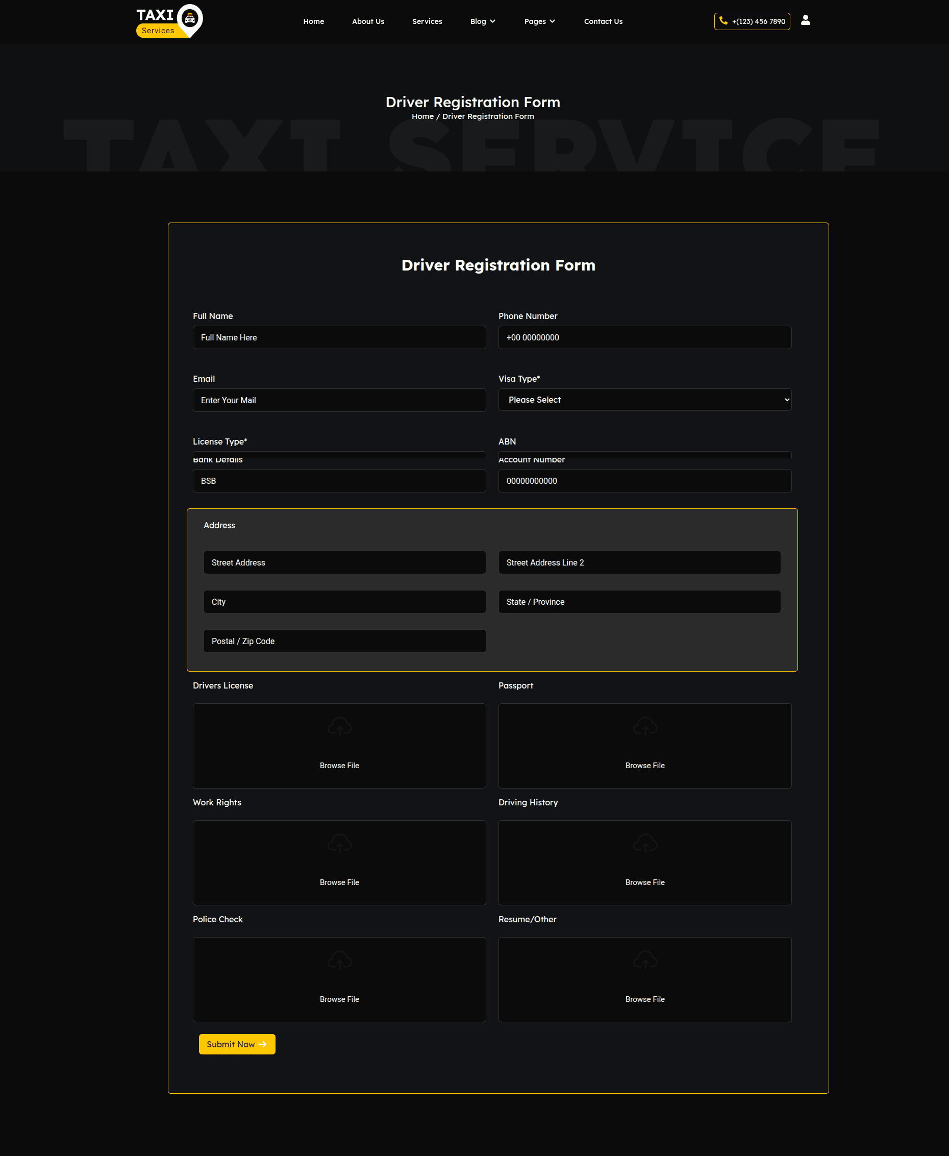
The registration form can contain the following fields depending on project requirements:
- Full Name
- Email Address
- Phone Number
- Driving Experience
- License Number
- Vehicle Information
- Address
- Additional Message
- Submit Button
Customization Options
- Create new forms using Contact Form 7.
- Edit existing form fields and labels.
- Modify email notification settings.
- Update the page heading and content using Elementor.
- Replace registration page images.
- Customize form styling from Elementor and theme settings.
- Add, remove, or reorder form fields as needed.
Frontend Preview
The completed Driver Registration Page displays the registration form along with supporting content and images, providing an easy way for drivers to submit their information.
This page streamlines the driver onboarding process by allowing applicants to quickly register and submit their details through a user-friendly Contact Form 7 registration form.
My Account Page
The My Account Page is created using the WooCommerce shortcode.
This page allows users to login, register, view orders,
and manage account details.
The page content is added using WooCommerce shortcode.
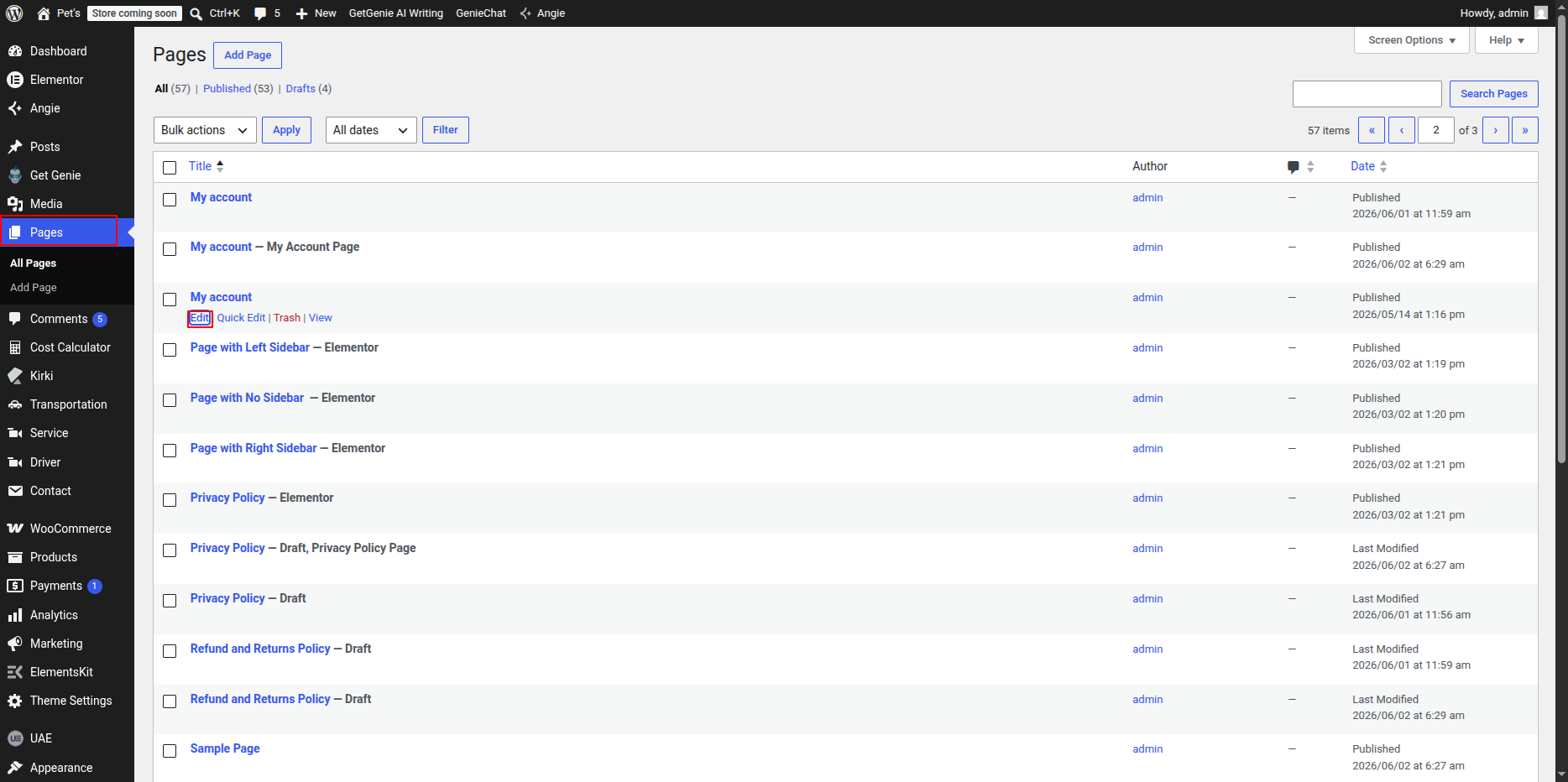
Editing My Account Page
- Go to Dashboard → Pages.
- Click My Account.
- Click Edit.
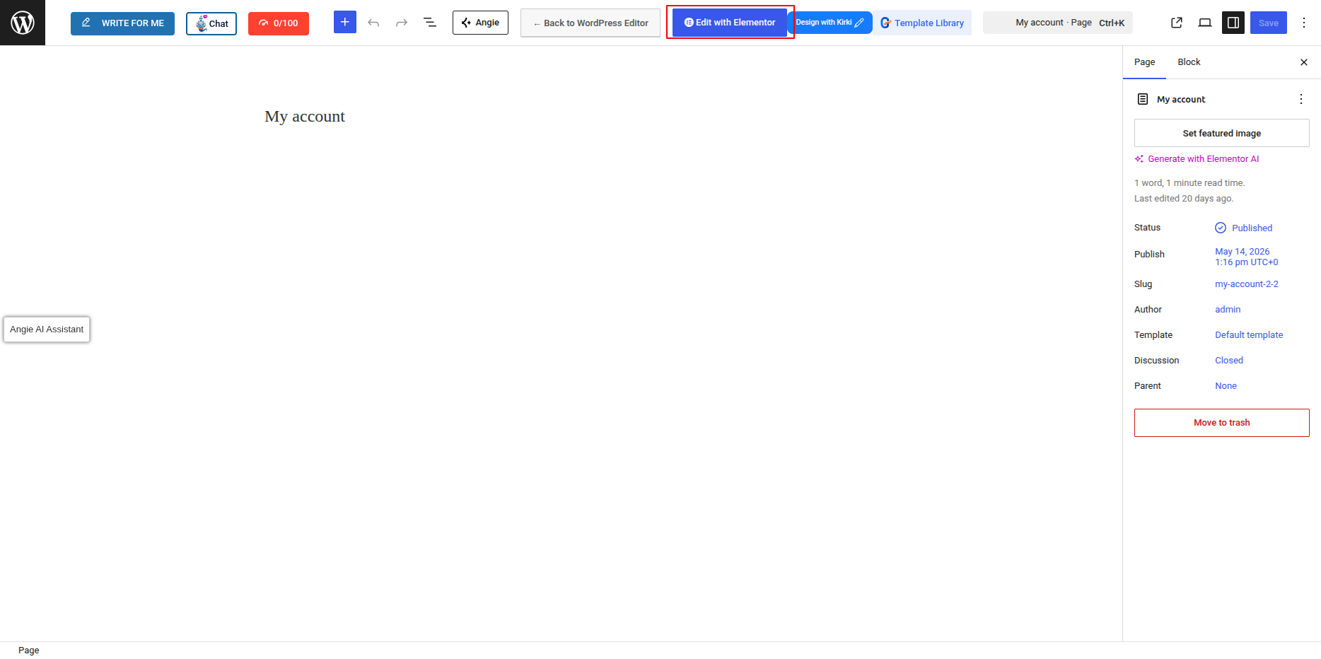
Adding WooCommerce Shortcode
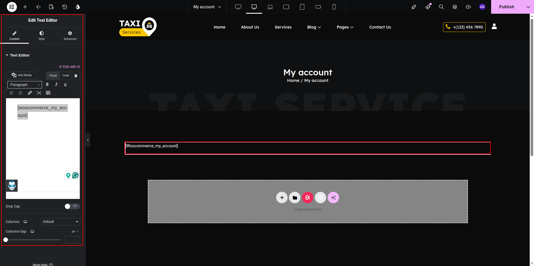
- Select the Text Editor / Shortcode Widget.
- Add the following shortcode:
[woocommerce_my_account]
- Click Update.
Important Notes
- WooCommerce plugin must be installed.
- Default WooCommerce pages should not be deleted.
- Make sure My Account page is selected in WooCommerce settings.
Setting My Account Page in WooCommerce
- Go to Dashboard → WooCommerce → Settings.
- Open Advanced Tab.
- Select My Account Page.
- Click Save Changes.
Responsive Settings
- Check Tablet view.
- Check Mobile view.
- Make sure form layout looks correct.
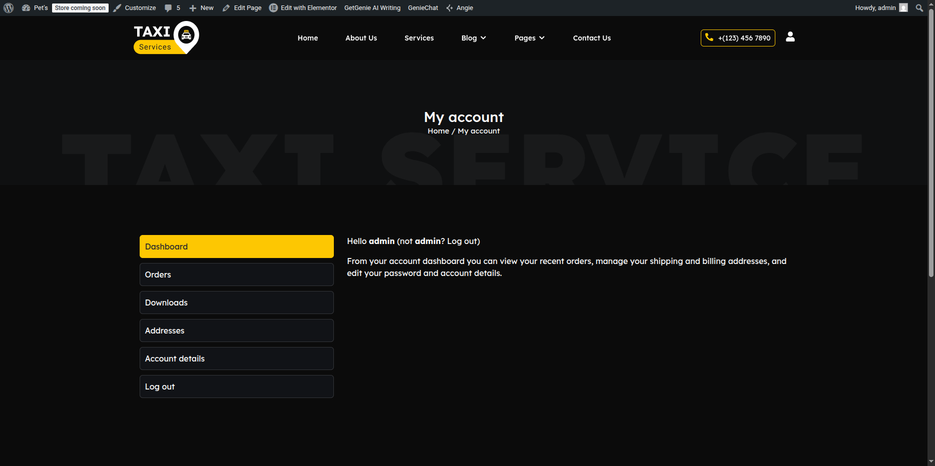
This is the final view of your page:
Privacy Policy Page
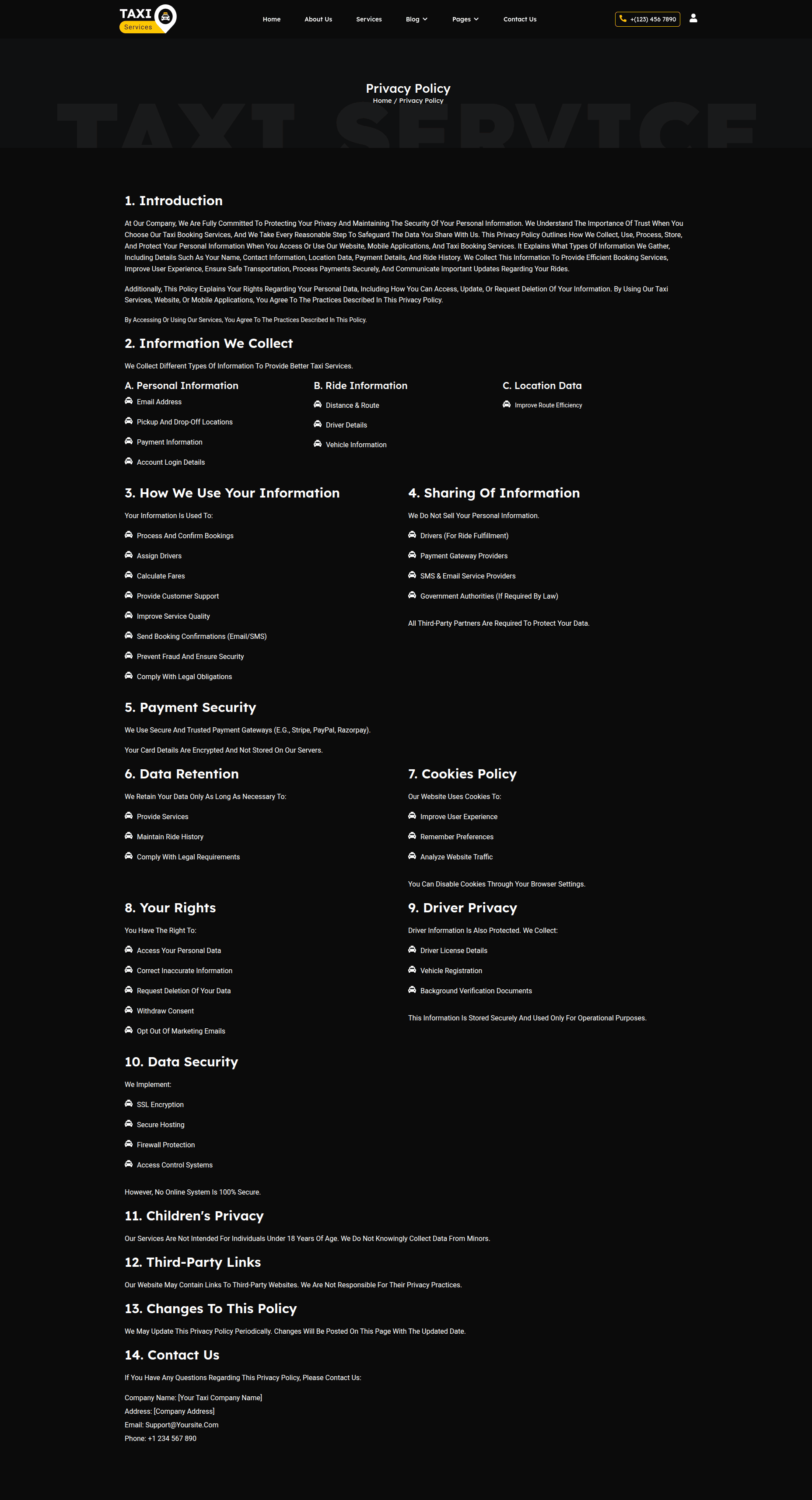
The Privacy Policy Page displays your website’s privacy information, including how user data is collected, used, and protected. This page contains a page title and detailed content only, without any sidebar or additional widgets.
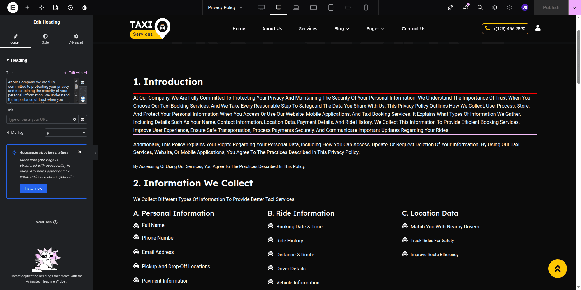
Editing the Privacy Policy Page
-
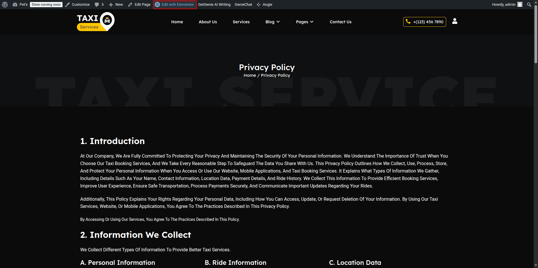
- Go to your WordPress Dashboard → Pages → Privacy Policy.
- Click on Edit with Elementor to open the page in the Elementor editor.
Privacy Policy Page Layout
This page uses a single-column layout focused entirely on text content. It is designed for readability and legal clarity.
Adding Page Title
-
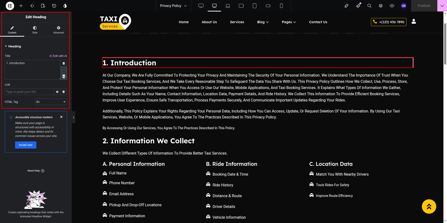
- Add a Heading Widget at the top of the page.
- Use the page title (e.g., Privacy Policy) as the heading text.
- The title will automatically update if the page name is changed in the WordPress Dashboard.
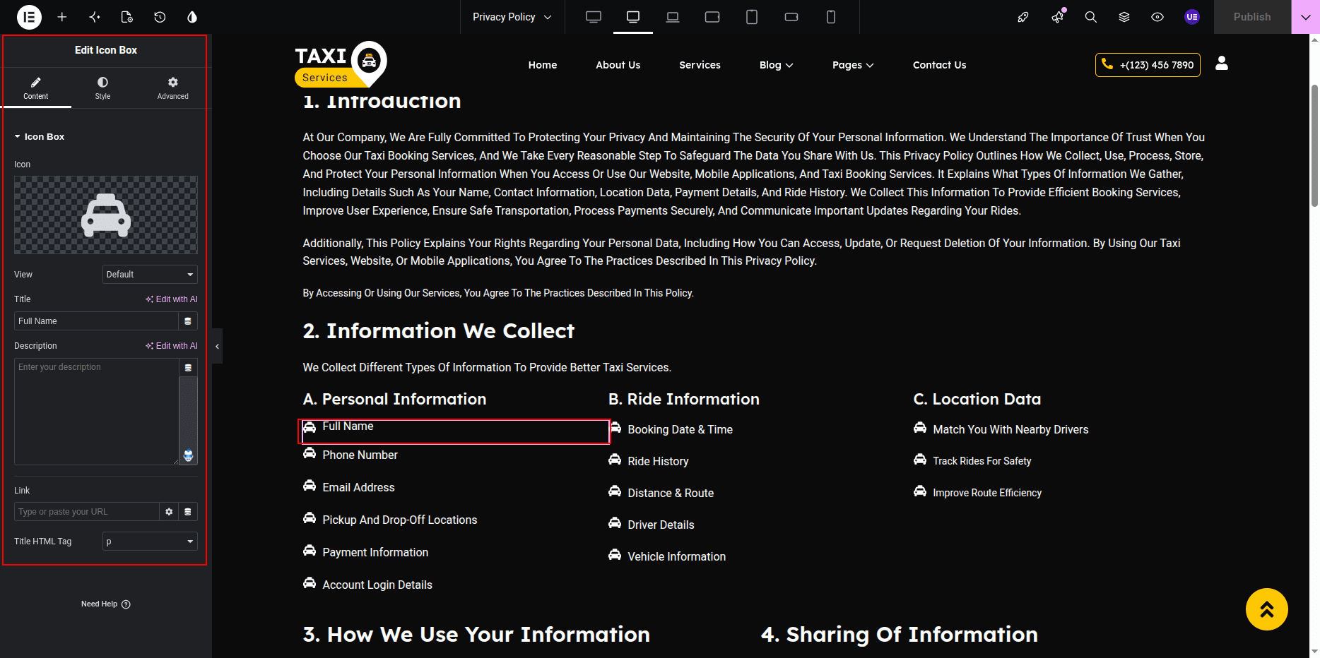
Adding Privacy Policy Content
-
- Add a Text Editor Widget below the page title.
- Enter or paste your privacy policy content.
- Use headings, paragraphs, and lists to structure the content clearly.
Customizing Page Design
-
- Adjust typography for better readability.
- Set line height and spacing between paragraphs.
- Keep background and text colors simple and accessible.
Responsive Settings
-
- Switch to Tablet and Mobile view.
- Ensure text size and spacing remain readable.
Final Adjustments
-
- Review the content for accuracy and compliance.
- Ensure headings are properly structured.
- Click Update to save the page.
Note: WordPress also provides a default privacy policy template, which you can customize further using Elementor.
Terms & Conditions Page
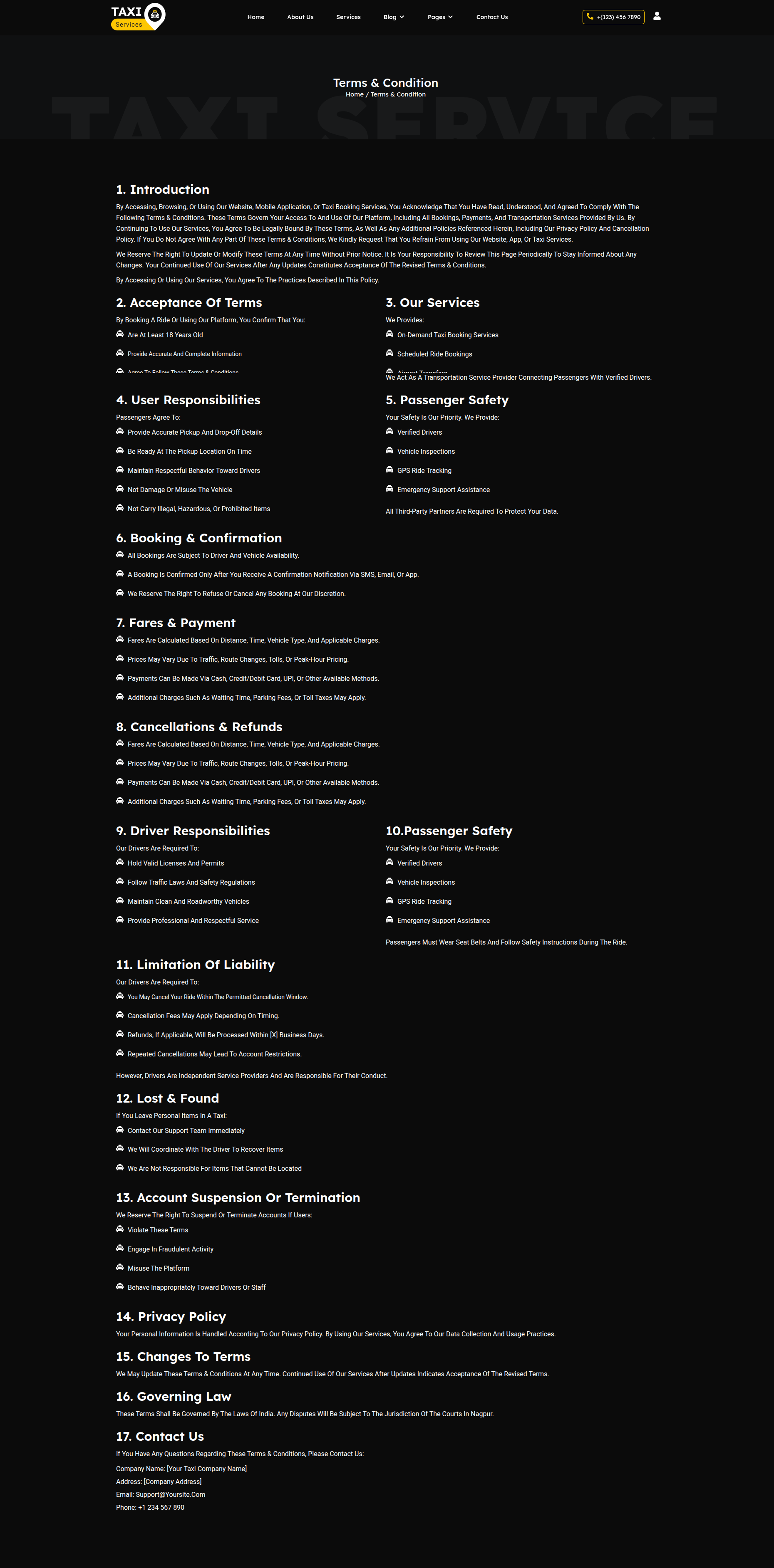
The Terms & Conditions Page outlines the rules, guidelines, and legal terms that users must agree to when using your website. This page includes a page title and detailed content only, without any sidebar.
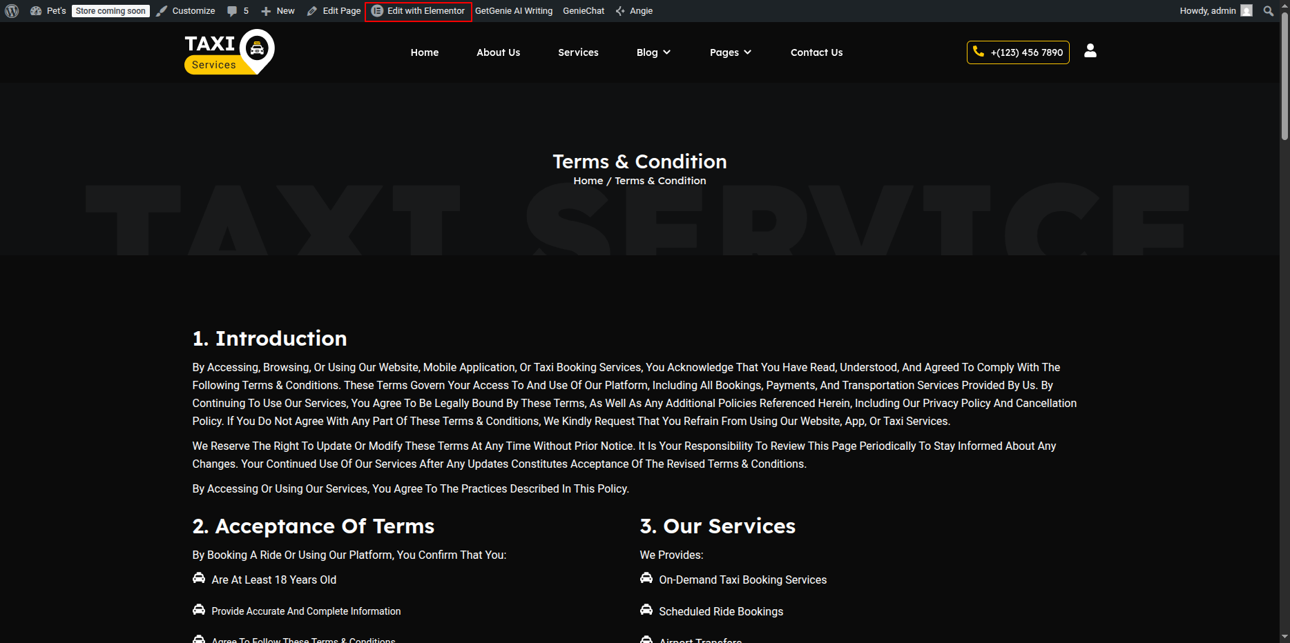
Editing the Terms & Conditions Page
-
- Go to your WordPress Dashboard → Pages → Terms & Conditions.
- Click on Edit with Elementor to open the page in the Elementor editor.
Terms & Conditions Page Layout
This page uses a single-column layout focused on text content for clarity and readability.
Adding Page Title
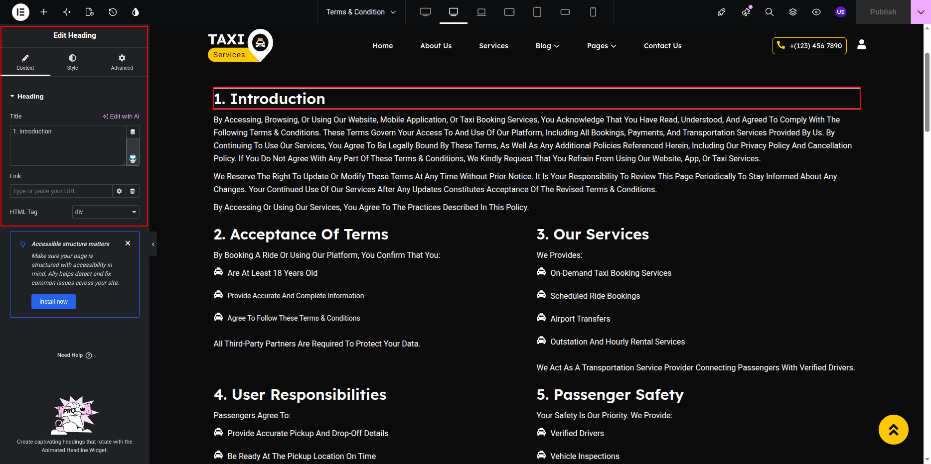
-
- Add a Heading Widget at the top of the page.
- Use the page title (e.g., Terms & Conditions) as the heading text.
- The title will automatically update if the page name is changed from the WordPress Dashboard.
Adding Terms & Conditions Content
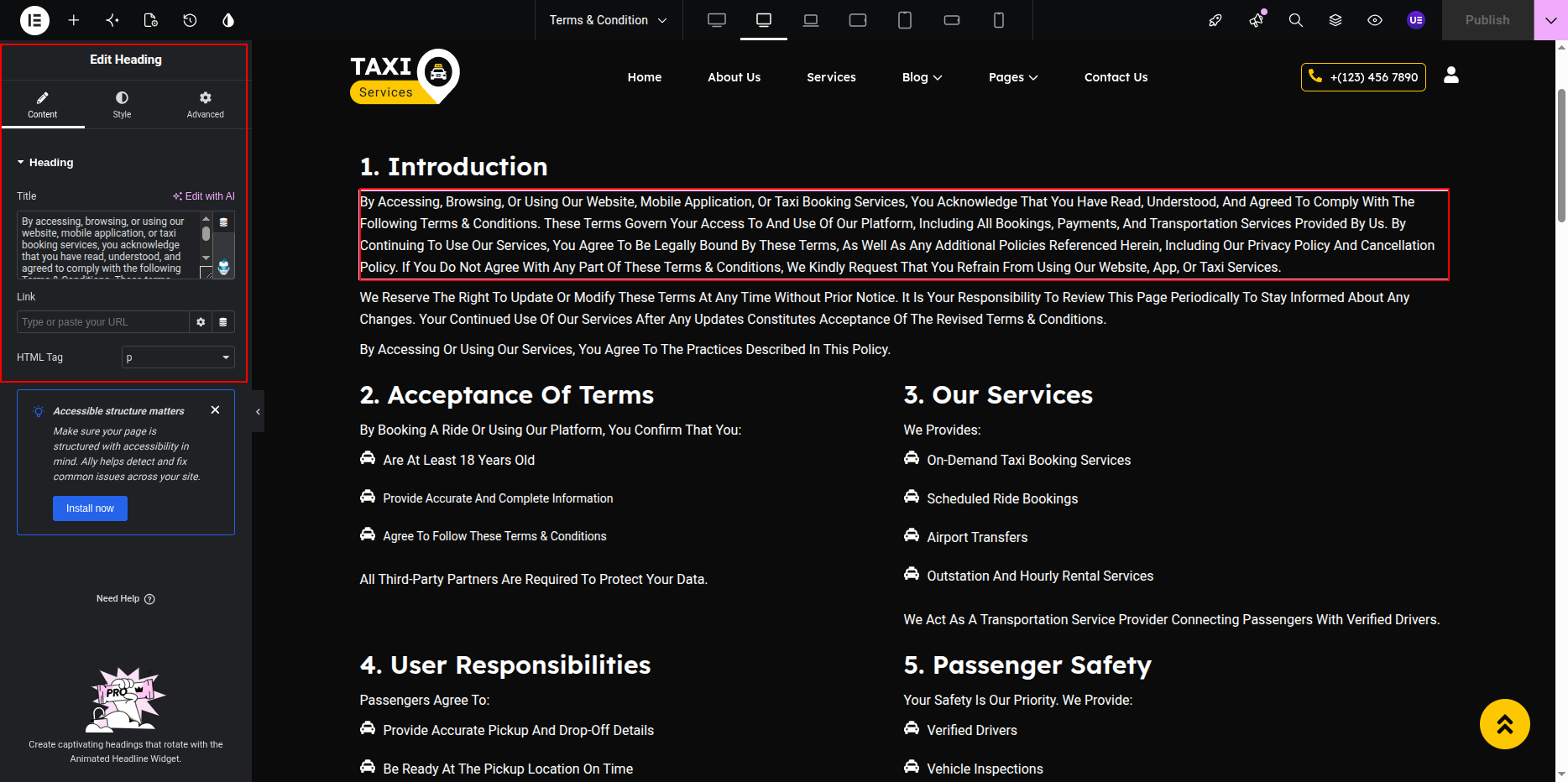
-
- Add a Text Editor Widget below the page title.
- Enter or paste your terms and conditions content.
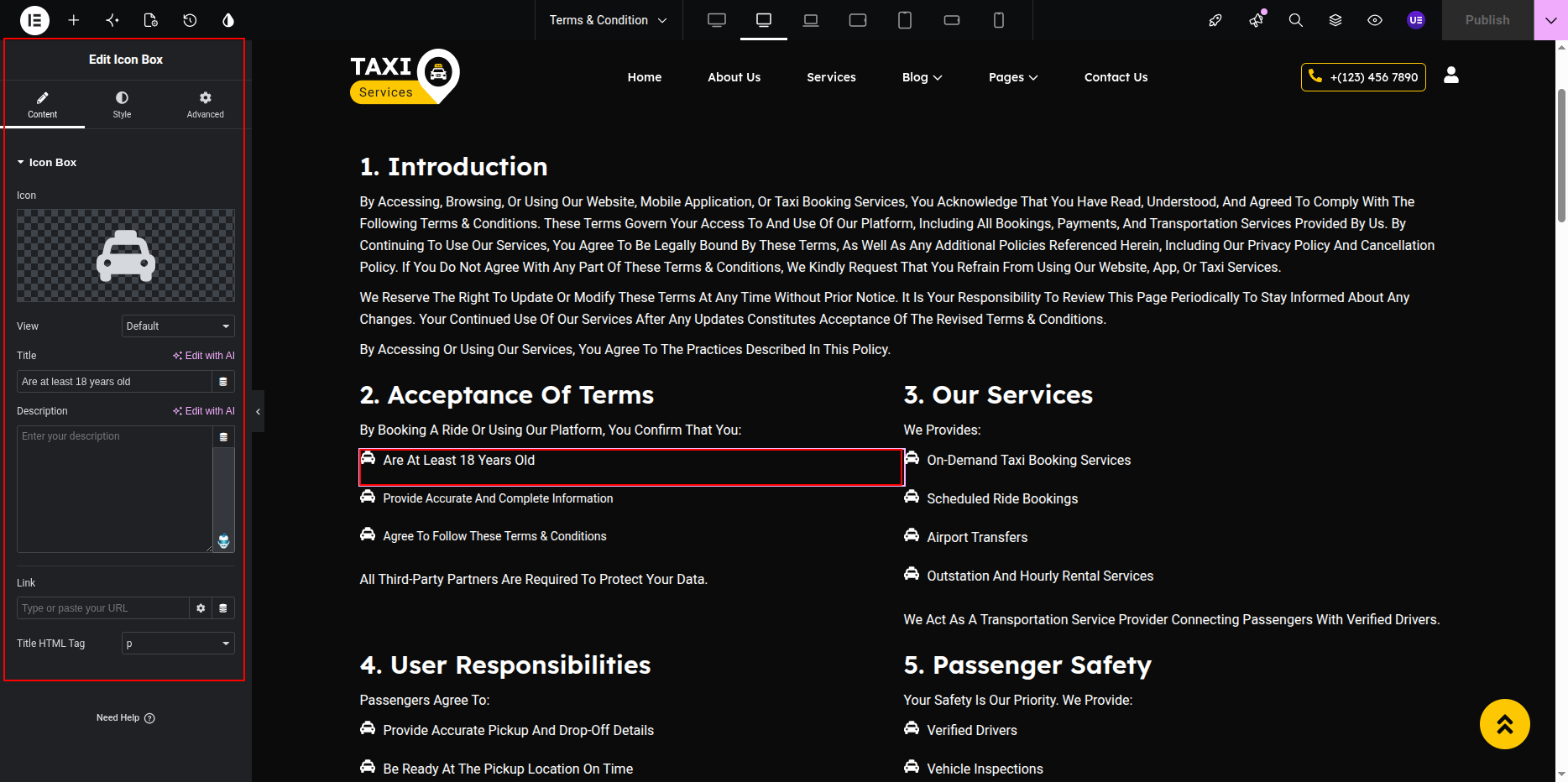
- Use headings, paragraphs, and lists to organize sections clearly.
Customizing Page Design
-
- Adjust typography for readability.
- Set appropriate line height and spacing.
- Keep background and text colors simple and accessible.
Responsive Settings
-
- Switch to Tablet and Mobile view.
- Ensure text remains legible on smaller screens.
Final Adjustments
-
- Review content for accuracy and legal compliance.
- Ensure consistent heading structure.
- Click Update to save the page.
Note: You can use WordPress’s default Terms & Conditions content as a base and customize it further using Elementor.
Booking Form Page
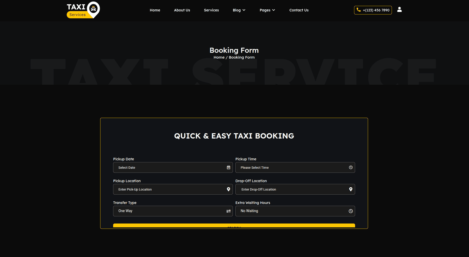
The Booking Form Page allows visitors to submit taxi booking requests directly from your website. The page content, heading, and booking form can be customized using Elementor and the provided booking form shortcode.
-
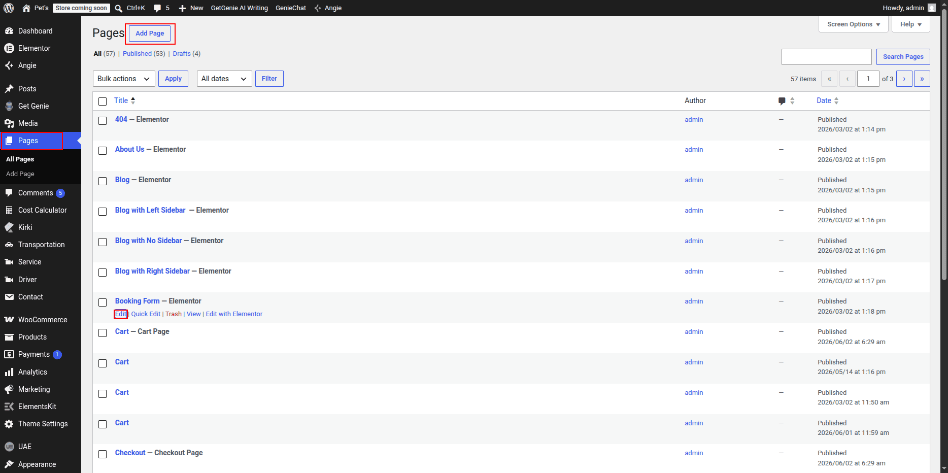
Editing the Booking Form Page:
- Go to your WordPress Dashboard and navigate to Pages → Booking Form.
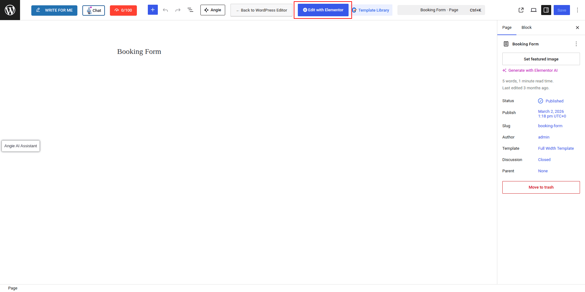
- Click on Edit with Elementor to open the page editor.
- Modify the page content, headings, images, and layout as required.
-
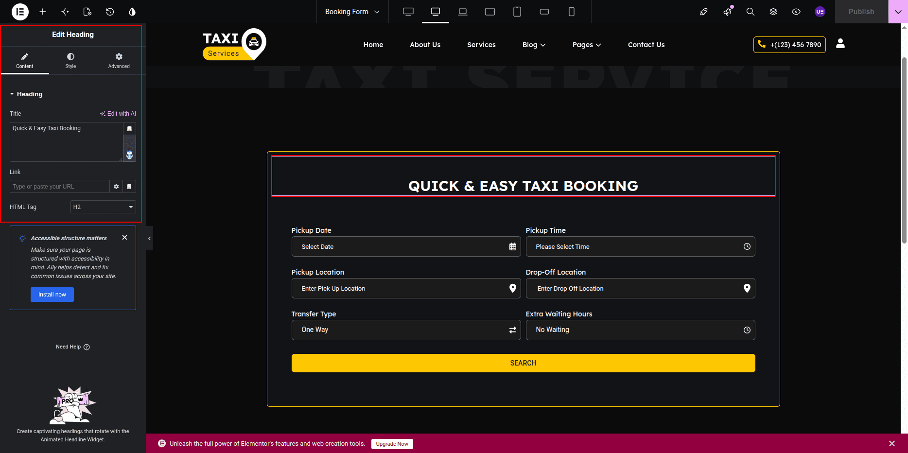
Updating the Booking Form Heading:
- Edit the heading widget in Elementor to change the booking form title.
- You can customize the typography, color, and alignment from the Elementor settings panel.
-
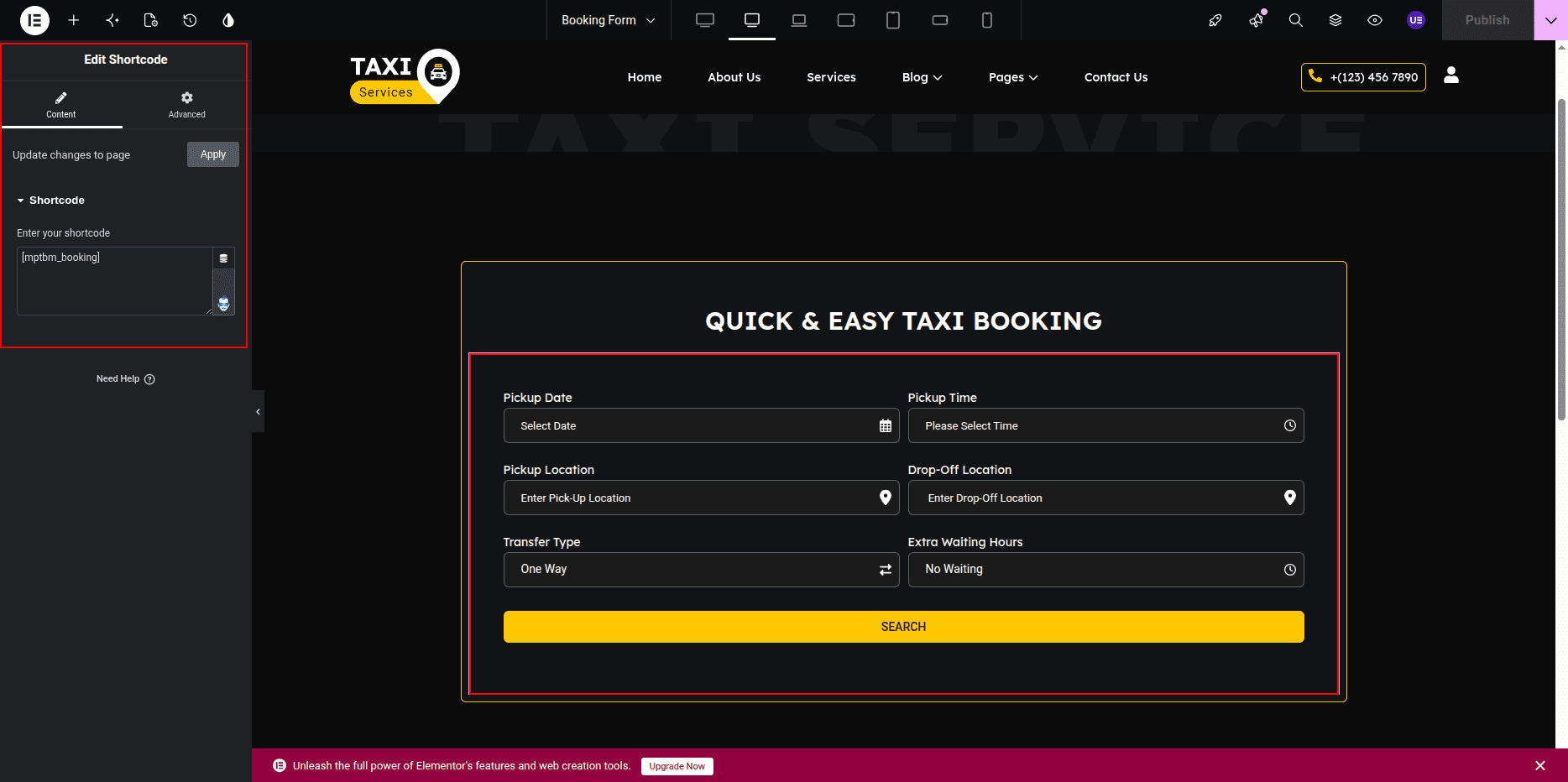
Booking Form Shortcode:
- The booking form is displayed using a shortcode.
- Ensure that the shortcode widget remains on the page for the booking form to function properly.
- You can move or style the shortcode section using Elementor settings.
Single Transportation Page
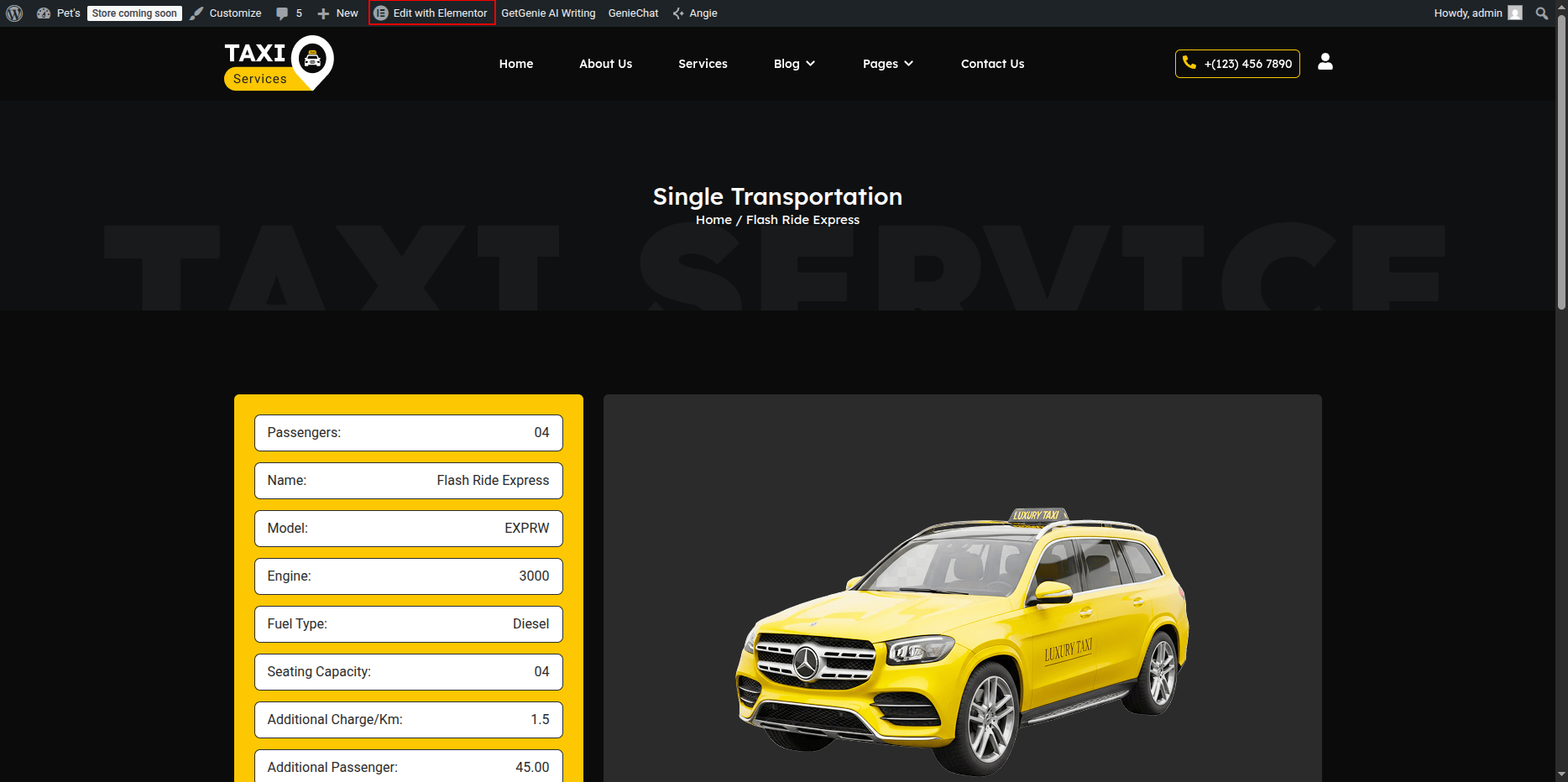
The Single Transportation Page is a custom template page created within the theme files.
Unlike standard Elementor pages, this page is dynamically generated using a dedicated template file and can be fully managed through the Theme Settings panel.
All content, images, and styling options are available from the WordPress dashboard without requiring any code modifications.
Managing Single Transportation Settings
To edit the Single Transportation Page:
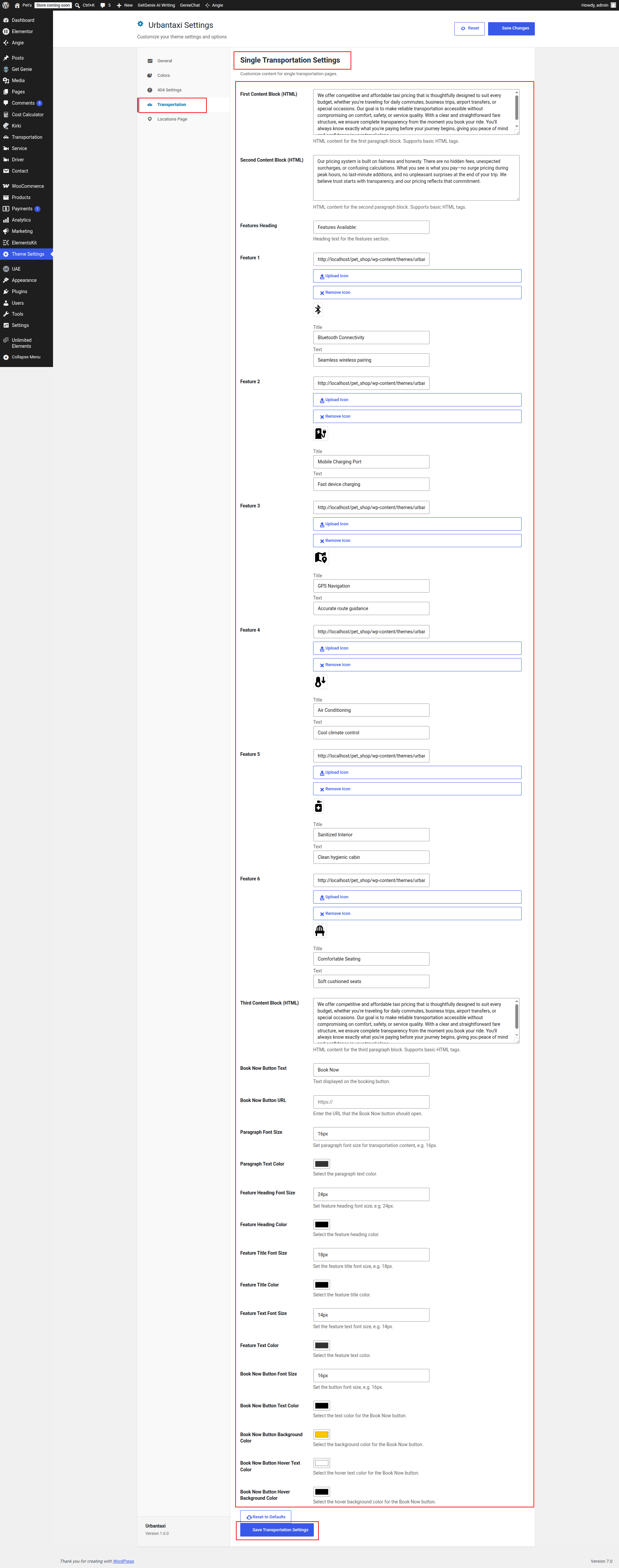
- Go to Dashboard → Theme Settings → Single Transportation.
- Update the page content, images, buttons, and styling options.
- Save the changes.
- The updates will automatically appear on all Single Transportation pages.
Content Management
The content editor allows administrators to manage all information displayed on the Single Transportation Page.
Various fields are available for updating transportation service details, descriptions, and related content.
Page Elements
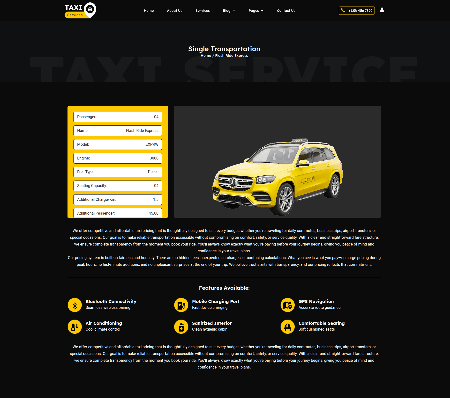
- Page Title: Displays the transportation service title.
- Featured Image: Displays the service image.
- Description: Shows detailed transportation service information.
- Content Sections: Displays custom transportation-related content.
- Buttons: Call-to-action buttons with customizable text and links.
- Additional Information: Displays service details and supporting content.
Style Customization Options
The Single Transportation Settings panel includes various styling controls that allow administrators to customize the appearance of the page.
- Change heading colors.
- Modify typography settings.
- Update content text colors.
- Customize button colors and styles.
- Change section spacing and layout settings.
- Modify background colors and design elements.
- Control image display settings.
Customization Options
- Edit transportation page content.
- Update titles and descriptions.
- Replace transportation images.
- Modify button text and links.
- Adjust page styling through Theme Settings.
- Control typography and color settings.
- Manage layout-related design options.
Frontend Preview
The Single Transportation Page displays transportation service details using the custom template file and Theme Settings configuration.
Any changes made through the Theme Settings panel are automatically reflected on the frontend after saving.
This custom template-based page provides centralized content and style management, allowing administrators to maintain transportation service pages efficiently through the dashboard without editing theme files directly.
Location Page
The Location Page is a custom template page created within the theme files to display transportation services, posts, or related content for a specific location.
This page dynamically fetches and displays location-based posts while allowing administrators to manage the page content and styling through the Theme Settings panel.
No code modifications are required to update the page content.
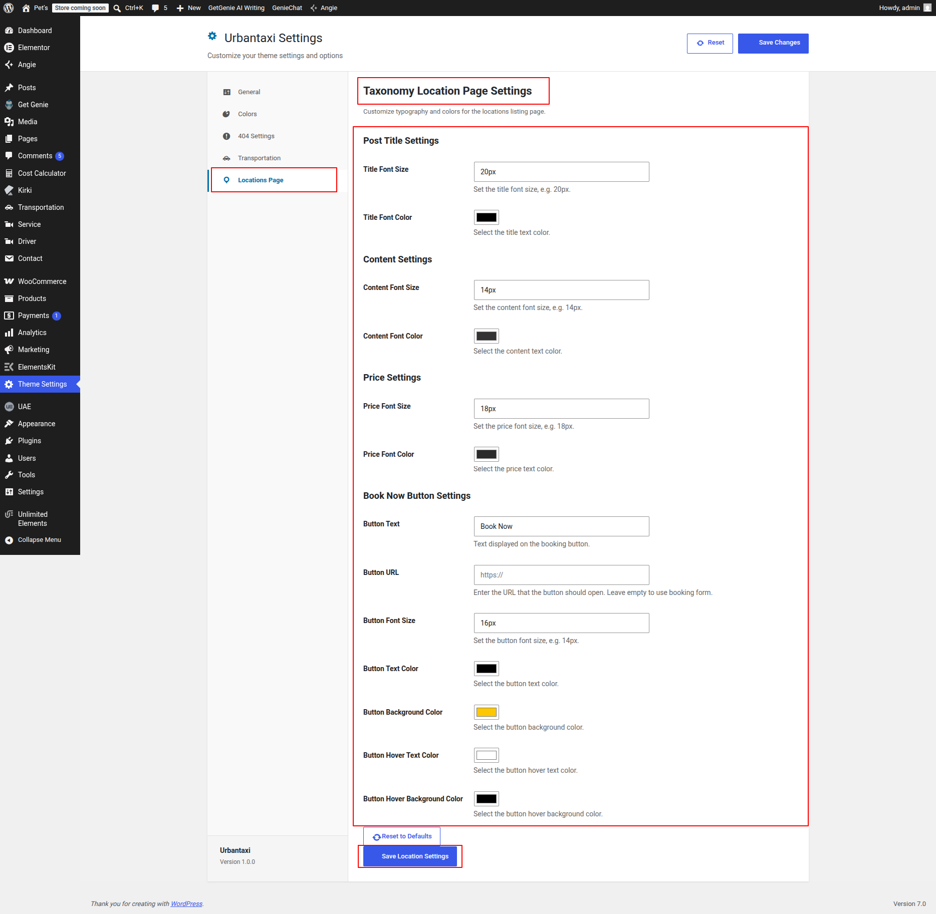
Managing Location Page Settings
To edit the Location Page content and appearance:
- Go to Dashboard → Theme Settings → Location Page Settings.
- Update the page headings, descriptions, and additional content.
- Modify available styling options as required.
- Save the changes.
- The updates will automatically appear on all Location Pages.
Dynamic Location Posts
The Location Page automatically displays posts and transportation services associated with the selected location.
When a location page is opened, all related posts assigned to that location are fetched and displayed dynamically using the custom template.
Page Elements
- Location Title: Displays the selected location name.
- Page Heading: Displays a customizable heading managed through Theme Settings.
- Description: Displays introductory content for the location.
- Location-Based Posts: Shows all transportation services or posts associated with that location.
- Featured Images: Displays images from the related posts.
- Buttons & Links: Provides navigation to individual service pages.
Content Customization Options
- Edit page headings.
- Update descriptive content.
- Modify section titles.
- Control displayed text content.
- Manage button labels and links.
- Configure location page information from Theme Settings.
Style Customization Options
- Change heading colors.
- Modify typography settings.
- Update content text colors.
- Customize button styles and colors.
- Adjust section spacing and layout settings.
- Modify background colors and design elements.
Frontend Preview
The Location Page displays all transportation services and posts associated with a specific location along with customizable page content managed through Theme Settings.
Any updates made from the dashboard are automatically reflected on the frontend after saving.
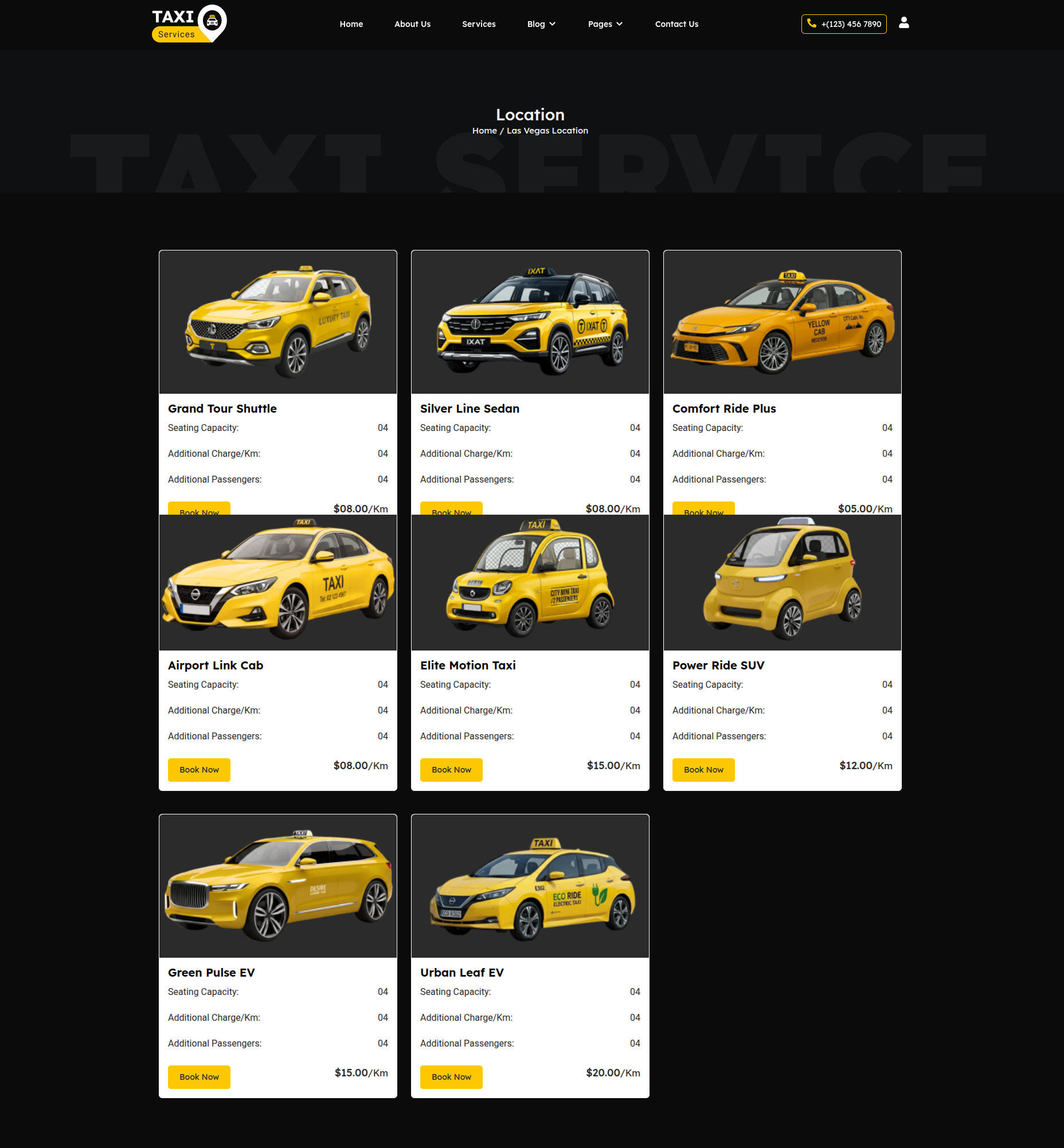
This custom Location Page provides an organized way to showcase transportation services based on location while offering centralized content and style management through the WordPress dashboard.